
In this tutorial, we’ll go over some CSS techniques for rendering circular <img> elements. The main CSS property responsible for the effect is border-radius. Though it’s quite simple to apply the effect to square images, rectangular images will require a little bit more extra work.

Square Images
An img element that’s perfectly square only needs one line of CSS. This technique works best on square images. HTML
<img class="circular--square" src="woman.png" />CSS
.circular--square { border-radius: 50%; }The style rule above is the shorthand for:
.circular--square { border-top-left-radius: 50% 50%; border-top-right-radius: 50% 50%; border-bottom-right-radius: 50% 50%; border-bottom-left-radius: 50% 50%; }By setting all the border-radius properties to 50% of the width/height of the square img element, we end up shaping the img element into a circle: 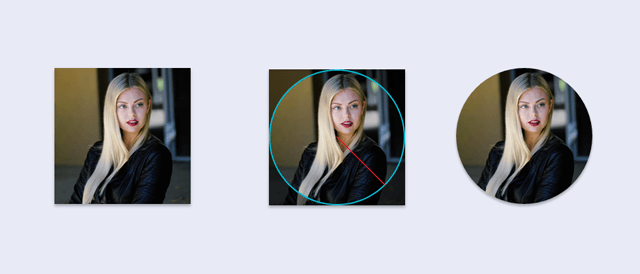
Rectangular Images
Rectangular images are a bit trickier. To render a circle, the image must start out as a square.
To work around the problem, we can wrap the img element in a square div element. We then “crop out” the parts of the img element that go beyond the square wrapper div. We can carry this out by setting the wrapper div‘s overflow property to hidden.
So that the subject of the photo is less likely to get cropped out, we also have to treat landscape photos (which are horizontally-oriented rectangles) differently from portrait photos (which are vertically-oriented rectangles).
Landscape-oriented Images
HTML
<div class="circular--landscape"> <img src="images/barack-obama.png" /> </div>CSS
.circular--landscape { display: inline-block; position: relative; width: 200px; height: 200px; overflow: hidden; border-radius: 50%; } .circular--landscape img { width: auto; height: 100%; margin-left: -50px; }The width and height property values must be the same so that the wrapper div (.circular--landscape) renders as a square. In addition, the width and height property values must be equal to or less than the height of the img. This makes sure the img element is able to occupy the wrapper div without being stretched out. Generally, the subject of landscape photos will — but not always — be located around the center of the composition.
To give us the best chance of not cropping out the photo’s subject, we can horizontally center the img element in the wrapper div by nudging the img element to the left to compensate for the left-biased cropping. The amount we nudge the img element is equal to 25% of the width/height of the wrapper div. In this case, we will nudge the image 50px (25% of 200px is 50px) to the left.
We can accomplish this by setting the margin-left property of the img element to a negative value:
margin-left: -50px;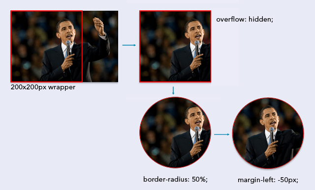 The assumption that the subject of the photo will be close to the center of the composition is not always going to be true. It’s best to keep this assumption in mind when you’re choosing (or editing) images for this technique.
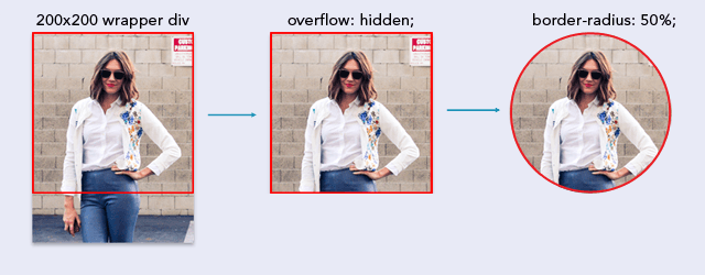
Portrait-oriented Images
HTML
<div class="circular--portrait"> <img src="images/woman-portrait.png" /> </div>CSS
.circular--portrait { position: relative; width: 200px; height: 200px; overflow: hidden; border-radius: 50%; } .circular--portrait img { width: 100%; height: auto; }The assumption we’ll make for portrait-oriented images is that the subject of the photo is at the top-center of the composition. Again, this isn’t going to be the case in every single portrait photo. Similar to landscape photos, the wrapper div of portrait-oriented img elements must have equal width and height property values so that the wrapper is a perfect square.
This time, the width/height property value must be equal or less than the width of the img element so that the image can cover the wrapper div without being stretched out. For portrait-oriented images, we assign a height of auto and width of 100%. (We did the opposite for landscape-oriented images.) We don’t need to move the img element, because our expectation is that the subject of the photo is at the top-center of the composition.
Recap
This technique is best used on square img elements, with the subject located dead-center of the photo. But, we don’t live in a perfect world, so if needed, you can use a wrapper div for rectangular img elements. The main CSS property responsible for the circular shape is the border-radius property.
Setting the radius of the corners to 50% of the width/height results in a circle.
Related Content
Responsive Full Background Image Using CSS How to Create CSS Ghost Buttons Creating Responsive Images with CSS

Connect with him on Twitter.
-
 President of WebFX. Bill has over 25 years of experience in the Internet marketing industry specializing in SEO, UX, information architecture, marketing automation and more. William’s background in scientific computing and education from Shippensburg and MIT provided the foundation for RevenueCloudFX and other key research and development projects at WebFX.
 -

WebFX is a full-service marketing agency with 1,100+ client reviews and a 4.9-star rating on Clutch! Find out how our expert team and revenue-accelerating tech can drive results for you! Learn more
Make estimating web design costs easy
Website design costs can be tricky to nail down. Get an instant estimate for a custom web design with our free website design cost calculator!
Try Our Free Web Design Cost Calculator
Share this article


Web Design Calculator
Use our free tool to get a free, instant quote in under 60 seconds.
View Web Design Calculator
Make estimating web design costs easy
Website design costs can be tricky to nail down. Get an instant estimate for a custom web design with our free website design cost calculator!
Try Our Free Web Design Cost Calculator