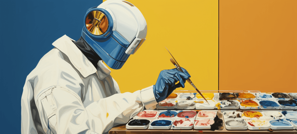
Preview
Step 1: Getting Started
This first step will provide a basic outline of the opening stages of a project, from the point where you and a client agree to work with one another.
So on to the first order of business: Write up a contract! That should always be the first thing you do when starting up on a new project that you intend to get paid for. A contract adds security for both you and your client, and ensures that you’re both agreed on how things are going to unfold over the course of the project.
Resources for Writing Contracts
- Contract Basics: Getting the Client to Sign on the Dotted Line
- Craft a Contract for Your Desktop Publishing Business
Client Brief
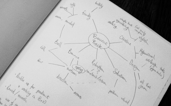
Working on a logo design begins with the design brief. The design brief involves interpreting what the client wants, and from there, realizing what directions you can take things to.
If you’re looking to be thorough with your analysis of the brief, it can help to highlight noteworthy parts. You can have a printout and you can start jotting ideas down in the form of notes or a preliminary spider diagram.
Over the course of this brief, I’ve been communicating with the client predominantly through phone calls.
Skype is an excellent tool, especially if you’re dealing with projects on an international or long-distance level. Since I deal with long-distance clients, Skype is a necessity for me!
We also communicated through email conversations, as well as a couple of face-to-face meetings.
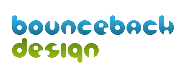
The Client
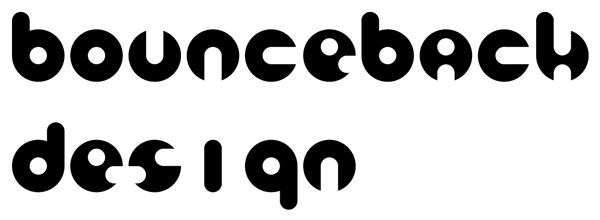
My client for this logo design project is Bounceback Design. As the company’s name suggests, they are a company that focuses on graphic design.
As such, I’m going to need to bear that in mind throughout the length of this project so that I can create a logo that reflects the nature of their company and a log that presents a creative attitude.
On top of analysing the brief, which can at times be just that: brief, talking things through with a client is essential in discerning what kind of visual aesthetics might be appropriate to bring into use. If you have the opportunity, having them fill out a short questionnaire can prove immensely helpful in this area, for both you and the client.
Asking the Right Questions
While different briefs may call for different questions to be asked, a good jumping off point for something like this is Ivan Raszl’s Corporate identity client questionnaire.
A few things that I usually make sure to ask are questions about which particular area the company works in — or aims to work in.
In this case, Bounceback Design works primarily with digital graphics, but also does web development and print work.
Other things you should find out are:
- What are the traits that the client feels are unique to their company?
- Which aspects of the company’s personality would they prefer to see emphasized/advertised?
- Who are their major competitors?
- Who are they aiming their products/services towards?
- What is the motivation/driving force for the company’s creation?
If you’re working on rebranding a company with a pre-established brand identity:
- What do they like about their current branding?
- What has proved successful about it?
- Are there any aspects of the current brand they specifically wish to move away from?
Ask anything that can give you an insight into where the client’s business started, where it stands now, and where they intend to take it the future.
From there, it’s on to do a bit of research.
Step 2: Take a Look Around

There are a few reasons why research is a necessity.
First of all, understanding your client’s industry, their competitors as well as their target audience will greatly aid you in creating a design that is both relevant and effective.
Secondly, even if you already have a strong idea of what you intend to do, looking into other designs can help make sure you’re not inadvertently creating something that someone else has already come up with.
And thirdly, just seeing what else is out there can really boost motivation and creativity!
Some good places to look for inspiration in this case are LogoPond and Brandstack, browsing through LogoLounge books (or their website if you’re a member), as well as design-related blogs.
It can also help to look at examples of other types of design, or even something not related to graphic design at all — anything that gets your creative juices flowing or gets you thinking in new ways!
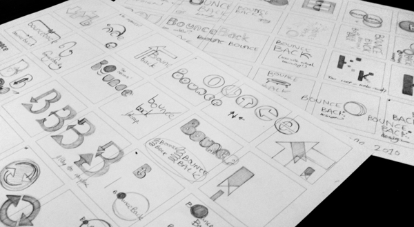
Step 3: Ideas Generation
Once your brain is in gear for the task at hand, it’s time to start thumbnailing ideas.
Spider diagrams can be useful during this phase, especially if you’re having trouble coming up with as many ideas as you’d like.
I try to make sure I get down at least a whole page of thumbails before continuing. Tthough that’s just my personal preference and work style for being thorough — you may find a concept that works perfectly early on, or perhaps it’ll take a little while longer before you get to a point where you’re happy moving forward. It really can vary from brief to brief.
When I’m designing a logo, I try to make sure it’s strong conceptually: Graphic design — is in no small part — about communication.
A company’s logo needs to convey — with a certain level of immediacy — their professional attitude and what they do.
In this brief, I’ve been leaning more towards rounder shapes and a more approachable feel, as well as trying to steer clear of the obvious associations with the phrase “bounce” just because it would be the easiest and least creative path to take. Though I’ve still sketched those out too, as you never know where an idea might evolve from. Explore every avenue — not all of them are cul-de-sacs!
When you’ve decided on the concept(s) you feel comfortable with taking further, it’s time to get cracking in Illustrator!
The idea I’ve chosen to go through with was one favoured by the client; the simplest of shapes being utilized to make up the forms of different characters, representative of the process of developing something from a simple idea into a communicative visual.
Step 4: Developing in Digital
Now that we’re ready to start work on building our concepts digitally, we’re going to create a base which we can use to form our letterforms.
The first thing to do is open up Illustrator and create a new document (Ctrl/Cmd + N).
The size and settings of your new Illustrator artboard can be whatever you prefer, though the document colour mode should be set to CMYK.
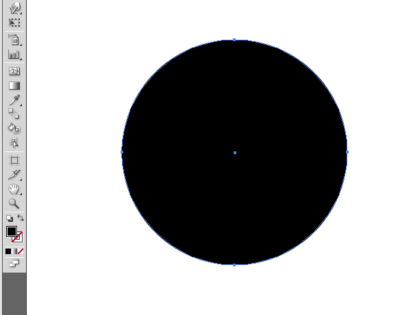
Choose the Ellipse Tool (L) and, holding Shift to constrain the proportions, create a circle.
Give it a solid fill with no outline.
Step 5: Creating a Foundation for Type
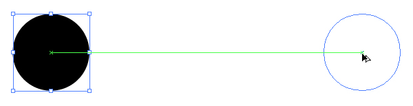
Now we’re going to turn this object into the base for our letterforms. Using the Selection Tool (V), drag the circle across the page whilst holding both the Alt and Shift key; this will create a copy on level with your original selection.
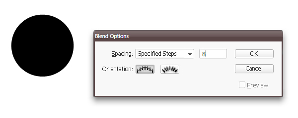
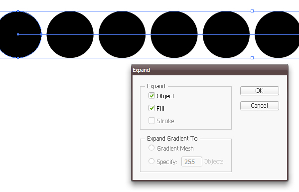
Use the Blend Tool (W) set to Specified Steps with a value of 8 to generate eight identical circles, and then click on the first circle and then the second. We set it to 8 since the longest word we’re working with contains 10 characters, and we have the bases of 2 already set out.
Since the distance between each circle is equal, we can move the ones at the end farther apart or closer together with the Direct Selection Tool (A) until they’re spaced more appropriately.
Once you’ve done this, go to Edit > Expand and, with the Object checkbox ticked, hit OK.
That should expand the blended elements into actual editable objects.
Step 6: Completing the Foundation
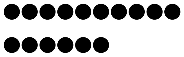
Now, we want to duplicate these objects so that we have a base for the word “design”. Using the same method of holding down Alt + Shift and dragging with the Selection Tool as before, create a copy of that first row directly beneath. Make sure to leave some space, as we’ll be adding in the ascenders and descenders of the characters shortly!
At this point, we can delete the circles we don’t need.
In this case, the last four on the bottom row.
Step 7: Creating the Letterforms
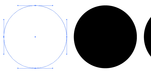
Next, we’re going to need to develop these regular old shapes into recognizable letterforms! Focusing on the top row for now, select the very first circle with the Direct Selection Tool and then Copy it.
Since we’re not going to be directly editing the circles we have so far just yet, it’s a good idea to Select All and Lock them (Ctrl/Cmd + A, then Ctrl/Cmd + 2). This way we won’t accidentally end up moving or changing the wrong thing in the following steps!
Paste the circle you just copied in front of the original using the Paste in Front command (Ctrl/Cmd + F) and change the fill colour to white.
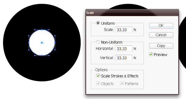
Now we’re going to want to make this object smaller so that we can use it to form the counters, ascenders and descenders of the type.
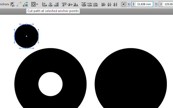
Keeping the path selected, double-click on the Scale Tool in the toolbar, enter a Uniform Scale amount of 33.33% and hit OK. Now we have our counter.
Drag and copy this new object up and to the left using Alt as before, until it sits level with the edges of the original circle.
After changing the fill back to black, select the anchor points on the left and right sides of this circle and Cut Path at selected anchor points so that you effectively end up with two semicircles.
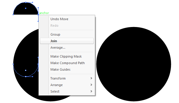
Select the lower semicircle and drag it down until it’s level with the bottom of the counter.
Select one of the open anchor points as well as the corresponding one of the semicircle above, and join them both.
Do the same for the other two endpoints to close the path, and you have your ascender! We can reuse these to help create the other letterforms, so make a copy and place them somewhere out of the way for the time being.
Step 8: Finalizing the Shape
Now we have our letter “b” looking right, we just need to make it official by making it one single object.
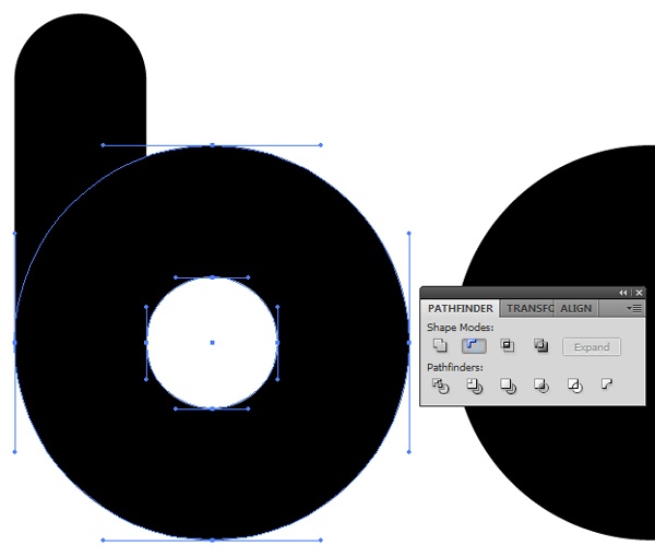
Unlock the original base for the letters (Ctrl/Cmd + Alt + 2) and, with the Direct Selection Tool, select the first circle, as well as the white counter in front of it.
Next, in the Pathfinder Panel (open it via Window > Pathfinder), choose Minus Front which will substract the small circle from its background. Click Expand if you’re presented with the option.
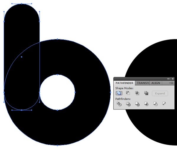
With the new shape still selected, select the ascender as well and use the Unite command through the Pathfinder Panel.
That’s our first letter done, which means it’s time to move on to the others!
Using copies of the counter and ascender put aside earlier, go through the same process to create letterforms out of the remaining objects.
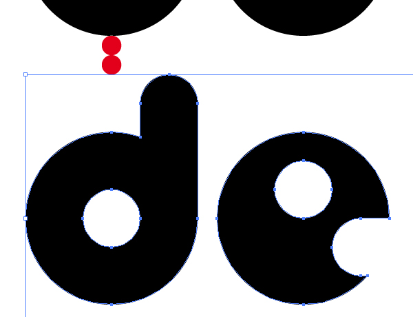
For some, this will be much easier. For instance, the same shape was able to be used for the letters “’u”, “n” and “c”.
It was possible to use Object > Transform > Reflect to make a vertical reflection of a “b” to create the “d”, and a horizontal reflection of that to form the “g”. I was also able to use the ascender-shape for the “i”, as well as for creating the open-counters.
Step 9: Getting Things to Where They Need to Be! (Part I)
So we have the letters done, but not quite dusted — the two rows still need to be pushed a little closer together, and the width of the “i” knocks the kerning way out for the word, “design”.
One nifty little trick is to create another circle (oh, so many circles) with the diameter of which measures from the edge of one letter to the opposite of the letter beside it.
Placing a copy of this object either side of the the letter “i” allows us to place that letter with the correct distance from the “s”.
Also bring in the “gn” too.
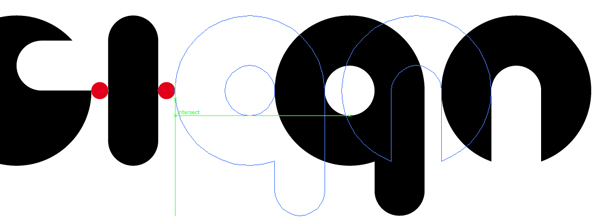
I also used two of those small red circles stacked one above the other to help me better place the word, “design”.
Step 10: A Few Adjustments
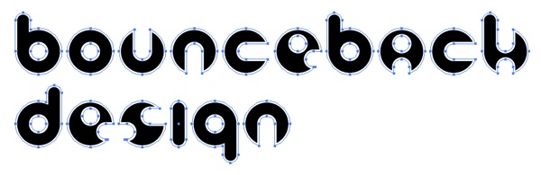
At this point, I’m feeling that some of the corners of each letter are a little too sharp and go against the overall smooth aesthetic I’ve been going for, so in this step, I’m going to go in and make them a little rounder.
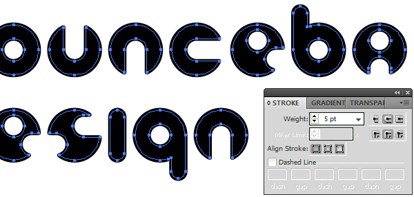
Instead of doing each and every corner individually, it is possible to save time and achieve the same (and technically more accurate) effect with the following method: Select everything and give it a white stroke with the weight of which will vary depending on how large you’re working at. Just as long as none of the closed counters end up opening, you should be fine. I’m currently working at almost the full width of a landscape A4 page, and so am using a stroke weight of 5.
The next thing to do is to go to Object > Path > Outline Stroke. This will create solid fill objects out of the strokes, which will each be grouped to the individual letter it surrounds.
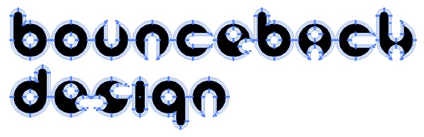
This makes things a lot easier for this bit.
You can select each letter with the Select Tool and use the Pathfinder Panel to Minus Front again. Once you’ve done this for all the letters, you should have much skinnier letters with a black fill left.
Select All (Ctrl/Cmd + A) and apply the same weight of stroke to it all again, this time also black, and give it a Round Join.
Outline Stroke again and use the Pathfinder Panel to issue the Unite command on all the paths so that each character is made solid and everything is grouped together.
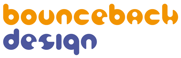
Step 11: Adding Colour
Now’s it’s on to adding colour. There are quite a few useful tools out there to help pick out a scheme that works, most notably Kuler and the Color Scheme Designer.
While this is the last stage in my development process, it is by no means an afterthought.
A brand’s colour needs to be well thought out and purposeful.
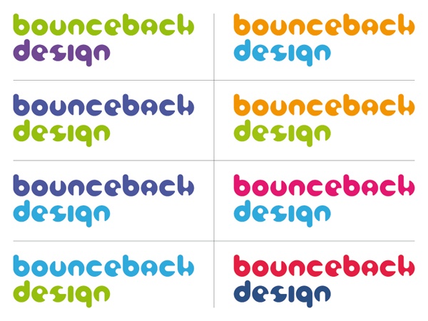
A good technique is to make several copies of your current desig, and go through applying a different colour scheme to each.
After careful consideration and a little bit of trial and error, I’ve decided on a warmer, vivid scheme: something that reflects a friendly and outgoing professional attitude, but which isn’t too gaudy.
Step 12: Getting Things to Where They Need to Be! (Part II)
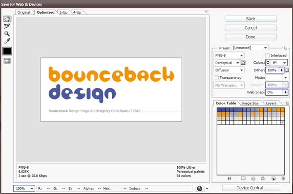
It’s now time to show the client what we’ve got and see what they think. Save your document for Web & Devices (Ctrl/Cmd + Alt + Shift + S) and make sure the size isn’t set too high but not too small either; you want to give your client an accurate visual of how their logo would look.
I’ve also included a short amount of text beneath that functions as a label, identifying this design as “logo A” to reduce the risk of phrases such as “the logo with the squiggly bit” being used to refer to a specific design.
I email this design — along with usually around 3 or 4 other concepts — to the client with a brief explanation of the reasons and thought-process behind each.
If I’m meeting the client face-to-face, I’ll print and mount each concept and talk the client through them.
If you’re sending your concepts via email, then you’ll likely be waiting at least a little while before you hear back from the client regarding which concept they prefer and any changes they might want made.
In this case, the client contacted me to say that they liked this design, but requested a few revisions.
The requested revisions were some adjustments to the colour scheme, if possible, introducing a lime green or similar colour, along with the suggestion of adding a color gradient.
Step 13: Making Revisions: Changing the Colours
Since the client asked for a colour change, I went back to Step 11 and laid out a few more copies of the logo, further altering the colours and bringing in greens where they worked.
When I’d found a few options that looked good, it was on to implement a color gradient.
Step 14: Making Revisions: Adding a Color Gradient
Time to bring a gradient into the mix. There are a couple of ways to go about adding a monochromatic gradient, but the method I found to produce the best results in this particular instance is the following.
Copy the word, “Bounceback” and Paste in Front.
Apply a Fade to Black linear gradient through the Gradient Panel. This should give you something that looks pretty weird!
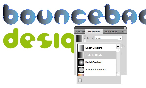
Then use the Gradient Tool (G) and drag from the bottom of the “o” up towards the top, holding Shift to keep the angle perfectly vertical.
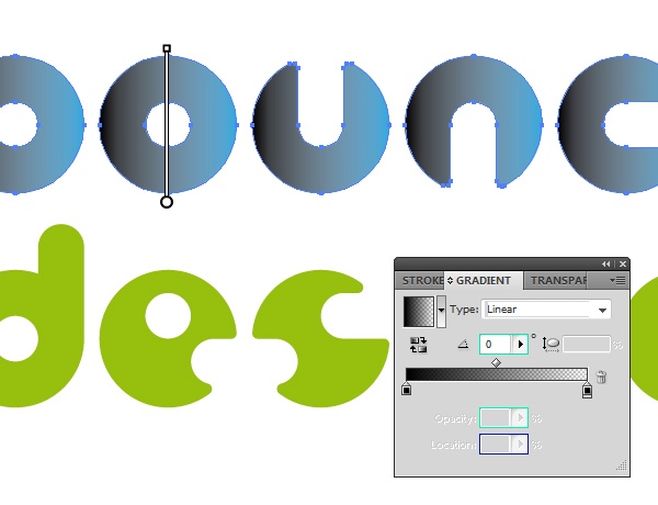
This will give you a consistent 90° transition that is uniform between all the objects as opposed to being measured from the top to bottom of each individual object.
Repeat that process for the word, “design” and reverse the direction with the Reverse Gradient option in the Gradient Panel.
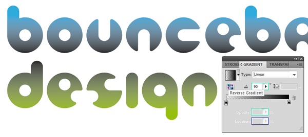
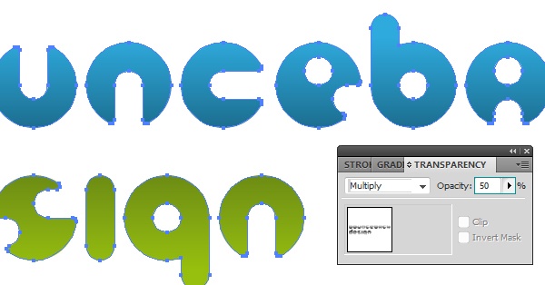
Step 15: Making Revisions: Fixing the Gradient
Now we need to sort the gradient out and get rid of that muddy grey look.
So open up the Transparency Panel and, with your gradient objects still selected, set the blending mode to Multiply and the opacity to 50%
Step 16: Wrapping things up
Once the logo has been altered as the client has asked, I repeat Step 13 to show them samples of the revised design in a few of the new colours.
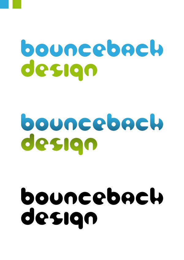
The client approved one of the color variants specifically, with no further revisions being requested.
I pasted the flat colour and gradient versions of the chosen logo into a new document and grouped each one before creating a duplicate of the flat colour design and changing the fill to black.
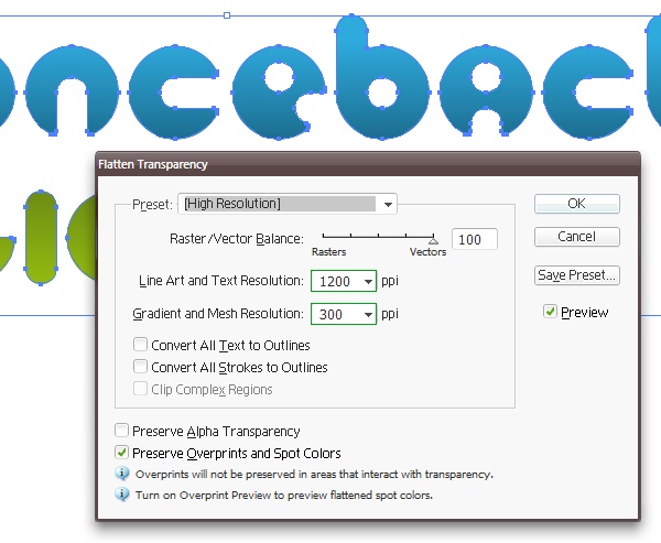
In the case of the gradient logo, I go to Object > Flatten Transparency and select the High Resolution preset. This ensures that the transparency in the gradient doesn’t cause any problems when the file is read back in.
I then created separate documents for each version of the design, and saved them as Illustrator 8 EPS files, PDF files and high resolution JPEGs.
I invoiced the client and — upon receiving payment — sent them the logo in the following formats:
- 1 x original Illustrator file (.AI) – Containing flat colour, graded and B&W logos (File > Save As…)
- 3 x Illustrator 8 EPS files – Separate flat colour, graded, and B&W logos (File > Save As…)
- 3 x PDF files – Separate flat colour, graded, and B&W logos (File > Save As…)
- 3 x High resolution JPEG images – Separate flat colour, graded, and B&W logos (File > Export…)
Some Parting Tips
When giving a client options of different designs, you might be surprised at how often they’ll go for the one you didn’t expect them to choose, so don’t ever go decide to put less effort into your other designs on the basis that “they’ll obviously go for the good one.” Instead, make all your finalized concepts as awesome as possible!
Keep the client up to date on your progress while you’re working on their design, but at the same time don’t smother them!
Don’t just jump ship as soon as you’ve handed over the project deliverables. Keep in touch with the client, check to see if everything’s working out well, and let them know they can always consider you for any future work you may be suited to. It never hurts to nurture a long-term business relationship if you find a client who’s reliable and good to work with.
Lastly, a logo is only one part of a company’s overall identity.
Think about how it might be incorporated into other facets of the corporate identity, such as stationery, website, etc. Even if you’ve been presented with a straightforward logo design brief, if it’s applicable, then it can often be a good move to present mock-ups of potential layout concepts of letterheads, business cards, and the like.
Tutorial Summary
In this tutorial, I showed you my process for creating a logo design, from start to finish. We started with the conceptualization of the idea, and how to create the design in Illustrator.
I also shared with you some tips on creating contracts, looking for inspiration, sending the mockups to your clients, and asking the right questions. I hope you enjoyed this tutorial and I look forward to your comments.
Download Source Files
- create_logo_design (ZIP, 0.96 MB)
-
 Trevin serves as the VP of Marketing at WebFX. He has worked on over 450 marketing campaigns and has been building websites for over 25 years. His work has been featured by Search Engine Land, USA Today, Fast Company and Inc.
 -

WebFX is a full-service marketing agency with 1,100+ client reviews and a 4.9-star rating on Clutch! Find out how our expert team and revenue-accelerating tech can drive results for you! Learn more
Make estimating web design costs easy
Website design costs can be tricky to nail down. Get an instant estimate for a custom web design with our free website design cost calculator!
Try Our Free Web Design Cost Calculator
Table of Contents
- Preview
- Step 1: Getting Started
- Step 2: Take a Look Around
- Step 3: Ideas Generation
- Step 4: Developing in Digital
- Step 5: Creating a Foundation for Type
- Step 6: Completing the Foundation
- Step 7: Creating the Letterforms
- Step 8: Finalizing the Shape
- Step 9: Getting Things to Where They Need to Be! (Part I)
- Step 10: A Few Adjustments
- Step 11: Adding Colour
- Step 12: Getting Things to Where They Need to Be! (Part II)
- Step 13: Making Revisions: Changing the Colours
- Step 14: Making Revisions: Adding a Color Gradient
- Step 15: Making Revisions: Fixing the Gradient
- Step 16: Wrapping things up
- Some Parting Tips
- Tutorial Summary
- Download Source Files
Share this article


Web Design Calculator
Use our free tool to get a free, instant quote in under 60 seconds.
View Web Design Calculator
Make estimating web design costs easy
Website design costs can be tricky to nail down. Get an instant estimate for a custom web design with our free website design cost calculator!
Try Our Free Web Design Cost Calculator