I will be using a graphics tablet for the painted part of this tutorial but you can also achieve the effect using the Pen Tool. Let’s get started!
Tutorial Resources
- Texture Stock by Ortonesque – Royalty free
- Paper Texture by Studder – Royalty free
- Snow Leopard by y3ti4liv3 – Royalty free
- Branch over lake by Caledwvech – Royalty free
- Dead Tree by stevekrh19 – Royalty free
- Rose 1 by wattsup – Royalty free
- Rose 2 by johnnyberg – Royalty free
- Brushes by Eraser x – Royalty free
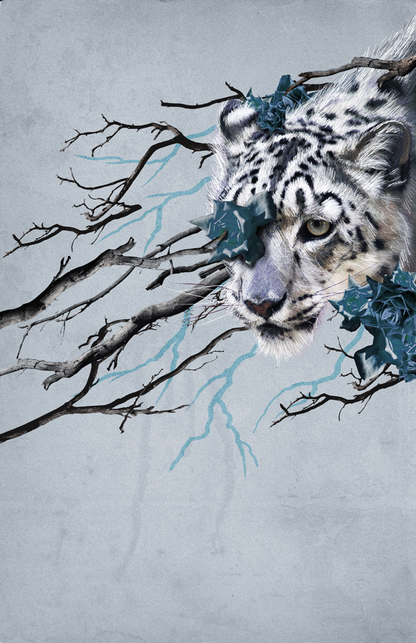
Preview

Step 1: Document Setup
First open a new document in Photoshop, this should be 3300×5100 pixels with a resolution of 300dpi. Using a size like this will enable us to print on relatively large formats while also maintaining the best quality possible. 
Step 2: Background Setup
We are going to put some textures on our canvas so that we have a nice background to work with that will bring out the best of the main components of the illustration.
Take the texture stock image and drag it into your canvas and then stretch it to fit the workplace.  Desaturate it (CTRL+SHIFT+I), change the layer blending mode to “Multiply” and lower the layer opacity to 15%. We need to bring a little bit more of the whites on the image, and to do so we are going to bring up the Levels Menu (CTRL+L) and apply the next settings:
  Now Download the Paper texture image and repeat the last step.
 Desaturate it and change the layer blending mode to “Multiply” then go again to the Levels Menu:
  We are going to add further texture to the background. Create a new layer and fill it with color black using the Bucket Tool (G) and we are going to add some noise to it. Go to menu Filter>Noise>Add noise and use the next settings:
  Invert it (CTRL+I), change the layer blending mode to “Multiply” and lower the layer opacity to 70%.
We need to have a little more darker image to get the best results with this texture, so go to menu Image>Adjustments>Brightness and Contrast and change the Brightness to about -30 and the contrast to 48.  The background still needs some color to match the overall composition. For this, we need to create a new layer and fill it with a light blue color: #96adc8. Change this layer blending mode to “Color” and lower the layer opacity to 20%.
Step 3: Animal Integration
Take the snow leopard stock image and drag it into your document. Select the Pen Tool (P) and slowly trace a path along the silhouette.
Don’t be too picky with all the hairs, we are going to fill that out later.  Once you have the path,right-click and select the option “Make selection” and under the feather radius settings use 3 pixels as feather.
  Now invert the selection (CTRL+SHIFT+I) and press delete to erase everything around it.
Place the lion on the top right part of your canvas. We are aiming for a fresh composition with this illustration.  Now, we are going to start doing all the “over painting” on the image to get that painted finish.
Select the Brush Tool (B) and chose a normal small round brush about 12 pixels wide with 100% opacity and 0% hardness.  Now go to the Brush presets menu and under the Brush Dynamics under the size jitter option, make sure you have selected the “Pen Pressure” on the Control.
  As said before, I’m using a graphics tablet to do this part of the tutorial because of the pen pressure settings, but if you don’t have one, you can do this by using the Pen Tool with the same settings and stroking different paths; creating clusters of hair and just cloning them and placing them around the image.
I will explain this as we go on. We will be using the main shape of the leopard as a reference for the direction of the strokes and the colors we will be using. By pressing and holding ALT and then clicking over any part of the animal, you can sample a color.
We will be filling out the edges of the leopard first and then we’ll make our way through the middle starting with the darker tones. 
 Create a new layer on top of the leopard and now with the Brush Tool, stroke in the same direction as the fur goes. If you are using the Pen Tool, draw a path in the same direction of the fur and then right-click and select “Stroke”.
 Start off by sampling first the darker tones of the hair to make a nice base, and as you progress, sample the lighter colors that will give this effect a lot of depth and realism. Try to variate as much as possible between the colors you use trying to match the ones on the fur. This process might be a little slow at first but it will look better and better the more layers of fur you add.
If you are using a graphics tablet, just keep stroking until you fill most part of the image. If you are using the Pen Tool, the best thing you can do to save time is to stroke some areas several times and then duplicating the layer and using the Move Tool (V) rotate it and position it on another spot.  Make your way from filling the edges first and then work your way to the middle.
Keep adding more layers as you go. Don’t overdo it though. Try to keep it as organic as you can.


 After a few layers of painted fur, try to edit down any clusters that might take away too much attention. You should now have something like this:
  As you can see from the original leopard image, the top is a bit cut so we need to fill that. Use the same procedure as before but now the all the strokes should be longer and in one direction to keep a nice flow on the animal.
Do not forget to add the whiskers. Do them by sampling the color of the other ones on it’s face and paint them with long strokes.  This part of the animal is almost done but it needs a little more detail to make it pop.
We are going to do this by stroking some more pure white lines along the leopard. Change the width of the brush to a lower size and select white as your foreground color.  Now do several strokes along the whole body of the lion to give it more impact.
Something like this:  Putting these extra details will make it look more polished and finished. For the eyes, just sample some colors from the original image and paint over to bring out all the details it already has. It doesn’t have to be completely exact but with a couple of white details around the edges, they will look much better.
 This is the result,after all the over painting is done. You should have now something looking similar to this:
Step 4: Branches
In this step, we are going to start working on the positioning and manipulation of the branches. This element on the illustration will be what sets the flow and main composition of the image.
Take the Branches stock image and open it on Photoshop. Using the Pen Tool draw a path around the tree branches to extract it. Try to be especially careful to get as much detail as possible while extracting it because the more detail you preserve, the better it will look.
After extracting the image, select the branches again (ALT+CLICK the layer thumb) and go to menu Select>Modify>Contract, then invert the selection and press delete. This will erase any edges we might have left from the background on the image. If your extraction didn’t have any remains of the background on the edges, you can skip this step.
 Go to the Hue and Saturation menu (CTRL+U) and apply the next setting to desaturate a bit the color of the branches.
  We also need to make the blacks on them a bit darker to give it more contrast against the background. For that, open the Levels Menu (CTRL+L) and apply the values shown below.
 Take the other Branches stock image and extract it from the background the same way we did with the first one.
  Now that we’ve got our branches extracted we are going to start placing them around to build up our composition. All the branches layers we are going to place right now will be going behind all the lion layers.
Use the Move Tool (V) to rotate and resize this layers. Use layer Masks to clean up and hide parts of the branches that break the composition. 
 Play around with the position of the branches, I chose to place them diagonally to get an interesting flow in the image.


Step 5: Roses
Drag the Rose stock image to your canvas and extract it the same way we did with the branches. Use the Move Tool (V) to change it’s size and rotate it slightly. Place it above the leopard’s eye.
 We need to change the hue of the image to match the color palette we are using on our composition. Bring the Hue and Saturation menu (CTRL+U) and change the color of the rose to a light blue hue.
  Now we need to paint a shadow under the rose to blend it to the composition.
Create a new layer and place it under the rose. Go to your Brush Tool (B) and select a small, soft round brush about 100 pixels wide and lower its opacity to about 20%. Select black as your foreground color.
 Now brush softly under the rose to create the effect of a shadow. Stroke as many times as you need where the shadow should be stronger. Use the light source on the rose as a reference on where the shadow should fall.
In this case, the shadow falls to the lower right side.  Drag the second Rose stock image and extract it from its background. We are going to finish the details of the composition using only this two roses images duplicated several times and resized and even tho will be using them several times, the cluster of roses around the leopard and the branches will look different.
 Like the rose before, we need to change the color on this one:
  Now, using the Move Tool and duplicating the rose layers, start forming clusters of roses around the leopard. Play with the position of the layers. Put some of the roses on top of the branches and some others below them.


 Try to keep the roses together for better results but be careful not to overdo it. Here is my image so far:
 Add a couple of branches on top the the rose layers to get more depth. Here I put one right on top of the rose that’s over the leopard’s eye to make it look like it’s holding it.
 Do not forget to put also a shadow under the branch that falls over the rose.
  Keep adding some more detail like branches and roses on the parts that look a little empty or unbalanced.
  As I said before, it’s important not to overdo these details.
Otherwise, it’s going to look very heavy and unorganized. However, it’s important to always keep these details in mind. Here is my result so far: 
Step 6: Final Details
For the final details, we are going to add a few more painted branches to enhance the mixed media feel to the illustration.
Download the Brush pack and open in Photoshop. Select the triangle shaped brush with a size of about 60 pixels wide (remember to have the pen pressure option activated).  Create a new layer on top of the background layers and using the main branches as reference, draw some crooked lines like in the example below to fill out the spaces unused by the other set of branches. Change this layer blending mode to “Color Burn”.

Step 7: Final Adjustments
For the final adjustments we are just going to add some more contrast to the whole image as well as give it a bit more color. Go to menu Layers>New Adjustment Layer>Brightness and Contrast and place this layer on top of all the layers. Play around with the settings to get more contrast on the image and really make it pop.
Here are my settings:  For the color, Create a new layer on top of that one and fill it with a light blue color: #0a407f set the layer blending mode to “Soft light” and lower its opacity to 15%.
  And that is it for the tutorial. I hope you learned some new techniques while recreating this piece and remember to try them on different compositions, with different colors and subjects.
Tutorial Summary
In this tutorial, we were able to compose a striking image using only a few stock images. We learned how to compose an image with consistent flow as well as how to use manual painting techniques in Photoshop. Here is the final image:
Download Source Files
- mixed_media_comp (ZIP, 10.3 MB)
-
 Trevin serves as the VP of Marketing at WebFX. He has worked on over 450 marketing campaigns and has been building websites for over 25 years. His work has been featured by Search Engine Land, USA Today, Fast Company and Inc.
 -

WebFX is a full-service marketing agency with 1,100+ client reviews and a 4.9-star rating on Clutch! Find out how our expert team and revenue-accelerating tech can drive results for you! Learn more
Make estimating web design costs easy
Website design costs can be tricky to nail down. Get an instant estimate for a custom web design with our free website design cost calculator!
Try Our Free Web Design Cost Calculator
Share this article


Web Design Calculator
Use our free tool to get a free, instant quote in under 60 seconds.
View Web Design Calculator
Make estimating web design costs easy
Website design costs can be tricky to nail down. Get an instant estimate for a custom web design with our free website design cost calculator!
Try Our Free Web Design Cost Calculator