
Table of Contents
- Preview
- Tutorial Resources
- Update: Free Download of This Tutorial Now Available
- Inspiration
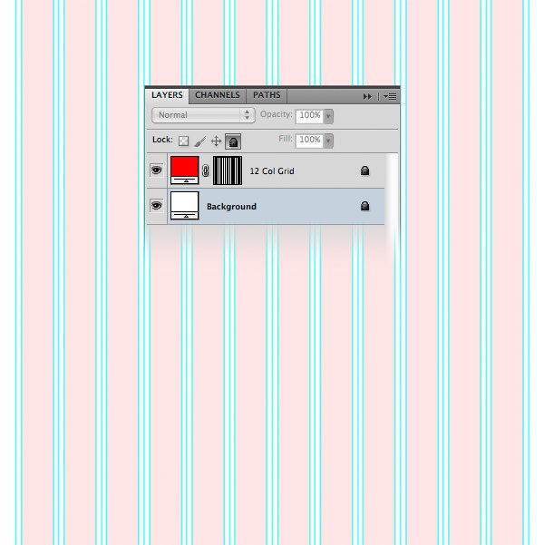
- Step 1: Set Up the 960 Grid System
- Step 2: Setting Up the Photoshop Grid
- Step 3: Setting Up the Document
- Step 4: Create the Background
- Step 5: Creating a Diagonal Stripe Pattern
- Step 6: Create a Bar at the Top
- Step 7: Creating a Modern Laboratory Desk Design Element
- Step 7: Create the Bottom Surface of the Desk (Navigation Bar)
- Step 8: Adding Noise to the Lab Desk
- Step 9: Creating the “Design Lab” Logo
- Step 10: Add Social Media Icons
- Step 11: Adding the Navigation Bar Items
- Step 12: Creating a Search Bar
- Step 13: Creating an Image Slider Area
- Step 14: Creating Navigation Arrows for the Image Slider
- Step 15: Creating the Main Content Area
- Step 16: Create a Patterned Button for the Web Form
- Step 17: Creating the Blog Area
- Step 18: Adding Content to the Blog Area
- Step 19: Creating a List of Categories
- Step 20: Creating the Footer
- Tutorial Summary
- Download Source Files
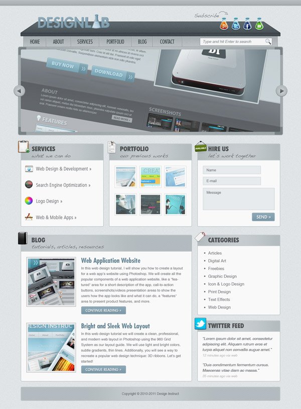
Preview
Tutorial Resources
- Icons: Social Media Icon Set by Noupe
- Icons: Web Designer’s Icon Set by Smashing Magazine
- Futura font
- Font: Futura Heavy
- Font: Handwriting Dakota font (this one is included in the Mac OS X; if you don’t have it, you can use the Worstveld Sling, which is free)
Update: Free Download of This Tutorial Now Available
The companion freebie of this tutorial has now been published in the Design Instruct Freebies section. Go to Modern Lab Layout: Website Template to download it for free!
Inspiration
After deciding to use a modern laboratory theme for this web layout, I took a pencil and a piece of paper and wrote down a few things that came to my mind that are related to the theme I chose.
Here is what I came up with:
- experimenting
- chemistry bottles
- white board
- sketching
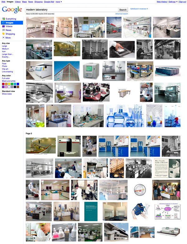
Then I went to Google Images and searched for images of modern laboratories. I took a look at the images I found and started sketching some elements that I thought would fit into my design. From these images I got the idea of using a lab desk in my web layout as header and navigation bar.
 After creating a wireframe using a pencil and a piece of paper, I started designing the web layout in Photoshop. You can see in the image below the elements that I talked about earlier. I created a laboratory desk for the header and the navigation bar and I used chemistry bottles for the logo and social media icons.
Underneath the navigation bar I created an image slider with a frame similar to the white boards frames. Also, I used a script font for the taglines to convey the idea of sketching; scientists working in labs often have lab notebooks where they hand-record raw data and make sketches.
Step 1: Set Up the 960 Grid System
In this tutorial we will use the 960 Grid System to organize and arrange the elements of our web layout.
Before we begin, download the grid system on your computer. Unzip the archive file you downloaded, go to the “templates” folder and then go to the “photoshop” folder. You will find three .PSD files.
Each of these files contains a grid with 12, 16 and 24 columns. The .PSD files have some guides already set up, which will be very useful. To activate the guides, go to View > Show > Guides, or use the shortcut Ctrl/Cmd + ;.
During this tutorial you will need to create shapes with specific dimensions. To see the exact size of a shape or selection while you are creating it, open the Info Panel by going to Window > Info. The width and the height of your shapes and selections will be displayed in this panel.
 Tip: If you need a more thorough guide for using 960 GS, I suggest reading the guide called The 960 Grid System Made Easy.
Step 2: Setting Up the Photoshop Grid
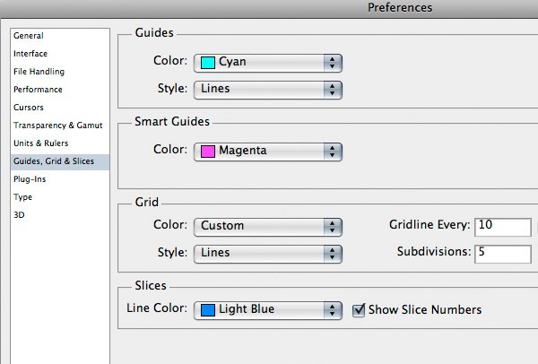
Open the Preferences window in Photoshop (Ctrl/Cmd + K), click on Guides, Grid & Slices and then set Gridline Every to 10px and Subdivisions to 5px. To activate the grid, go to View > Show > Grid, or use the shortcut Ctrl/Cmd + ‘. You can activate the grid every time you create a shape such as a rectangle or an ellipse.
Step 3: Setting Up the Document
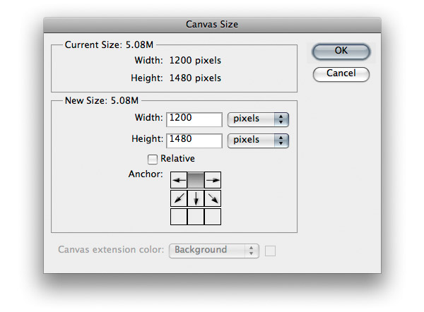
For this web layout we will use the 12-column grid. Open the “960_grid_12_col.psd” file in Photoshop. Then go to Image > Canvas Size and set the width to 1200px and the height to 1480px.
Step 4: Create the Background
As you can see in the Layers Panel, the Background layer has a lock icon next to it. This means that we can’t modify the layer unless we unlock it. To unlock the layer, click on the black lock icon from the top area of the Layers Panel (underneath the blending modes).
Now we can edit the layer, but the position is still locked (the black lock icon changed into a white lock icon) which means that we can’t move the layer. We don’t need to change the position of this layer, so we’ll leave it locked. However, if you do need a layer to be completely unlocked, click on the Lock Position icon (underneath the blending modes, next to the black lock icon).
Double-click on the thumbnail of the Background layer and change its color to #dfe4e6. Right-click on this layer and select Convert to Smart Object. Note: We converted the layer into a Smart Object because we will apply a noise filter to it and we will be able to edit the filter’s settings at any time, just like the layer styles. If we apply a filter to a regular layer, we can’t edit it anymore.
Now go to Filter > Noise > Add Noise and use the settings from the following image. 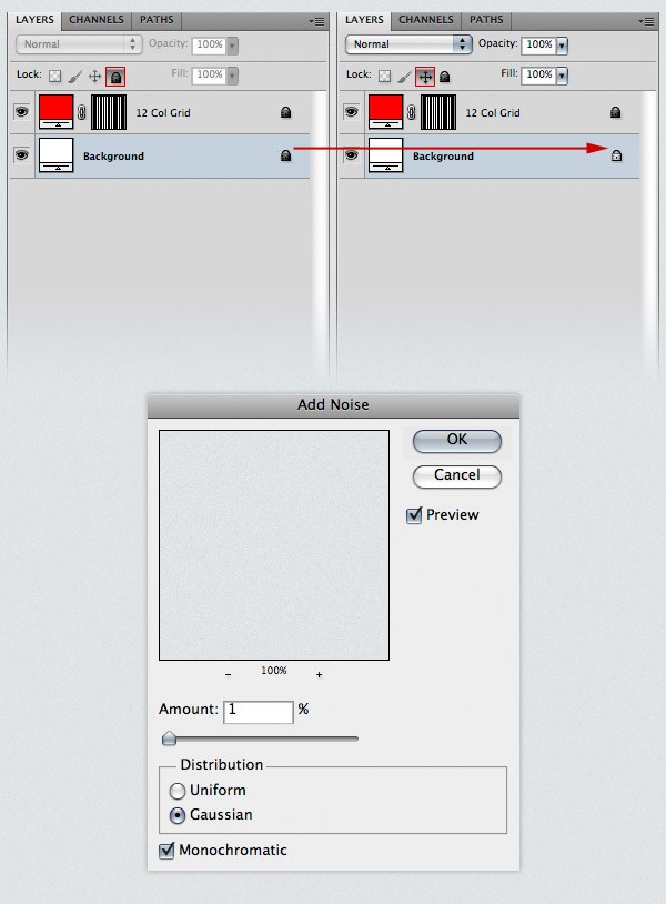
Step 5: Creating a Diagonal Stripe Pattern
Create a new document (Ctrl/Cmd + N) with the dimensions 5px by 5px. Use the Zoom Tool (Z) to zoom in as much as you can.
Then create a new layer (Ctrl/Cmd + Shift + N) and select the Pencil Tool. Set the size to 1px and use the Pencil Tool to create a diagonal line from the lower left corner of the document to the upper right corner. Hide the Background layer by clicking on its eye icon from the Layers Panel.
Then go to Edit > Define Pattern, give your pattern a name and click OK. Now you can close this document. 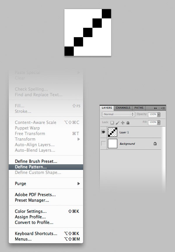
Step 6: Create a Bar at the Top
Select the Rectangle Tool (U), activate the grid (Ctrl/Cmd + ‘) and create a rectangle with the height 20px at the top of the document using the color #b0b7ba.
Name this layer “top bar”, double-click on it to open the Later Style window and use the settings from the following image. The color that I used for Bevel and Emboss Shadow Mode is #bec3c6 and the one I used for Stroke is #9da5a9. 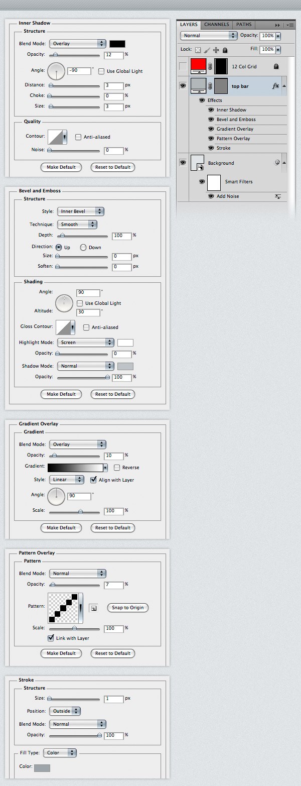
Step 7: Creating a Modern Laboratory Desk Design Element
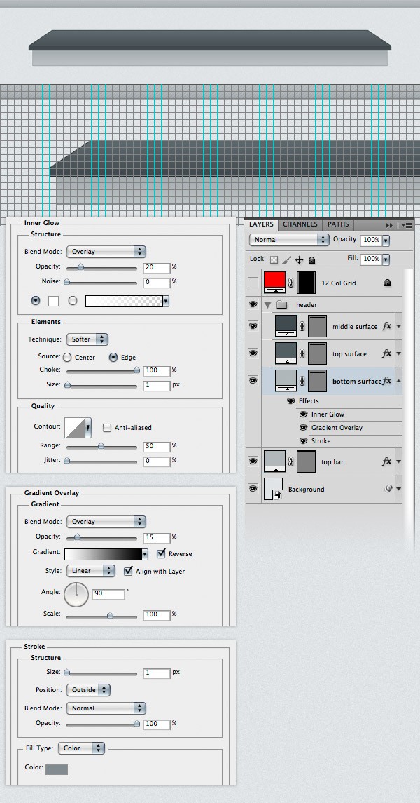
Create a new group (Layer > New > Group) and name it “header”. Activate the guides (Ctrl/Cmd + 😉 and the grid (Ctrl/Cmd + ‘). Then select the Rectangle Tool (U) and create a rectangle with the dimensions 940px by 40px using the color #535d62. Name this layer “top surface”. Use the Direct Selection Tool (A) to select the upper left corner of this rectangle. Then hold down the Shift key and hit the Right Arrow key on your keyboard 6 times to move this anchor point 60px to the right. Then select the upper right corner of this rectangle and move it 60px to the left.
Double-click on the “top surface” layer to open the Layer Style window and use the settings from the following image. For Stroke I used the color #282f32. 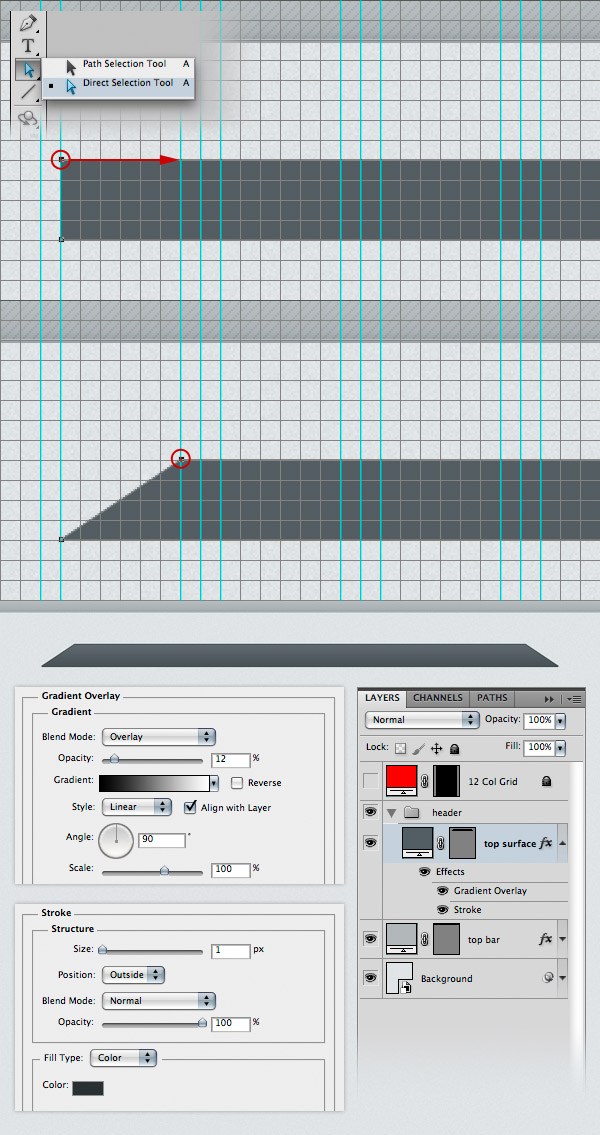 Create a new rectangle underneath the top surface of the desk with the dimensions 940x10px and the color #414a4f. Name this layer “middle surface”, right-click on it and use the settings from the following image for Stroke. The color that I used is #252b2e.
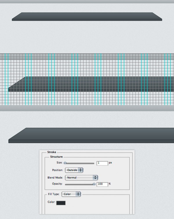
Step 7: Create the Bottom Surface of the Desk (Navigation Bar)
Select the Rectangle Tool (U) and create another rectangle underneath the middle surface of the desk with the dimensions 920x40px and the color #b0b7ba. We will use this area for the navigation bar. Double-click on this layer to open the Layer Style window and use the settings from the following image.
For Stroke I used the color #818b8f. Name this layer “bottom surface” and put it underneath the “top surface” layer in the Layers Panel. Now you can deactivate the grid and the guides.
Step 8: Adding Noise to the Lab Desk
Hold down the Ctrl/Cmd key and select the three surface layers that you created. Then right-click on one of them and select Convert to Smart Object from the menu that appears. Name this layer “desk”, go to Filter > Noise > Add Noise and use the settings from the following image.
Note: When you convert a layer into a smart object, you can no longer edit it directly (e.g., you can’t use the Brush Tool to paint on the layer). If you need to edit a smart object, double-click on its thumbnail. A new document will be opened with the source of the smart object (the layers that you converted).
After you edit the source document, save it, close that document and the smart object will be updated in your current document. 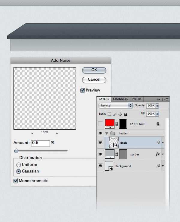
Step 9: Creating the “Design Lab” Logo
Now we will create a logo related to the theme of the web layout. The name of our layout will be “Design Lab”, and we will replace the letter “A” with a chemistry bottle.
First, create a new group (Layer > New > Group) and name it “logo”. Then select the Type Tool (T) and write “Design Lab” using the color #85a3b3. The font that I used is Futura Heavy. Double-click on this text layer to open the Layer Style window and use the settings from the following image. The color I used for Drop Shadow is #6e8a99. 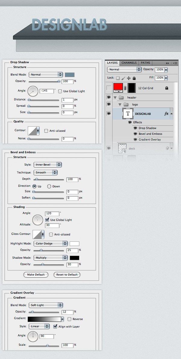 Create a new group (Layer > New > Group) and name it “chemistry bottle”. Select the Pen Tool (P) and create a shape over the letter “A” of the text layer. Take a look at the following image for reference. The color is not important at the moment.
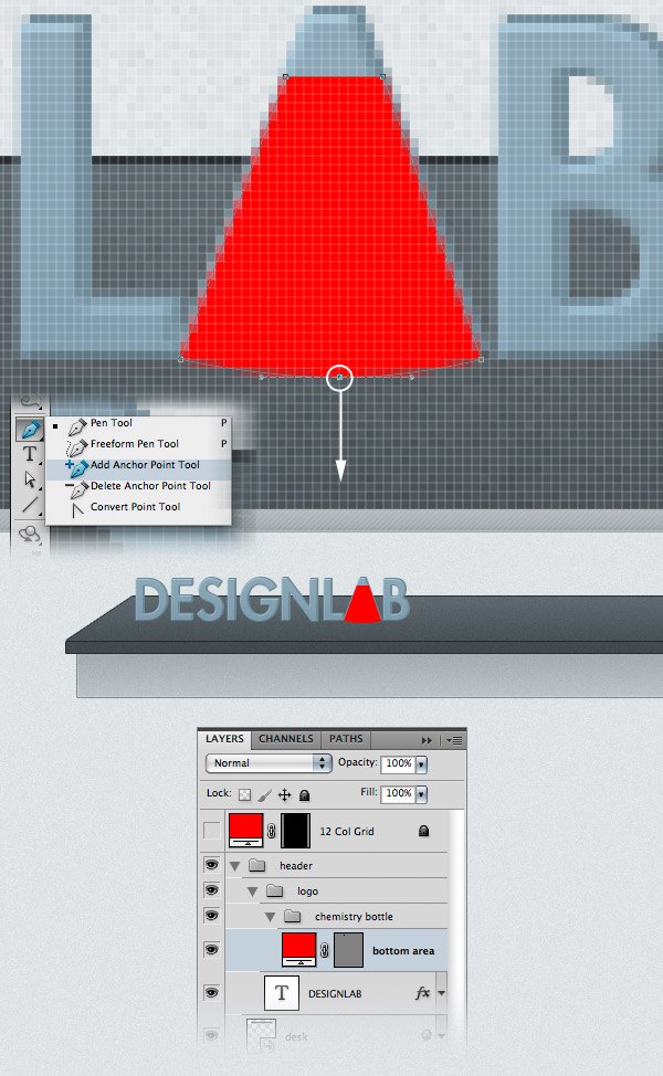
I made my shape red so you can see it better. Name this layer “bottom area”. 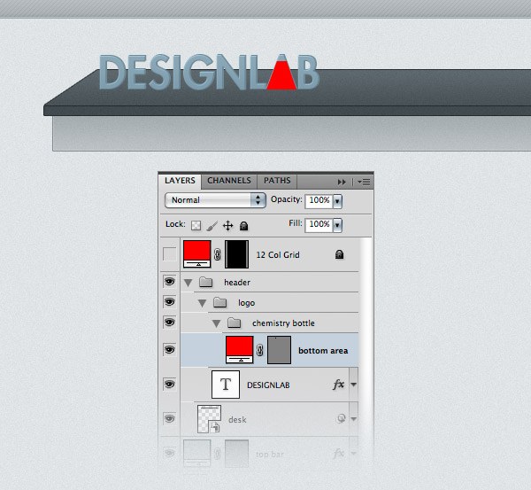 Click and hold on the Pen Tool in the Tools Panel to reveal additional tools, and then select the Add Anchor Point Tool. Then click on the vector mask of the “bottom area” layer to make it active (if the vector mask is active, you can see the path of your shape, and the thumbnail has a white stroke). Zoom in, and then use the Add Anchor Point Tool to add an anchor point on the bottom path of the chemistry bottle, in the middle.
Then use the Direct Selection Tool (A) to select that anchor point and drag it 2px down. This will make the bottom line of the chemistry bottle more rounded. Take a look at the following image for reference.
 Select the Rectangle Tool (U) and create a rectangle like you see in the following image. This will be the neck of the chemistry bottle. Name this layer “middle area”.
 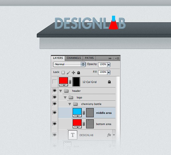 Select the Ellipse Tool (U) and create an ellipse at the top of the chemistry bottle’s neck using the color #85a3b3. Name this layer “top area”, double-click on it and use the settings from the following image. For Stroke I used the color #708c9b.
 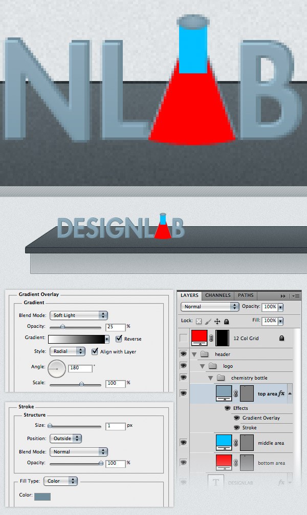 Change the color of the “bottom area” and “middle area” layers to #85a3b3. Then select the Pen Tool (P) and create a shape like you see in the following image. Use the color #b8d1df. Name this layer “water”, double-click on it to open the Layer Style window and use the settings from the following image.
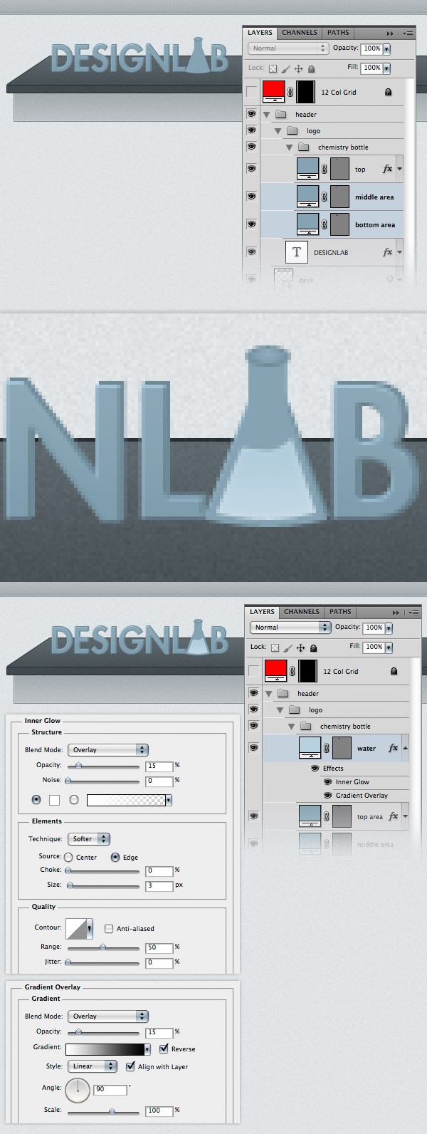 Select the Pen Tool (P) again and create a shape like the one below. This will be the top area of the water. Name this layer “water top”, double-click on it and use the settings from the following image.
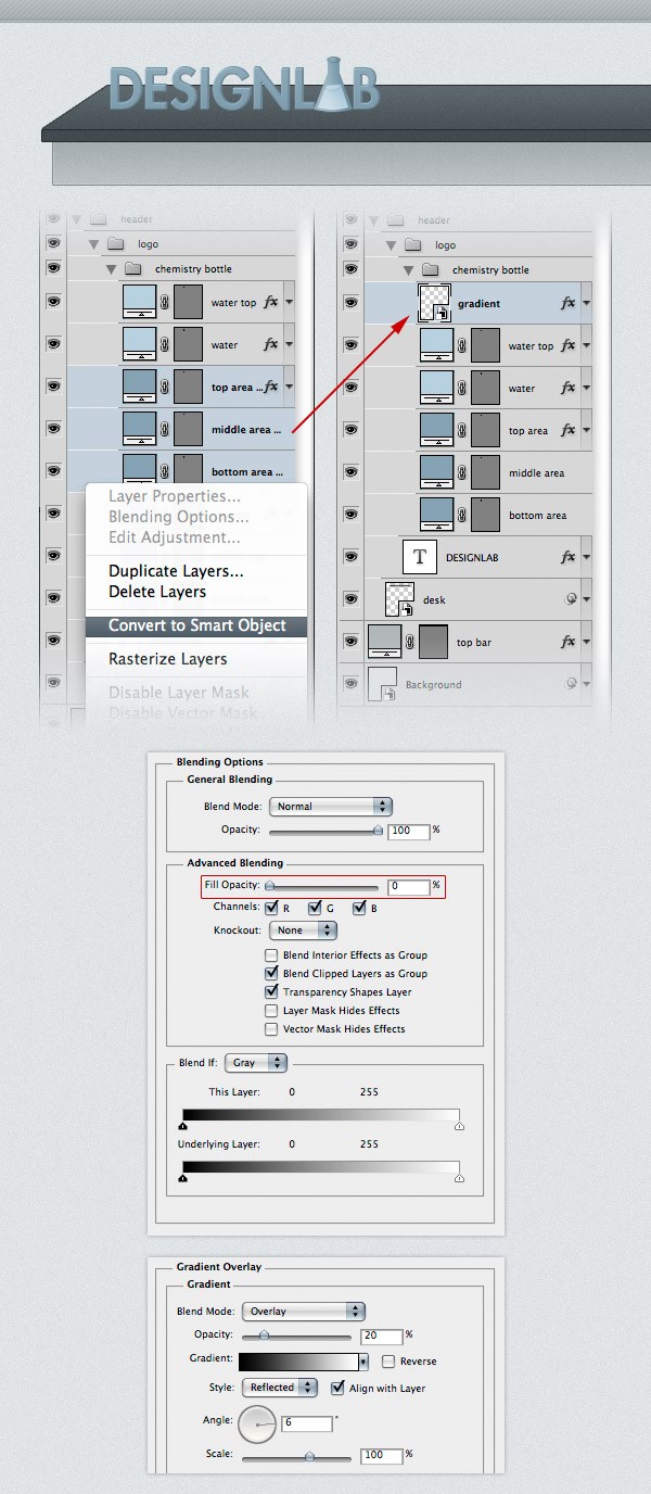
For the Stroke I used the color #9dbccd. 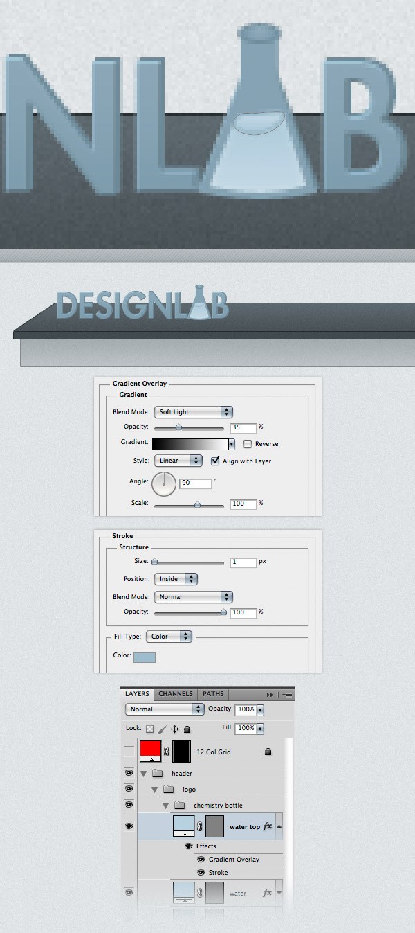 Hold down the Ctrl/Cmd key and select the three layers that form the chemistry bottle (“bottom area”, “middle area” and “top area”). Right-click on one of these layers, select Duplicate Layers from the menu that appears and click OK.
With the duplicated layers selected, right-click on one of them and select Convert to Smart Object. Name the new layer “gradient” and move it above the “water top” layer. Double-click on the “gradient” layer to open the Layer Style window and use the settings from the following image.
Note: By settings the Fill to 0%, the layer becomes completely invisible, but we are still able to add layer styles. If we set the Opacity of the layer to 0%, both the layer and the layer effects will be invisible. That’s why we used the Fill property instead of Opacity.
 Use the Pen Tool (P) to create a white shape on the left side of the chemistry bottle. Take a look at the following image for reference. Name this layer “highlight”. Duplicate this layer. Then go to Edit > Transform > Flip Horizontal. Change the color of this layer to black and move it in the right side of the chemistry bottle using the Move Tool (V).
Name this layer “shadow”. Set the blend mode of the “highlight” and “shadow” layers to Overlay 20%. 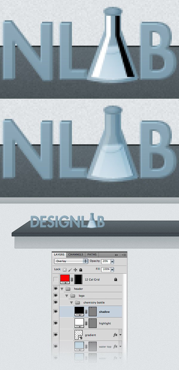 Now what’s left to do is delete the “A” letter from the text layer. Before that, I selected the “LAB” word and changed its font from Futura Heavy to Futura Bold.
Using the Type Tool (T), select the “A” letter and delete it. To push the “B” letter to the right, you can use the space bar. Then select the Move Tool (V) and reposition the chemistry bottle icon between the letters “L” and “B”. Now the logo is finished. 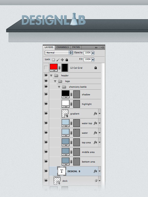
Step 10: Add Social Media Icons
Download these icons from Noupe and open in Photoshop the social icons that you want to use. I used the rss, twitter, facebook and email icons.
Make sure that you use the 48px by 48px images. To move the icons to your web layout document, select the Move Tool (V) and simply drag them over the document. Name each of these layers and group them (select the layers and hit Ctrl/Cmd + G).
Name the group “social media icons”. Using the Move Tool (V), place the icons in the right hand side of the layout, at a distance of 10px from each other. Take a look at the following image for reference. 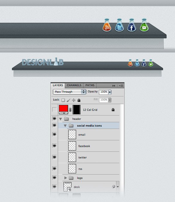 These icons look a bit dark for our web layout.
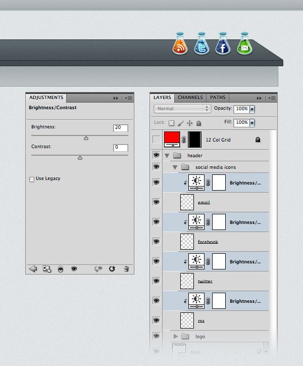
To make them brighter, I used some Brightness/Contrast adjustment layers. Go to Layer > New Adjustment Layer > Brightness/Contrast and set the Brightness to 20. Put this adjustment layer above the first icon layer, right-click on the adjustment layer and select Create Clipping Mask from the menu that appears. This way, the adjustment layer will only be applied on the layer underneath it. Repeat this process for the other icons as well.
 Select the Type Tool (T) and write the word “Subscribe” using a script font. I used Handwriting Dakota and the color #696e70. Then create a new layer (Ctrl/Cmd + Shift + N), select the Brush Tool (B), set the Size to 1px and the Hardness to 100%, and draw an arrow pointing towards the social media icons. Use the same color that you used for the text. Name this layer “arrow”.
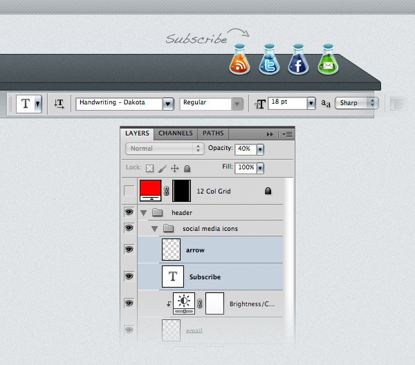
Step 11: Adding the Navigation Bar Items
I already mentioned that we would use the bottom area of the desk as a navigation bar. Now we need to add the navigation items and some separators. Create a new group (Layer > New > Group) and name it “navigation”. Then select the Type Tool (T) and write the name for your navigation menu items. I used the font Futura Light Condensed and the color #313a3e. 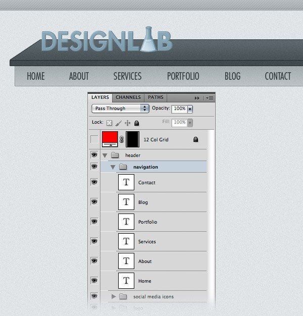 Create a new group (Layer > New > Group) and name it “separators”. Zoom in so you can see the navigation bar better. Select the Line Tool (U), set the Weight to 1px and the color #818b8f. Then hold down the Shift key and draw a straight vertical line from the top of the navigation bar to the bottom.
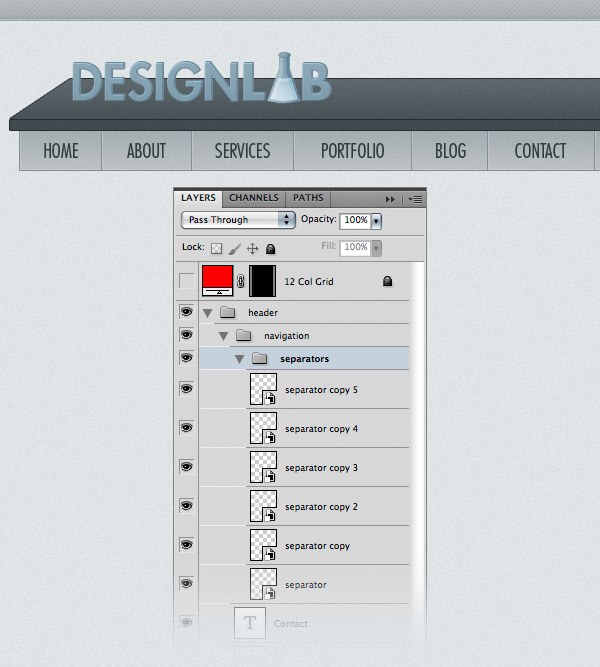
Name this layer “1px line”. Hit Ctrl/Cmd + J to duplicate this layer. Select the Move Tool (V) and hit the Right Arrow key on your keyboard once to move this layer 1px to the right. Change the color of this new line to #c0c5c8. 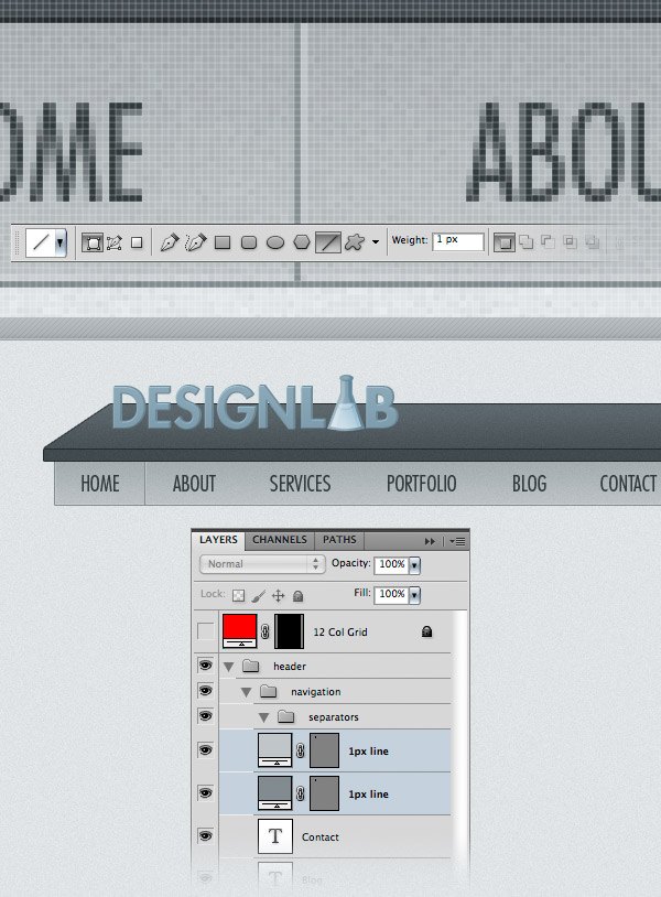 Hold down the Ctrl/Cmd key and select the two line layers. Right-click on one of them and select Convert to Smart Object from the menu. Name this layer “separator”. Duplicate this layer as many times as you need and use the Move Tool (V) to put a separator between each of the navigation items. Tip: When you need to duplicate a layer many times, you can select the Move Tool (V), hold down the Alt/Option key, click on the image and drag the cursor to create a copy of that layer. In our case, you can hold down Alt/Option + Shift keys and when you click and drag a copy of the current separator to the right you’ll see that it’s easier to move the new layer sideways and not go up or down.
Note: Another advantage of smart objects is that if you edit one smart object, all the copies of that smart object will be updated as well. For example, if you have the separators as shape layers and you want to change their colors, you would have to edit each layer individually. By creating one separator, converting it into a smart object and duplicating that smart object as many times as we needed, we can now double-click on the thumbnail of a separator layer, edit the source of the smart object (which contains the two line layers that we converted), save the document and then all the other separator layers will be updated.
Step 12: Creating a Search Bar
Create a new group (Layer > New > Group) and name it “search”. Select the Rectangle Tool (U) and create a rectangle with the dimensions 260x26px and the color #f4f4f4. Add a 1px Stroke to this rectangle using the color #7f898d. Download this set of icons from Smashing Magazine and open the “search.png” image in Photoshop. Move the icon into your first document using the Move Tool (V).
Put the icon inside the search bar and use Free Transform (Ctrl/Cmd + T) to change the size of the icon. Select the Type Tool (T) and write “Type and hit Enter to search” inside your search bar. I used the font Helvetica Oblique and the color #848e92. Now we’re done with the header. Let’s move on to creating an image slider. 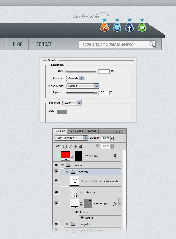
Step 13: Creating an Image Slider Area
To keep the laboratory look of our layout, we will create an image slider that looks like a white board.
Create a new group (Layer > New > Group) and name it “image slider”. Activate the guides and the grid. Then select the Rounded Rectangle Tool (U), set the Radius to 6px and create a rounded rectangle with the dimension 960x320px. Name this layer “image_slider_bg”, right-click on it and select Convert to Smart Object from the menu.
Double-click on this layer to open the Layer Style window and use the settings from the following image. The color that I used for Stroke is #818b8f. Go to Filter > Noise > Add Noise and use the settings from the image below.
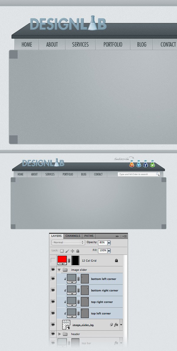
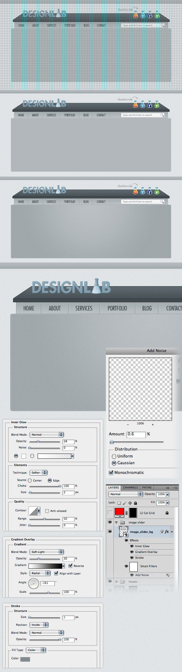 Activate the grid (Ctrl/Cmd + ‘), select the Rectangle Tool (U), hold down the Shift key and create a square with the dimensions 30x30px and the color #848d91. Put this square in the upper left corner of the rounded rectangle you created. Name this layer “top left corner”.
 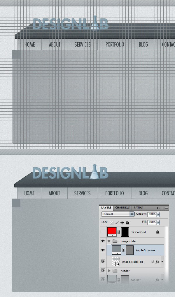 Duplicate this layer three times and put one square in each corner of the big rounded rectangle. Then hold down the Ctrl/Cmd key, select all the square layers, right-click on one of them and select Create Clipping Mask. Now the squares will be visible only on the surface of the big rounded rectangle. Set the Opacity of these layers to 80%.
 Activate the grid (Ctrl/Cmd + ‘), select the Rounded Rectangle Tool (U), set the Radius to 4px and create a rounded rectangle with the dimensions 940x300px. Take a look at the following image for reference. Name this layer “image_holder”. Now you can add an image above this layer, right-click on it and select Create Clipping Mask to make it visible only over the “image_holder” layer.
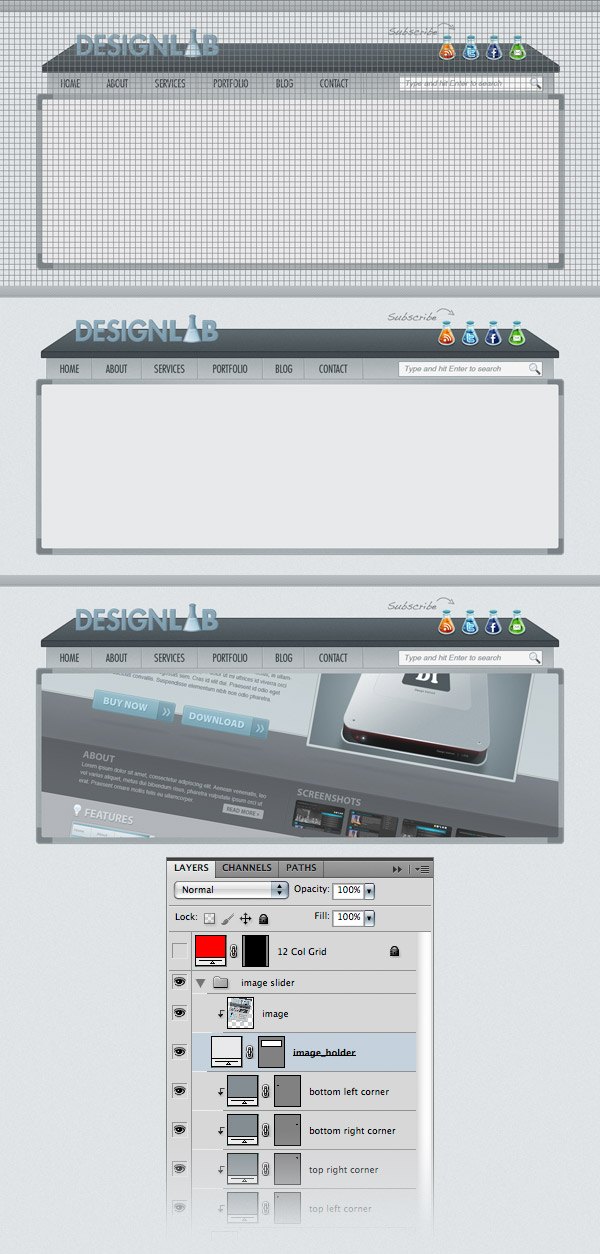
Step 14: Creating Navigation Arrows for the Image Slider
Create a new group (Layer > New > Group) and name it “right arrow”. Select the Ellipse Tool (U), activate the grid, hold down the Shift key and create a circle with the dimensions 40x40px. Double-click on this layer to open the Layer Style window and use the settings from the following image. For Stroke I used the color #818b8f.
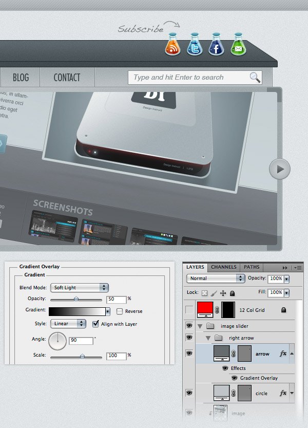
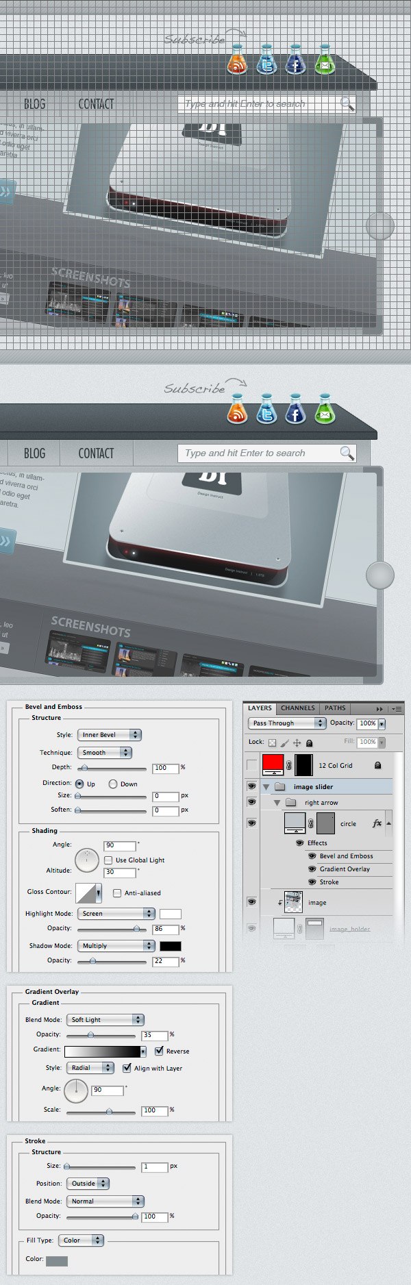 Select the Pen Tool (P) and create an arrow shape like you see in the image below. Use the color #656b6e. Name this layer “arrow”, double-click on it to open the Layer Style window and use the settings from the following image for Gradient Overlay.
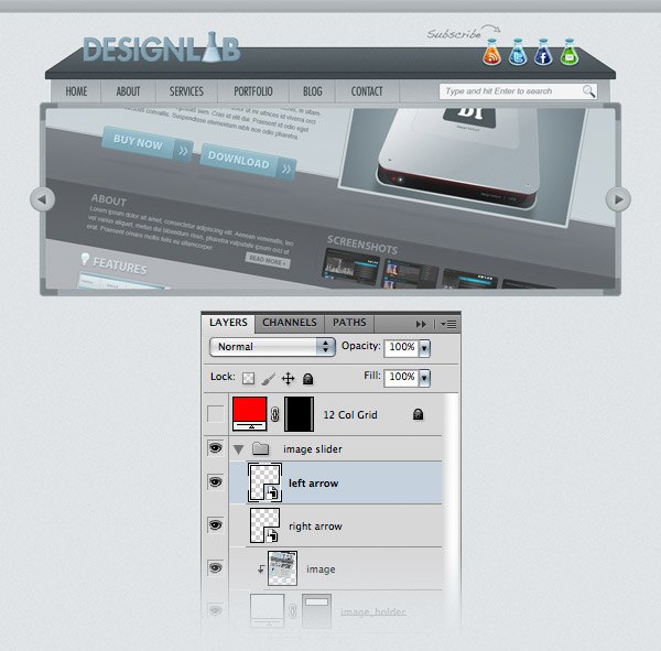
 Right-click on the “right-arrow” group and select Convert to Smart Object. Hit Ctrl/Cmd + J to duplicate this layer. Then go to Edit > Transform > Flip Horizontal. Name this layer “left arrow”, select the Move Tool (V) and move it to the left side of the image slider.
Step 15: Creating the Main Content Area
Create a new group (Layer > New > Group) and name it “content”. Create another group inside the first one and name it “services”. Activate the grid (Ctrl/Cmd + ‘) and the guides (Ctrl/Cmd + ;). Select the Rounded Rectangle Tool (U) and set the Weight to 4px. Then create a square with the dimensions 300x300px and the color #f9f9f9. Leave a distance of 30px between the image slider and this square. Name this layer “services_bg”, double-click on it to open the Layer Style window and add a 1px Stroke using the color #a5adb1. 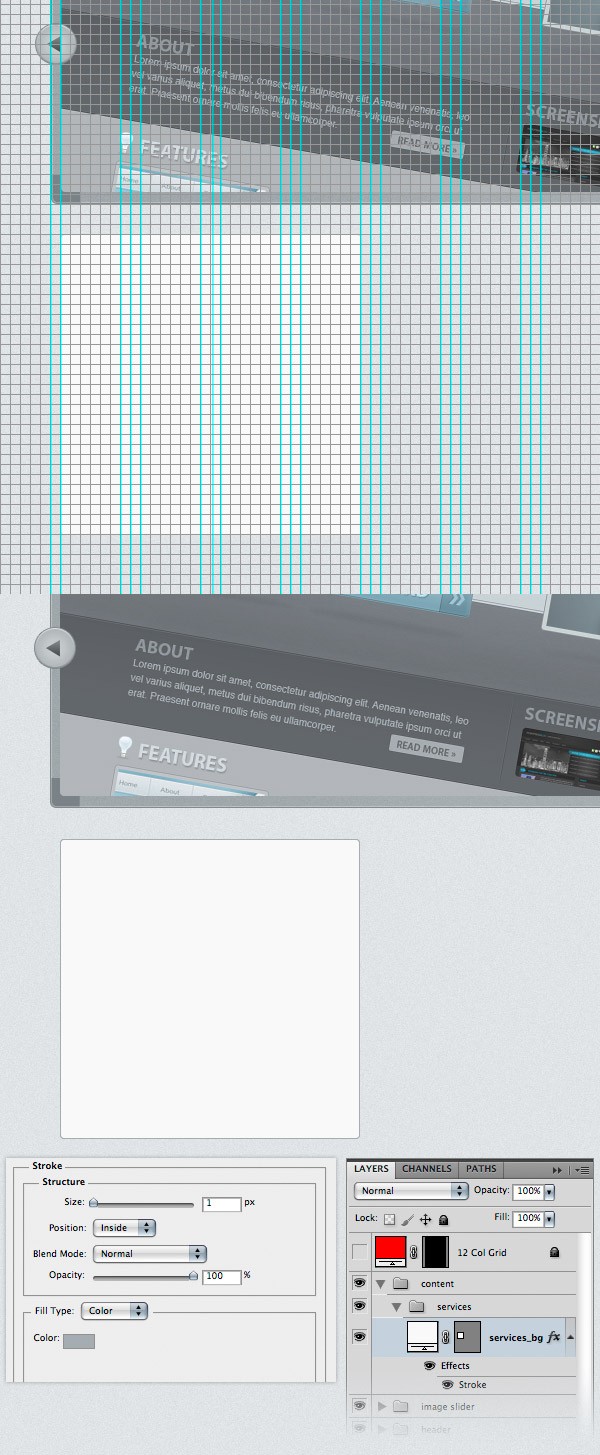 In order to save some time later, we can save the layer style that we applied to the “services_bg” layer and use it again whenever we need it. Open the Styles Panel (Window > Styles). Make sure that the “services_bg” layer is selected and click on the Create new style button from the bottom of the Styles Panel.
A new window will appear. Name this style “content area 1px stroke”. Leave the Include Layer Effects option checked and click OK. Now, when we need to use this layer style, you can click it from the Styles Panel to apply it to any layer you want. 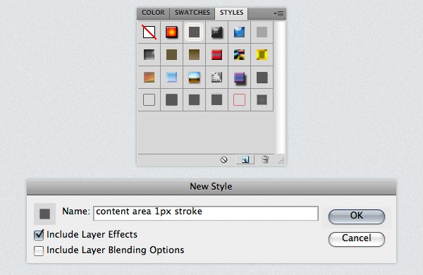 Select the Rectangle Tool (U) and create a rectangle with the dimensions 300x60px and the color #c2c9cc.
Name this layer “top bar” and put it at the top of the white rounded square. Double-click on this layer to open the Layer Style window and use the settings from the following image. For Stroke I used the color #a5adb1 and for Pattern Overlay I used the diagonal stripe pattern that we created in this tutorial.
Right-click on the “top bar” layer and select Create Clipping Mask to make it visible only over the white square. 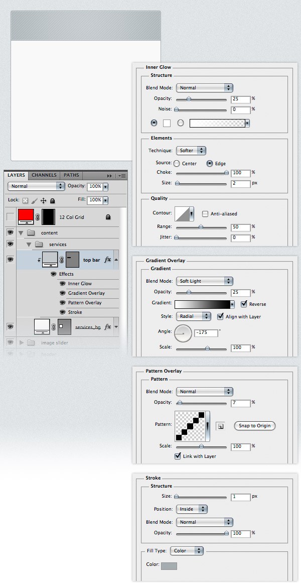 Again, save the layer style that you applied to the “top bar” layer so you can use it later when we’ll need it.
 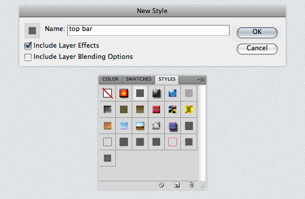 Open the “clipboard_check.png” image from the icon set you downloaded at the beginning of this tutorial.
Move the image into your web layout document using the Move Tool (V). Name this layer “services icon”. Activate the grid and place the icon as you see it in the following image. 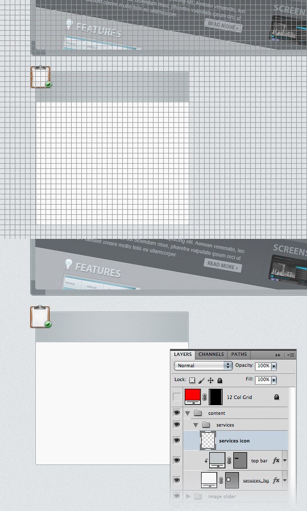 Select the Type Tool (T) and write the word “Services” next to the icon. I used the color #4f5254 and the font Futura Extra Bold Condensed.
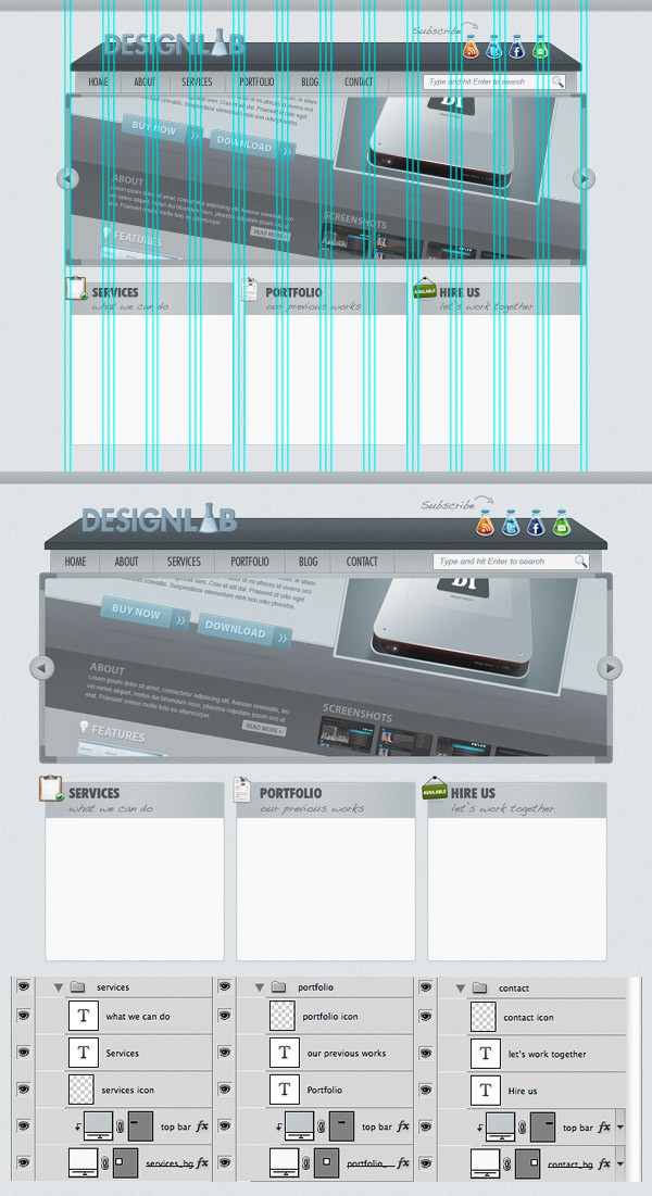
Write the words “what we can do” underneath the “Services” headline using the color #6a6e70 and a script font (such as Handwriting Dakota). Use the grid to help you align these text layers. 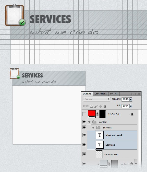 To save us some time, we will now duplicate the “services” group two times for the other two content areas.
Activate the guides (Ctrl/Cmd + ;). Right-click on the “services” group, choose Duplicate Group and click OK. Name the new group “portfolio” and move it to the right as you see it in the image below.
Duplicate this group one more time, move it to the right side of the layout and name it “contact”. Now use the Type Tool (T) to edit the text of each content area. Also, for the portfolio area I used the “curriculum_vitae.png” icon and for the contact area I used the “sign_available.png” icon. You can find these images in the icon set you downloaded.
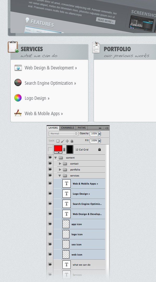
 Now we’ll focus on the “services” group’s content. Here we will display a list of services and an icon for each of the list items. Select the Type Tool (T) and write a list of services in the white area using the color #6a6e70. Below you can see my list items and the name of the icon I used for each item.
- Web Design & Development » (browser.png)
- Search Engine Optimization » (speed_kmh.png)
- Logo Design » (color_wheel.png)
- Web & Mobile Apps » (applications.png)
 Go to the “portfolio” group, create a new group inside it and name it “images”. Activate the grid (Ctrl/Cmd + ‘). Then select the Rectangle Tool (U), hold down the Shift key and create a square with the dimensions 80x80px using the color #e6ebec. Name this layer “square 1”, double-click on it to open the Layer Style window and use the settings from the following image.
The color that I used for Stroke is #d2d2d2. Duplicate this square layer 5 times (Ctrl/Cmd + J) and arrange them as you see in the image below. Note: In the first screenshot image below, I temporarily made the squares blue so you can see how they are aligned to the grid. 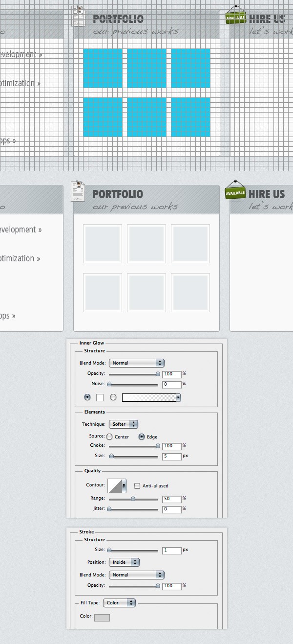 Now you can add some images over each of the blue squares and use the Create Clipping Mask command to make the images visible only over the squares.
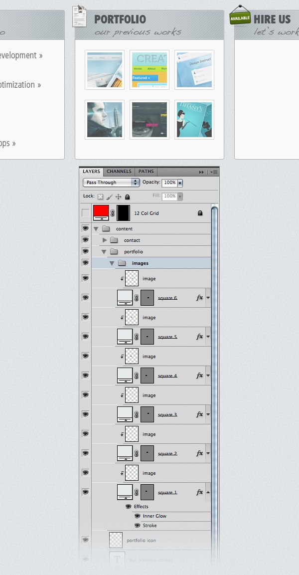 Go to the “contact” group, create a new group inside it and name it “contact form”. Use the Rectangle Tool (U) to create three rectangles using the color #e6ebed, like you see in the image below. Add a 1px Stroke to these rectangles using the color #c5ccd0. Select the Type Tool (T) and write labels (e.g., Name, E-mail and Message) inside the input fields. I used the font Helvetica and the color #6a6e70.
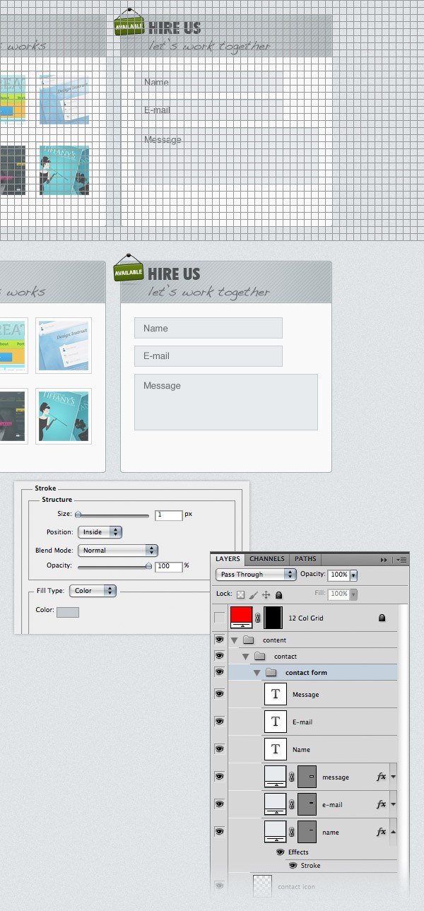
Step 16: Create a Patterned Button for the Web Form
Now we’ll create a button for the contact form. Create a new group (Layer > New > Group) and name it “button”. Select the Rounded Rectangle Tool (U), set the Radius to 2px and create a rounded rectangle with the dimensions 80x28px and the color #85a3b3. For Stroke I used the color #6d8794. Save the style that you applied to this layer and name it “button”. We will use it later for the other buttons that we will create. 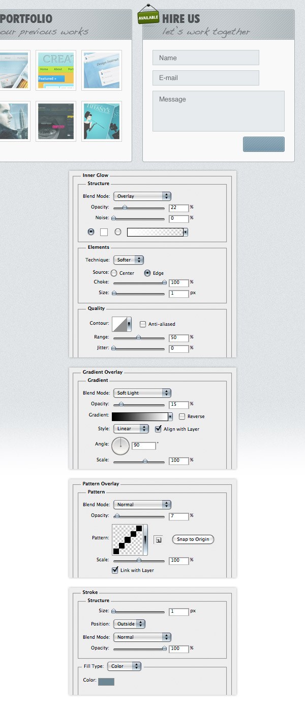 Select the Type Tool (T) and write the word “Send »” inside your button using the color #ecf1f3. The font that I used is Futura Heavy. Now go to the Styles Panel and save this layer style as well. Name it “text drop shadow”.
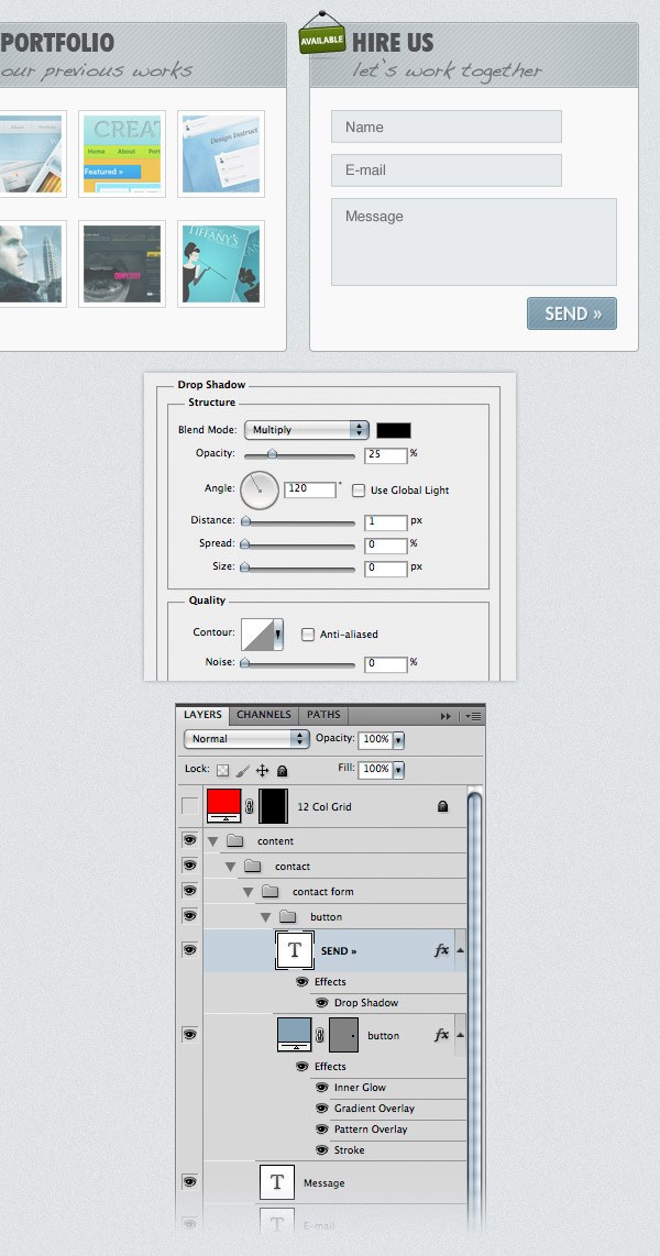
Step 17: Creating the Blog Area
Create a new group (Layer > New > Group) and name it “blog”. Activate the grid and the guides. Then select the Rounded Rectangle Tool (U), set the Radius to 4px and create a rounded rectangle with the dimensions 620x530px and the color #f9f9f9. Click on the “contact area 1px stroke” style from the Styles Panel. This will add the layer style that we saved when we created the “services” area. Name this layer “blog bg”. 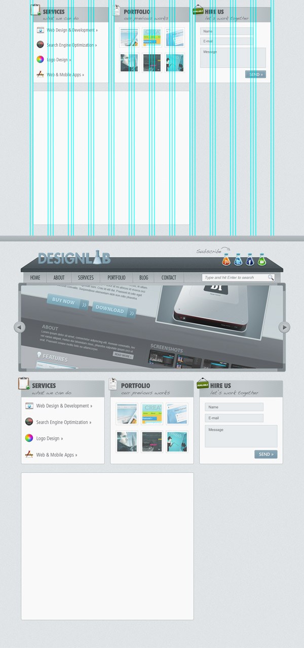 Select the Rectangle Tool (U) and create a rectangle with the dimensions 940px by 60px and the color #c2c9cc. Name this layer “top bar” and put it at the top of the white rounded rectangle. Right-click on this layer and choose Create Clipping Mask.
Then click on the “top bar” layer style from the Styles Panel. 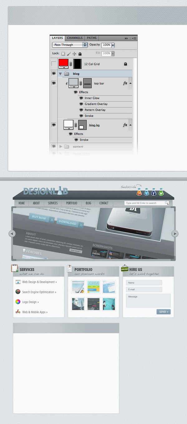 Add an icon in the upper left corner of the blog area. Use the grid to help you align it.
I used the icon “moleskine_black.png”. Select the Type Tool (T) and write the word Blog as a headline and underneath it write “tutorials, articles, resources”. Use the same fonts and colors that you used for the services, portfolio and contact areas. 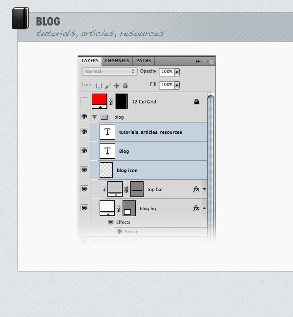
Step 18: Adding Content to the Blog Area
Create a new group (Layer > New > Group) and name it “blog”. Activate the grid, select the Rectangle Tool (U) and create a square with the dimensions 180x180px. Leave a distance of 20px between the top and left edges of the white area and this square. Name this layer “image_holder”, double-click on it to open the Layer Style window, and use the settings from the following image.
For Inner Glow I used the color #ebebeb and for Stroke I used #a5a5a5. 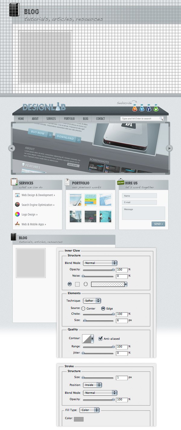 Open an image that you like in Photoshop and move it over the square you created. Name this layer “image”, right-click on it and choose Create Clipping Mask from the menu.
 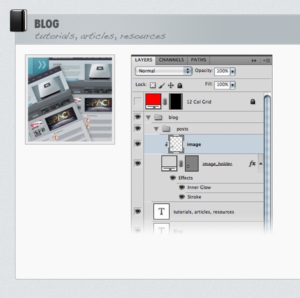 Use the Type Tool (T) to add some content next to the image you added at the previous step.
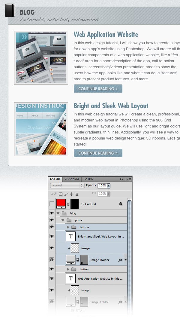
For the headline I used the font Futura Bold Condensed (#648393) and for the block of text I used Helvetica (#6a6e70). Select the Rounded Rectangle Tool (U), set the Radius to 2px and create a rounded rectangle with the dimensions 160x26px and the color #85a3b3. Apply the “button” style to this layer (you saved the layer style after creating the contact web form button earlier). Select the Type Tool (T) and write the words “Continue Reading »” inside your button using the color #ecf1f3. The font that I used is Futura Heavy. Add the “text drop shadow” layer style to this layer. 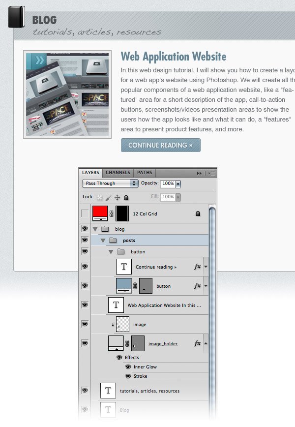 Create another blog post just like you created the first one.
Step 19: Creating a List of Categories
Create a new group (Layer > New > Group) and name it “categories”. Activate the grid and the guides. Then select the Rounded Rectangle Tool (U), set the Radius to 4px and create a rounded rectangle with the dimensions 300x290px. Name this layer “categories_bg” and apply the “content area 1px stroke” style from the Styles Panel.
Select the Rectangle Tool (U) and create a rectangle with the dimensions 300x40px and the color #c2c9cc at the top of the white rounded rectangle. Name this layer “top bar”, right-click on it and choose Create Clipping Mask from the menu that appears. For this layer use the “top bar” style that you saved in the Styles Panel.
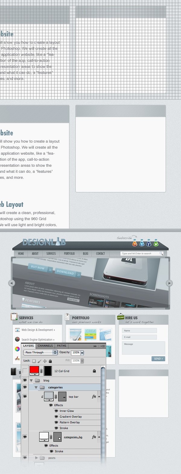 Add an icon in the upper left corner of the categories area. I used the “tag_white.png” icon. Select the Type Tool (T) and write the word “Categories” next to the icon using the same font and color that you used for the headlines of the other content areas.
Use the Type Tool (T) to write a list of categories. I used the font Helvetica Regular and the color #6a6e70. Leave a distance of 20px from the top of the white area and 40px from the left edge. Create a new group (Layer > New > Group) and name it “bullet points”. Then select the Ellipse Tool (U), hold down the Shift key and create a circle with the dimensions 5x5px and the color #6a6e70. Name this layer “bullet point” and put it in front of the first item from the categories list. Duplicate this layer as many times as you need and put a bullet point in front of each list item. 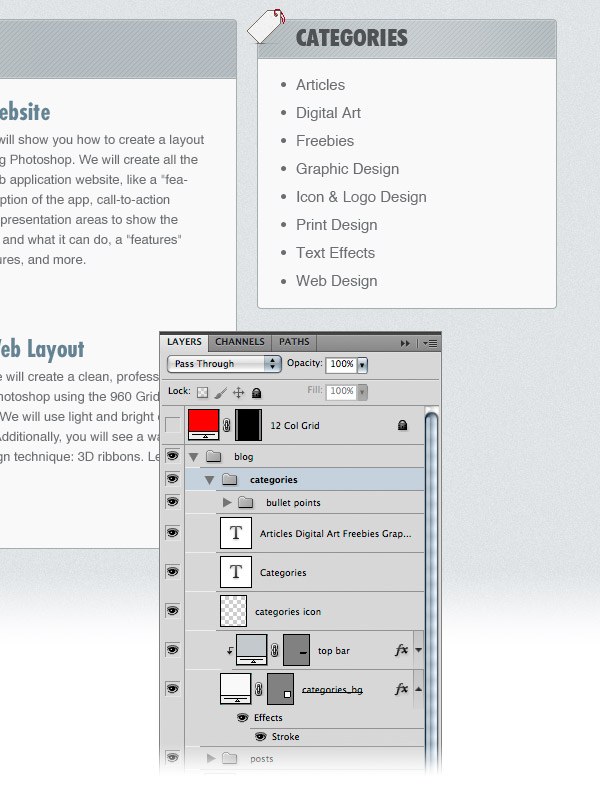 Create a new group (Layer > New > Group) and name it “twitter”. Then create a background for this area just like you did for the “categories” area. The icon that I used is “social_twitter_bird.png”. Add a couple of tweets in this area. I used the font Helvetica Oblique with the color #6a6e70 for tweet and #bcbcbc for the time information.
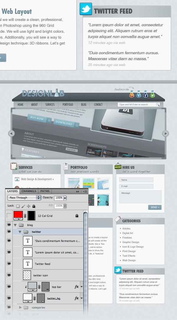
Step 20: Creating the Footer
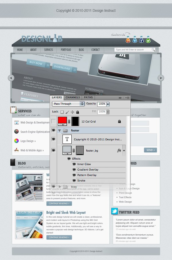
Create a new group (Layer > New > Group) and name it “footer”. Select the Rounded Rectangle Tool (U) and create a rounded rectangle with the dimensions 940px by 50px and the color #c2c9cc. Name this layer “footer_bg” and apply to it the “top bar” style from the Styles Panel. Select the Type Tool (T) and add a copyright statement in the middle of the footer area using the color #6a6e70 and the font Helvetica.
Tutorial Summary
We are finished! Below you can see the final web layout. This design should be great for user experience and brand reputation for a number of industries.
Maybe not for some businesses like a golf course’s web design, but it would be super effective for most websites about technology or science. We did a lot in this tutorial, from creating custom Photoshop patterns to using the handy 960 GS. I showed you some workflow tips such as saving layer styles and creating smart objects for flexibility.
I hope you enjoyed this tutorial and you learned some new things. Be sure to leave your opinions in the comments section below.
Download Source Files
- modern_laboratory_layout (ZIP, 3.20 MB)
-
 Trevin serves as the VP of Marketing at WebFX. He has worked on over 450 marketing campaigns and has been building websites for over 25 years. His work has been featured by Search Engine Land, USA Today, Fast Company and Inc.
 -

WebFX is a full-service marketing agency with 1,100+ client reviews and a 4.9-star rating on Clutch! Find out how our expert team and revenue-accelerating tech can drive results for you! Learn more
Make estimating web design costs easy
Website design costs can be tricky to nail down. Get an instant estimate for a custom web design with our free website design cost calculator!
Try Our Free Web Design Cost Calculator
Table of Contents
- Preview
- Tutorial Resources
- Update: Free Download of This Tutorial Now Available
- Inspiration
- Step 1: Set Up the 960 Grid System
- Step 2: Setting Up the Photoshop Grid
- Step 3: Setting Up the Document
- Step 4: Create the Background
- Step 5: Creating a Diagonal Stripe Pattern
- Step 6: Create a Bar at the Top
- Step 7: Creating a Modern Laboratory Desk Design Element
- Step 7: Create the Bottom Surface of the Desk (Navigation Bar)
- Step 8: Adding Noise to the Lab Desk
- Step 9: Creating the “Design Lab” Logo
- Step 10: Add Social Media Icons
- Step 11: Adding the Navigation Bar Items
- Step 12: Creating a Search Bar
- Step 13: Creating an Image Slider Area
- Step 14: Creating Navigation Arrows for the Image Slider
- Step 15: Creating the Main Content Area
- Step 16: Create a Patterned Button for the Web Form
- Step 17: Creating the Blog Area
- Step 18: Adding Content to the Blog Area
- Step 19: Creating a List of Categories
- Step 20: Creating the Footer
- Tutorial Summary
- Download Source Files
Share this article


Web Design Calculator
Use our free tool to get a free, instant quote in under 60 seconds.
View Web Design Calculator
Make estimating web design costs easy
Website design costs can be tricky to nail down. Get an instant estimate for a custom web design with our free website design cost calculator!
Try Our Free Web Design Cost Calculator