

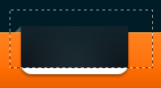
Preview
Click on the preview image below to see the layout in full scale. 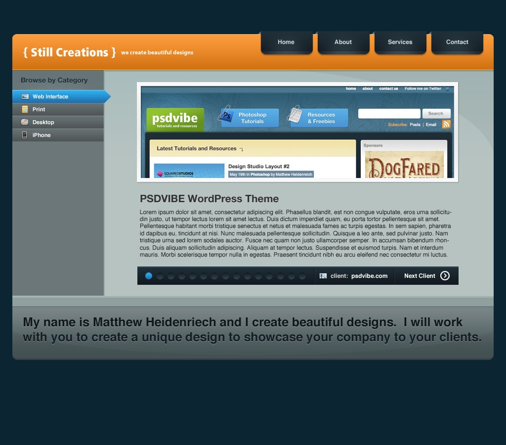
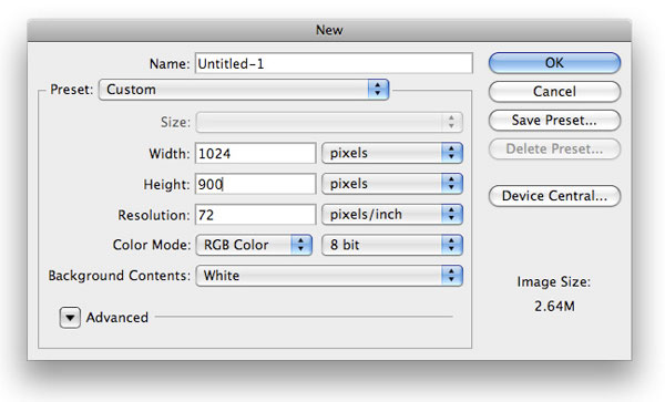
Step 1: Set up your Photoshop canvas
The first thing we need to do is to create a new document of 1024x900px. This will be a good working size for a web page layout.
 Using your Paint Bucket Tool (G), fill the default white Background layer with a dark blue color (#0b2533).
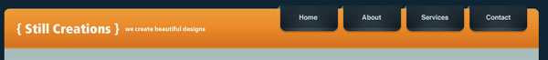
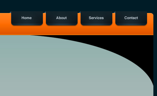
Step 2: Create the web page header shape
Now go to your Tools Panel and choose your Rounded Rectangle Tool (U). Set the Radius in the Options Bar to 10px.
Make a rounded rectangle shape at the top of our canvas that’s about 970px in width that will serve as our header/masthead for the layout. Center it horizontally using the Move Tool (V). 
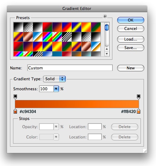
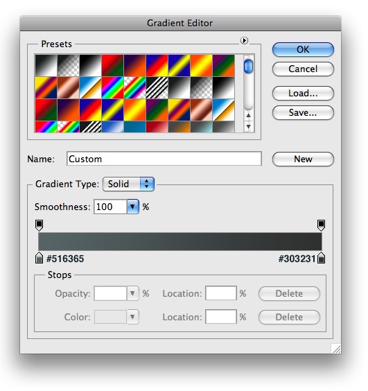
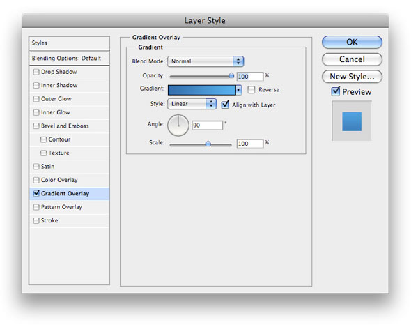
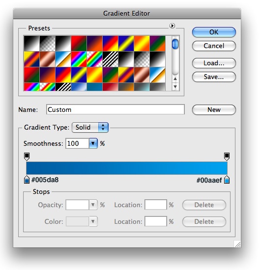
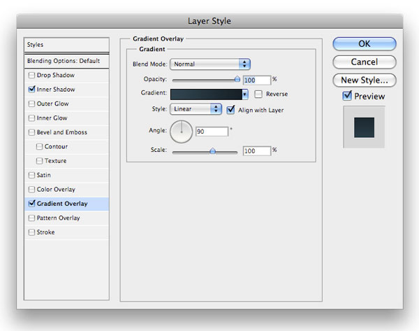
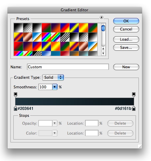
Step 3: Add layer styles to the header shape layer
Now we want to add some layer styles to the rounded rectangle we made.
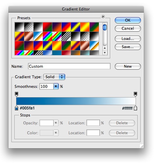
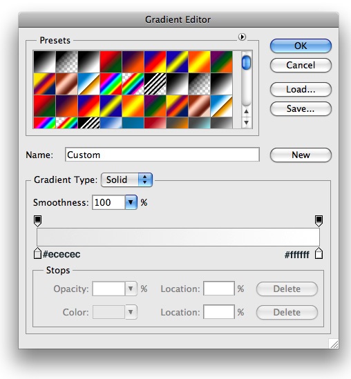
Right-click your rounded rectangle layer in the Layers Panel and choose Blending Options from the menu to open up the Layer Styles dialog window. Add a Gradient Overlay layer style to give our header its metallic orange color. 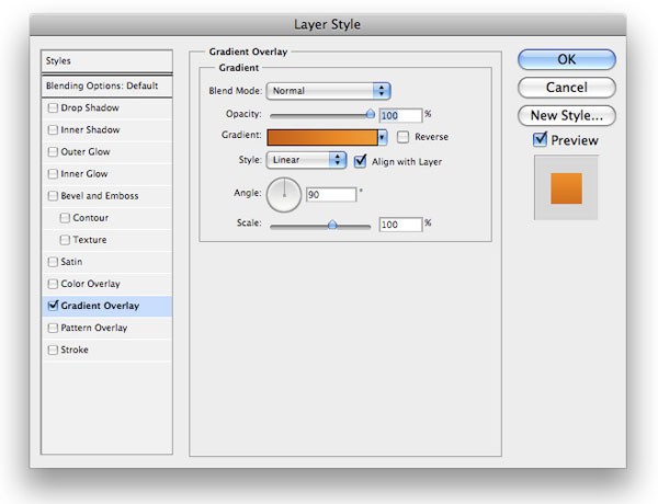
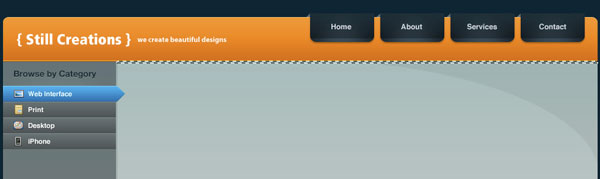
Step 4: Create the site name/logo
Using a simple font (I used Fruitger for the logo and Myriad Pro for the tag line), pull out the Horizontal Type Tool (T) and lay out your logo on the left side of our header.
Make sure your site name and tag line are on separate text layers so that you can move them independent of each other. 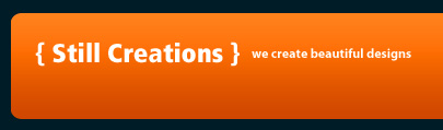
Step 5: Create the top bevel on the header
Ctrl/Cmd + click on your rounded rectangle layer to make a marquee selection around it automatically. Fill your selection with white (#ffffff) on a new layer.
While still selected, move your selection down a nudge (about 1px or 2px depending on how big you want the bevel to be) with the Move Tool (V) and then go to Edit > Clear.  Go ahead and change the blend mode of the layer to Soft Light, and then lower the Opacity to 65%.
Step 6: Make the primary navigation bar button
Time to make our navigational menu.
Use your Rounded Rectangle Tool to make a small rounded rectangle shape on the top right side of the header.  Use your Rectangular Marquee Tool (M) to make a selection at the top of the shape, and then choose Edit > Clear (or hit the Delete key).
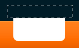
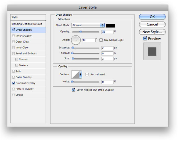
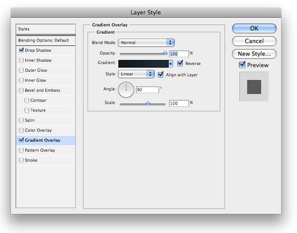
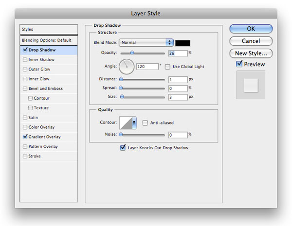
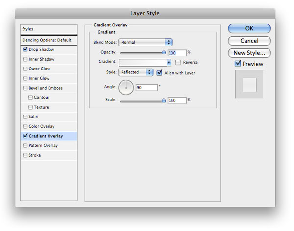
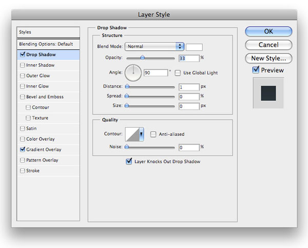
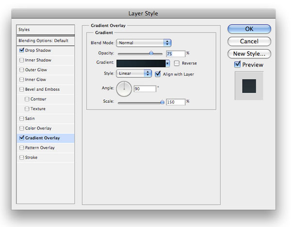
Step 7: Add layer styles to the navigation bar button
Next up, we’ll style our navigation bar button.
We’ll do so by adding a Drop Shadow layer style and a Gradient Overlay layer style.
Drop Shadow layer style
Gradient Overlay layer style

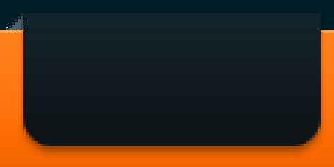
Step 8: Create the 3D effect on the navigation menu bar button
Using your Polygonal Lasso Tool (L), make a triangular selection on the left side of the button to give it an impression that it’s hanging over the header. Fill the selection with a bluish-gray color (#657681).
Step 9: Give the button a radial glow
Use your Elliptical Marquee Tool with Feather at about 15px to make a selection around the center of your button. 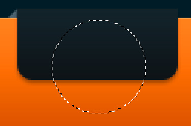 On a new layer, fill the selection with white (#ffffff). Change layer’s blend mode to Soft Light and lower the Opacity to about 52%.
On the button’s shape layer (not the radial glow layer), Ctrl/Cmd + click on the layer to select it. Then, invert your selection by going to Select > Inverse (Shift + Ctrl/Cmd + I). Choose your radial glow layer again, and press your Delete key to remove the areas outside of the button.

Step 10: Add the bottom 3D effect on the button
Again, we need to Ctrl/Cmd + click our button’s shape layer make a selection around it. Then, on a new layer (below the radial glow layer, but above the button’s shape layer), fill the selection with white (#ffffff). Using your Rectangular Marquee Tool (M), make a selection that excludes about 5px-6px of the button’s lower part.
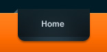
 Choose Edit > Clear to remove the top part of the white rectangle. Go ahead and change the layer’s blending mode to Overlay, and then lower its Opacity to about 44%. Add text to it (like “Home”) using the Horizontal Type Tool (T) to your button.
Step 11: Make more navigation menu buttons
Repeat the process to create more link items for your primary navigation bar. I created three more navigation menu bar buttons. 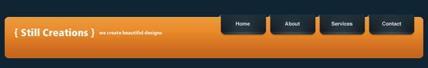
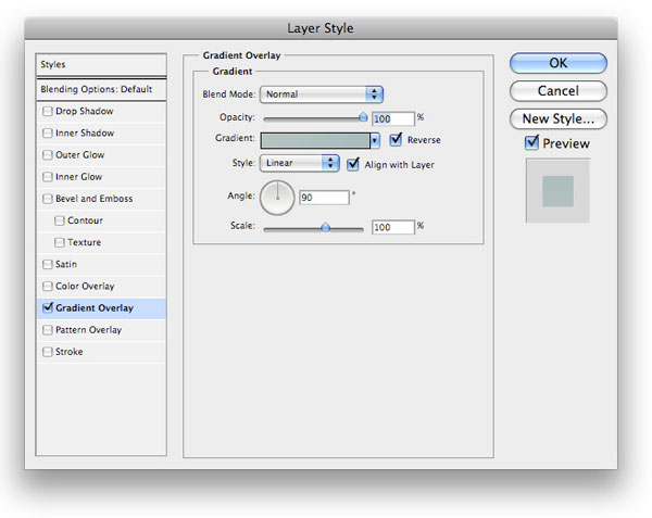
Step 12: Create the content area background
Let’s go ahead and make the background for our content area.
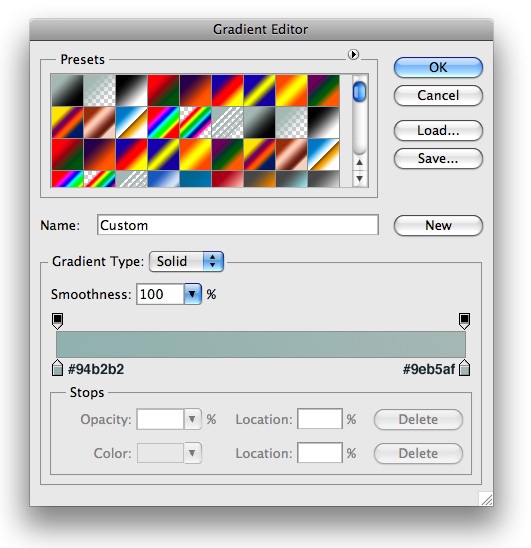
Using your Rectangular Marquee Tool (M), make a selection that spans the width of your header and around 460px in height. Fill your selected area with a light-bluish-gray color (#b7c3c1). 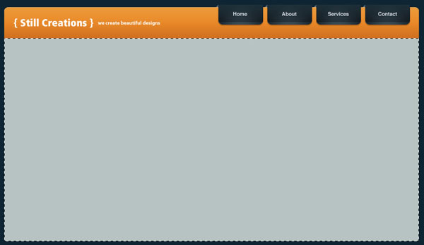 Let’s give the content area background a Gradient Overlay.
Step 13: Create a 1px horizontal inset on the header
Let’s move back up a bit to the header. We need to add a bit of a shine on the bottom of our orange gradient. It’s a small thing, but details count.
Make a 1px-high selection 1px from the bottom of the orange header area. On a new layer, fill in the selection with white (#ffffff). Change the layer’s blend mode to Soft Light, and what you’ll end up with is a nice 1px inset effect.
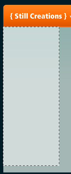
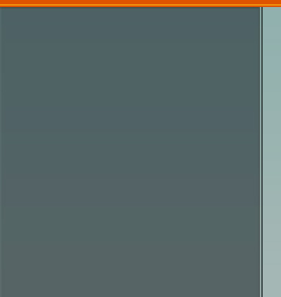
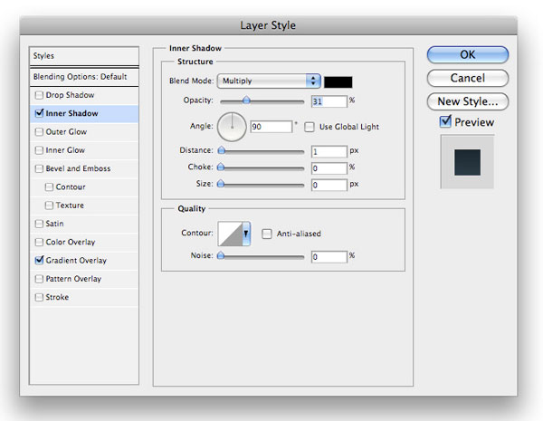
Step 14: Create the sidebar on the left
Let’s move on to our sidebar. Make a selection with your Rectangular Marquee Tool (M) on the left side of the content area; it should be around 180px-200px in width. Fill the selection with any color (we’ll be using layer styles to color it in later, so the color you choose doesn’t matter at this point).
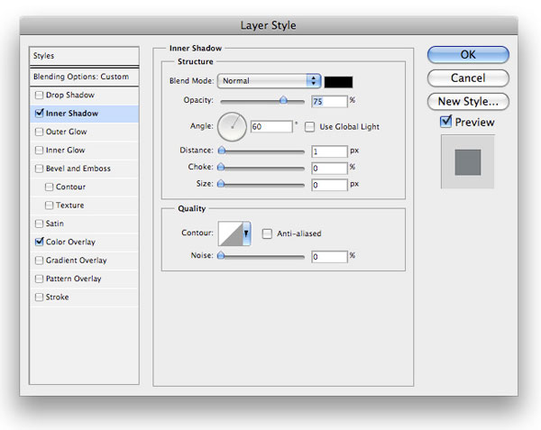
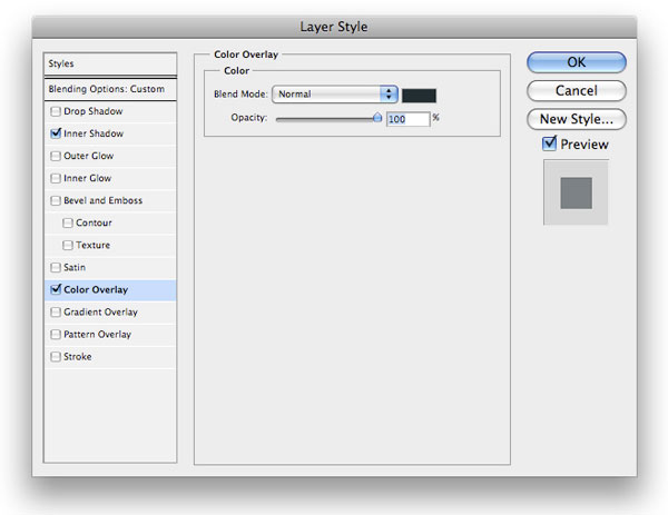
 Next, we give the sidebar an Inner Shadow and a Color Overlay.
Inner Shadow layer style
Color Overlay layer style
Step 15: Make a vertical divider on the right
We want to create a 1px vertical divider between our sidebar and the main content area. Make a selection for the 1px vertical divider that spans from top to bottom, and, on a new layer, fill it with gray color (#4a5452).
 Then lower the Opacity of your divider layer to about 37%.
Step 16: Add a sidebar menu heading
Using your Horizontal Type Tool (T) and with your Foreground color set with a dark blue color (#1e2e36), add a heading at the top of our sidebar. I used the text “Browse by Category”.  Let’s style the heading text layer with a Drop Shadow layer style that will give it that popular inset/letterpress text effect.
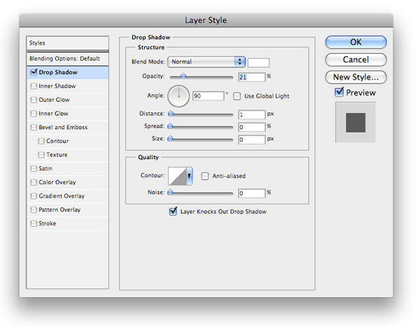
Step 17: Make the active sidebar menu item background
Make a selection with your Rectangular Marquee Tool (M) right below the “Browse by Category” heading and fill it with black (#000000). This will serve as the background for your active category link.
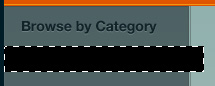 Using your Polygonal Lasso Tool (L), make a selection so that the right side of the active category background will be shaped like a rightward-pointing arrow. With your selection done, choose Edit > Clear or hit the Delete key to remove the unwanted area.
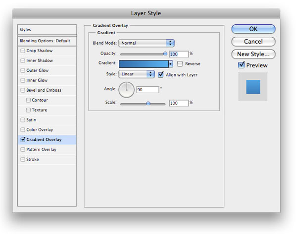
 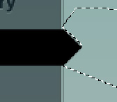 For the color of the active category background, we will use a blue-colored Gradient Overlay layer style.

Step 18: Give the menu item background a 1px border
Ctrl/Cmd + click your layer to select it and then fill the selection with white (#ffffff) on its own layer. Don’t deselect yet (and if you did, just press Shift + Ctrl/Cmd + D to reselect). Go to Select > Modify > Contract and, in the Contract By option, specify 1px.
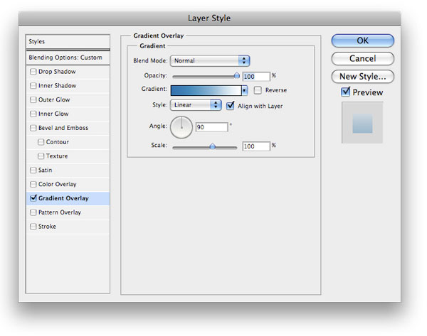
Then choose Edit > Clear. This should give our active category link background a white 1px border around it.  Lower the layer’s Opacity to 40%, and then give the 1px border a blue-to-white Gradient Overlay layer style.
 Use your Rectangular Marquee Tool (M) to put a 1px line selection at the bottom of your active menu background and fill it with black (#000000) on a new layer.
 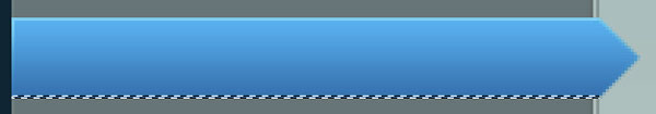 Lower the opacity of the new layer to 15%.
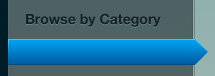
Step 19: Design the background for non-active category links
We then want to show how our non-active categories will show up.
Use the Rectangular Marquee Tool (M) to place a selection below our active category background, and then, on a new layer, fill it with a very dark gray color (#1f2324). 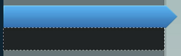 For the color of the background of non-active category links, we’ll use a Gradient Overlay layer style.
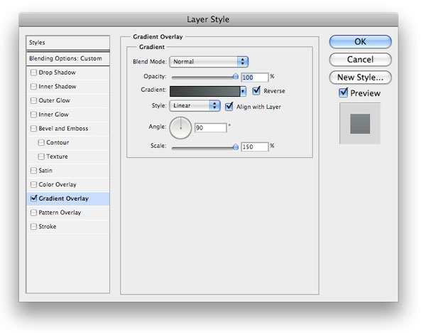
Step 11: Create horizontal dividers between category links
Using your Rectangular Marquee Tool (M), make a 1px-high selection that will act as horizontal dividers between the category links.
On a new layer, fill the selection with white (#ffffff) and also lower the layer’s Opacity to about 19%. 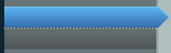
Step 12: Add category names and icons
All that’s left for the sidebar is to add some icons and your text. I’ll let you find your own favorite icon sets to use (or don’t use any icons at all).
Just use the Horizontal Type Tool (T) with the color set at white (#ffffff) for your text. The font I used was Helvetica Bold, at 11pt size. 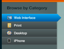 That’s it for our sidebar category links.
Step 13: Add a shadow on the top right of the content area
Let’s make the content area a bit more interesting by adding a shadow towards the top right of it. Using your Rectangular Marquee Tool (M) put a rectangular selection at the top right and fill it with black (#000000) on a new layer. Then use your Elliptical Marquee Tool to cut out the left portion of your black rectangular area (just hit the Delete key when you’re satisfied by your elliptical selection).
 Also, go ahead and lower the Opacity of this layer to around 5%. Using your Rectangular Marquee Tool (M) again, make a selection at the top of the content area, just below the orange header. Fill the selection with black (#000000) and then lower the Opacity of your layer to 12%.
Step 14: Make the featured content section
With your Rectangular Marquee Tool (M) put a selection towards the top portion of the content area, leaving some margins on all sides. This area will contain our featured area image, which can be used to promote your featured project. Fill the featured content area section selection with black (#000000) on a new layer.
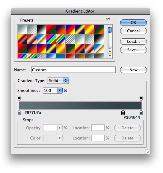
 To style our featured content area section, we will add a Drop Shadow and a Gradient Overlay layer style.
Drop Shadow layer style
Gradient Overlay layer style
Step 15: Add a featured project image and fill content
I went ahead and added some filler for a title and description, as well as a featured project image. You can use, for example, a screenshot of a design project you’re proud of.
Use a lorem ipsum generator tool to get some text content combined with the Horizontal Type Tool (T). 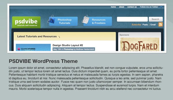
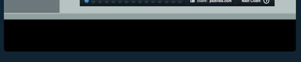
Step 16: Make the “detail” bar
We now want to make a “detail” bar, which is a user interface element that works as a navigation scheme for our featured project images, letting your users scroll through your work, and provide a little information for your potential clients. Use your Rectangle Marquee to make a short and wide rectangular selection below the filler content we placed in the previous step.
Fill it will black (#000000).  Style the “detail” bar by adding a color gradient using the Layer Styles dialog window.
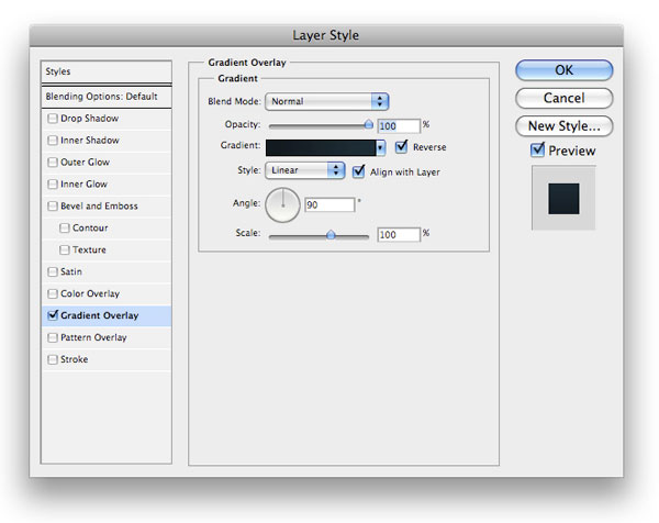
 Next, use your Rectangular Marquee Tool (M) to add a 1px high border across the top of your bar.
Make sure that the selection is 1px from the top of the bar. On a new layer, fill the 1px border with white (#ffffff) and lower the new layer’s Opacity to about 53%, as well as set the blending mode to Soft Light. 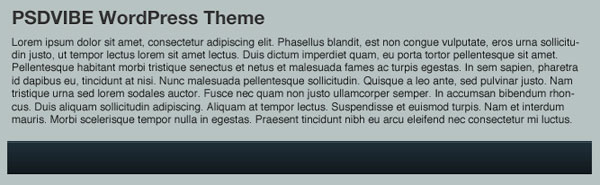
Step 17: Design the progress circles on the “detail” bar
Use your Elliptical Marquee Tool while holding down Shift to make a circle towards the left side of the bar.
Fill it with white (#ffffff). This will serve as the indication of which featured project the user is currently on.  Add a gradient overlay to style the circle.
 We then need to make the circles for the non-active items. Create another circle that’s the same size as the first circle (or duplicate the first circle and just change the layer styles to the ones discussed below). Then use an Inner Shadow and a Gradient Overlay to give the non-active item circle its color.
Inner Shadow layer style
Gradient Overlay layer style
 Next, duplicate the circle you just made into however many non-active item circles you want. Also add some text and icons to our “detail” bar.
Step 18: Create the bottom part of our content area
Add the bottom part of the content area using 1px horizontal lines like we’ve done in previous steps with the Rectangular Marquee Tool.
 Then use your Rectangular Marquee Tool (M) to make a selection around the bottom area and then fill it with a bluish-gray color (#8fa09d).
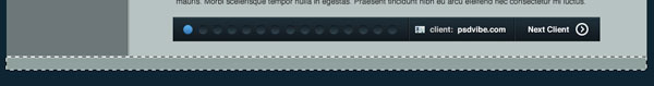
Step 19: Make the footer area
The last step is to create your footer. Use your Rounded Rectangle Tool (U) to create a rectangle at the bottom of your layout with the Radius option set at 10px — make sure this layer is under all your other layers except your Background layer.
 Give the footer area a Gradient Overlay layer style.
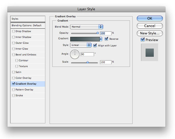
 Next Ctrl/Cmd + click your newly created rounded rectangle shape layer in the Layers Panel to select it. On a new layer, fill your selection with black (#000000).
Now, nudge the selection (not the layer, just the selection) up by about 6px. 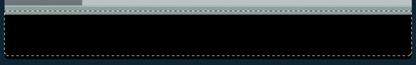 Choose Edit > Clear and then lower this layer’s Opacity to about 19%.
  Again, we want to Ctrl/Cmd + click the footer’s background layer to select it and fill the selected area with black (#000000) on a new layer.
We then want to use our Elliptical Marquee Tool (M) to make a selection right about in the middle to give the footer its metallic-looking surface. After creating the selection, just go to Edit > Clear to remove the area within it. 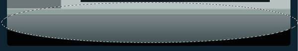 Lower the Opacity of the layer to about 5%.
The last thing we need to do is to add a little description about your portfolio site in the footer with the Horizontal Type Tool (T). I used Helvetica, and a Drop Shadow and Gradient Overlay options on my text layer.
Drop Shadow layer style
Gradient Overlay layer style

Tutorial Summary
This tutorial showed you, step-by-step and with plenty of screenshots, how to create a modern-looking web layout that would be perfect for a personal or agency portfolio.
The PSD mockup can be converted to a fully functioning HTML/CSS layout or even ported to a CMS/publishing platform like Drupal or WordPress. We made use of basic Photoshop tools such as marquee selection tools, shape tools, and layer styles to create this wonderful layout.
Download Tutorial Source Files
- modern_portfolio_weblayout (ZIP, 0.67 MB)
-
 Trevin serves as the VP of Marketing at WebFX. He has worked on over 450 marketing campaigns and has been building websites for over 25 years. His work has been featured by Search Engine Land, USA Today, Fast Company and Inc.
 -

WebFX is a full-service marketing agency with 1,100+ client reviews and a 4.9-star rating on Clutch! Find out how our expert team and revenue-accelerating tech can drive results for you! Learn more
Make estimating web design costs easy
Website design costs can be tricky to nail down. Get an instant estimate for a custom web design with our free website design cost calculator!
Try Our Free Web Design Cost Calculator
Table of Contents
- Preview
- Step 1: Set up your Photoshop canvas
- Step 2: Create the web page header shape
- Step 3: Add layer styles to the header shape layer
- Step 4: Create the site name/logo
- Step 5: Create the top bevel on the header
- Step 6: Make the primary navigation bar button
- Step 7: Add layer styles to the navigation bar button
- Step 8: Create the 3D effect on the navigation menu bar button
- Step 9: Give the button a radial glow
- Step 10: Add the bottom 3D effect on the button
- Step 11: Make more navigation menu buttons
- Step 12: Create the content area background
- Step 13: Create a 1px horizontal inset on the header
- Step 14: Create the sidebar on the left
- Step 15: Make a vertical divider on the right
- Step 16: Add a sidebar menu heading
- Step 17: Make the active sidebar menu item background
- Step 18: Give the menu item background a 1px border
- Step 19: Design the background for non-active category links
- Step 11: Create horizontal dividers between category links
- Step 12: Add category names and icons
- Step 13: Add a shadow on the top right of the content area
- Step 14: Make the featured content section
- Step 15: Add a featured project image and fill content
- Step 16: Make the “detail” bar
- Step 17: Design the progress circles on the “detail” bar
- Step 18: Create the bottom part of our content area
- Step 19: Make the footer area
- Tutorial Summary
- Download Tutorial Source Files
Share this article


Web Design Calculator
Use our free tool to get a free, instant quote in under 60 seconds.
View Web Design Calculator
Make estimating web design costs easy
Website design costs can be tricky to nail down. Get an instant estimate for a custom web design with our free website design cost calculator!
Try Our Free Web Design Cost Calculator