31 Education Website Design Examples You Need To See
Get inspired for a new or redesigned educational website with this compilation of website examples from the higher education space, from colleges to universities to private schools.
-
 insights from 61,900+ hours of higher education marketing experience

Table of Contents
- 1. University of Alabama
- 2. Cameron University
- 3. Moravian Academy
- 4. University of Louisville
- 5. Drexel University
- 6. Stanford University
- 7. Texas A&M University
- 8. Academy for Thinkers
- 9. Lausanne Collegiate School
- 10. Moorlands
- 11. St. Joseph’s College of Maine
- 12. Groton
- 13. Seven Generations Charter School
- 14. Deerfield Academy
- 15. Misericordia University
- 16. Milton Hershey School
- 17. Salesian College Preparatory
- 18. Louisiana State University (LSU)
- 19. Horace Mann School
- 20. The Hotchkiss School
- 21. Barnard College
- 22. University of Wyoming
- 23. Pingry
- 24. University of Florida
- 25. Princeton University
- 26. Oregon State University
- 27. University of Georgia
- 28. Andover
- 29. The Dalton School
- 30. Alvernia University
- 31. New Mexico State University
- Feeling inspired by these education website design examples?
- We Drive Results for Higher Ed Centers
A well-designed website impacts the first impressions you set –– 94% of first impressions stem from website design. On top of that, 75% of website credibility comes from your website’s design. That means you need a well-designed website to set a positive first impression and build credibility for your institution.
So, where do you start with education web design?
To help you get inspired for your website, we’ve created this list of 31 education website design examples you can draw inspiration from! Keep reading to learn about what these education websites do well!
And if the list of things you want on your website keeps growing and you feel overwhelmed, don’t worry! The experts at WebFX have over 30 years of experience designing websites. Contact us online to see how we can help!
1. University of Alabama
Area of focus: Homepage
First on this list of education website designs, let’s look at the University of Alabama. This university integrates its iconic red and white color scheme throughout to help build brand recognition.
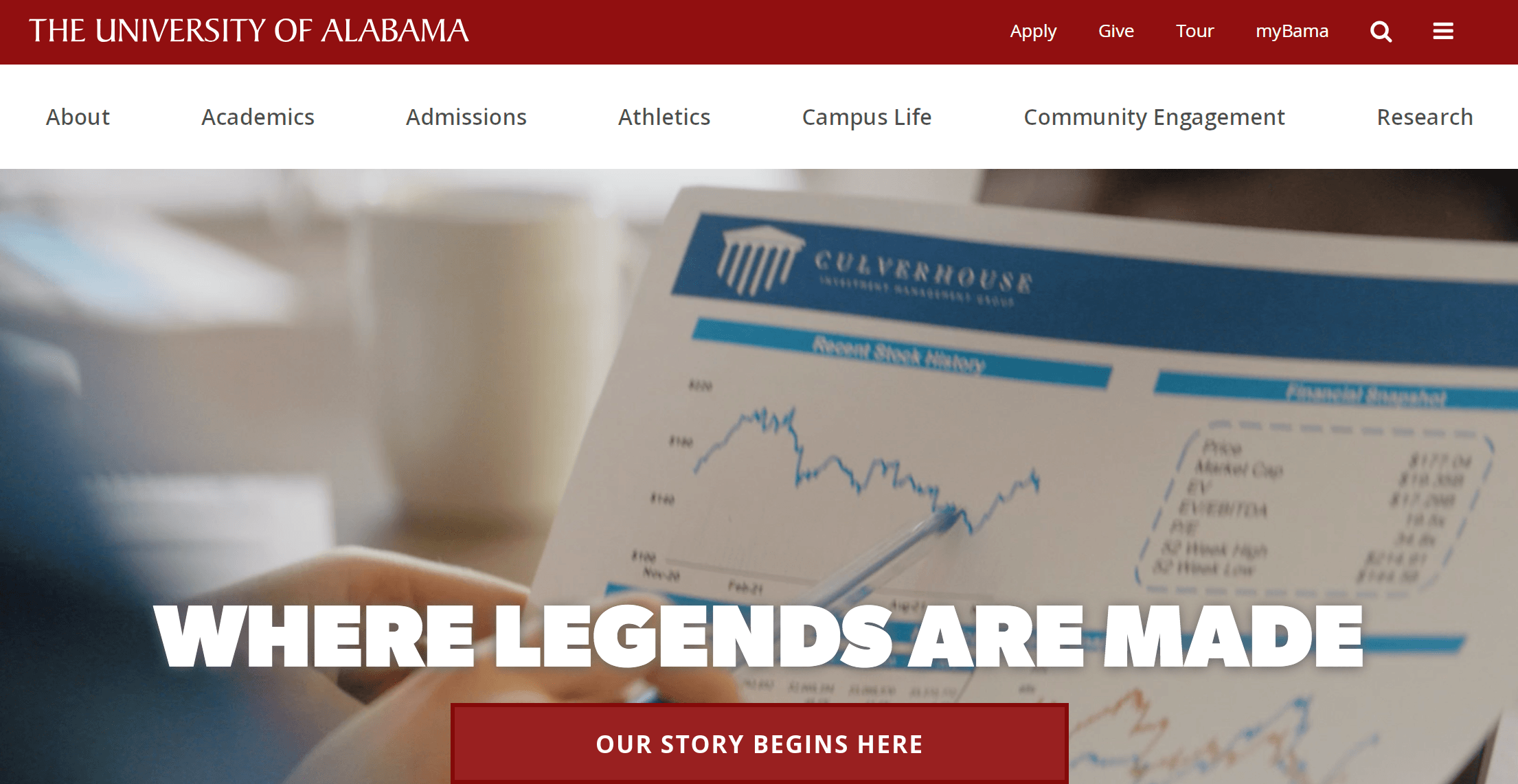
The most notable element of the University of Alabama’s website is the homepage. They do a great job of providing helpful information to prospective students right away, like information about academic programs, life on campus, and a tour of their campus.
Your homepage is often where people land when they discover your institution. This page must give a solid overview of what you offer, so people will remain on your website and learn more.
ACTION ITEM: Build a home page that wows your audience when they visit your website. Include an overview of the must-know aspects of your university, like campus life, academic programs, and more.
2. Cameron University
Area of focus: Style
If you want to see good web design, check out Cameron University. Cameron University uses a bright design accompanied by their custom logo to create a unique online experience.
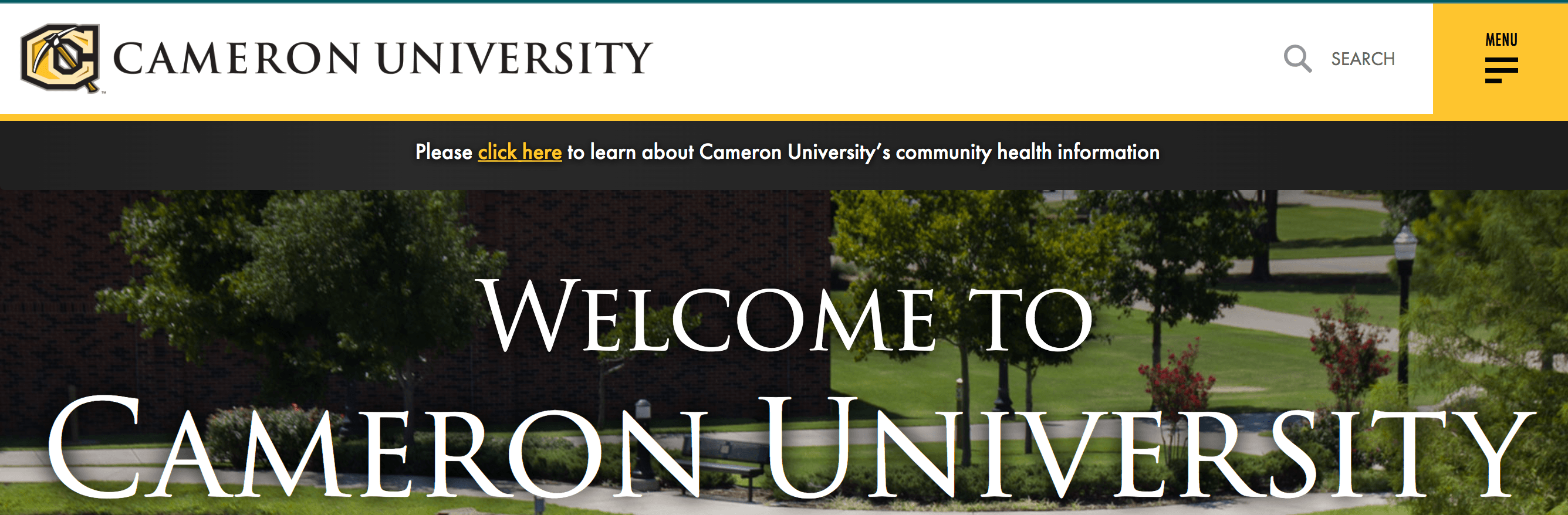
One of the most notable elements of Camera University is the website’s style. It’s simple, modern, and eye-catching. They use bright colors, high-quality images, and interactive elements to make their website visually appealing to visitors.
Many people make decisions based on the looks of your website –– 38% of people stop engaging with a website if unattractive, and 64% of people want to see a website that holds their attention. So, as you can see, you must create an aesthetically pleasing and engaging website to keep people engaged.
ACTION ITEM: Define your institution’s style and integrate that style throughout your website.
3. Moravian Academy
Area of focus: Navigation
When you enter the Moravian Academy website, you see dozens of high-quality photos of students learning accompanying their red design.
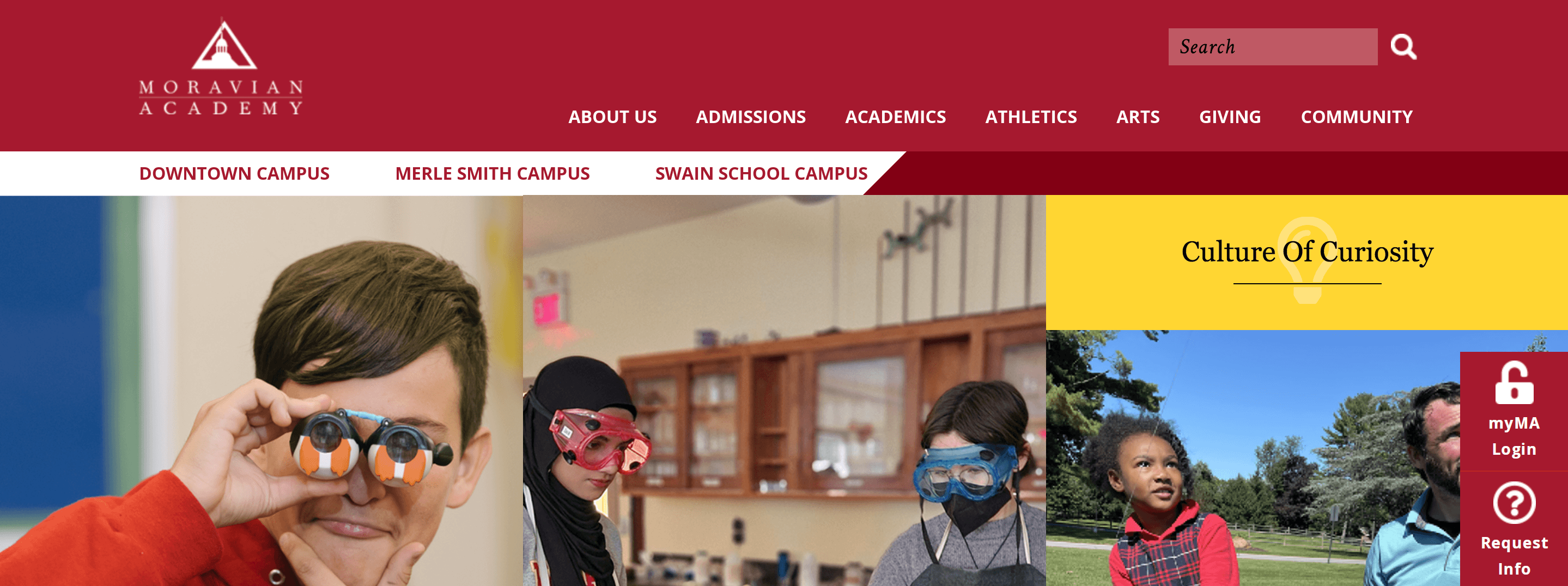
While there are numerous aspects of their website that they do well, let’s focus on their navigation. Moravian Academy does a great job of creating navigation that’s easy to use. The site also has broad headings to help keep pages organized, so prospective families can find the information fast.
ACTION ITEM: Organize your navigation so prospects can find information easily. Use broad headings on your navigation bar, like “About Us” and “Academics,” so you can place numerous pages underneath those headings. You can then use subheadings to organize pages further.
4. University of Louisville
Area of focus: Call to action (CTA) buttons
To continue on this list of web design examples for education, let’s look at the University of Louisville. This college has a bright red design that catches your attention as soon as you visit their website.
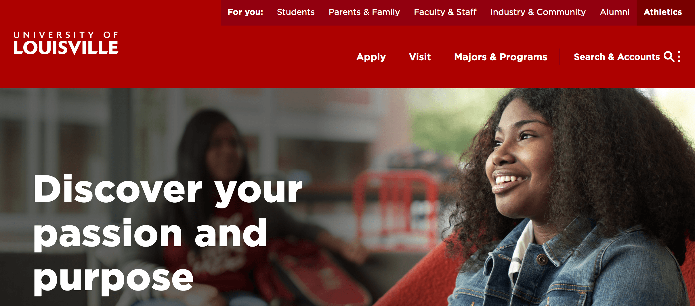
One aspect of the University of Louisville’s website that stands out is their call to action (CTA) buttons. They use bright red CTA buttons to draw in website visitors to actions they want them to take.
Having CTA buttons that stand out is crucial for driving website visitors to take the next step. Whether you want them to check out programs, contact your institution, or apply to your school, you must use CTA buttons to guide them to those actions and tell them how to proceed.
ACTION ITEM: Create CTA buttons that stand out on the page. Using a bold color that fits with your color scheme can help draw attention to these buttons, so people will take your desired action.
5. Drexel University
Area of focus: Authentic imagery
Another one of the best education website designs comes from Drexel University. The college’s iconic dark blue and yellow colors are integrated throughout their website, from the navigation to the CTA buttons.
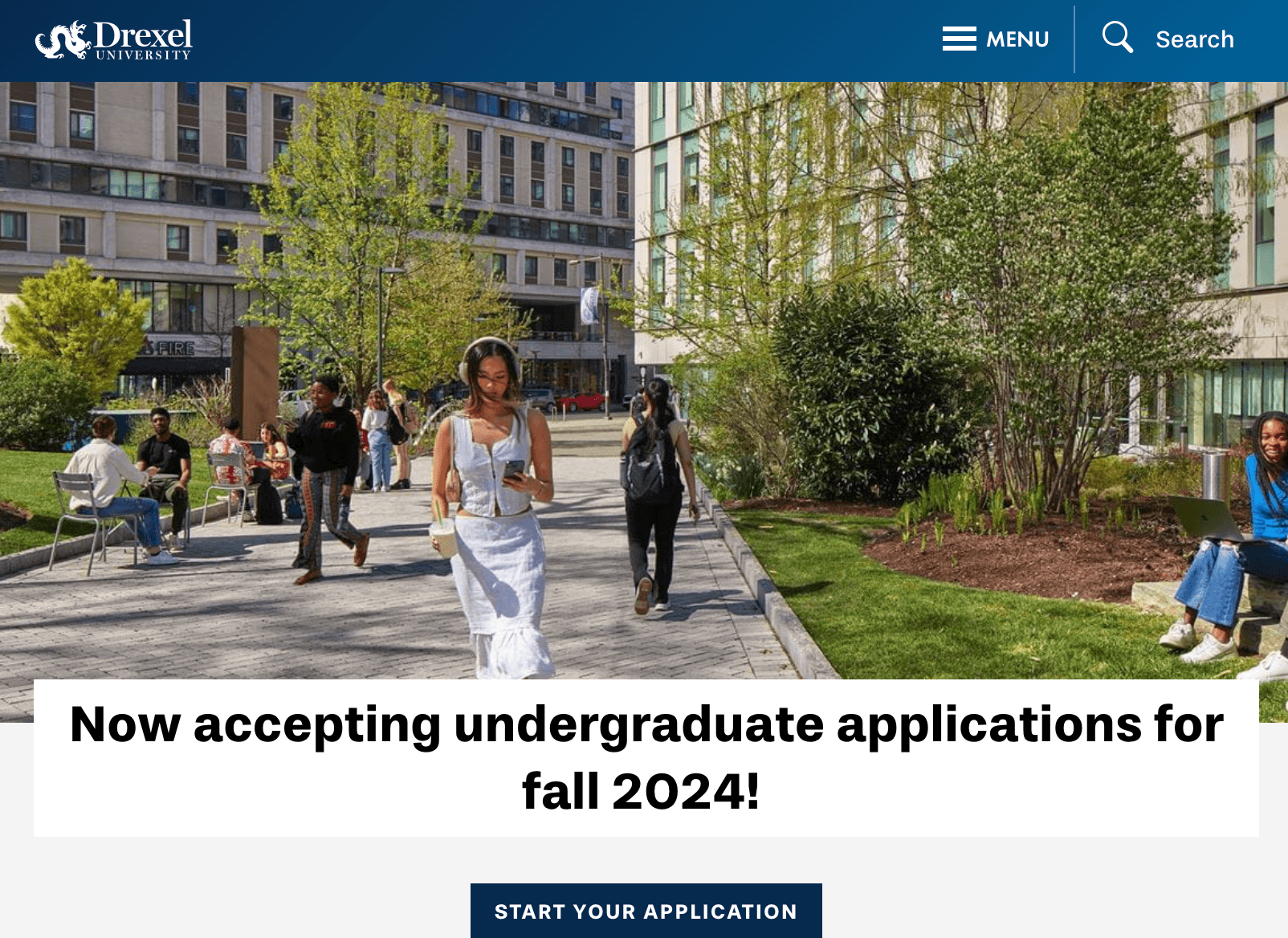
What’s most notable about Drexel University is their use of authentic imagery throughout their website. As you scroll through their homepage, you see numerous pictures of their students, campus, and more:
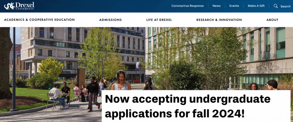
Authentic photos are crucial for enticing prospective students to attend your institution. They want to know what life is like on campus and what your campus looks like –– using stock photos may lead students to feel misled about your school.
ACTION ITEM: Integrate authentic images into your design. You can walk around campus and photograph students as they go about their daily lives to give prospective students insight into your campus.
6. Stanford University
Area of focus: Copywriting
To continue on this list of web design examples for education, let’s look at Stanford University. This college has a simple, modern design that makes it easy to browse their website and find relevant information.
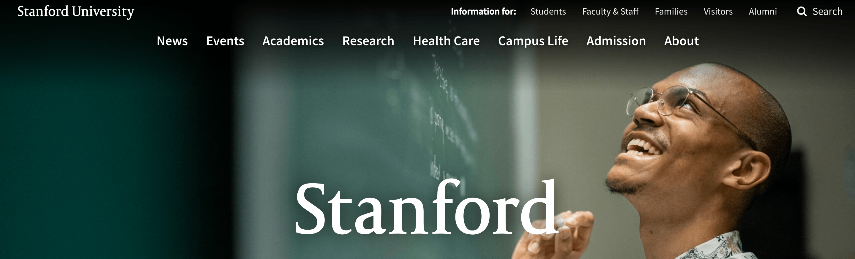
One aspect they do well is their copywriting. Their copy is succinct and provides all the details prospective students need without any fluff.
Having succinct copywriting helps you share the most valuable information with prospective students. It helps keep your copywriting shorter, making it easier to skim so website visitors find the information they need faster.
ACTION ITEM: Refine your website copy to make it succinct and cut out the fluff. Only include the details that are most necessary to deliver to your audience.
7. Texas A&M University
Area of focus: Search bar
Another one of the top education web designs comes from Texas A&M University. Their recognizable logo and branded colors greet you as you enter their website.
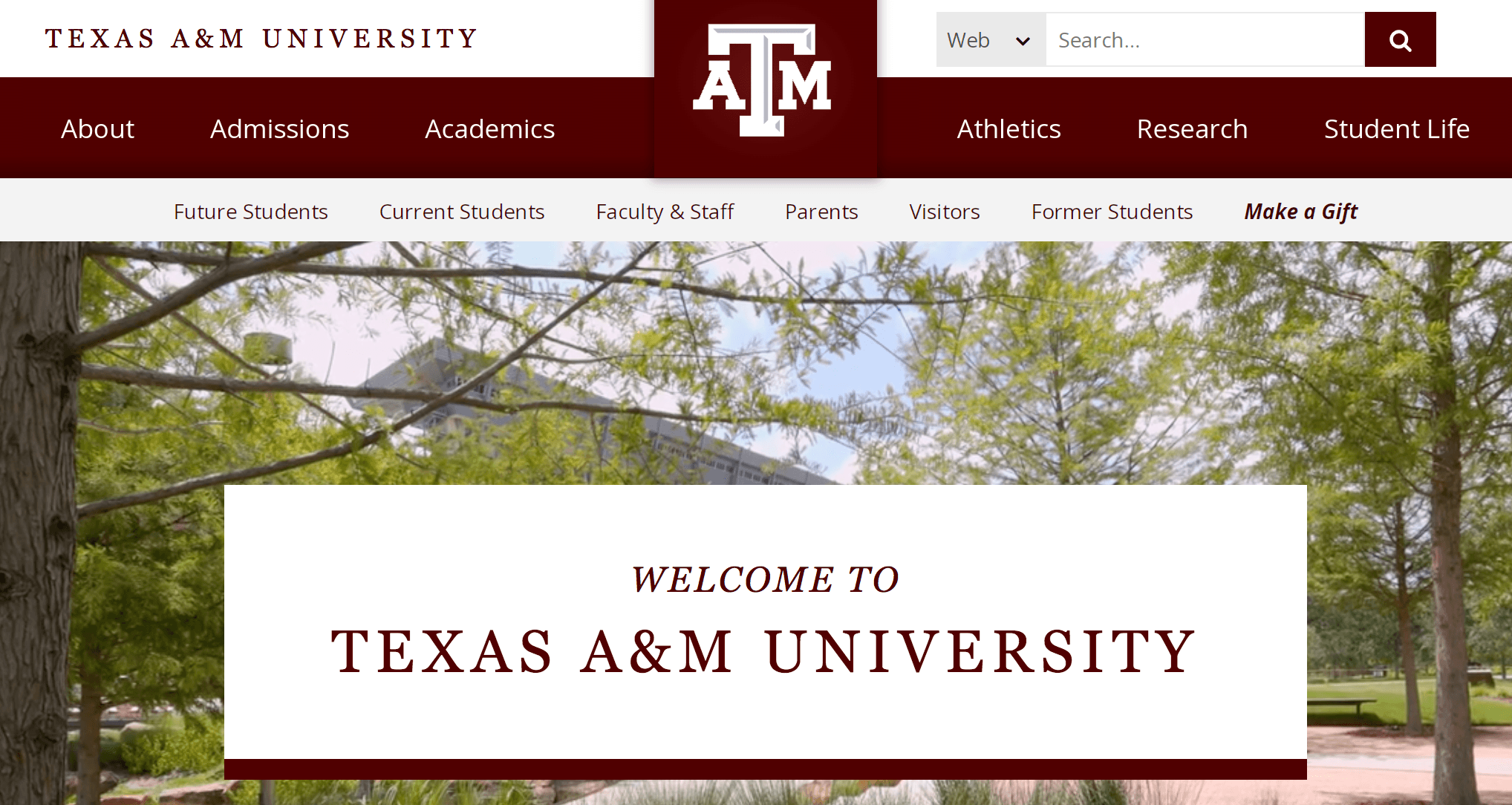
One aspect you’ll want to note about Texas A&M University’s website is the search bar included in its navigation. If you wanted to find out more information about their football program, for example, you can search it.
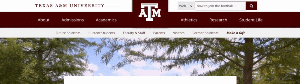
Having a search bar as part of your navigation makes it easier for people to find the information they need from your institution. Instead of combing through pages on your navigation bar, they can search and find what they need fast.
ACTION ITEM: Add a search function to your website to make it easy to find information. You’ll want to integrate the search bar into your navigation to ensure people can always find the information they need no matter what page they’re on.
8. Academy for Thinkers
Area of focus: Forms
Next on this list of education website design examples, look at Academy for Thinkers. This educational website does a great job of integrating the brand’s red and white color scheme throughout, as well as using authentic imagery.
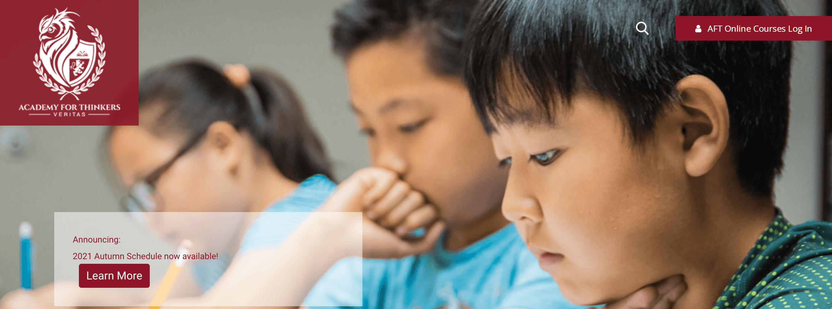
Something they excel at is their forms. Their contact form is short and simple, only asking for a name, email address, subject, and message.
Having simple forms is crucial for ensuring people fill them out. If your form is too long or complicated, it deters people from completing it.
ACTION ITEM: Create simple forms to encourage submission. Only ask for the most necessary information on your forms, like a person’s name and a way to contact them. You can always ask for more information later.
9. Lausanne Collegiate School
Area of focus: Testimonials
If you want to see more educational web design examples, check out Lausanne Collegiate School. This school has a simple website design that features high-quality images and information on life at the school.

One thing Lausanne Collegiate School does great is integrating testimonials into its website. They present their testimonials using hats for the colleges their students went to. When you hover over the hats, you can see testimonials from the students who attended Lausanne Collegiate School.
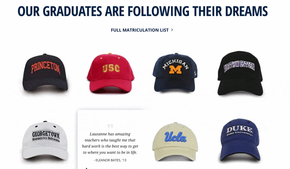
Integrating testimonials into your website is a great way to build credibility for your institution. It gives prospective students insight into what it’s like to be at your school.
ACTION ITEM: Integrate testimonials into your website’s design. You can create graphics, for example, to help your testimonials stand out and catch your audience’s attention.
10. Moorlands
Area of focus: Design elements
Ready to see some more web design examples for education? Check out Moorlands! The minute you enter their website, the videos and prominent purple and yellow design draw you in.
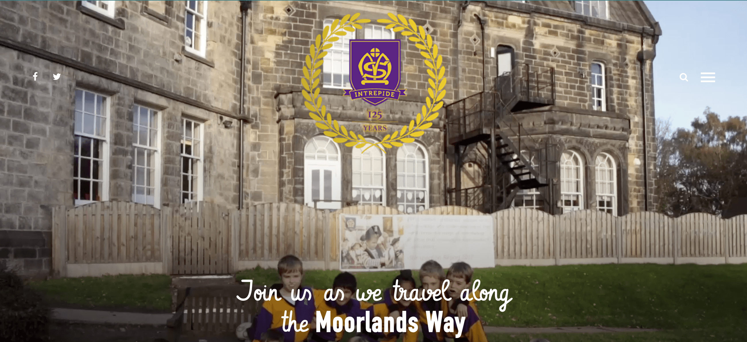
One aspect that Moorlands does particularly well is design elements. As your scroll down their page, you’re guided by lines that appear as you go and draw your attention to specific parts of their website.
Adding these small but simple design elements helps to make your website more unique. You can also use these design elements to help draw people’s eyes toward information or visuals.
ACTION ITEM: Find ways to integrate unique design elements into your website. It can be lines going down the page, arrows, or something similar. Adding these elements will help add a unique flair to your website.
11. St. Joseph’s College of Maine
Area of focus: User-focused information
If you want to see a good example of putting the user first, check out St. Joseph’s College of Maine. This college has a simple design that integrates the university’s blue and white colors throughout.
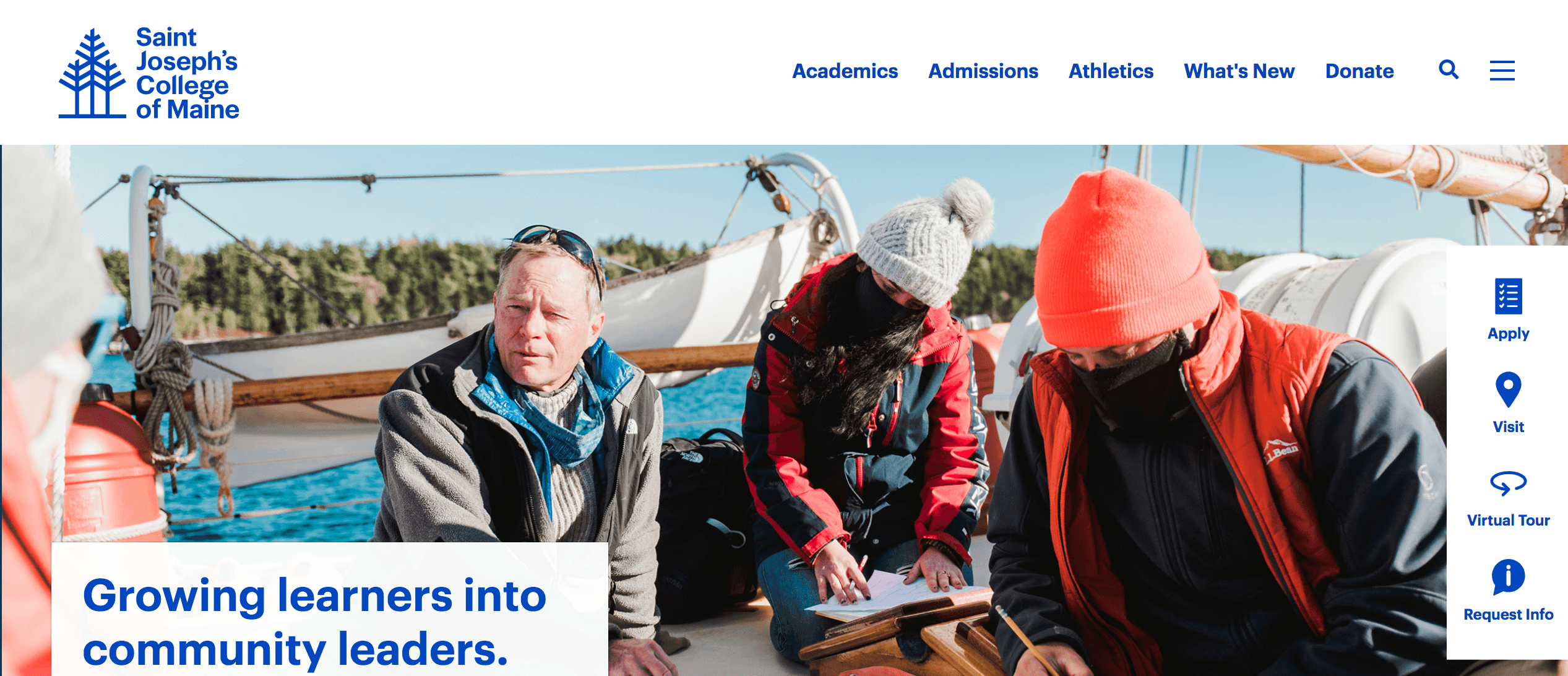
One area where St. Joseph’s College of Maine excels is with user-focused information. When you enter their homepage, you see a grid with valuable facts and information that prospective students want to know.
St. Joseph’s College of Maine takes a user-focused approach when integrating information into its website by sharing what people want to know most.
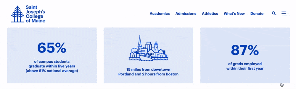
When prospective students look at your website, you must tell them the information they want to know immediately, like popular programs, graduation rates, and potential career salaries. Sharing this information can help prospective students determine if you’re a good fit.
ACTION ITEM: Integrate user-focused information into your website. Think about what prospective students want to know most and integrate that information into your website through video, graphics, or something similar.
12. Groton
Area of focus: White space
Groton is another great example of education web design. This private school uses eye-catching visuals and a simple design to create a professional website for interested families.
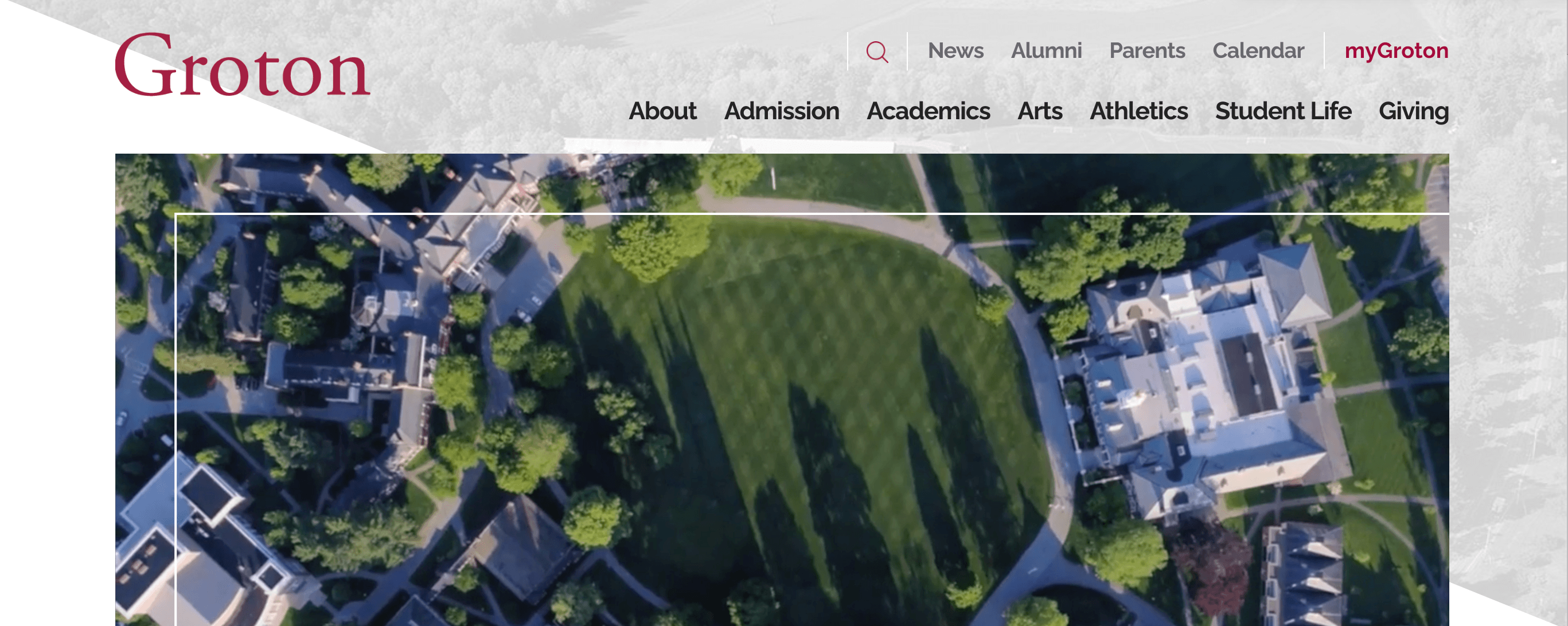
One thing Groton does particularly well is utilize white space. Their website isn’t overcrowded with text and images –– everything is strategically placed and uses white space to make it easy to focus on the content on their website.
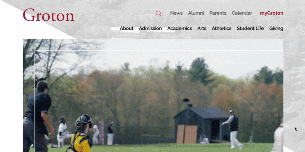
Using white space is crucial for ensuring your website isn’t cluttered and overwhelming for visitors. Integrating white space will draw attention to the information that matters most on your website.
ACTION ITEM: Integrate white space into your design to ensure you provide a clean and clutter-free website for prospective students.
13. Seven Generations Charter School
Area of focus: Website security
Check out Seven Generations Charter School to get more inspiration from education website designs. Their prominent tree logo and green color scheme create an earthy feel for their school.

One key element Seven Generations Charter School has is website security. When you look at their URL, there’s a padlock at the front and “https” in the name. That means their website is secure.

A secure website is crucial if you want people to share their information with you. They want to feel confident that any information, like their contact info, is protected on your website.
ACTION ITEM: Get a Secure Sockets Layer (SSL) certificate to help protect and encrypt the information people share on your website. Make sure your website address has “https,” which indicates the security.
14. Deerfield Academy
Area of focus: High-quality images
One of the most visually eye-catching education web designs comes from Deerfield Academy. They use a green and white color scheme to create an aesthetically appealing and engaging website for prospective students.
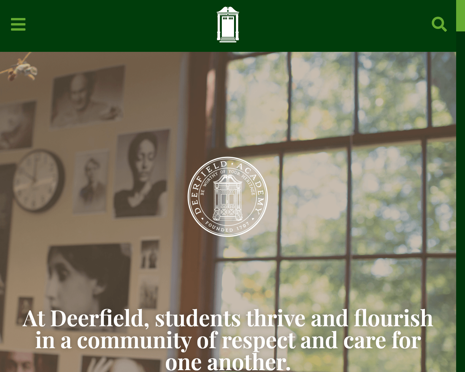
Most notably, Deerfield Academy uses high-resolution images throughout its website. These images showcase their institution and students doing activities at their school. Website visitors see what student life is like when attending Deerfield Academy.
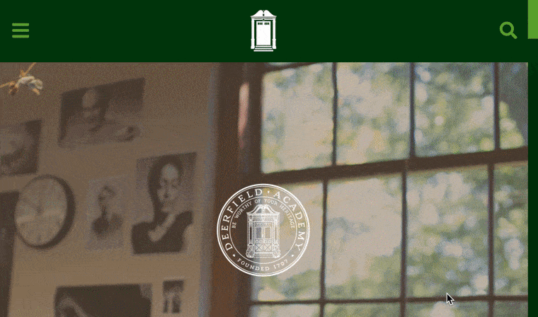
High-quality photos give prospects a clear look into your institution and build trust and credibility. If you have grainy, stretched, or low-resolution images on your website, people may think your website isn’t credible.
ACTION ITEM: Get high-quality photos for your website. You don’t need a professional camera to take them either –– today’s smartphones can be an effective medium for taking high-quality photos at your institution.
BONUS TIP: When adding photos to your website, compress them using an image compression tool like Kraken.io. High-resolution photos tend to be larger file sizes, which can bog down your website. Compressing your image files will ensure you keep the high-quality resolution of your photos without slowing down your site.
15. Misericordia University
Area of focus: Social media integration
To continue on this list of education web designs, let’s look at Misericordia University. Their homepage immediately grabs your attention with their videos and professional design.
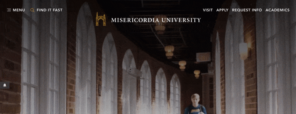
Misericordia University also does a great job integrating their social media into their website’s design. When you scroll down their homepage, you can see a section where you can choose which social media feed you want to see and check out content from their school.
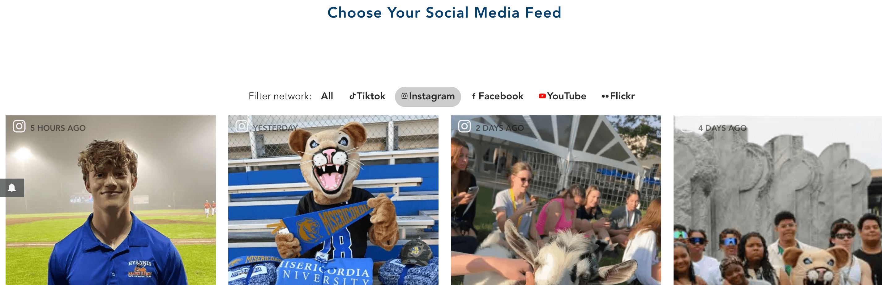
There are numerous benefits to integrating social media into your website’s design. Not only does it provide an inside look at your campus, but social posts can serve as testimonials to the quality of your university.
ACTION ITEM: Integrate your social media into your website’s design to provide an inside look into life on campus.
16. Milton Hershey School
Area of focus: Eye-catching elements
Another one of the top education website designs comes from the Milton Hershey School. This educational website does a great job of integrating high-quality visuals, informative text, and simple design all into one.
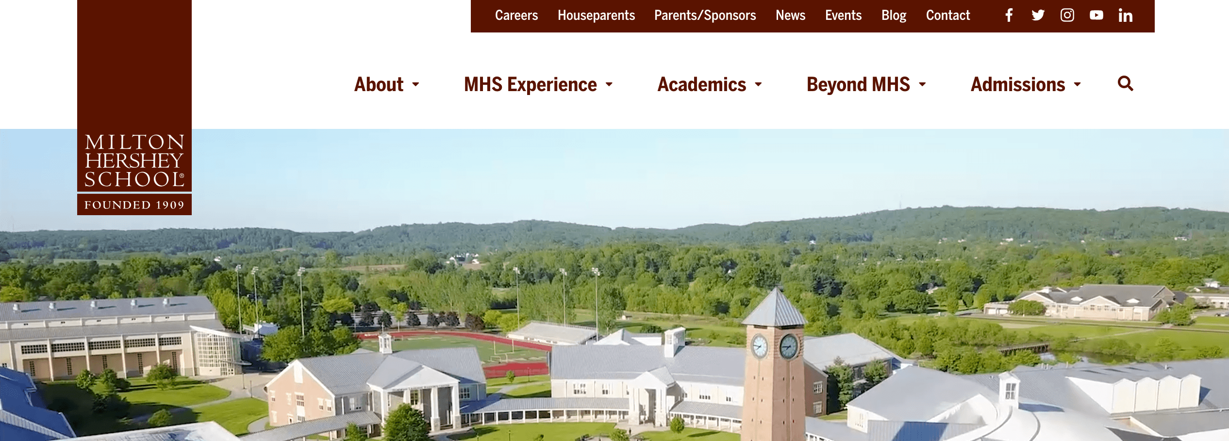
One thing that the Milton Hershey School does well is use eye-catching elements on their website to draw in users. When you enter the homepage, for example, you see drone footage of their campus that immediately attracts attention.
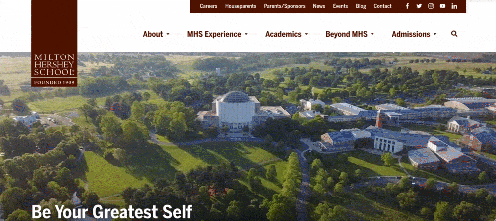
By adding these eye-catching elements, you draw in website visitors and get them to stay. That means they spend more time browsing and learning about your institution.
ACTION ITEM: Integrate eye-catching elements throughout your website to boost interest and engagement. You can add a photo carousel, videos, or moving graphics to help catch your audience’s attention and make your website more attention-grabbing.
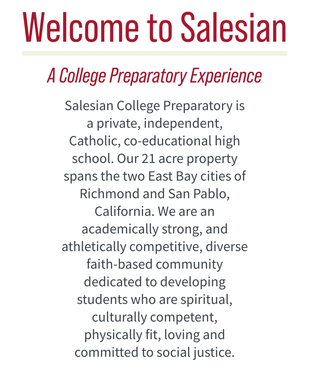
17. Salesian College Preparatory
Area of focus: Web-safe fonts
If you want to see another great example of education website design, check out Salesian College Preparatory. They use a red and brown color scheme, authentic images, and white space to create a pleasant browsing experience.
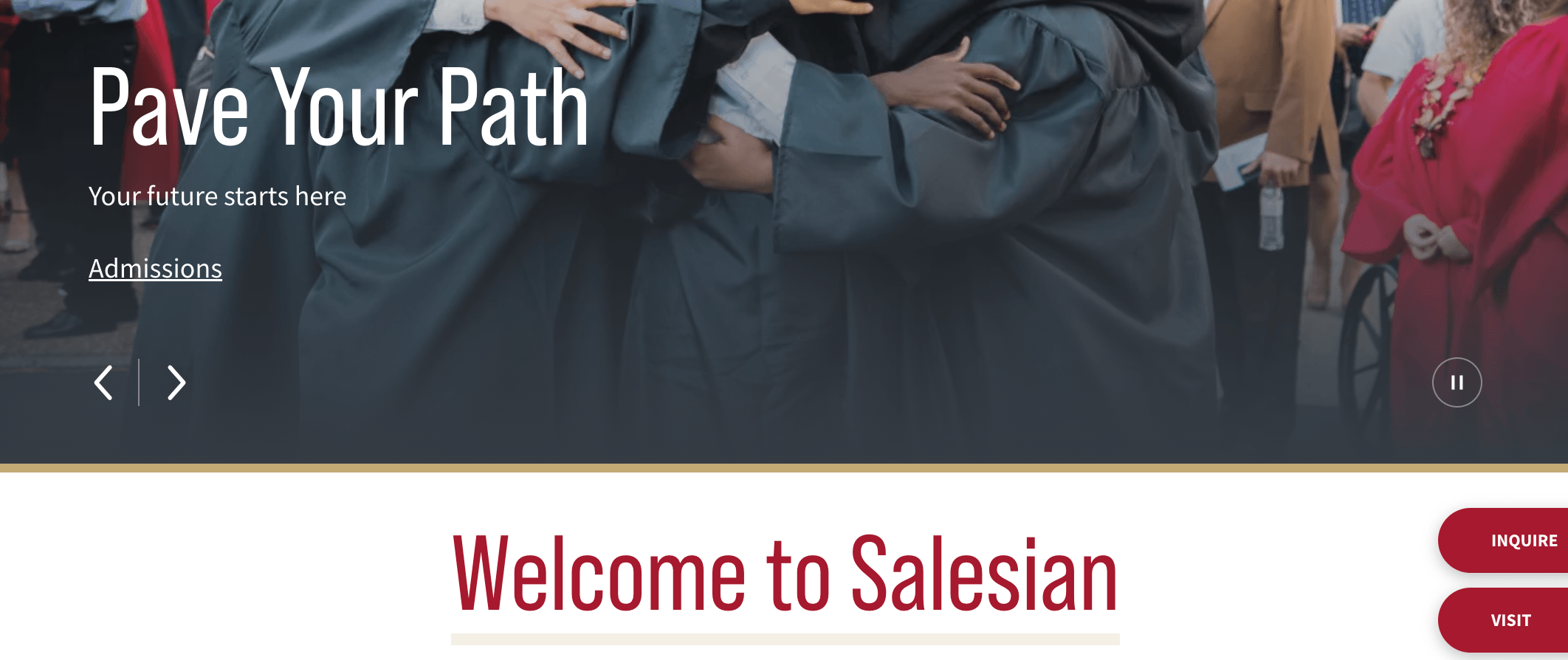
Salesian does a great job of using web-safe fonts on their website. When you look at the text throughout their website, you can see it’s easy to read and clear.
Web-safe fonts are critical for ensuring everyone can read information from your website. If your fonts are too fancy (think cursive fonts), people will have trouble reading information and leave your website.
ACTION ITEM: Choose a web-safe font for your website to ensure everyone can read the information. Use “fancy” fonts sparingly.
18. Louisiana State University (LSU)
Area of focus: Design consistency
Another of the top education website designs comes from LSU. Their website integrates its prominent purple and yellow colors to create a branded experience for website visitors.
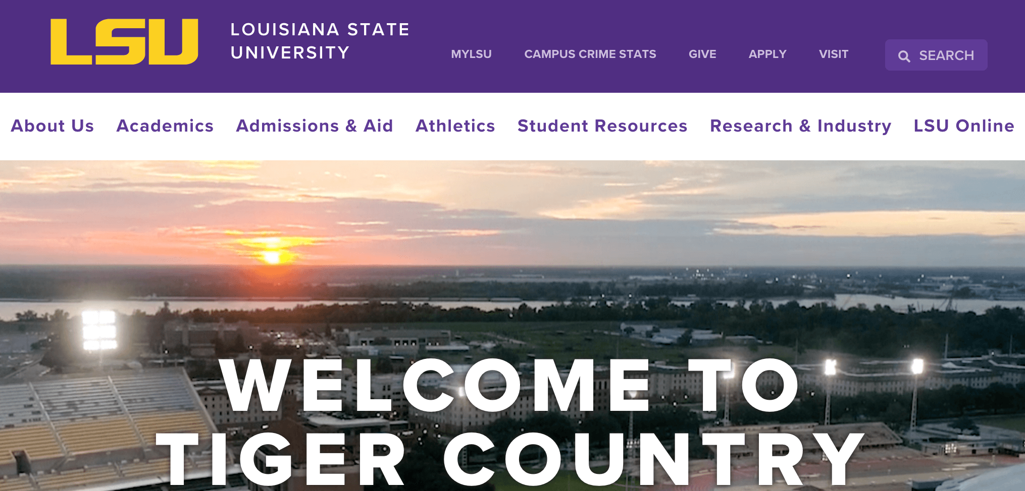
One thing LSU does well is integrate its colors throughout their website. Whatever pages you visit, you’ll see the prominent purple and yellow color scheme.
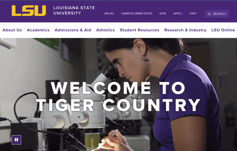
A consistent design is crucial for creating a cohesive experience for your audience. You want people to feel like they’re on the same website when browsing different pages.
ACTION ITEM: Create a consistent design for your website by establishing a style guide. Your style guide will ensure that specific elements on each page are the same, which will help you create a cohesive website.
19. Horace Mann School
Area of focus: Logo integration
Next on this list of educational web design examples, let’s look at the Horace Mann School. When you enter the Horace Mann School’s website, you see tons of nice imagery and simple text descriptions.
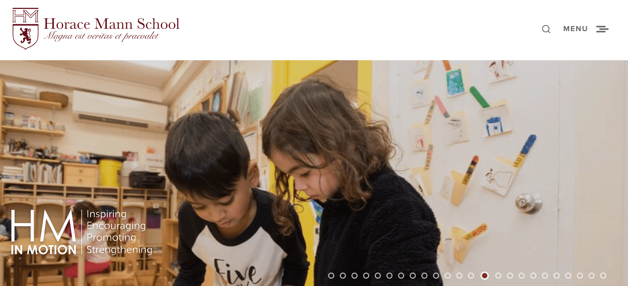
One thing the Horace Mann School does well is logo integration. Not only is their logo integrated into their navigation bar at the top, but it’s also integrated into various other aspects of their website.
![]()
![]()
Logos help build your brand identity and familiarity with your audience. Your logo helps people remember your institution in the future when they’re ready to decide on a school.
ACTION ITEM: Create a defined and noticeable logo. Your logo should fit your brand, be simple, and integrate into your website to help build brand recognition for your institution.
20. The Hotchkiss School
Area of focus: Icons
If you want to see more education website design examples, check out The Hotchkiss School. The Hotchkiss School uses a modern and simple design filled with imagery to help provide insight into life at their institution.
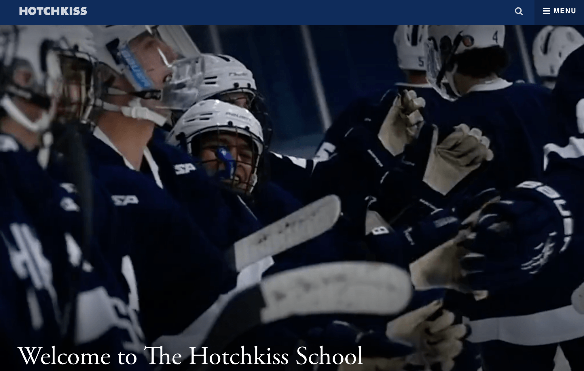
One thing The Hotchkiss School does well is integrating icons to help supplement information. They use icons like a school and a globe to add a visual aspect to pages.
![]()
Using icons can help enhance your message and make your content more engaging.
ACTION ITEM: Use icons when appropriate on your page to help enhance your messages.
21. Barnard College
Area of focus: Fast-loading pages
When looking at educational web design examples, make sure you take a look at Barnard College. Their website uses high-quality images and a simple blue-and-white design to attract prospective students.
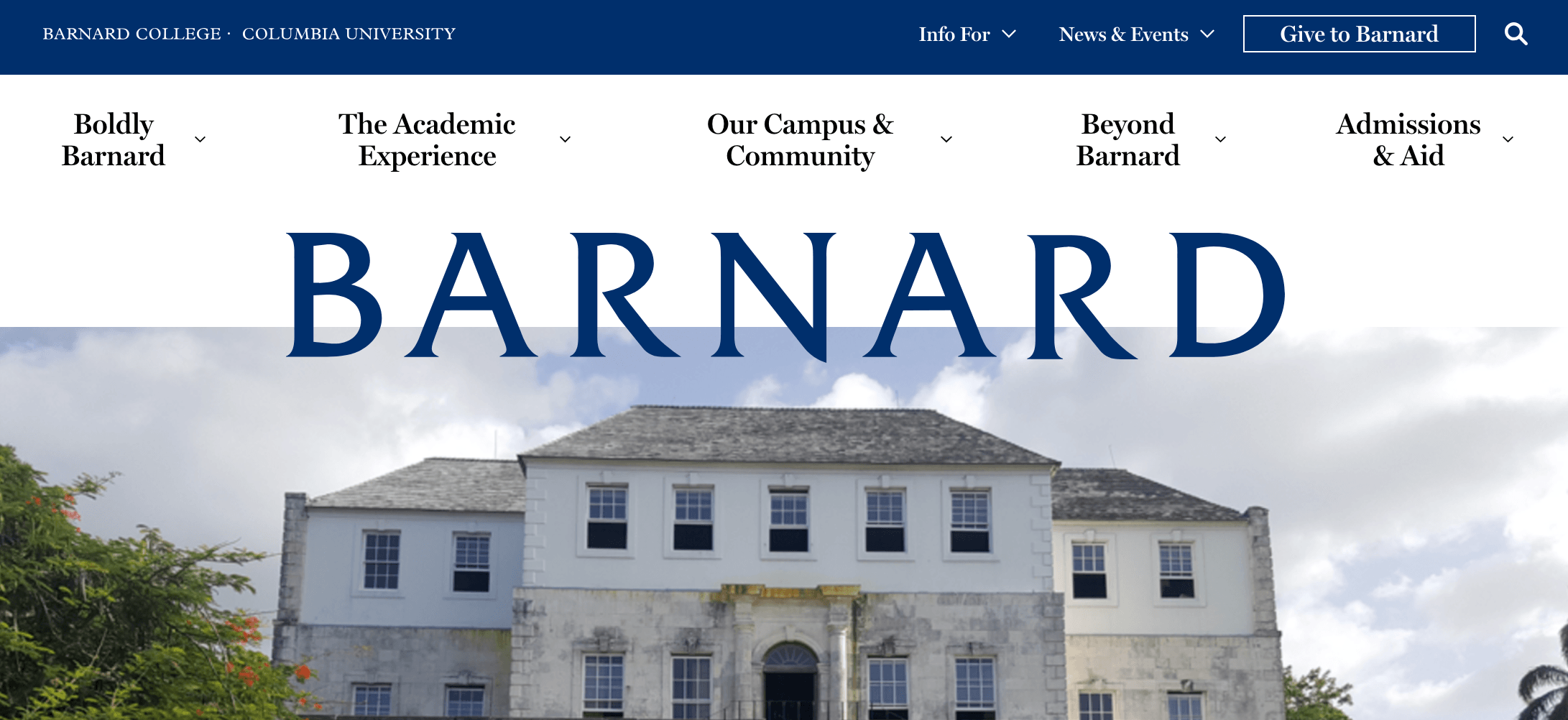
One notable element about Barnard College is its page speed. When you go to Barnard College’s website, the information loads quickly.
A fast-loading website is crucial for keeping people engaged, considering 83% of people expect a website to load in three seconds or less.
ACTION ITEM: Speed up your website. You can use Google PageSpeed Insights to help you see what your website’s current load time is and get suggestions for improving it.
22. University of Wyoming
Area of focus: Virtual tour
The University of Wyoming is another great example of good education web design. They integrate their school’s brown and yellow color scheme throughout their website to help build brand recognition.
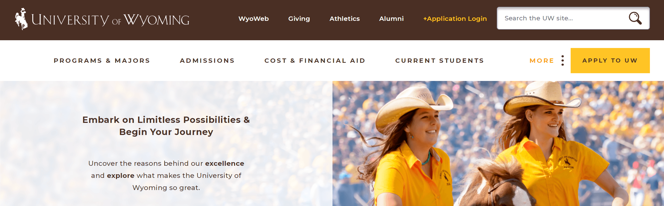
University of Wyoming’s website offers a unique virtual tour. They integrate a 360-degree virtual tour that prospective students can use to explore the campus.
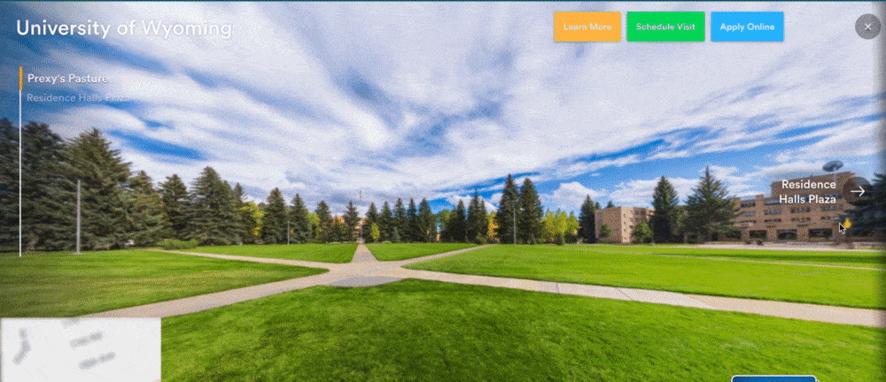
Adding a virtual tour is a great way to help people see what your campus looks like, especially if they are students that aren’t close enough to visit in person. It’s a great way to help prospective students learn about your campus.
ACTION ITEM: Consider adding a virtual tour to your website. It’s a great way to give all students insight into your campus and what you offer.
23. Pingry
Area of focus: Video integration
Up next on the list is Pingry. This education website uses a simple blue-and-white design to engage prospective students that visit their site.
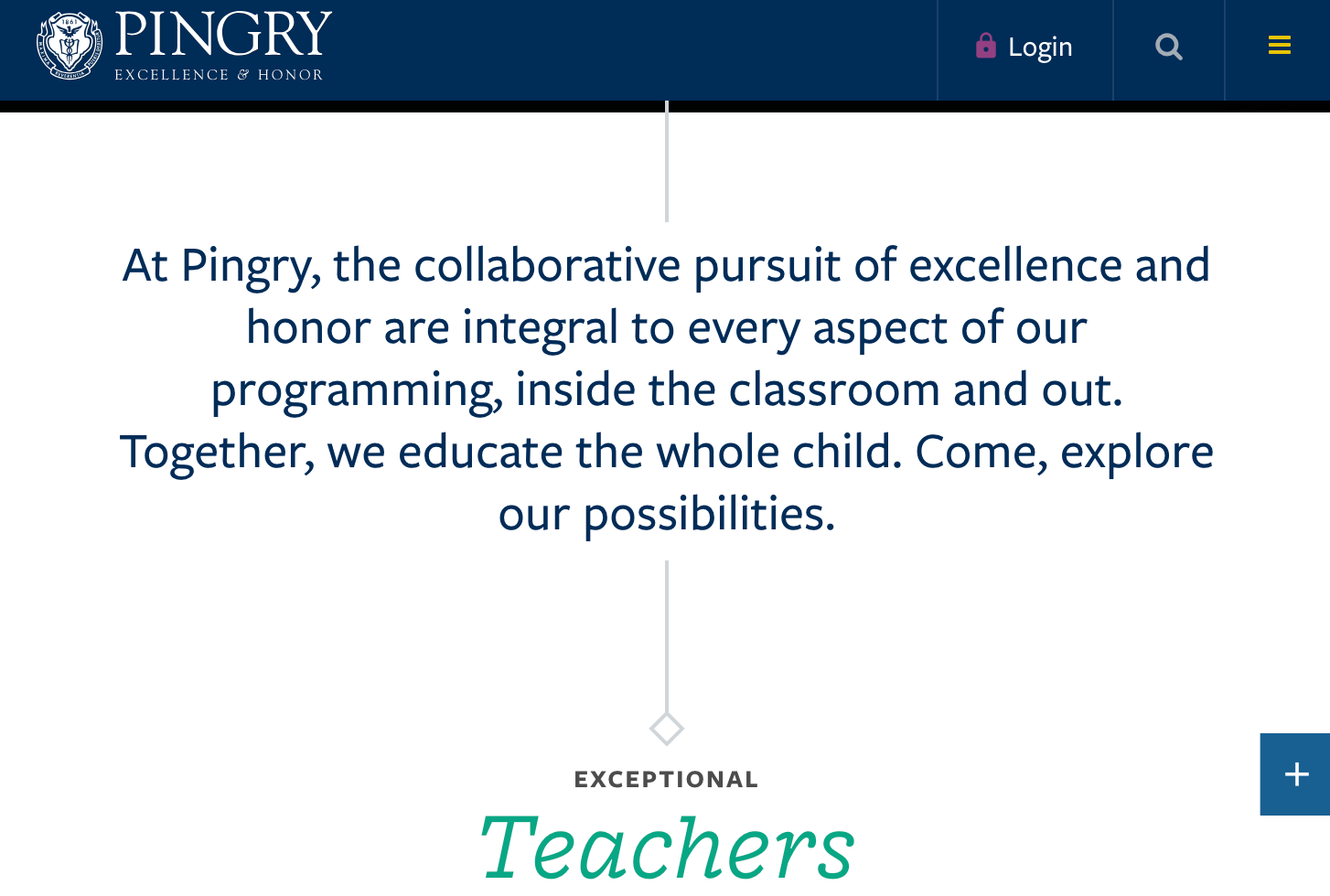
Pingry does a great job of integrating video into their website. They use videos to showcase their campus so students can learn what life is like at their school.
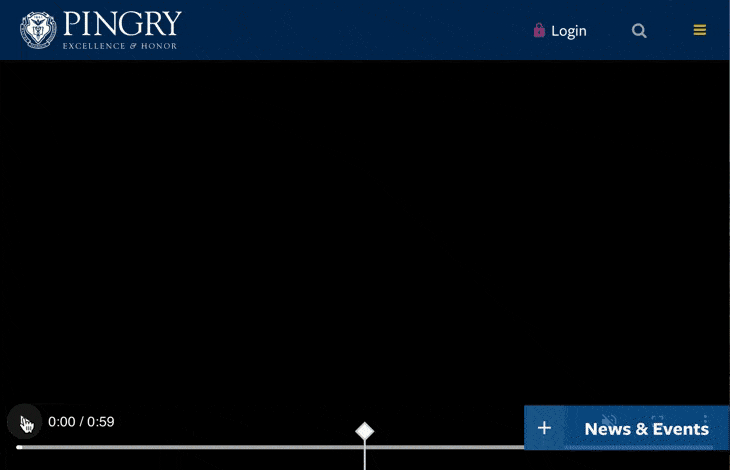
Integrating video helps you catch your audience’s attention and keep them engaged. It’s also a great medium to deliver a lot of information efficiently.
ACTION ITEM: Integrate videos into your website’s design. You’ll want to host your videos on an external platform to ensure they don’t slow down your website.
24. University of Florida
Area of focus: Responsive design
To continue on this list of education web designs, let’s look at the University of Florida. This university has a modern design that features high-quality imagery and clear, easy-to-read text.

One notable aspect of the University of Florida’s website is the responsive design. If you access their website on a device with a smaller screen, their website adapts to fit that screen.
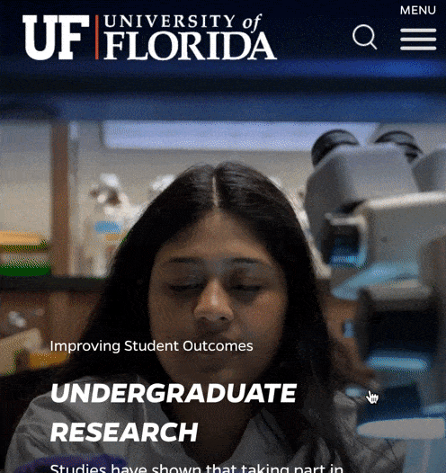
A responsive design is crucial for ensuring you provide a positive experience to anyone who visits your website. Considering that over 50% of online traffic comes from mobile devices, you need a mobile version of your website.
ACTION ITEM: Integrate responsive design into your website to ensure a positive mobile experience for all website visitors. Make sure you use mobile-friendly features, like hamburger menus and thumb-friendly buttons, to provide the best user experience.
25. Princeton University
Area of focus: Integration of content
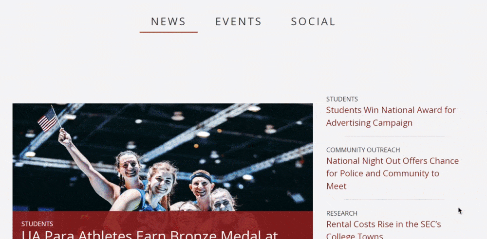
Want to see more of the top educational website designs? Look at Princeton University. This college uses a clean and simple design to get prospective students interested in their institution.
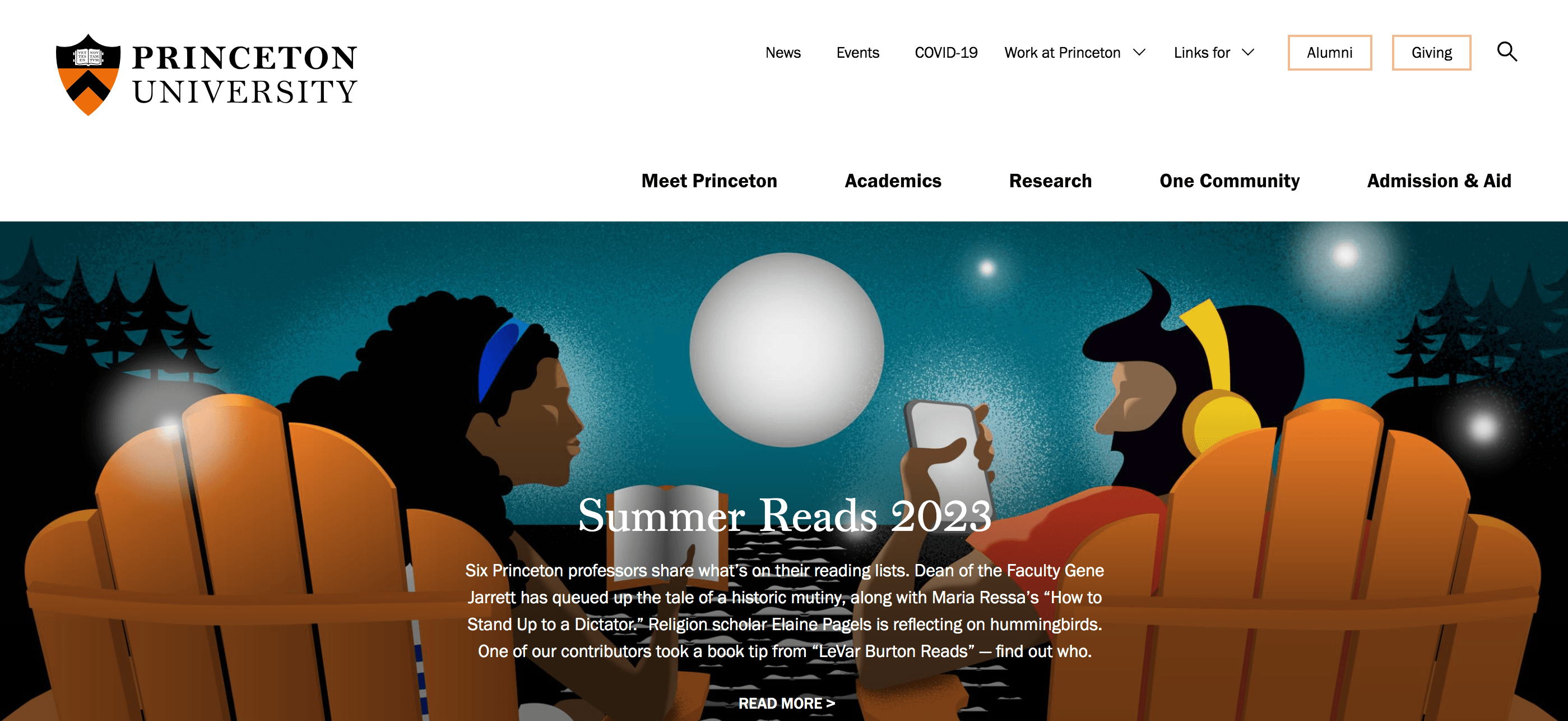
Princeton University does a great job of integrating content into the website’s design. They have a dedicated section for university news, for example, where people can learn about what’s happening at their institution.
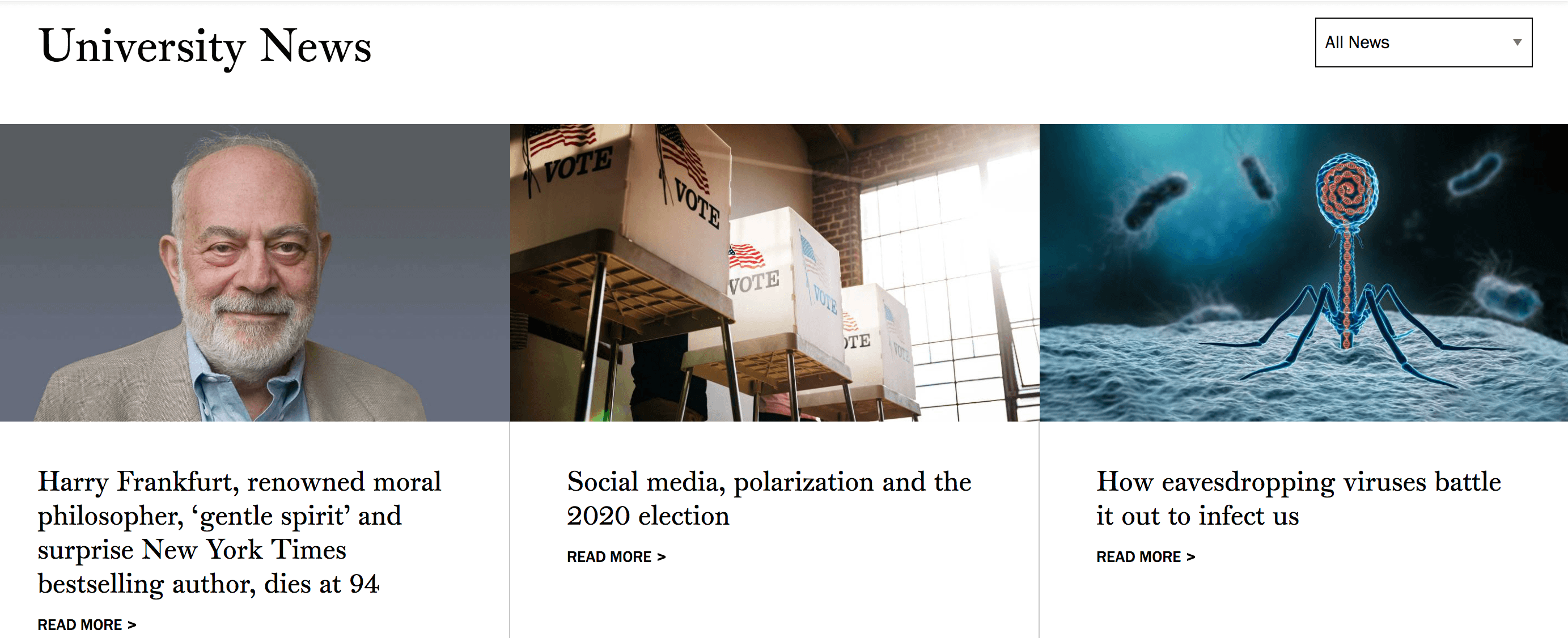
Sharing information is a great way to keep prospects engaged on your website. They spend more time learning about your institution, which can help you get more prospective students to your school.
ACTION ITEM: When designing your website, create an area where you can share content with prospective students. You can create a dedicated blog, for example, to share helpful information with website visitors.
26. Oregon State University
Area of focus: Eye-catching graphics
If you want to see one of the most eye-catching education web designs, check out Oregon State University. Oregon State University uses a bold orange and black design with its environmental school logo to create an inviting experience for website visitors.
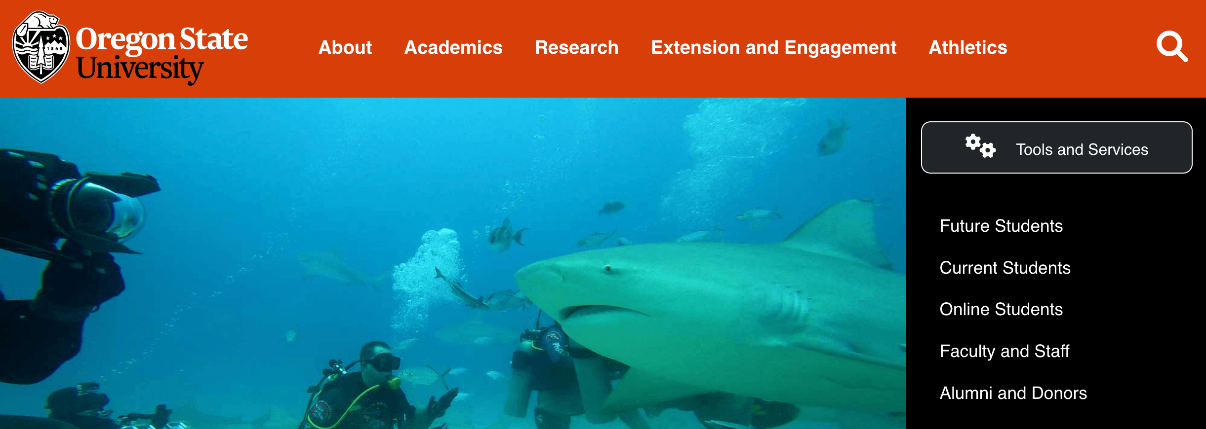
This college does a great job of integrating eye-catching graphics into their design. As you scroll through their pages, you’ll see numerous graphics that catch your attention, like an octopus icon to promote their oceanography program, and draw you in to read the information on their page.
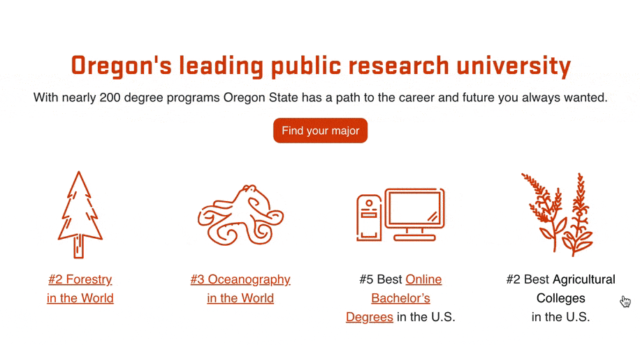
Eye-catching graphics are a great way to draw people to your website and keep them engaged.
ACTION ITEM: Integrate graphics into your website when appropriate. Make sure they fit with your website’s design and are purposeful.
27. University of Georgia
Area of focus: Readability
If you want to keep seeing education website design examples, check out the University of Georgia. The University of Georgia uses high-quality visuals with a modern design to provide an excellent experience for its audience.
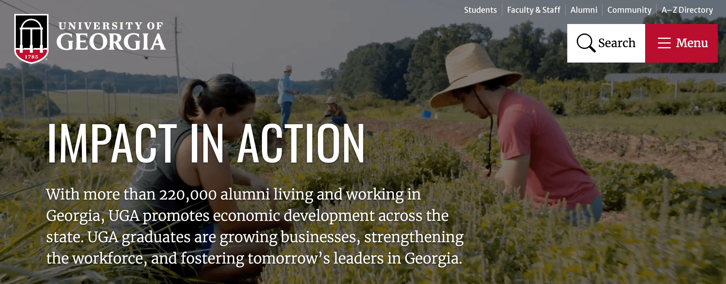
This university does a great job of making its text easily readable. They use small paragraphs and break up information into small, digestible sections. It’s easy to skim the website and find the information you need.
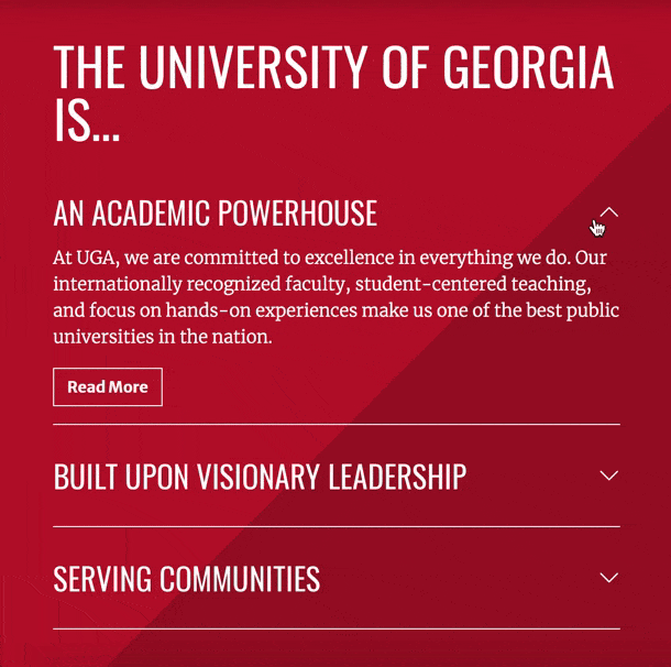
When you add text to your website’s design, make it easily readable. Big paragraphs of text will discourage people from reading content on your website and may cause them to leave altogether.
ACTION ITEM: Make the text on your website easily readable. Use small paragraphs of text and bulleted lists to help make it easy to read information on your website.
28. Andover
Area of focus: Interactive elements
Next on our list of education website design examples, check out Andover. Andover has a simple website with moving elements that catch your attention as you scroll and learn more about their institution.
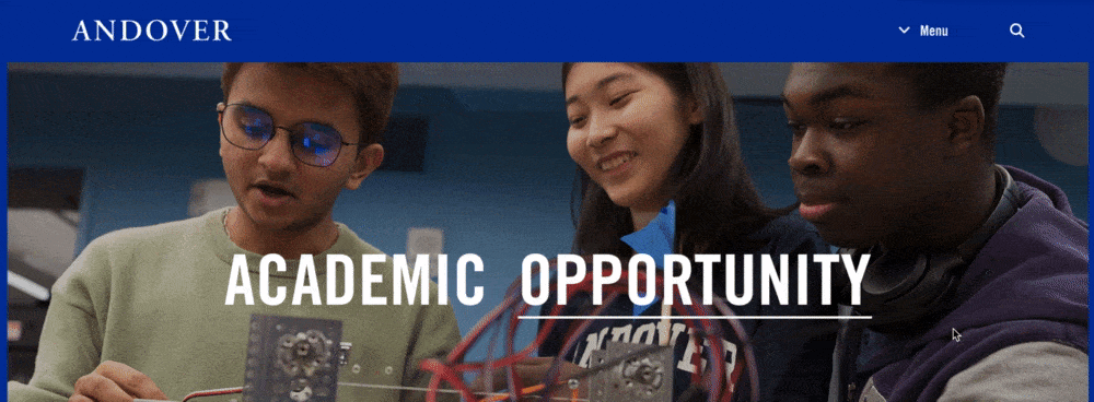
One aspect that catches our attention with Andover is their interactive elements. When you scroll down the page, they have a section on “A Day in the Life,” where you can click on a student and see a quote from them about what it’s like to be at Andover.
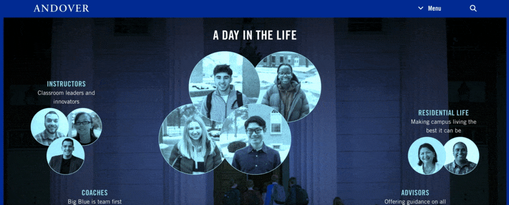
Having interactive elements is valuable for boosting engagement on your website. It can entice prospects to keep interacting with your website and learn more about what your institution offers.
ACTION ITEM: Add interactive elements to your website. You can use interactive elements to present testimonials, provide an exploratory map of campus, and more.
29. The Dalton School
Area of focus: Website layout
Want to see more web design examples for education? Check out The Dalton School. This institution fills their website with high-quality imagery and informative copywriting.
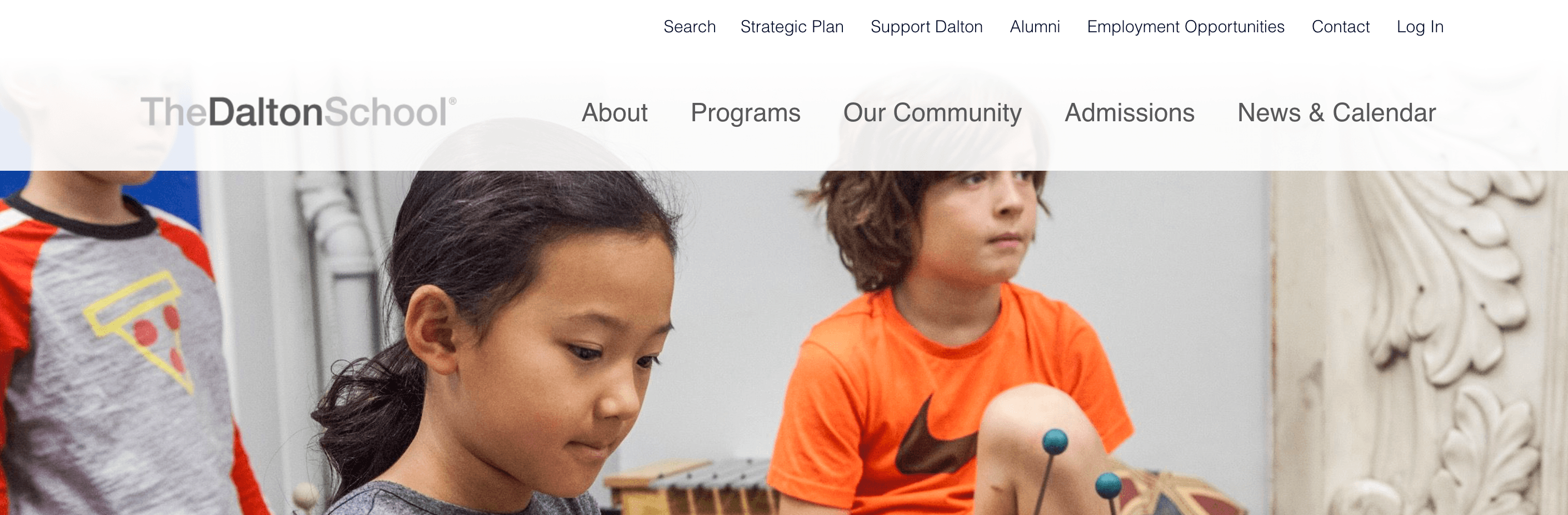
When you visit The Dalton School’s website, you’ll notice the layout is easy to follow. It’s simple and keeps all the information organized, so visitors can find what they need when they’re on the website.
Having a simple website layout is crucial for keeping prospects engaged on your website. If your design is complicated to follow, people will get discouraged and leave.
ACTION ITEM: When you design your website layout, consider using a wireframe to help ensure your website is simple and easy to follow. Wireframing let’s you lay out all the features you want for your website without making it cluttered or confusing.
30. Alvernia University
Area of focus: Above-the-fold attention
To continue on this list of education website design examples, let’s look at Alvernia University. They integrate their maroon, gold, and black color scheme throughout their website to build a consistent browsing experience.
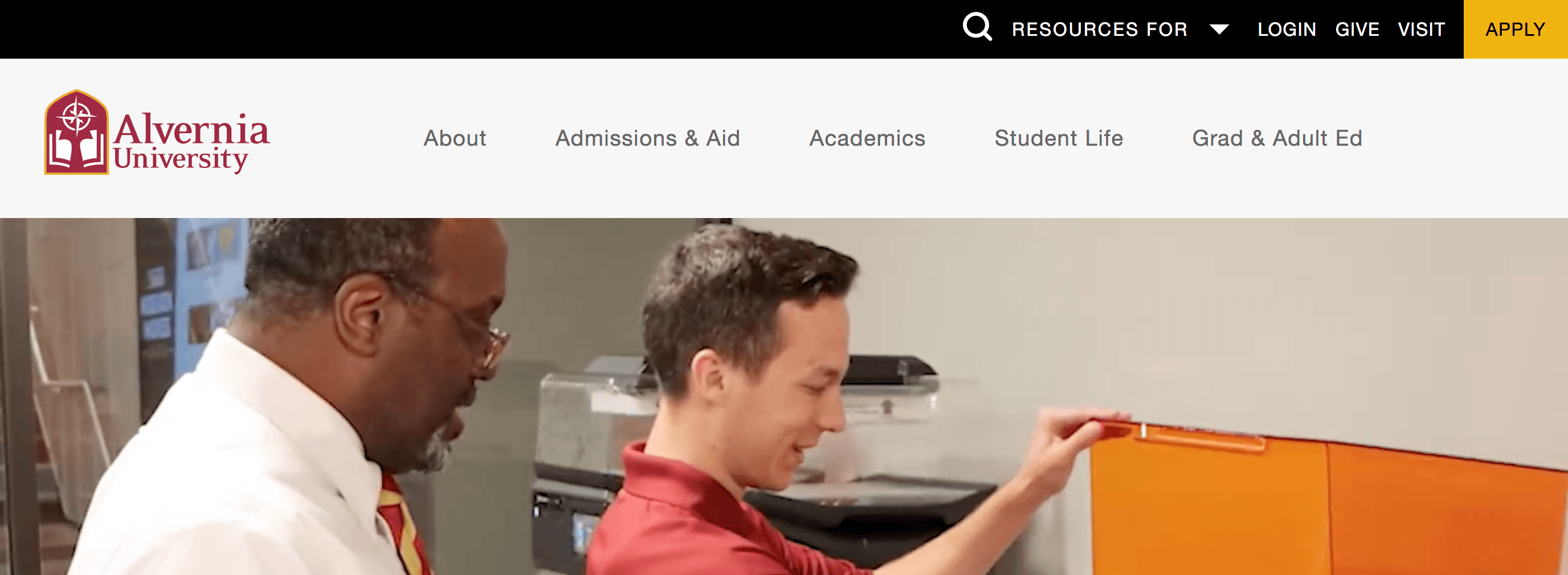
What stands out the most about Alvernia University’s website is the above-the-fold content. When you enter their website, it catches your attention immediately with moving videos at the top of the page.
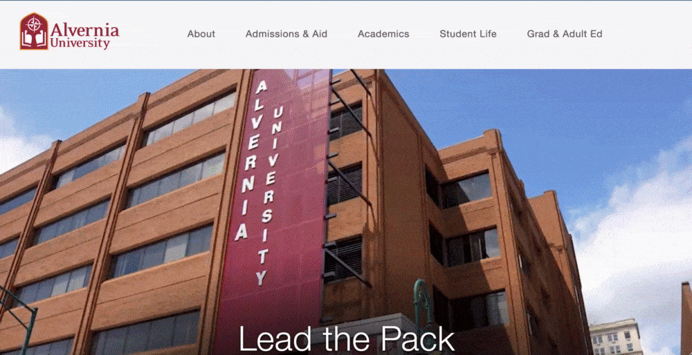
Creating an eye-catching, above-the-fold experience is crucial for keeping prospective students on your website.
ACTION ITEM: Create an engaging above-the-fold experience with your website. You can use high-quality images, videos, or something similar to catch your audience’s attention.
31. New Mexico State University
Area of focus: Chatbox
To wrap up this list of education website designs, let’s look at New Mexico State University. This institution has a simple maroon and white web design and numerous high-quality images to engage prospective students.
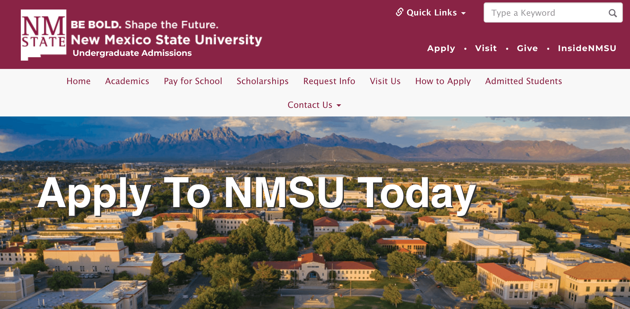
One notable element of New Mexico State University’s website design is their integration of a chatbox feature. This chat box enables prospective students and their families to ask questions as they browse the website.
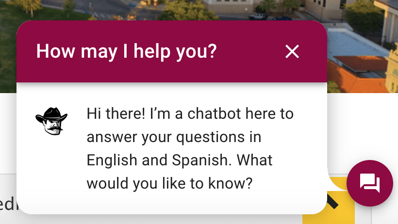
A chatbox function is an excellent way to provide helpful information to prospective students, especially when they ask common questions that don’t require a human answer. Integrating a chatbox with a chatbot can help you provide information fast and move prospective students closer to applying.
ACTION ITEM: Find the right chatbox software for your institution and budget so you can integrate it into your website.
Feeling inspired by these education website design examples?
After looking at all these web design examples for education, you may feel inspired to get started with your website. You may feel overwhelmed, though, with everything you need to include in your website’s deisgn.
That’s where the experts at WebFX can help. We have a team of over 750 web design experts with experience crafting award-winning websites. Check out our design portfolio to see some of the awesome work we’ve done!
If you’re ready to build your dream website and get more students on your campus, contact us online or call us today at 888-601-5359 to speak with a strategist about our web design services!
We Drive Results for Higher Ed Centers
- 188+ education industry experts
- Renowned for our communication and transparency


Table of Contents
- 1. University of Alabama
- 2. Cameron University
- 3. Moravian Academy
- 4. University of Louisville
- 5. Drexel University
- 6. Stanford University
- 7. Texas A&M University
- 8. Academy for Thinkers
- 9. Lausanne Collegiate School
- 10. Moorlands
- 11. St. Joseph’s College of Maine
- 12. Groton
- 13. Seven Generations Charter School
- 14. Deerfield Academy
- 15. Misericordia University
- 16. Milton Hershey School
- 17. Salesian College Preparatory
- 18. Louisiana State University (LSU)
- 19. Horace Mann School
- 20. The Hotchkiss School
- 21. Barnard College
- 22. University of Wyoming
- 23. Pingry
- 24. University of Florida
- 25. Princeton University
- 26. Oregon State University
- 27. University of Georgia
- 28. Andover
- 29. The Dalton School
- 30. Alvernia University
- 31. New Mexico State University
- Feeling inspired by these education website design examples?
- We Drive Results for Higher Ed Centers
Solving key challenges for higher education
We’re not driving enough traffic to our school’s website
Need to get more prospective students or even alumni to visit your website? Our team will help you increase your website’s rankings in the search results when potential students search for your courses online, alumni look for the latest news, and more.

We’re opening a new campus
Set your new campus (or even program!) for success with revenue-driving digital marketing strategies that boost your new school’s online visibility and spread the word so you can fill your building with new students.

We’re not attracting new students
Need to grow enrollment rates? Get access to highly targeted advertising campaigns and effective marketing strategies that reach your target audience where they spend their time online and encourage them to become students.

We’re struggling to secure funding
Not securing enough funding from alumni or donors? Our experts can help get your school in front of prospective donors’ eyes so you can secure the funding you need to run your school and classes.

Increase student enrollment and engagement
- 4 Email Marketing Tips for Higher Education
- 9 Best College Websites to Emulate
- Best Student Recruitment Strategies
- Education Marketing ROI: How to Calculate and Improve It
- Education Trends for 2026: Teaching for Tomorrow
- Future Trends in Higher Education Marketing
- How to Increase College Enrollment
- How to Increase Higher Education Enrollment with SEO
- How to Market a College: 11 Marketing Strategies for Universities & Colleges
- Social Media for Higher Education
- The Best Higher Education Marketing Agency: WebFX
- education statistics/education industry statistics