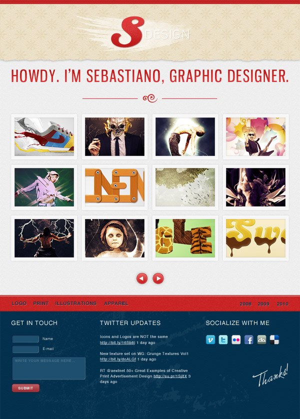
Preview
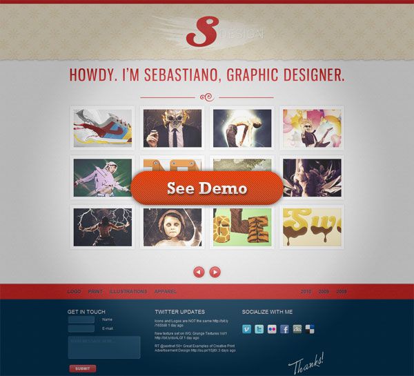
Live Demo
We have also provided a working XHTML web template as a proof of concept for this web design including an animated slider handcrafted using jQuery just for this tutorial. Click below to see the demo.
You can download the web page template below and study the code as we will not be covering the working template in this tutorial.
Tutorial Resources
- Font: Gnuolane via dafont.com
- Brushes: Grunge metal scratches by WeGraphics
- Font: Monika by Catrina fonts
- Icons: Social Network Icon Pack by Komodo Media
- Font: Diavlo by Jos Buivenga
- Brushes: Subtle grunge textured Photoshop brushes by WeFunction
Introduction to the Web Design Process
The web portfolio is the best way to catch new clients. In today’s market, it represents the most powerful way of getting hired for new projects and also as way for you to make a successful brand on the web.
This is why every designer should give great importance to how his personal site is structured. It’s important to put all graphical elements in strategic positions so that you can make the most of a potential client’s visit.
To build a web page is never simple.
I generally start by taking inspiration from CSS galleries. When I visit other sites, two things grab my attention in particular.
Structure/Organization
Pay attention to where to put your portfolio pieces and how to enhance them so that they are visually appealing. Think about where to put your contact form and information so that it is easily seen by potential clients.
A practical approach to visual hierarchy consists of interacting with the site you’re admiring.
For example, if you came across a site and you quickly find the way to navigate to the author’s portfolio, it means that there’s something to learn from it.
If you spend a lot of time trying to locate the contact page link, for example, it means that there’s a deficiency in site usability. You can also learn from these types of layout “bugs.” If the contact link is difficult to find on a site that you have visited, maybe you can think of ways to solve that issue so that you can avoid it in your own design.
Design
The core of the web portfolio is the gallery where you show off your projects. In addition, the site’s design and theme can say a lot about you too.
It’s all about the sensation you want to transmit to your visitors. If you are an illustrator who loves to use colored vector swirls in your work, put some of these trademark elements into your web design. If your design style is modern, design your web portfolio as such.
If you like creating grunge designs — then go with a grunge theme in your web portfolio’s web layout.
Find a balance between site aesthetics and usability; they are not mutually exclusive. Usability and visual appeal can go hand and hand if you are aware of what you are trying to achieve.
Now that you know a little bit about my philosophies in designing websites, let us get started.
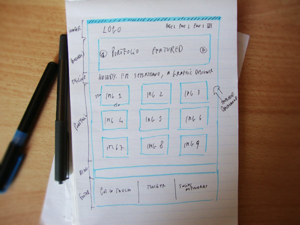
First, I’ve sketched out the site structure on paper. This gives me a general idea of the layout that I will create in Photoshop.
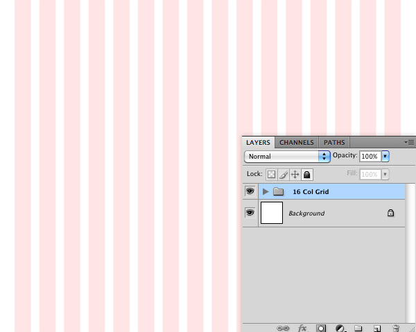
Step 1: Download and Open the 960 Grid System
Download the 960 grid Photoshop template.
It will help you create a well-structured and well-aligned site that is 960px wide. Open the 16 columns template.
Step 2: Create the Background Noise Pattern
The idea behind the design is to create a textured and intricately detailed layout. Let’s start from the background: We will create a tillable pattern to fill it.
The reason we want a repeating pattern is to conserve bandwidth: The user will only need to download a single small image that we can repeat using CSS instead of loading large heavy textures. Doing so reduces page-loading times, and in turn improves the user’s experience.
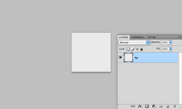
Create a new 50x50px document in Photoshop (Ctrl/Cmd + N) and fill the Background layer with a soft gray (#eaeaea). You can do this by setting your Foreground color to the soft gray color, and then using the Fill command (Shift + F5) with the Use option set to Foreground Color.
Apply a Noise Filter
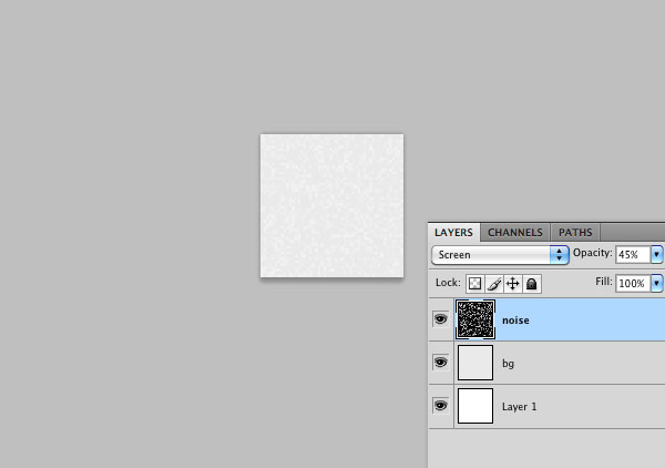
Create a new layer in the 50x50px document and fill it with black.
Add a noise effect (Filter > Noise > Add Noise) setting Uniform as the Distribution option and 90% as the Amount.
Switch the layer’s Blend Mode to Screen and reduce its Opacity a little bit to make the noise softer.
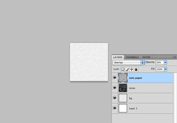
Apply a Note Paper Filter
Create another layer on top of the Noise filter layer.
Also fill this new layer with black.
Choose Filter > Sketch > Note Paper. Use the default options for the filter. Next, set the layer’s Blend Mode to Overlay with the Opacity reduced to about 30%.
The background pattern is now complete.
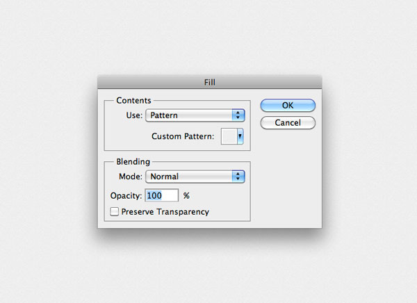
Go to Edit > Define Pattern to save it.
Step 3: Apply the Background Noise Pattern
Switch to our main Photoshop document. Select the Background layer in the Layers Panel and go to Edit > Fill (Shift + F5). Here, set the Use option to Pattern and in the Custom Pattern dropdown menu, find the pattern you just created.
Perfect!
The background is now complete. You can save the 50x50px pattern’s PSD for the HTML/CSS conversion of our web design (if you want).
Step 4: Create the Vintage Flower Header Pattern
For the header, I want to use another pattern. Now I’ll walk you through the process of creating a simple vintage-looking flower in Illustrator that we will import in Photoshop to create a second pattern.
For those who want to skip creating this vector, it is available in the source file download below.
Create the Flower in Illustrator
Create a new document in Illustrator. The size of the artboard doesn’t matter.
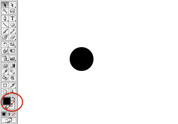
Once the new illustrator document is ready, set your Fill color to black and Stroke to None.
Grab the Ellipse Tool (L) from the Tools Panel and then draw a black circle (hold down Shift to draw a perfect circle).
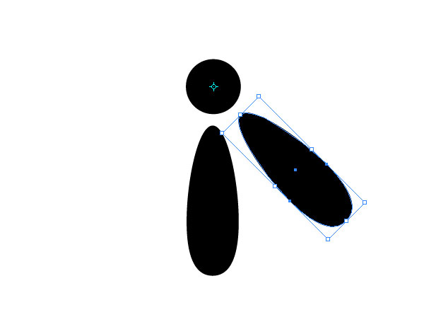
Draw another ellipse underneath it — this is going to become the first petal of our flower. With the Direct Selection Tool (A), select the two anchor points on the left and right side of the ellipse and drag them towards the bottom.
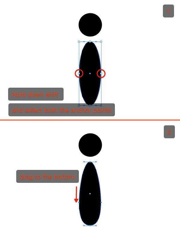
Choose the Rotate Tool to move the center of the rotation so that it will coincide with the center of the first circle.
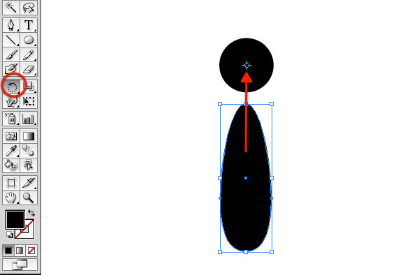
Hold down Alt/Option + Shift and move the petal to duplicate and rotate it.
Note: Alt/Option is often used to duplicate objects; this is why we press it down during the rotation.
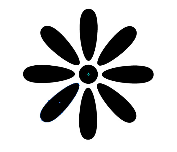
We simultaneously press Shift with Alt/Option to rotate the petals precisely at 45o increments.
Now a useful Illustrator trick: Press Ctrl/Cmd + D to apply the same transformation. Click Ctrl/Cmd + D repeatedly until the flower is complete.
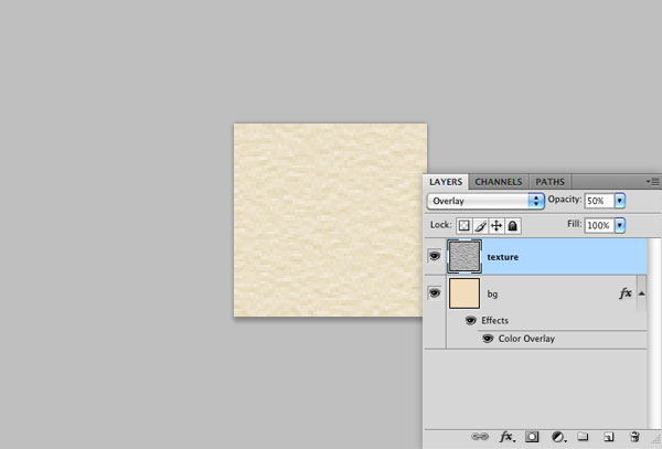
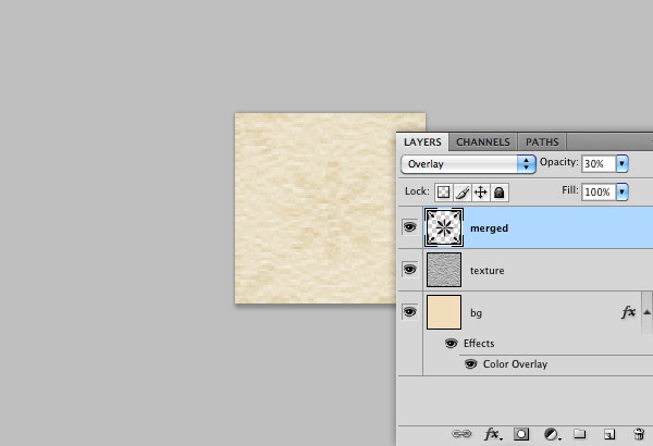
Create the Pattern in Photoshop
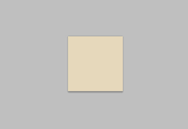
Create a new 70x70px document in Photoshop and fill its background with a subtle beige (#e6d9bb).
As we made with the first pattern, create a new black layer and apply the Note Paper filter to it. Afterwards, switch the layer’s Blend Mode to Overlay and reduce its Opacity to 50%.
In Illustrator, select the flower vectors, copy them (Ctrl/Cmd + C), and then paste them (Ctrl/Cmd + V) in Photoshop as a smart object.
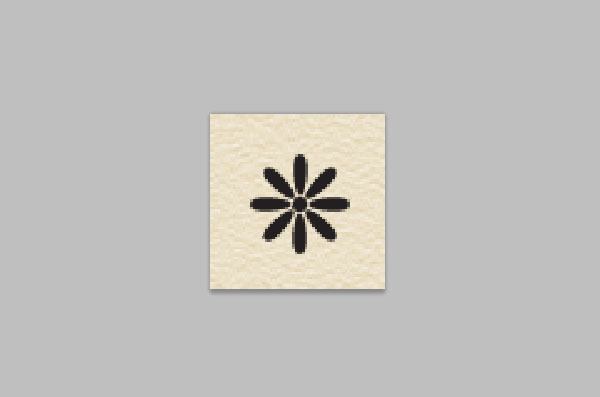
Make sure that the flower layer in the Layers Panel is your active layer.
Press Ctrl/Cmd + J to duplicate the flower layer and move the duplicated one on the top-left corner of the 70x70px canvas.
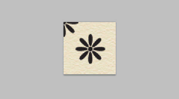
Duplicate the flower 3 more times to cover the remaining 3 corners of the canvas.
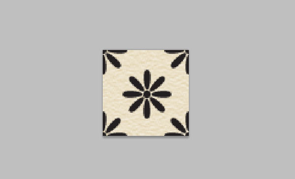
In the Layers Panel, select all the layers containing the flowers and merge them (Ctrl/Cmd + E) into just one layer. Switch the layer’s Blend Mode to Overlay and reduce the Opacity to 30%.
You can now save the vintage flower pattern by going to Edit > Define.
Step 5: Apply the Vintage Flower Pattern to the Header
Make a new layer group by pressing the Create new group icon at the bottom of the Layers Panel. Make sure that the layer group is above the Background layer.
Keep our PSD organized by naming the layer group as “Header”. While working with web layouts in Photoshop, organization of your layers will help you code a web design more quickly and with less prevalence of errors.
Create a layer inside the “Header” layer group, grab the Rectangular Marquee Tool (M) and make a selection of around 200px height that spans the entire canvas; this is the area you want to fill with the pattern.
Go to Edit > Fill, set the Use option to Pattern and find your vintage flower in the Custom Pattern option’s dropdown menu.
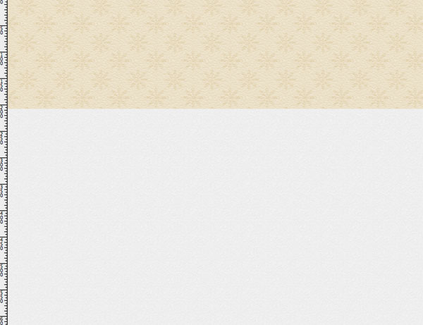
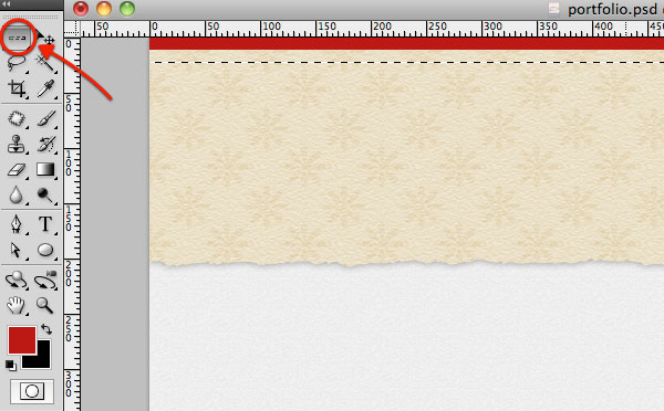
Step 6: Add the Ripped Paper Effect to the Header
To create the ripped paper effect, grab the Lasso Tool (L) and make an irregular selection at the bottom of the header area.
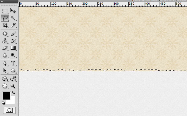
Simply press Delete to remove the selection.

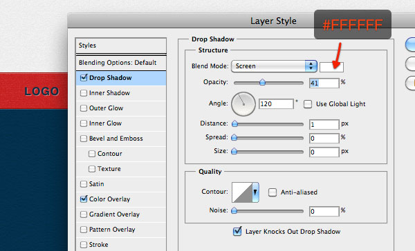
To stylize the ripped paper effect, add a soft drop shadow layer effect by right-clicking on its layer in the Layers Panel, choosing Blending Options from the menu and then clicking on Drop Shadow on the left of the Layer Style dialog window that appears.

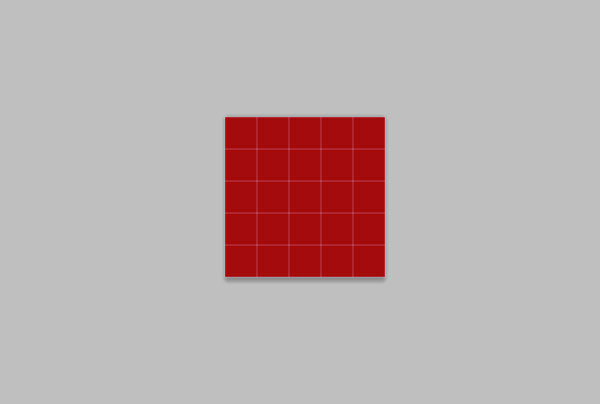
Step 7: Create the Top Red Bar
The top red bar in our web layout is a simple visual flourish that can give our work some originality as well as reinforce the color palette (red) to develop our theme. Create a new layer and use the Rectangular Marquee Tool to make a 10px-high selection that spans the entire canvas.
Fill the selection with a red color (#bc1515).
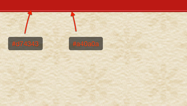
1px Horizontal Lines to Give Depth
The clever use of 1px lines can give the illusion of depth to your designs. In this case, create a new layer and place a selection at the bottom of the top red bar using the Single Row Marquee Tool.
Set the Foreground color to a light red (#d74343), then hit Alt/Option + Delete to fill the selection. Move this line immediately below the red bar using the Move Tool (V).
Using the same process, create a second line that’s a darker red color (#a40a0a).
Create the Top Bar Pattern
It’s time for another pattern (that is provided in the source files if you are feeling lazy).
If you want to create it by yourself — Great! — just follow the process that follows.
Create a new 5x5px document in Photoshop. Since we will create some diagonal white lines, fill the background with red (temporarily) so we can visualize the lines.
With the Line Tool (U), create two diagonal lines (press Shift while drawing the lines to keep them straight).
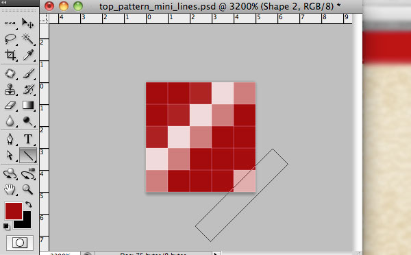
Hide the visibility of the red background and save the pattern (you know the drill by now).
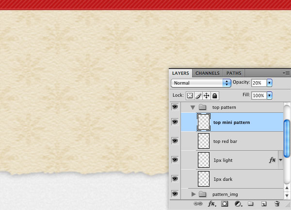
Switch to our main canvas and create a new layer above the top red bar’s layer.
Ctrl/Cmd + click on the top red bar’s thumbnail in the Layer’s Panel to make a selection around it, then go to Edit > Fill, choosing our diagonal pattern for the fill.
Then, reduce the Opacity of the layer to about 20%.
The top red bar now looks nice, doesn’t it?
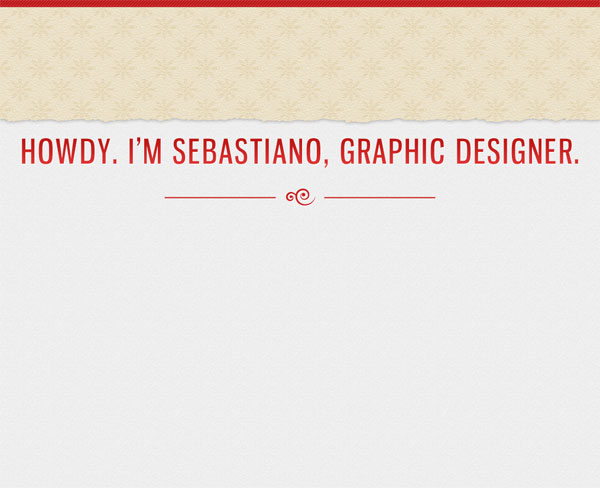
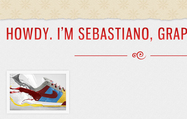
Step 8: Design the Site’s Introduction Tagline
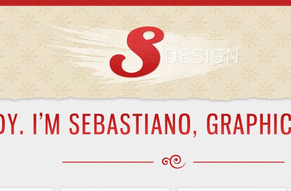
The tagline is a fundamental element of a portfolio in my opinion.
It should be a brief and concise description of who you are and what you do. This makes first-time visitors immediately know they’re in the right place so that they can be encouraged to explore your site further. Keep in mind that the tagline is often the first thing that attracts the user’s attention in a layout such as ours: so make your tagline’s copy great!
Make the tagline evident but not so excessive that it distracts the user’s experience as she traverses your site.
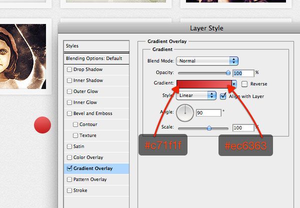
In my case, I’ve used the Gnuolane font to introduce myself to the visitors. I’ve given the text layer a Gradient Overlay going from a dark red (#bc1515) to a lighter one (#e03636).
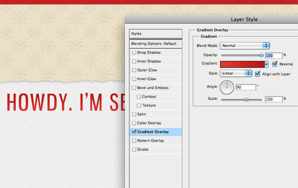
To embellish the text, duplicate it (Ctrl/Cmd + J) and move the duplicated layer to the bottom of the original text layer.
Remove the Gradient Overlay and replace it with a white Color Overlay. Now click the Down arrow key once, and then click the Right arrow key once too to offset the text a bit.
Voila! A quick and easy solid drop shadow that gives the text some more depth.

To create a visual separation between the tagline and the slideshow gallery (that we have yet to create), I have added 2 horizontal lines (2px height) and a swirl in the center (you can find this swirl element in the source files).
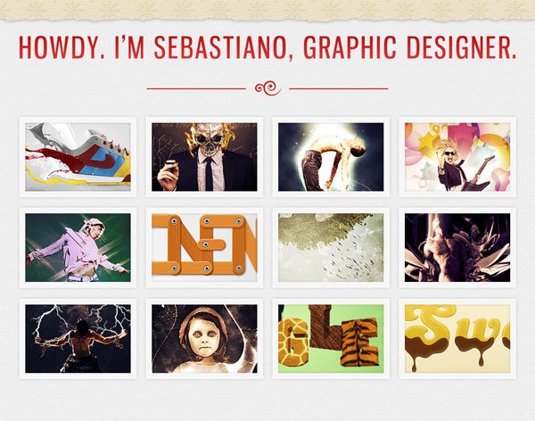
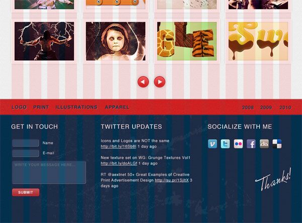
Step 9: Design the Slideshow Gallery
This is the most important area of a portfolio.
Clients want to see what you are able to do. Don’t hide your work — put them in a prominent position. For my own preference, I don’t like those complicated Flash galleries that you often see in a creative’s personal website.
When I go looking for talented designers to hire for my company, WeGraphics, I’m more comfortable with simple portfolio galleries that show a good amount of work per page instead of portfolios that mask the shallowness of a portfolio with whiz-bang animation effects.
With that in mind, we will make a simple sliding gallery. No fancy 3D effects and convoluted user interfaces that you can only interact with using special key combinations — we will just have a left and right button. The co-founder of Design Instruct, Jacob Gube, has provided you with a jQuery script in the source files.
If you are curious to see how it works, study his code.
Alright, back to the task at hand. Grab the Rectangle Tool and, with the help of the grid (press Ctrl/Cmd + ; if you don’t see the guides), draw the first box, which will be the container for your works’ thumbnail photos.
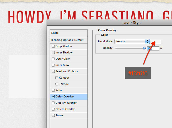
Style the Box
Right-click on the box’s layer in the Layers Panel and then select Blending Options, which should open the Layer Style dialog window. Style this box with HTML/CSS code in mind: Don’t use tons of complex layer effects that will be hard/impossible for the person coding the layout later to convert into a web template.
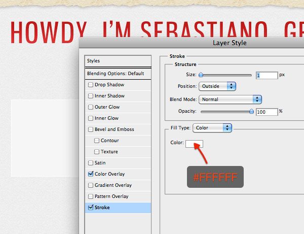
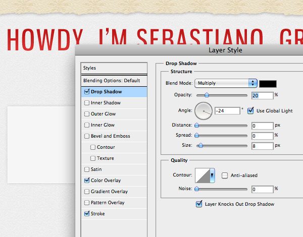
For our boxes, I have styled them with a Color Overlay, a Stroke and a Drop Shadow.
Complete the Gallery
Now you can paste in the first thumbnail image of your work.
Leave some room on each side of the thumbnail image.
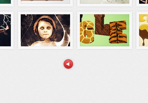
Just duplicate the box and move them to create a grid. Here is the completed gallery:
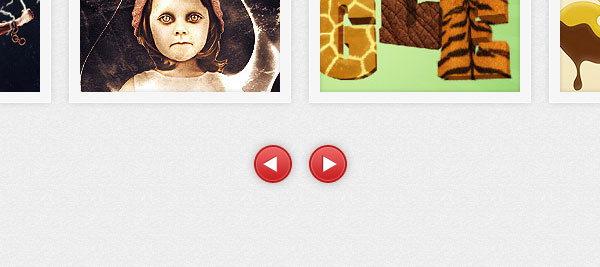
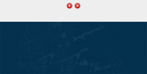
Step 10: Draw the Slideshow Navigation
Another important feature is to provide an easy way to allow visitors to navigate the gallery. There’s nothing more functional and ubiquitous than a left/right user interface that only has two possible actions: go left or go right.
Use the Ellipse Tool (U) to create a small circle that will be the base shape of our left/right buttons.
Give the circle a red-colored Gradient Overlay layer effect.
Also give the now-red circle a Stroke layer effect.
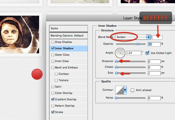
Use an Inner Shadow layer effect to give it a defined look.
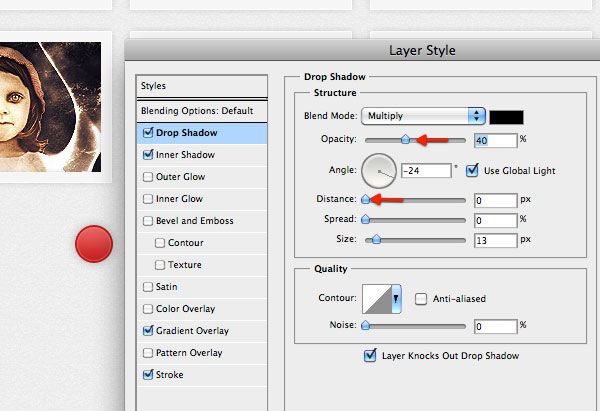
Finally, to match our thumbnail boxes and the overall theme of the layout, also give our red circle shape a Drop Shadow.
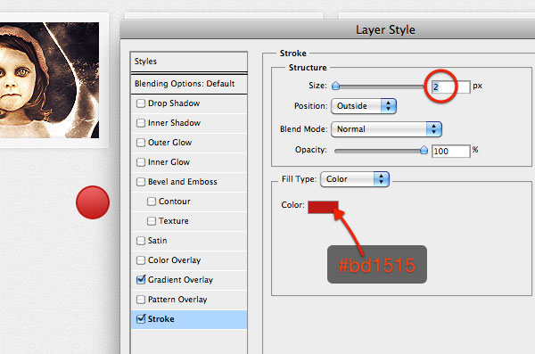
Create a white triangle using the Polygon Tool (U); in the Options Bar, set Sides to 3 to make a triangle. Put the triangle inside the red circle. Add a drop shadow to the triangle shape, changing the color to the same red color (#bd1515) as the Stroke layer effect above.
Use the same method to create the right arrow.
Or you could duplicate the layers of the right arrow, and then flip the layers horizontally (Edit > Transform > Flip Horizontal).
Move your arrows to the bottom of the gallery, making sure to give them enough space. Center them and align them using Photoshop’s various Align Layers To Selection commands (Layers > Align Layers To Selection).
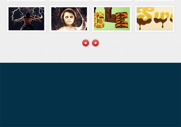
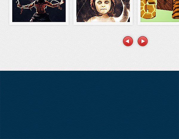
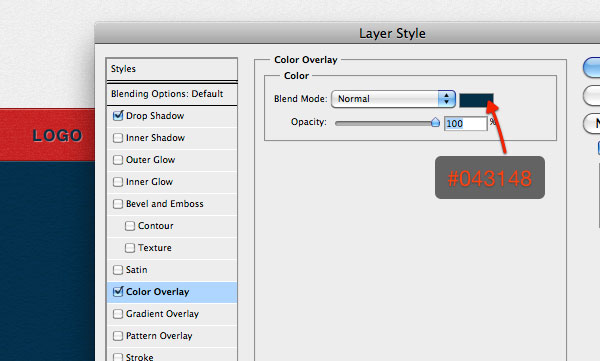
Step 11: Create the Footer’s Background
Create a new layer group for the footer of the web design to keep our work organized. From here on out, any layer associated with the footer of the layout should be placed inside this layer group.
Set the Foreground color to dark blue (#043148) and then use the Rectangle Tool (U) to draw a big rectangle at the bottom of the canvas that spans the entire width of the canvas.
Create the Footer’s Textured Effect
Duplicate (Ctrl/Cmd+J) the blue rectangle shape layer.
On the duplicated shape layer (which should be on top of the original blue rectangle), apply a filter by choosing Filter > Sketch > Note Paper.
Use the default options of the filter. After the filter has been applied, set the layer’s Blend Mode to Overlay with Opacity at about 20%.
Apply Grunge Brushes
Create a new layer for the grunge accents. We will use the free WeGraphics Metal Scratches brushes to create some grunge effects.
Download the brush library and install it. Apply some brush strokes with the Brush Tool (B) using the metal scratches brushes. Once done, reduce the layer Opacity to make the effect softer: between 5% to 15% would be a good setting.
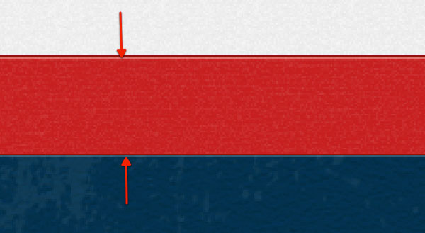
Step 12: Create the Footer’s Red Bar
Create a red (#c82222) bar that spans the width of the canvas and put it at the top of the footer area.
We will use it as a footer navigation bar that will display categories (such as Logo, Print, and so on).
Add a 1px red (#930a0a) stroke at the top and bottom of the red bar.
Use the same technique that we used for the blue footer background to texturize it: Duplicate it, go to Filter > Sketch > Note Paper, and then reduce the layer’s Opacity to 20% as well as switch the Blend Mode to Overlay.
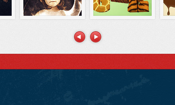
As we made at the beginning with the top menu bar, use 1px lines to give the footer’s red bar some depth.
You can now add categories using the Horizontal Type Tool (T). I’ve used Helvetica, bold, 16pt.
I gave the text a Drop Shadow layer effect (which can be replicated in the HTML/CSS template using CSS3’s text-shadow property), as well as a Color Overlay.
Step 13: Fill the Footer with Useful Information
At this point, you can fill the footer providing important information like links to your social profiles, the contact form and Twitter updates (a Twitter follower could turn into a client). This part, I will leave up to you.
Some guidelines to help you fill out the footer:
- The layout grid’s guides (toggle them on and off using Ctrl/Cmd + 😉 can help you organize and align the footer content in the best way possible.
- For the headings, I’ve used Helvetica, regular, 20pt.
- The handwritten font used to write “Thanks” on the right side of the footer is Monika.
- For the icons you see on the right of the footer layout, I used the Social Network Icon Pack.
- The input fields of the contact form were created using the Rounded Rectangle Tool (U).
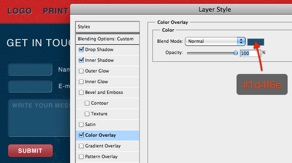
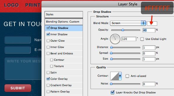
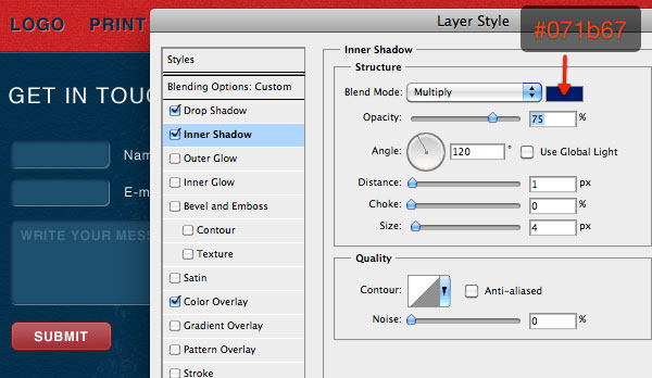
- The debossed effect of each input field is made using a combination of Color Overlay, Drop Shadow, and Inner Shadow.
- The Submit button has the same layer style as the red left/right buttons for the gallery. Instead of the Ellipse Tool, use the Rounded Rectangle Tool to draw it and then copy the layer style from the left/right buttons.
Here are the effects for the input boxes.
Color Overlay
Drop Shadow
Inner Shadow
Footer Finished
Step 14: Create the Site Logo
Normally, you see most Photoshop web design tutorials doing the footer as the last phase. I am switching up this trend. The last part will be creating the logo that is placed at the center-top of the web layout.
We already created a large clean header as its background to complement it.
I’ve added my personal logo — in fact you will notice the symbol can be interpreted like an “S” or like a “G”, the initials of my name (Sebastiano Guerriero).
You can place your own logo here, but in case you want to create something similar to mine, the font I used to write “design” is Diavlo, created by the talented font designer, Jos Buivenga.
The dry paint effect is created with one of the sets I created for WeGraphics. For the grunge effect, I’ve used Subtle Grunge brushes created by my friend Liam McKay of WeFunction.
I will briefly cover a nice technique in case you would like to create subtle grunge effects as seen in my logo. First, create a new layer above the logo’s layer.
Ctrl/Cmd + click on the logo’s layer to make a selection of it. In this way, brushes will affect only that area. Select a grunge brush from the set, resize it so that it won’t cover the entire logo, but only a part of it, and then click once to apply the effect.
Now go to Filter > Sharpen > Sharpen. Run the filter twice and reduce the Opacity of the layer a little bit. Done!
Tutorial Summary
We covered plenty of professional-level web design techniques in this tutorial for producing a useable and web-ready web layout mock-up.
We have also provided you with the HTML/CSS source file and PSDs for you to be able to study and analyze the layout. I hope you acquired some more useful techniques for creating your next site. Share your thoughts in the comments!
Download Source Files
- stylishly_portfolio_webdesign (ZIP, 7.65 MB)
-
 Trevin serves as the VP of Marketing at WebFX. He has worked on over 450 marketing campaigns and has been building websites for over 25 years. His work has been featured by Search Engine Land, USA Today, Fast Company and Inc.
 -

WebFX is a full-service marketing agency with 1,100+ client reviews and a 4.9-star rating on Clutch! Find out how our expert team and revenue-accelerating tech can drive results for you! Learn more
Make estimating web design costs easy
Website design costs can be tricky to nail down. Get an instant estimate for a custom web design with our free website design cost calculator!
Try Our Free Web Design Cost Calculator
Table of Contents
- Preview
- Live Demo
- Tutorial Resources
- Introduction to the Web Design Process
- Step 1: Download and Open the 960 Grid System
- Step 2: Create the Background Noise Pattern
- Step 3: Apply the Background Noise Pattern
- Step 4: Create the Vintage Flower Header Pattern
- Step 5: Apply the Vintage Flower Pattern to the Header
- Step 6: Add the Ripped Paper Effect to the Header
- Step 7: Create the Top Red Bar
- Step 8: Design the Site’s Introduction Tagline
- Step 9: Design the Slideshow Gallery
- Step 10: Draw the Slideshow Navigation
- Step 11: Create the Footer’s Background
- Step 12: Create the Footer’s Red Bar
- Step 13: Fill the Footer with Useful Information
- Step 14: Create the Site Logo
- Tutorial Summary
- Download Source Files
Share this article


Web Design Calculator
Use our free tool to get a free, instant quote in under 60 seconds.
View Web Design Calculator
Make estimating web design costs easy
Website design costs can be tricky to nail down. Get an instant estimate for a custom web design with our free website design cost calculator!
Try Our Free Web Design Cost Calculator