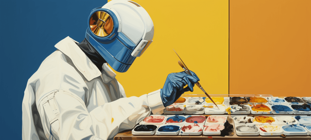
Making the translation from screen to fabric introduces a new set of limitations and considerations when a t-shirt is the final destination of your artwork. These limitations can be overcome with the right amount of awareness, and reasonable expectations for what is possible. Using t-shirt fabric as a design medium has an inherent set of constraints because of the print process, porousness of the surface, inks used, and its elasticity.
Knowing these constraints is just half the battle, but we’ll show you the solutions to overcome the obstacles of dealing with fabric as a design medium.
Fabric vs. Paper
 First, let’s begin by looking at the differences in the way fabric and paper handle printed designs. Paper as a print medium translates best from what you see on the computer screen to print. Since paper isn’t as absorbent as fabric, the inks dry faster with minimal color mixing.
More important, the inks dry quickly near the surface. Fabric, however, is absorbent, allowing the inks to saturate deeper than paper, which makes fabric great for permanent print. This also greatly affects the way colors look, especially processing light-colored inks on dark colored t-shirts.
For example, if you want a white print design on a black t-shirt, the color will translate differently since the black of the t-shirt will dominate the white ink. The solution to this common problem is running the white ink twice with flashing in between each printer run. What is flashing? While it might sound like something you do on Bourbon Street during Mardi Gras, it’s actually curing ink temporarily with a heat lamp before printing it again with the same screen.
Running the same screen twice with flashing allows the ink to become double strength and stops the shirt color from pushing through. Another very common technique for printing inks on dark colored fabric is to use a white under-base. The process involves printing all of the design in white first, in order to create a blank canvas underneath the actual color design. Under base is a very effective method to get the colors as bright and true as possible on dark colored t-shirts.
Solution – Make sure the inks are under-based and/or flashed on dark colored t-shirts.
The Devil is in The Detail
 With the process of screen-printing, colors in the design are printed individually with a short period in between each color. This is just enough time for the colors to spread marginally before settling.
As a designer, this means there is a potential for details to be lost if they are too fine-grained, causing colors to spread. The main culprit for spreading is the tightness or lack thereof in the mesh of the screen being used to squeegee the ink through. If the mesh isn’t tight enough, the ink can come through in bigger blobs causing more spreading.
The easiest fix to this is to reduce the fine detail in the design in the places that aren’t necessary. The complexity of the design could end up being its downfall, turning parts of the design into a muddy mess. For the elements in the design that can’t be removed, beef up those parts to make them thicker or try to rearrange them in areas that aren’t touching other colors.
On the print side, request a tighter mesh screen in case your printer hasn’t already determined the need for one. Solution – Remove unnecessary fine detail, try to keep the small design elements from touching other colors, and work with a tighter mesh screen for printing.
Introduction to Inks
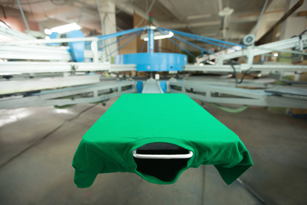
 Printed t-shirts are worn both indoor and outdoor, in dry and wet conditions, and go through an intensive cleaning process repeatedly in household washers and dryers.
The heavy usage of a printed t-shirt over time requires the ink to permanently adhere to the fabric and maintain its quality. There are three major ink options for t-shirt print designs, and in order of popularity, they are plastisol ink, water-based ink, discharge ink. Covering all three inks would put you to sleep so we’ll focus on the most commonly used as well as the easiest to find – plastisol. There are numerous benefits to plastisol with longevity and brightness of the print being two of the most important.
The downside of plastisol, however, is being thick to the touch. Designs that have a lot of ink coverage on the fabric can become intrusive when they should actually be seen and not felt. One overlooked solution to this problem is making more use of the negative space on the t-shirt.
When used properly, incorporating the blank space in the t-shirt with your design can even make it appear as if you are using an additional print color without the disadvantages of additional ink use. Screen printing inks come in singular solid colors. Each color is printed one at a time to accomplish the completed design.
In doing so, it isn’t the best to handle color gradients, shading or photograph-like images that contain thousands of colors. Nevertheless, it is possible to print these more complex designs in screen printing inks, though quality suffers. Expect the result to scale down to roughly 50%-80% of your original design as it looks on the computer screen.
Solution – Try to avoid shading or gradients whenever possible. Use them sparingly and not as the focal point of the design. Make good use of the negative space of the t-shirt to limit ink coverage as well as the thickness of the print.
Registration of the Print
 Fabric stretches a lot. So much so, that it rarely maintains a consistent size or shape. How does this affect you as a designer?
Making sure the colors in the design butt right up to each other accurately becomes increasingly difficult when dealing with a material that can change shape. The technical printing term to ensure the colors are in the right place in relation to the other colors is registration. Errors in registration will result in a design that appears misprinted and poorly aligned. Even a slight movement in the fabric can result in a blurry appearance or a misaligned print.
While most of the registration process lies on the print side, you can make it easier and more accurate in the design phase by using trapping. Trapping the design simply means adding a very small stroke to the colors that touch each other so there is a little overlap. This small step can make all the difference in registration.
Solution – Trap your design by adding a very small stroke to help register the printed colors.
Know Your Colors
 Your blue is not someone else’s blue. In fact, to get even more granular, your navy blue is not someone else’s navy blue.
The most widely used universal color system used by designers and printers is the Pantone Color Matching System, or abbreviated as PMS colors. It serves the purpose of transferring the color you want in your design to the printer in exact terms. The printer can take the PMS color number you need and mix their standard ink colors to reproduce the PMS color. This is crucial because it removes opinions on what a color should be, and turns it into a measurable result.
If you take this advice a step further and actually convert your design colors to PMS colors using a swatch library, be wary of your screen settings altering the appearance of the color. The best way to be sure that all parties involved in the design and print process are on the same page is to refer to the paper PMS color chart. Solution – Be explicit in your color selection by providing PMS colors for print.
Conclusion
Understanding these obstacles and their solutions when using fabric as a design medium can drastically improve the finished product. Doing what you can as a designer during the design portion of the process is crucial. Knowing the printer’s challenges will help you effectively communicate the remaining critical steps, ensuring the best results in the translation from computer screen to fabric.
-
 Trevin serves as the VP of Marketing at WebFX. He has worked on over 450 marketing campaigns and has been building websites for over 25 years. His work has been featured by Search Engine Land, USA Today, Fast Company and Inc.
 -

WebFX is a full-service marketing agency with 1,100+ client reviews and a 4.9-star rating on Clutch! Find out how our expert team and revenue-accelerating tech can drive results for you! Learn more
Make estimating web design costs easy
Website design costs can be tricky to nail down. Get an instant estimate for a custom web design with our free website design cost calculator!
Try Our Free Web Design Cost Calculator
Share this article


Web Design Calculator
Use our free tool to get a free, instant quote in under 60 seconds.
View Web Design Calculator
Make estimating web design costs easy
Website design costs can be tricky to nail down. Get an instant estimate for a custom web design with our free website design cost calculator!
Try Our Free Web Design Cost Calculator