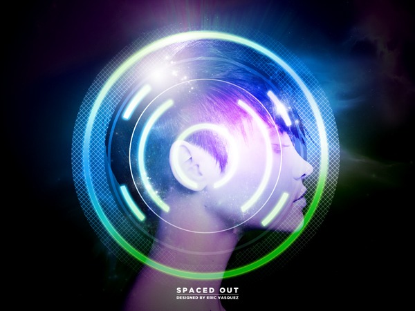
Preview
Tutorial Resources
- Stock Image: Beautiful Sensual Woman on iStockphoto.com
- Vector File: Circle_Fragments.eps by Eric Vasquez (that’s me)
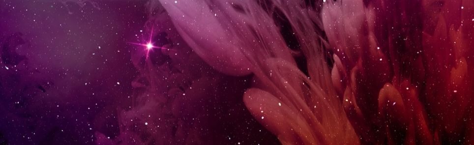
- Stock Image: Christmas Nebula by Casperium
Step 1: Create a New Document in Photoshop
We’re going to kick things off by creating a new document in Photoshop (Ctrl/Cmd + N) that is a common landscape-oriented poster size — 24×18”. This is a piece that I want to create in a large enough format so that it can be reduced later on if need be. 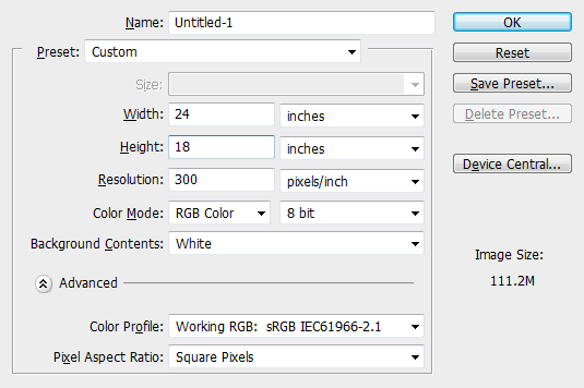
Step 2: Isolated Beauty
Next, we are going to open up the Beautiful sensual woman stock image.
You can purchase this particular image from iStockphoto.com for a few credits. Any good profile shot will work for this, and you can even use yourself or a friend as the subject of our piece — now that sounds like a fun idea! 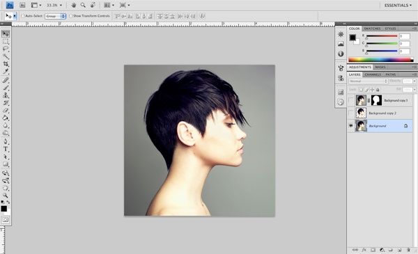 We want to eliminate the background from this nice photo, but it can be a bit tricky, especially when trying to remove spaces between pieces of hair because the stock photo doesn’t have a pure solid background color (so if you’re taking a headshot photo to use instead of the stock photo I used, try to stand behind a solid color background).
There are several ways we can do this, and there are quite a few guides out there on this subject so I would encourage you to use the method that you feel the most comfortable with. You can use the Magic Wand Tool (W), a layer mask, or the Pen Tool, just to name a few of your options. 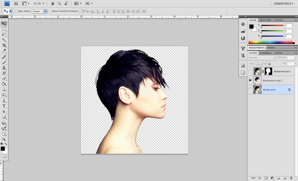
Step 3: Drag N’ Drop
Once we have isolated our subject from the background, we will simply drag the layer over to our blank document.
If you are using this particular image, you may need to resize it a bit so that it fits into the document nicely. If you are using a small image, you may want to drop it into a smaller document just so it doesn’t become pixelated when trying to scale it up. 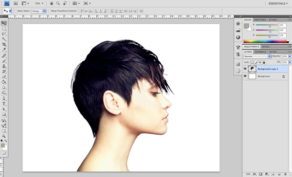
Step 4: Fill In the Background
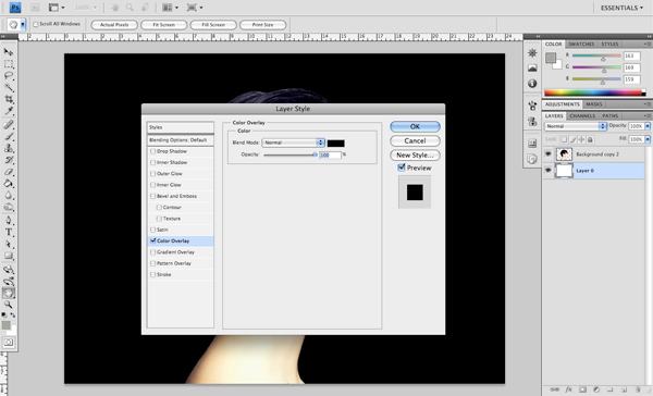
Next, double-click on the Background layer to unlock it and make it editable.
Double-click the Background layer again and you should now see your Layer Style dialog window. Check the Color Overlay box and select a solid black color (#000000) to fill the Background layer with black. We are changing the background color this way so that we can modify it easily later on rather than having to use the Paint Bucket Tool (B) or the Fill command.
Step 5: Creating a Custom Pattern
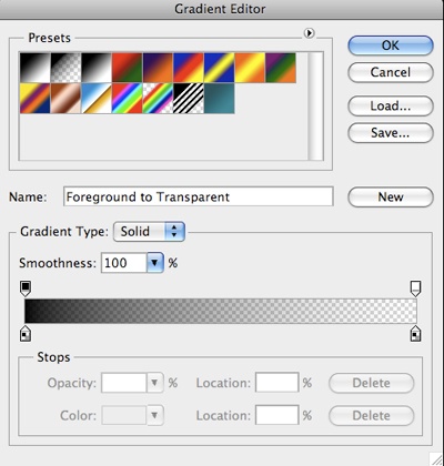
We will take a step back for a moment and create something from scratch that we will be using in a little bit. To start, create a new 20x20px Photoshop document. We want the background to be transparent, so under the Background Contents option, choose Transparent.
If you forgot to choose the Transparent option when creating your new document (don’t worry, we all do), that’s fine, just double-click the Background layer to unlock it, and then turn it off (or delete it). Add a new layer above the Background layer, and then using your Rectangular Marquee Tool (M), create a thin, 1-pixel line that goes vertically from top to bottom. Rotate this line so that each end is squarely in the upper right and lower left corner, forming half of an X shape.
Duplicate this layer by pressing Cmd/Ctrl + J and then rotate the duplicate line to complete our X shape.  Merge the lines by selecting the top layer and then pressing Cmd/Ctrl + E (the keyboard shortcut for Layer > Merge Down). Shortcuts are a great time-saver and I use them quite a bit (you should too)!
What we want to do now is go to Edit > Define Pattern to create a Photoshop pattern out of our X shape. 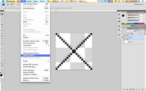 You will be asked to save your pattern with a name; you can call it whatever you would like, but for the sake of keeping things simple, I’m just going to name this pattern “x pattern” before clicking the OK button to save it.
 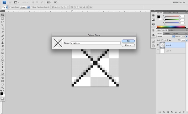 After defining the pattern, you can close out of this document (saving it won’t be necessary).
You will see why we have created this pattern later on.
Step 6: Fire Up Illustrator
Hop back over to our main Photoshop document and turn off the visibility of the layer with our photo subject. All you should see is the black background layer for now; we will be coming back to this later.
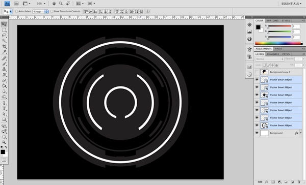
Next, start up Illustrator and open the Circle_Fragments.eps file that I have created and provided for you in this tutorial. When you open the file up in Illustrator, you will notice that all of the objects are ungrouped — and the reason for this is that we want to bring them over into Photoshop one piece at a time since we will be applying a variety of different effects to each shape. 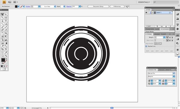 Select the outermost part of the circle fragments and then copy this shape before heading back to Photoshop and pasting it into our document.
When you are prompted with the dialog window that asks how you want to paste it, you can accept the default Vector Smart Object option by just clicking the OK button; this will paste the first shape into the center of the file. By choosing the Vector Smart Object option, we can resize these shapes without any quality loss, which we will need to do once we bring in the rest of the pieces. 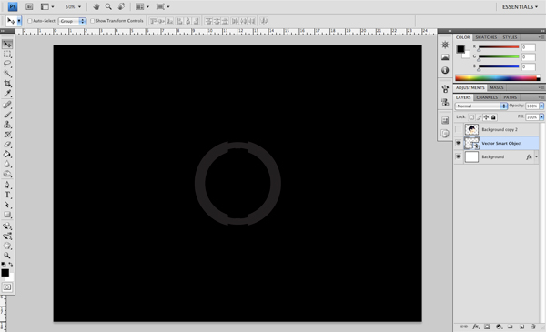 Continue this process by copying from Illustrator and pasting into Photoshop, gradually rebuilding the shape, layer by layer.
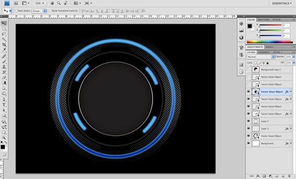
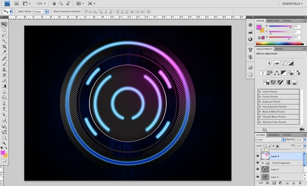
I would recommend starting with the outside and working your way in, just to keep things nice and neat. 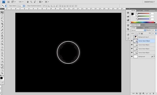 Once you have pasted all of the vector shapes into the document, you should have something that looks like this.
 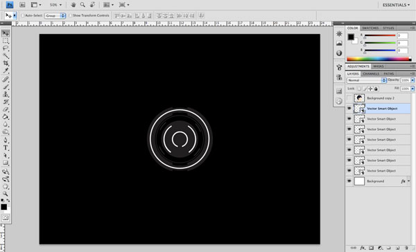 We can now close out of Illustrator and move on to the rest of the tutorial.
Step 7: Do It Big
Back in Photoshop, select the top vector shape layer that we have just brought in and hold the Shift key. While holding Shift, select the bottom vector shape layer. Next, we will press Cmd/Ctrl + T to initiate the Free Transform command.
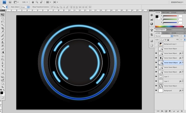
Move your cursor over one of the corners, and while holding Shift + Alt, begin to drag outwards to enlarge all of our vector shapes, from the center, outwards. Normally, holding the Shift key will enlarge everything proportionally from whichever corner we choose, but by holding the Alt key as well, we enlarge our shapes from the middle. Scale them up so they are approximately the same size as the shapes in the image below.
Step 8: Apply Our Custom Pattern
Turn off all of the vector shape layers except for the bottommost layer, which should be the first one that we brought in from Illustrator. Hold down the Cmd/Ctrl key and click on the small icon in the Layers Panel — that should give you an active marquee selection around the shape. 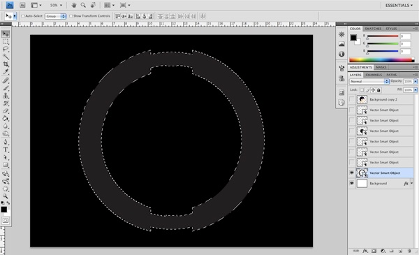 While this selection is still active, create a new layer either by clicking the Create new layer icon at the bottom of the Layers Panel, or by pressing Cmd/Ctrl + Option/Alt + Shift + N — That is one heck of a long keyboard shortcut, but it really comes in handy for times like these!
After creating this new layer, the selection should still be active. Go to the Edit > Fill (Shift + F5) from the dropdown menu. When the dialog box appears, change the Use option to Pattern, and as you may have guessed, we will now scroll down to the bottom of our patterns where we will eventually find the “x pattern” we had created earlier.
Press OK to apply this custom pattern to the vector shape we have just selected. 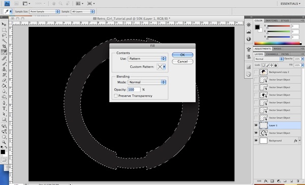
Step 9: Styling Our Custom Pattern
Next, just as we had done earlier to our Background layer, we are going to double-click the new layer we just created that has our pattern fill. This should bring up the Layer Style dialog box where we will once again choose Color Overlay, but this time we want to fill it with a solid white (#ffffff).
Click OK to accept these changes. 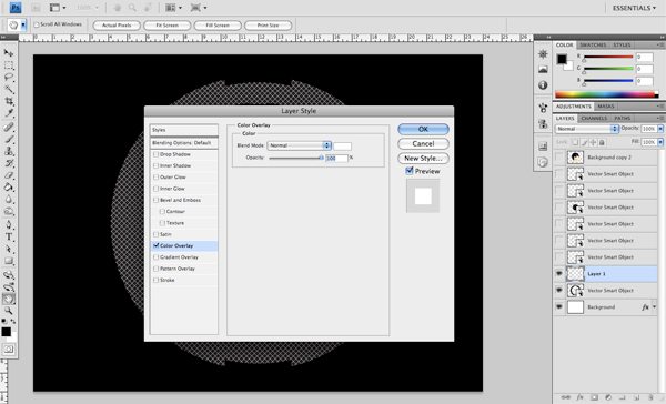
Step 10: Fading Out the Pattern
Now we want to create yet another new layer (above the pattern layer). While we have this new layer selected, hold Cmd/Ctrl and select the vector object that is now two layers below it.
This should once again give you an active selection of the vector shape. We will be using a linear gradient that fades from black to transparent for the next step. We can use the Gradient Tool (G) for this; once you have the tool selected, pay attention to the toolbar along the top — it’s the Options Bar and it will give you additional options for the active tool.
The Options Bar is where you can choose and set your options for the gradient. We want a solid black color that fades from 100% to completely transparent. 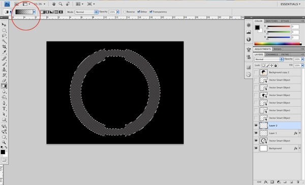
 Now we are ready to fade out some of the X pattern that we have applied.
To do this, we will click our mouse just above the top of the vector shape and drag straight down, a little bit past the center of the shape before releasing. We will do the same thing coming up from the bottom in order to create a fade on both sides. 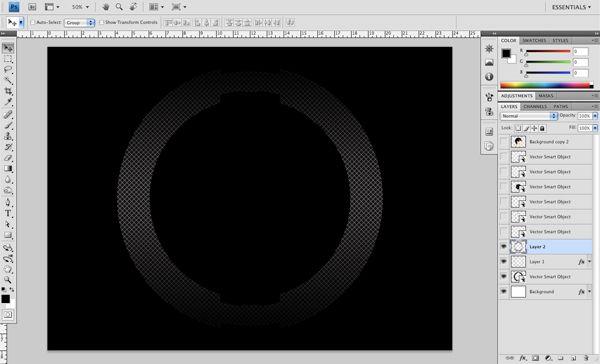
Step 11: Outside In
Next up, we will turn on the next vector shape just above the layers we were previously working on; this should be the halo layer that goes through the middle of the outermost shape.
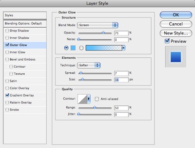
Double-click this layer to bring up the Layer Style dialog box and check Gradient Overlay. 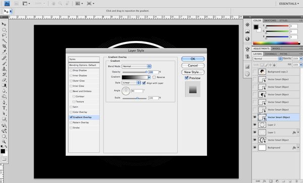 Within the Gradient Editor, set the colors such that it’s #0623a2 for the deeper shade of blue on the left and #85d4f1 for the lighter shade on the right.
 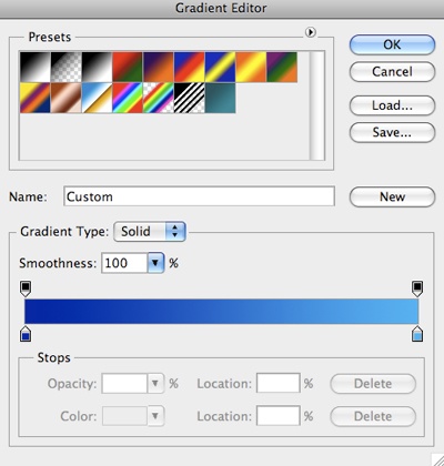 Before closing out of the Layer Styles window, we are also going to apply an Outer Glow using the color #2abbff.
 Turn on the next vector shape layer, keeping in mind that we are working from the bottom up.
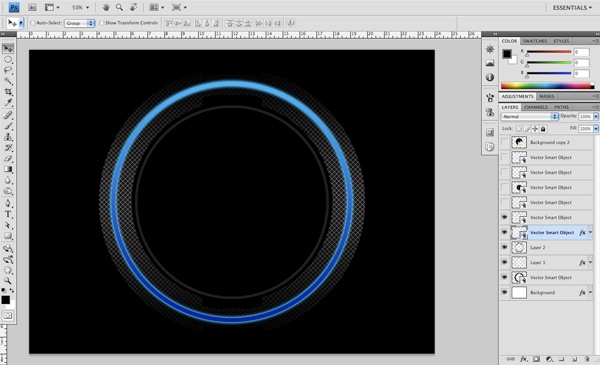
Step 12: Copying and Pasting (Layer Styles)
Now we want to right-click on the layer that has the Gradient Overlay (the halo layer that we worked with earlier and applied the glow to). Once we do this, we can then select Copy Layer Style from the menu that appears.
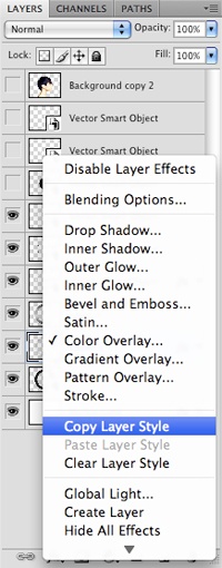 Once we have done this, we will turn on and activate the next vector object layer which is the layer containing the 4 circle fragments that we brought in from Illustrator. We will again right-click this layer and pick Paste Layer Style from the menu. One small change that we will need to make in the settings of the Layer Style is to uncheck Gradient Overlay and, instead, select Color Overlay where we will fill the shapes with the lighter blue color we used earlier (#85d4f1).
 Copying and pasting layer styles can save you time and also makes sure that your settings are identical.
Step 13: Further Styling
Next, we will activate the vector shape layer above the previous layer, which is the inner circle shape. Double-click on this layer and apply the Inner Shadow layer style with the settings shown below.
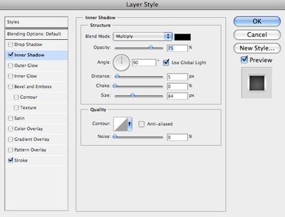 Once you have applied the inner shadow, check the Stroke layer style (use the settings shown below).
 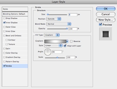 When applying the Stroke settings, you want to make sure that rather than using a solid color stroke, you apply a gradient stroke. You will need only two colors for this gradient — solid white for the middle, and #858585 on both ends of the gradient.
Step 14: More Neon Lights!
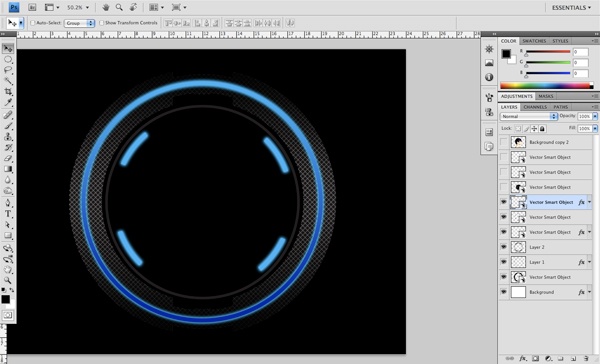
Turn on the next vector shape (the 2 arc shapes just above the previous layer we worked with). We want to copy the layer style from the 4 circular fragments (the layer that has both a Color Overlay and Outer Glow). Paste these layer styles on this layer.
 Repeat this step for the last vector shape, pasting the previous layer style once more so that we also have the Color Overlay and Outer Glow effect on the inner circular fragment.
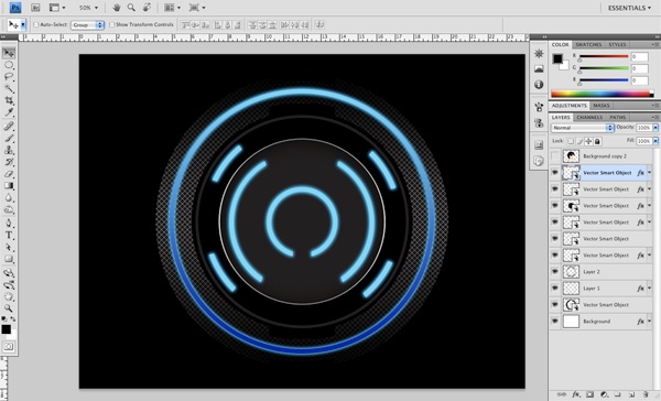
Step 15: Spring Cleaning
Now that we have pasted in and styled our circle fragments from Illustrator to Photoshop, we are going to organize our work a bit (a good habit to get into). Select the top vector shape layer, and then click on the icon that looks like a folder at the bottom of the Layers Panel to produce a new layer group.
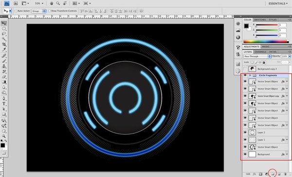 Double-click on the new layer group so that you can rename it to something that makes sense, like “Circle Fragments” (by default, Photoshop will have named this group as “Group 1”). Select all of the vector shape layers and drag them into this folder.
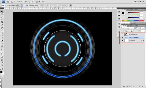
Step 16: Build You Up
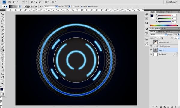
Create a new layer below the “Circle Fragments” layer group we just created (but this layer should be above the Background layer).
Set your Foreground Color to a dark blue (#00082a) and then pick the Gradient Tool (G) from the Tools Panel afterwards. We want to use a radial gradient that fades from the dark blue color to transparent (set these options on the Options Bar). On our new layer, click in the middle of the canvas and drag outwards so that you are left with a dark blue gradient.
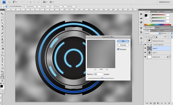
 We will again create a new layer above the dark blue gradient layer and then press D to automatically reset our Foreground Color and Background Color to the default colors (black and white). Now we will go to Filter > Render > Clouds.
 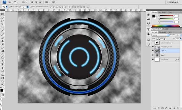 After applying the Clouds filter, go to Filter > Blur > Gaussian Blur and set the Radius to about 36 before applying the filter.
 Now that we have done that, we will simply change the Blend Mode of the layer to Overlay.
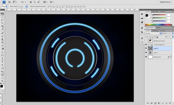
Step 17: Let There Be Light!
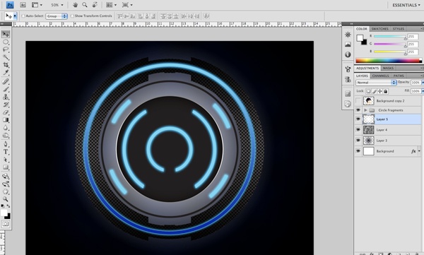
Create a new layer below the “Circle Fragments” layer group, but above the cloud layer. Select a solid white color and apply another radial gradient, fading outwards from white to completely transparent.
 With the new layer still selected, go to the Filter > Render > Fibers and apply these settings:
 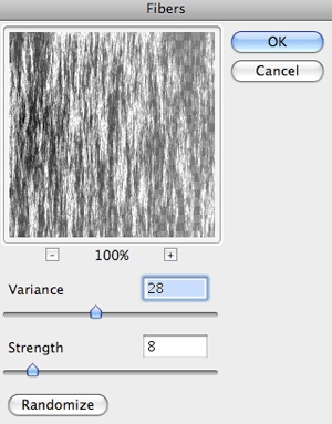 Right after that, go to Filter > Blur > Radial Blur and use the following settings.
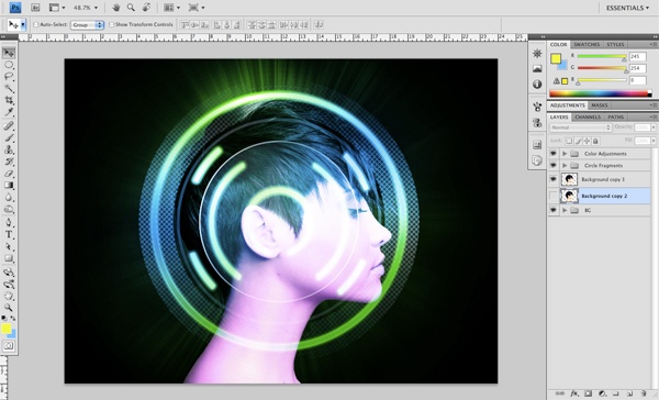
 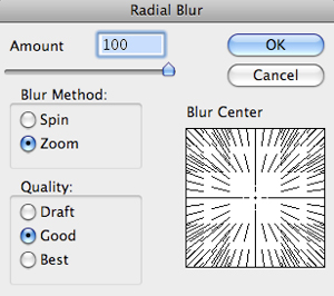 This is our piece as it stands:
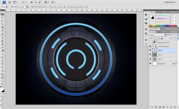
Step 18: Duplicate and Blend
Duplicate the layer we have just created 4 or 5 times by pressing Cmd/Ctrl + J and then merge these copies together by selecting them all in the Layers Panel and pressing Cmd/Ctrl + E. Lower the opacity of this layer to about 50%, set its Blend Mode to Soft Light, and then place this layer below the Clouds layer.
Step 19: Adding Some Magenta
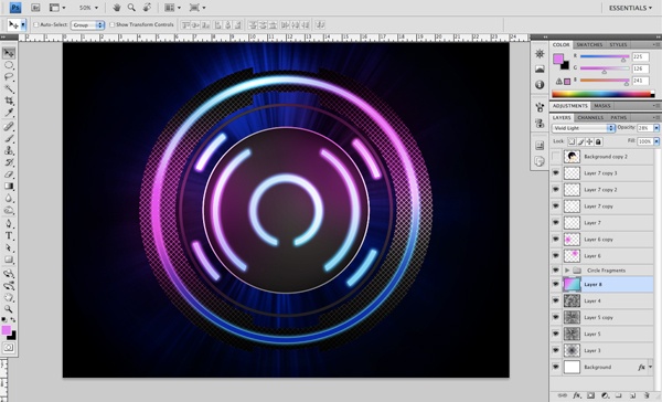
Next, create a new layer above the “Circle Fragments” layer group. Select a bright magenta color (#f10fde) and create a radial gradient fading from a solid color to transparent. Set the Blend Mode of this layer to Color — and feel free to move this gradient around the canvas to see where you think it works best in our scene.
 Duplicate this layer (Cmd/Ctrl + J) and place it somewhere else where you see fit.
 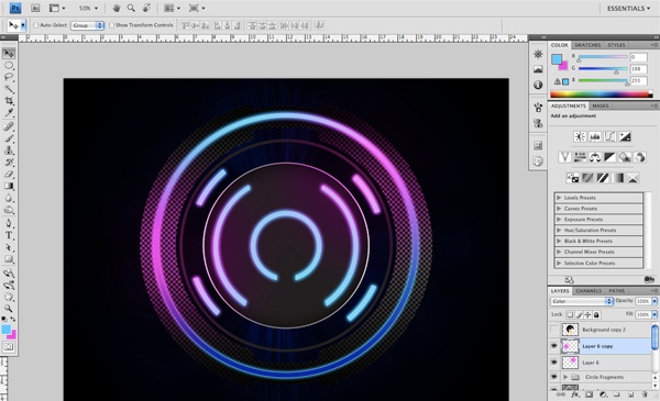 We are doing this not only to add some variation to the colors in the piece, but also because by setting the blending modes to Color in this part of the process, we will be able to amplify the neon light effect when we apply additional colors above them (and setting their blending modes to Overlay). In fact, we are going to do just that by repeating the transparent radial gradients using a solid white color and duplicating them a few times.
Place them around the image in places that really bring out and amplify the neon light effect. 
Step 20: Back to the Background
Next, we will duplicate the layer below the clouds (the radial blur layer) by simply pressing Cmd/Ctrl + J. After duplicating the layer, press Cmd/Ctrl + T to use Free Transform to rotate this layer a bit, which will exaggerate this effect a bit more.
 On a new layer, just below the “Circular Fragments” group, we will create a linear gradient using the following colors (from left to right: #d25de5, #e17ef1, #94d2e6, #2b9ec4).
 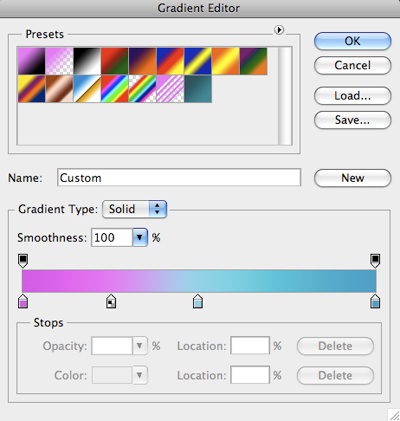 Click outside of the upper left hand corner of our canvas and drag all the way down past the opposite corner before releasing the mouse. Set the Blend Mode of this layer to Vivid Light.
Step 21: Modifying Our Colors
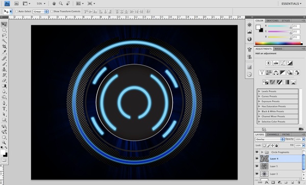
At this point, I have decided that I want to change up the colors a bit. So far, we have been working with a blue/pink color palette, which is fine, although it’s nice to see how other color options would look here. Select the top layer that is just below the image of the subject and at the bottom of the Layers Panel, click on the small icon that looks like a black and white cookie — this is the icon for creating fill or adjustment layers.
Choose Hue/Saturation and set the top Hue slider to -100. This now gives us a blue/green palette. You can play around with this slider as you see fit, and maybe you will like some of the other variations that can be made using this simple method. For now, I think this is looking pretty good.
We just have a few more tweaks to make before bringing our girl back into the picture! 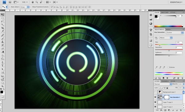
Step 22: Darkening the Edges
Create a new layer just below the “Circle Fragments” layer group and select a solid black color. Using the radial gradient technique that we have done in previous steps, we are now going to darken up the outer edges of the composition.
Once you have selected the Gradient Tool (G) to apply the radial gradient, you will notice along the Options Bar that there is an option checkbox where you can select Reverse to reverse the direction of the gradient — apply that option by making sure it’s checked. Once you have your Gradient Tool ready, click your mouse in the middle of the image and drag outwards. You may need to do this a few times to get it just right (just press Cmd/Ctrl + Z to undo) — or you can scale it up by pressing Cmd/Ctrl + T to initiate the Free Transform.
Once you are happy with your radial gradient, you can uncheck the Reverse option now so that you don’t forget, as we will be using a regular radial gradient in subsequent steps. 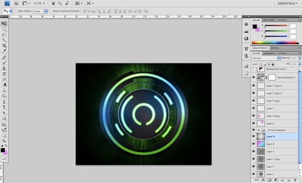
Step 23: Best Practice
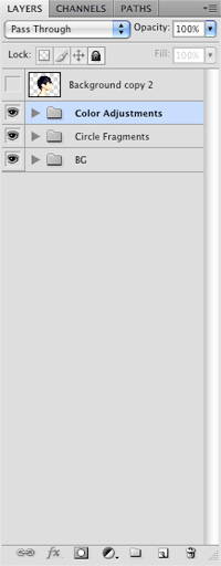
This next step isn’t absolutely necessary, but when dealing with a lot of layers I find it useful to group similar objects together. Select the layer just below our “Circle Fragments” layer and click the folder icon again at the bottom of the Layers Panel.
Name this new folder as “BG”. 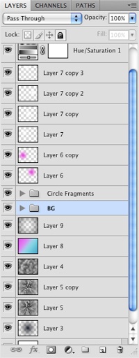 Next, we are going to select all of the layers below this folder and drop them into the “BG” folder.
 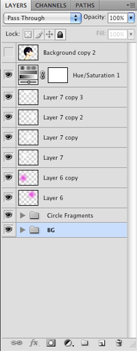 We will then select the top layer, just below the image of the girl and create another new layer group. Name this one something like “Color Adjustments” and drag the remaining loose layers into this folder.
Step 24: Moving On Up
In the next step, we will activate the image of the girl sitting on top of our Layers Panel and make a duplicate before turning off the original layer. I am doing this just in case we need to revert back to the original image for some reason. Now what we will do is grab both the “Color Adjustments” layer group as well as the “Circle Fragments” layer group and drag them so they are both sitting at the very top of the Layers Panel, above the image of the girl.
Step 25: Spaced Out
Open up the Christmas Nebula stock image listed in the Tutorial Resources section above and place it above the image of the girl, but below the two layer groups that are now sitting on top of the Layers Panel. While holding Cmd/Ctrl, click your mouse on the layer containing the image of the girl; this should give you an active selection around the shape of her head. Make sure that while you have this selection active that you then click on the layer above it, where we have our nebula image.
Next, click on the Add layer mask icon at the bottom of the Layers Panel to create a mask so that the space image will only be visible within our subject’s head. Lower the opacity of this masked layer to about 60%. 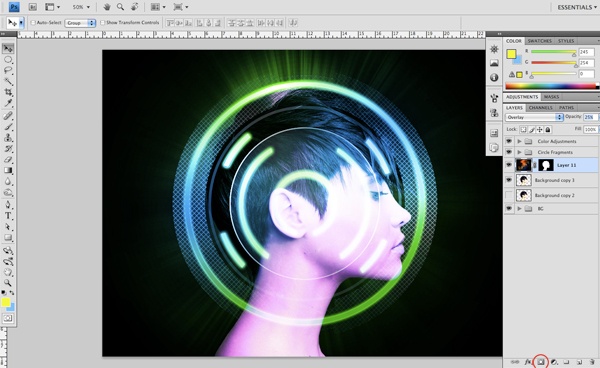
Step 26: Kevin Spacey
…is awesome!
I just want to see if you’re still with me. Anyways, on to the tutorial. Open the other nebula image and bring it into the document.
Place it just above the image of the girl and set the Blend Mode to Screen before lowering the layer’s Opacity to 50%. 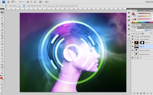 We want the focal point to remain on the girl and the circles so we are going to just darken the outer part of the image a bit. To do this, we will select a solid black color and then grab our Gradient Tool (G) again.
We want to create a radial gradient and make sure to check off Reverse on the Options Bar. Create a new layer just below the layer groups and click and drag a gradient outwards from the center of the image. This will create a reversed radial gradient that will fade out the outside of the image evenly, all the way around.
You may have to scale it up just to make the effect appear more subtle, which can be done easily using Free Transform, holding down Alt + Shift while dragging one of the four corners, as we have done earlier, so that the center remains in place. 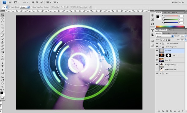
Step 27: Adding More Highlights
We are almost ready to wrap this one up, but before we do, I want us to enhance and add just a few more touches of color. To do this, I have added a few more layers at the top of the Layers Panel and will use the Radial Gradient Tool (be sure to uncheck Reverse since we used this option in the previous step).
Choose a few blue and magenta colors that are more saturated, and then create a few small radial gradients, each on its own new layer. Change the Blend Mode of these colored gradients to Color and move them around the model’s face until you are satisfied with the results. After adding these touches of color, I have added one additional radial gradient of solid white and placed it on the upper left part of the circle shape.
Also set this layer’s Blend Mode to Overlay. 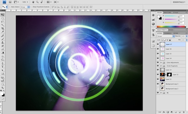
Step 28: Create a Levels Adjustment Layer
Next, select the top layer on the Layers Panel and click on the Create new fill or adjustment layer icon at the bottom; choose Levels from the menu that appears. Move the left slider inwards.
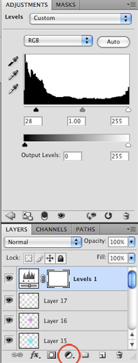 This will help to bring some additional contrast into the picture by darkening the colors of it a little bit.
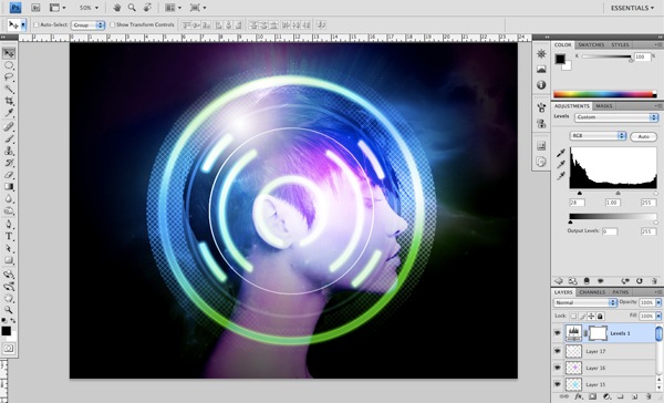
Step 29: Finishing Touches
For the last step, we are just going to add some additional elements to reinforce the colorful outer space feel of this piece. Using a hard round brush with solid white, paint a few clusters of dots to give the feel of distant stars (do this on a new layer above all of the other layers).
Once you have painted in your stars and are satisfied with the result, save your work and call it a day! 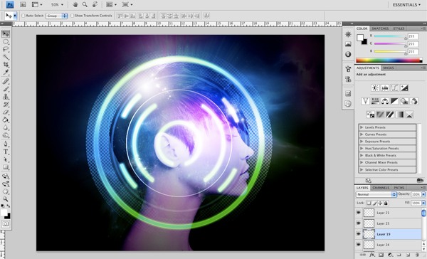
Tutorial Summary
This Photoshop and Illustrator digital art tutorial walked you through the process of composing a scene using vector shapes. We talked about creating and defining custom patterns, using the Gradient Tool to make great-looking light effects that give us a spacey, retro-futuristic vibe, a few Photoshop filter tricks to give our composition a unique tactile feel, and more.
Share your thoughts and ask your questions in the comments below!
Download Tutorial Source Files
- space_retrofuturistic_lights (ZIP, 59.80 MB)
-
 Trevin serves as the VP of Marketing at WebFX. He has worked on over 450 marketing campaigns and has been building websites for over 25 years. His work has been featured by Search Engine Land, USA Today, Fast Company and Inc.
 -

WebFX is a full-service marketing agency with 1,100+ client reviews and a 4.9-star rating on Clutch! Find out how our expert team and revenue-accelerating tech can drive results for you! Learn more
Make estimating web design costs easy
Website design costs can be tricky to nail down. Get an instant estimate for a custom web design with our free website design cost calculator!
Try Our Free Web Design Cost Calculator
Table of Contents
- Preview
- Tutorial Resources
- Step 1: Create a New Document in Photoshop
- Step 2: Isolated Beauty
- Step 3: Drag N’ Drop
- Step 4: Fill In the Background
- Step 5: Creating a Custom Pattern
- Step 6: Fire Up Illustrator
- Step 7: Do It Big
- Step 8: Apply Our Custom Pattern
- Step 9: Styling Our Custom Pattern
- Step 10: Fading Out the Pattern
- Step 11: Outside In
- Step 12: Copying and Pasting (Layer Styles)
- Step 13: Further Styling
- Step 14: More Neon Lights!
- Step 15: Spring Cleaning
- Step 16: Build You Up
- Step 17: Let There Be Light!
- Step 18: Duplicate and Blend
- Step 19: Adding Some Magenta
- Step 20: Back to the Background
- Step 21: Modifying Our Colors
- Step 22: Darkening the Edges
- Step 23: Best Practice
- Step 24: Moving On Up
- Step 25: Spaced Out
- Step 26: Kevin Spacey
- Step 27: Adding More Highlights
- Step 28: Create a Levels Adjustment Layer
- Step 29: Finishing Touches
- Tutorial Summary
- Download Tutorial Source Files
Share this article


Web Design Calculator
Use our free tool to get a free, instant quote in under 60 seconds.
View Web Design Calculator
Make estimating web design costs easy
Website design costs can be tricky to nail down. Get an instant estimate for a custom web design with our free website design cost calculator!
Try Our Free Web Design Cost Calculator