
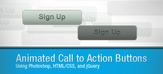
In this web design and development tutorial, you’ll get a walkthrough for creating a “Call to Action” button sprite in Photoshop as well as how to use jQuery to animate it. This tutorial is broken up into three sections: Photoshop, HTML/CSS, and JavaScript.
Introduction
This tutorial is divided into three sections:
- Section 1: Photoshop
- Section 2: HTML/CSS
- Section 3: JavaScript (jQuery)
If you enjoyed the tutorial, please express your appreciation by including images/screen shots of your work in the Six Revisions Flickr group – we’re trying to build up the collection there so that we can all have a nice community showcase.
Final Result
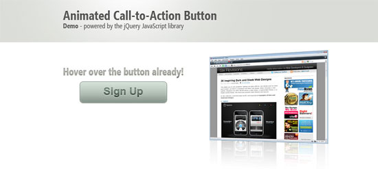 Click to see live demo.
Demos
Section 1: Photoshop
The first section will deal with the graphic creation of the Call to Action button.
Set up the Photoshop document
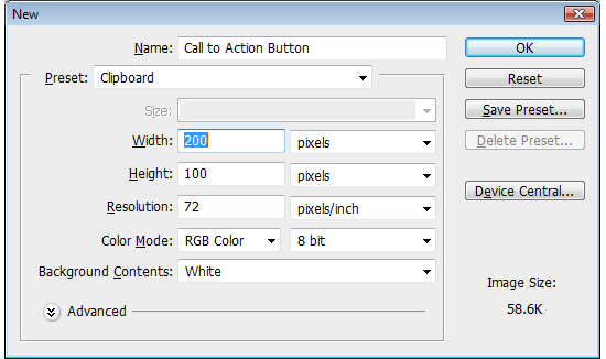
1 Our button’s dimensions will be 200px x 50px, but since we’ll be creating a CSS background sprite for the two different states, we’ll make the height of the canvas 100px. To begin, create a new Photoshop document (Ctrl + N) that has a canvas width of 200px and a canvas height of 100px.
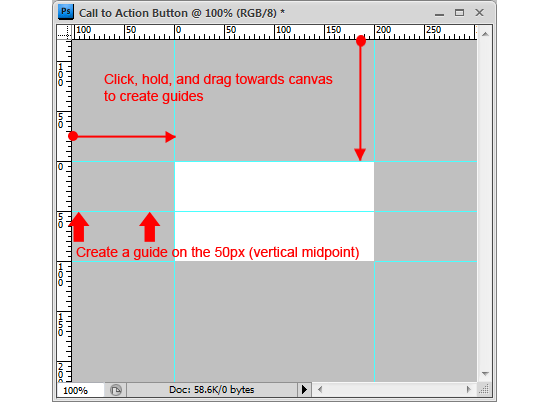
2 To make drawing the button easier, we’ll set up some guides. If it isn’t turned on yet, turn on your rulers first (Ctrl + R to toggle it on and off) by going to View > Rulers and making sure that it’s checked.
To create a guide, simply click on a ruler on the edge of the Photoshop workspace and drag towards your canvas. We’ll make 5 guides: 4 at the edges of the canvas, and 1 horizontal guide at the 50px mark (which effectively divides our canvas into two equal parts).
Creating the button shape
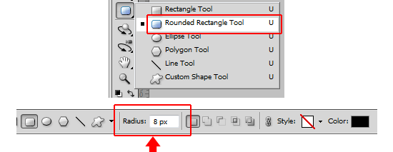
3 Now we’ll create a rounded rectangle shape. Get the Rounded Rectangle Tool from the Tools Panel.
Adjust the Radius option in the Options bar to 8px. The foreground color doesn’t matter because it will be overridden by the layer styles that we’ll soon apply.
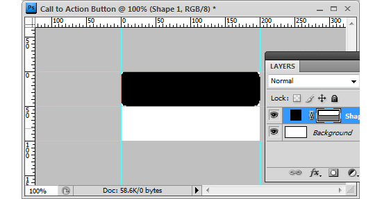
4 With the Rounded Rectangle Tool ready to go, created the rounded rectangle shape at the top half of the canvas by dragging from the top left corner to the bottom right corner of the 50px mark.
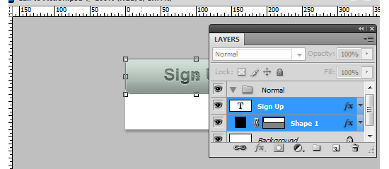
Adding layer styles to the button
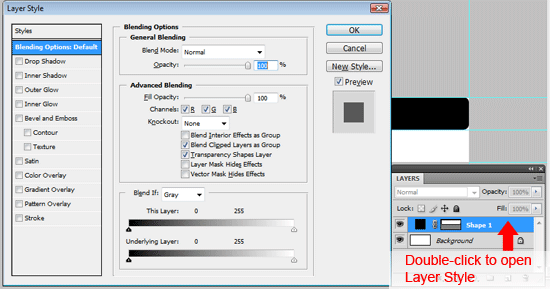
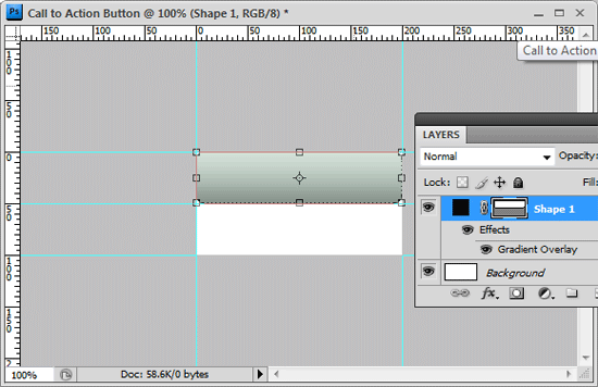
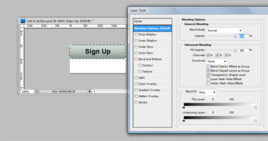
5 We’ll now add a series of layer styles to the rounded rectangle shape that we just created. To start, double-click on the shape layer in the Layers Panel to open the Layer Styles dialog box.
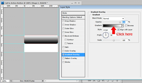
6 First we’ll add a gradient overlay.
Click on the Gradient Overlay to apply the layer style. Then click on the Gradient option to open the Gradient Editor dialog box to choose the colors we want.
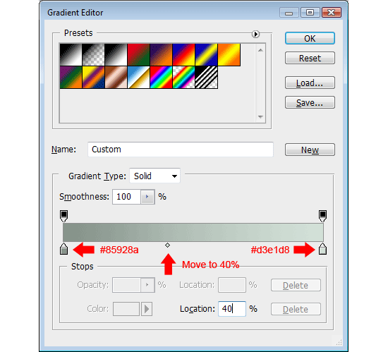
7 In the Gradient Editor, change the left color stop’s color by clicking on it (this will be the color at the bottom of the button). I’ve decided to use a dark olive green color for the left color stop (#85928a).
Change the right color stop to a lighter green color (#d3e1d8) – this will be the color of the button at the top. Then slide the Color Midpoint to 40% so that the light green is slightly more dominant.
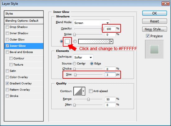
8 Add an Inner Glow layer style next, this will give the button a subtle white border. Set the Opacity option to 100% and change the color of the glow to white (#ffffff) by clicking on the small box to open the color picker and then changing it there.
Then under the Elements option set, change the Size option to 3px.
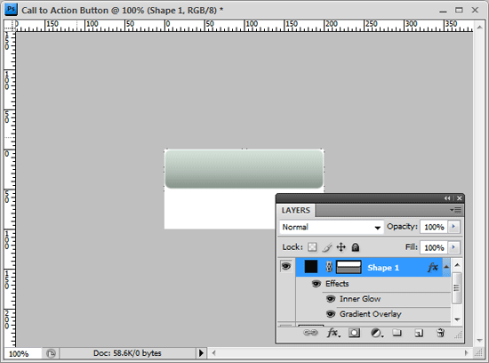
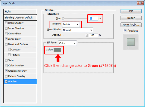
9 The final layer style we’ll add to the normal state button is a 1px dark green (#74857a) stroke to add a narrow border around the shape. Set the Size option to 1px. Set the Position option to Inner so that it draws the border inside the button shape.
Finally, change the color of the stroke by clicking on the Color option to open the Color Picker dialog box and entering a dark green color (#74857a).
Typing in the text
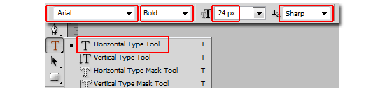
10 For the text of our button, we’ll use a simple and familiar font family: Arial. You can use any font that you wish, but typically, the text effect we’ll be applying is best suited for bold and sans serif fonts – keep that in mind when selecting the font family. Grab the Horizontal Type Tool (T) from the Tools Panel.
In the Options bar, set the font family to Arial, the font style to Bold, font size to 24px, and anti-aliasing method to Sharp. Don’t worry about the font color since it will be overridden by the layer styles we’ll be applying later.
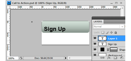
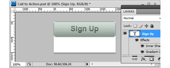
11 Click anywhere in the canvas to start typing, and type your call to action; the call to action used here is “Sign Up” but yours might be “Buy Now” or “See Demo”, it’s up to you.
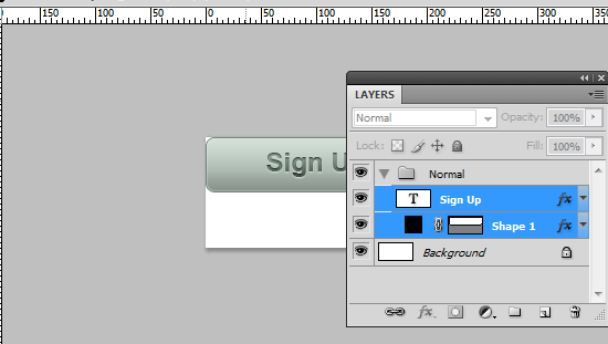
Centering the text
12 Depending on where you started typing, your text may not be centered in the button, so we need to center it precisely. First, create a marquee selection around the button by Ctrl + clicking on the button shape layer’s thumbnail in the Layers Panel; this will automatically create a marquee selection around the edge of the button.
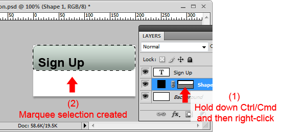
13 Now click on the text layer in the Layers Panel to make it the active layer (don’t deselect the selection yet).
Then go to Layer > Align Layers to Selection > Vertically Center to position the text layer vertically centered on our button.
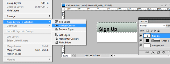
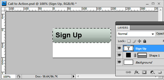
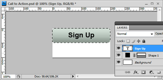
14 With the marquee selection still around the button and the text layer still the active layer in the Layers Panel, go to Layer > Align Layers to Selection > Horizontally Center to locate the text in the middle of the button.
Applying Layer Styles to the text
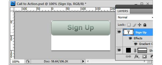
15 Double-click on the text layer to open up the Layer Styles dialog box. We’re going to create an inset text effect similar to the How to Create Inset Typography in Photoshop tutorial I wrote a while back.
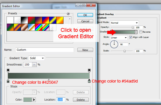
16 Apply a gradient overlay by checking the checkbox beside it. click on the Gradient option to open the Gradient Editor.
For the left color stop, choose a dark olive green color (#425047). For the right color stop, choose a slightly lighter green color (#94ad9d).
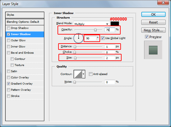
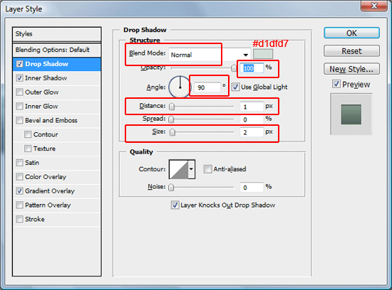
17 Next, apply an inner shadow layer style. Set the Angle option to 90 degrees, Distance to 1px, and Size to 2px.
Keep the inner shadow color to black (#000000) and the Opacity option to 75%. This will create a subtle inset/stamped-in effect.
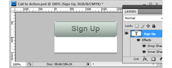
18 To finish off the text layer styles for the normal state, we’ll add a subtle drop shadow at the bottom of the text. Change the Blend Mode option to Normal and the color of the shadow to a light green color (#d1dfd7).
Set the Opacity to 100%. Make sure that the Angle option is also at 90 degrees to keep it the same as the inner shadow’s light source. Finally, set the Distance option to 1px and the Size option to 2px (equal to the inner shadow’s settings).
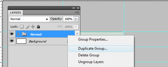
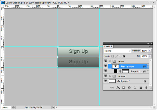
Creating the hover state button group
19 The hover state will fill up the bottom of our canvas.
We’ll just duplicate the normal state button, move it down the lower part of the canvas, and tweak the layer styles to make a slightly different look. To keep things organized, we’ll group together the normal state button layers. To create a group, click on the Create a new group icon at the bottom of the Layers Panel (it looks like a folder).
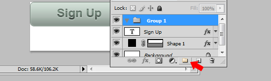
20 Change the group’s name to something more intuitive than the default Group 1, such as Normal.
Then drag the two normal state layers in the newly created group.
21 If you’ve turned off the guides that we created earlier, turn it back on to help us position the hover state button accurately; the shortcut is holding down Ctrl (or Cmd) and then pressing ; (alternatively, go to View > Show > Guides).
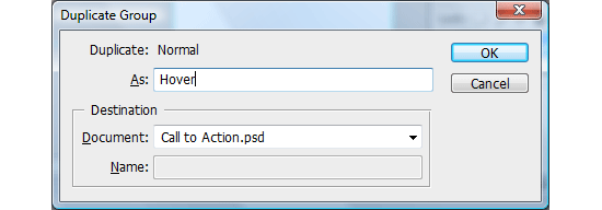
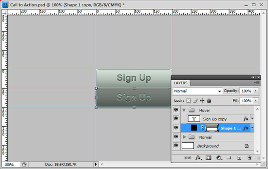
22 Duplicate the Normal group by choosing the group in the layers panel. Name the group to something that makes sense like Hover.
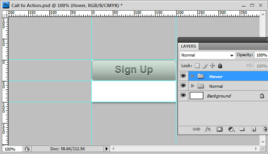
23 With the Hover group active in the Layers Panel, click on the Move Tool (V) in the Tools Panel and use your down arrow key to move the Hover group to the bottom of the canvas so that the top edge of the button is right on the middle guide. Use the Zoom Tool (Z) in the Tools Panel to help you position the Hover group if you’re having a hard time seeing the edges.
If you use the Zoom Tool (Z), just press Ctrl/Cmd + 1 to go back to 100% view.
Changing the layer styles of the Hover group
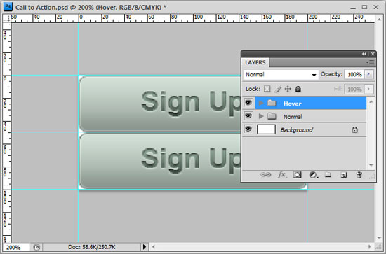
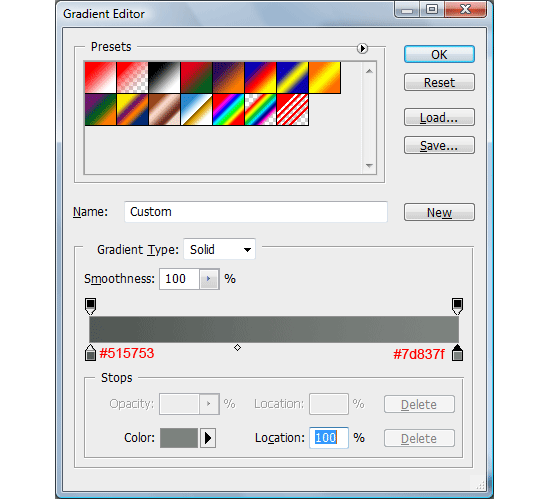
24 Since we just need to tweak a few settings, creating the hover group button will be quicker. Inside the Hover group, double-click on the button shape layer in the Layers Panel to open the Layer Styles dialog box. We will keep everything the same except the gradient overlay layer style colors.
Edit the settings so that the left color stop of the gradient is a dark green color (#515753) and the right color stop is a slightly lighter green color (but still dark – #7d837f).
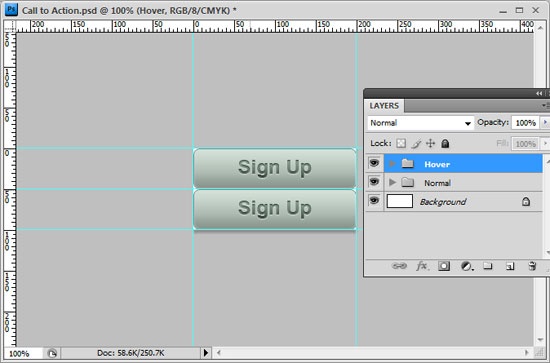
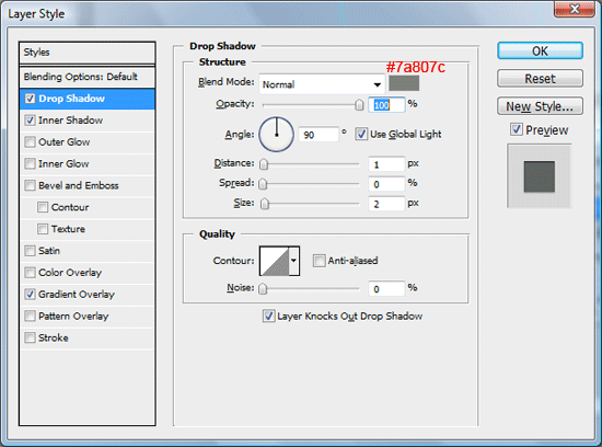
25 Next, double-click on the text layer in the Hover group to open up its Layer Styles dialog box. Change the Drop shadow color to a darker color (#7a807c).

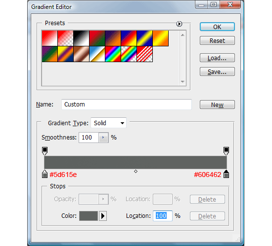
26 Finally, edit the gradient overlay layer style colors. Set the left color stop to a dark green color (#5d615e) and the right color stop to a slightly lighter green, but still dark, color (#606462).
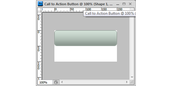
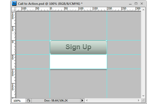
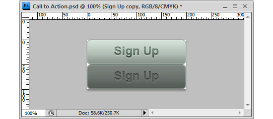
Section 1: Photoshop done
We’re now done with the Photoshop portion of this tutorial (Section 1).
If you followed along, you should now have something like this:
This will be our CSS background sprite. Don’t close the Photoshop document yet, since we still have to save it for the web in Section 2.
Section 2: HTML/CSS
Now, we’ll make our Call to Action button functional using HTML/CSS.
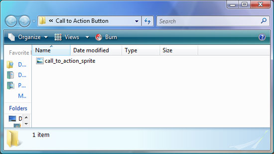
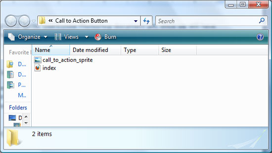
1 Start by creating a folder that’s designated as our working directory. I called this directory “Call to Action Button” but feel free to name it something else.
We’ll save all of our assets in this folder.
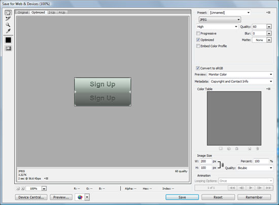
2 FWe’ll save our CSS background sprite (the button we created in Section 1). Go back to Photoshop, choose File > Save for Web & Devices. Save it in JPG file format (PNG or GIF works too) inside the Call to Action Button folder as call_to_action_sprite.jpg.
3 Next, we’ll create the HTML document – the best way to do this is with your favorite source code editor (I use Dreamweaver), but a simple text editor will suffice. Create a standard HTML document, and save it inside the Call to Action Button folder as index.html.
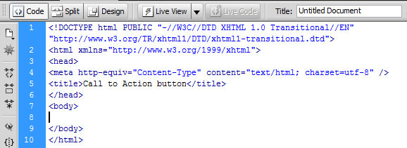
4 For the HTML, we’ll use a hyperlink element <a> nested inside a paragraph element (<p>) with a class of cta-button. Here is the code to place inside the <body> of index.html.
For web accessibility, we type out the text in our call to action button, which is “Sign Up”.
Code block 1:
<body> <p class="cta-button"><a href="#">Sign Up</a></p> </body>
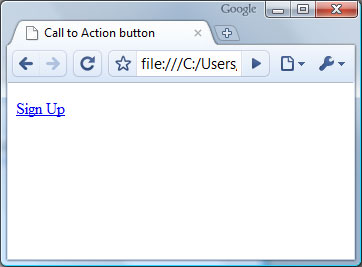 View of
 p.cta-button a element in Google Chrome.
5 Now we need to style it, so create a stylesheet called styles.css and save it in the Call to Action Button folder.
6 In index.html, link to your stylesheet.
Code block 2:
<head> <link rel="stylesheet" href="styles.css" type="text/css" media="screen" /> </head>
7 We need to display the p.cta-button element as a block element so that we can give it a set height and width equal to our call to action button (width:200px, height:50px). We also set it so that its background is the bottom part of our CSS sprite (the hover state). Later on, we’ll reveal it by moving the background of the <a> element by styling the a:hover pseudo-selector.
To center the button on the browser viewport, we use the margin:0 auto technique, which works for most browsers including IE5.5 and above.
Code block 3:
.cta-button { display:block; width:200px; height:50px; background:url(call_to_action_sprite.jpg) no-repeat 0 -50px; margin:0 auto; }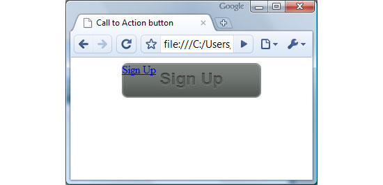 View of Call to Action button with background sprite set.
8 Next we’ll style the <a> element inside the p.cta-button paragraph. We also need it to be a block element so that we can use the text-indent CSS background image replacement technique to move the HTML text (“Sign Up”) outside of the browser’s viewport; we do this by setting an extreme value of -9999px to its text-indent attribute. With set the width and height to 100% so that it’s equal to the width and height of p.cta-button.
Finally, we position the background sprite to the top left of the image sprite, which is the normal state.
Code block 4:
.cta-button a { display:block; width:100%; height:100%; background:url(call_to_action_sprite.jpg) no-repeat 0 0; text-indent:-9999px; }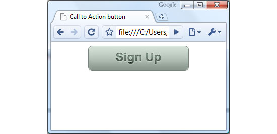 View of Call to Action button with CSS finalized. Sign Up HTML text is indented out of the viewport.
9 At this point, we want to reveal the hover state when the user mouses over the button, so we’ll use the :hover psuedo-selector to hide the background.
Code block 5:
.cta-button a:hover { background-position:0 50px; }Section 2: HTML/CSS finished
All together, here’s our HTML and CSS.
Code block 6:
<body> <p class="cta-button"><a href="#">Sign Up</a></p> </body>
Code block 7:
.cta-button { display:block; width:200px; height:50px; background:url(call_to_action_sprite.jpg) no-repeat 0 -50px; margin:0 auto; } .cta-button a { display:block; width:100%; height:100%; background:url(call_to_action_sprite.jpg) no-repeat 0 0; text-indent:-9999px; } .cta-button a:hover { background-position:0 50px; }Demo of HTML/CSS
Example 1: Call to Action button with HTML/CSS.
Section 3: JavaScript/jQuery
Let’s animate our button, shall we?
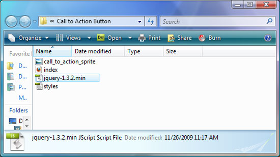
1 First, download the jQuery library and save it in the Call to Action button folder. If you’re interested in studying the library, download the uncompressed version, but if you’re going into production, download the minified (smaller file size) version.
2 In the <head> of index.html, right below the link reference to styles.css, reference the jQuery JavaScript library.
Code block 8:
<link rel="stylesheet" href="styles.css" type="text/css" media="screen" /> <script type="text/javascript" src="jquery-1.3.2.min.js"></script> </head>
3 Create a blank JavaScript file and save it as cta-javascript.js inside the Call to Action button folder.
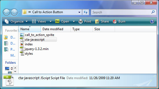
4 Reference cta-javascript.js in index.html, right below the jquery library reference.
Code block 9:
<link rel="stylesheet" href="styles.css" type="text/css" media="screen" /> <script type="text/javascript" src="jquery-1.3.2.min.js"></script> <script type="text/javascript" src="cta-javascript.js"></script> </head>
5 Switch over to cta-javascript.js, then we’ll start coding.
First, let’s set up the .ready() method which is a jQuery method that allows us to run our code as soon as the DOM is ready to be worked on.
Code block 10:
$(document).ready(function(){ ...our code goes in here... });6 The first thing we need to do is to remove the :hover style because it will affect the animation effect. Doing it this way (via JavaScript) ensures that our button degrades nicely – even with JavaScript disabled, there will still be a hover effect. We can use the .css() method to remove the style.
Code block 11:
$('p.cta-button a') .css({ 'backgroundPosition':'0 0' })7 Next, we chain the .hover() method, which is an event helper that deals with the mouseover event to the $() element selection.
The hover method can take in two functions: the first function executes code for the mouseover event, and the second function executes code for the mouseout event (when the user removes the mouse pointer out of the element).
Code block 12:
$('p.cta-button a') .css({ 'backgroundPosition': '0 0' }) .hover( function(){ ...code to execute on mouseover... }, function(){ ...code to execute on mouseout... } )8 The code we want to execute on mouseover and mouseout is the .animate() method, which smoothly transitions CSS properties from the current value to the desired value. In this case, we want to transition the opacity to 0 when on mouseover (to reveal the hover state), and 1 when the mouse leaves the p.cta-button a element. The .animate() method also takes an integer as a parameter that dictates how fast the effect transisition should occur, in millisecond units.
I found that 650ms was a good speed, but feel free to experiment here. And on a final note, we use the stop() JavaScript method on the element we’re transitioning so that if the user mouses in and out quickly before a transition is finished, it stops it before executing the new animation event.
Code block 13:
.hover( function(){ $(this) .stop() .animate({ 'opacity': 0 }, 650); }, function(){ $(this) .stop() .animate({ 'opacity': 1 }, 650); } );Section 3: JavaScript (jQuery) done!
We’re now done with the entire tutorial. Here’s the JavaScript in one go:
Code block 14:
$(document).ready(function(){ $('p.cta-button a') .css({ 'backgroundPosition': '0 0' }) .hover( function(){ $(this) .stop() .animate({ 'opacity': 0 }, 650); }, function(){ $(this) .stop() .animate({ 'opacity': 1 }, 650); } ); });JavaScript demo
Example 2: Call to Action button with jQuery animation.
Download the source files
- animated-call-to-action (ZIP, 0.57MB)
Questions or comments?
Were you able to complete the tutorial? How was the difficultly? Did you get stuck in any way?
Please pose your questions and provide us with your feedback on how we can make tutorials on Six Revisions better.
Related Content
-
 President of WebFX. Bill has over 25 years of experience in the Internet marketing industry specializing in SEO, UX, information architecture, marketing automation and more. William’s background in scientific computing and education from Shippensburg and MIT provided the foundation for RevenueCloudFX and other key research and development projects at WebFX.
 -

WebFX is a full-service marketing agency with 1,100+ client reviews and a 4.9-star rating on Clutch! Find out how our expert team and revenue-accelerating tech can drive results for you! Learn more
Make estimating web design costs easy
Website design costs can be tricky to nail down. Get an instant estimate for a custom web design with our free website design cost calculator!
Try Our Free Web Design Cost Calculator
Share this article


Web Design Calculator
Use our free tool to get a free, instant quote in under 60 seconds.
View Web Design Calculator
Make estimating web design costs easy
Website design costs can be tricky to nail down. Get an instant estimate for a custom web design with our free website design cost calculator!
Try Our Free Web Design Cost Calculator