- Home
- Blog
- Web Design
- A Look at Some CSS Methodologies
A Look at Some CSS Methodologies
-
 16 min. read
-
 William Craig
 CEO & Co-Founder
- President of WebFX. Bill has over 25 years of experience in the Internet marketing industry specializing in SEO, UX, information architecture, marketing automation and more. William’s background in scientific computing and education from Shippensburg and MIT provided the foundation for RevenueCloudFX and other key research and development projects at WebFX.
CSS is notoriously difficult to manage in large, complex, rapidly-iterated systems. One reason is CSS lacks a built-in scoping mechanism. Everything in CSS is global.
That means any change you make has the potential to cascade and alter the presentation of unrelated bits of the UI. Extended CSS languages, a.k.a. CSS preprocessors, such as Sass, Less and Stylus make things a little easier by offering up features that make writing CSS easier.
But even these extended CSS languages, in my opinion, don’t truly fix the scalability issue. Until CSS gets its own native scoping mechanism, we need to devise our own system for locking down styles to specific sections of an HTML document. CSS methodologies are the solution.
In this article, we will take a look at these CSS methodologies:
- Object-Oriented CSS (OOCSS)
- Block, Element, Modifier (BEM)
- Scalable and Modular Architecture for CSS (SMACSS)
- SUIT CSS
- Systematic CSS
Full disclosure: I’m the creator of Systematic CSS. CSS methodologies are formal, documented systems for authoring CSS in a way that allows us to develop, maintain and scale the front-end as a set of small, isolated modules. Rather than as one massive lump of indivisible code. Adopting a CSS methodology — even if it’s one that you create yourself — will make it easier for you to design and iterate on your web design projects, regardless of scale and complexity.
Related: CSS Development at Large-Scale Websites Each CSS methodology offers a slightly different set of solutions to the CSS scalability/maintainability problem. A CSS methodology will often define guidelines for:
- CSS and HTML best practices
- Class- and ID-naming conventions
- Ordering and grouping of CSS style rules
- Code formatting
There is no “best” CSS methodology. Different approaches work better for different individuals/teams/projects. Hopefully, looking at a few existing CSS methodologies will help you discover one that fits your needs.
Or it might inspire you to create your own custom CSS-authoring guidelines.
Object-Oriented CSS (OOCSS)
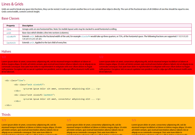 Nicole Sullivan’s Object-Oriented CSS, or OOCSS for short, was launched in 2009. It was really the first CSS methodology to become widely adopted. It’s still hugely influential today. OOCSS advocates the separation of structure from skin.
The methodology makes a clear distinction between content and its containers. In OOCSS, style rules are written exclusively using CSS class selectors.
OOCSS Example
For example, the style of your button elements might be set via two classes that you have given the class of:
.button— provides the button’s basic structure.grey-btn— applies colors and other visual properties
CSS
.button { box-sizing: border-box; height: 50px; width: 100%; } .grey-btn { background: #EEE; border: 1px solid #DDD; box-shadow: rgba(0, 0, 0, 0.5) 1px 1px 3px; color: #555; }HTML
<button class="button grey-btn">One goal of the OOCSS methodology is to reduce duplication of the same properties throughout your various style rules. In other words, OOCSS can help us maintain DRY stylesheets. The methodology attempts to achieve this goal by using lots of small, modular, specialist CSS classes.
Very few style properties are applied via type selectors (e.g. h1, div and body).
Counter-Example
The use of descendant selectors is discouraged.
For example: CSS
/* Descendant selectors are discouraged in OOCSS */ .wrapper .blog-post .button { ... }This way, the presentation of your HTML elements is never dependent upon them being used in a specific context or DOM structure. The great thing about the OOCSS methodology is it urges authors to make the most of CSS’s cascading behavior, rather than trying to lock it up with high-specificity selectors.
Related: How CSS Specificity Works Authors are encouraged, whenever possible, to reuse existing style rules instead of creating new ones. We are also encouraged to extend style rules by specifying additional CSS properties with new classes, rather than modifying or overwriting existing CSS properties.
Counter-Example
Let us say we want to give the first list item of an unordered list element a different color.
This is one way to do it: HTML
<!-- Counter-example --> <ul class="to-do"> <li>Combine my CSS files</li> <li>Run CSS Lint</li> <li>Minify my stylesheet</li> </ul>CSS
/* Counter-example */ .to-do { color: #FFF; background-color: #000; } .to-do li:first-child { color: #FF0000; }OOCSS Example
To make our CSS more modular and flexible, and to avoid descendant selectors, the above counter-example could be rewritten in this manner: HTML
<!-- OOCSS --> <ul class="to-do"> <li class="first-to-do-item">Combine my CSS files</li> <li>Run CSS Lint</li> <li>Minify my stylesheet</li> </ul>CSS
/* OOCSS */ .to-do { color: #FFF; background-color: #000; } .first-to-do-item { color: #FF0000; }The main downside of OOCSS is that you can end up with an awful lot of classes. Which can be difficult to maintain and manage. And, in my opinion, the concept of object-oriented programming — which is where OOCSS takes inspiration from — does not fit comfortably with CSS.
But that’s not to say the principles of OOCSS are invalid. On the contrary, OOCSS is a commonsense CSS methodology that brings back sanity to large-scale CSS development.
Block, Element, Modifier (BEM)
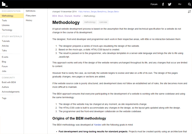 Block, Element, Modifier — more commonly called BEM — is a CSS class-naming system devised by the dev team at Yandex (the Google of Russia).
The idea behind BEM is to differentiate CSS classes that fulfill different roles. This is done by naming CSS classes in a way that indicates their role. BEM complements OOCSS because OOCSS doesn’t impose any particular class-naming convention.
In BEM terminology, a block is an independent, modular UI component. A block may be composed of multiple HTML elements, or even multiple blocks. An example of a block might be your navigation menu or search form.
An element is a component of a block. An element serves a singular purpose. For example, if you have a navigation menu block, then elements of it might be your navigation menu’s links, which in turn might be in the form of list items (li elements) and links (a elements).
A modifier is a CSS class that changes the default presentation of a block or element. This is the BEM class-naming syntax:
.block.block--modifier.block__element.block__element--modifier
Counter-Example
Consider the following example, the markup for a login form: HTML
<form> <label>Username <input type="text" name="username" /></label> <label>Password <input type="password" name="password" /></label> <button>Sign in</button> </form>BEM Example
Here’s the markup above with BEM classes applied: HTML
<form class="loginform loginform--errors"> <label class="loginform__username loginform__username--error"> Username <input type="text" name="username" /> </label> <label class="loginform__password"> Password <input type="password" name="password" /> </label> <button class="loginform__btn loginform__btn--inactive"> Sign in </button> </form> The .loginform class is the block. The .loginform block is composed of three elements:
| Element | Purpose |
|---|---|
loginform__username |
Take in the username |
loginform__password |
Take in the password |
loginform__btn |
Allow the user to submit the web form |
The three modifiers are:
| Modifier | Description |
|---|---|
.loginform__username--error |
When there’s an error, the element’s visual properties are modified so that it indicates to the user there was an error. |
.loginform__btn--inactive |
The element’s visual properties are modified so that it has an inactive appearance. |
.loginform--errors |
This modifier visually presents the login form in a manner indicating that it contains errors. |
The BEM naming convention helps CSS authors comply with the OOCSS principle of using a flat selector hierarchy composed of equally-specific class selectors. It also helps OOCSS authors avoid deep descendant selectors.
Counter-Example
So instead of the following style rule, which uses three CSS class selectors… CSS
.loginform .username .error { ... }BEM Example
…you can just use a single class selector: CSS
.loginform__username--error { ... }BEM is a very robust class-naming convention. It successfully distinguishes the different concerns that classes are used for. And it’s easy to see in the markup which classes are related to one another.
A couple of subjective criticisms against BEM are:
- The class names can end up being long and ugly
- The naming convention is not intuitive to inexperienced developers
Personally, I don’t think those are particularly strong criticisms. However, it would be nice to have a class-naming convention that is as robust as BEM, while also being a little tidier and more intuitive.
Scalable and Modular Architecture for CSS (SMACSS)
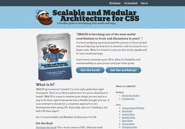 Jonathan Snook published his book on Scalable and Modular Architecture for CSS in 2011. Abbreviated as SMACSS. Pronounced as “smacks”. A key idea in this CSS methodology is how we categorize our CSS style rules. Snook came up with five categories:
| Category | Description |
|---|---|
| Base | Style rules that sets the default CSS properties of individual HTML elements. These are typically CSS type selectors.
Examples: |
| Layout | Style rules that are related to the structural layout of web pages. Containers, the grid, etc. They are prefixed with layout- or l-.
Examples: |
| Modules | Modular, reusable components. Examples:
|
| State | Style rules that specify the current state of something in the interface. Examples:
|
| Themes | Are style rules that affect layout and modules, triggered by user preferences/actions/viewing contexts. |
SMACSS offers a simpler naming convention than BEM.
There are no names for base styles because only type selectors (h1, p, a, etc.) are used for those. Modules are given their own unique class names. Sub-components and variations are prefixed with the name of their parent module.
SMACSS Example
Let’s say our layout is called .l-footer. We have a search form module inside it. The search form has already been submitted at least once by the user.
This might be our markup: HTML
<section class="l-footer"> <form class="search is-submitted"> <input type="search" /> <input type="button" value="Search"> </form> </section>SMACSS discourages the use of descendant selectors. Jonathan Snook explains this by introducing a concept he calls depth of applicability. This concept is all about limiting the impact that CSS has on HTML markup by using classes to very precisely target elements you want to style.
SUIT CSS
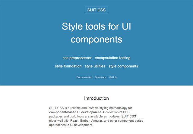 Nicolas Gallagher’s SUIT CSS introduced in 2014, is interesting because it combines a BEM-like class-naming system with a CSS preprocessor. So SUIT CSS provides us with extended CSS syntax a la Sass, Less or Stylus. SUIT CSS classes come in five formats:
u-utilityNameComponentNameComponentName--modifierNameComponentName-elementNameComponentName.is-stateOfName
This class-naming convention highlights the division between:
- General utility classes
- Standalone/modular UI components
- Individual elements
- Modifiers
SUIT CSS Example
Here’s how this CSS methodology might get applied to a login form: HTML
<form class="LoginForm LoginForm--errors"> <label class="LoginForm-username is-required"> Username <input type="text" name="username" /> </label> <label class="LoginForm-password"> Password <input type="password" name="password" /> </label> <button class="LoginForm-button is-inactive">Sign in</button> </form>Systematic CSS
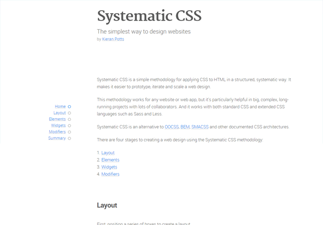 Systematic CSS is a new CSS methodology which I developed and launched recently. Systematic CSS is based on a CSS-authoring system that I have fine-tuned over several years while working for various tech startups. Systematic CSS is how I personally compose web designs.
Systematic CSS shares many of the principles and ideas you can find in OOCSS, BEM, SMACSS, SUIT CSS, and other CSS methodologies. Systematic CSS is meant to be a simpler alterative to existing CSS methodologies: There are fewer naming-conventions to remember, and the class-naming convention is intended to be more intuitive. In the Systematic CSS methodology, the process of developing a new web design is broken up into four phases:
- Layout
- Elements
- Widgets
- Modifiers
Systematic CSS Example
HTML First, an empty wireframe-like layout is created from a series of sectioning elements such as section and div:
<div class="CONTAINER"> <header class="BANNER"></header> <nav class="NAVIGATION_PRIMARY"></nav> <nav class="NAVIGATION_SECONDARY"></nav> <main class="MAIN"></main> <aside class="ADVERTS"></aside> <footer class="FOOTER"> <nav class="SITEMAP"></nav> <div class="LEGAL"></div> </footer> </div> Second, we establish the default presentation for HTML elements that will encapsulate content and render interactive controls. Examples include headings (h1, h2, h3), paragraphs (p), lists (ul and ol), tables, forms, and so forth. Third, we identify recurring patterns of content in our designs.
We bundle these recurring patterns up into independent modules of markup and styling (and scripting if needed). These bundles of recurring content patterns are called widgets in the Systematic CSS methodology.
Systematic CSS Example
Here’s the markup for two widgets that render a navigation bar and search form: HTML
<!-- navigation bar --> <div class="NavBar"> <ul> <li><a href="./">Home</a></li> <li><a href="about.html">About</a></li> <li><a href="learn/">Learn</a></li> <li><a href="extend/">Extend</a></li> <li><a href="share/">Share</a></li> </ul> </div> <!-- search form --> <div class="SearchBox"> <form action="search.html" method="get"> <label for="input-search">Search</label> <input name="q" type="search" id="input-search" /> <button type="submit">Search</button> </form> </div>Content — in the form of widgets and naked HTML elements — is then placed within the layout.
Finally, modifier classes are added to vary the default presentation of things.
Systematic CSS Example
In the following example the navbar-primary modifier varies the default presentation of the NavBar widget, and the navbar-selected modifier targets the current selection: HTML
<div class="NavBar navbar-primary"> <ul> <li><a href="./">Home</a></li> <li><a href="about.html" class="navbar-selected">About</a></li> <li><a href="learn/">Learn</a></li> <li><a href="extend/">Extend</a></li> <li><a href="share/">Share</a></li> </ul> </div>In Systematic CSS, each class either:
- Represents the name of a layout section
- Represents the namespace for a widget
- Modifies the default presentation of something
Classes must fall within one of the three distinct purposes above. A class must not combine/fuse together the purposes above. The three types of classes adopt different naming conventions, to easily tell them apart.
| Class Type | Casing |
|---|---|
| Layout | .UPPER_CASE |
| Widget | .CamelCase |
| Modifier | .lower_case |
What’s nice about this naming convention is the hierarchy of classes is represented by their letter-casing. Layout classes, written using all-upper-case letters, scream out from the markup. Examples: .NAVIGATION, .SIDEBAR, .FOOTER.
The CamelCase letter-casing of widgets, which will always be nested within layout classes, are a little less prominent. Examples: .MainMenu, .ImageGrid, .BlogPost. Modifier classes — which are arguably the least important classes since they merely modify things and are not critical to achieving a default presentation — are the least conspicuous of all, being written in all-lower-case letters.
Examples: .is-highlighted, .has-errors, .hidden.
In Conclusion
All CSS methodologies tackle the scalability and maintainability problem in CSS by providing a class-based system for breaking up big web designs into lots of small, modular, discrete units. Each UI module can be reused over and over throughout a design, and even ported from one project to another if two projects share the same CSS methodology.
In the process, CSS methodologies do much more than fix the CSS scalability problem. They make it easier to develop and iterate a design. They make front-end code easier to read and understand, provide ready-made documentation, and make it easier for multiple people to collaborate on a design.
Adopting a CSS methodology can reduce the learning curve for new designers joining a project, and make for a smoother transition when a project is handed over to a new team. And because CSS methodologies encourage reuse of existing code, they enforce consistency in visual designs and reduce page size and increase page rendering speed. CSS methodologies have different class-naming conventions and they carve up web designs along slightly different lines.
But the specifics of any particular methodology are less important than the general solutions they provide for modularizing front-end code and making CSS easier to scale. You can take away the ideas and develop your own categories of classes and devise your own class-naming conventions that work best for you. That’s what I do.
Systematic CSS is my starting point, but every project is different, and I always tweak and extend my CSS methodology to better fit the skill set and creative temperament of the team I’m working with.
Other CSS Methodologies
- Atomic Design — a design system that uses chemistry terms and analogies (atoms, molecules, and organisms)
- DoCSSa — a Sass-based CSS methodology by Matthieu Larcher and Fabien Zibi
- csstyle — a Sass/PostCSS-based methodology by Dave Geddes
Related Content
- 5 Standardized Methods for Writing CSS
- Are You Using CSS3 Appropriately?
- A List of CSS Styles Guides for Inspiration
 Kieran Potts is a full-stack developer specializing in building bespoke websites, web apps and RESTful web APIs for Internet startups. Visit his website: kieranpotts.com.
-
 President of WebFX. Bill has over 25 years of experience in the Internet marketing industry specializing in SEO, UX, information architecture, marketing automation and more. William’s background in scientific computing and education from Shippensburg and MIT provided the foundation for RevenueCloudFX and other key research and development projects at WebFX.
 -

WebFX is a full-service marketing agency with 1,100+ client reviews and a 4.9-star rating on Clutch! Find out how our expert team and revenue-accelerating tech can drive results for you! Learn more
Make estimating web design costs easy
Website design costs can be tricky to nail down. Get an instant estimate for a custom web design with our free website design cost calculator!
Try Our Free Web Design Cost Calculator


Web Design Calculator
Use our free tool to get a free, instant quote in under 60 seconds.
View Web Design Calculator
Proven Marketing Strategies
Make estimating web design costs easy
Website design costs can be tricky to nail down. Get an instant estimate for a custom web design with our free website design cost calculator!
Try Our Free Web Design Cost Calculator
What to read next


