

Preview
Click the image below to see it in full size. 
Tutorial Resources
960 Grid System Introduction
In this tutorial we will use the 960 Grid System to organize and arrange the elements of our web layout. Before we begin, download the grid system on your computer. Unzip the archive file you downloaded, go to the “templates” folder and then go to the “photoshop” folder.
You will find three .PSD files. Each of these files contains a grid with 12, 16 and 24 columns. The .PSD files have some guides already set up, which will be very useful.
To activate the guides, go to View > Show > Guides, or use the shortcut Ctrl/Cmd + ;. During this tutorial you will need to create shapes with specific dimensions. To see the exact size of a shape or selection while you are creating it, open the Info Panel by going to Window > Info.
The width and the height of your shapes and selections will be displayed in this panel. 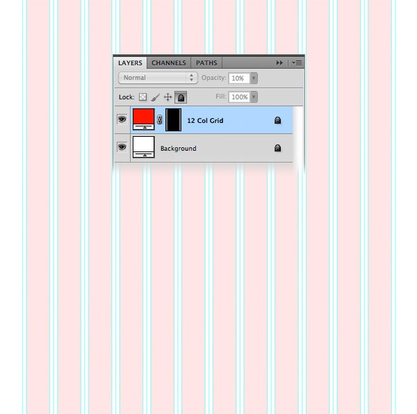 Tip: If you need a more thorough guide for using 960 GS, I suggest reading the guide called The 960 Grid System Made Easy.
Step 1: Setting up the document
Open the “960_grid_12_col.psd” file in Photoshop. Then go to Edit > Canvas Size and set the width to 1200px and the height to around 1700px.
You can adjust the height later on so that your web layout fits within your document. 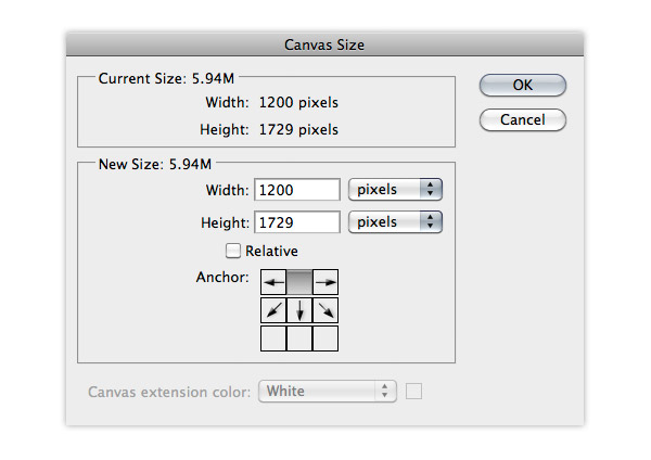
Step 2: Creating the header
Create a new group and name it “Header”. Select the Rectangle Tool (U) and create a rectangle with the dimensions 1200px by 100px and the color #383c3e. Name this layer “header bg”. Right-click on this layer and select Convert to Smart Object. Then go to Filter > Noise > Add Noise and use the settings from the following image. 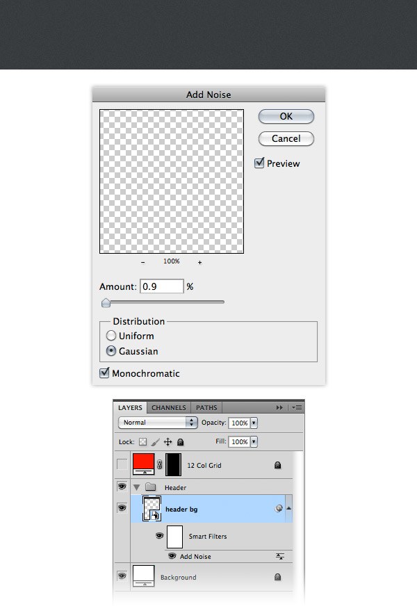
Step 3: Adding the name of the web layout
Select the Type Tool (T) and write the name for your web layout in the left side of the header.
I used the font Rockwell Bold with the size 40pt and the color #FFFFFF. Activate the guides (Ctrl/Cmd + 😉 to help you position this layer as you see in the image below. 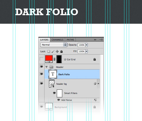
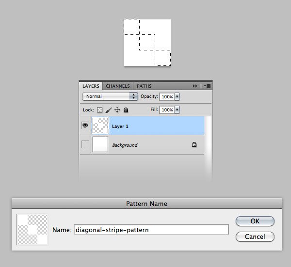
Step 4: Creating diagonal stripe pattern
Now we will create a diagonal stripe pattern that we will use later to add a stylized shadow to the text layer.
Create a new document with the dimensions 3px by 3px. Hide the Background layer and then create a new layer (Ctrl/Cmd + Shift + N). Use the Rectangular Marquee Tool (M) to create three square selections as you see in the following image (hold down the Shift key and then create each square selection).
Fill the selected are with white and hit Ctrl/Cmd + D to deselect. Go to Edit > Define Pattern, give your pattern a name and click OK. Now you can close this document.
Step 5: Adding a stylized shadow to the text layer
Hold down the Alt/Option key and drag a copy of the text layer beneath the original one. Name this new layer “shadow” and change its color to red so you can see it better when we move it. Select the Move Tool (V) and use the arrow keys on your keyboard to move this text layer 2px down and 2px to the right.
Then set the Fill of this layer to 0% and the Opacity to 40% (we set the Fill to 0% in order to make the layer invisible but still be able to apply the pattern to it, or any other style). Double-click on the “shadow” layer to open the Layer Style window and use the settings from the following image for Pattern Overlay. 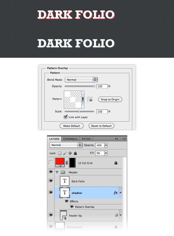
Step 6: Adding the navigation items
Create a new group and name it “navigation”. Select the Type Tool (T) and add the name for your navigation menu items. I used the font Rockwell Regular with the size 16pt and the color #e1e6e9. I also added a second line of text for each navigation item using the font Lucida Sans Regular with the size 12pt and the color #e1e6e9. 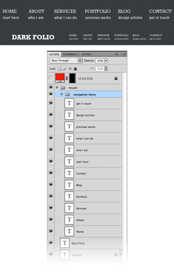
Step 7: Adding separators between the navigation items
Now we will create a vertical dashed line pattern to use for our separators. Create a new document with the dimensions 1px by 10px. Create a new layer (Ctrl/Cmd + Shift + N) and hide the Background layer by clicking on its eye icon.
Use the Rectangular Marquee Tool (M) to create a selection with the dimensions 1px by 6px. Fill this selection with white and hit Ctrl/Cmd + D to deselect. Go to Edit > Define Pattern, give a name to your pattern and click OK.
Now you can close this document. 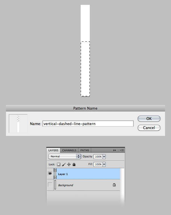 Use the Line Tool (U) to create a vertical separator between two navigation items. Set the Fill of this layers to 0% and the Opacity to 30%.
Name this layers “dashed line” double-click on it to open the Layer Style window and use the settings from the following image for Pattern Overlay. Duplicate this layer as many times as you need and put a separator between all the navigation menu items. 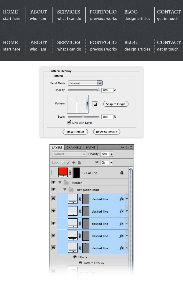
Step 8: Creating the style for the active navigation menu item
Now we will create a brighter background for one of the navigation menu items to indicate that it is active.
Use the Rectangular Marquee Tool (M) to create a selection as you see in the following image. Go to Layer > New Adjustment Layer >Brightness/Contrast and use the settings from the following image. The selection that you created will be used as mask for the adjustment layer.
Put this layer beneath all text layers from the “navigation items” group. 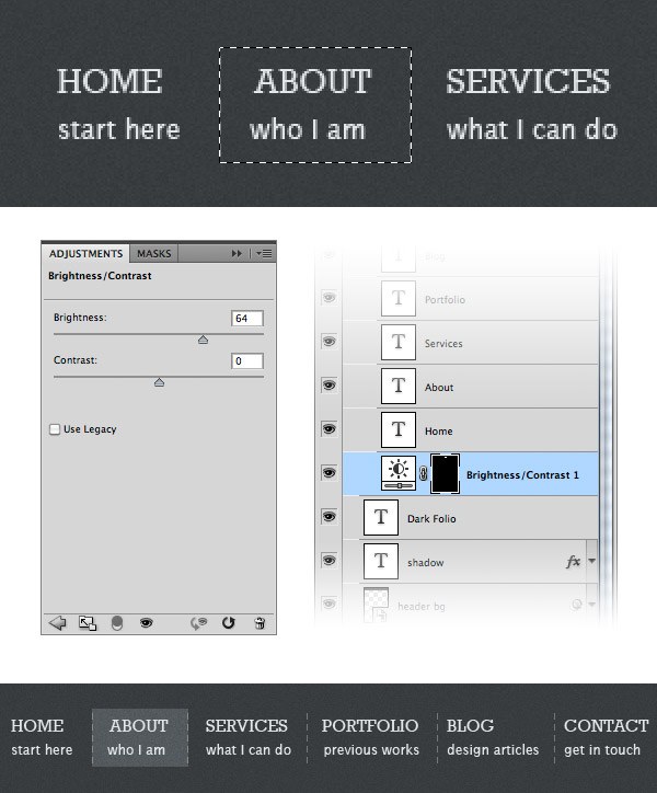
Step 9: Creating a bar for breadcrumbs
Adding breadcrumbs to your website is a good practice because it lets visitors know all the time where they are on the website and where they came from. Select the Rectangle Tool (U) and create a rectangle with the dimensions 1200px by 40px and the color #63686b.
Name this layer “breadcrumbs bg”. Right-click on this layer and select Convert to Smart Object. Then go to Filter > Noise > Add Noise and use the settings from the following image. 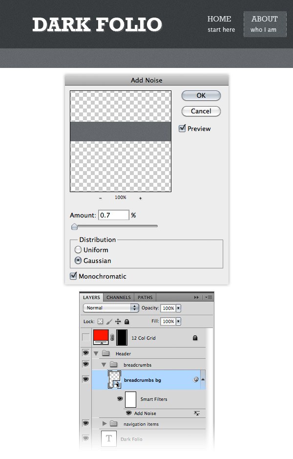 Create a new document with the dimensions 5px by 5px.
Use the same technique that you used earlier to create a diagonal stripe pattern, but this time fill the selection with black. After you create the pattern, go back to your web layout document, double-click on the “breadcrumbs bg” layer and use the settings from the following image for Pattern Overlay. 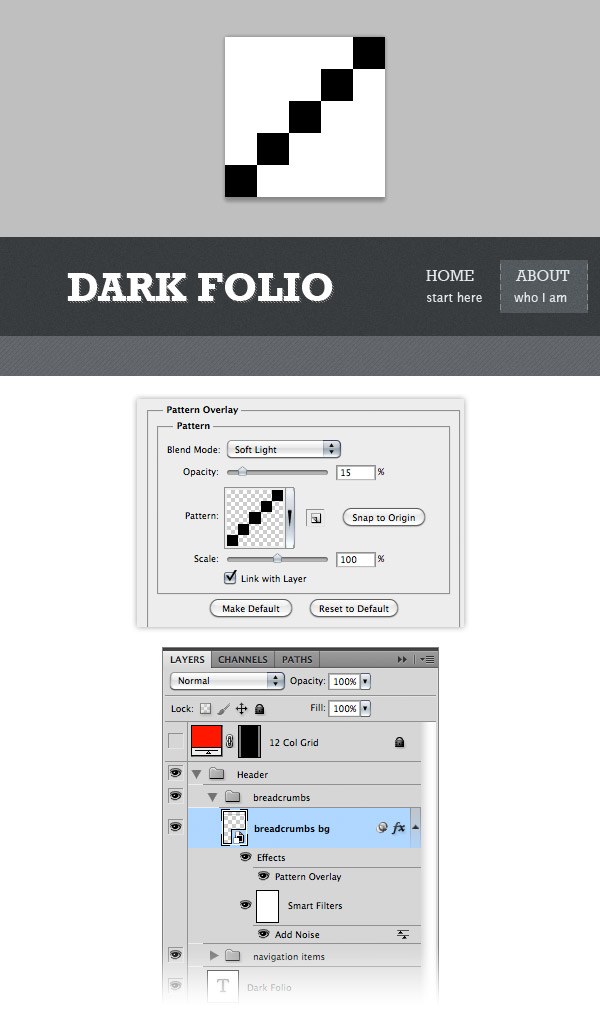
Step 10: Complete the breadcrumbs bar
Select the Type Tool (T) and add some text to your breadcrumbs bar.
I used the font Lucida Sans with the size 12pt and the color #dde2e5. Select the Line Tool (U), set the weight to 1px and create a horizontal line beneath the breadcrumbs bar using the color #373a3c. Duplicate this layer (Ctrl/Cmd + J) and move it one pixel up. Change the color of the new line layer to #787e82. Add two more line layers at the top of the breadcrumbs bar using the same colors. 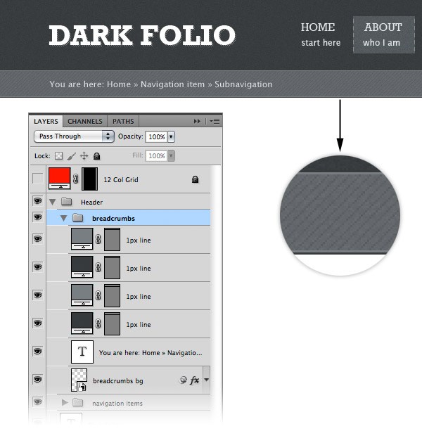
Step 11: Creating a background for the image slider
Create a new group and name it “Slider”. Select the Rectangle Tool (U) and create a rectangle with the dimensions 1200px by 460px and the color #45494c. Name this layer “slider bg”. Right-click on this layer and select Convert to Smart Object. Then go to Filter > Noise > Add Noise and use the settings from the following image. 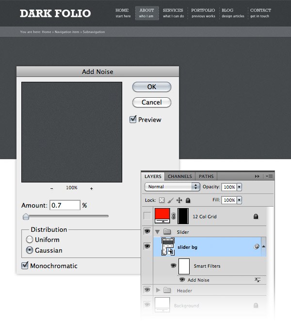
Step 12: Creating the image slider
Select the Rectangle Tool (U) and create a rectangle with the dimensions 940px by 340px and the color #5e6468. Name this layer “border”. Double-click on this layer to open the Layer Style window and add a 1px stroke using the color #787e82. 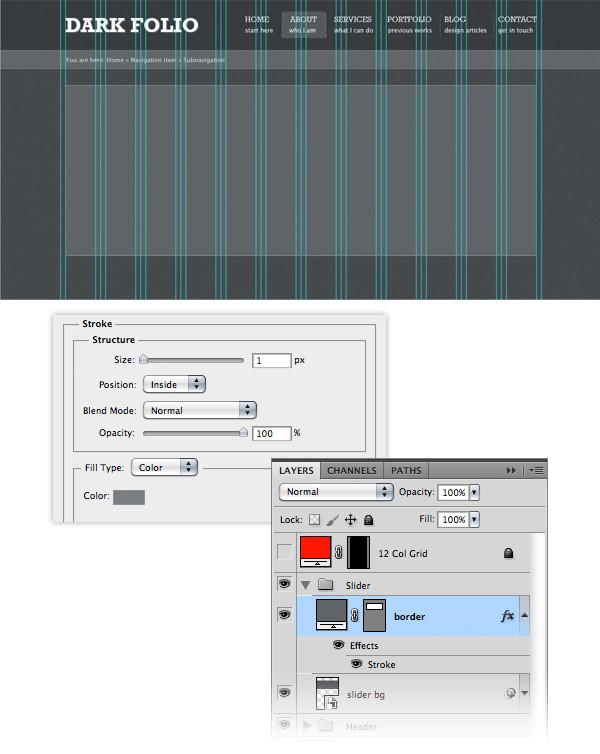 Use the Rectangle Tool (U) to create a new rectangle with the dimensions 910px by 295px inside the previous rectangle that you created. Name this layer “image_holder” and add a 1px inside stroke to it using the color #45494c.
 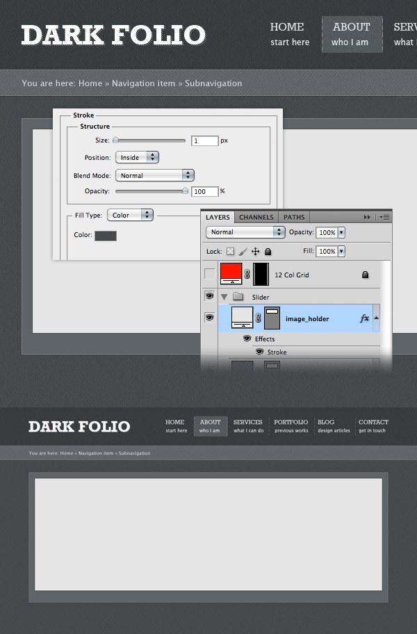 Find an image that you want to display on your image slider and open it in Photoshop.
Move this image into your web layout document using the Move Tool (V) and put it above the “image_holder” layer. Name this layer “image”, right-click on it and select Create Clipping Mask to make it visible only over the area of the “image_holder” layer. 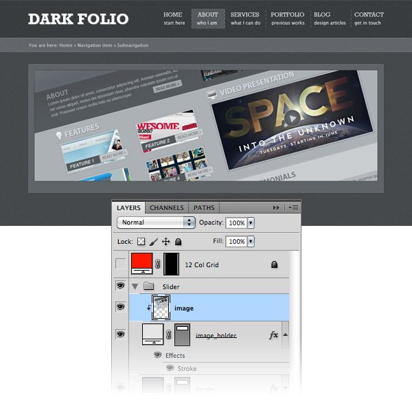
Step 13: Creating the navigation for the image slider
Now we will create a ribbon where we will display the name of the current image, and the previous and next buttons for the image slider.
Create a new group and name it “slider navigation”. Select the Rectangle Tool (U) and create a rectangle with the dimensions 960px by 50px and the color #c4ccd1. Name this layer “rectangle”. Right-click on this layer and select Convert to Smart Object. Then go to Filter > Noise > Add Noise and use the settings from the following image. Double-click on this layer to open the Layer Style window and use the settings from the following image.
The color that I used for Inner Glow is #d8e0e4 and the one I used for Stroke is #575d61. 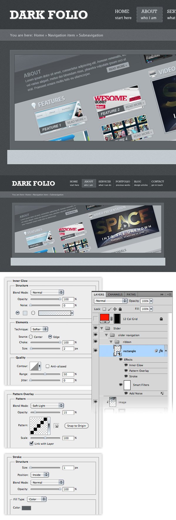 Select the Pen Tool (P) and create a triangle in the lower right corner of the rectangle, as you see in the following image. Set the color of this triangle to #636b70 and name the layer “triangle right”. Right-click on this layer and select Convert to Smart Object. Then go to Filter > Noise > Add Noise and use the settings from the following image. Double-click on this layer to open the Layer Style window and add a one pixel stroke using the color #575d61.
 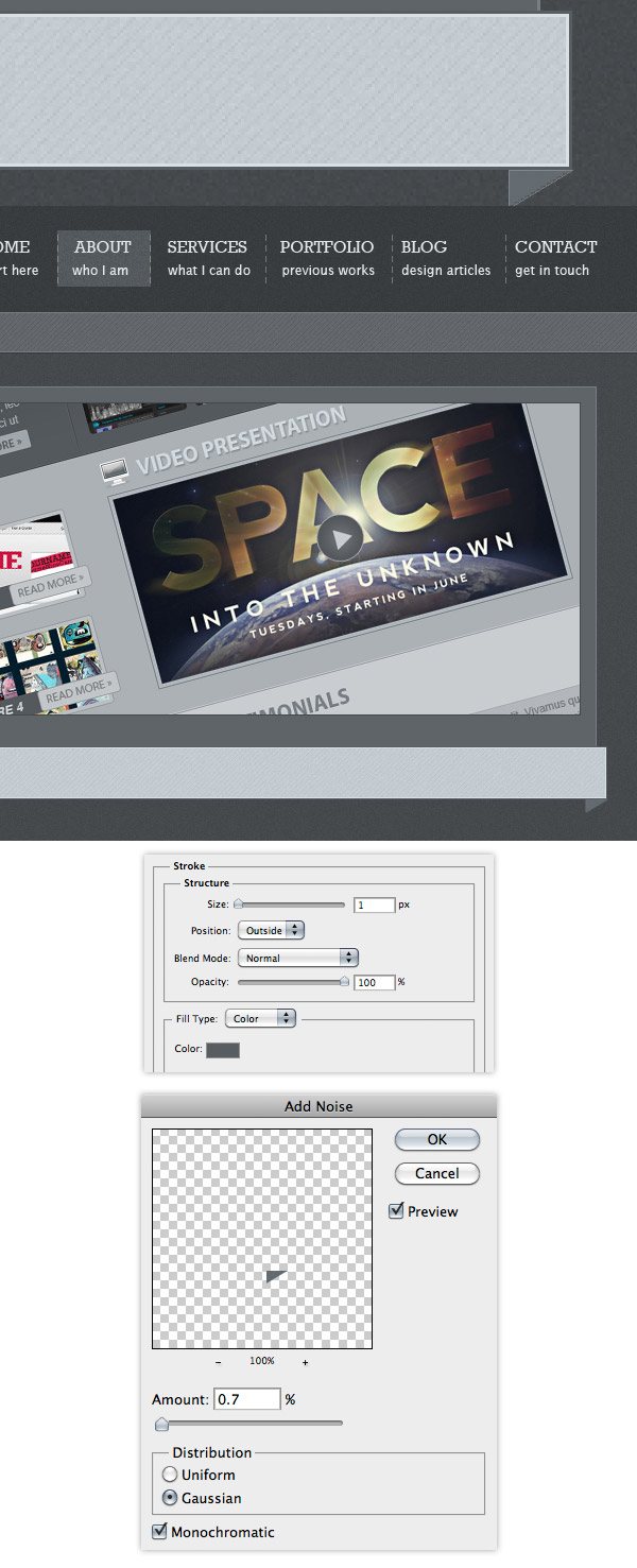 Now we will create the end area of the ribbon. Select the Pen Tool (P) and create a shape like you see in the following image using the color #8b9297. Name this layer “end ribbon right”. Right-click on this layer and select Convert to Smart Object. Add a 0.7 Gaussian monochromatic noise to this layer. Double-click on this layer to open the Layer Style window and use the settings from the following image.
For Outer Glow I used the color #9ea6ab and for Stroke I used #3d4245. Put this layer beneath the “triangle right” layer and move it as you see in the image below. 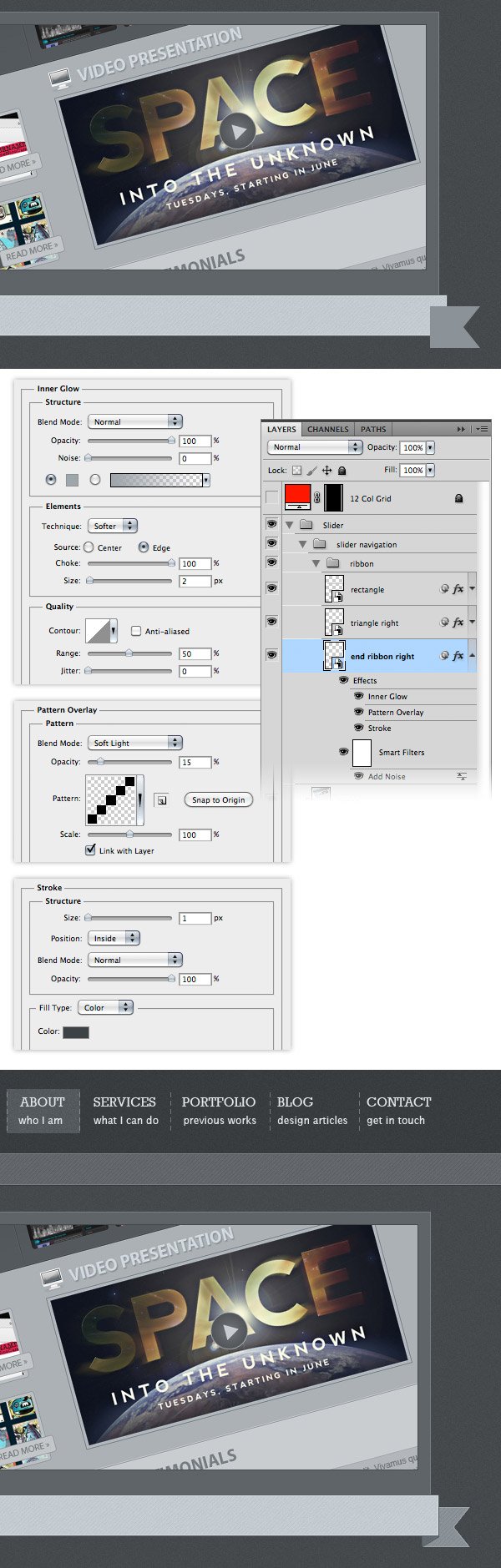 Duplicate the “triangle right” and “end ribbon right” layers (select them and drag them over the ‘Create a new layer’ button). With these two layers selected go to Edit > Transform > Flip Horizontal.
Use Move Tool (V) to move these layers in the left side of the ribbon, as you see in the following image. 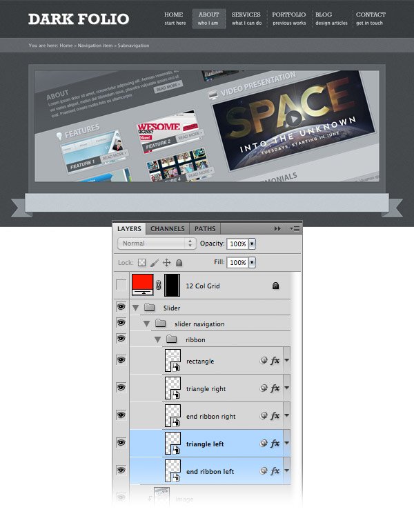 Now we will add a shadow to the ribbon. Select the Rectangle Tool (U) and create a black rectangle as you see in the following image (1).
Name this layer “shadow”. Right-click on this layer and select Convert to Smart Object. Then go to Filter > Blur > Gaussian Blur and use the settings from the following image (2). Put this layer beneath all the other ribbon layers (3).
Go to Layer > Mask > Hide All. This will make the “shadow” layer invisible by adding a black mask to it. We do this because we want to apply the shadow only at the bottom of the ribbon.
Select a big white soft brush (B) and paint with it over the bottom area of the ribbon to reveal the shadow. Set the opacity of this layer to 60% (4). 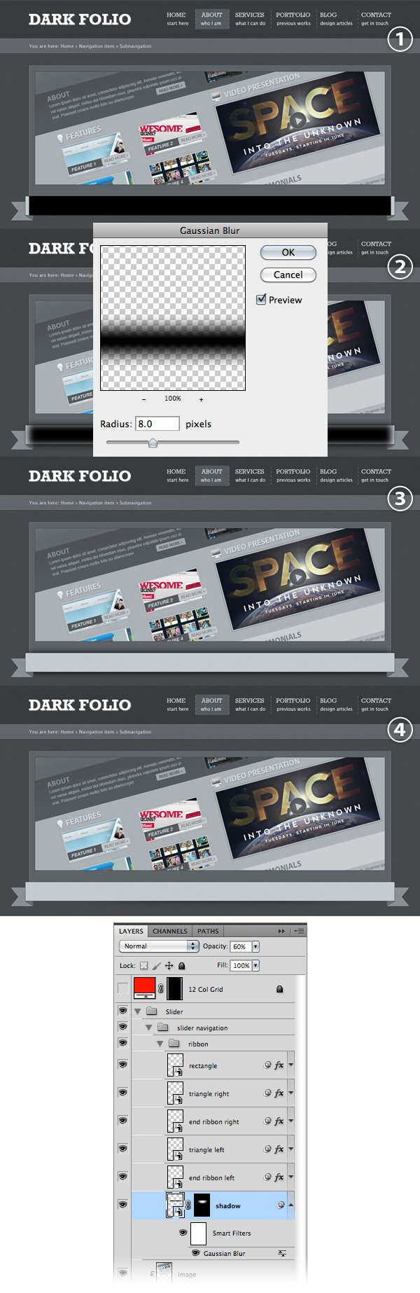 Select the Type Tool (T) and add the name of the image that is displayed in the image slider.
I used the font Lucida Sans with the size 18pt and the color #4b4e50. 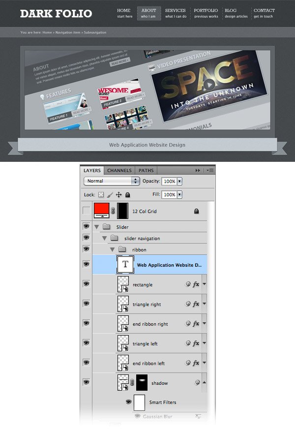
Step 14: Adding the navigation buttons for the image slider
Create a new group and name it “next button”. Select the Rounded Rectangle Tool (U), set the Radius to 4px and create a rounded rectangle with the dimensions 110px by 26px and the color #8fbfd1. Name this layer “button”, double-click on it to open the Layer Style window and use the settings from the following image. The color the I used for Stroke is #6f95a4. 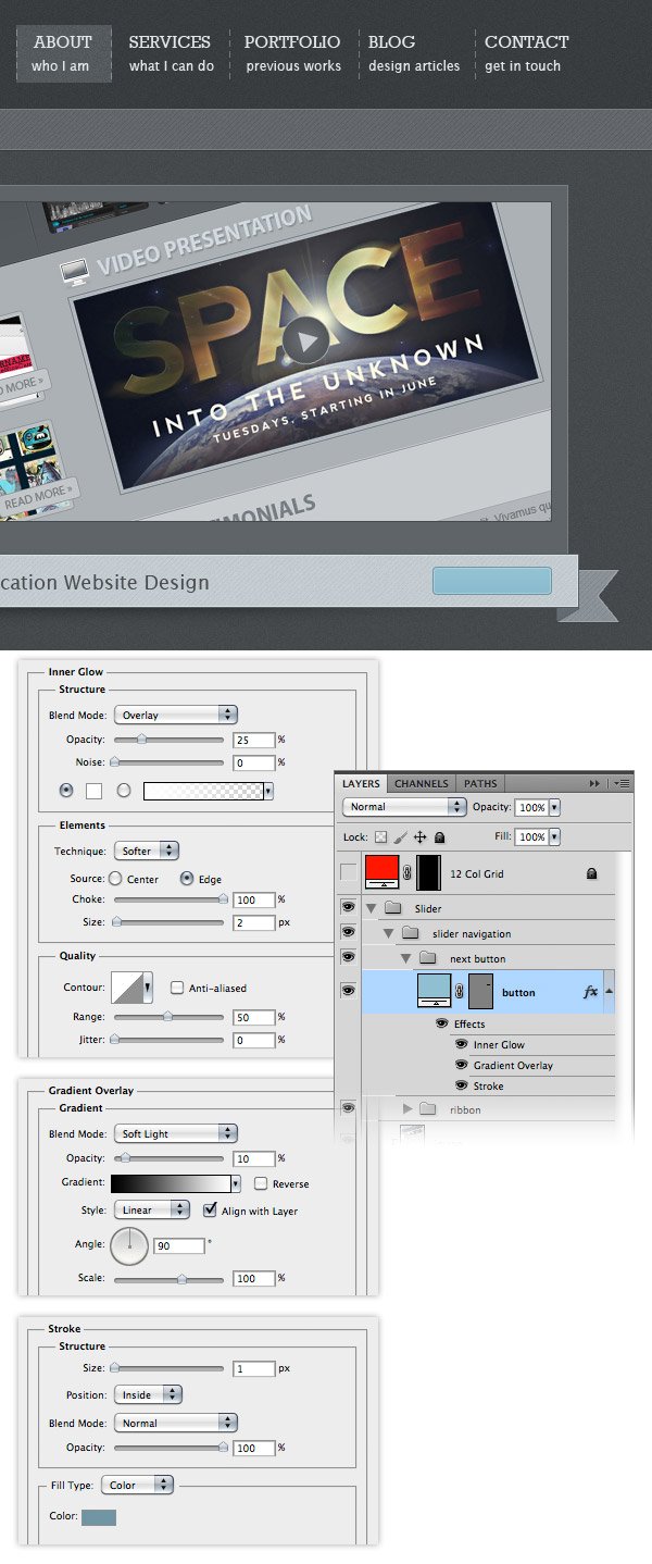 Select the Rectangle Tool (U) and create a rectangle over the right side of the button using the color #72a3b5. Take a look at the following image for reference. Name this layer “dark rectangle”, right-click on it and select Create Clipping Mask to make it visible only inside the button.
 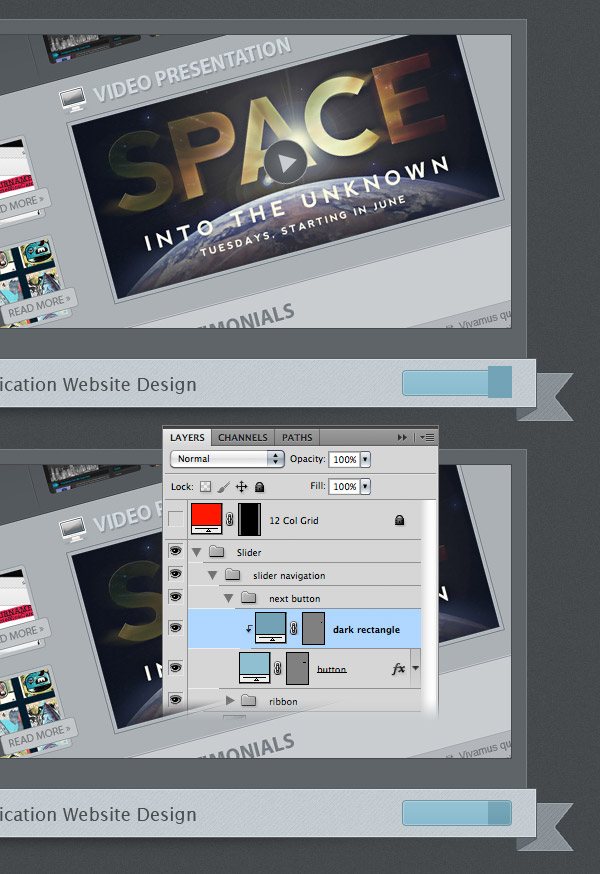 Hold down the Ctrl/Cmd key and click on the thumbnail of the “button” layer to select it.
Create a new layer and fill the selection with white. Name this layer “noise”, right-click on it and select Convert to Smart Object. Then go to Filter > Noise > Add Noise and use the settings from the following image.
Set the blend mode of this layer to Multiply 50%. 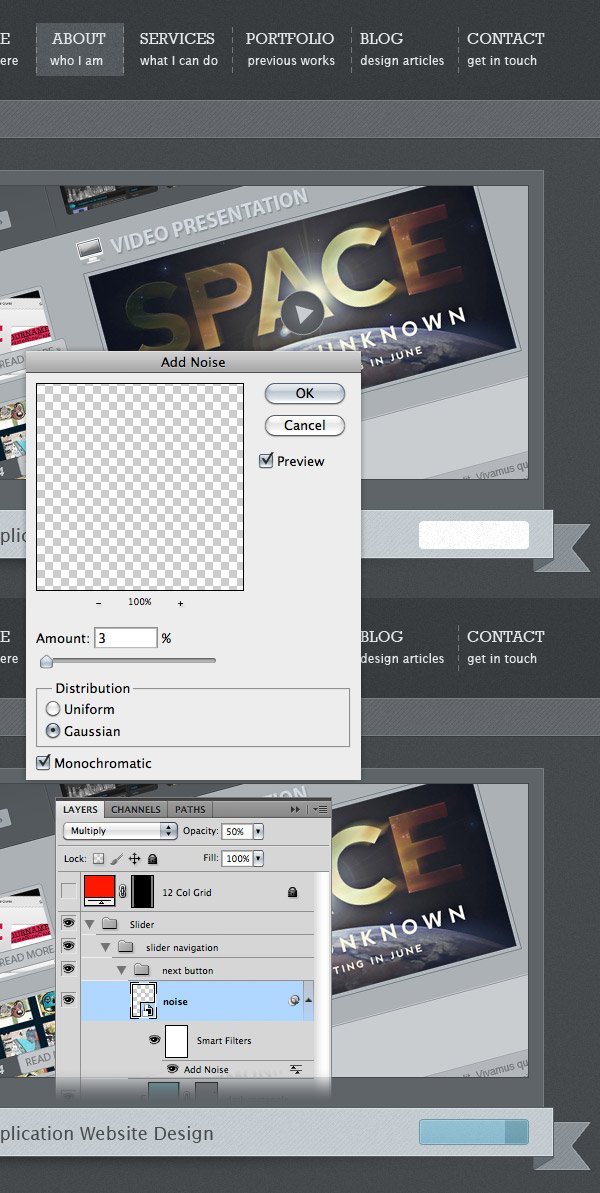 Select the Type Tool (T) and write the words “Next Project” on your button. I used the font Rockwell Regular with the size 13pt and the color #effbff.
Copy this symbol “»”, go to Photoshop, select the Type Tool (T) and paste it on the darker side of the button. I used the font Rockwell Regular with the size 20pt and the color #effbff. 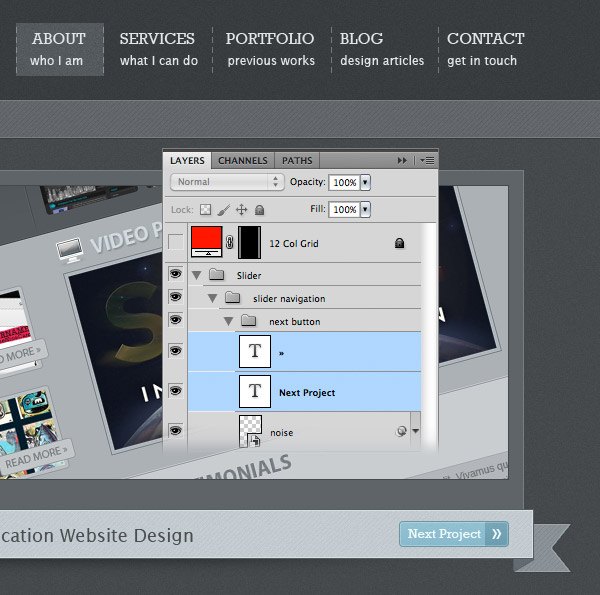 Duplicate the “next button” group (right-click on it and select Duplicate).
Name the new group “prev button”. Go to Edit > Transform > Flip Horizontal and move this button in the left side of the ribbon. You will need to erase the text layer (because it was flipped with the entire group), select the Type Tool (T) and write “prev button” on it using the same font and color. 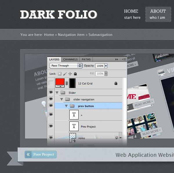
Step 15: Create bullet points for the image slider
Create a new group and name it “bullet points”. Select the Ellipse Tool (U), hold down the Shift key and create a circle with the dimensions 10px by 10px and the color #373b3e. Name this layer “bullet point”. Duplicate this layer a few times (Ctrl/Cmd + J) and use the Move Tool (V) to arrange the circles as you see in the image below. Create a new circle with the dimensions 6px by 6px and the color #a6adb2. Put this circle inside the first dark circle. Name this layer “active”. 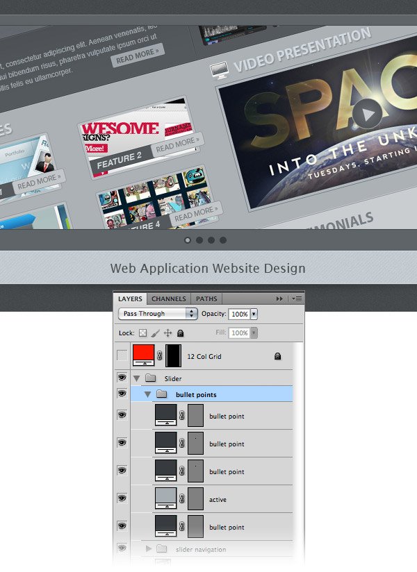
Step 16: Give the image slider a pixel line
Select the Line Tool (U), set the Weight to 1px and create a horizontal line at the bottom of the slider background. Use the color #373a3c. Name this layer “1px line”. Duplicate this layer and move the new line one pixel up. Change the color of the new line layer to #5a5f63. 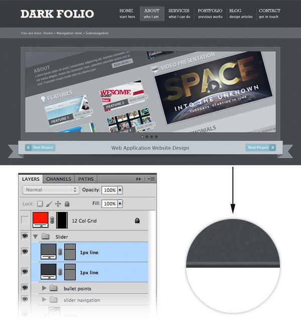
Step 17: Creating the content area
Create a new group and name it “Main Content”. Select the Rectangle Tool (U) and create a rectangle with the dimensions 1200px by 670px and the color #5e6468. Put this rectangle beneath the image slider area. Name this layer “main content bg”, right-click on it and select Convert to Smart Object. Now we will use some filters to add a texture to this background.
First, go to Filter > Noise > Add Noise and set the Amount to 1, the Distribution to Gaussian and tick the Monochromatic box. Go to Filter > Distort > Glass. Set the Distortion to 16, the Smoothness to 2 and the Texture to Tiny Lens.
Then go to Filter > Brush Strokes > Crosshatch and set the Stroke Length to 8, the Sharpness to 6 and the Strength to 1. Your result should look similar to what you see in the following image. 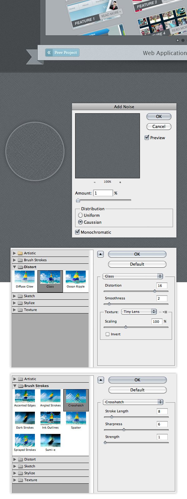 Double-click on the “main content bg” layer and use the settings from the following image for Inner Shadow to add a small shadow at the top of this area.
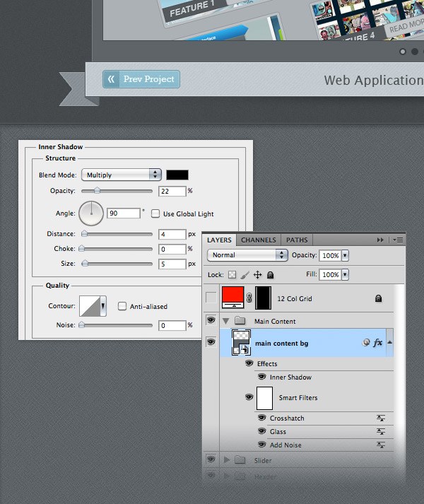
Step 18: Add the intro paragraph
Now we will add a paragraph of text in the main content area.
This area could be used to present yourself and your services. Select the Type Tool (T) and add a paragraph of text, as you see in the image below. I used the font Rockwell with the size 26pt and the color #eeeeee and I also centered the text.
Double-click on your text layer to open the Layer Style window and use the settings from the following image for Drop Shadow. 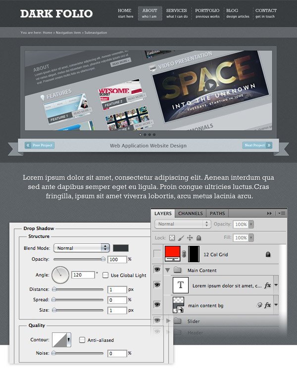
Step 19: Creating a background for the main content
Select the Rounded Rectangle Tool (U) and create a rounded rectangle with the dimensions 940px by 380px. Activate the guidelines (Ctrl/Cmd + 😉 to help you create the rectangle.
Name this layer “content bg”, double-click on it to open the Layer Style window and use the settings from the image below. The Stroke color that I used is #4c5154. 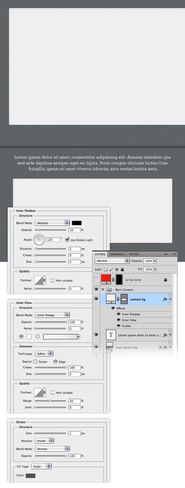 Now we will add a shadow at the top and at the bottom of the rectangle that we created earlier. Duplicate the “content bg” layer by dragging it over the ‘Create a new layer button’ from the bottom of the Layers panel. Name this new layer “shadow”. Right-click on it and select Clear Layer Style. Change the color of this layer to black and drag it beneath the “content bg” layer. Right-click on the “shadow” layer and select Convert to Smart Object.
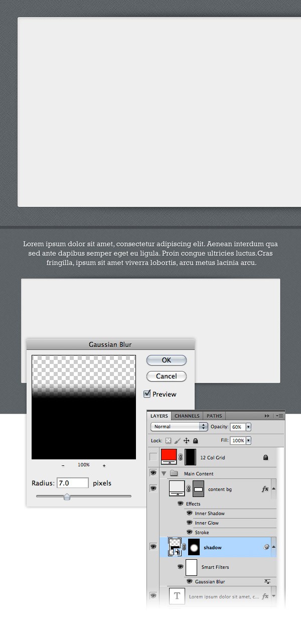
Then go to Filter > Blur > Gaussian Blur and set the Radius to 7px. As I mentioned, we will add the shadow only at the top and at the bottom of the rectangle. To achieve this, go to Layer > Mask > Hide All.
A black mask will be added to your “shadow” layer, which means that the shadow is now invisible. Select a big white soft brush (B) and paint with it over the middle area of your rectangle in order to reveal the shadow at the top and at the bottom of the rectangle. Take a look at the following image for reference.
Step 20: Creating the ‘Services’ area
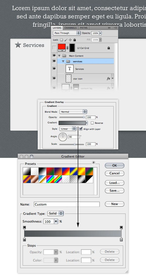
Create a new group and name it “services”. Download this set of icons, open the .psd file provided and move the star icon into your web layout document, at the top of your rounded rectangle. Be sure to leave some space between the icon and the margins of the rectangle. Name this layer “star icon”, double-click on it to open the Layer Style window and change the colors of the gradient to #505356 and #a1a5a8. Select the Type Tool (T) and write the word “Services” next to your icon. I used the font Rockwell Regular with the size 22pt and the color #5e6468. Tip: to select the icon that you want without having to look through all the layers, select the Move Tool (V) and from the drop-down menu from the option bar above your document select ‘Layer’. Now hold down the Ctrl/Cmd key and click on the icon that you want to use. The layer of that icon will be automatically selected and you can move it into your web layout document.
 Now use the Type Tool (T) to add a list of services. Activate the guides (Ctrl/Cmd + 😉 to help you create this content column. Also, add an icon for each service listed.
For example, I used the iMac icon for web design services, the beaker icon for SEO services and the iPad icon for iPhone/iPad apps services. For the headlines I used the font Rockwell Regular with the size 18pt and the color #5e6468. For the paragraphs of text I used the font Lucida Sans Regular with the size 12pt and the color #5e6468. Organize all these layers using groups, as you see in the image below. 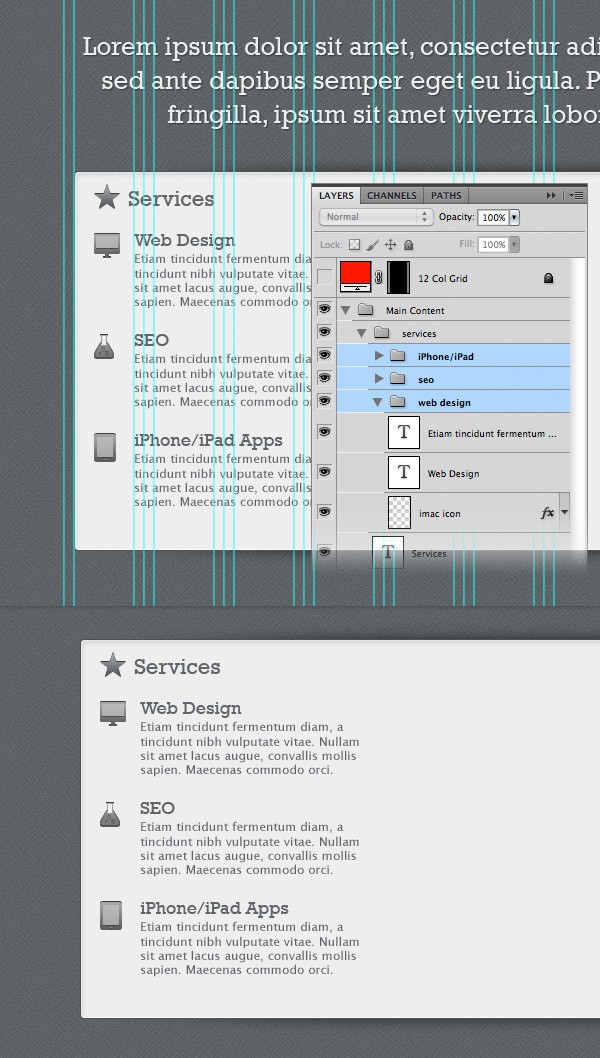
Step 21: Creating the ‘Portfolio’ area
Create a new group and name it “portfolio”. Move the suitcase icon from the icons pack you downloaded into this folder. Then copy the layer style from the iMac icon and paste it to this layer. Use the Type Tool (T) to write the word ‘Portfolio’ using the same font and color that you used for the ‘services’ area.
Create a new group and name it “portfolio items”. Select the Rectangle Tool (U) and create a square with the dimensions 80px by 80px and the color #c8ccce. Name this layer “border”, right-click on it and select Convert to Smart Object. Double-click on this layer to open the Layer Style window and use the settings from the following image.
The Stroke color that I used is #bababa. Then add a noise filter to this layer using the settings form the image below. 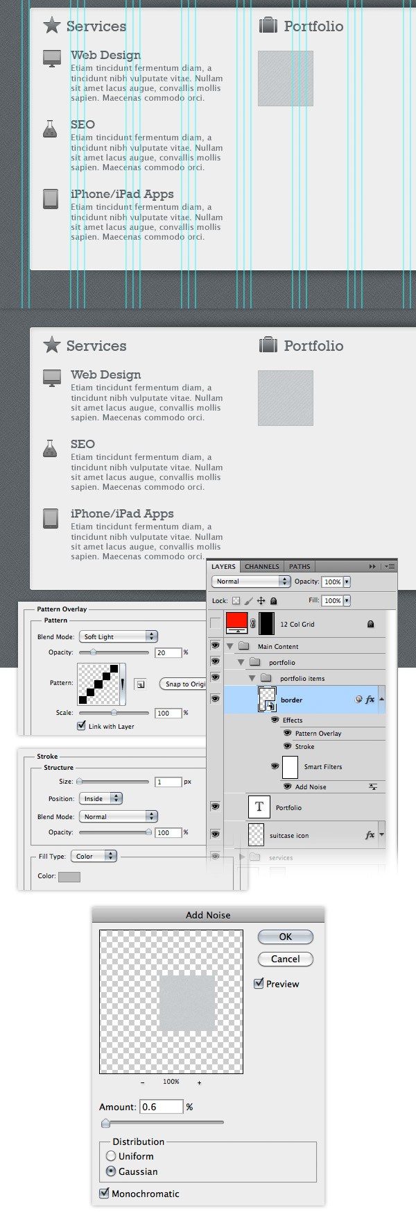 Select the Rectangle Tool (U), hold down the Shift key and create a square in the middle of the “border” layer.
Name this layer “image_holder” and add a 1px stroke to it using the color #bababa. 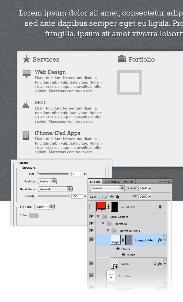 Hold down the Ctrl/Cmd key and select the “border layer” and the “image_holder” layer. Duplicate these layers eight times and arrange them as you see in the following image.
I left a distance of 20px between the portfolio items. 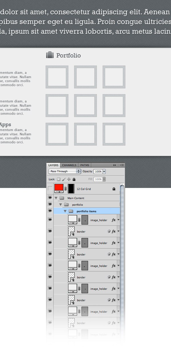
Step 22: Creating the ‘About’ area
Create a new group and name it “about”. Move the ‘user’ icon from the icons pack you downloaded into this group and apply the same layer style that you used for the ‘services’ and ‘portfolio’ areas icons. Select the Type Tool (T) and write the word “About” next to the icon. Select the Rectangle Tool (U) and create a rectangle with the dimensions 270px by 120px and the color #c8ccd0. Right-click on this layer and select Convert to Smart Object. Use the same layer effects and the filter effects that you used for the border of the portfolio items. Create a new rectangle in the middle of the previous one that you created.
Name this layer “image_holder” and add a 1px stroke to it using the color #bababa. Open an image in Photoshop that you want to use in your ‘about’ section. Use the Move Tool (V) to move it into your web layout document, over the “image_holder” layer.
Name this layer “image”, right-click on it and select Create Clipping Mask. Now your image is visible only over the area of the “image_holder” layer. Select the Type Tool (T) and add some text beneath your image.
I used the font Lucida Sans Regular with the size 12pt and the color #5a6064. 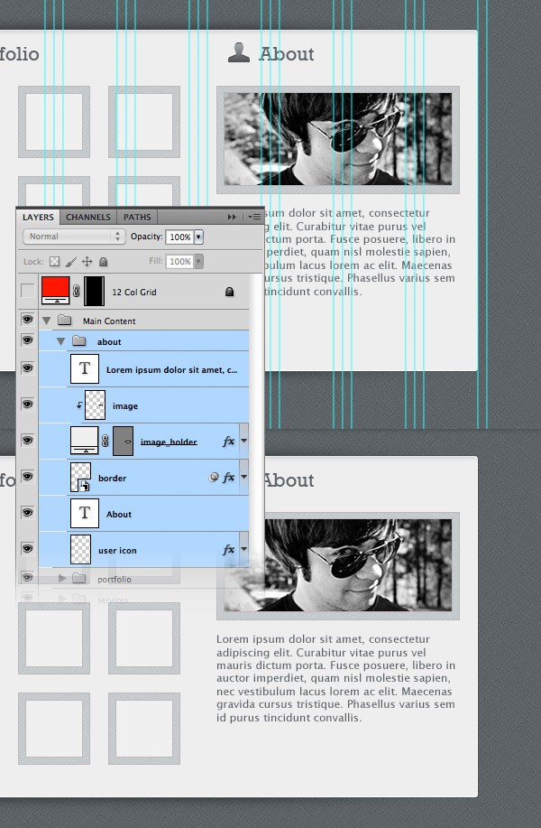
Step 23: Creating the buttons for the main content area
Create a new group and name it “buttons”. Select the Rounded Rectangle Tool (U), set the Radius to 4px and create a rounded rectangle with the dimensions 190px by 38px. Name this layer “button”, double-click on it to open the Layer Style window and use the settings from the following image. The color that I used for Stroke is #415c66. 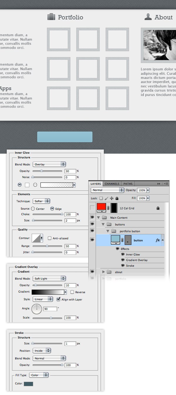 Select the Rectangle Tool (U) and create a rectangle over the right area of the rounded rectangle. Use the color #72a3b5. Name this layer “dark rectangle” and add a 1px stroke to it using the color #608c9d. Right-click on this layer and select Create Clipping Mask to make it visible only over the area of the “button” layer. Select the Type Tool (T) and write the words “View portfolio” on your button.
I used the font Rockwell Regular with the size 20pt and the color #effbff. Then copy this symbol “»” and paste it in the right area of the button, where we created the darker rectangle. 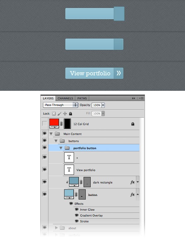 Now we will add some noise to the button.
Hold down the Ctrl/Cmd key and click on the vector mask of the “button” layer to make a selection of it. Create a new layer above the “dark rectangle” layer and fill the selection with white. Name this layer “noise”, right-click on it and select Convert to Smart Object.
Then go to Filter > Noise > Add Noise and use the settings from the following image. Set the blending mode of this layer to Multiply 50% to get rid of the white color. 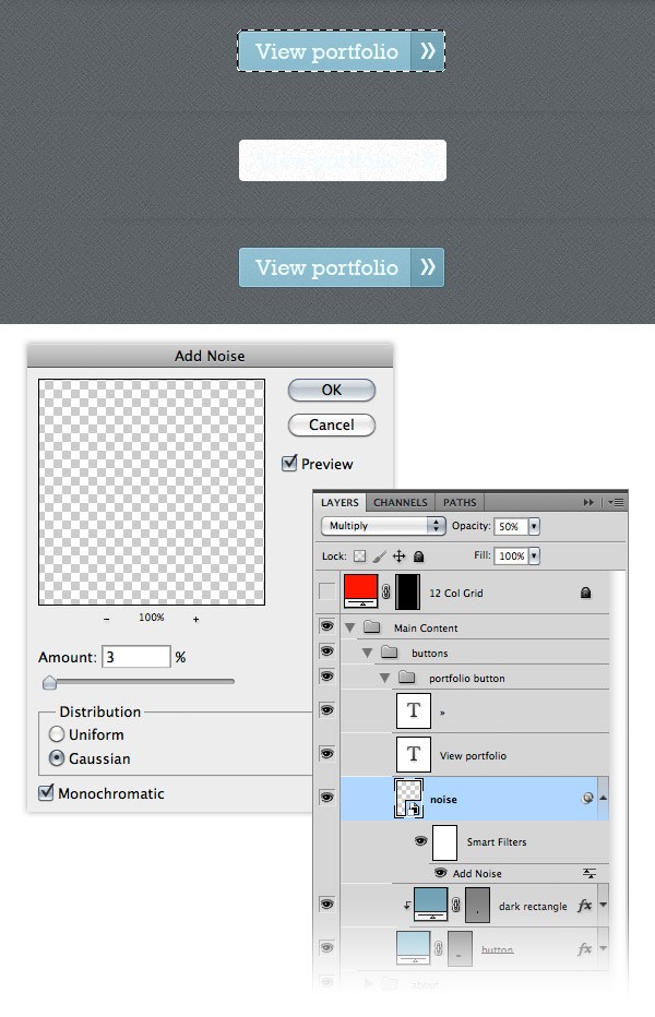
Step 24: Creating a ‘hire me’ button
Similar to how you created the portfolio button, create a ‘hire me’ button.
Take a look at the following image for reference. 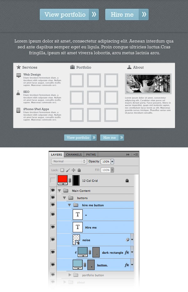
Step 25: Adding the separators
Now we will create two separators for the main content area. Create a new group and name it “separators”. Select the Line Tool (U) and create a vertical line from the top of the rounded rectangle to the bottom. Set the color to #ffffff and name this layer “1px line”. Duplicate this layer (right-click on it and select Duplicate). Change the color of the new line to #abb0b3. Select the Move Tool (V) and move this layer one pixel to the right. Select the two line layers and duplicate them. Then use the Move Tool (V) to move them between the other two content columns.
Add a mask to the “separators” group (Layer > Layer Mask > Reveal All). Then select the Gradient Tool (G), hold down the Shift key and drag a black to transparent gradient at the top of your separators to make them fade away. Then drag another gradient at the bottom of the separators as well.
Take a look at the following image for reference. 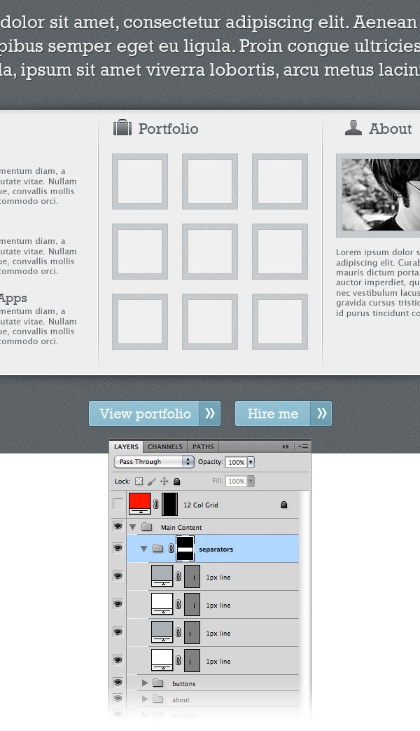
Step 26: Creating the ‘Testimonials’ area
If you work as a freelancer, posting testimonials from clients you worked with on your online portfolio can bring you more clients and projects. In this section of the tutorial I will show you how to make a design for the testimonials, to make them stand out.
Create a new group and name it “Testimonials”. Select the Rectangle Tool (U) and create a rectangle with the dimensions 1200px by 500px and the color #45494c. Name this layer “bg”, right-click on it and select Convert to Smart Object. Then go to Filter > Noise > Add Noise and use the settings from the following image.
Double-click on this layer to open the Layer Style window and use the settings from the image below for Drop Shadow. 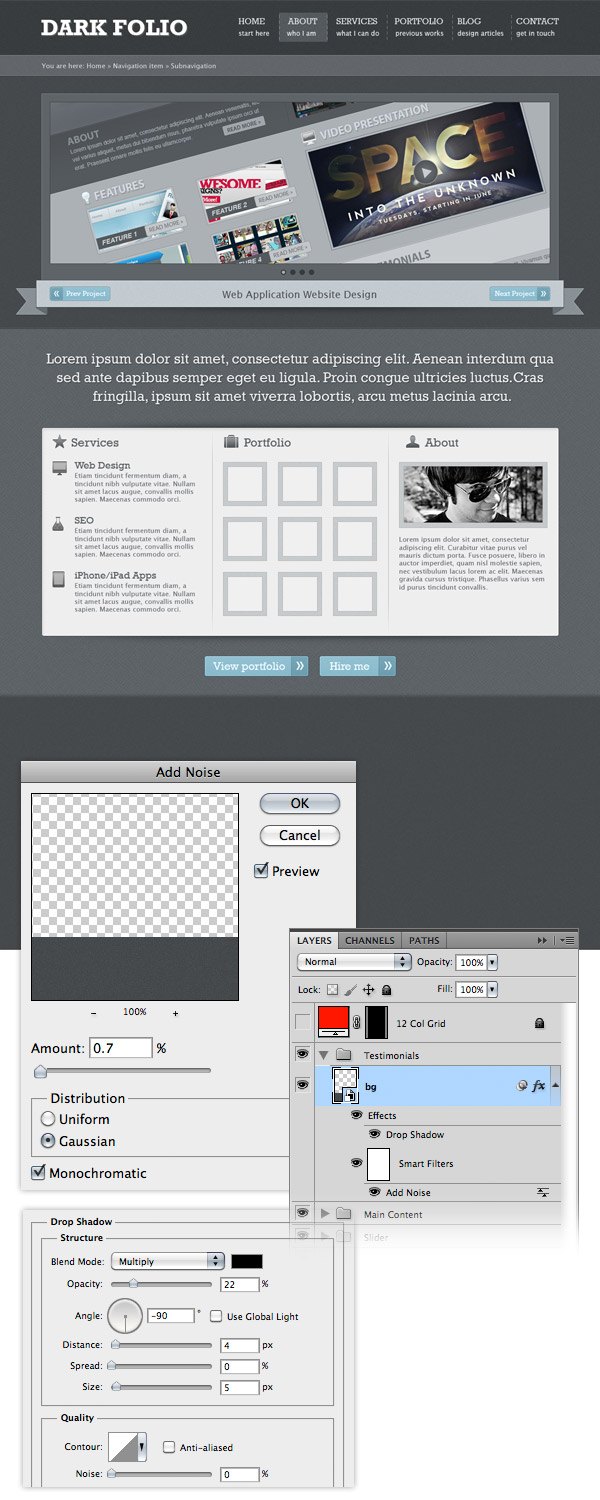 Select the Line Tool (U) and create a vertical line at the top of the rectangle you created at the previous step using the color #373a3c. Name this layer “1px line”. Duplicate this layer and use the Move Tool (V) to move the new layer 1px down. Change the color of the new line to #5a5f63.
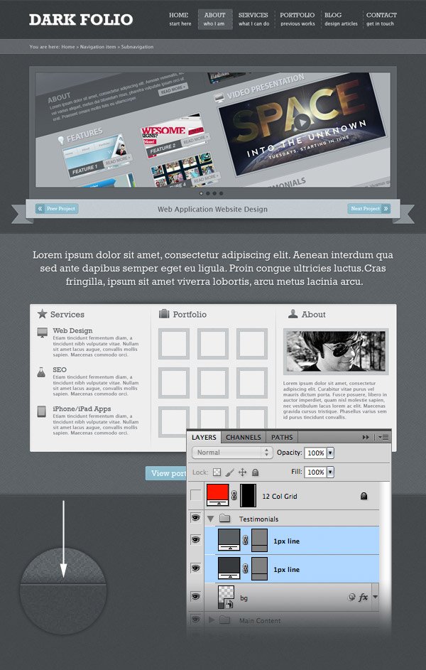
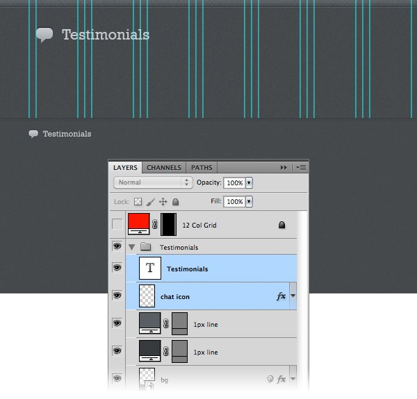
Step 27: Create the ‘Testimonials’ heading
Activate the guides (Ctrl/Cmd + ;). Move the chat icon from the icons pack you downloaded inside the “testimonials” group. Put this icon in the upper left corner of the ‘testimonials’ area.
Copy the layer style from one of the icon layers that you used previously and paste it to this icon. Select the Type Tool (T) and write the word “Testimonials” next to the icon. I used the font Rockwell with the size 22pt and the color #c5cacd.
Step 28: Create a ‘Testimonial’ layout
Now we will create the actual design of the testimonials. Create a new group and name it “testimonial #1”. Select the Rounded Rectangle Tool (U) and create a rounded rectangle with the dimensions 490px by 120px. Name this layer “text bg”. Add a 1px stroke to this rectangle using the color #252729. Leave a distance of 30px from the left edge of the web layout. We will use that area to add a photo/logo of the client. 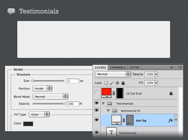 Now we will create an area for the client’s photo/logo.
Select the Rounded Rectangle Tool (U) and create a rounded square with the dimensions 60px by 60px and the color #747a7f. Name this layer “border”. Select the Pen Tool (P) and make sure that the ‘Shape layers’ button from the option bar above your image is activated. Then create a triangle for the “border” layer, as you see in the image below. Name this layer “arrow”. Use the Rectangle Tool (U) to create a square with the dimensions 50px by 50px. Name this layer “image_holder” and put it in the middle of the “border” layer. 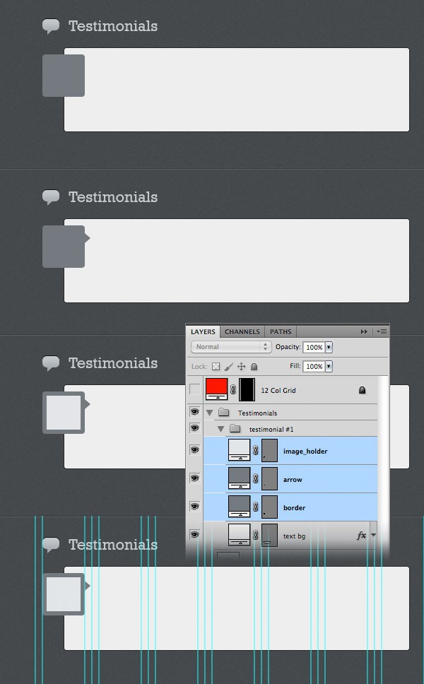 Select the Type Tool (T) and add a paragraph of text for the testimonial area.
I used the font Lucida Sans with the size 12pt and the color #6f7274. 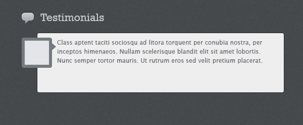 Now we will create a dashed line to separate the testimonial from the client’s info. Create a new document (Ctrl/Cmd + N) with the dimensions 10px by 1px. Create a new layer (Ctrl/Cmd + Shift + N).
Use the Rectangular Marquee Tool (M) to create a selection with the dimensions 6px by 1px. Fill this selection with black. Hide the Background layer and go to Edit > Define Pattern.
Give your pattern a name and click OK. Now you can close this document. Go to your initial web layout document, select the Line Tool (U) and create a horizontal line with the dimensions 430px by 1px.
Set the Fill of this layer to 0% and the Opacity to 20%. Double-click on this layer to open the Layer Style window and use the settings from the following image for Pattern Overlay. 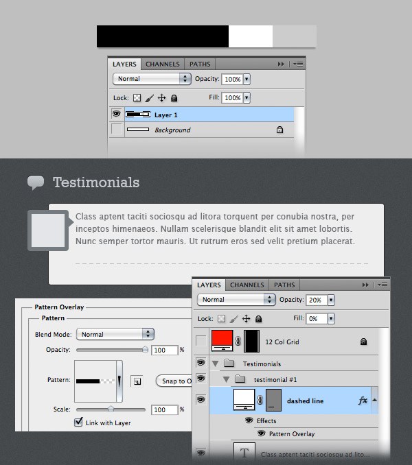 Use the Type Tool (T) to add some client info beneath the dashed line.
Add an icon for each piece of information (name, company, website). I used Free Transform (Ctrl/Cmd + T) to change the size of these icons. Also, I converted the layers into Smart Objects and I applied a Color Overlay using the color #7e8082. 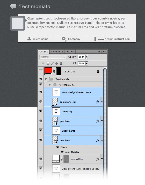
Step 29: Create more testimonials
Duplicate the “testimonial #1” group and put the new testimonial beneath the first one. 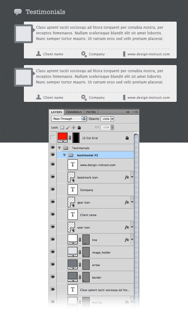
Step 30: Creating a contact form
Create a new group and name it “contact”. Add the envelope icon inside this layer and use the same layer style that you applied to the other icons. Select the Type Tool (T) and write the words “Contact me” next to the icon. I used the font Rockwell Regular with the size 22pt and the color #c5cacd.
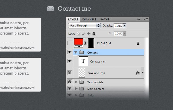 Select the Rectangle Tool (U) and create the contact form using the color #eeeeee. Use the layer style settings from the following image for each field of the contact form. The Stroke color that I used is #393c3e.
Select the Type Tool (T) and write inside each field what it represents. 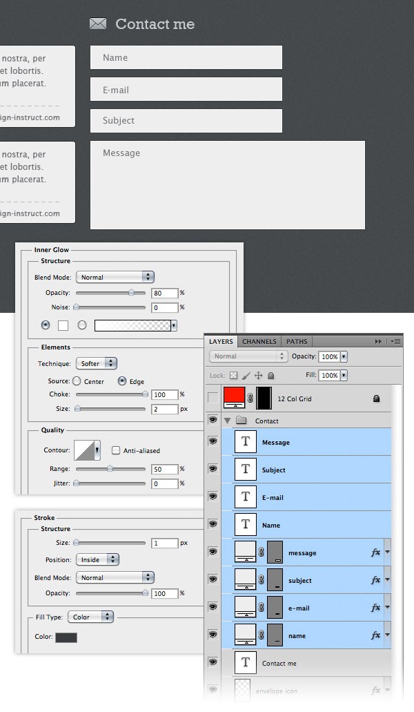 Create a send button with the dimensions 100px by 28px just like you created the “portfolio” and the “hire me” button.
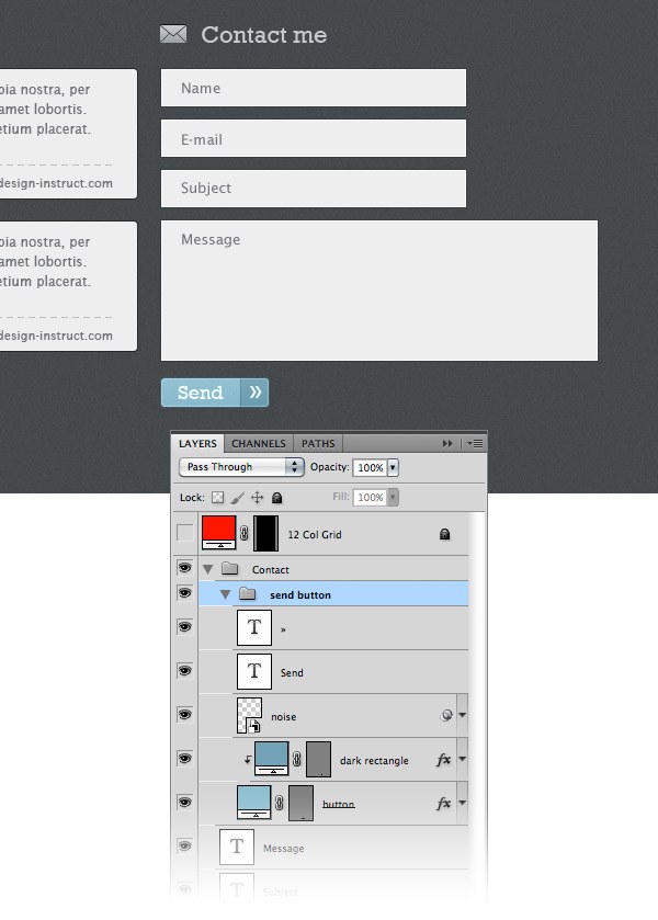
Step 31: Creating the footer
Create a new group and name it “Footer”. Select the Rectangle Tool (U) to create a rectangle at the bottom of your web layout with the height 40px. Name this layer “footer bg”. Use the Line Tool (U) to create two horizontal lines at the top of the footer. For the dark line use the color #303436 and for the brighter one use the color #4a5053. Select the Type Tool (T) and add some a copyright statement in the middle of your footer. I used the font Lucida Sans Regular with the size 12pt and the color #a8aeb1. 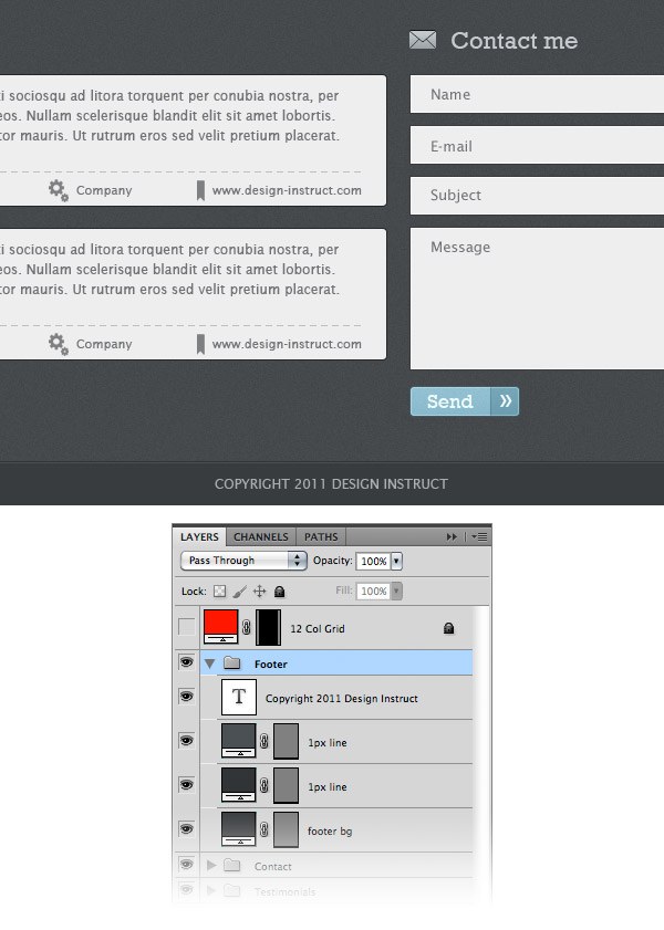
Final Result
Below is the final web layout of this tutorial. I hope you enjoyed it and you learned some new things. Share your opinions regarding this tutorial in the comments section below.
Thank you for reading. 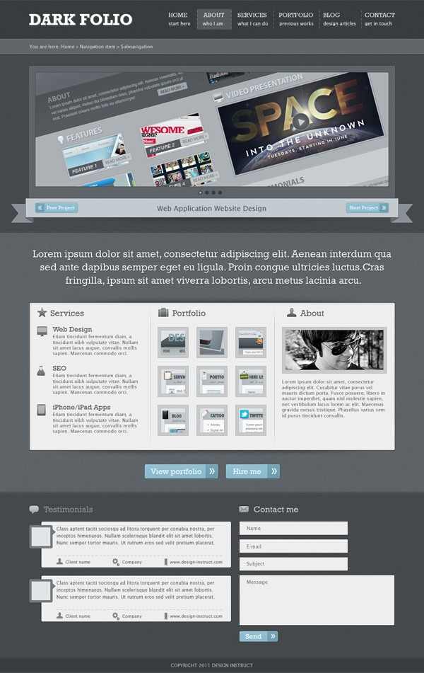
Download Source Files
- photoshop_dark_textured_portfolio (ZIP, 5.30 MB)
-
 Trevin serves as the VP of Marketing at WebFX. He has worked on over 450 marketing campaigns and has been building websites for over 25 years. His work has been featured by Search Engine Land, USA Today, Fast Company and Inc.
 -

WebFX is a full-service marketing agency with 1,100+ client reviews and a 4.9-star rating on Clutch! Find out how our expert team and revenue-accelerating tech can drive results for you! Learn more
Make estimating web design costs easy
Website design costs can be tricky to nail down. Get an instant estimate for a custom web design with our free website design cost calculator!
Try Our Free Web Design Cost Calculator
Table of Contents
- Preview
- Tutorial Resources
- 960 Grid System Introduction
- Step 1: Setting up the document
- Step 2: Creating the header
- Step 3: Adding the name of the web layout
- Step 4: Creating diagonal stripe pattern
- Step 5: Adding a stylized shadow to the text layer
- Step 6: Adding the navigation items
- Step 7: Adding separators between the navigation items
- Step 8: Creating the style for the active navigation menu item
- Step 9: Creating a bar for breadcrumbs
- Step 10: Complete the breadcrumbs bar
- Step 11: Creating a background for the image slider
- Step 12: Creating the image slider
- Step 13: Creating the navigation for the image slider
- Step 14: Adding the navigation buttons for the image slider
- Step 15: Create bullet points for the image slider
- Step 16: Give the image slider a pixel line
- Step 17: Creating the content area
- Step 18: Add the intro paragraph
- Step 19: Creating a background for the main content
- Step 20: Creating the ‘Services’ area
- Step 21: Creating the ‘Portfolio’ area
- Step 22: Creating the ‘About’ area
- Step 23: Creating the buttons for the main content area
- Step 24: Creating a ‘hire me’ button
- Step 25: Adding the separators
- Step 26: Creating the ‘Testimonials’ area
- Step 27: Create the ‘Testimonials’ heading
- Step 28: Create a ‘Testimonial’ layout
- Step 29: Create more testimonials
- Step 30: Creating a contact form
- Step 31: Creating the footer
- Final Result
- Download Source Files
Share this article


Web Design Calculator
Use our free tool to get a free, instant quote in under 60 seconds.
View Web Design Calculator
Make estimating web design costs easy
Website design costs can be tricky to nail down. Get an instant estimate for a custom web design with our free website design cost calculator!
Try Our Free Web Design Cost Calculator