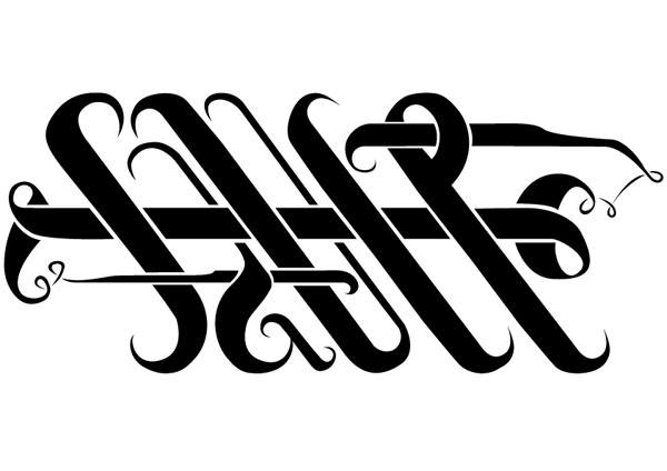
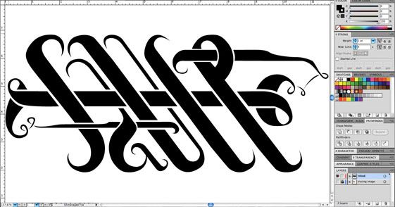
Preview
Click on the image preview to see the finished product in its full scale.
Introduction
Recently, I’ve been getting more and more addicted to the world of typography. I am beginning to see why some designers become so particular about type to the point of indecision. Your choice in typeface could make or break your overall design.
Typography is really a designer’s bread and butter, if you ask me. After all, typography is the most effective and versatile design tool a designer can use since, not only do the words themselves carry a message, but the typeface also has its own language.
Because of this fact, I’ve put it upon myself to keep learning and refining my eye for typography. Truthfully, there was a time in my life when Helvetica might as well have been Arial.
Yes, I know, silly right?
The design is based on a single shape from which all the letterforms in the design can be derived. I wrote this tutorial as an exercise that will serve two purposes. The first is to get some practice with the almighty Pen Tool in Illustrator.
The second is to reinforce the notion that typefaces work through some kind of uniformity in their shapes – a kind of language within the letterforms that we can achieve by creating all the letters based on a single shape. So let’s get the show on the road.
Step 1: Preliminary Sketches
First, I started making sketches in a notebook to get ideas. I sketched out shapes that I felt I could use as a basis for my design.
Then I tried sketching out some letterforms using the different curves and angles to get a better idea of the overall feel of the type design.
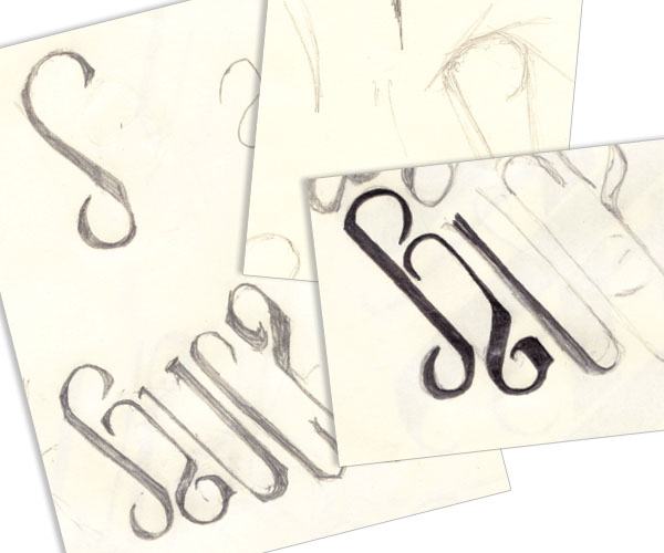
When I figured out the idea behind my rough sketches, I made a somewhat cleaner sketch, which I scanned into my computer. I didn’t spend too much time on this “clean” sketch since I knew I was going to be tracing it in Illustrator anyway. This clean sketch will serve merely as a rough guide.
A tip for designers and artists that don’t have access to a scanner: before I was able to buy my own scanner, I used to take photos of my sketches and drawings to place in my digital work.
It might not be fancy, but it gets the job done.
If you want to skip this step for now and still follow along the tutorial, you can download my original scanned in sketch called sauce_sketch (which is also included in the source file package download at the bottom of this tutorial).

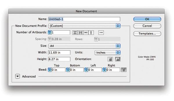
Step 2: Setting up your artboard
Open up Adobe Illustrator. Create a new file.
Personally, I just use a typical A4 size for doing vector work.
It gives me a nice workable size on my monitor. Since I’ll be working with vectors, I can scale the illustration up or down later if needed.
Place your scanned image into illustrator using File > Place.
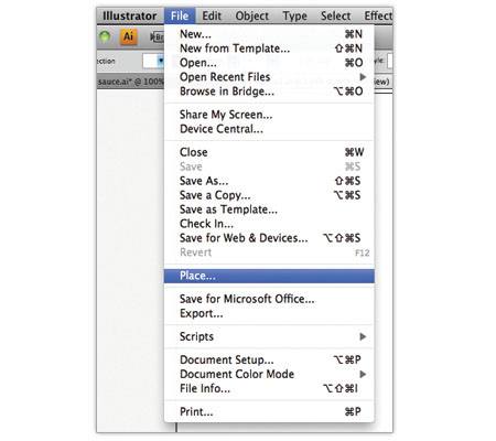
Make the necessary adjustments to your image (rotate, resize, etc.), then click the Embed button in the Options bar.
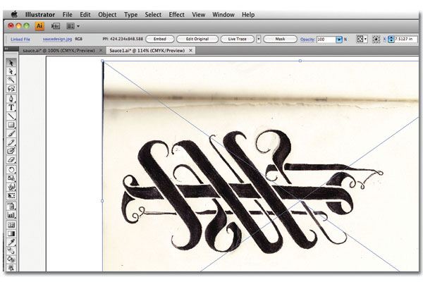
Now we have our tracing image. Go to the Layers Panel and double-click on the layer in which you placed the tracing image.
The Layer Options will pop up prompting you to change the Layer name, the layer’s selection color, etc. I named this layer creatively: tracing image.
We also need to lock this layer so that it doesn’t move around accidentally. This window is also where we can dim the tracing image by lowering its opacity, making tracing with the Pen Tool (P) easier.
Step 3: Tracing the design
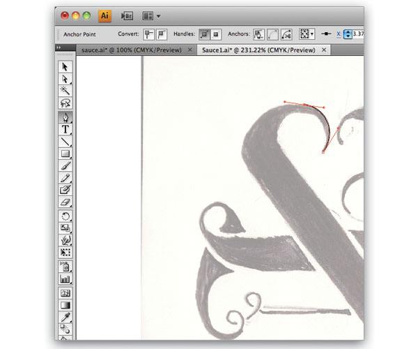
Now we are ready to start tracing with the Pen Tool (P).
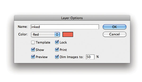
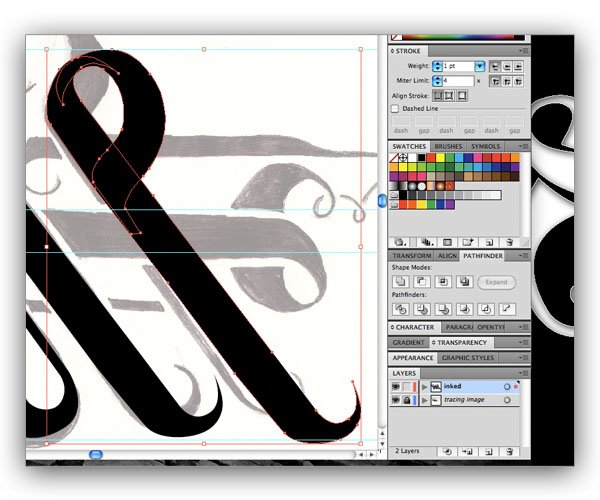
First, create a new layer on top of our tracing image and name it inked since we’re going to be sort of applying ink (digital, though it may be) to the sketch.
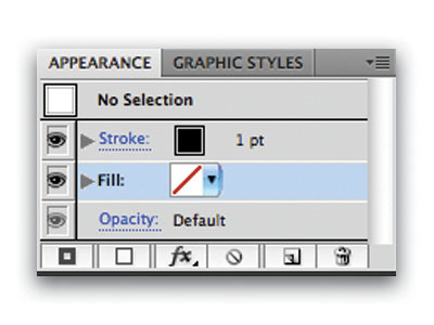
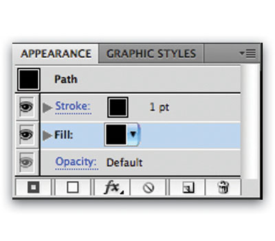
Use your Pen Tool (P) to start tracing the image. But first, go to the Appearance Panel and change the stroke to 1pt and change the Fill to None. This will help you see where you’re drawing your curves.
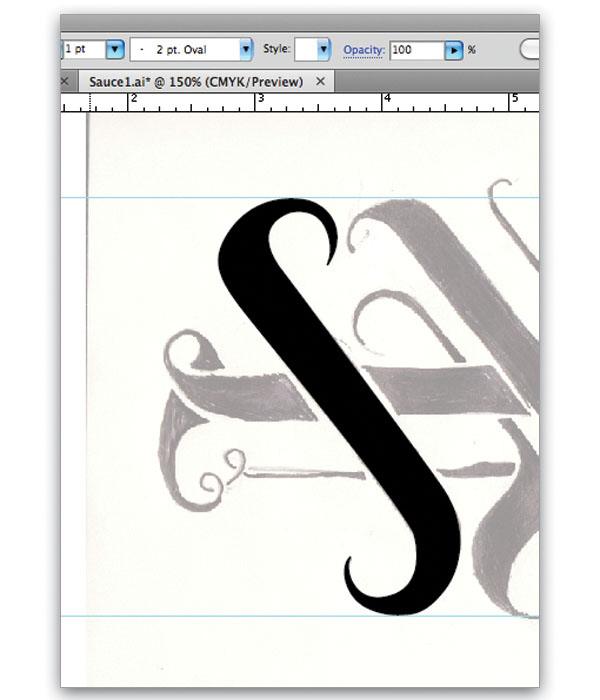
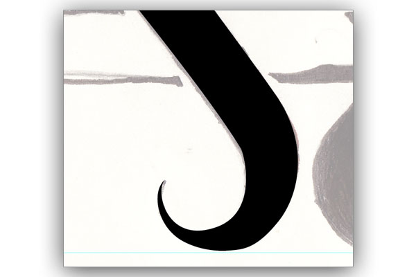
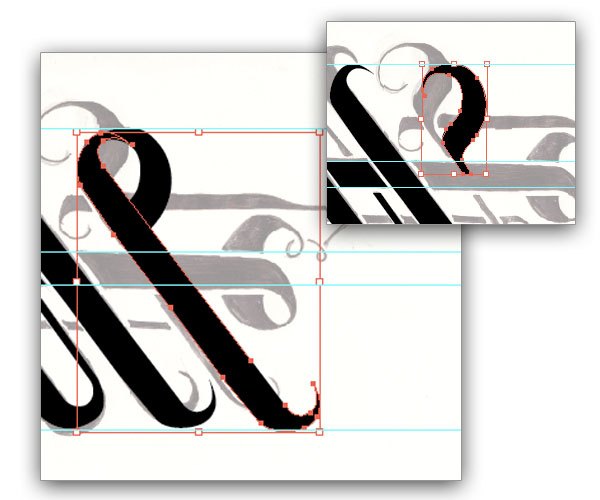
Start the trace at the top of the “S”.
The letter “S” is the shape from which we will derive all of the letterforms in this design.
The Pen Tool (P) is perhaps one of the most intimidating tools in Illustrator, especially when you’re just starting out. It’s because the way it makes curves and lines is completely different from how you would draw on a piece of paper.
However, with just a little time and some practice, it does get easier and just as instinctive as putting pen to paper.
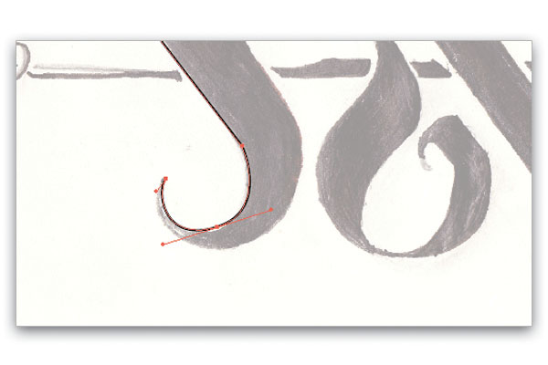
This image has a lot of pointy bits, so you will inevitably need to convert a Bezier curve anchor point into a “corner”. You can do this by holding down Option/Alt on your keyboard and clicking the anchor point with your mouse.
You’ll notice that your anchor point, which had 2 handles, now only has one.
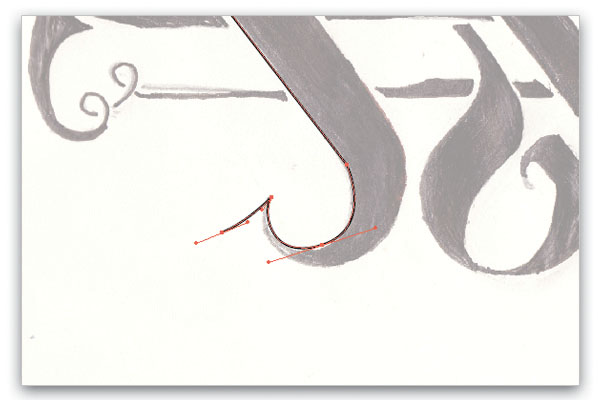
Oops! I’ve just made a mistake.
What do I do now? The beauty about the Pen Tool is that there is really no need to panic when you mess up. All you have to do is either delete the anchor point where you messed up, undo your last action by pressing Cmd/Ctrl + Z, or adjust the anchor point using your Direct Selection Tool (A). Personally, I like to adjust wayward anchor points whenever I can.
Illustrator makes adjusting anchor points easy by remembering which of the selection tools you used last and you can easily access that selection tool by pressing and holding the Cmd/Ctrl key on your keyboard. For this adjustment, we will be using the Direct Selection Tool (A).
Continue around the letter “S” with the Pen Tool (P) until you can close the shape. Once the shape is closed, I like adding a fill to the shape to get a better overall feel and to see if I need to make any more adjustments.
You can do this by going to the Appearance Panel and choosing a fill color under the Fill property.
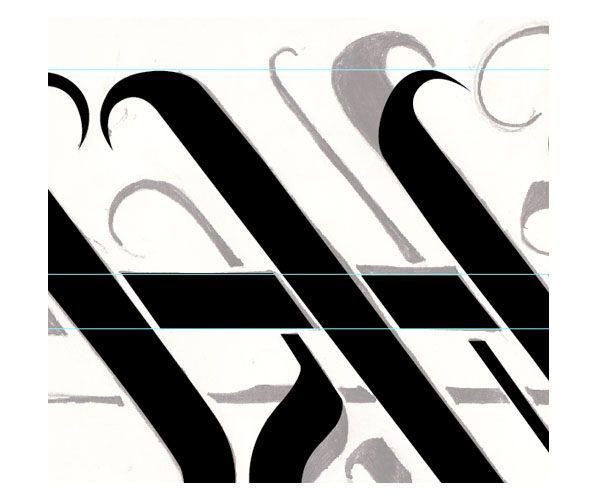
Step 4: Setting up guides
If you look at my sketch, you’ll notice that the heights of the letters in my design aren’t the same. I want to make these heights uniform for the final product so before I continue with the illustration, I make guides using the height and the baseline of the “S” I just drew as the basis for the height of all my letterforms. You do this by showing your rulers (View > Show Rulers) or by pressing Cmd/Ctrl + R on your keyboard.
Then you drag out a couple of guide from the top ruler into your illustration.
Set up as many guides as you think you need. You can turn off the guides on the artboard by pressing Cmd/Ctrl + ;.
Step 5: Continue with tracing
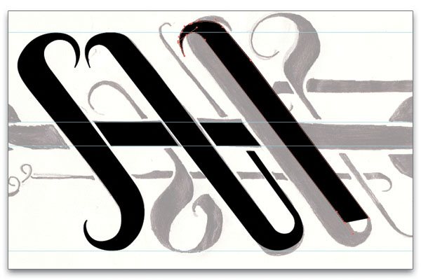
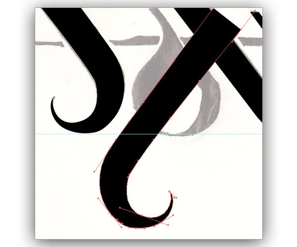
Continue with the tracing. To create the “U”, I just used my Pen Tool to mimic the curves of the “S” shape.
I did this manually.
We will be using a copy of a part of the “U” to create our next letter. When done tracing the “U”, select the anchor points you want to copy and then press Cmd/Ctrl + C then paste the copied shape by pressing Cmd/Ctrl + V.
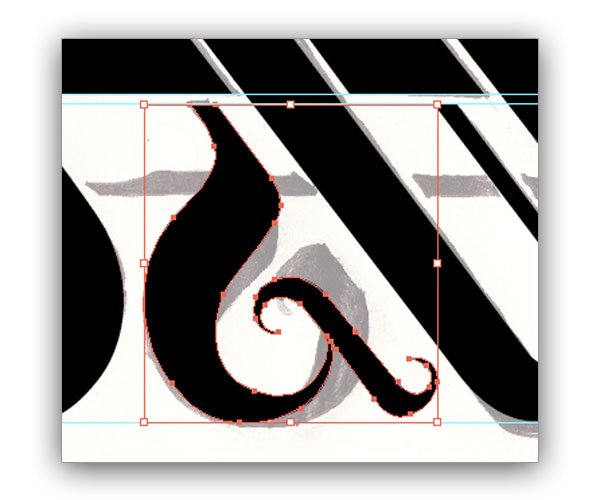
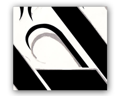
Step 6: Creating the “C”
Not only will copying and pasting save you time, you’ll also get a more uniform and more finished look to your image when you’re done.
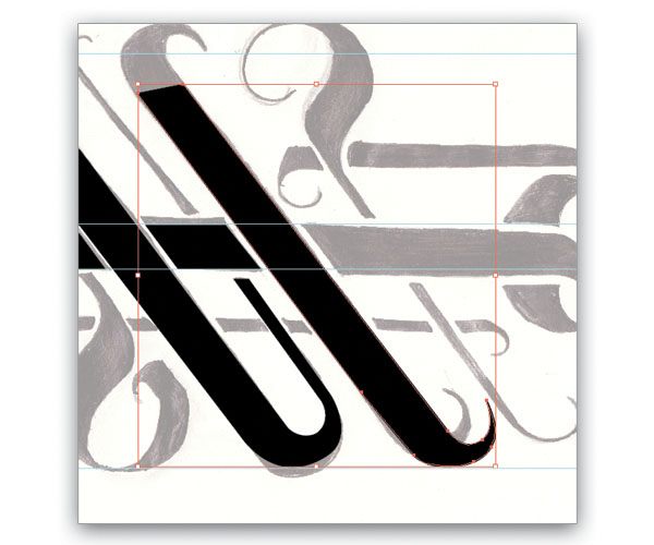
To create the letter “C”, I used the Direct Selection Tool (A) to select the anchor points of the letter “U” that I wanted to copy and then I pasted it to a different part of the illustration.
Then I simply rotated the copied shape and used the guidelines to align what would now become the bottom part of the letter “C”.
To create the top part of the “C” drag out another copy of bottom part of the “C”.
I do this by using the Selection Tool (V) and holding down Alt, and then dragging out another copy.
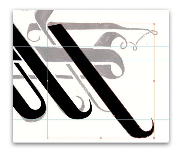
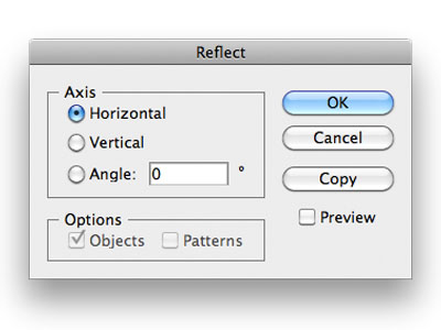
Then I transformed the new shape by reflecting, Object > Transform > Reflect, to fit the direction of the “C”.
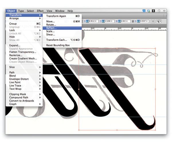
Reflect the shape horizontally.
Place the new reflected shape on top of the bottom part of the “C” and make any necessary adjustments by using the Direct Selection Tool (A) to grab the anchor points you want to adjust.
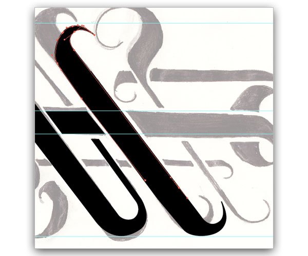
We now have the two shapes comprising the letter “C”.
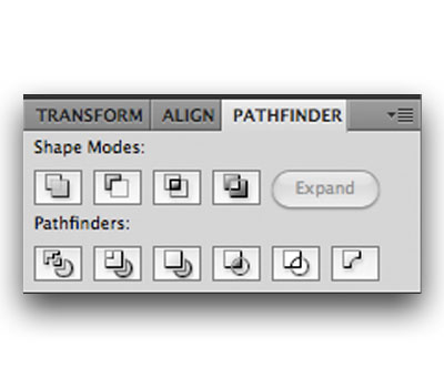
Now we have to make the “C” just one shape.
Do this by using Pathfinder Panel which can be found in Window > Pathfinder or by pressing Cmd/Ctrl + Shift + F9. I usually keep the Pathfinder Panel docked in the user interface since it’s a tool that I use frequently.
Select both the top and bottom parts of the “C” and click on the Unite command on your Pathfinder Panel. You’ll notice that all the overlapping anchor points of the two shapes are gone and you will have just one shape for the letter “C”.
Step 7: Creating the “A”
Next, we have to make the “A” and the “E” of the design. The more time I spend with this design, the more I see repeating shapes that I can use.
If you look closely, the “A” and “E” can be made from the same shape with a few modifications.
Start by making the base of the “A”. Just like with everything else we’ve done up to this point, the shape I’ll be using can be derived from the letter “S” in the design.
Therefore, to create the “A” I will copy the bottom part of the “S” and modify it to fit the letterform. I do this by using the Direct Selection Tool (A) to select the anchor points I want to copy.
Then press Cmd/Ctrl + C to copy the anchor points and then Cmd/Ctrl + V to paste the shape.
Now, adjust the copied part of the “S” to fit the “A” letterform by selecting the shape and reflecting it with Object > Transform > Reflect. You must reflect the shape vertically.
Make the necessary adjustments using your Direct Selection Tool (A) until you are satisfied with the result.
Step 8: Creating the “E”
Now we can copy the shape we just made for the “A” and rotate it to fit the letter “E”.
To make the tail of the “E”, use a copy of the letter “C” that we created earlier and paste it over the “E”.
Use the Direct Selection Tool (A) to drag around any anchors that you think might need adjusting.
When you’re satisfied with the outcome, select both shapes that comprise the “E” with your Selection Tool (V) and use the Unite command in the Pathfinder Panel.
Step 9: Refining the “A”
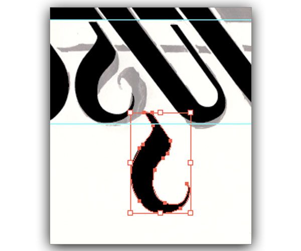
Looking at the bottom part of the “A”, I feel like there’s something missing. I decided to copy the “S” entirely and I reflect it using Object > Transform > Reflect to form a sort of tail.
Then, resize the now backwards “S” shape to a desirable size by selecting the shape with the Selection Tool (V) and dragging one corner of the selection box while pressing the Shift key to retain the shape’s proportions.
At this point in the tutorial, we’ve copied and modified so many shapes and the design has taken on a rather uniform and decent look already. You can turn off the tracing layer to get a better idea of where you stand.
Step 10: Refining the composition
We’re almost there. Now we have to create the top parts of the letters “A” and “U”.
Now we go back to using the Pen Tool (P).
I quite enjoy the curve of the top part of the “A” in the tracing image so I’ll just manually ink that shape using the Pen Tool.
For the top part of the letter “U”, apply the same shape as the top part of the “A” by selecting the shape to copy, and then paste the copied shape to the “U”. Make any necessary adjustments using the Direct Selection Tool (A).
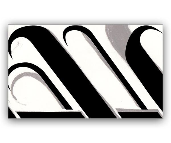
Now let’s see where we stand.
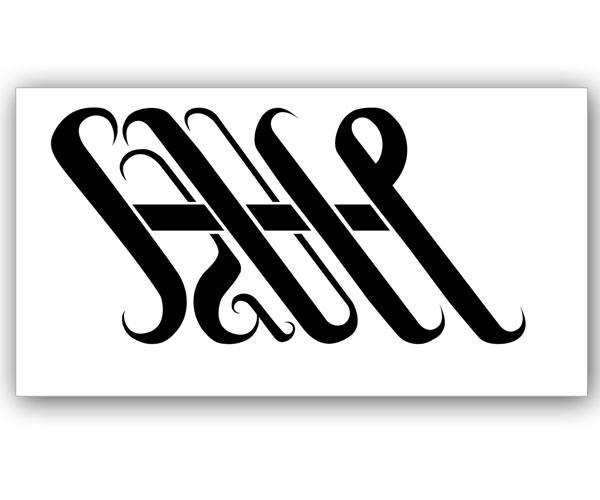
Now we get to fun the stuff, which is creating the ribbon that will wrap around the letters.
Using the Pen Tool (P), I start inking parts of the ribbon. Remember to turn off the fill of your shapes to get a better idea of what your shapes will look like. With the many changes that we’ve made from the original sketch, obviously some parts of the tracing image will not match perfectly with your inked version.
This is where the fun begins.
You can get really creative with the ribbon and make all kinds of twists and turns. This is where the Pen tool truly shines. After you make the finishing touches for the ribbon.
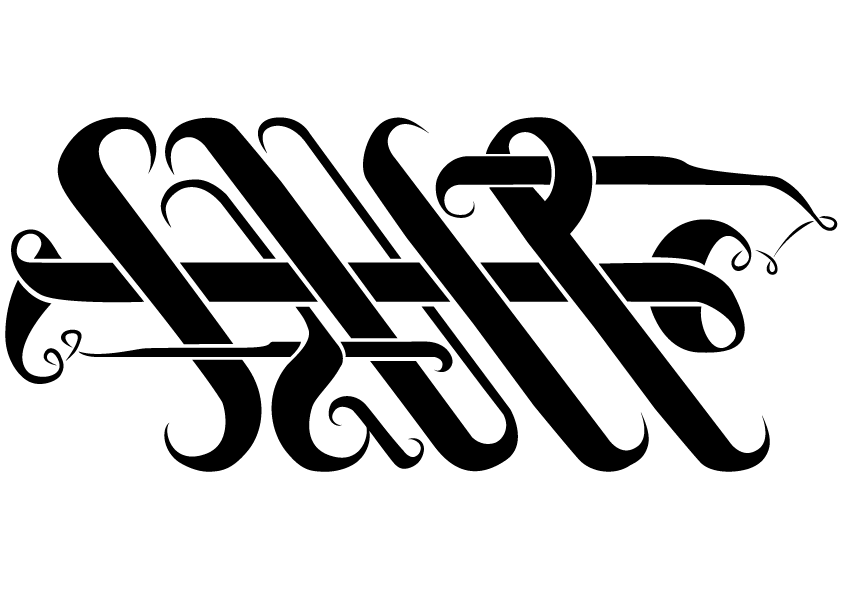
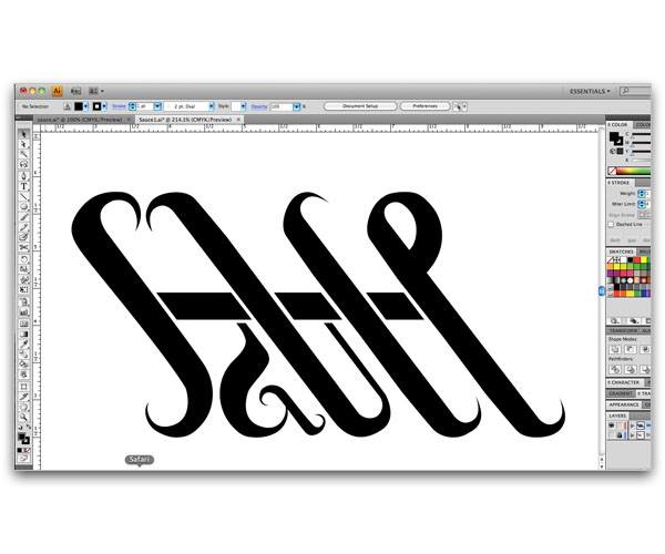
You’re done!
Conclusion
We covered how to create an abstract vector typography illustration using Adobe Illustrator.
We followed some time-saving techniques such as replicating parts of your illustration to make new letters, using the first letter, “S” as the jump off point. Now you can use your design for any number of real world applications such as screen prints, T-shirts, etc.
Please share your own experiences designing custom type treatments in the comment section.
Don’t forget to show off your work in our Flickr group pool!
Download Source Files
- abstract_type_art (ZIP, 5.4 MB)
-
 Trevin serves as the VP of Marketing at WebFX. He has worked on over 450 marketing campaigns and has been building websites for over 25 years. His work has been featured by Search Engine Land, USA Today, Fast Company and Inc.
 -

WebFX is a full-service marketing agency with 1,100+ client reviews and a 4.9-star rating on Clutch! Find out how our expert team and revenue-accelerating tech can drive results for you! Learn more
Make estimating web design costs easy
Website design costs can be tricky to nail down. Get an instant estimate for a custom web design with our free website design cost calculator!
Try Our Free Web Design Cost Calculator
Table of Contents
- Preview
- Introduction
- Step 1: Preliminary Sketches
- Step 2: Setting up your artboard
- Step 3: Tracing the design
- Step 4: Setting up guides
- Step 5: Continue with tracing
- Step 6: Creating the "C"
- Step 7: Creating the "A"
- Step 8: Creating the "E"
- Step 9: Refining the "A"
- Step 10: Refining the composition
- Conclusion
- Download Source Files
Share this article


Web Design Calculator
Use our free tool to get a free, instant quote in under 60 seconds.
View Web Design Calculator
Make estimating web design costs easy
Website design costs can be tricky to nail down. Get an instant estimate for a custom web design with our free website design cost calculator!
Try Our Free Web Design Cost Calculator