 In web design, the position of design elements and the layout of web pages is everything. So many cool, exciting techniques are available to help us lay out our designs (especially with CSS3 at our disposal) that we often forget that structure is as important as aesthetics. How do you determine where content should appear, and how can a well-oiled interface increase website readability?
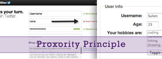
This is what we’ll aim to uncover in this article. We’re going to examine a basic technique that could help you improve your general content flow, and, for lack of a better term, I’m going to call that technique the proxority principle (a portmanteau word that combines “proximity” and “priority”).
Communication through Design
Designers already understand that the relationships between objects on a page matter.
That’s why when we create a design, we think about visual hierarchy, visual weight, Gestalt psychology, the distinctiveness of important elements and other principles that affect relationships between the various components of a web page. It’s one of the reasons why we tend to get neurotic when it comes to navigation menus, headers or footers. With so much going on inside the average web page, getting the right content to users in the right place and at the right time is quite an achievement!
If your content isn’t structured suitably, there can be a number of downsides, such as:
- Critical information getting lost or skipped
- User interaction issues like error-proneness or confusion
- Reduced web accessibility for screen readers
The proxority principle, in a nutshell, puts forth the idea that if we can prioritize our content to ensure that the most relevant material is visible and appealing, users will immediately be drawn to it. This principle asserts that all related, important content should be grouped or joined together whenever possible to allow flow and feedback. The art of this technique isn’t in the theory, because we often lay out content logically as we write it (headings, subheadings, bullet points, etc.); instead, it’s in the planning stage.
Proxority Principle in Site Navigation
Consider something like a navigation menu. One of the first things we do when producing the information architecture of a site is to organize pages and links into one cohesive structure, after which we add categories or subsections if appropriate. This technique leads to the development of drop-down menus and other unique browsing aids which help us to further bind content that lacks proxority.
When planning navigation menus, one must pay particularly close attention to the value of pages and their connections, in order to make them a perfect example of proxority in action. This particular technique works for any style of website, so whether you’re scaling a huge service-heavy but content-light layout (like Amazon) or a content-heavy but feature-light design (like a blog), the technique should be of use. Better yet, the principle can help you organize your website’s information architecture; the proxority between pages is as important as what exists upon individual pages.
If you find yourself struggling to determine where stuff should be placed, this strategic guide will help you.
Priority: Boost the Best, Weed out the Worst
Many of us know only too well the benefits of prioritizing. The priority we give our content plays a huge part in the perceived value it has upon a page.
A site’s logo/name, for example, is recognizable because of its critically high placement, usually in the top left-hand corner, and it maintains visibility in that position on every page of a website. 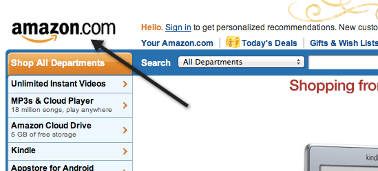 A logo should be dominant over all other objects on a page. That’s its proxority.
Rate Each Element’s Value
To identify which pieces of a web page are most critical and important, we need to begin by examining every object in a layout, no matter how small.
Rate them based on their perceived value (according to what your visitors need to know or are likely to want to know) and their functional value (according to what contributions they make to the website, such as functionality or advertisements). You can do this either by taking a screen capture (or printout) of the entire page and annotating it, or by producing a list of everything that appears on a page. This exercise will help you reassess the value of your website’s content.
Rate images, media, content (at a paragraph level), and everything else according to this numbering system:
| Rating | Description of Element |
|---|---|
| 1 | The website cannot function without this. |
| 2 | This adds benefits but is non-essential. |
| 3 | This supplements or reiterates content. |
| 4 | This is redundant or wastes space in some other way. |
Eliminate Unneeded Elements
When you’ve gone through everything, review the results. Before we go any further, it’s probably worth mentioning that if you find content, links or objects that are no longer useful or don’t contribute anything, remove them. Eliminating clutter from an interface is tough, but reductionism improves the general user experience of a website.
For elements rated at a 3, removal might be a bit harsh, so consider rewording or attaching things together to add value. 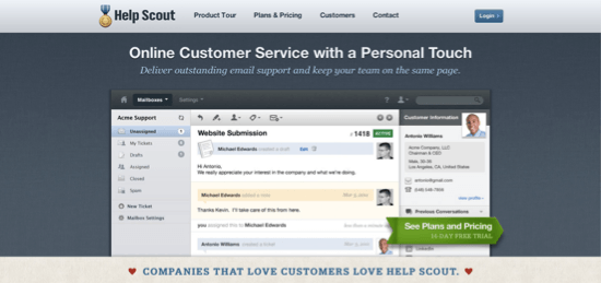 This website arranges its critical information into clearly defined segments for readability. After you’ve identified the stuff that can be deleted, merged or moved, look at everything you’ve given a rating of 2. These elements can be the toughest to deal with because you want visitors to benefit from them, but you don’t want to overburden them.
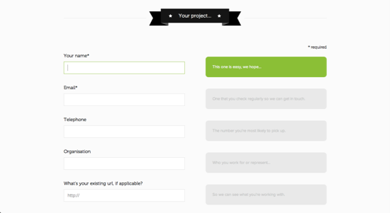
One solution to giving these these needed, but non-essential elements an appropriate proxority is to use progressive disclosure: make content appear on demand with drop-down menus or tooltips, or display it further down the page so that it’s still available but less prominent. 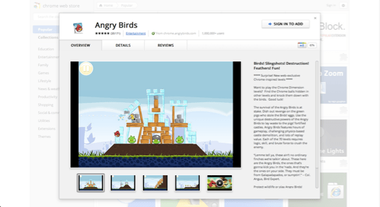 Many websites use progressive disclosure to avoid swamping their users with details.
Proximity: Flow, Feedback and Functionality
We’ve considered the importance of prioritizing every asset on your page, identifying which bits have more sway than others, eliminating the fluff that has accumulated, combining weak material into a strong structure and pushing the less critical data out of the field of vision. We now need to take all the remaining content and follow through on the second part of the process: to connect everything logically and put it all back together, as if it were a jigsaw puzzle — or a storybook, wherein the plot develops at consecutive points.
You should be left with everything that needs to be on your website, in its most diluted form, with supplementary content either hidden down the page or waiting in tooltips and extensible data boxes.
Rate Important Elements in Relation to Each Other
Go back over everything to which you have assigned ranks of 1 and 2, and rank them again; number everything according to what order you believe readers need to know about it. If everything ends up where it should end up, it will all make perfect sense when you read it aloud.
 The developers and designers behind this website clearly understand the need for organization and feedback.
Redesign
Once you’ve got everything labeled, re-shuffle your source code to match the new reading order. Pay special attention to bits of content that connect to or depend on other pieces of content (such as image captions), and put them as close together as possible. Then, make the necessary changes to your CSS and JavaScript.
Proxority: Examples and Patterns in Action
Many websites already exhibit what I’d define as high proxority in that they take great care to use techniques that account for both priority (bringing attention to certain elements) and proximity (making reactions happen directly next to or above the objects being interacted with). Below is a showcase of a few examples of best practices in use. Some we’ve briefly mentioned before, and others are being introduced here.
By following similar practices, you can avoid user confusion and increase reading efficiency. Using progressive disclosure to track the progress of a form: 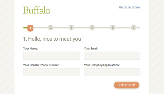 Informing visitors of errors as they enter data:
 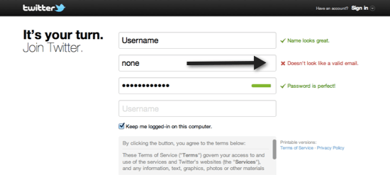 Drop-down menus expanding close to the cursor icon:
 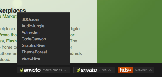 Input objects disabling once they’ve been submitted:
 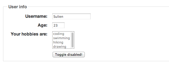 Progress bars showing loading progress:
 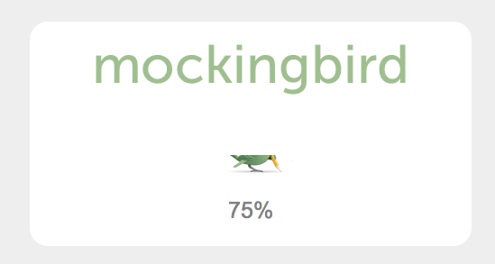 Content or light boxes expanding upon user interaction:
Proxority: Origami for the Web
The proxority principle posits that everything you find on a web page can be assigned a value and a place in sequence, in relation to the objects that surround it. This idea has existed since the early days of the Web, but too few designers pay enough attention to it.
Think through what is actually needed, where it is needed and when it should appear (as opposed to simply putting all of the content on the screen, in its entirety, in an order that “looks pretty”). The need for such techniques is increasing, especially given the proliferation of handheld devices and the idea of designing with a “mobile-first” philosophy. 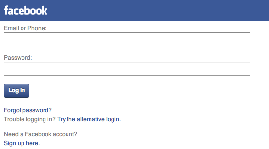 If content isn’t worthy of a restrictive mobile layout, why is it needed in the desktop layout? If you have ten spare minutes, give this simple activity a try.
Go through your website and weed out anything that isn’t offering what it should. Make existing objects provide greater value to users (or use less space), and don’t be afraid to reorganize your code and its content to ensure that what’s needed is what appears. Oh, and if you do feel tempted to make actions elicit responses, ensure that users know that your website is responding; after all, you don’t want them clicking “submit” ten times in a row, only to fail.
Related Content
- Quick Overview of User Experience for Web Designers
- Is It Time to Rethink Website Navigation?
- 10 Important UI Design Considerations for Web Apps
-
 President of WebFX. Bill has over 25 years of experience in the Internet marketing industry specializing in SEO, UX, information architecture, marketing automation and more. William’s background in scientific computing and education from Shippensburg and MIT provided the foundation for RevenueCloudFX and other key research and development projects at WebFX.
 -

WebFX is a full-service marketing agency with 1,100+ client reviews and a 4.9-star rating on Clutch! Find out how our expert team and revenue-accelerating tech can drive results for you! Learn more
Make estimating web design costs easy
Website design costs can be tricky to nail down. Get an instant estimate for a custom web design with our free website design cost calculator!
Try Our Free Web Design Cost Calculator
Share this article


Web Design Calculator
Use our free tool to get a free, instant quote in under 60 seconds.
View Web Design Calculator
Make estimating web design costs easy
Website design costs can be tricky to nail down. Get an instant estimate for a custom web design with our free website design cost calculator!
Try Our Free Web Design Cost Calculator
What to read next