
 One of the most variable aspects of web design is the way in which we approach width and height in terms of measurements and flexibility. For many years, we have rotated between the benefits and pitfalls of using fixed, elastic, and liquid measurements in a quest to give optimal viewing experiences in highly varied situations, while balancing our need to control things in our web pages. But, as Bob Dylan proclaimed a long time ago, “The times, they are a-changin’,” and with these changes come a variety of new ways for laying out your website’s pages and an even more variable landscape of methods for viewing websites.
In this article, we will examine web layout types — old, new, and the future. Each of these page layout designs will easily enhance website user experience. We will explore the subject in the context that websites are being viewed in a diverse amount of ways, such as through mobile phones, netbooks, and touchscreen personal devices like the iPad.
About Your Options
Let’s set our objectives for this exploration of layout types:
- We shall examine the variety of options that exist
- For each layout type, I’ll try to suggest some situations they are best used in
- The pros and cons of a layout type compared to others
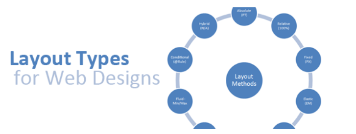
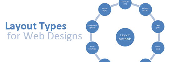
We will discuss 10 types of web layout ideas. 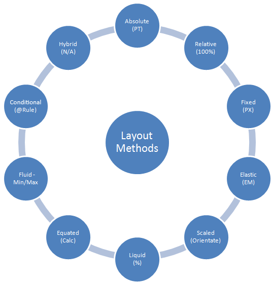 While pixel perfection is a pipe dream, there’s more to layouts than fixed, liquid or elastic! The main lesson to take away from these choices is to think carefully about why an option is suitable for a particular situation and how your choice will affect your audience. Let’s dig in, starting with absolute layouts.
Absolute Layouts
One of the least commonly used methods of measurement employed in web design is absolute measurement (i.e. inches, cm, mm and picas). Absolute units and positioning is traditionally found in print media, which natively use these units of measurement.
The conversion of print to web format can be seen in word processing software such as Microsoft Word, which still uses these conventions when formatting text and sizing the dimensions of a document in order to make it appear as close as possible to printing on paper. Absolute layouts have limited use in web designs. 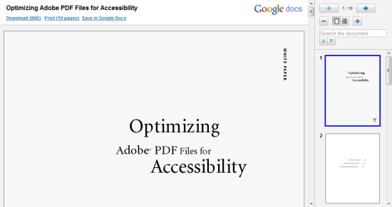 A use for absolute layouts on the web is for PDF documents where content remains static. Of course, just because it isn’t popular doesn’t mean it doesn’t have its place on the web designer’s bevy of options.
If you are someone who utilizes printer-friendly stylesheets — yes, people do still print web pages — the absolute measurements of cm, mm, inches, and pt can help you prepare a page layout for printers more accurately.
Relative Layout
Relative positioning and layouts adjust in size depending on the size of the user’s browser viewport. 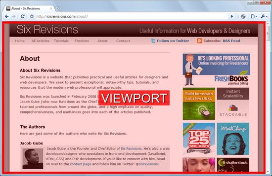 The area inside the red border is the browser’s viewport.
You can change the size of the viewport by resizing the window. Different monitor sizes have various maximum sizes for the view port. Typically, this type of layout relies on everything working at 100% width, whether it’s a small screen (like a netbook) or a 24-inch widescreen desktop monitor. This means that the layout will scale according to the viewer’s situation.
 Very few sites make use of 100% widths, but it does work.
Fixed Layout
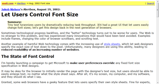
Commonly regarded as one of the least flexible methods of laying out a web design, the use of pixel-based measurements has almost a digital resonance associated with it that transfers across from the print industry, in that the medium relies on fixed/static measurements. This unit of measurement is accurate and leaves little guessing as to how a web design will appear across different web browsers and has become exceptionally popular among sites that favour control and predictability over optimizing the layout for the audiences’ particular viewing situation. 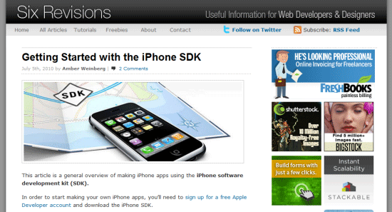 A fixed width layout is used on Six Revisions. We all know that problems can arise from having to scroll in all sorts of directions, and the fixed measurement of a px-based layout has this general issue in spades.
While many people seek out some sort of ideal width to ensure maximum compatibility, it’s worth mentioning that if you use a lot of elements that require fixed layout rules like non-repeating background images or borders with other non-relative elements, fixed measurement layouts can do the job well and act as the best all-around solution.
Elastic Layout
One of the most used methods of laying out a design’s content is using the relative em unit of measurement. Commonly referred to as an elastic layout design (due to the way it flexes by growing and shrinking to meet the content’s needs), it has shown a great deal of appreciation within the web design community due to its ability to scale content, text sizes, and such.
Unlike with fixed units of measurements where absolute-unit elements like images are best suited (due to maintaining without distorting), elastic layouts work best when flexible content (such as text blocks) takes the front seat.  Popular for its elastic nature, em measurements are recommended for font sizes. Of all the methods listed, the elastic layout type is the most subservient to your content as it gives the content itself the deciding position as to how the layout should scale. Making the text smaller in such a design will reduce the width or height, and enlarging the text will have the opposite effect.
This unique attribute allows the layout to resize based on the content rather than the needs of the layout. Using an elastic solution is perfect if you want the layout to be determined by the content, but it can have issues if the text scales beyond the viewport (causing unwanted horizontal scrolling).
Scaled Layout
One of the latest methods in CSS3 allows the manipulation of the available viewport around certain device orientations (i.e.
portrait and landscape). Depending on the way in which the device is held, the design has the potential to alter its visual layout (altering the amount of space given to the content itself). Unlike the others, this type of layout does not rely on measurement units, but rather a specific layout type.
However, this notion shouldn’t be underestimated as a way of dealing with complex columns on small screens. 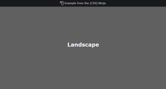 10 years ago, we wouldn’t have considered a screen’s orientation. How the times have changed! Scaled layouts truly shine in the smartphone market where the display can be rotated or moved frequently (such as the iPhone, for example).
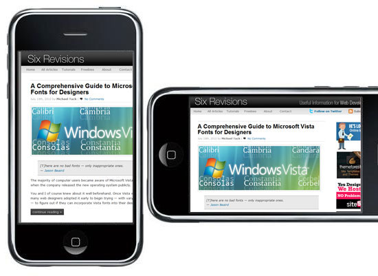 The iPhone adjusts orientation of your websites on-the-fly. With such limited space being available on handheld mobile devices, you cannot only maximize the way your pixels are allocated, but you can also allow people the option to choose whichever method they prefer to visualize the information. Each person will use his or her web-enabled mobile device in a different way, and by allowing your design to relate your content in a transformative way depending on the orientation, you can maximize the usability of your content.
Liquid (or Fluid) Layout
The most relaxed method of providing a dynamically expanding or contracting design makes use of the ever-popular percentage (%) unit measurement.
This layout type has gained mass popularity because it is the ultimate way of allowing the total opposite of a fixed layout where the content will simply take whatever space is available to it. 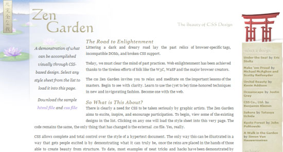 Percentages require careful calculation as you can’t give more than 100% without issues! The limited guarantees you hold on the viewport being used goes beyond screen resolutions (imagine your site on a 6-inch screen versus a 100-inch screen, even just at 80% width). Though it goes without saying that a liquid layout is useful in almost every web-based situation because it adjusts its width depending on how big or small the user’s viewport is — so it’s definitely worth looking into.
Equated Layout
The next method of laying out content we shall look at is the equated layout, which makes use of a new CSS function called calc (see W3C calc spec). 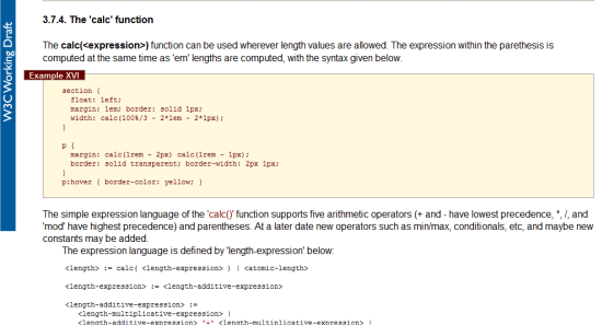 When this measurement capability reaches browsers, a new level of control will exist. While the previous layouts we’ve covered rely on specific widths or heights being provided, an equated layout allows you to mix a fixed and relative value by using a calculation like
 width: calc(50% - 200px). Have you ever had a situation where you wished that you could make up the full 100% but also account for things like divs with borders and elements that have fixed widths (such as an image)?
If you’re anything like me, it’s certainly something that has crossed your mind. The calc CSS3 function, which has not been widely adopted yet (but is part of the CSS3 spec) may just be the thing you are looking for. While the function still isn’t widely supported by existing web browsers, this can be a future-forward option for building layouts with an added layer of pliancy.
Fluid-Min/Max Layout
A common problem that we have as designers is that whenever the amount of space we have becomes either too wide or too narrow (or too tall or too short), the relatively-measured and flexible content we have gets too diluted or too compressed (which is bad news). Using minimum and maximum widths (or heights), you can set limits on how much the design can scale so that you can still have flexibility — but only to a certain extent. Rather than spanning the viewport like a liquid layout, this layout type flows only up to where it’s told (‘atta boy).
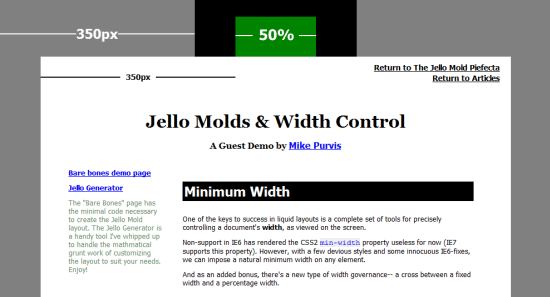 A fluid/”jello” layout will scale only to a certain fixed width or height. If there’s one thing that causes problems with layouts, it’s us making assumptions as to the amount of space that we will have available for our design elements. The benefits of the CSS
 min-width, max-width, min-height and max-height properties are most widely noticed when you want your layout to be confined within certain dimensions (like within a fixed-width design) but don’t want to suffer the wrath of horizontal scrolling. For example, if you wanted to have your width scale to 100% for small screens but only up to, say, 1,500px so that your layout doesn’t get too wide for larger screens, then you can use a max-width:1500px.
As this method of laying out a web page provides a safety net that browsers can rely on (based on the min and max values you supply), you can give your fixed work a bit of added flexibility.
Conditional Layout
With the rise in devices like the iPhone, a need has appeared for a way of altering web designs beyond conventional layouts to ensure that mobile device users can have an optimized experience. The ability to serve a unique stylesheet based on the device or viewport width and height (through CSS3’s media queries) gives rise to an even more flexible and friendly way to represent your site’s content.
This layout type is something I’d like to call “conditional layout.”  The above design uses CSS3 media queries to scale the design down as required. Of all the methods of laying out information that have appeared recently, this is by far the one with the most promise (once the browser compatibility issues are ironed out). Most website designs rely on a single stylesheet. Using CSS3 media queries (especially with mobile and desktop experiences) can bring conditional layouts to best meet the user agent.
The downside of this is that it means you will need to develop and maintain stylesheets for particular devices — much like how you, in the past, maintained IE-specific stylesheets.
Hybrid Layout
Of course, while mentioning all of these layout types, we can’t forget to mention the most popular layout method of all — the hybrid layout pretty much stands by its name in that the design ends up using a mixture of various layout types. This includes mixing and matching various units and concepts to ensure that the web design adapts to the browser’s viewport only when it needs to and still be able to retains a certain level of control over parts of a website that need more fixed structures.
While it requires you to be more thoughtful over your work, it’s possibly the smartest way to design and develop. 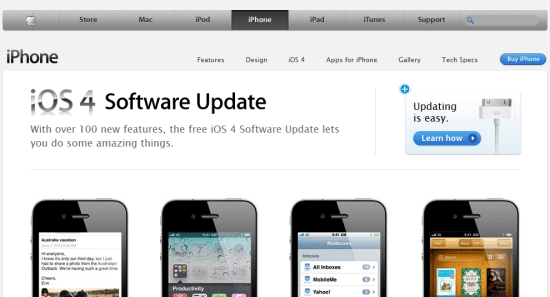 Most sites don’t stick to one measurement type, they hybridize based on needs. Most websites make use of a hybrid layout because certain measurement units are useful for certain situations. While many people still cling to the idea that there is one perfect layout method waiting to be found, I think that the hybrid will overcome situational issues by blending together the best of all worlds.
Perhaps you might end up with an absolute layout in your print stylesheet, and maybe you might have fixed widths using a liquid body with elastic content and a fluid control for the outside edges with scaled and flexible support for certain devices — the combinations are bountiful!
The Bigger Picture
Clearly, there are many options to consider when laying out your web pages, and thus it makes sense — both pragmatically and theoretically — to pay close attention to the details and scope of any design project you undertake. Which layout type you utilize to produce your website is something that deserves as much attention as the fonts you use or the color theme you put together.
It’s also worth highlighting that there’s no perfect way to deal with every situation and therefore there’s no one type that is universally the best for all situations.  There’s no right or wrong way to design, but careful thought can improve some situations. Design is one of the most fundamental skills that any web professional must get to grips with. The way the Internet is being consumed is rapidly evolving, with wide disparities in both the devices we employ and the tools we take advantage of, which is why web design is important.
There’s more to contend with than good usability, accessibility, web copy, color contrast, and so forth. A good website must meet an ever increasing number of needs and thus the search for the perfect layout has become a Holy Grail quest of sorts for web designers. While times are changing (as do situations), picking the right layout right now should be done methodically.
Related Content
-
 President of WebFX. Bill has over 25 years of experience in the Internet marketing industry specializing in SEO, UX, information architecture, marketing automation and more. William’s background in scientific computing and education from Shippensburg and MIT provided the foundation for MarketingCloudFX and other key research and development projects at WebFX.
 -

WebFX is a full-service marketing agency with 1,100+ client reviews and a 4.9-star rating on Clutch! Find out how our expert team and revenue-accelerating tech can drive results for you! Learn more
Make estimating web design costs easy
Website design costs can be tricky to nail down. Get an instant estimate for a custom web design with our free website design cost calculator!
Try Our Free Web Design Cost Calculator
Share this article


Web Design Calculator
Use our free tool to get a free, instant quote in under 60 seconds.
View Web Design CalculatorMake estimating web design costs easy
Website design costs can be tricky to nail down. Get an instant estimate for a custom web design with our free website design cost calculator!
Try Our Free Web Design Cost Calculator