White space is a powerful tool that can take your designs to the next level. When used strategically, that is.
Debunking the Myth: White Space is Wasted Space
Way back in 1930, groundbreaking Swiss designer and typographer Jan Tschichold wrote that white space “is to be regarded as an active element, not a passive background.” Long ago, Tschichold could see that white space was not simply dead space or wasted space, but rather, a design element in and of itself. Let’s talk about some things that can be improved using white space.
Readability
Internet users don’t read, they scan.
This just means there’s a lot more scanning going on than there is reading word for word. Since it’s in the nature of people to scan content, we want to make sure we make it as easy for them as possible. Good use of white space helps readers scan pages and information to pick up the most important key points.
A study carried out by Wichita State University showed that with optimal leading and margins — white space between and around text — comprehension improved. The study fundamentally demonstrates that white space affects the reading experience. Many designs can be improved simply by increasing the leading of text. The analog of leading in web design is the line-height CSS property.
For web designs, a popular line-height to font-size ratio is 150%. For example, if the font-size is 20px, then the line-height would be 30px. The 150% ratio will vary depending on the font you’re using, but it’s a good starting point. Compare the two paragraphs below.
The text content and font-size is the same, but the line-height and padding properties are different. Which version is easier and more pleasant to read? 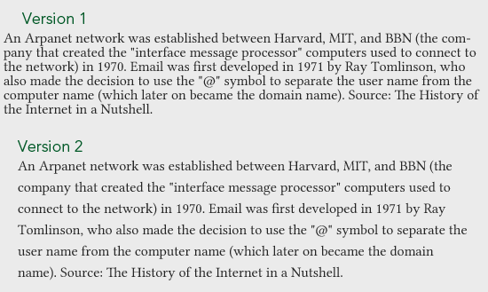 CSS properties of Version 1:
font-size: 16px line-height: 16px padding-left: 3px padding-right: 3px
CSS property of Version 2:
font-size: 16px line-height: 24px padding-left: 15px padding-right: 15px
By having sufficient white space in the form of line-height and padding, we can improve readability quite drastically.
Comfort
White space can make designs more pleasant to look at.
Check out the following example from an article about white space at A List Apart: 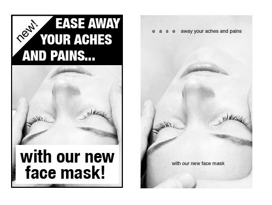 Source: alistapart.com Both versions have the same text content. However, the one on the right has significantly more white space and is thus more comfortable to read. In contrast, the version on the left is visually jarring and busier.
Eye Flow
White space is a great tool for guiding users to chief focal points in a design.
Look at how white space is effectively used in the Apple iMac web page: 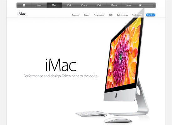 Even with a big and colorful competing image of the iMac on its right, your eyes will still flow onto the product name and tagline because of the strategic use of white space around it.
Emphasis
On every design, there will always be elements that are more important than others. Using white space is one of the easiest ways to make your principal elements garner more attention. This is in essence due to having fewer competing visuals in close proximity to them.
For example, your calls-to-action are important. To make them stand out even when there’s plenty of other information on the page, you can surround them with white space. Take for example the call-to-action button on the Marketcircle site screenshot below.
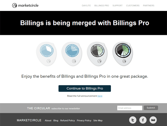 Because of the button’s visual weight and the white space surrounding it, the button is hard to miss even if the page has a lot of other elements.
Grouping
Let’s have a look at the following example. By simply adding in white space between the list items, we instantly create logical groupings within our list without having tax our brains: 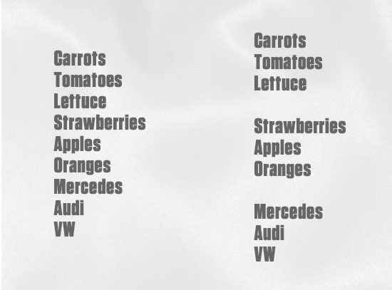 All we have done with the list is add a little white space; we didn’t change colors, font sizes, add text effects or anything complicated.
Summary
Just as the design examples on this page show the power of white space, these SEO examples demonstrate how technical optimization can improve your site’s performance. Readability, comfort, eye flow, emphasis, and grouping are just some of the things that can be enhanced if we use white space as an active element.
Additional Reading on White Space
These will help you learn how to use white space more effectively:
- Negative Space in Webpage Layouts: A Guide
- Working with Visual Weight in Your Designs
- Gestalt Principles Applied in Design
Related Content
- Improving Usability with Fitts’ Law
- Symmetry in Design: Concepts, Tips and Examples
- Deconstructing Minimalist Landing Pages
- Related categories:Web Design
About the Author
 John Macpherson works for Media Surgery, providers of ExpressionEngine development services. He runs a podcast and video series about web development at Web Payload.
-
 President of WebFX. Bill has over 25 years of experience in the Internet marketing industry specializing in SEO, UX, information architecture, marketing automation and more. William’s background in scientific computing and education from Shippensburg and MIT provided the foundation for RevenueCloudFX and other key research and development projects at WebFX.
 -

WebFX is a full-service marketing agency with 1,100+ client reviews and a 4.9-star rating on Clutch! Find out how our expert team and revenue-accelerating tech can drive results for you! Learn more
Make estimating web design costs easy
Website design costs can be tricky to nail down. Get an instant estimate for a custom web design with our free website design cost calculator!
Try Our Free Web Design Cost Calculator
Share this article


Web Design Calculator
Use our free tool to get a free, instant quote in under 60 seconds.
View Web Design Calculator
Make estimating web design costs easy
Website design costs can be tricky to nail down. Get an instant estimate for a custom web design with our free website design cost calculator!
Try Our Free Web Design Cost Calculator