- Home
- Blog
- Web Design
- 40 Best Contact Us Page Designs to Draw Inspiration From
40 Best Contact Us Page Designs to Draw Inspiration From
-
 Published: May 22, 2025
-
 18 min. read
-
 Trevin Shirey
 VP of Marketing
- Trevin serves as the VP of Marketing at WebFX. He has worked on over 450 marketing campaigns and has been building websites for over 25 years. His work has been featured by Search Engine Land, USA Today, Fast Company and Inc. Read his review of working with WebFX for the last 15 years.
Creating a contact us page that’s easy to use can help you earn more form completions, leads, and contacts. But how do you create the best contact us page?
To help you get inspired, we’ve compiled over 40 examples of the best contact us pages to help you get inspired to create your own page. Keep reading to learn more!
Skip ahead to what you want to see:
- Key elements you need to create a contact page
- Best contact us pages
- FAQ on creating a contact us page
Key elements of great contact page design
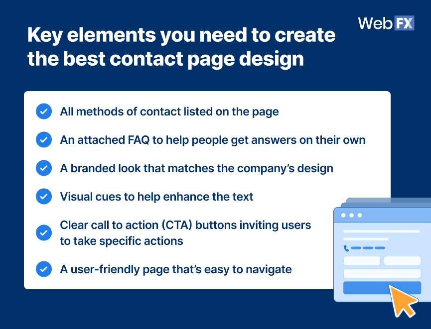
Here’s what some of the best contact us page examples all have in common:
- All methods of contact listed on the page
- An attached FAQ to help people get answers on their own
- A branded look that matches the company’s design
- Visual cues to help enhance the text
- Clear call to action (CTA) buttons inviting users to take specific actions
- A user-friendly page that’s easy to navigate
Having a combination of these elements will help you create a better contact page for your audience.
Additionally, if you have a form on your contact page, it should be simple and only ask for the basic information.
Now let’s dive into the examples, so you can see what we’re talking about!
40 best contact us pages to draw inspiration from in 2025
We’ve gathered the 40 best contact us page examples to help explain the qualities of a good contact us page.
1. Casper
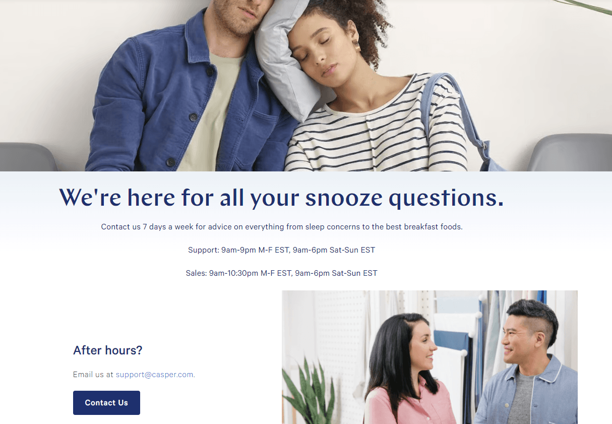
Here’s why Casper has one of the best contact us pages:
- Contact us page fits their brand’s unique style
- Easy-to-find contact information to reach support or sales
- Imagery that matches the purpose of the page
2. Yeti
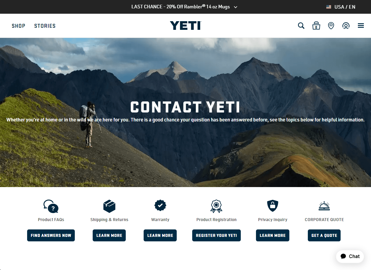
Here’s why this example is the best contact page design:
- Utilizes visual cues to designate FAQ topics
- Provides multiple ways to communicate: Phone numbers, an address, and social media links
- Lists support hours to manage customer expectations about response times
- Clean design that is easy to navigate
3. Dunkin
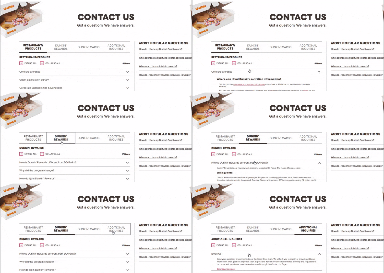
So, why is Dunkin’ on the list of contact us page examples?
- Integrates FAQ to help answer users questions before needing to contact
- Multiple ways to contact their company
- Popular questions listed for easy access
4. Burger King
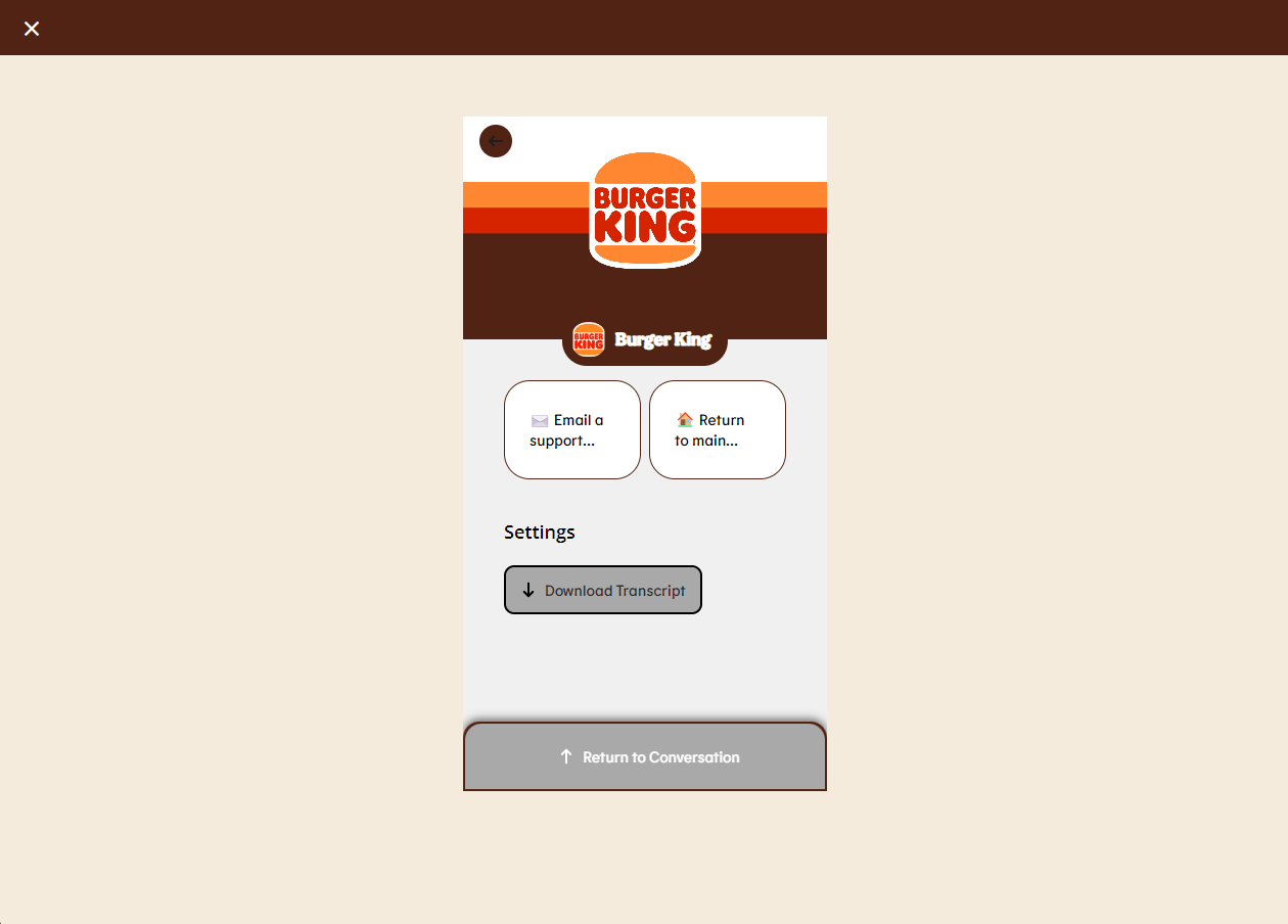
Here’s why Burger King makes it on this list of best contact us page examples:
- Live chat provides immediate support for visitors
- The mobile-friendly design increases usability across devices
- Live chat provides an option to talk to a human representative and clickable interactions to prompt users through the support resources
5. Grammarly
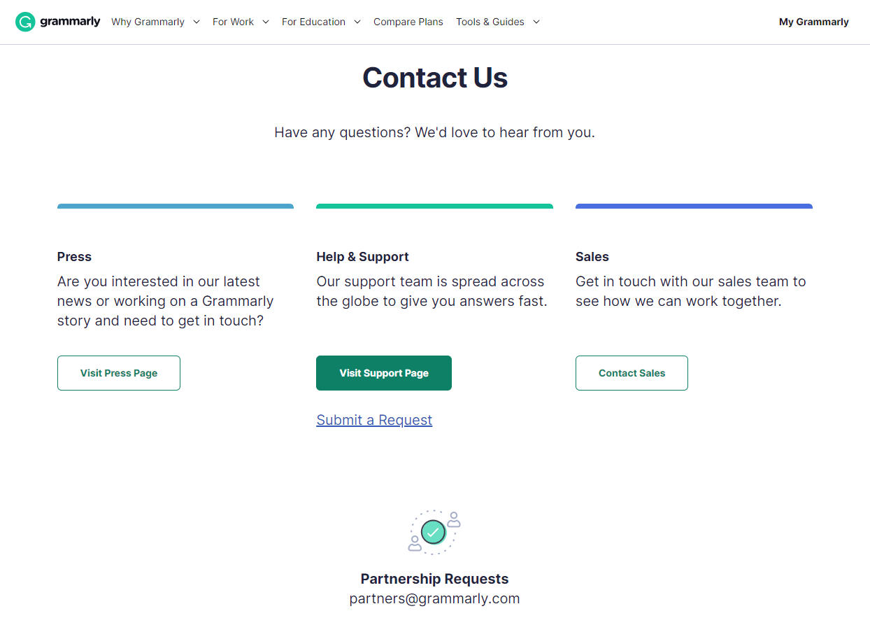
Why is Grammarly on this list of best contact page designs?
- Provides multiple ways to communicate: email, an address, and social media links
- Clear call to action with “Submit a Request” button
- They include separate contact methods for businesses and the press to keep an open line of communication just for customers
- Sleek design that’s easy to navigate and makes the support page stand out
6. Not Your Mother’s
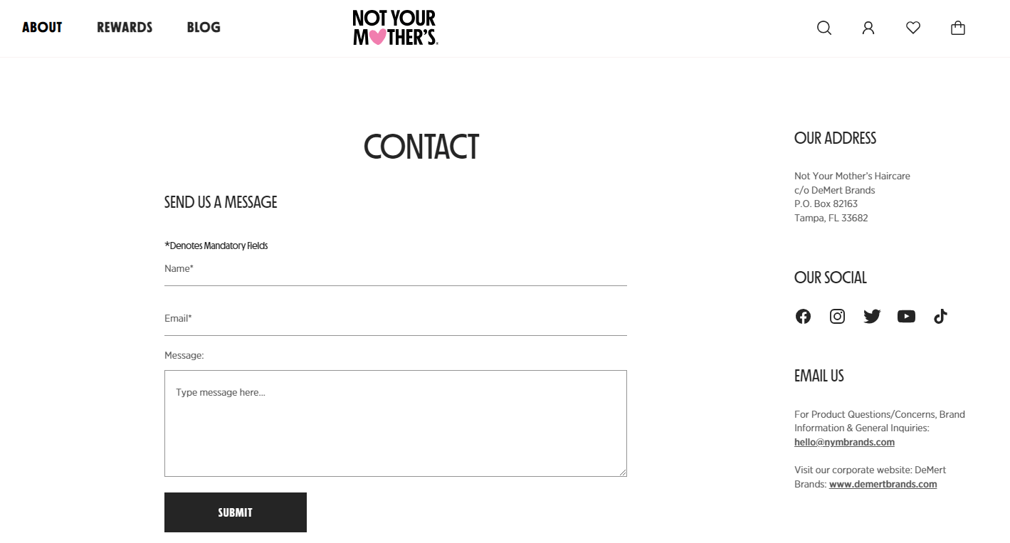
Not Your Mother’s makes it on this list of best contact page designs because:
- Simple design that makes it easy to find what you need
- Multiple ways to contact them, like address, social media, and email
- Simple form to contact the company
7. Ulta Beauty
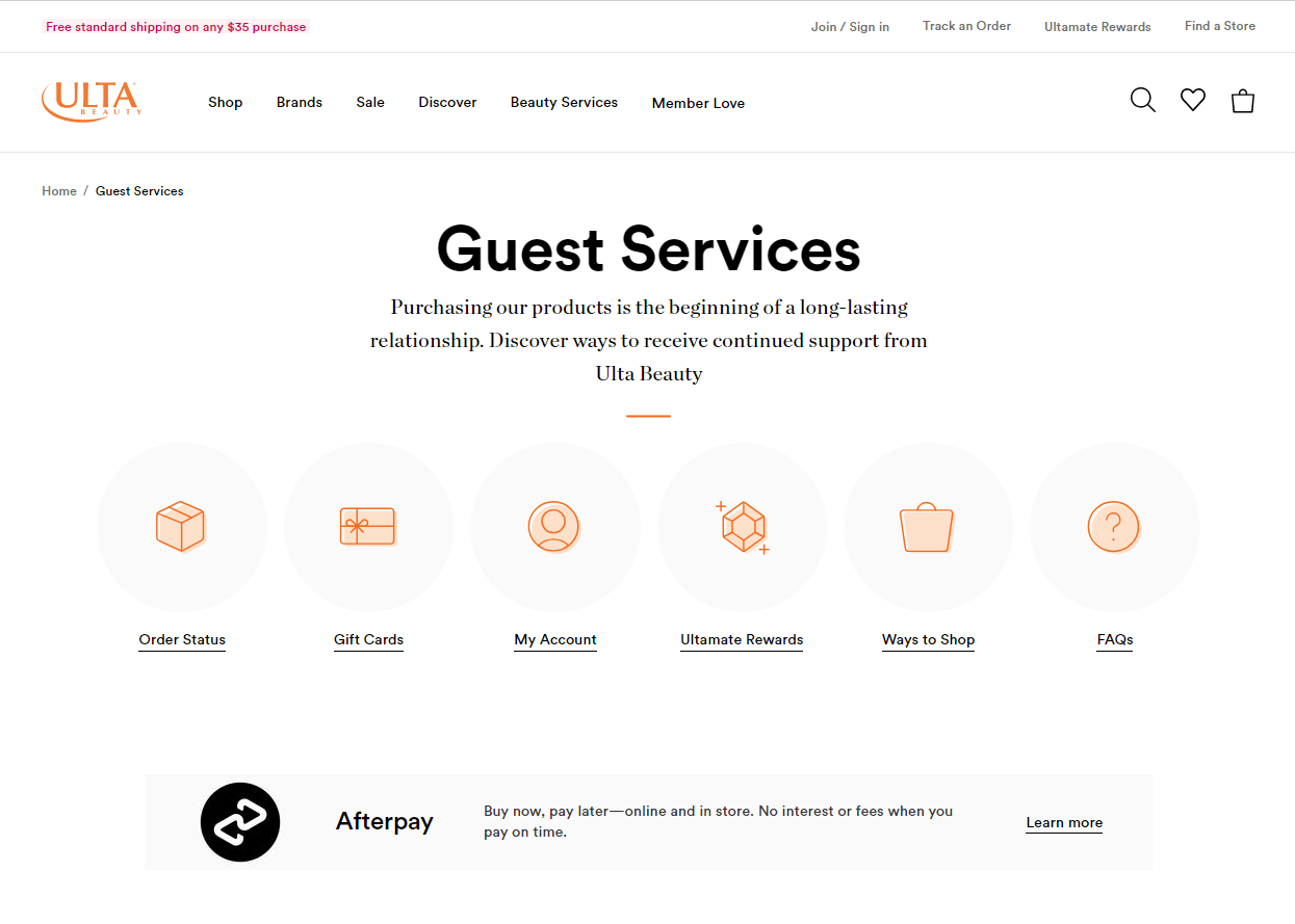
Ulta is an example of a create contact page because it:
- Utilizes visual cues to designate FAQ topics
- Provides a list of popular FAQ topics with answers
- Includes clickable buttons to call, email, or chat with support hours
- Emphasizes continued support in page text
8. Peloton
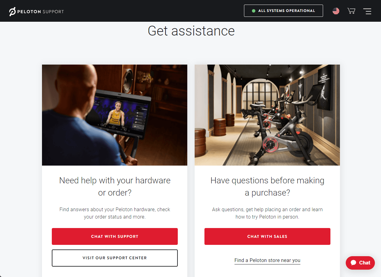
Peloton has one of the best contact us pages because it has:
- A clear call to action with “Chat with support” button
- Live chat that provides immediate support for visitors
- Separate contact methods for business inquiries and the press to keep an open line of communication just for customers
- Addresses of offices and studios, and clickable directions to easily find these locations
9. Petco
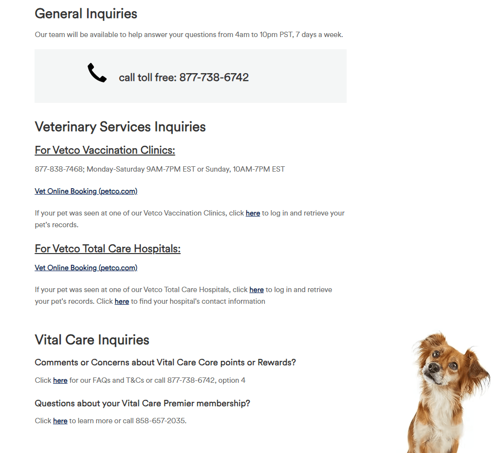
Petco has numerous elements that make it a good contact page, including
- Visual cue to designate a phone number
- Designations for different numbers to reach different services
- Images to enhance the branding of Petco
10. Slack
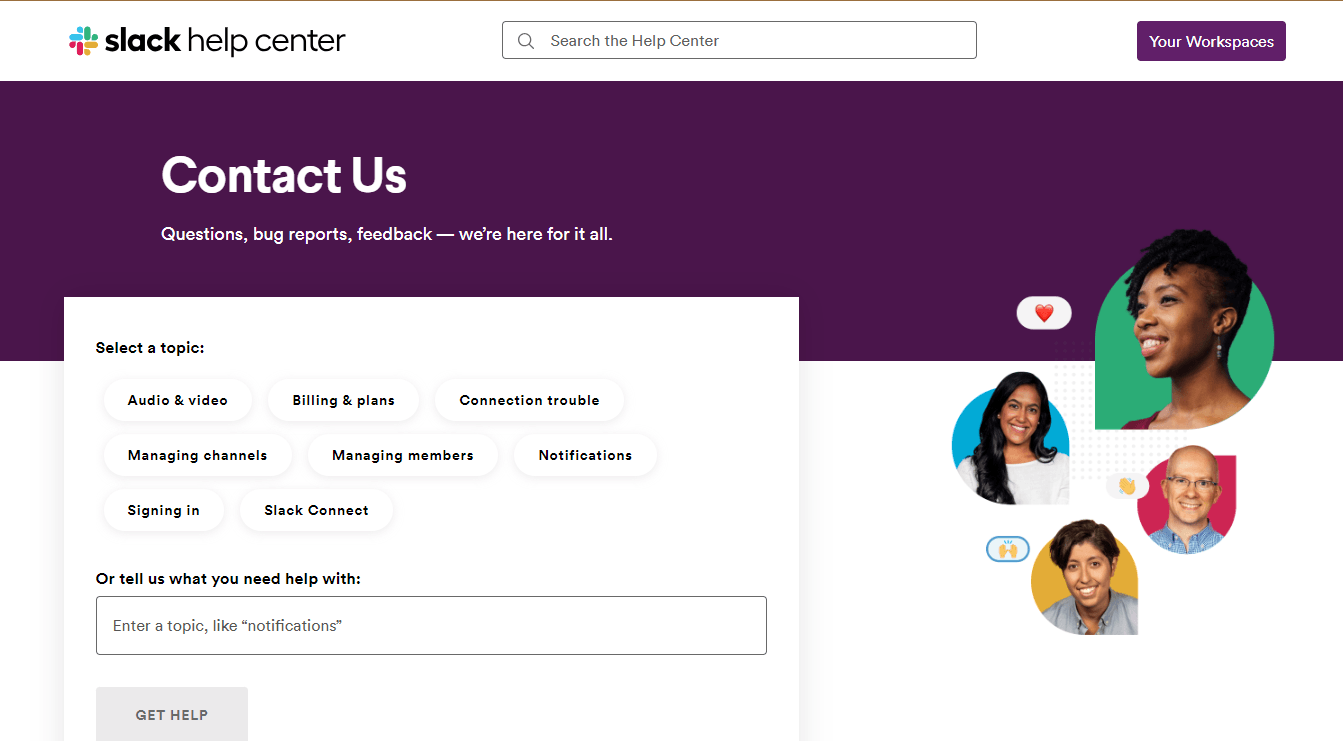
- Buttons at the top to select the category you’re having problems with
- Search bar to find answers to a questions
- Imagery that reinforces the friendliness of customer service
- Option to send a message or start a live chat
11. Dropbox
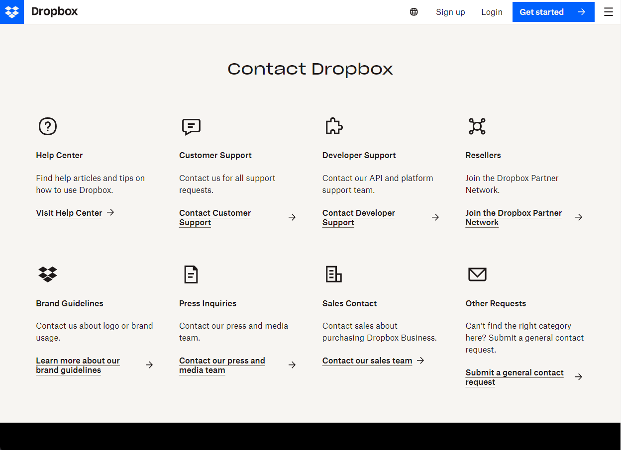
- Utilizes visual cues to designate FAQ topics
- The mobile-friendly design increases usability across devices
- Clean, simple contact us page design with links to relevant resource pages
- They include separate contact methods for business inquiries and the press to keep an open line of communication just for customers
12. Hydroflask
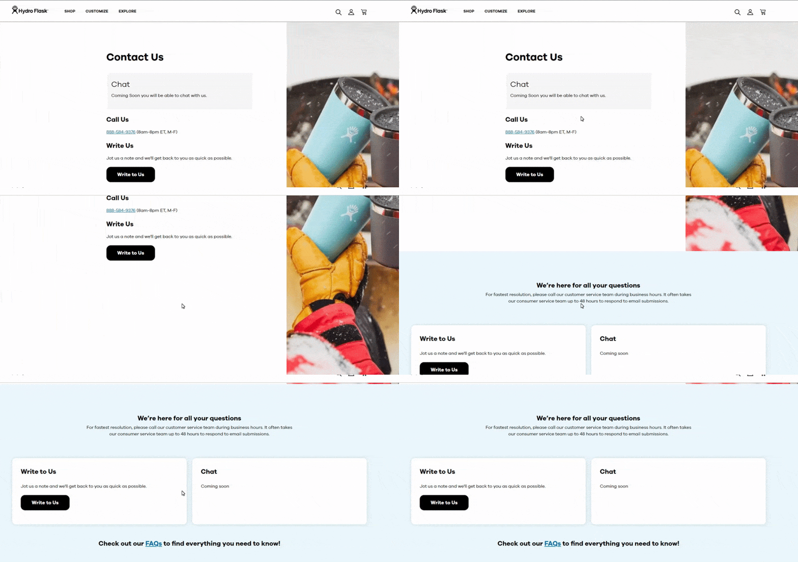
- Multiple options to contact the business, including email and phone
- Direct CTA button to guide users to action
- Suggestions on how to best reach the company if needing a fast resolution
13. Sephora
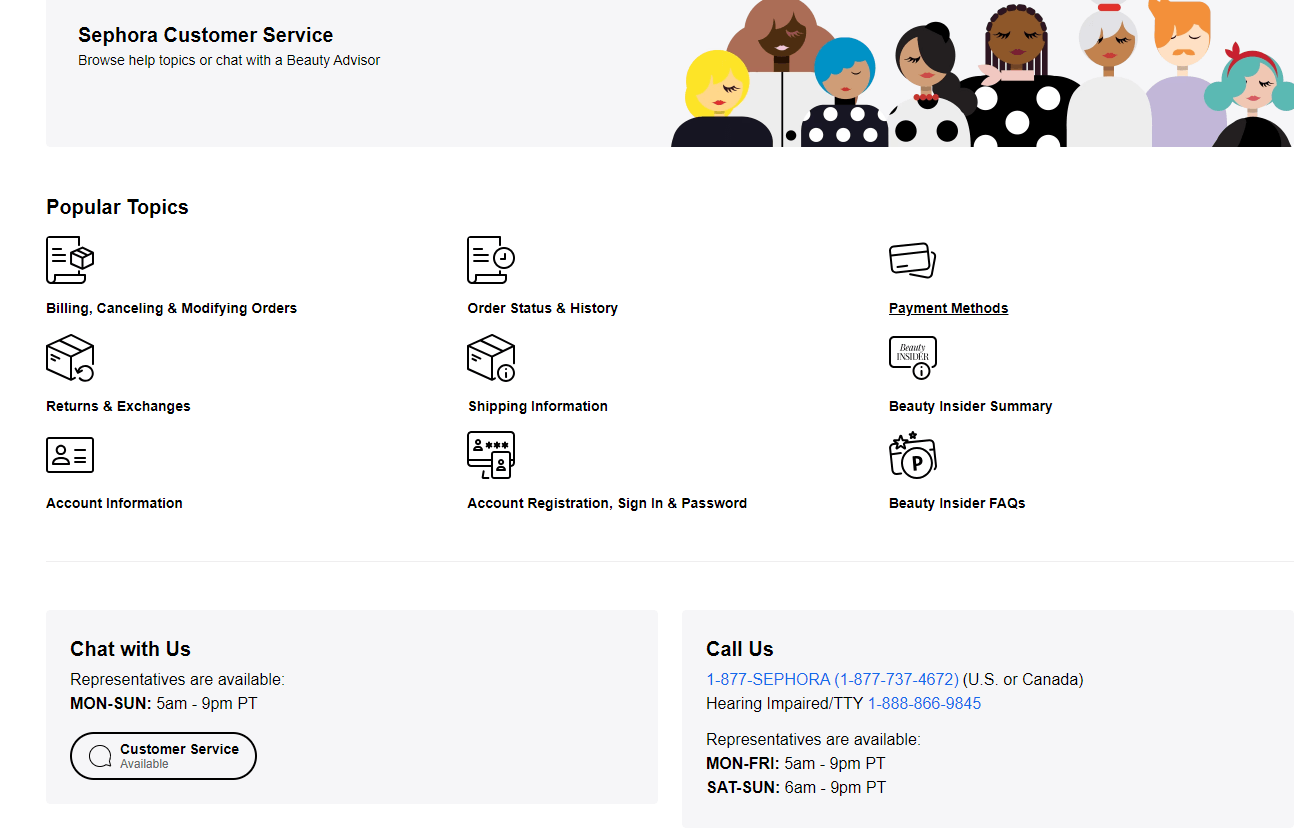
Sephora is one of the best contact us page examples because it offers:
- Visual support for categories where customers need help
- Status of whether customer service is available
- Multiple forms of contact, including phone number, a phone number for hearing-impaired individuals, and chat options
14. Frida
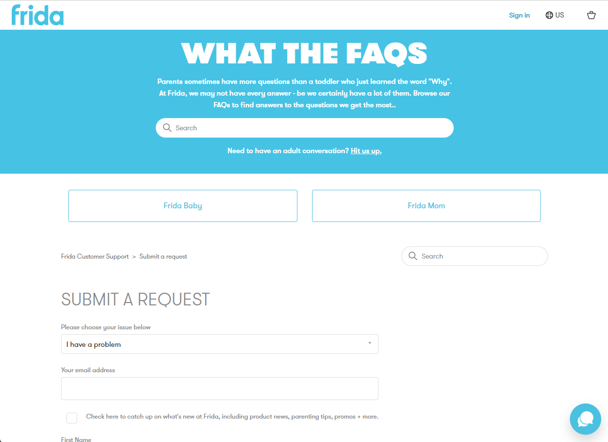
So, why is Frida on this list of the best contact us designs?
- Includes an element of humor that humanizes their support team through their website
- Has easy-to-use contact form based on pre-selected topics
- Clear call to action to “submit a request” via their forms
- Two category pages provide answers and product suggestions for various topics
15. Dell
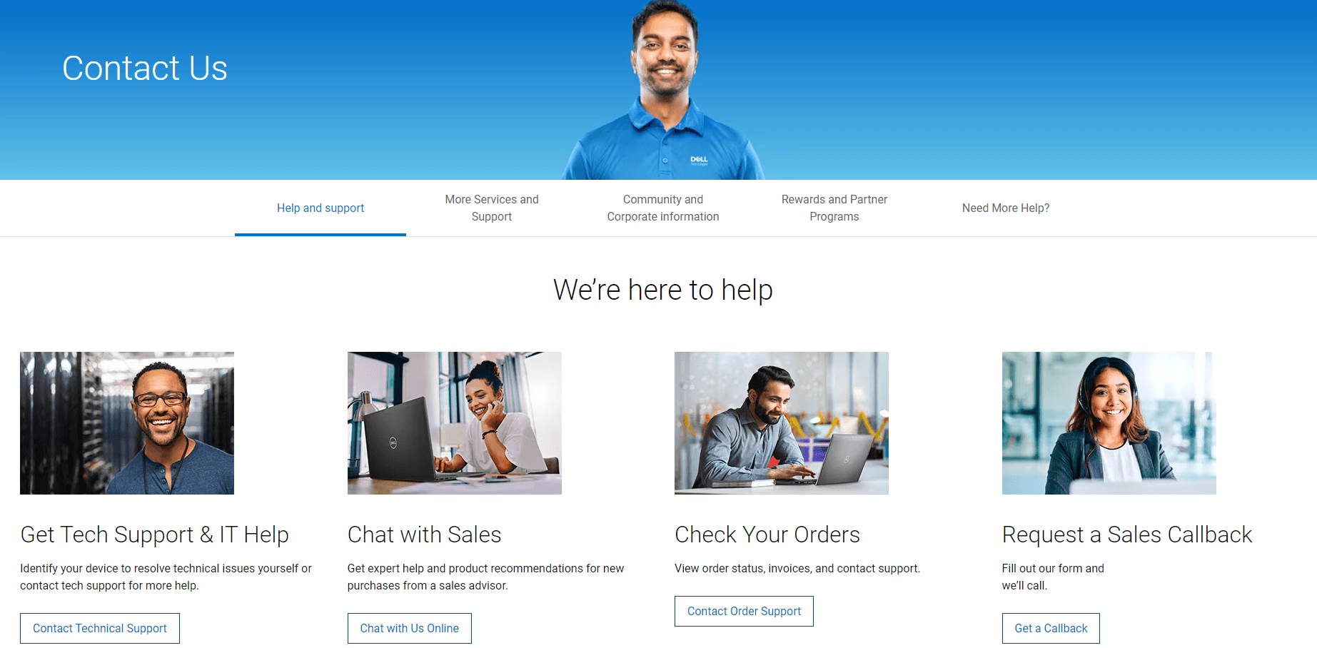
Dell makes it on this list of best contact page design examples because it uses:
- Photos that enhance the message of friendly customers service
- Multiple categories for people to choose what kind of help they need
- Direct CTA buttons that tell people what will happen
16. PayPal
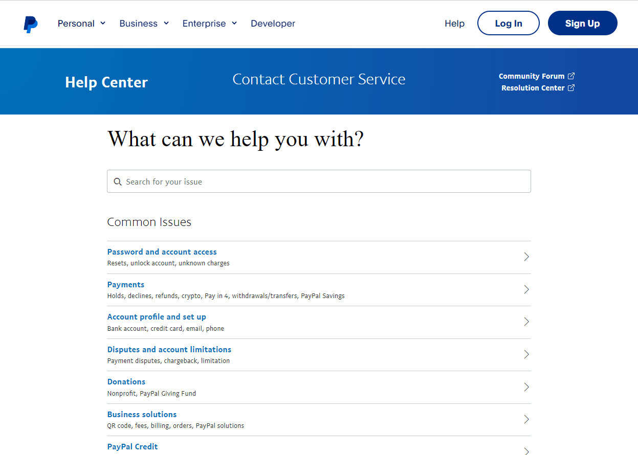
PayPal has one of the best contact us pages because it:
- Lists common issues with answers to easily find relevant information
- Provides clickable contact methods, including “ask the community” which encourages customers to communicate with each other to find solutions
- Offers live chat provides immediate support for visitors
17. Podia
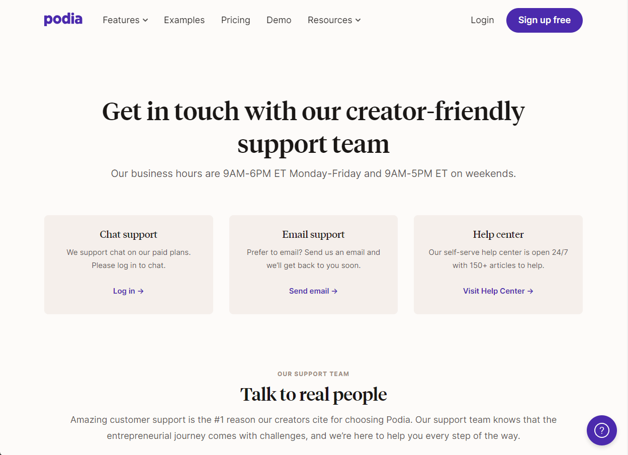
We put Podia on this list because it:
- Has the unique inclusion of introductions for the support team members humanizes their resources
- Provides clickable contact methods including a live chat feature
- Lists support hours to set visitor expectations of times they can expect support
18. Notion
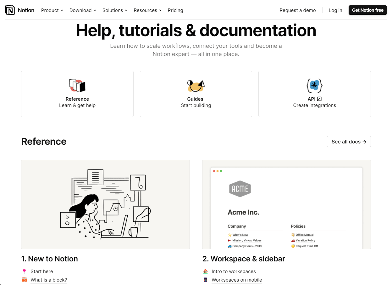
Notion has one of the best contact us pages because it:
- Lists references by topic to provide relevant information for visitor questions
- Provides video guides on how to complete specific tasks
- Offers live chat provides immediate support for visitors
- Clickable email feature to easily contact support teams
19. Giant
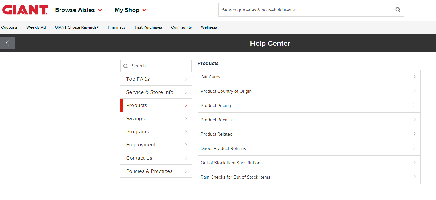
So, why did Giant make it onto this list? Here’s why:
- They offer multiple forms of contact, including chat, phone, and email
- Selecting chat immediately starts a conversation in the chatbox for fast customer service
- Access to FAQs and other important information that people may want when looking for help
20. Prezi
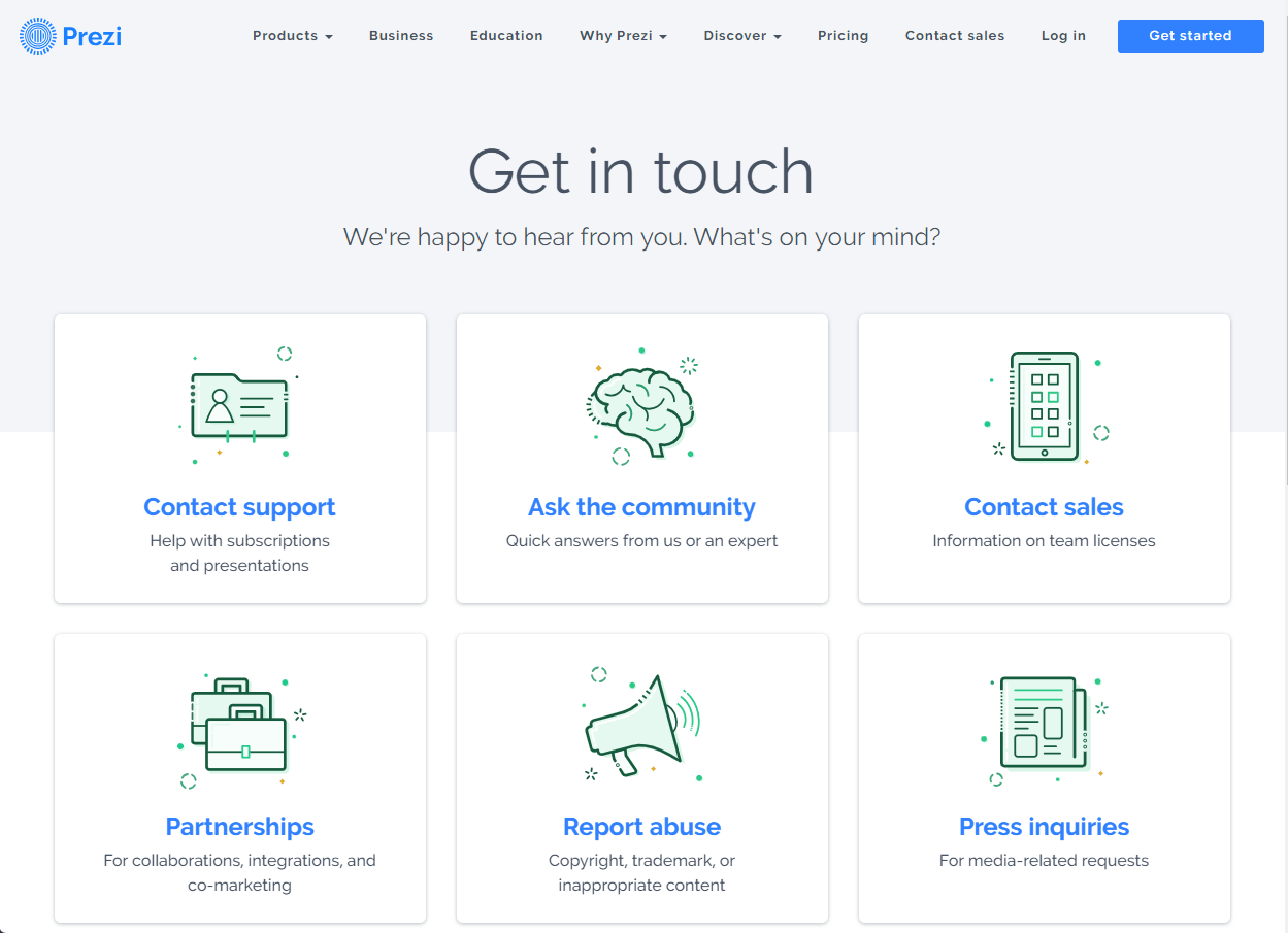
Prezi makes it on the list of the top contact page designs because it offers:
- Clear call to action to encourage visitors to “get in touch”
- Visual cues to separate the various types of contact methods
- Separate contact methods for business inquiries and the press to keep an open line of communication just for customers
21. Xfinity
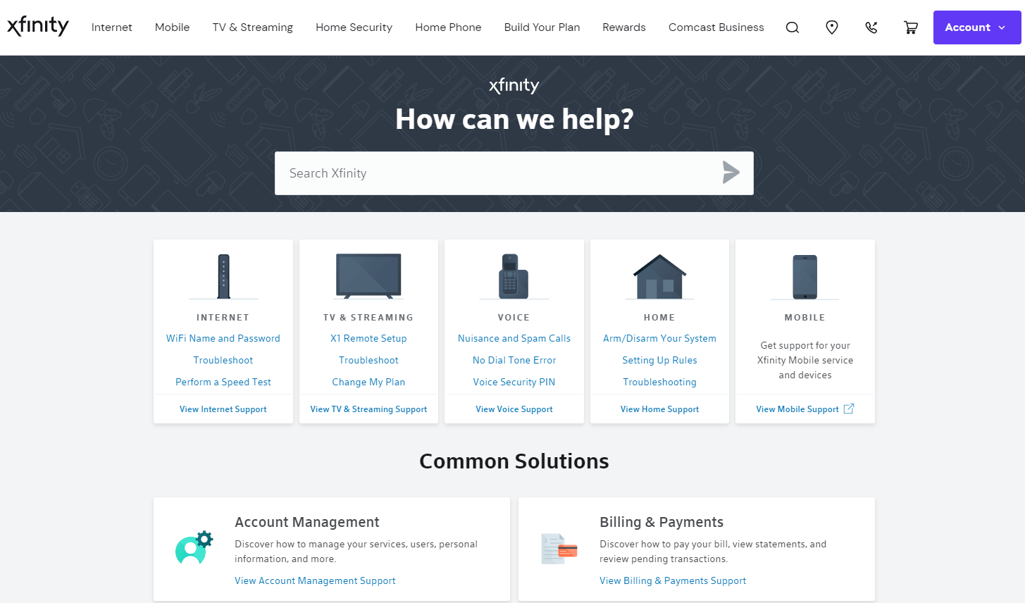
Xfinity is on our list of top contact us page examples because it:
- Uses visual cues to help people find information they need
- Offers a search bar to find information on your exact problem
- Offers the option to talk directly with Xfinity customer support through chat
22. Union Bank & Trust
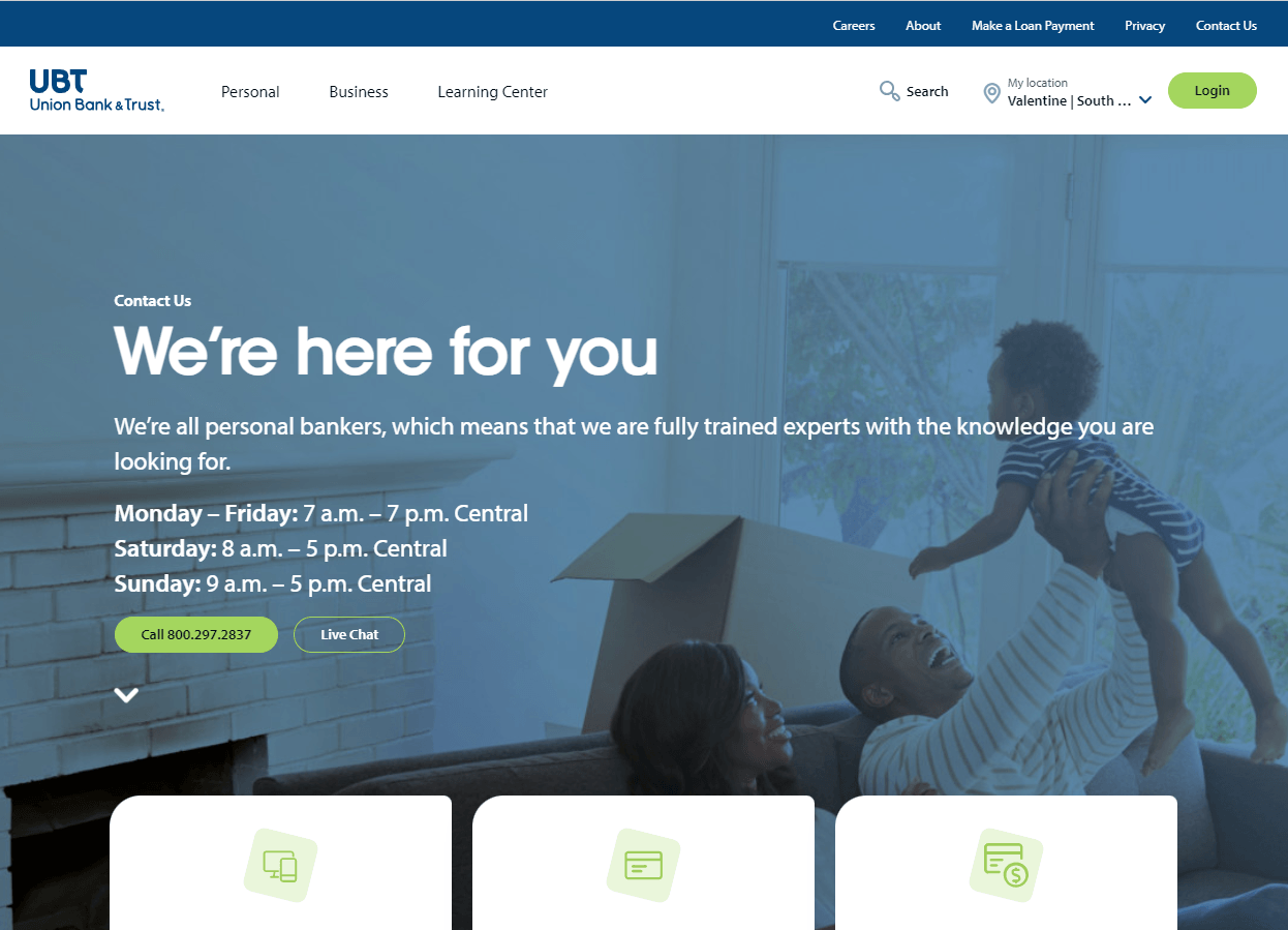
So, why is Union Bank & Trust on this list?
- The form on the contact page allows visitors to message directly from the site
- Contact form protected by CAPTCHA ensures visitors that their information is secure
- Lists support hours to manage visitor expectations of when they can receive support
23. Nationwide
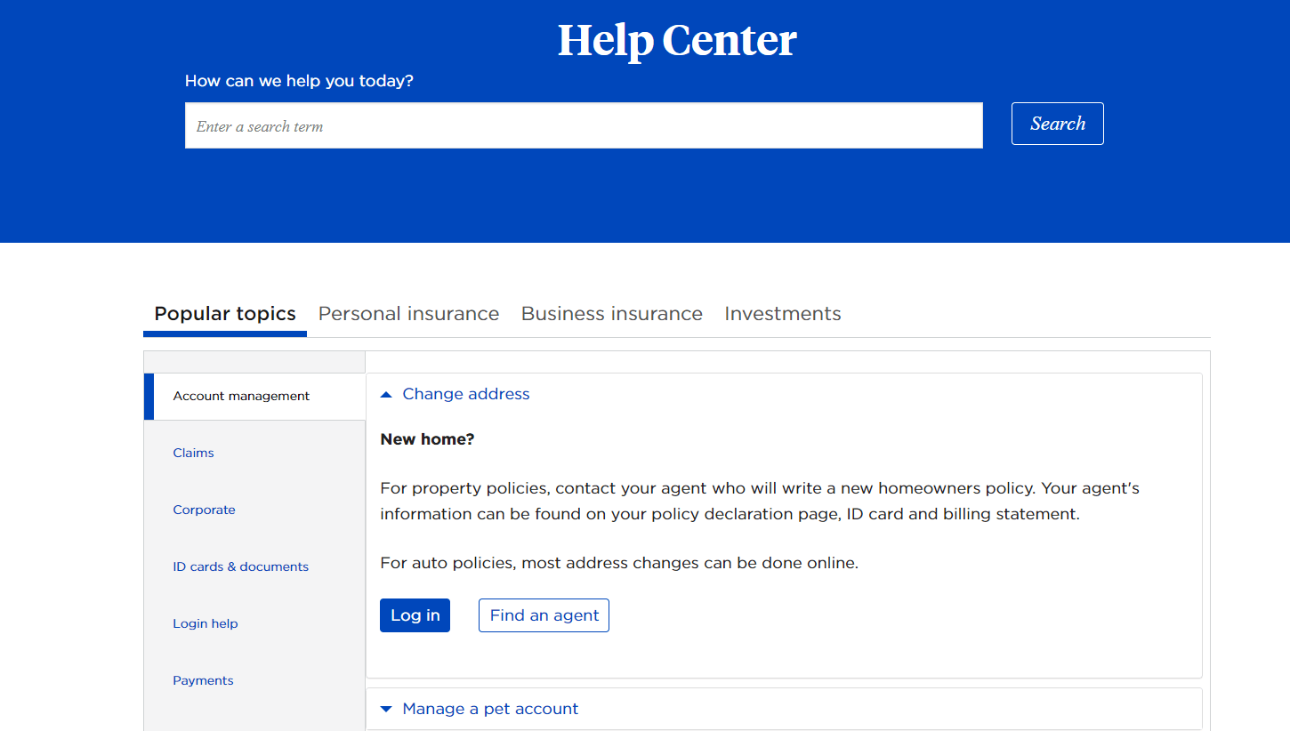
Nationwide made it on this list of contact us page examples because it:
- Offers calls to action that are direct
- Search bar to make it easy to search for what you need
- Multiple contact options, including texting, calling, and email
24. Adobe
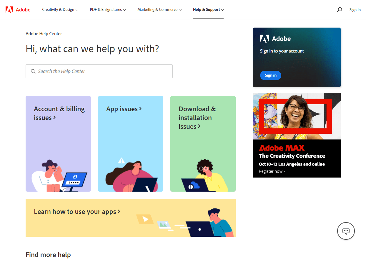
Adobe is on this list of best contact page designs because it offers:
- Live chat for immediate support for visitors
- An Ask the Community feature allows visitors to communicate with experts at their own convenience
- Help center is searchable to easily find relevant information
25. Chipotle
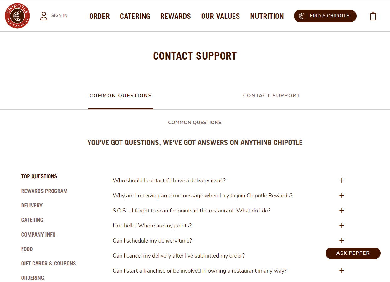
Chipolte is on this list of best contact us pages because it:
- Lists common questions divided by topics
- Offers easy-to-use simple contact form
- Provides immediate support for visitors through live chat
26. Red Bull
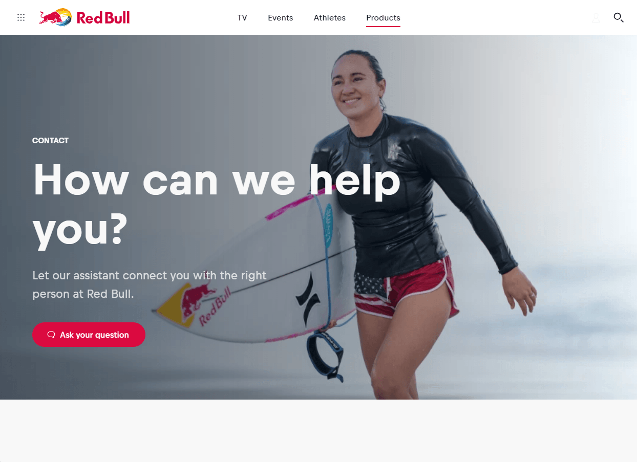
Why is Red Bull on this list of contact page designs?
- Offers clear call to action to “ask your question”
- Provides Red Bull Assistant live chat feature
- Includes links to other sources on their website
27. JetBlue
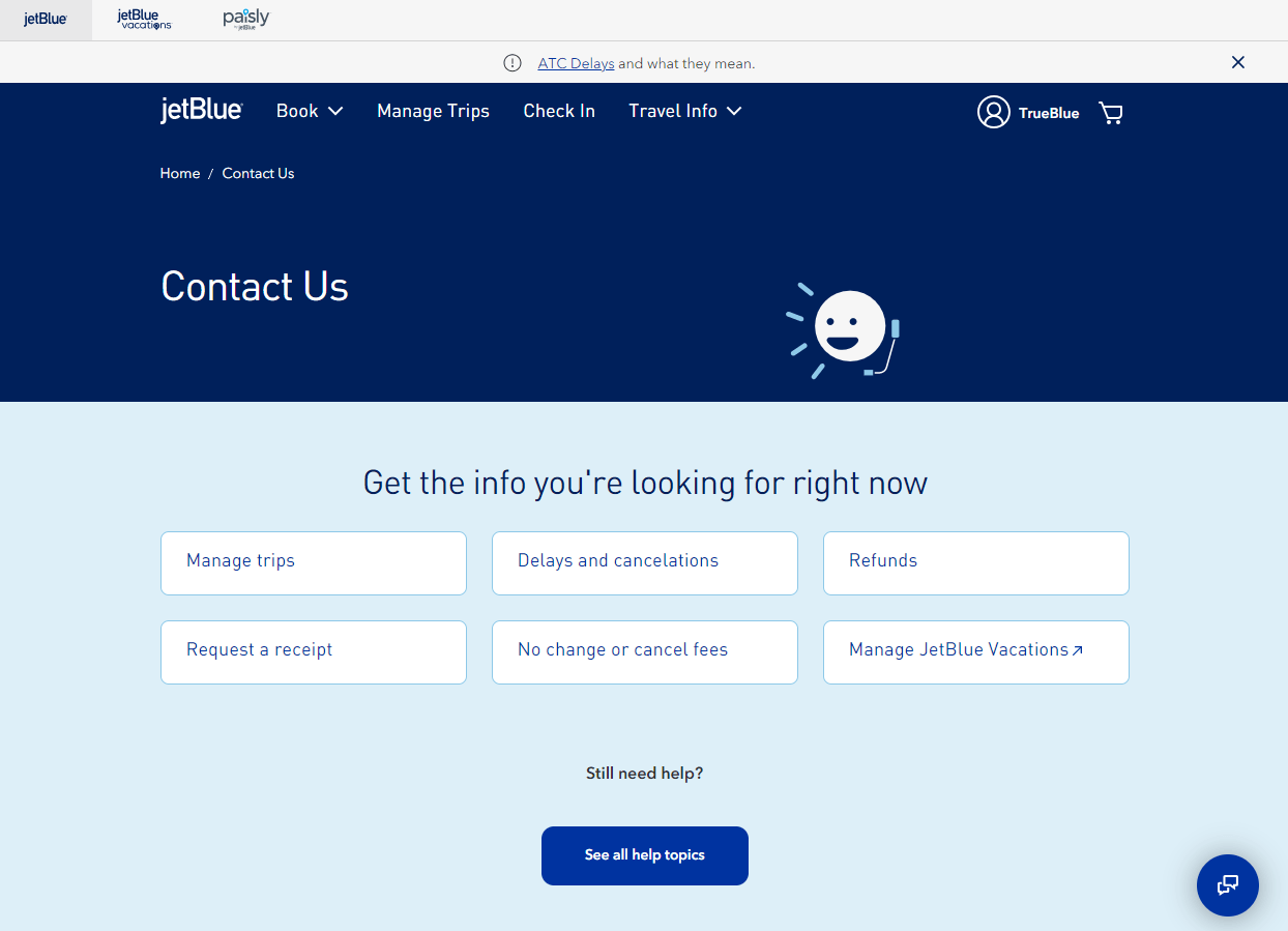
JetBlue has one of the best contact us pages because it:
- Separates FAQ information by topic for easy access to relevant information
- Offers live chat for immediate support for visitors
- Uses visual cues to separate the various types of contact methods
28. Coast
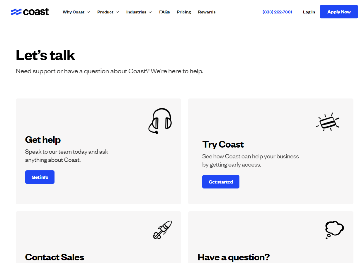
Coast is another one of the best contact page designs because it offers:
- Clickable buttons to email support teams directly from the website
- Simple design with clear call to actions
- FAQ page divided by topic for easy access to relevant information
29. Dollar Shave Club
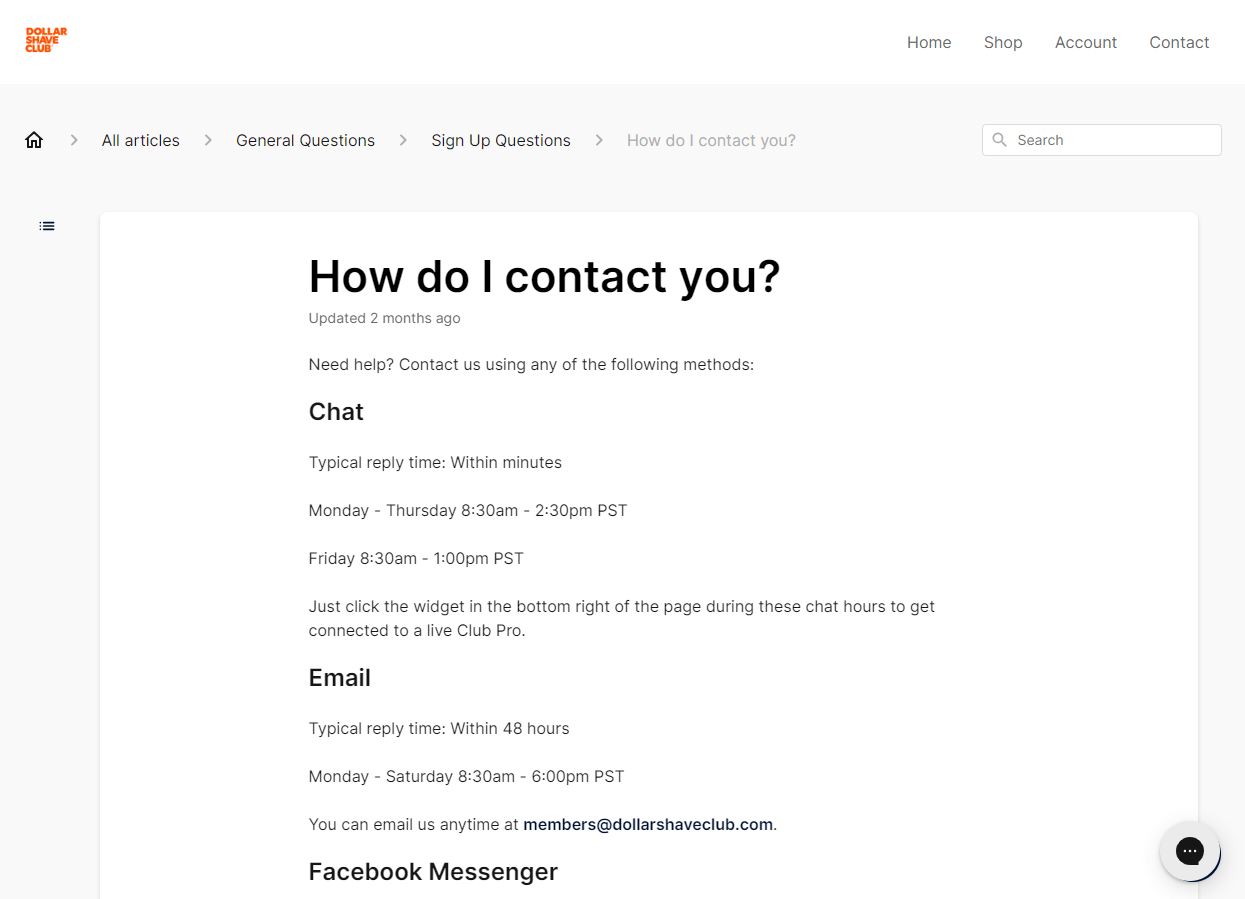
Dollar Shave Club is an excellent example of contact page design because it:
- Uses a simple listing of contact information that’s easy to navigate
- Provides support hours to manage visitor expectations of when they can receive support
- Offers live chat provides immediate support for visitors
30. BCW Supplies
BCW has one of the top contact page designs because it:
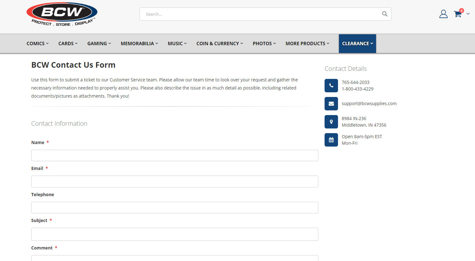
- Offers visual cues for different contact methods
- Enables you to choose the priority of your request to get customer service at the speed you need it
- Enables you to choose which department needs to handle your request
31. Verizon
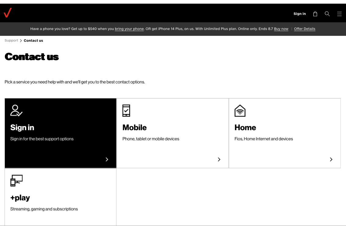
Verizon made it on to this list of the best contact us pages because it offers:
- The ability to click through topics and FAQs to find relevant information
- A Call Us feature that includes estimated wait time to manage visitor expectations of reply times
- Live chat for immediate support for visitors
32. Uber
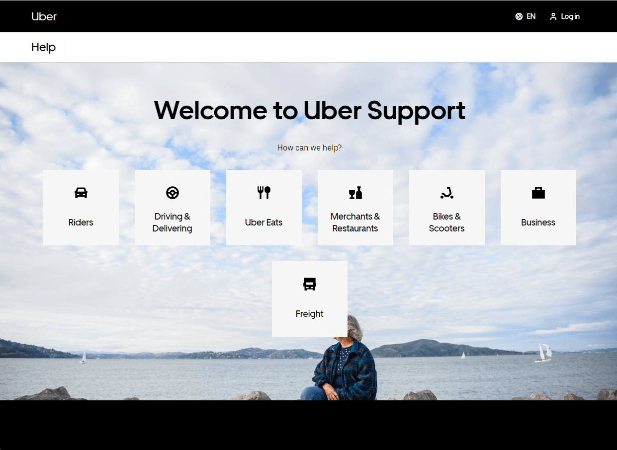
- Click through topics and FAQs to find relevant information
- Separates various Uber business contact pages
- Simple and easy to navigate
33. Chewy
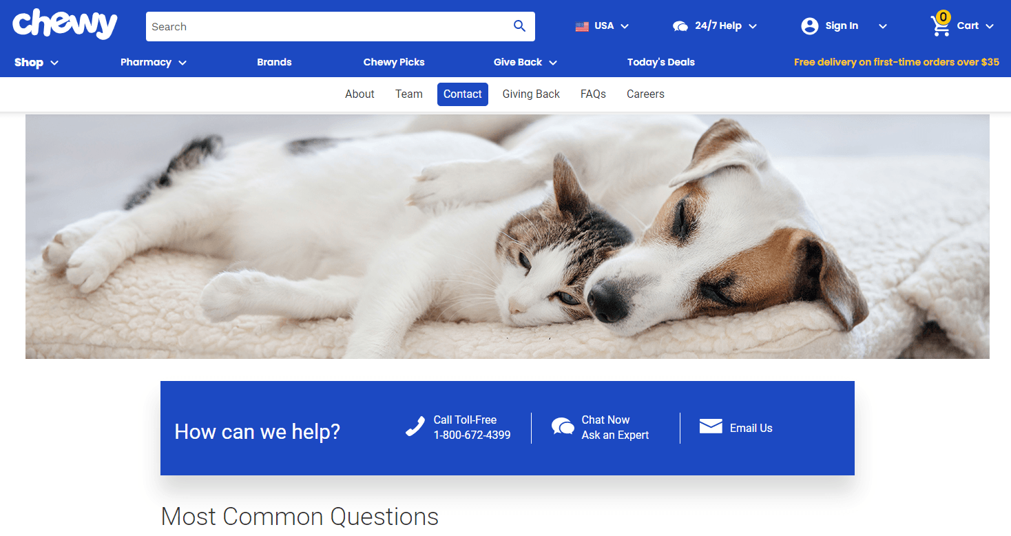
Chewy is one of the best examples of contact us pages because it:
- Offers multiple contacted methods and lists them at the top for easy access
- Provides visual cues for contact methods
- Uses a picture of pets to fit their branding
34. Beardbrand
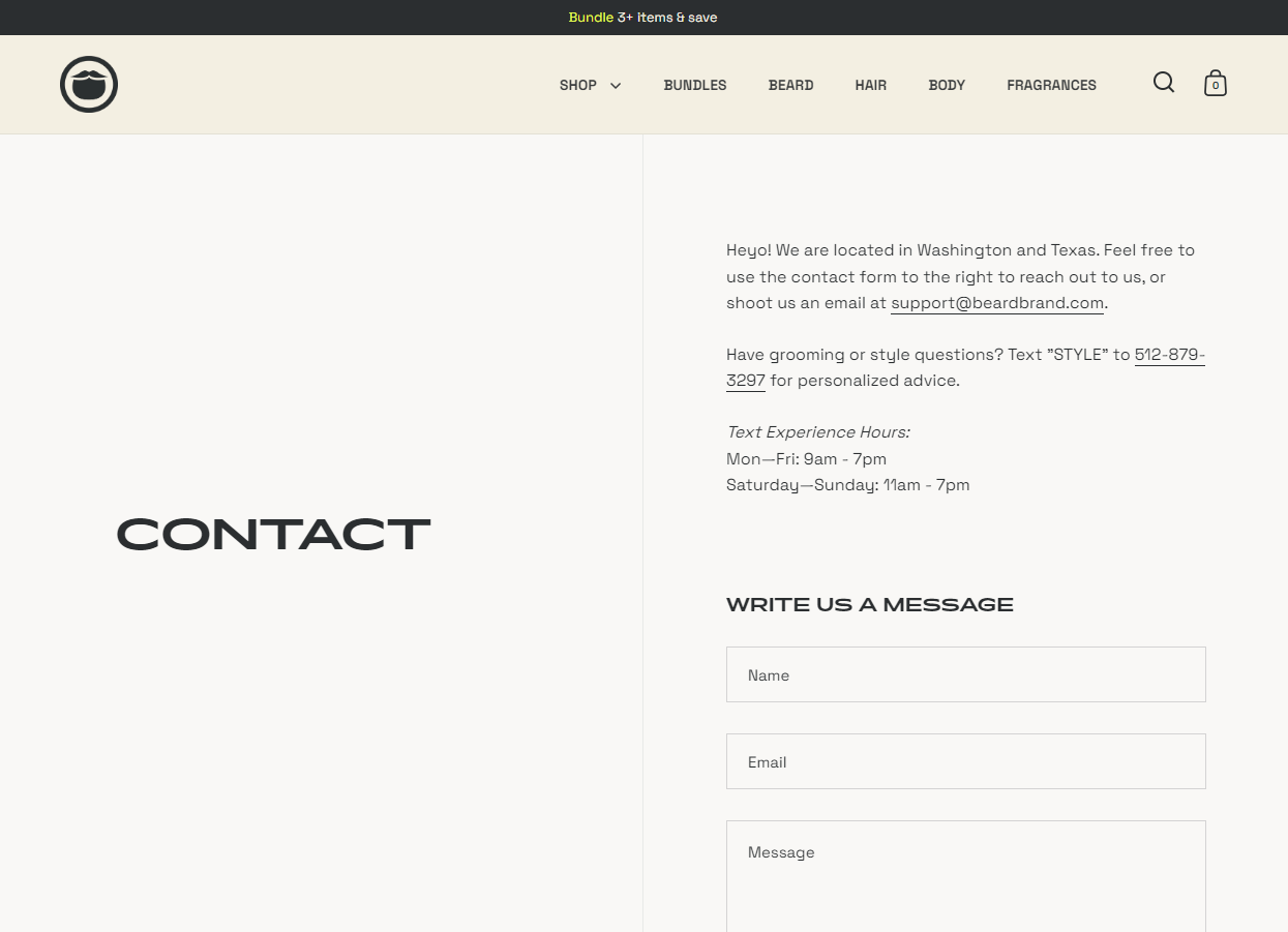
BeardBrand made it on to this list of contact us page designs because:
- The form on the contact page allows visitors to message directly from the site
- It provides multiple methods to contact the company
- It includes support hours to manage visitor expectations of response times
35. Cricut
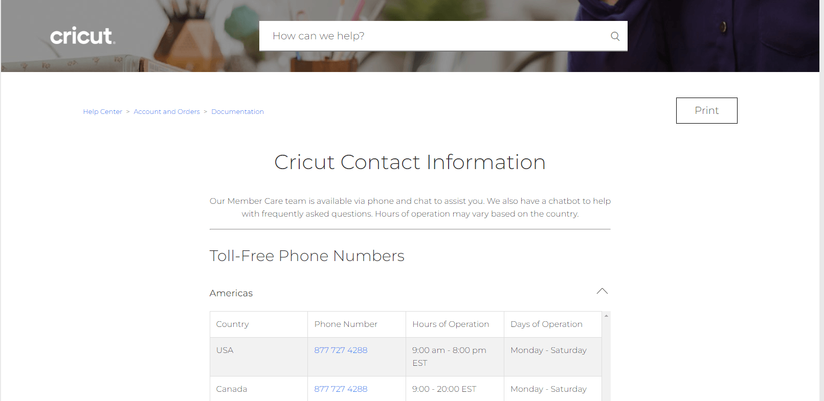
Cricut has one of the best contact page designs because it:
- Offers an organized table to contact the right customer service number based on location
- Provides details about customer service hours and days
- Provides live chat options for quick help
36. Michaels
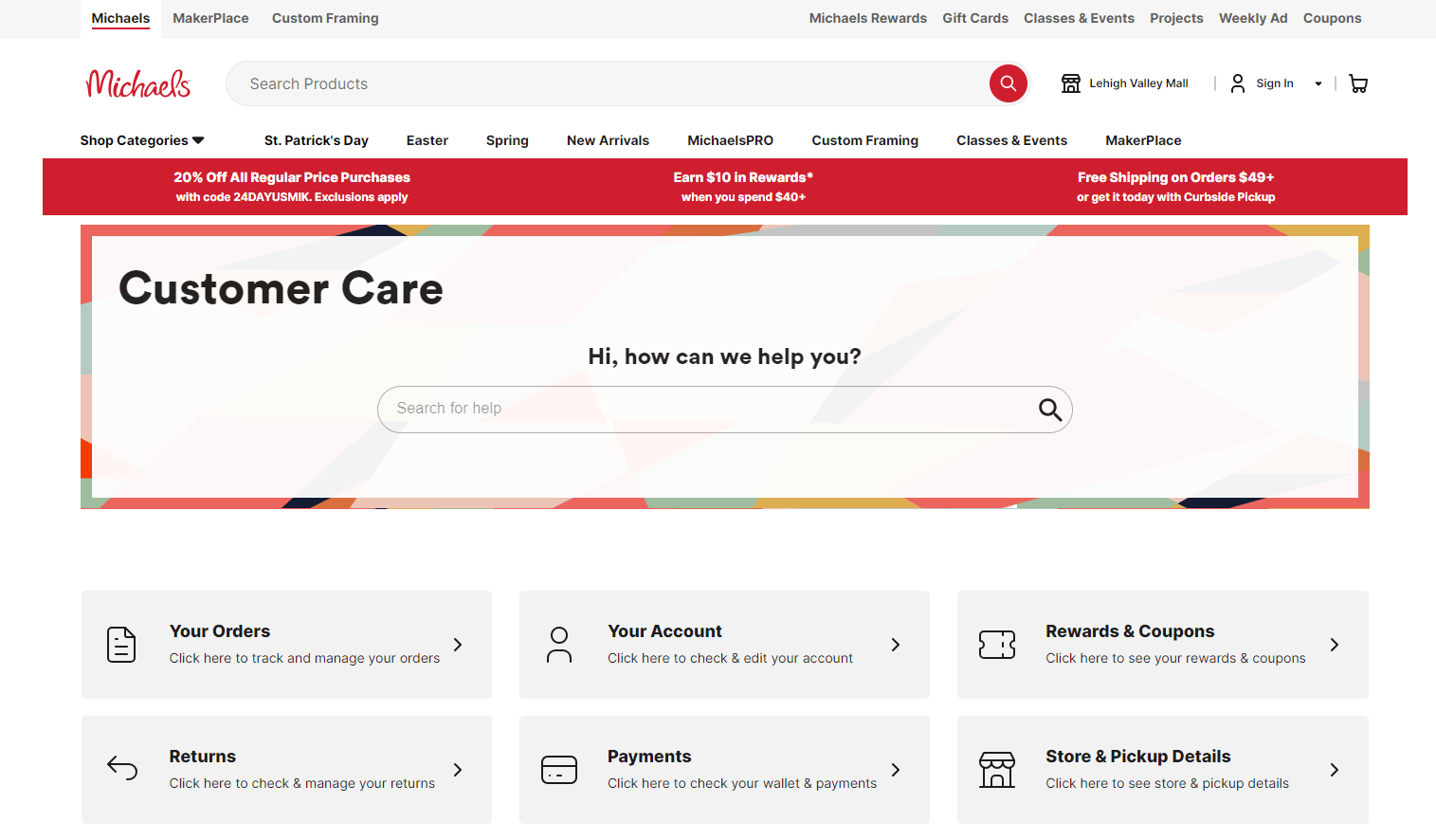
Michaels is another great example of a contact page because it:
- Offers visual cues for different support categories
- Integrates their brand’s unique colorful style
- Offers immediate live chat support with the click of a button
37. Lewa House
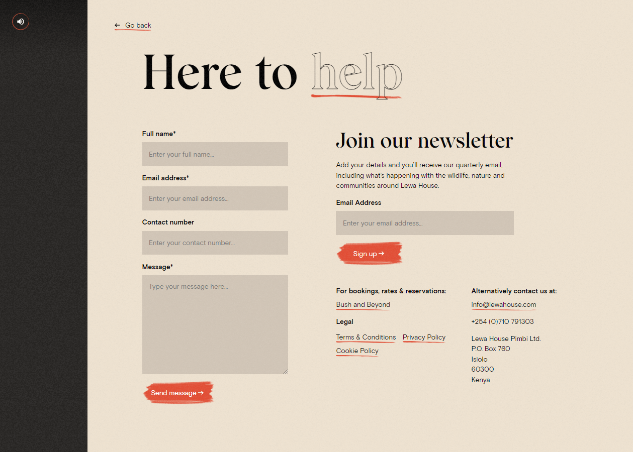
Lewa House has a great contact page because:
- The form on the contact us page allows visitors to message directly from the site
- The prompt to sign up for their newsletter shows clear call to action
- It lists various methods of contacting them
38. Stripe
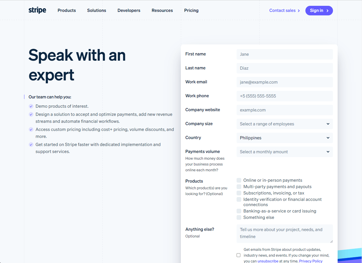
Stripe is on our list of the best contact page designs because:
- The form on the contact page allows visitors to message directly from the site
- Their page lists services that visitors can receive by submitting a form
- The “Speak with an expert” language enhances the credibility of their support team
39. Delta
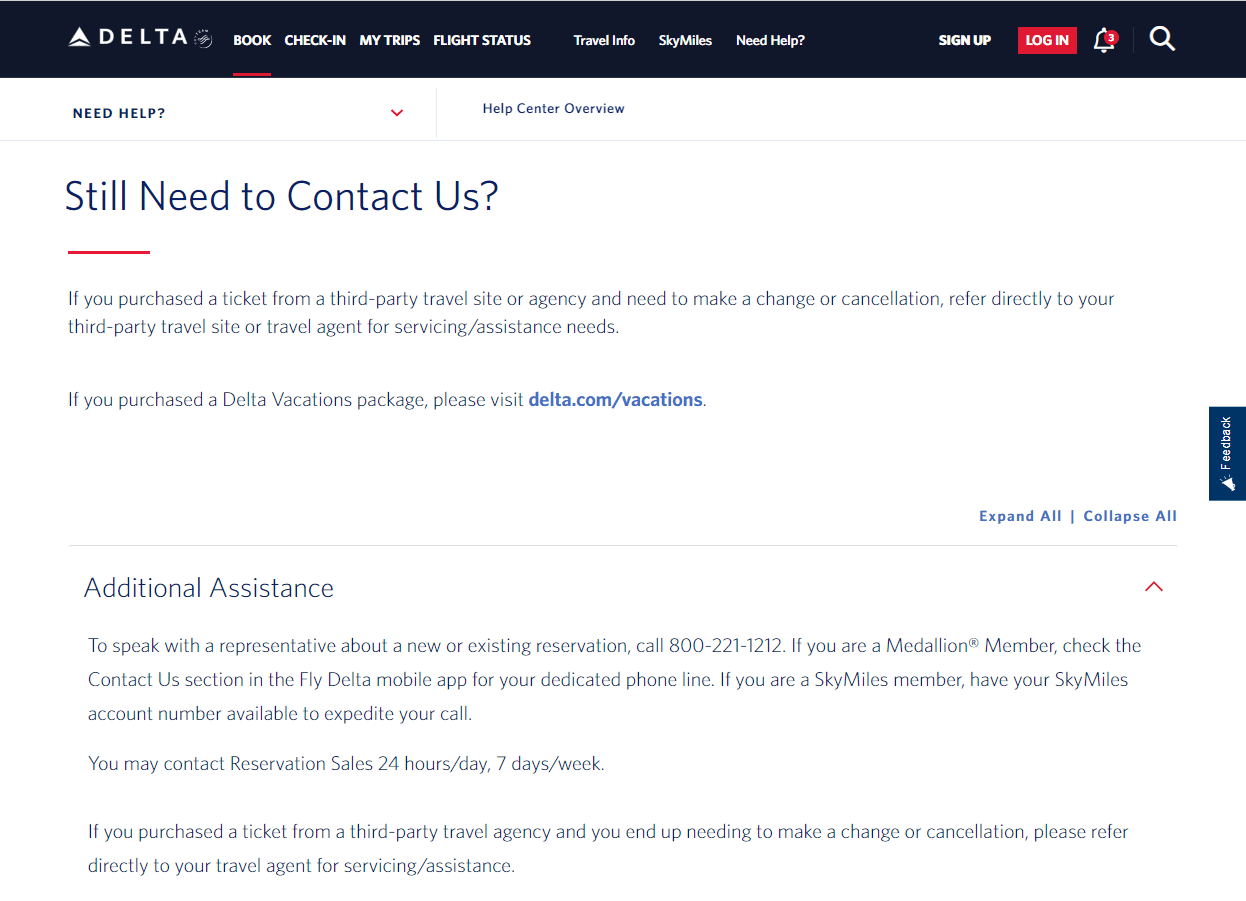
Here’s why Delta has one of the best contact us pages:
- Live chat provides immediate support for visitors
- They provide a list of phone numbers by assistance topic and support hours
- The page includes a contact form that allows visitors to message directly from the site
40. Choice Screening
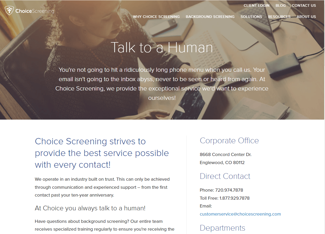
To wrap up this list of the best contact page examples, here’s why Choice Screening makes it on the list:
- “Talk to a human” headline creates a personalized touch for the support team
- The form on the contact page allows visitors to message directly from the site
- Provides multiple methods to contact the company
FAQs about contact us page design
Learn more about contact us page design with these FAQs:
Why is my contact page’s design important?
A quality contact us page design is important for generating leads and traffic for your company. No user wants to dig through multiple pages just to find a phone number to reach out to you. Putting this basic, yet vital, information in one location enhances user experience and makes it easy for people to ask questions and get an answer.
Having a good contact page design helps enhance customer service and experience, which leads to more loyal, happy customers.
How can I improve my contact page’s design?
Feeling like your contact page’s design is falling flat? Here are some ways you can improve the design of your contact page to deliver a better user experience:
- Put the key information at the top
- Include a call-to-action above the fold
- Create some FAQs for common questions
- Link to further resources on your site
- Add customer reviews
- Add art and designs (if it makes sense for your brand)
How do I design a contact page?
When you design a contact page, you want to keep it simple. Don’t overwhelm users with too much information and too many design elements. Keep in mind that the end goal is to have people contact your business.
That means you’ll want to keep the contact aspect at the forefront of your page to ensure people complete that action.
How does my contact page impact my local SEO?
Having a well-designed and functional contact page can positively impact your local SEO. A key component of local SEO is your name, address, and phone number (NAP) information. It provides people with the details they need about your company.
By adding this information to your page, and boosting it with some local schema markup, you can improve your local SEO by delivering accurate contact information to people in your area.
Once I launch my new contact us page, am I done?
Realistically, no.
Once you launch your contact us page, you need to continually test it to ensure you’re putting out the best version of your contact page. To ensure clean results, you’ll want to tweak one element at a time to see how it impacts your contact page.
You can test things like your form lengths, your CTA text, and layouts to continually improve your contact page.
Capture more leads with a well-design contact us page
Paying special attention to contact us page design will pay off. As illustrated by the page examples, a quality contact us page that is easy to navigate and provides relevant information to visitors can help to increase leads and website traffic.
Let WebFX help you create the best contact us page design for your company. Contact us online or call us today at 888-601-5359 to see how we can help you create contact pages that help you earn more leads!
-
 Trevin serves as the VP of Marketing at WebFX. He has worked on over 450 marketing campaigns and has been building websites for over 25 years. His work has been featured by Search Engine Land, USA Today, Fast Company and Inc. Read his review of working with WebFX for the last 15 years.
 -

WebFX is a full-service marketing agency with 1,100+ client reviews and a 4.9-star rating on Clutch! Find out how our expert team and revenue-accelerating tech can drive results for you! Learn more
Make estimating web design costs easy
Website design costs can be tricky to nail down. Get an instant estimate for a custom web design with our free website design cost calculator!
Try Our Free Web Design Cost Calculator


Web Design Calculator
Use our free tool to get a free, instant quote in under 60 seconds.
View Web Design Calculator
Proven Marketing Strategies
Make estimating web design costs easy
Website design costs can be tricky to nail down. Get an instant estimate for a custom web design with our free website design cost calculator!
Try Our Free Web Design Cost Calculator
What to read next


