- Home
- Blog
- Web Design
- 3 Advanced CSS3 Techniques You Should Learn
3 Advanced CSS3 Techniques You Should Learn
-
 11 min. read
-
 William Craig
 CEO & Co-Founder
- President of WebFX. Bill has over 25 years of experience in the Internet marketing industry specializing in SEO, UX, information architecture, marketing automation and more. William’s background in scientific computing and education from Shippensburg and MIT provided the foundation for RevenueCloudFX and other key research and development projects at WebFX.
 If you’re reading this, then I can safely assume that you’ve at least heard of CSS3. The latest version of CSS includes properties that allow you to style your HTML elements with rounded corners, drop shadows, and even color gradients. However, these techniques just scratch the surface of what CSS3 can really do.
In this guide, I am going to be talking about three advanced CSS3 techniques.
View Demo
Here is a single demo page of all the code I’ll be using in this guide. It’s best viewed on WebKit browsers (like Google Chrome and Apple Safari) so you can see the CSS3 -webkit animation properties in action. View Demo
1. Advanced Selectors
One of the most important but under-hyped features of CSS3 is the new advanced selectors. I’m sure I don’t have to tell you why being able to target specific HTML elements without having to use an ID attribute is a good thing! Traditionally, CSS selectors have always been: IDs (#id), classes (.class), HTML elements (such as p), and occasionally pseudo-classes like :hover or :active.
The problem with this formula is that nearly every element needs to have a hook. This means that to get specific with what you’re selecting, the element needs to have either an ID (if it’s just one element) or a class (if it’s a group of elements) so that the browser knows what you’re talking about. When you start working with very complex layouts, the amount of IDs and classes you need to add to your markup begins to slow you (and your web pages) down.
Enter CSS3. With numerous new pseudo-classes to choose from, your markup and page response times will thank you. To demonstrate some of these new selectors, I’ve marked up a simple example: two unordered lists.
<!DOCTYPE html> <html> <body> <ul> <li>First Line</li> <li>Second Line</li> <li>Third Line</li> <li>Fourth Line</li> <li>Fifth Line</li> <li>Sixth Line</li> </ul> <ul> <li>First Line</li> <li>Second Line</li> <li>Third Line</li> <li>Fourth Line</li> <li>Fifth Line</li> <li>Sixth Line</li> </ul> </body> </html>
The following code block is some basic CSS just for visuals.
All I’ve done is reset the margins and padding of every element using the universal selector (*) and applied some basic styles to both unordered lists.
* { margin: 0; padding: 0; } ul { list-style-type: none; margin: 2%; border: 1px solid #ccc; padding: 5px; width: 44%; float: left; } ul li { margin-bottom: 5px; padding: 2px; } Now it’s time to write our first advanced selector! (Don’t be scared!) The first part of our selector just says to select the <ul> that is the first child of another element (the <body> in this case).
Then it goes on to select the odd list items (first, third, fifth, and so on) in the first unordered list. As you can see, using a combination of pseudo-classes and HTML element selectors, we’ve managed to only select the first of the two identical unordered lists.
ul:first-child li:nth-child(odd)
Another way of doing this is shown below, which does the same thing except this time it does so by selecting the first <ul> on the page, regardless of whether or not it’s the first child of another element.
ul:first-of-type li:nth-child(odd)
As you progress further into using CSS selectors, you’ll find that there are many ways of doing the same thing, and it’s up to you to decide which one to use. With the first unordered list selected, we can style the odd list items (we will give them a different background color than the other list items).
ul:first-child li:nth-child(odd) { background-color: #d2fffe; border: 1px solid #000; } That isn’t the only way of using :nth-child, though.
We can also use it to style individual elements based on their position. The code block below gives the 5th list item of the first unordered list on our web page a pink background.
body > ul:first-child li:nth-child(5) { background: #ffd2d2; }  For another example, let’s add a web form to our HTML document.
Please note the fact that one of the input elements (name=email) has the Boolean attribute of disabled so that I can demonstrate the :disabled pseudo-class later on.
<form method="post" action="#"> <p> <label for="name">Name:</label> <input type="text" name="name" value="" /> <p> <label for="email">Email:</label> <input type="text" name="email" value="" disabled /> </p> <p> <label for="message">Message:</label> <textarea name="message"></textarea> </p> </form>
The following code block is just some basic styles for our web form. What this will do is remove some default styling on the form and float the labels to the left and the inputs to the right.
form { clear: both; width: 95%; } form p { margin-bottom: 15px; clear: both; overflow: hidden; } form label { float: left; } form input, form textarea { width: 70%; float: right; border: 1px solid #000; } form textarea { height: 50px; } We’re now going to take advantage of the disabled attribute on the email input to add a darker gray background to it.
input:disabled { background: #e7e7e7; } Next up, we have a complex-looking selector, but it’s actually quite simple. By using the :not pseudo-class, we are selecting everything inside a paragraph that is also inside a form except for <textarea> and <label> elements.
Essentially, what this will do is target all form fields that aren’t textareas.
form p *:not(textarea):not(label) { height: 20px; } In actual practice, it would be more efficient to use input as the selector in our particular case, but I chose to do it this way to demonstrate the :not selector and how we can chain different pseudo-classes together to produce a more specific selector. That’s it for advanced selectors.
We covered a lot, but we still have two more techniques to look at! Let’s get started with those.
2. Animations
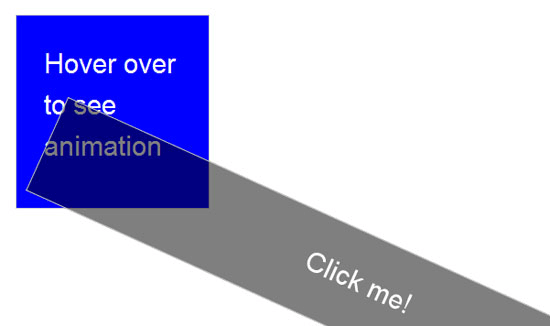
Animation on the web has long been the domain of Flash and JavaScript. Now, with CSS3, it’s possible to do the same sorts of animation with only a few lines of code! To demonstrate animation techniques, let’s add another section to our markup: a simple div with no class or ID, and inside it, an <h1> — nothing too fancy.
<div> <h1>Hover over to see animation</h1> </div>
Since it’s our first div, we can use the :first-of-type pseudo-class to select it. I’ve made it a 200px by 200px blue box just to make it easy to see. I’ve also styled the h1 for visuals.
div:first-of-type { width: 200px; height: 200px; background: blue; color: #fff; clear: both; } h1 { color: #fff; font: 30px/1.5 Helvetica, Arial, sans-serif; width: 150px; margin: 25px auto; }  Now comes the fun part! To create the animation, add the following three lines to the
 div:first-of-type selector. You’ll see nothing yet, but this sets the stage for the animation functionality, which will kick in when the box is hovered on.
-webkit-transition-property: background, border; -webkit-transition-duration: 2s, 1s; -webkit-transition-timing-function: linear, ease-in-out;
I’m using three properties to define two animations for the box (background and border). By adding commas between the properties of each option, I can distinguish which ones will be applied to which animation. The -webkit-transition-property value defines which CSS properties will be animated (background and border).
The -webkit-transition-duration property defines how long the animation transition will be — in this case, 2 seconds for the background and 1 second for the border. The last -webkit-transition-timing-function tells the browser what equation to use for the transition. So we’ve set the stage for the animation, but we haven’t added any animation yet!
Let’s fix that by declaring our :hover properties.
div:first-of-type:hover { background: #ccc; border: 20px solid blue; }Now, when you hover over our blue box, the background and border will change and grow. That’s it.
We don’t have to add any other code, the animation will run automatically! We’re not done yet, let’s add one more example animation to the markup.
<div onclick="this.style.webkitTransform='rotate(360deg)'"> <h1>Click me!</h1> </div><!--end clickable-->
I’ve used a bit of inline Javascript so that when the div is clicked, it rotates itself around 360 degrees (in production, you will want to do this unobtrusively by using JavaScript DOM selection methods — but that’s out of the scope of this guide).
Next for the CSS, we’ll use the :last-child pseudo-class (since we want to target the last div in our HTML).
div:last-child { width: 95%; height: 100px; -webkit-transition: -webkit-transform 3s ease-in; background: rgba(0,0,0,.5); cursor: pointer; } The things to note about the above CSS code block is that the background property uses the rgba property to give the div a semitransparent background. The other thing to note is the use of the -webkit-transition property shorthand to animate the rotation of the div.
 And with that, we’re done with the animation. It’s full steam ahead to the last CSS3 technique we’ll cover: media queries.
3. Media Queries
The third and last advanced CSS3 technique I’ll be discussing is media queries. What are they? Media queries allow web designers to add conditional CSS rules depending on what the user is using to view the web page.
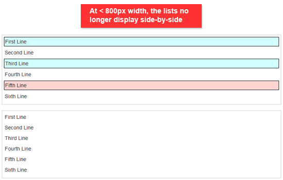
The advantage of this is that we can make new rules on how to display a web page depending on the situation of our user. For example, if their viewport’s width is thinner than 800 pixels, we can adjust the layout accordingly, giving us a truly fluid and flexible layout. So how do we do it?
Easy.
@media screen and (max-width:800px) { ...properties when browser is 800px or less... }If you open up the demo in a web browser that supports media queries, you will see that as you reduce the size of the browser, the boxes change sizes, which is great.
However, wouldn’t it be awesome if when the browser’s width gets reduced, the two lists stop floating? Yes, it would be. And the CSS for that is the following:
@media screen and (max-width:800px) { ul { float: none; max-width: auto; width: auto; } }  While we’re at it, let’s make a few other changes.
In the following code block, we’ll make it so that the first div disappears if the viewport is less than 800px.
div:first-of-type { display: none; } Now when the browser is reduced past 800px, the blue box will disappear! We can even have multiple @media rules in one document.
How about we do something else if the browser is lowered to 600px in width?
@media screen and (max-width:600px) { ul:last-of-type { display: none; } }Now, when you reduce the browser a little more (less than 600px) — like magic — the second unordered list disappears! Here’s some styles for when the width is reduced to 400px.
@media screen and (max-width: 400px) { div:last-child, form { display: none; } ul:first-of-type { height: auto; padding: 50px; } ul:first-of-type li { margin-bottom: 50px; } }I hope you see the potential of media queries, especially with the growing number of ways people view websites (such as through mobile devices).
Wrapping Up
Now you know three advanced CSS3 techniques! Give yourself a pat on the back, you deserve it.
It’s important to note that while the selectors and media queries will work in most modern browsers (Firefox, Safari, Chrome), the animation will only work on Webkit-based browsers like Safari and Chrome.
Further Reading
- Selectors (W3C specs)
- CSS Animation (WebKit’s blog)
- Media Queries (W3C specs)
- CSS Media Queries & Using Available Space
- 10 Interesting CSS3 Experiments and Demos
- Semantic CSS3 Lightboxes
- Examples of CSS3 in the Wild
Related Content
-
 President of WebFX. Bill has over 25 years of experience in the Internet marketing industry specializing in SEO, UX, information architecture, marketing automation and more. William’s background in scientific computing and education from Shippensburg and MIT provided the foundation for RevenueCloudFX and other key research and development projects at WebFX.
 -

WebFX is a full-service marketing agency with 1,100+ client reviews and a 4.9-star rating on Clutch! Find out how our expert team and revenue-accelerating tech can drive results for you! Learn more
Make estimating web design costs easy
Website design costs can be tricky to nail down. Get an instant estimate for a custom web design with our free website design cost calculator!
Try Our Free Web Design Cost Calculator


Web Design Calculator
Use our free tool to get a free, instant quote in under 60 seconds.
View Web Design Calculator
Proven Marketing Strategies
Make estimating web design costs easy
Website design costs can be tricky to nail down. Get an instant estimate for a custom web design with our free website design cost calculator!
Try Our Free Web Design Cost Calculator


