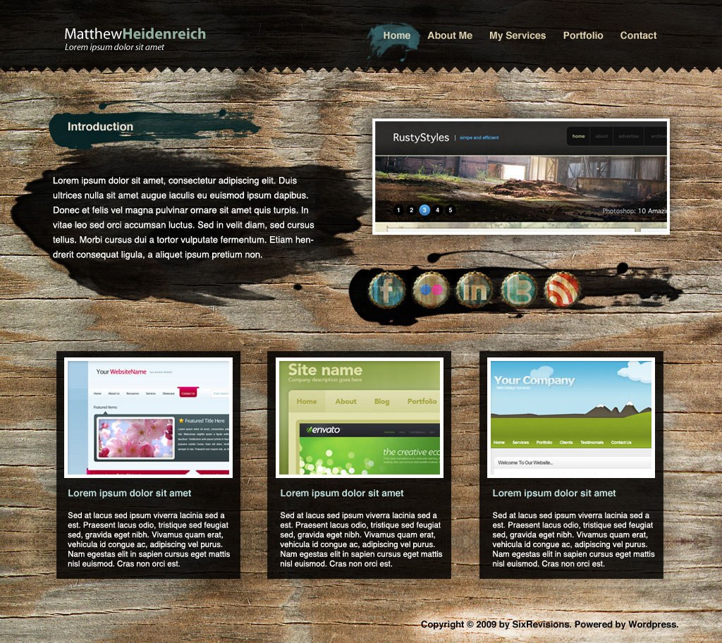
 In this beginner-level web design tutorial, I’ll show you how to construct a portfolio web layout that has a fixed wooden background with Photoshop. We’ll also use some brushes to accent the design.
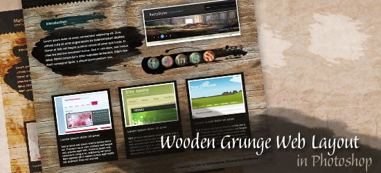
Preview
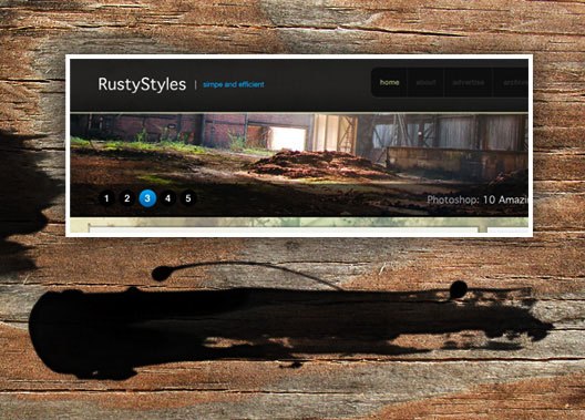
You can see the final result below. Click on the image to see it in full scale.
Resources
- Wood Grain Textures by Texture Lovers
- Myriad Pro by Robert Slimbach and Carol Twombly
- FlightOfGrey Stroke Brush Set by FlightOfGrey
- Old Bottle Crowns Icon Set by Jan Cavan
Set Up the Photoshop Canvas
1 The first thing we want to do is create a new document with the dimensions of 1024px x 912px. 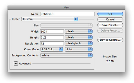
Add the Background
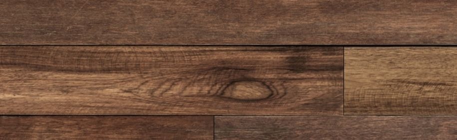
2 For our background, we want to add a wooden texture. I used this wooden grain texture from Texture Lovers for the purpose of this tutorial. Resize the texture using Free Transform (Ctrl/Cmd + T) to fit the texture on our canvas. 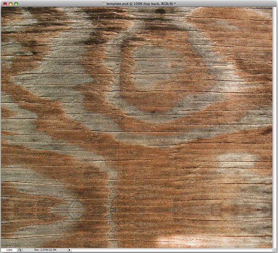
Create the Header
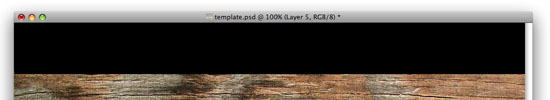
3 Starting with our header on a new layer, we want to use our Rectangle Marquee Tool (M) to make a rectangle selection, filling it with black (#000000).
 4 Using the Polygonal Lasso Tool (L), make a jagged and organic selection at the bottom of the header background to create a ridged edge. Once you have made your selection, go to Edit > Clear.
 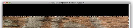 5 Go ahead and lower the Opacity of that layer to 85% to let the wooden background show through a bit.
Create the Site Name/Logo
6 For our site name/logo, we can just go with a simple text logo. I used the font Myriad Pro with the color #FFFFFF for the first half of the site name and the tagline, and a washed out green color for the second half of the site name (#93B19D).
Position the site name at the top left corner of your canvas with the Move Tool (V). 
Add Links to the Header
7 We are then going to add some links to the right side of our header using the Horizontal Type Tool (T). The “Home” link has a color of #D9D5BB, and the rest of the navigation links are a slightly different color (#DDCFAB). Lay them out in a similar fashion to the following: 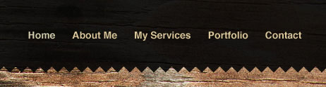
Create the Active Navigation Link
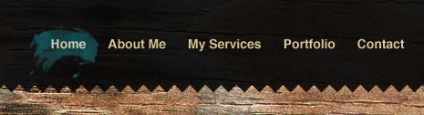
8 Our “Home” link will serve as our mockup for the active link that indicates the current page the website user is on.
We want to add an active effect to it, and for this tutorial, we are going to add a little brush stroke behind it. To do that, we need to download the FlightOfGrey Stroke Brush Set brush set from deviantART and install it. Of course, feel free to use your own brushes or make your own brush. If you use the FlightOfGrey Stroke Brush Set, locate the brush tip that looks similar to the one below (only a few to chose from) and resize it to your liking. I created a layer beneath the navigation links text layer and then used the Brush Tool (B) with a bluish color of #355D63 to create the active link (shown below).
Make the Intro Box Section
9 The intro box is the next step. We want to use our Brush Tool (B) with the second brush in the FlightOfGrey Brush Set with the Master Diameter option set to something manageable for the background of our intro heading (about 300px). Make sure your foreground color is set to black (#000000). You can trim off excess splatter that you don’t want by using the Lasso Tool (L) and going to Edit > Clear. It should look something like this: 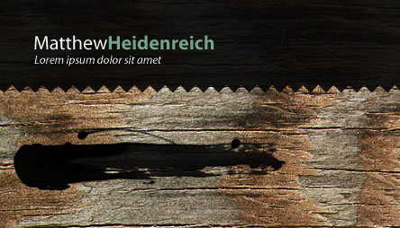 10 Now add a Color Overlay as a layer style on the intro box layer:
 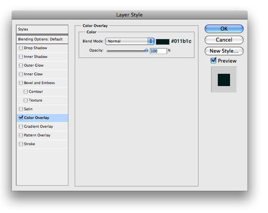 11 Use a font like Helvetica to add your “Introduction” text using the Horizontal Type Tool (T) using an off-white color like #F1E6D8.
You should come out with this: 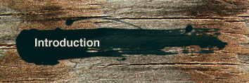 12 Time to use our Brush Tool (B) again. Use the third brush in the FlightOfGrey Brush Set, making sure that your foreground color is set to #000000 and the brush’s Master Diameter option set to about 400px. On its own layer, create a brush stroke in the following manner for the introduction copy text:
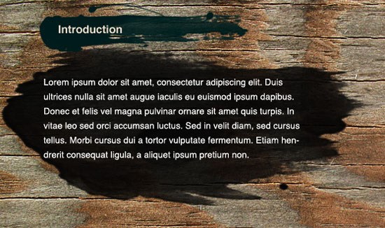
 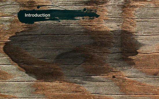 13 It’s a little lighter than we would like it to be, so duplicate your layer a couple times (Ctrl/Cmd + J) to darken it. Put in some mock-up text (I used some Lorem Ipsum for the purpose of this tutorial).
Create the Featured Design Section
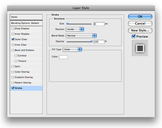
14 To the right side of our intro box will be a nice little spot for a featured design. I created a thumbnail image with a size around 420px x 165px and then added an Outer Glow and Stroke layer style to the thumbnail; you can use the following settings for the layer styles: 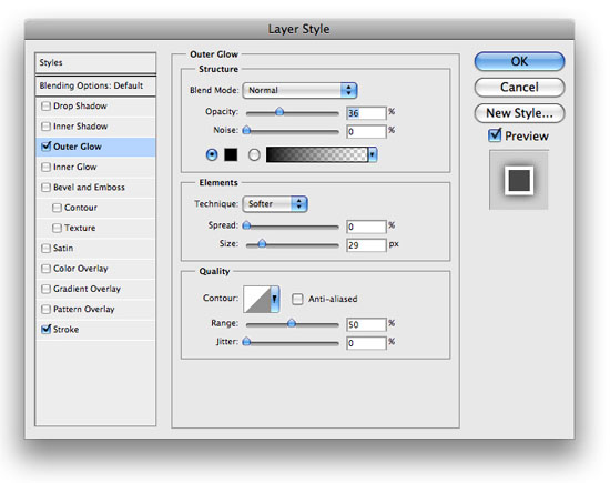
Add Social Media Icons
15 Next, it’s time to add our social media icons. Using the same brush we used for the back of our introduction title. We want to add a black brush stroke similar to the following, using a bit larger brush than previously.
 16 The next step is to add the Old Bottle Crowns Icon Set icons created by Jan Cavan from the Freebies section here on Six Revisions. You’ll end up with something like the following:
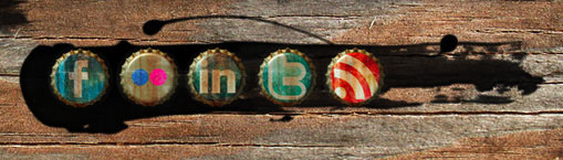
Make the Latest Projects Section
17 Next, make an area for your latest projects below the intro box section. Using your Rectangle Marquee Tool (M), make a rectangle similar to the following, and fill it with #000000.
Lower its layer Opacity value to 85%. 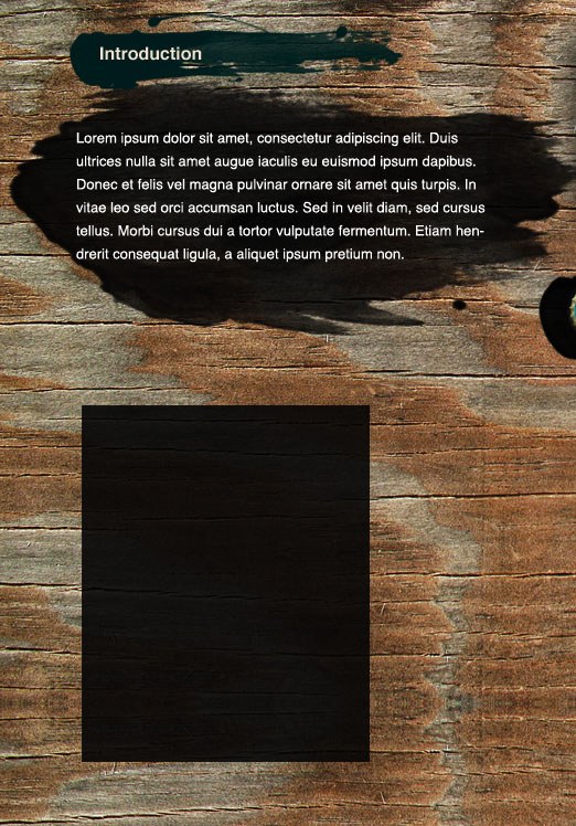 18 Add an Outer Glow layer style to the layer:
 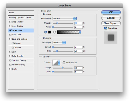 19 Go ahead and arrange the contents of the box in a manner similar to the following image. Use a 220px by 160px thumbnail of your latest project.
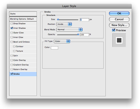
For the heading, the color is #C3E2E0, and the description text is white (#FFFFFF). 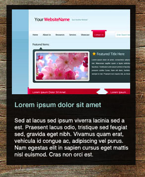 20 The thumbnail is a little dull and boring, so lets add an Inner Glow layer style and a Stroke layer style (use the settings shown below) to our latest project thumbnail’s layer to give it a nice border and a bit of an inner shadow.
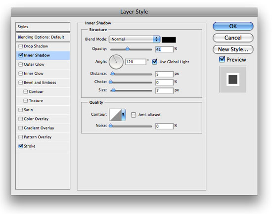
 21 Go ahead and make two more boxes by duplicating the layers of the first latest project box and then moving the duplicated layers to its right using the Move Tool (M).
Here’s how mine ended up: 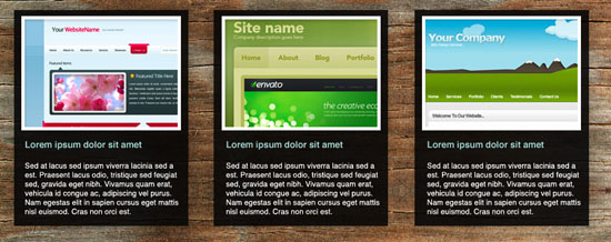
Finish Up with a Simple Footer
22 The last step is to add a copyright notice that serves as our simple text-based footer. To make your text a little more visible on that wooden background, you can use your Dodge Tool (O) to lighten up the area. Here’s the final layout with the simple footer:
Related Content
- How to Code a Grunge Web Design from Scratch
- Create a Winter Theme Web Design in Photoshop
- Coding a Band Website Created in Photoshop
-
 President of WebFX. Bill has over 25 years of experience in the Internet marketing industry specializing in SEO, UX, information architecture, marketing automation and more. William’s background in scientific computing and education from Shippensburg and MIT provided the foundation for RevenueCloudFX and other key research and development projects at WebFX.
 -

WebFX is a full-service marketing agency with 1,100+ client reviews and a 4.9-star rating on Clutch! Find out how our expert team and revenue-accelerating tech can drive results for you! Learn more
Make estimating web design costs easy
Website design costs can be tricky to nail down. Get an instant estimate for a custom web design with our free website design cost calculator!
Try Our Free Web Design Cost Calculator
Share this article


Web Design Calculator
Use our free tool to get a free, instant quote in under 60 seconds.
View Web Design Calculator
Make estimating web design costs easy
Website design costs can be tricky to nail down. Get an instant estimate for a custom web design with our free website design cost calculator!
Try Our Free Web Design Cost Calculator
What to read next