
 Clean, simple web designs have become a popular trend. This article will cover the subject through a two-part discussion. First, we’ll talk about a few traits that clean designs tend to have in common.
Secondly, I’ll share some tricks and techniques that can be helpful when trying to achieve a clean design.
Common Traits of a Clean Web Design
Let’s start by looking at some fundamental characteristics of clean web designs.
Solid Web Page Layout Structure
If you take a few minutes to browse sites that might fall into the “clean” category, I’d be willing to bet they all have one thing in common: a well-thought-out grid that the designer is really putting to work. For anyone not familiar with designing with a grid, just imagine that each comp starts with an invisible structure of columns and rows, and that structure drives the scale and placement of the elements in the composition. This grid creates a sense of order by helping designers establish hierarchy, rhythm and consistency.
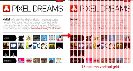 Pixel Dreams is designed in a grid using the popular 960 Grid System. A solid grid layout structure provides order and unity. For instance, Creative Review has several page layouts for certain types of content, however, the browsing experience is continuous because they all share the same underlying framework.
 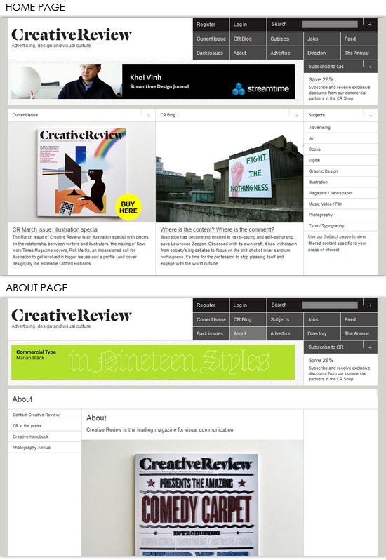 When a site has a lot of content to display, such as an online magazine or a newspaper site, achieving a clean design aesthetic can be more difficult.
But sites like The Guardian, a British newspaper, show that it’s possible with a well-thought-out layout grid. 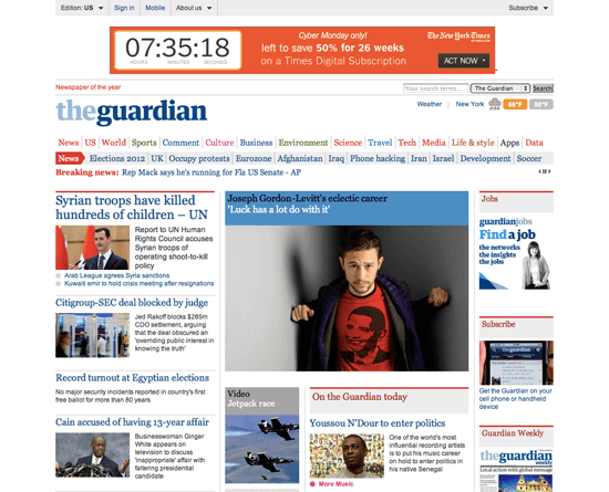 If all their content were plopped onto the page without a solid structure, the front page would definitely be a mess. However, by using their grid as a starting point and relying on rules and white space to establish hierarchy, the robust content feels far from overwhelming.
Every pixel of margin and every rule was tweaked until it was “just right,” and all that effort resulted in a layout that feels effortless. Here are two resources that will help you learn more about designing on a grid:
Good Typography
It seems that good typography often centers around doing more with less, and when it comes to getting that “squeaky clean” feel in your designs, restraint is key. When too many typefaces are used, they compete with one another, making a design appear disjointed and disorderly. If you do a quick survey of well-designed sites, you’ll probably find they rely on one or two typefaces, and then vary size, case, color and weight to establish a clear typographic hierarchy.
This approach creates a sense of consistency and refinement that can be seen on sites such as The New York Times and The Mavenist. 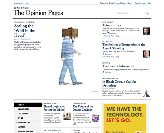 The New York Times
 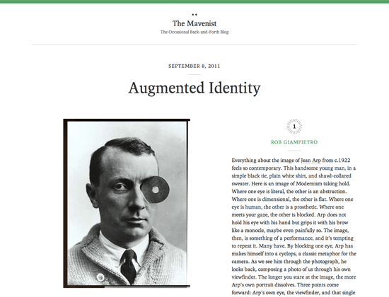 The Mavenist In both examples above, there are no more than two typefaces in the style sheets, yet the designers have established clear hierarchies by using those typefaces to their fullest. Good typography is best displayed in the details.
Leading, the spaces between lines of text, can help make content easy to read and pleasing to the eye. When there’s just enough space, the reader’s eye can easily return from the end of one line to the beginning of the next. In web design, leading can be adjusted through the line-height CSS property.
The optimal ratio of type size to leading often depends on the typeface, color and width of the text block. Additionally, letter-spacing, the space between letters, can allow the letterforms to breathe a bit. Here are some resources related to web typography:
- A Basic Look at Typography in Web Design
- CSS Typography: The Basics
- CSS Typography: Techniques and Best Practices
- CSS Typography: Examples and Tools
Limited Color Palette
In print design, color is often limited by necessity. A budget may allow for only a two-color poster, and so the designer is forced to work within those constraints. That’s never the case with websites, though, since most modern computer monitors can display millions of colors.
However, cleanly-designed sites seem to trend toward limited color palettes. From what I’ve seen, these sites often use core grays and one color. The color is earmarked for the most important elements (like links and headers), a trick that not only enhances usability but also helps to visually unite elements throughout the site.
A1 rolls this direction, using a bluish green and gray color palette. 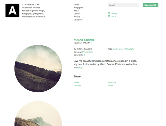 Meanwhile, the fine folks at Fuzzco take it all the way down to a single color: red.
 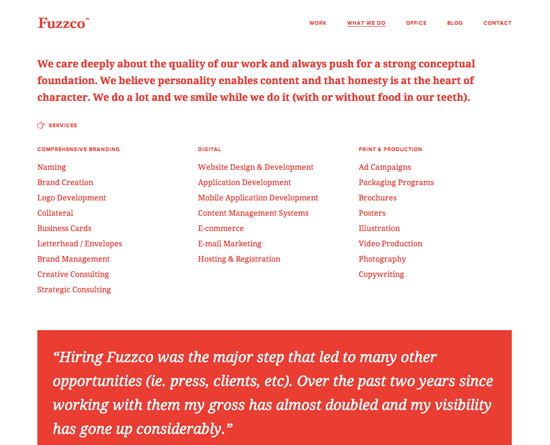 Clean designs that successfully push beyond one- or two-color palettes often do so by using color sparingly and by using neutral colors to break things up.
Solo is a great example of this. 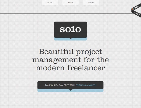 Just like the connection between typeface and message, it’s not all about picking colors that look good. Stronger designs incorporate palettes that set a visual tone which echoes the site’s content.
For example, bright, complementary colors make sense for Notologist because of the nature of the site. 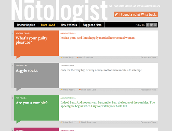
Consistent Imagery
Does it bother you when the style of imagery (photography, illustrations, charts, etc.) shifts from page to page throughout a site? Me too.
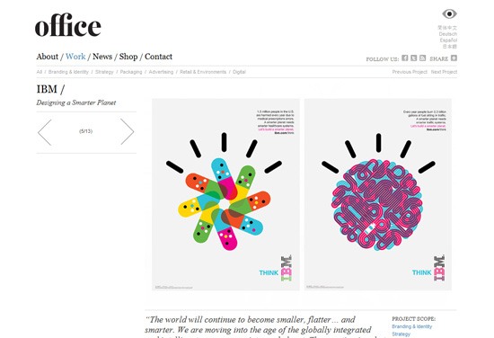
Making sure these visually prominent elements are stylistically in harmony is a pretty powerful trick when it comes to creating a site with a clean appearance. For example, IBM’s Smarter Planet campaign touched on dozens of topics. Throughout the related print and interactive materials, illustrations and charts that share geometrical frameworks, bold strokes and saturated colors help tie the campaign’s materials and topics together.
 And over on Protein, you’ll notice that even though the photography for the profiles comes out of different shoots, there is a carefully produced similarity across the images in terms of composition, depth of field and quality of light. Consistency across these often-prominent elements helps viewers look past individual pieces and see the sites as a whole.
 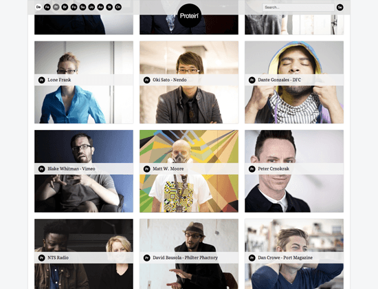 Obviously, there are instances where it just isn’t practical to produce all the imagery in the same style.
News sites and blogs can’t throw out a great image that enhances a story just because it doesn’t fit with others. And sometimes clients don’t have budgets to produce new charts and illustrations, so the designer is forced to make existing assets work. I’ve noticed that in these cases the use of graphic elements around the imagery, such as borders, can help inconsistent imagery feel a bit more uniform.
Tips for Achieving Clean Designs
What follows are a few tips for producing clean web designs.
Start Complex, Then Simplify
 Putting things on the page is part of the design process.
In my experience, one of the traps designers can easily fall into when they set out to create something “simple” is becoming afraid to add anything to the page. The resulting designs are usually pretty bland because the process didn’t allow for exploration (and those “happy design accidents” we all love). To avoid this problem, I find that it’s helpful to “start complex, then simplify.” In the early phases of the design, don’t limit what you put on the page.
Explore different layers of content and try out different design elements. Then, once that design feels like it could be close to complete, start to simplify. Ask yourself, “what doesn’t really need to be here?” If dropping a design element (like a rule or texture) seems to make the page fall apart, keep it around.
But, if that’s not the case, ditch it. We’ve all heard the adage that 20% ends up doing 80% of the work. We’re just applying that theory to design by identifying the elements that are doing the heavy lifting in our layouts. (Read more about this subject: Reductionism in Web Design.) It may even be worth bringing in someone who’s more detached from the design for an outside opinion on what should stay and what should go.
If you can’t give a more solid defense for why something should be on the page other than “it’s cool” or “they do it on this other site,” then remove it. Ultimately, you’ll be left with the ingredients that will give you the strongest design. Once you get there, a little bit of fine-tuning should leave you with a strong, uncluttered design.
Tweak, and Tweak Some More
 I’ve been told that I tend to “beat my page designs into submission.” Honestly, I take that as a compliment.
To me, a design is never really “finished” and can always be pushed further. Seriously, just ask any designer or student who has had the unfortunate luck of working with me. I’m guessing it’s not all that fun when I ask them to try another shade of green for the twelfth time.
As we explored earlier, that “clean” feel is the product of all the aspects of the design — composition, hierarchy, palette and typography — working harmoniously. If you’re like me, making that happen means a lot of time spent tweaking: adding a point of line-spacing here, removing 2px of margin there, trying #ddd instead of #eee for the dotted rules, etc. These may seem like inconsequential adjustments, but when it comes to getting all the elements in a composition to work together, a single pixel can make a big difference.
So, tweak, and then tweak some more. One tweak will lead to another, and sometimes what you uncover will lead you to fork your designs or backtrack. Making something look clean and cohesive is a process that takes time and persistence (and, generally, a lot of coffee).
But, if you stick with it, all the details will eventually fall into place and the design will become cohesive.
Don’t Miss the Big Picture
 In my previous life as a “mostly print designer,” printing and pinning up your layouts was a daily ritual. The firm’s walls were saturated with everything from annual reports to logo explorations. But something funny happened when I started to focus on web design — I stopped printing.
It was almost like I decided that because the project would never see a press, it never needed to see paper. After a long spell of blank walls (and subsequent blocks of frustration with how my projects were coming together), it hit me. The beauty of printing and pinning was seeing the big picture.
I was missing my chance to evaluate the system as a whole, shore up throughlines, and find opportunities to simplify. Flipping through layers in Illustrator or Photoshop just doesn’t offer the same perspective as seeing all the comps side by side. So, my suggestion is to print, pin and repeat.
It’ll help you identify inconsistencies and find opportunities to synchronize your layouts, all of which will result in a cleaner design. (Sorry trees.)
Conclusion
Whether you’re well-versed in the creation of “clean” design or looking to move in that direction, respect for imagination followed by attention to detail will go a long way. As I said early on, an organic but intentional process — not standards and rulebooks — will come in most handy.
Of course, each designer has moments of magic throughout his or her individual process. So, if you have any tips and tricks you tend to use to strengthen your layouts, or examples of “clean” design you love, please feel free to add them below so we can keep the discussion going.
Related Content
- Minimalist Web Design: How Minimal is Too Minimal?
- Gestalt Principles Applied in Design
- Reductionism in Web Design
-
 President of WebFX. Bill has over 25 years of experience in the Internet marketing industry specializing in SEO, UX, information architecture, marketing automation and more. William’s background in scientific computing and education from Shippensburg and MIT provided the foundation for RevenueCloudFX and other key research and development projects at WebFX.
 -

WebFX is a full-service marketing agency with 1,100+ client reviews and a 4.9-star rating on Clutch! Find out how our expert team and revenue-accelerating tech can drive results for you! Learn more
Make estimating web design costs easy
Website design costs can be tricky to nail down. Get an instant estimate for a custom web design with our free website design cost calculator!
Try Our Free Web Design Cost Calculator
Share this article


Web Design Calculator
Use our free tool to get a free, instant quote in under 60 seconds.
View Web Design Calculator
Make estimating web design costs easy
Website design costs can be tricky to nail down. Get an instant estimate for a custom web design with our free website design cost calculator!
Try Our Free Web Design Cost Calculator