Minimalism, interestingly enough, is usually born out of excess. In all arts, in all ways of life, we start out by taking and adding whatever we can. When we start to realize that more is not necessarily better, and that we can get by with less stuff, we try to simplify by removing unnecessary elements so we can focus on what’s truly important.
What is Minimalism?
Minimalism, in its purest form, is the reduction of something to its bare essentials.
Think of a car. It only needs a few critical components — engine, wheels, gas, and so on — for it to run. As long as it has these parts, you can take out many non-essential elements such as its audio system, heated leather seats and cup holders, and the car will still get you to where you’re going.
In web design, minimalism translates to producing a site from the basics. Instead of including everything but the kitchen sink and then paring it down to only the necessary features, a better approach would be to start with a blank slate and only include the essentials. Minimalism is an exercise in restraint, with the eventual goal being a design that helps the user focus and accomplish their tasks as quickly as possible.
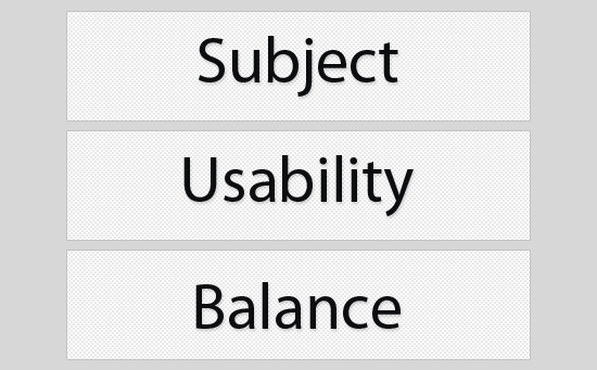
When designing minimalist websites, you should keep three things in mind:
- Subject: What’s the most important thing on the web page? Is it effectively keeping the user engaged and focused?
- Usability: What things burden the user experience? What missing elements can enhance user-friendliness?
- Balance: Does the web page have the appropriate visual hierarchy and do components have appropriate visual weights?
 These three elements are actually the most important elements in all styles of web design, but whereas other visual styles may beg for additional aesthetic layers, minimalism does not.
Why Use Minimalism?
This minimalist thinking is the basis of modern web design — we begin with content, perhaps a brand, but nothing else. By adding in only what’s necessary, we create a website that caters specifically and solely to its mission. There are many benefits to designing a minimalist website.
First is the obvious: Minimalist web designs usually end up with fewer code and site assets. A minimalist site will often have fewer CSS rules, HTML elements, images, JavaScript, and so on. This ultimately means increased front-end web performance and, in turn, enhanced usability and a better user experience.
This doesn’t mean the design stage is any easier — minimalism takes just as much thought, planning and production as any other type of website. And perhaps even more, if my theory about our innate desire for “more stuff” is correct. 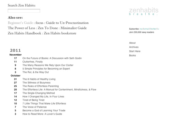 Zen Habits’s archive page shows how easy it can be to build a minimalist website once the concept is there. It’s also harder to mess up minimalism, in my opinion.
By proactively leaving out superfluous elements, your design becomes more open and free. When there’s less to see, there will be fewer distractions. As long as you give ample consideration to balance, typography and white space, your design will look pretty good.
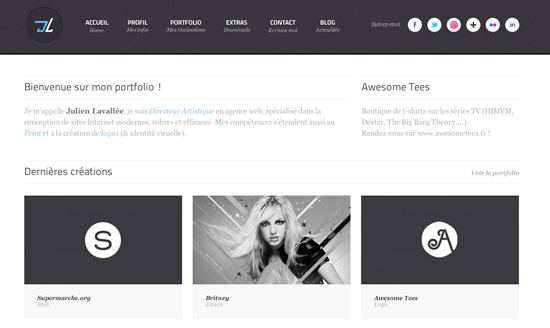
This is much easier than wrangling with a PSD template with dozens of layers. And for those who have little artistic skill or proficiency in Photoshop, minimalism is a perfect way to create a site using only a strong understanding of typography, white space, and balance. While not the most minimalist of examples in this article, Julien Lavallée’s site (featured below) demonstrates how interesting and visually appealing simple websites can be.
 However, the most important reason to design minimally is that, without extraneous design elements, the site’s content is emphasized. By adding more white space, the various sections of a website are given breathing room. On Daniel Gray’s site, notice how enough white space is given around each content section so that readers can quickly focus on the content without being distracted by much else.
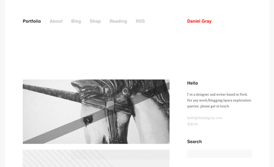 The one problem with the site is that the reader’s eye focuses on the content in an odd order. My eyes go from the navigation bar, to the image of the unicorn, then to “Daniel Gray”, and then finally to the “Hello, I’m a designer and writer based in York.” tagline. But because there aren’t a whole lot of visual elements to distract the reader, this order doesn’t matter so much.
In a visually busier site, some of this content would get lost, but here, although I see things in a different order than what’s probably optimal, I still consider each content element in turn.
Don’t Sacrifice Usability for Minimalism
As we’ve all heard by now, “content is king”, and although there are some that might disagree with that, there are very few who would say content is not important at all. Every line of code you write is to serve the page’s content in some way. Just as important as content is how accessible that content is — without adequate consideration of usability, content can be difficult to find and read.
Now that we have new web standards and technologies like CSS3 and HTML5 at our disposal, we must deeply consider what is necessary so that we avoid the overuse of these things. (I wrote something about this before.) My suspicion is that as web technology grows tantalizingly better and more complex, minimalists are going to have a harder time paring down their designs to the essentials, especially as certain superfluous design patterns have become almost expected, like using CSS transitions to make links hover a little softer. But always in the back of your mind should be considerations of usability.
Chances are — unless you’re a big, established and well-recognized company like Apple, Starbucks or Nike — you should probably include the name of your company with your logo. And don’t think you can reduce your navigation menu to a set of enigmatic icons; even if it doesn’t confuse most readers, it will confuse some.
Don’t Worry, You Can Still Be Pretty
Designing minimally doesn’t always have to mean a reduction to the barest essentials. To the contrary, many minimalist sites include subtle design elements that manifest themselves beautifully and more remarkably because of fewer competing, distractive elements.
Chance Graham’s site, for example, has great use of color, iconography and subtle visual effects (like the box shadow on the navigation items at the top-left of the web page layout) that add enough nuances to intrigue the user without them being a disturbance. 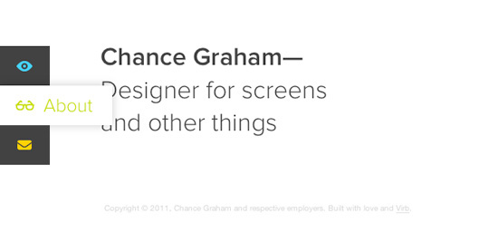
Are You Designing Minimally for a Good Reason?
Minimalism on the Web could be thought of not as an aesthetic, but as the lack of one. If you “go minimal” just for its looks without understanding the purpose of minimalism, you will be lost, and your designs will turn out less than stellar.
Just as any other art genre or design style, minimalism must be well understood in order to be well executed — don’t let simple-looking web designs fool you; there is more going on with them than what can be seen on the surface. In addition, minimalism shouldn’t be arbitrarily confusing or enigmatic. Many people see minimalist websites as a way to make their brand seem more mysterious, but this isn’t the goal, and there are much more effective ways to build a mythos around your brand than designing it inappropriately.
When any design is confusing, or enigmatic in its structure, or uncomfortable in its balance, it throws the viewer off. The last thing you want is a confused user, unable to find what they’re looking for. In general, you should avoid ambiguity and confusion when designing in any style.
Minimalism is no exception. In fact, minimalism is the design style where ambiguity must be avoided like the plague, and usability embraced, analyzed and perfected to the point where no user could possibly be confused in any instance when visiting your site. Most importantly, make sure you clearly understand the goal of minimalist design before you plunge right in.
Without proper direction, your creations could end up something like the piece below, which is great for many things except for conveying information in a clear and effective way. 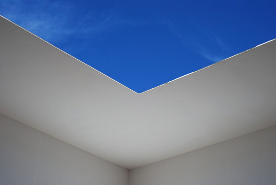 James Turrell’s Space That Sees demonstrates the difference between minimalist art and minimalist design. The goal that you should strive for, when employing minimalism in your designs, is to enhance readability, improve navigation and usability, and, as always, create the most pleasant user experience possible.
Is Your Design Too Minimal?
Your design might be too minimal if:
- You’re using minimalism for the wrong reason
- If you’re sacrificing usability in any way
These problems are easy to fix as long as you understand the goal of visual design in general: To clearly and effectively convey information. Constantly consider how your design decisions affect your users. At the core of every design is minimalist thinking: the idea that few things are actually necessary and critical.
Related Content
- Reductionism in Web Design
- Gestalt Principles Applied in Design
- Symmetry in Design: Concepts, Tips and Examples
-
 President of WebFX. Bill has over 25 years of experience in the Internet marketing industry specializing in SEO, UX, information architecture, marketing automation and more. William’s background in scientific computing and education from Shippensburg and MIT provided the foundation for RevenueCloudFX and other key research and development projects at WebFX.
 -

WebFX is a full-service marketing agency with 1,100+ client reviews and a 4.9-star rating on Clutch! Find out how our expert team and revenue-accelerating tech can drive results for you! Learn more
Make estimating web design costs easy
Website design costs can be tricky to nail down. Get an instant estimate for a custom web design with our free website design cost calculator!
Try Our Free Web Design Cost Calculator
Share this article


Web Design Calculator
Use our free tool to get a free, instant quote in under 60 seconds.
View Web Design Calculator
Make estimating web design costs easy
Website design costs can be tricky to nail down. Get an instant estimate for a custom web design with our free website design cost calculator!
Try Our Free Web Design Cost Calculator