- Home
- Blog
- Web Design
- 20 Website Homepage Design Examples and Best Practices for Pixel Perfection
20 Website Homepage Design Examples and Best Practices for Pixel Perfection
-
 Published: Aug 14, 2024
-
 12 min. read
-
 Celeste Yates
 Content Writer
- Celeste has worked in the online marketing space for twenty years. She has written for sectors including tourism, sustainability, education, lifestyle, food, and marketing. You can find her work featured by Green Building Media South Africa, Stodels Gardening, and The Post House Hotel. In magazines, you may have seen her in The Cape Times, Oprah South Africa, and The Property Magazine. While you can find her writing up on the latest SEO trends and exploring digital techniques during the day, her love of story-telling carries on in enriched games and books after hours.
Knowing what to do and seeing how it works is a great way for you to explore what is best for your homepage. Often, successful websites will use a combination of best practices, which is why they are successful. For example, the first website on this list (Apple) uses clear branding and a beautiful balance of white space.
Looking at other websites will enable you to see what looks and feels best and what design elements and practices you want to implement in your own design.
On this page, we’ll share 20 website homepage design examples to inspire your website’s design!
Once you have an idea of what you want, you can reach out to us to build it. We can create custom websites that are fully optimized for you and capture your brand. Phone us at 888-601-5359 to speak to a specialist about your vision.
Bonus Read! Looking for a best practice checklist for your website? Check out our 9 web design best practices checklist
20 web design best practices and examples
We have scoured the web, pulling together home pages that showcase the best practices, along with website homepage design examples that will help you understand the significance that a well-designed and user-centric home page can offer to your clients.
1. Have clear branding like Apple
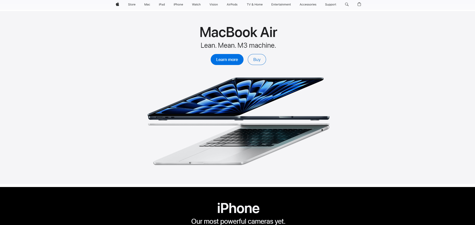
Apple’s logo is iconic, so they don’t even use their name. A single black apple, with a bite missing, white background, and you know what it is. Their entire brand, from product to their website, is clean, minimalistic, and aligns 100% with their brand identity.
Their home page is a website example that is consistent with that identity, from font to design elements.
2. Have simple navigation like Google
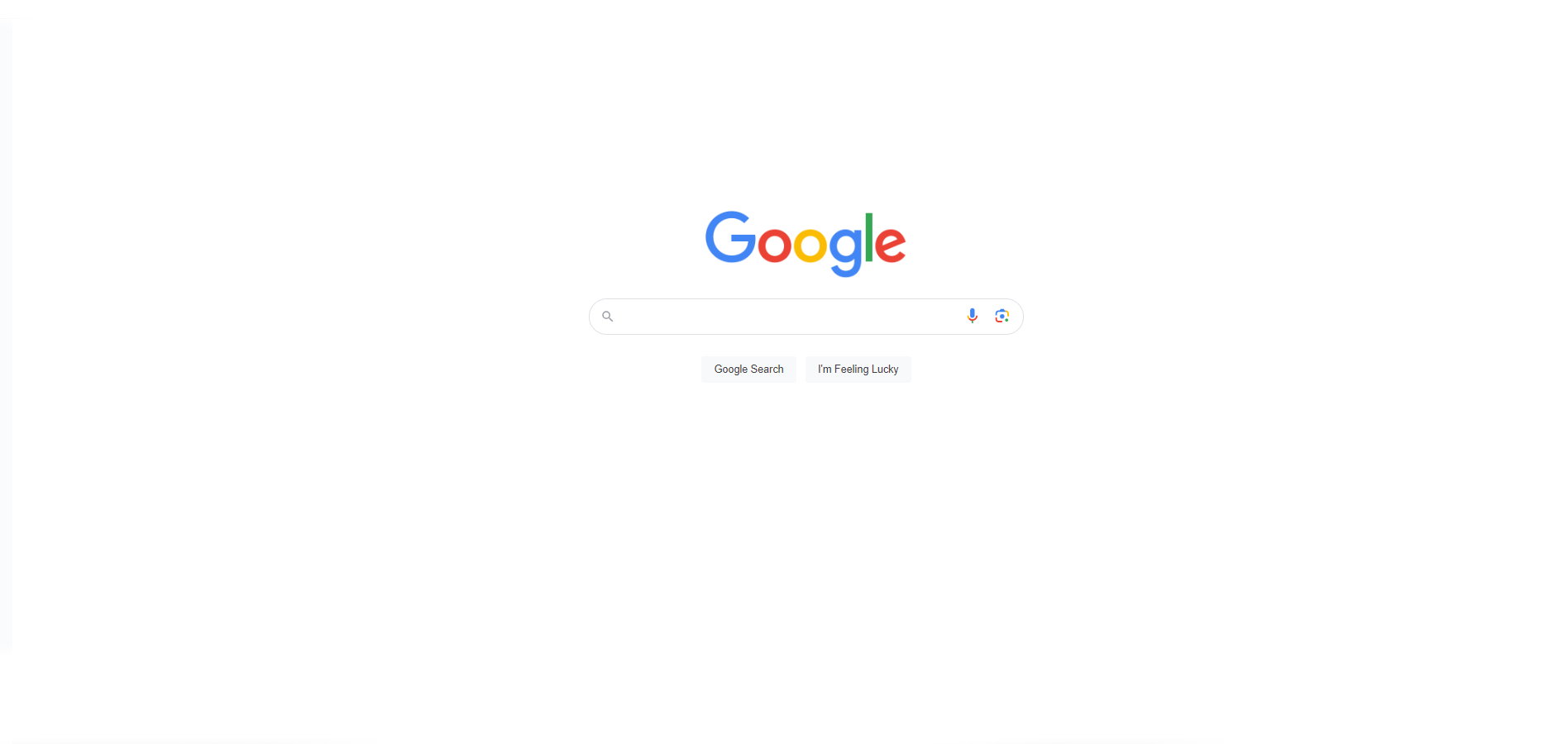
Search engines are home pages as well! The home page is incredibly simple, except for the occasional holiday where Google might change its logo. There’s one search bar to use that’s prominently displayed in the middle of the page.
Other options, such as Gmail and images, have been kept unobtrusive but still accessible in the top right corner.
3. Be responsive in your design like Airbnb
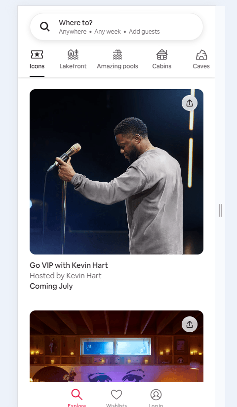
Many websites, like social media and streaming platforms, pioneered responsive design because they quickly realized their target audience was viewing them on mobile devices. Airbnb was one of the first accommodation websites to realize this.
Today, it adjusts seamlessly to different screen sizes and devices. Layout, images, and text automatically reflow for their users to receive optimal experiences.
4. Have a fast load time like Dropbox
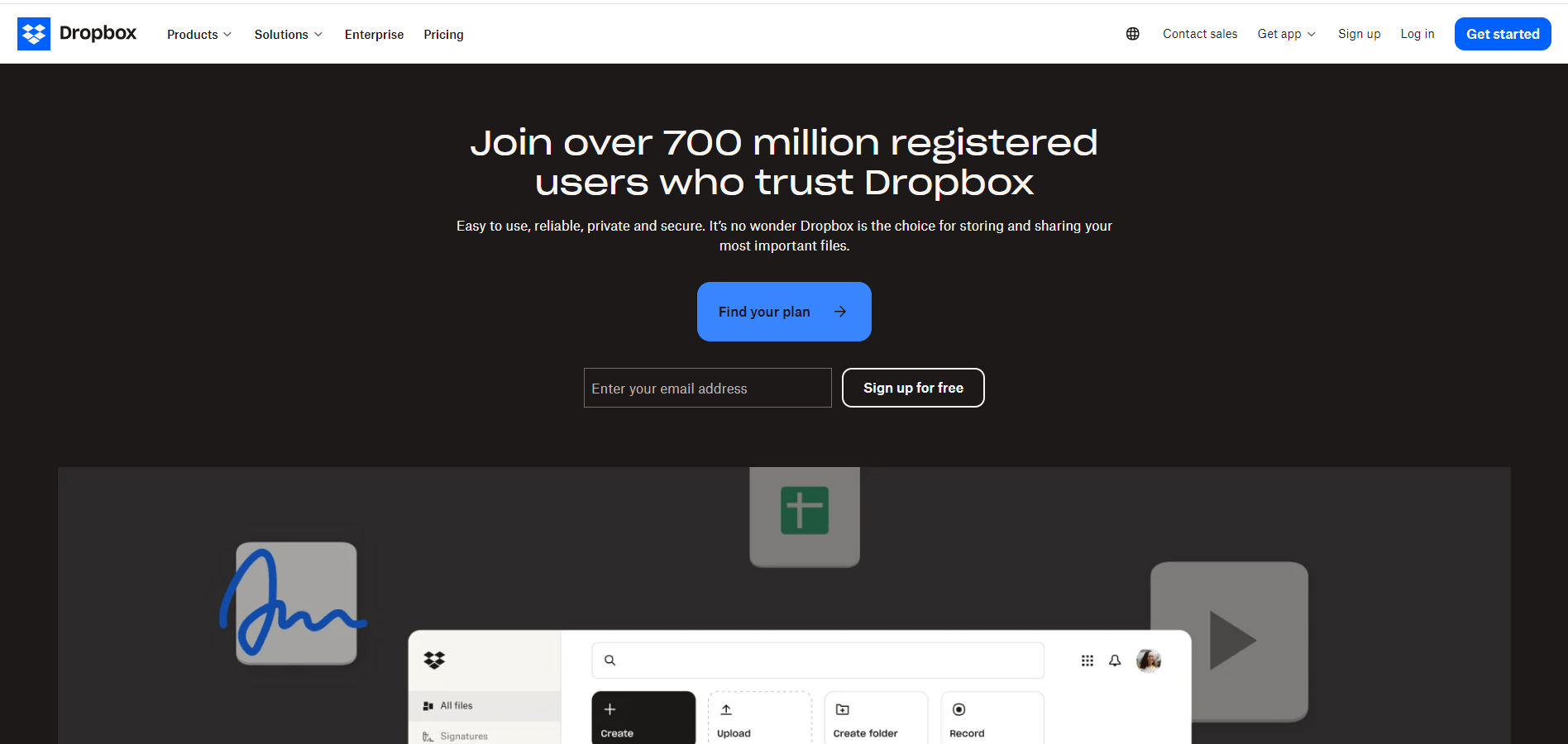
If cloud solutions are your main business model, then having a fast load time will be your biggest unique selling proposition (USP). Dropbox has ensured fast loading time by keeping their images light, optimized, and backed that up with efficient coding practices.
5. Get a compelling headline like Slack
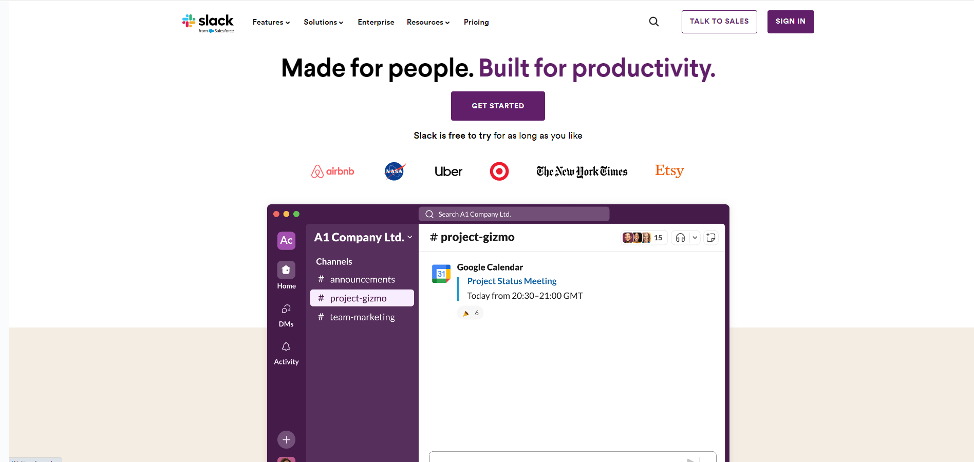
Slack has always included an engaging headline in their design, stressing the point that they are all about coworkers being able to communicate. Their phrase, “Made for people. Built for productivity,” strongly emphasizes that this is not like a ‘discord’ or regular messaging platform for casual conversation but a place of purpose and professionalism.
6. Implement high-quality images like Squarespace
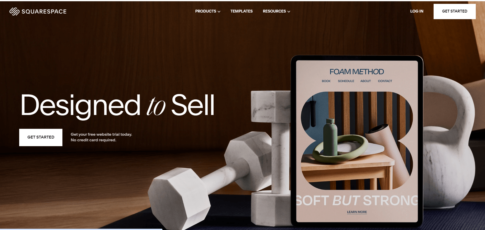
Squarespace’s top priority is promoting its website design and aesthetics. It follows that through by leading with its own design. It uses high-resolution, visually appealing images to showcase the beauty of websites created with its platform.
7. Use minimal text like Stripe
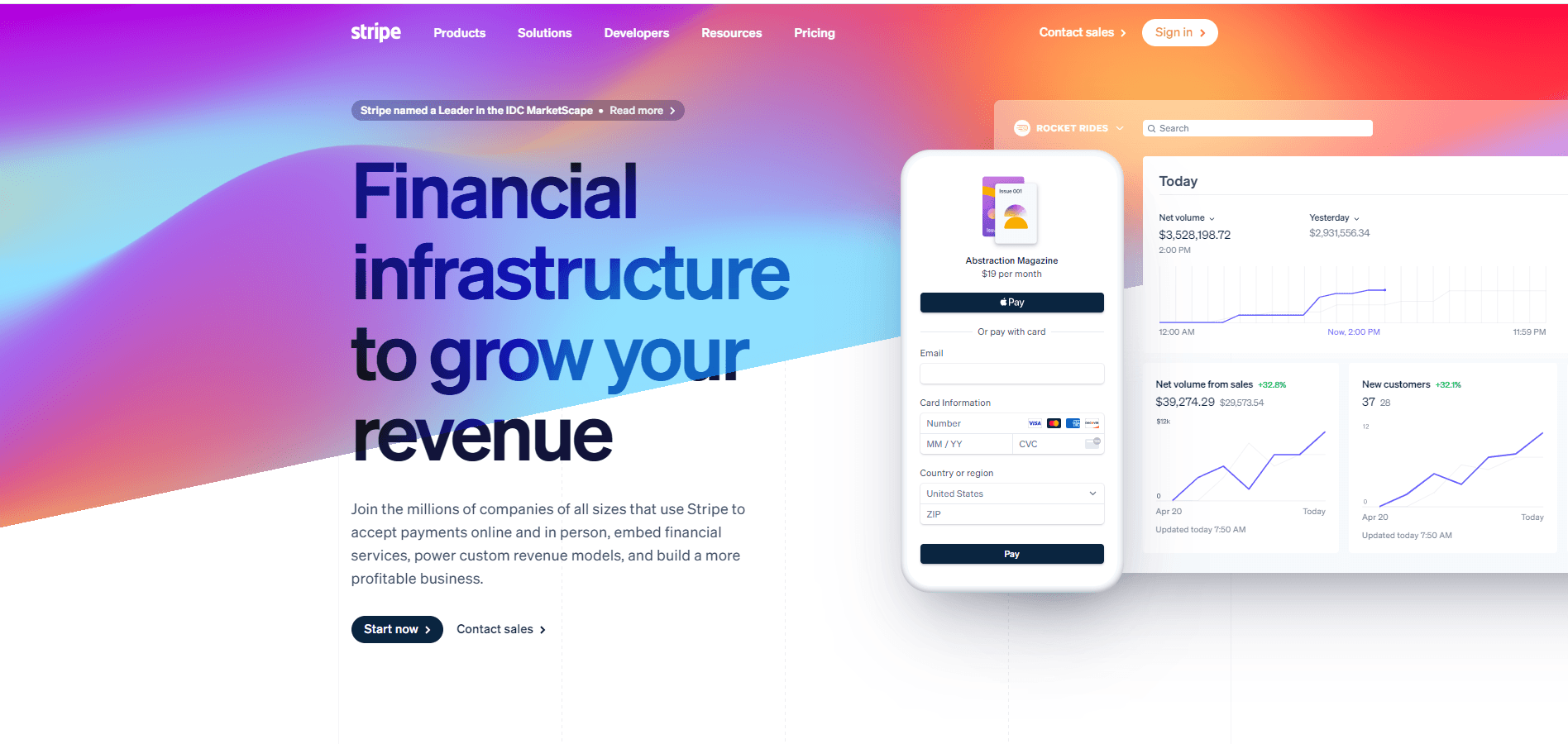
Even though Stripe is in the finance sector, there isn’t a large wall of jargon on their site. In fact, their site is quite the opposite. There is decent white space, large, powerful headings, and then a small paragraph to capture the audience.
This is then finished off with a powerful call to action (CTA) to guide the user to the next step. Their concise copy highlights only the features and benefits without overwhelming the user.
8. Integrate good CTAs like Netflix
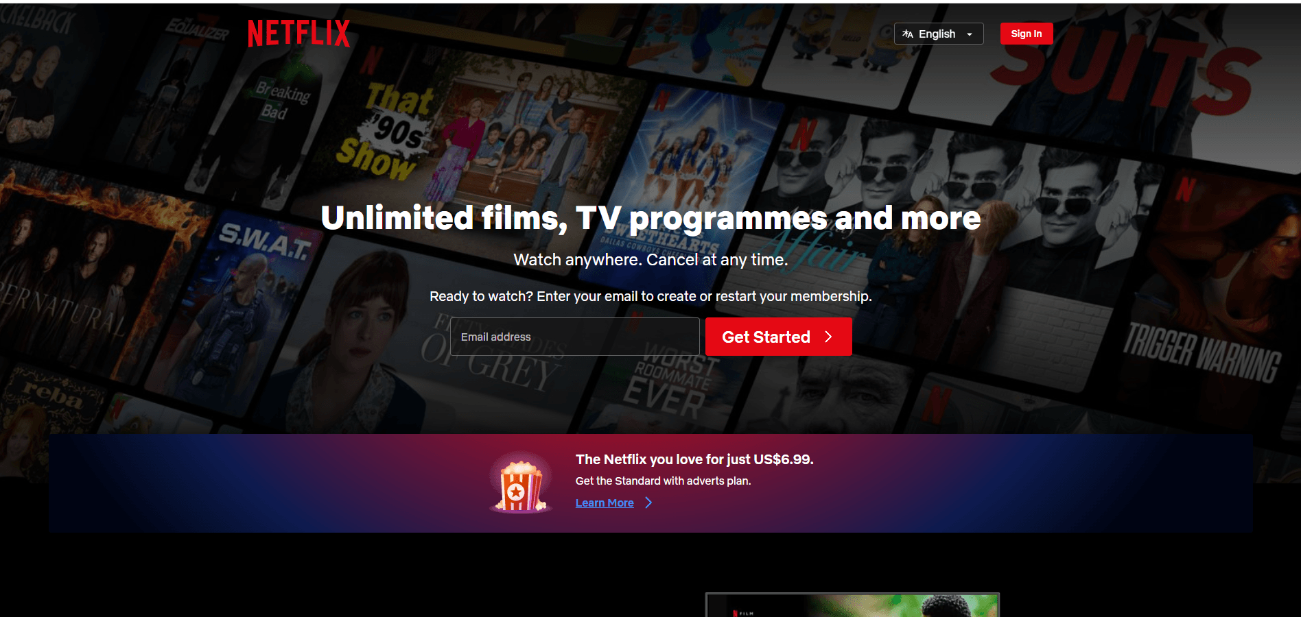
Netflix’s branding is a great website example for using color to draw the eye. The sharp red-on-black pulls your eye right in. But they also use this color combo for their call to action. While the text is still highly visible and readable in white on black, the buttons are the real star of the homepage.
The wording also calls the user to action by using simple, direct, active instructions such as “get started” or “sign in.” These instructions are strategically placed to encourage the user to push them. After all, everyone has always wanted to push the big red button.
9. Use white space like Albert
Albert is a simple banking finance app, and they wanted to express that in their website design. Their homepage makes incredible use of white space. They also use a very subtle approach to capture the eye with movement. But unlike other sites that do this with text change or a whole image, Albert does this by flicking between the screens on its app.
It’s a gentle change that draws interest while keeping the focus on what is really important. The spacing between elements prevents clutter and allows the user to focus on the product.
10. Use a prominent logo placement like Mad Tasty
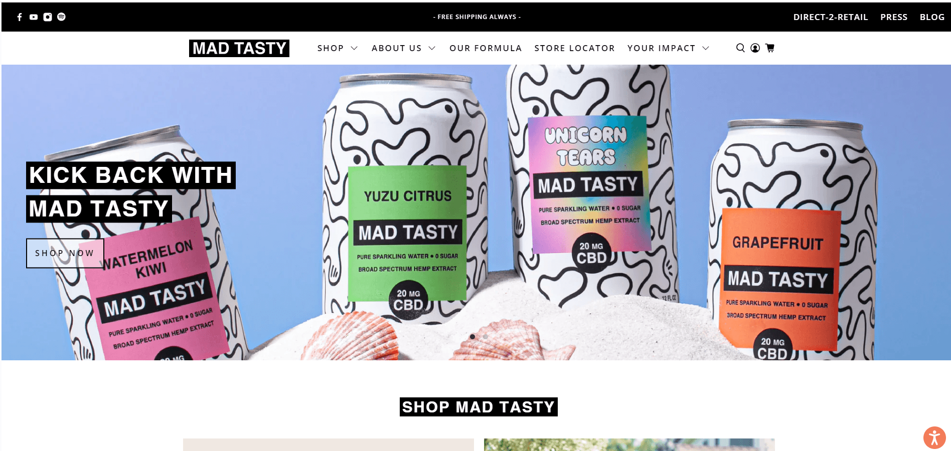
Mad Tasty has a distinct logo: White, capitalized text that is clean and minimal on a solid black rectangle. The main logo is in a focused point position in the top banner. The design is then replicated in CTA’s and main headings. Their logo also services as a button to their home page, providing an easy way for users to navigate back to the starting point.
11. Create great “contact us” accessibility like Basecamp
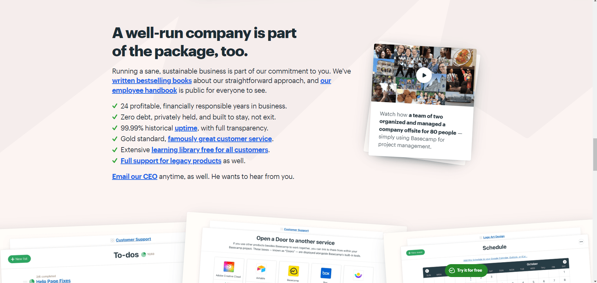
While most companies offer a “contact us page” in their top navigation, most CTAs will probably direct you to sales or their pricing page. Basecamp offers all of that but also gives links to their customer services, and if you want more of a personal connection, they offer the CEO’s email address directly.
Not a lot of CEOs out there are willing to be that hands-on.
12. Integrate social proofing information like Zendesk
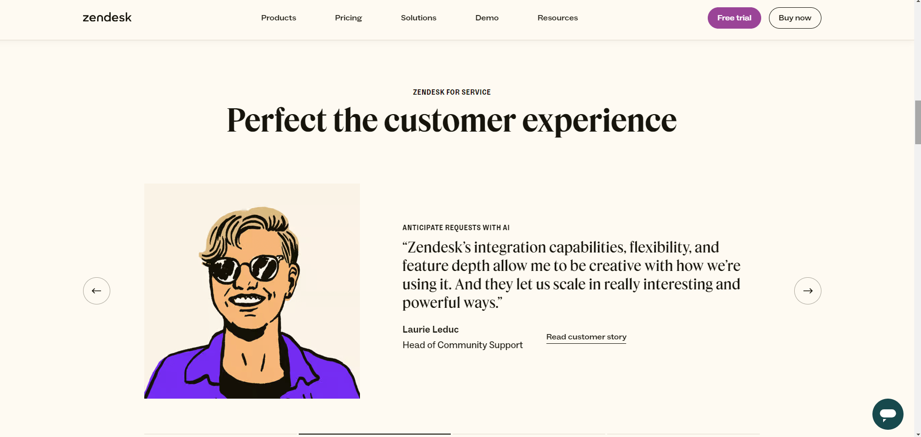
Testimonials, case studies, and client logos are prominent on Zendesk’s home page. The company showcases its credibility by displaying the positive impact of its solutions on its clients.
Elements from third parties work similarly to word-of-mouth credibility. Being endorsed by others reflects well on the company’s customer service and ability to deliver, making the potential new client feel safe investing in the product.
13. Use interactive elements like Spotify
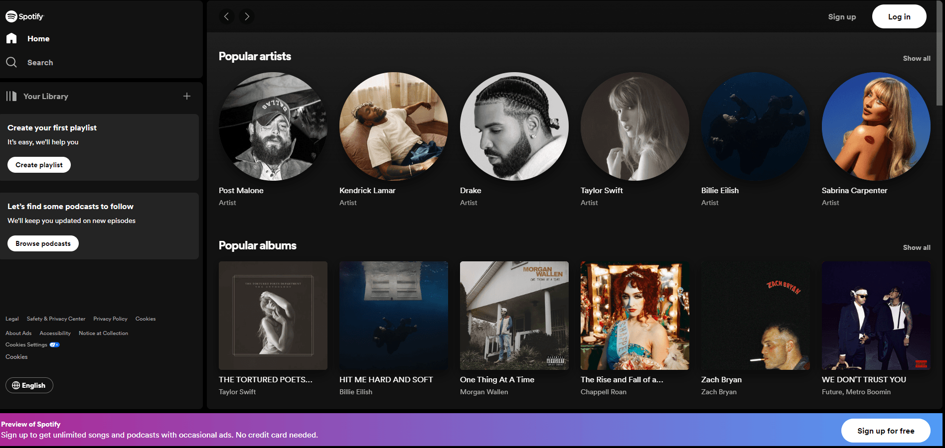
Almost every element on Spotify’s home page can be interacted with, played, or expanded to see more options. Spotify is a great website example of how interaction can improve the customer’s journey.
You can preview music and personalized recommendations. With each interaction, the user’s browsing experience is enhanced and attended to.
14. Be consistent with your layout, like Microsoft
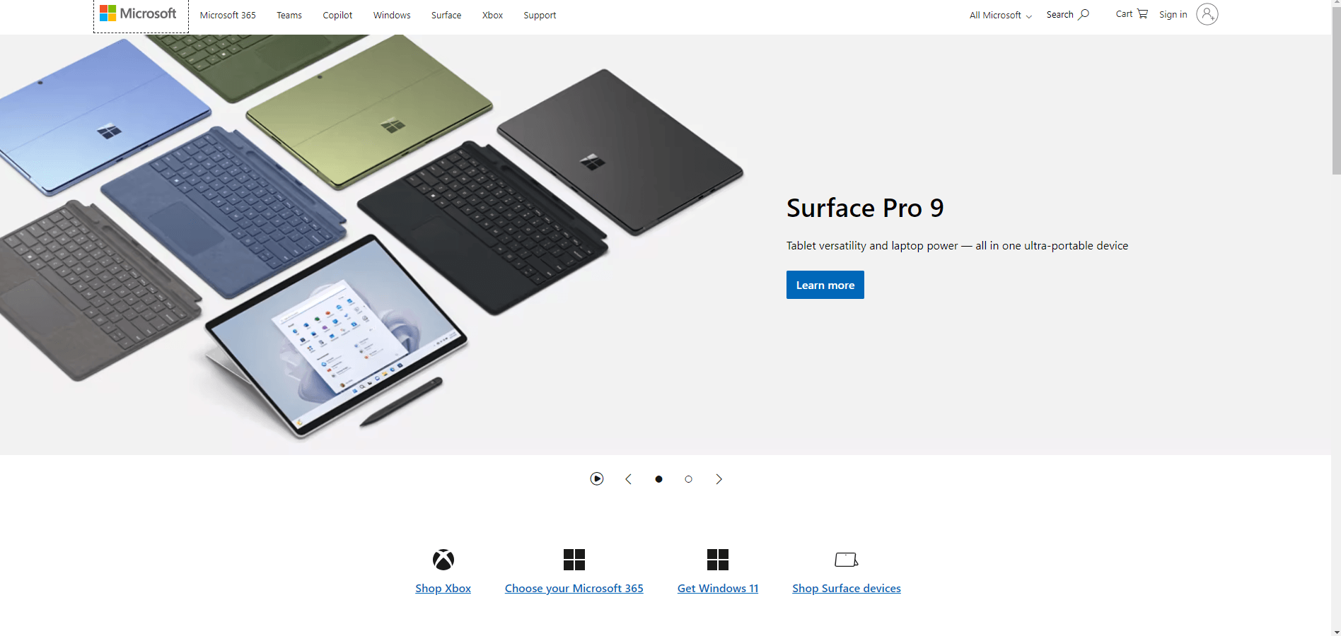
Microsoft has had a very clean, consistent, clear, functional branding for decades. They have always prioritized website accessibility and ease of use in their operational systems and software, and their homepage is no different.
It has a clean structure with lines, good use of white space, and a conventional layout, so users can easily navigate and find the product or service they require.
15. Have user accessibility like W3C
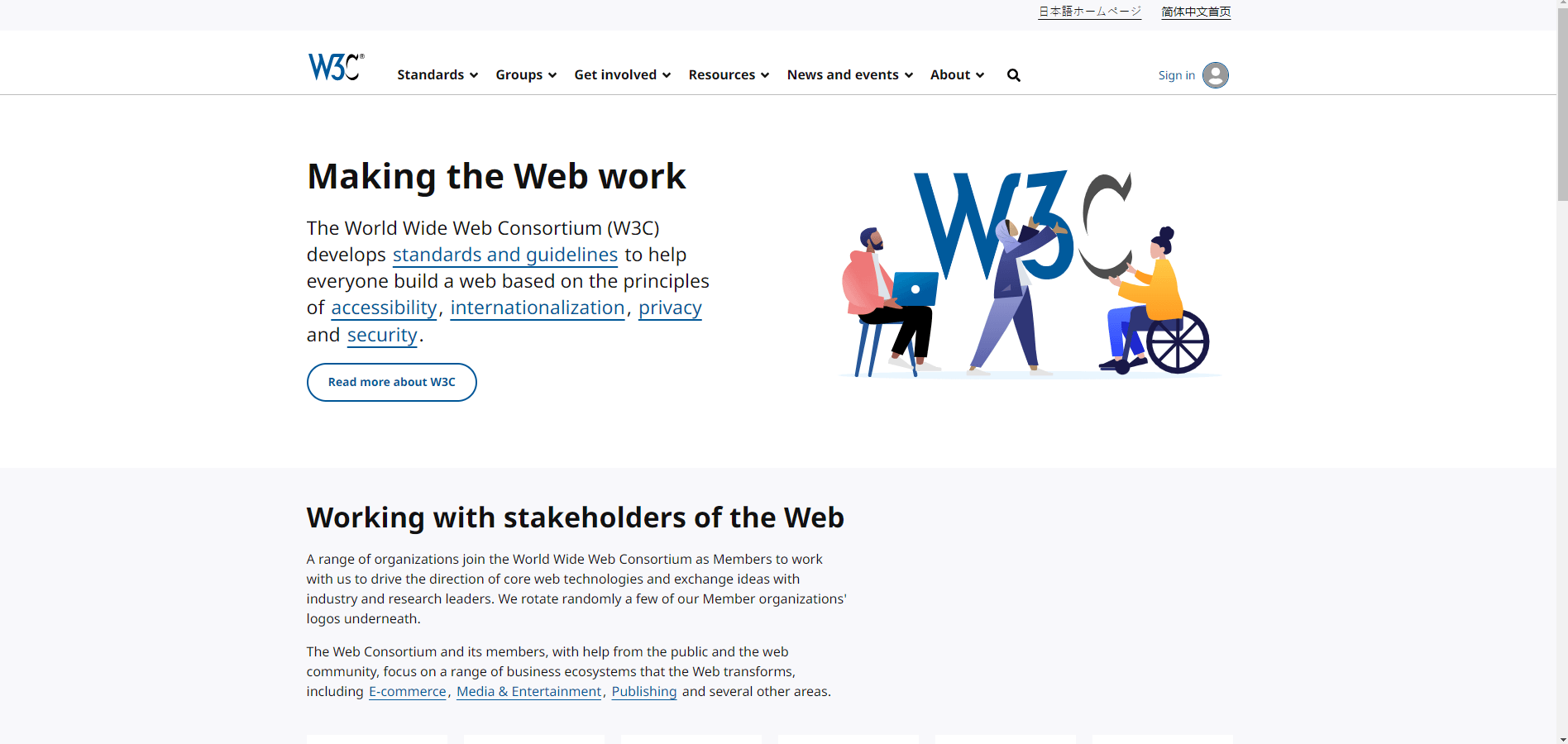
The World Wide Web Consortium (W3C) is designed with accessibility in mind. To ensure all users can access their contact information, they have provided alt text for images, keyboard navigation, high-contrast options, different language settings, and more.
The main focus of the W3C is to drive technology so that everyone has access to information and create guidelines for website accessibility. They demonstrate that they are not only discussing these issues but leading by example by implementing many of them on their own website.
16. Have articles and blog features like TechCrunch
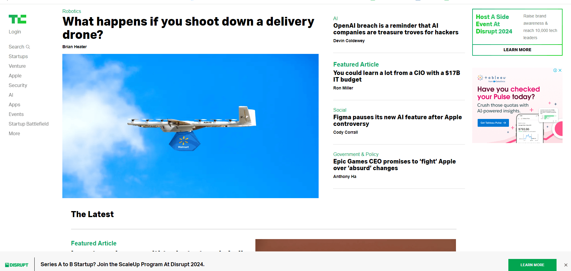
TechCrunch prominently displays articles and news stories on the homepage. The main section has featured articles that capture the user’s attention immediately.
Each article has engaging thumbnail images and diverse content formats. Regular updates ensure the content remains current, encouraging users to visit often.
17. Be user-centered with a design like Asana
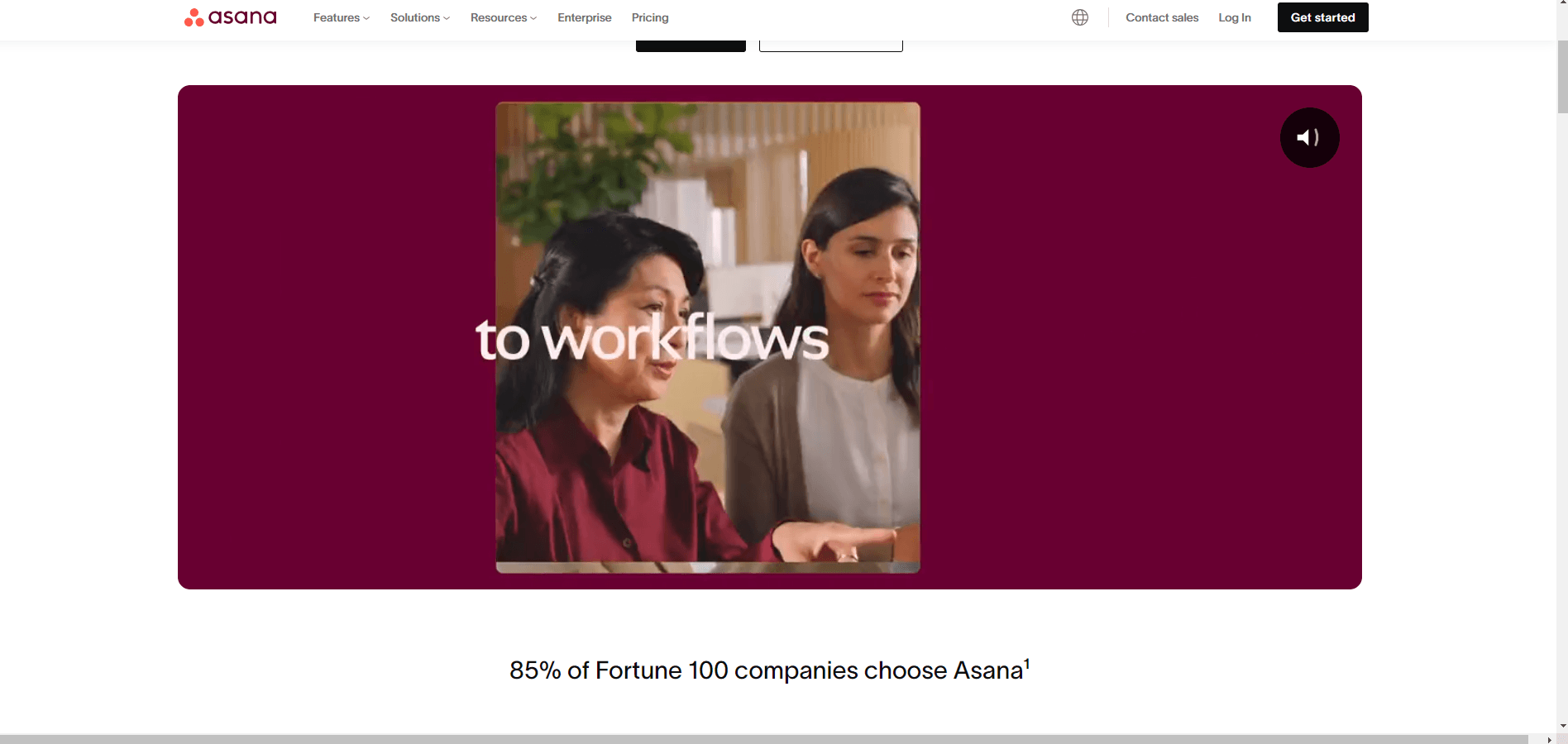
Asana’s website focuses on clarity and ease of use. Their support chat box appears quickly, their text is written with no jargon, and their headings are concise. Throughout the home page, you’ll find helpful videos, easily laid out features, and clear buttons and navigation.
The design gives important information first so that clients can understand how Asana can help them manage their projects and taste efficiency. There is also a personalization element, where recommendations are made based on the user’s needs.
18. Give personalization like Tailor Brands
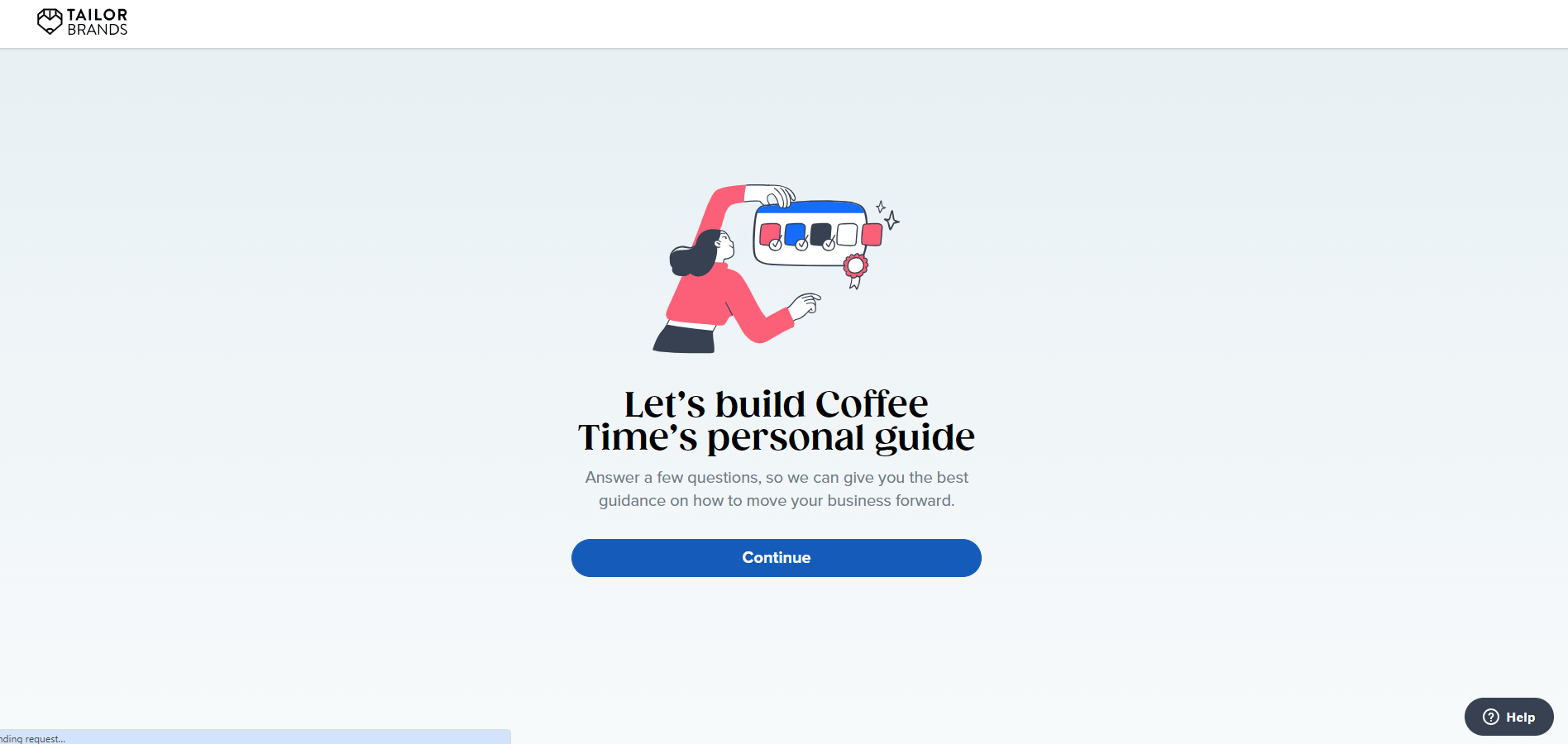
Tailor Brands gives clients tools to personalize and build platforms. Their homepage does the same for the client, doing everything possible to get the client to go on a journey of personalization for their idea.
Based on these inputs, the website immediately gives options and recommendations, giving the user a tailored engagement and an experience relevant from the start.
19. Include analytics integration like Shopify
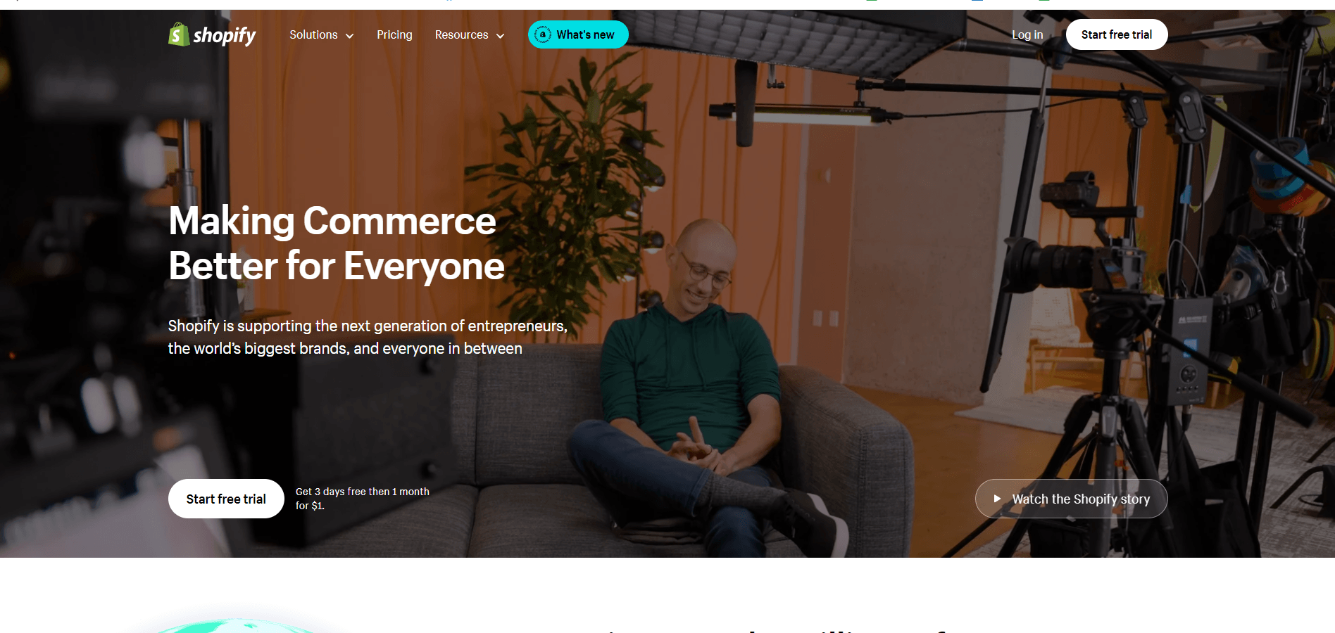
Shopify focuses on highlighting the analytics and reporting features of its website builders directly on its homepage. It wants to showcase that its platform provides users with valuable insights into their stores’ performance.
How do they do this? By providing detailed sales processes, customer behavior analytics, marketing insights, and more to visitors.
20. Give a clear hierarchy like BBC
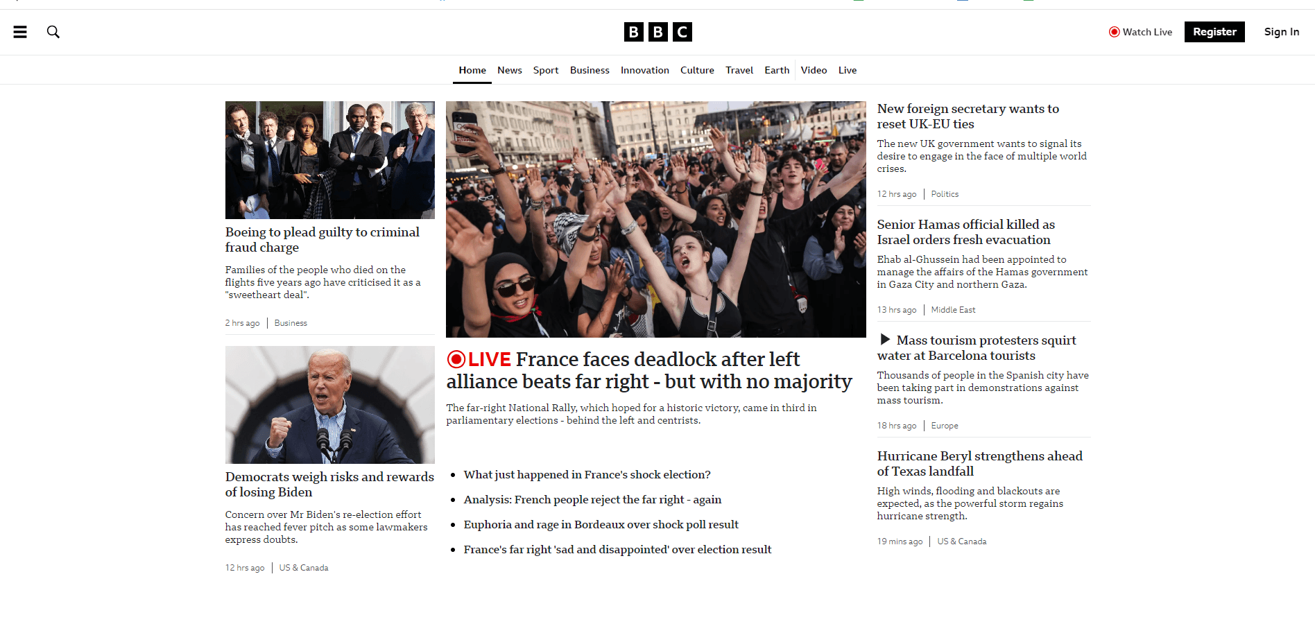
Newspapers and magazines often give hierarchy to the layout within their print publications. The biggest, important stories go on the front page, while warm fuzzy stories go on page three. BBC has focused similarly on its website, emphasizing larger, distinct headings for the big story and lesser eye catchment for the others.
The structure helps users easily find news, articles, and other content that would be of engagement to them.
Create the best website homepage design with WebFX
Having looked at the website homepage design examples, you should now be ready to incorporate that in your own site.
Need help implementing your favorite design elements? WebFX offers custom site designs that will give you the opportunity to launch a site that captures your brand, improves your conversion rates, all with the best website practices in mind.
Our team of 500+ digital experts is ready for your call. Contact us on 888-601-5359 to speak to a strategist or reach out online, to start a conversation about your business and it’s online potential today!
-
 Celeste has worked in the online marketing space for twenty years. She has written for sectors including tourism, sustainability, education, lifestyle, food, and marketing. You can find her work featured by Green Building Media South Africa, Stodels Gardening, and The Post House Hotel. In magazines, you may have seen her in The Cape Times, Oprah South Africa, and The Property Magazine. While you can find her writing up on the latest SEO trends and exploring digital techniques during the day, her love of story-telling carries on in enriched games and books after hours.
 -

WebFX is a full-service marketing agency with 1,100+ client reviews and a 4.9-star rating on Clutch! Find out how our expert team and revenue-accelerating tech can drive results for you! Learn more
Make estimating web design costs easy
Website design costs can be tricky to nail down. Get an instant estimate for a custom web design with our free website design cost calculator!
Try Our Free Web Design Cost Calculator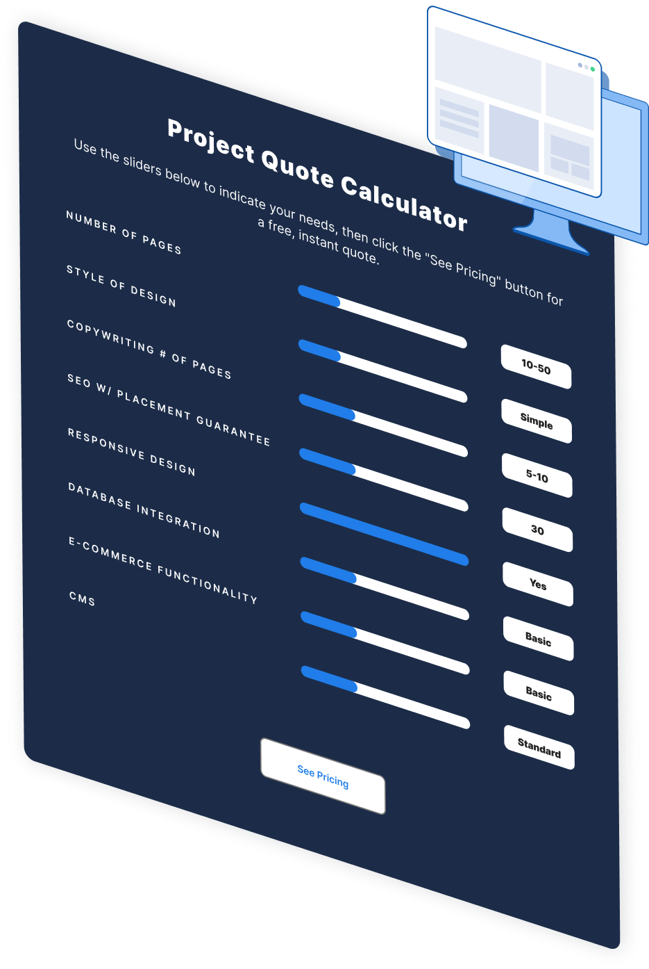
Table of Contents
- 20 web design best practices and examples
- 1. Have clear branding like Apple
- 2. Have simple navigation like Google
- 3. Be responsive in your design like Airbnb
- 4. Have a fast load time like Dropbox
- 5. Get a compelling headline like Slack
- 6. Implement high-quality images like Squarespace
- 7. Use minimal text like Stripe
- 8. Integrate good CTAs like Netflix
- 9. Use white space like Albert
- 10. Use a prominent logo placement like Mad Tasty
- 11. Create great “contact us” accessibility like Basecamp
- 12. Integrate social proofing information like Zendesk
- 13. Use interactive elements like Spotify
- 14. Be consistent with your layout, like Microsoft
- 15. Have user accessibility like W3C
- 16. Have articles and blog features like TechCrunch
- 17. Be user-centered with a design like Asana
- 18. Give personalization like Tailor Brands
- 19. Include analytics integration like Shopify
- 20. Give a clear hierarchy like BBC
- Create the best website homepage design with WebFX


Web Design Calculator
Use our free tool to get a free, instant quote in under 60 seconds.
View Web Design Calculator
Proven Marketing Strategies
Make estimating web design costs easy
Website design costs can be tricky to nail down. Get an instant estimate for a custom web design with our free website design cost calculator!
Try Our Free Web Design Cost Calculator
What to read next


