 Google — it seems — is testing a new design today, demonstrating it to certain visitors of the site. This type of live testing is common (the process known as split testing) to evaluate the efficacy of a new design. Could this be how Google will look soon?
Check out some images comparing the new design versus the current design.
Logo
Google’s logo is larger and its colors appear brighter with the reduction of the text’s bevel. The drop shadows of the letters are pulled in closer to reduce their prominence. The overall effect of the logo tweaks is that it looks more modern.
New
![]()
Current
![]()
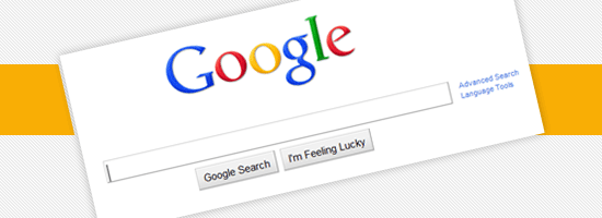
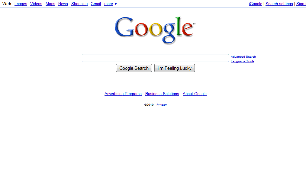
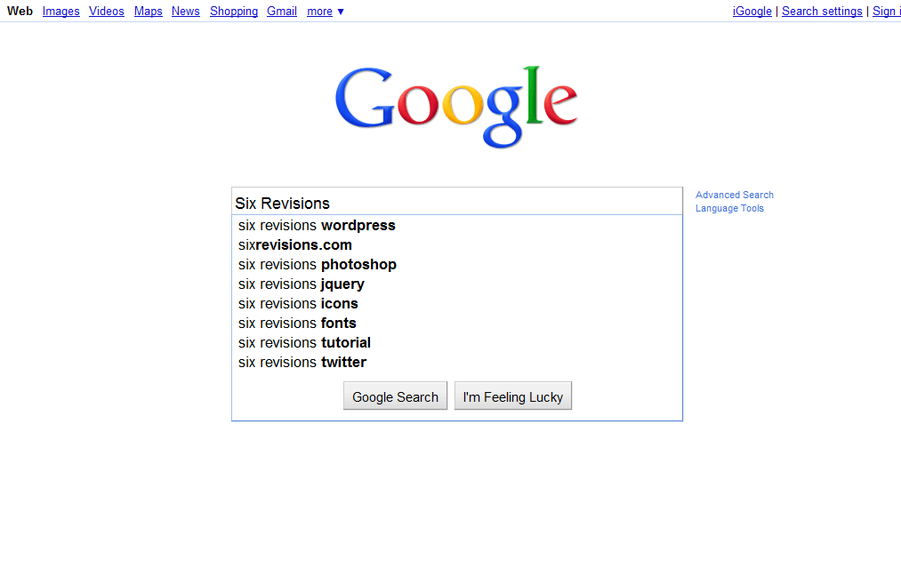
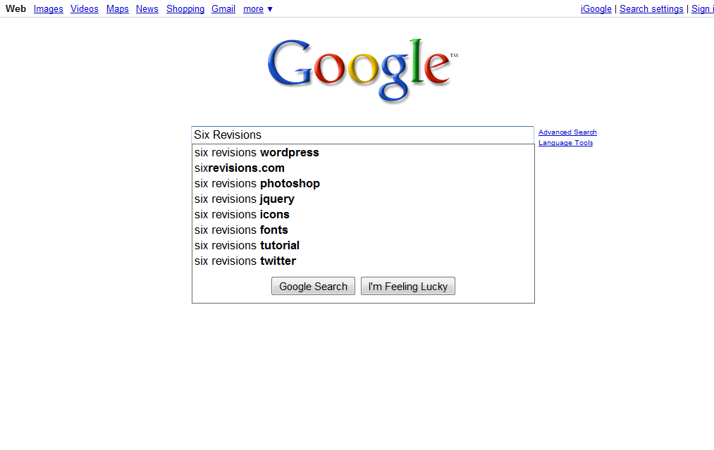
Front Page
The search input box is bigger.
The design has switched the buttons from the user’s default browser buttons to CSS-styled buttons, providing more consistency between different browsers and operating systems.
New (click to enlarge)
Current (click to enlarge)
Front Page with Suggestions
The Ajax search suggestions are the same as the current design, except for a light blue border around them instead of the dark gray that presently surrounds the suggestions.
New (click to enlarge)
Current (click to enlarge)
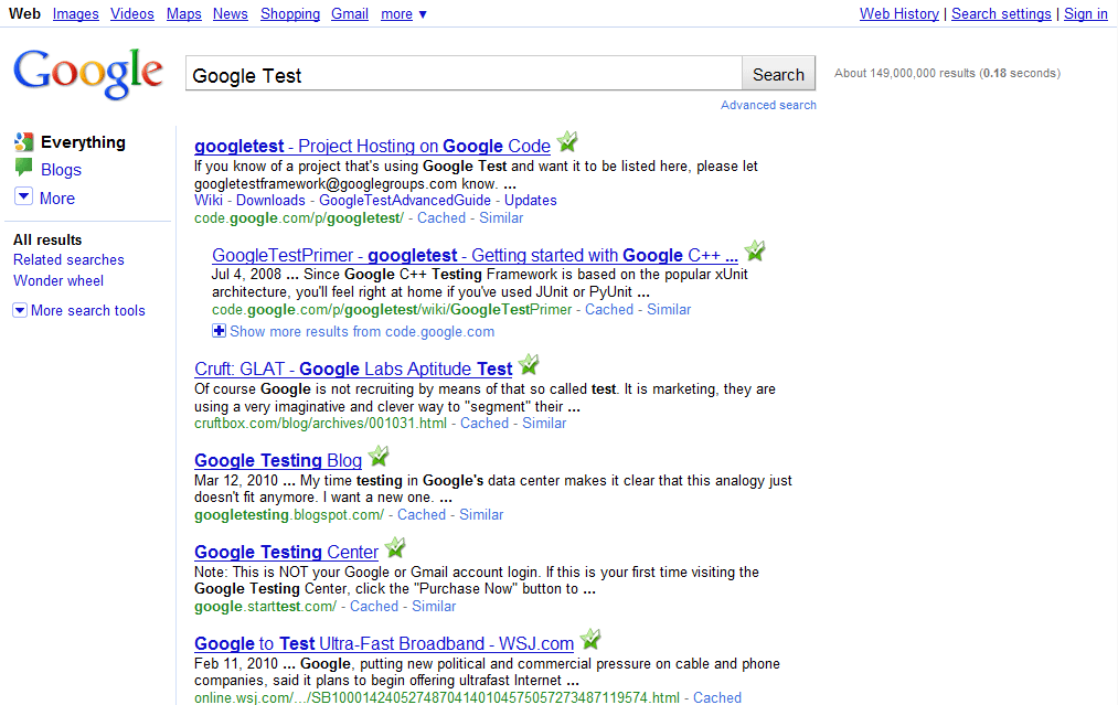
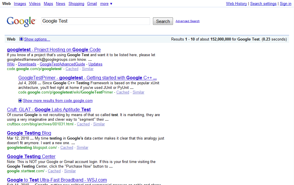
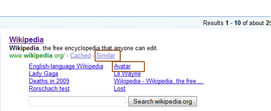
Search Results Page
With the current design, you have to click on the “show more options” link to display the left sidebar. The new design has it expanded by default.
New (click to enlarge)
Current (click to enlarge)
Search Result Items
All hyperlinks except the title of the search item no longer have text underlines.
New
Current
Left Sidebar
They’ve added icons and made the search option links larger — presumably — to see if more people use them. 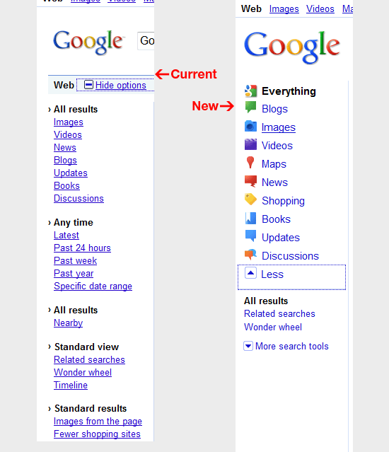
Footer
They cleaned up the footer to match the new logo design.
New
Current
 What do you think of the new design?
Related Content
- The Three Golden Rules of Site Redesigns
- 10 Google Chrome Extensions for Boosting Your Productivity
- 15 Fantastic Finds on the Google Code Repository
-
 President of WebFX. Bill has over 25 years of experience in the Internet marketing industry specializing in SEO, UX, information architecture, marketing automation and more. William’s background in scientific computing and education from Shippensburg and MIT provided the foundation for RevenueCloudFX and other key research and development projects at WebFX.
 -

WebFX is a full-service marketing agency with 1,100+ client reviews and a 4.9-star rating on Clutch! Find out how our expert team and revenue-accelerating tech can drive results for you! Learn more
Make estimating web design costs easy
Website design costs can be tricky to nail down. Get an instant estimate for a custom web design with our free website design cost calculator!
Try Our Free Web Design Cost Calculator
Share this article


Web Design Calculator
Use our free tool to get a free, instant quote in under 60 seconds.
View Web Design Calculator
Make estimating web design costs easy
Website design costs can be tricky to nail down. Get an instant estimate for a custom web design with our free website design cost calculator!
Try Our Free Web Design Cost Calculator