What to read next

Understanding AI Cybersecurity for SMBs: Here’s What You Need to Know in 2025

The 5 Best AI Photo Editors That Make Image Editing a Breeze

What Is an RFI for Marketing? A Step-By-Step Playbook To Vetting Agencies Like a Pro

SEO for Doctors: How to Attract More Patients with a Smarter Search Strategy


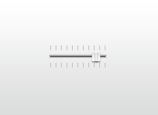
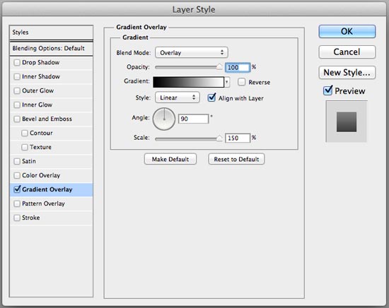 Now we have a good, complementary background for our slider:
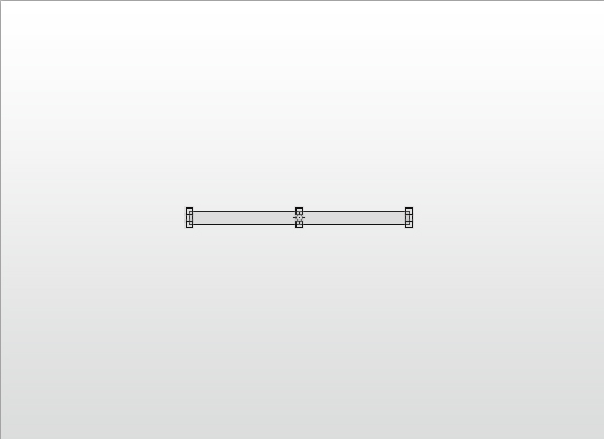 Double-click on the rectangle shape layer to open up the Layer Style window.
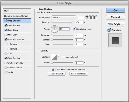
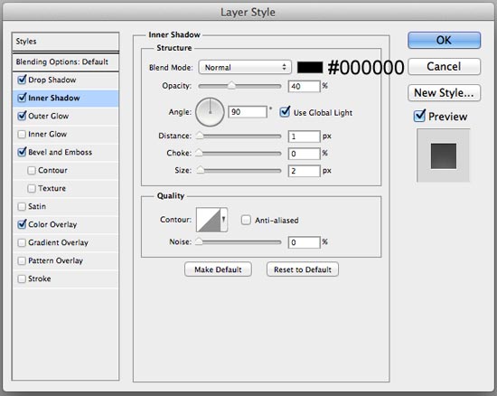
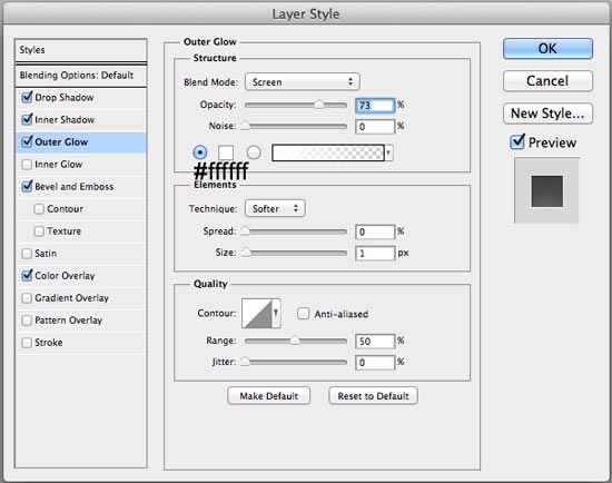
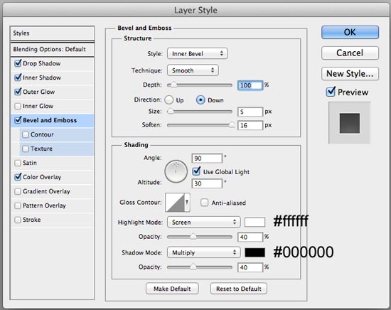
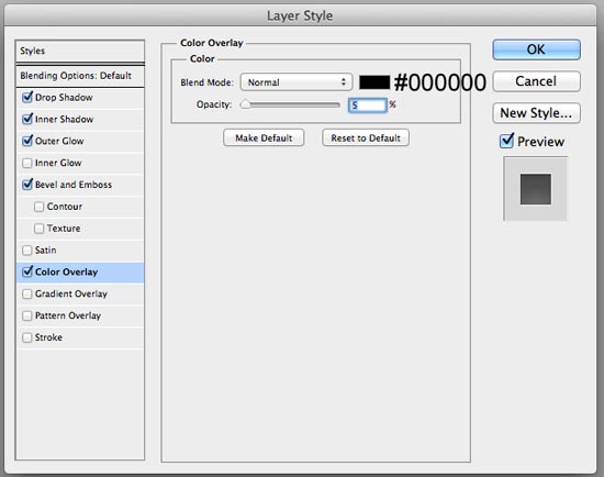 Check out what the layer style did to our ordinary rectangle shape:
  Now we’ll place a smaller rectangle inside the rectangle we just created.
 For this shape layer, we’ll apply 4 layer effects: Drop Shadow, Inner Shadow, Inner Glow, and Bevel and Emboss.
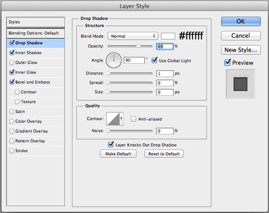
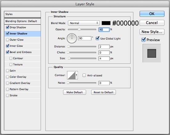
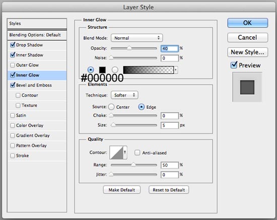
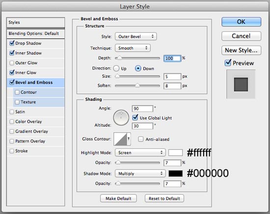 Take a look at our finished slider bar now:
  Let’s keep things organized by putting both of these shape layers in a layer group (which we can name “Slider bar”). To place the layers in a layer group, just select both layers in the Layers panel and then go to Layer > Group Layers.
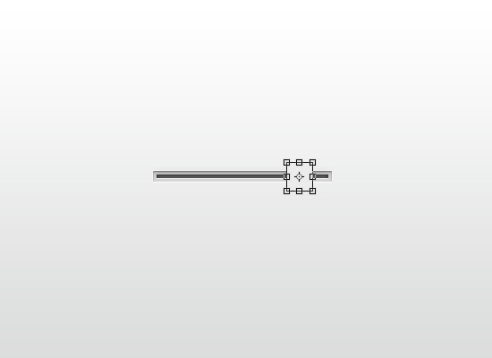 Double-click the shape layer in the Layers panel to reveal the Layer Style window again.
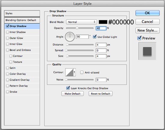 Here’s our slider control with the Drop Shadow layer effect applied:
  Duplicate the layer by going to Layer > Duplicate Layer. Right-click on the duplicated layer, which will reveal a contextual menu where you should choose Clear Layer Style to remove the Drop Shadow layer effect.
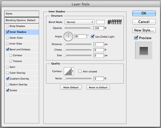
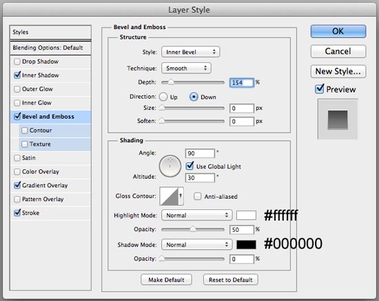
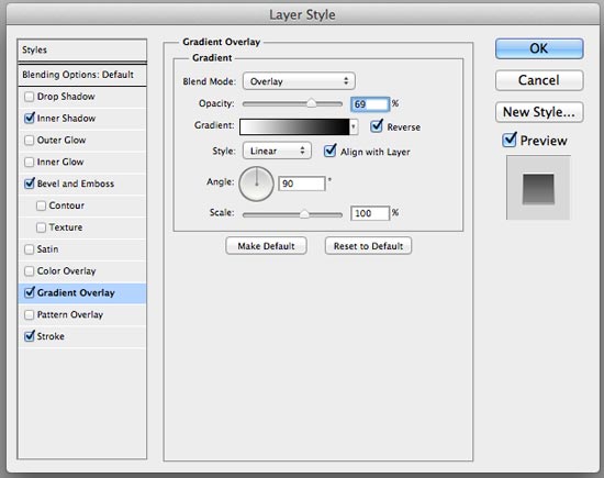
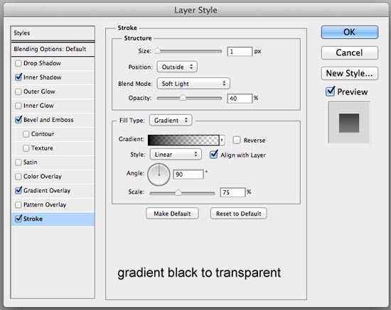 Below is the result of our layer effects:
 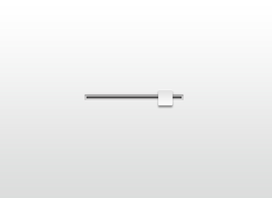 Switch to the Rectangle Tool (U) with the Color still set to #ececec. Draw a vertical rectangle in the middle of our slider control.
 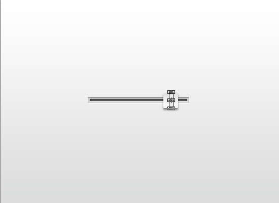 Give the vertical rectangle layer these 5 layer effects: Drop Shadow, Inner Shadow, Outer Glow, Bevel and Emboss, and Gradient Overlay (the settings are all below).
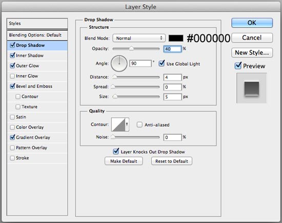
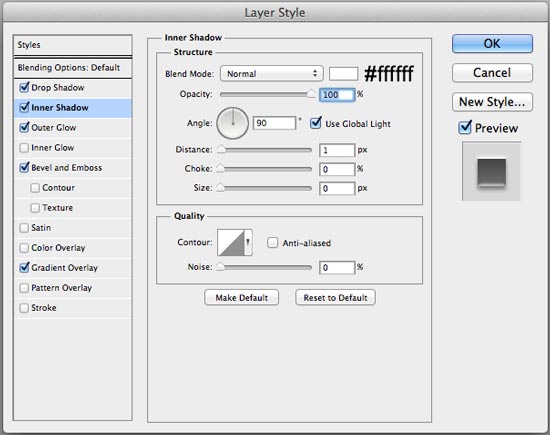
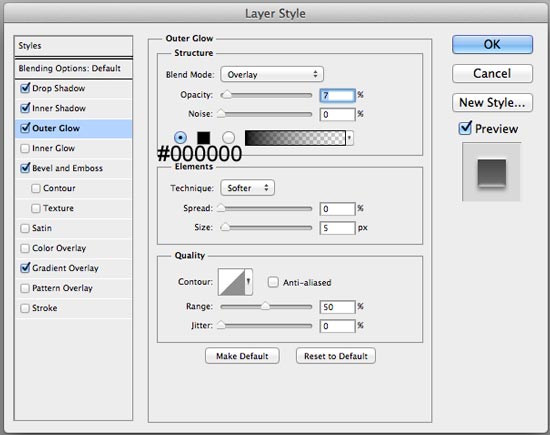
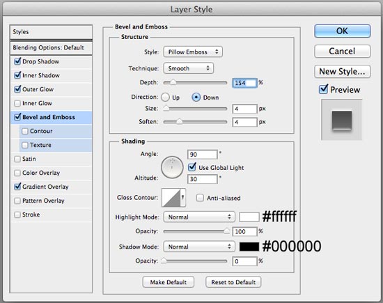
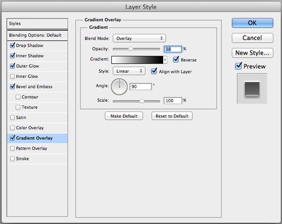 Looking good so far, right?
 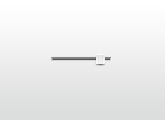 Put all these layers in a layer group, which you can call “Slider control”.
 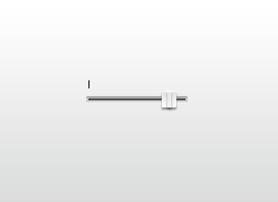 Press Ctrl+Alt+T (or Cmd+Option+T for Mac OS) to duplicate the shape. Use your Arrow key or your mouse to move the duplicate to the right.
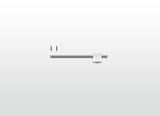 Repeat this process until you have your desired number of lines.
 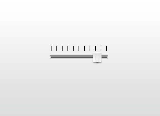 Give just one of the lines these 4 layer effects: Drop Shadow, Inner Shadow, Outer Glow, and Color Overlay.
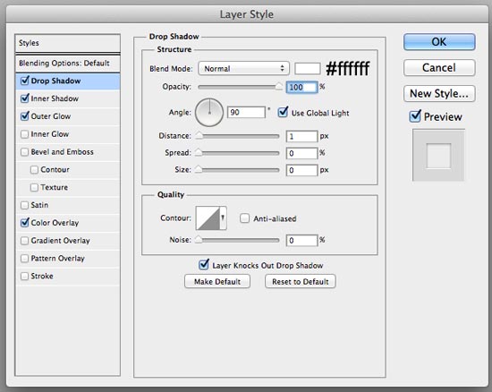
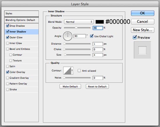
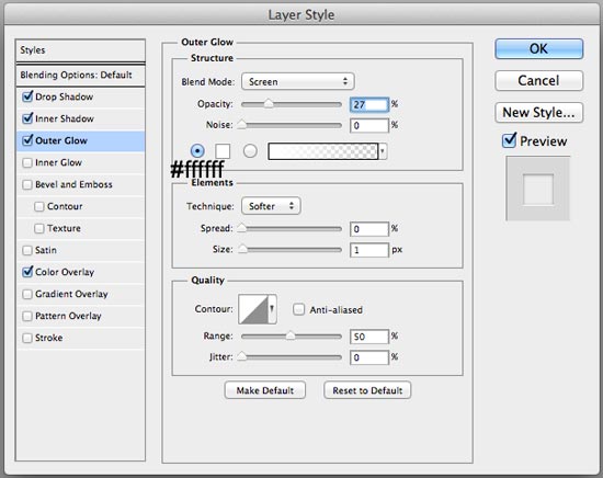
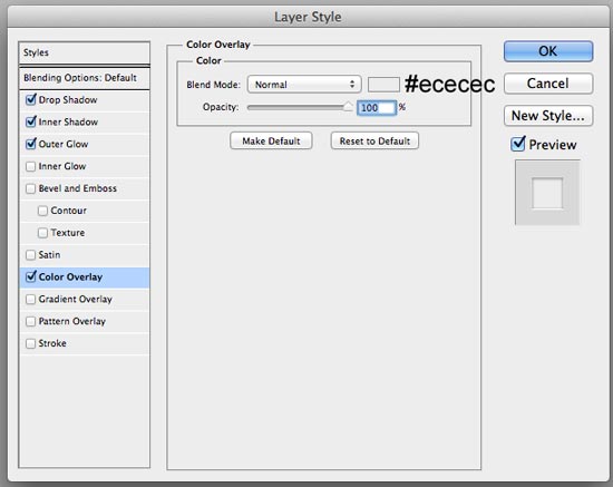 Now we’ll just quickly copy-and-paste this layer style to the other lines.
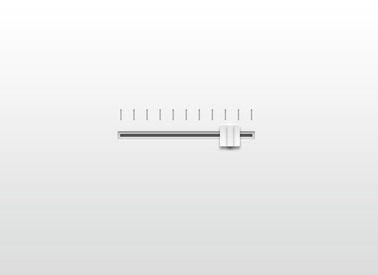 Just duplicate these layers and move the duplicates down below the slider bar.
 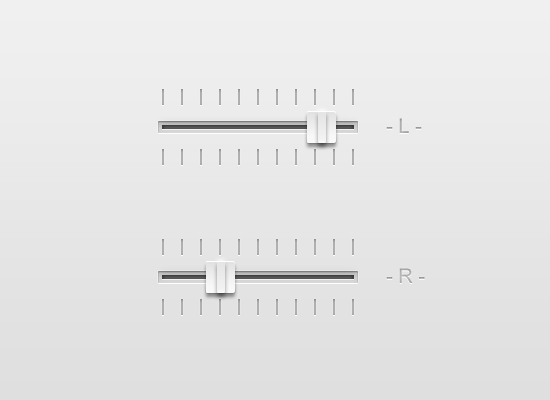 Thanks so much for reading my tutorial! I hope this helps you!