In these cases, typography can be a designer’s best tool for creating visual interest using only words. After all, letters are just a different type of picture, and when you utilize interesting typography in your printed designs, you have the potential to reverse the paradigm and make your words worth a thousand pictures.
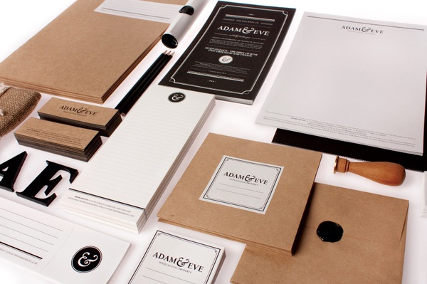
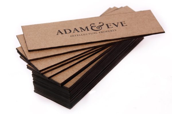
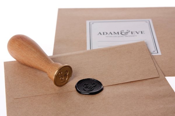
Adam and Eve Law Firm
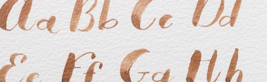
 The branded typography in this company’s media kit uses a classically styled font to evoke feelings of nostalgia and sophistication.
The company’s signature ampersand (&) is a good example of typography used effectively in a brand’s logo. The ampersand appears on everything, from labels and letterheads to a wax seal on official documents, helping to reinforce the brand’s identity at every opportunity.
Tamasyn Gambell
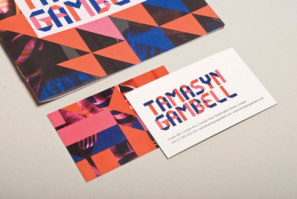
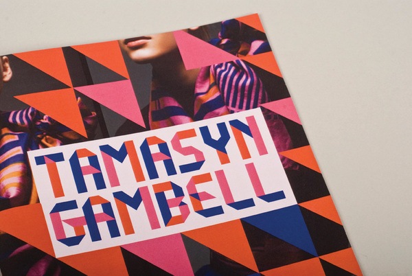
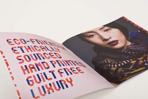 This print media kit for a textile designer utilizes a colorful font style that is modern and chic.
The vibrant typography utilizes overlapping shapes to create a unique look that’s reminiscent of fabric patterns. (Learn how to produce a similar text effect by following along this tutorial: Creating Retro Folded Typography Using Photoshop.) The font is on the large side to make it easy to read, while still maintaining the fashion-forward attitude of a brand that is confident and trendsetting.
Pixelo Design
![]()
![]() The logo for this graphic design agency uses graffiti-inspired typography, giving the brand an artistic, almost rebellious, identity that speaks to youth culture and urban life.
The logo for this graphic design agency uses graffiti-inspired typography, giving the brand an artistic, almost rebellious, identity that speaks to youth culture and urban life.
The backside of the business card uses a different font for each line of copy. Normally, this would be a huge design faux pas — design best practices suggest that we should use only a few fonts — but the designer manages to pull it off well, creating a unique look that makes the brand seem bold and daring.
Am Fleischmarkt 1
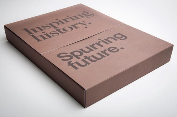
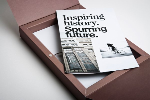 This office complex’s print media kit uses a pair of contrasting, yet complementary, fonts to great effect — the tag line Inspiring History, Spurring Future is written half in a serif font and half in a sans serif font.
The serif font brings back memories of old newspapers, tying into the nostalgic feeling of the media kit. On the other hand, the sans serif font is more current, which helps simultaneously evoke feelings of the modernity.
Casa da Musica
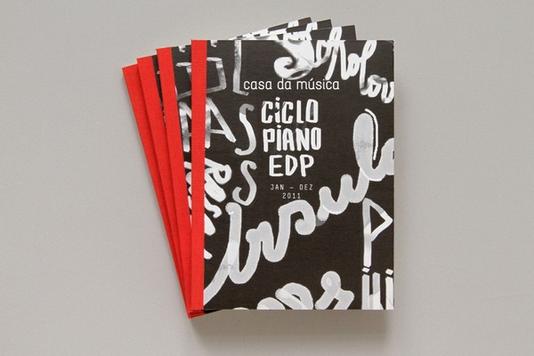
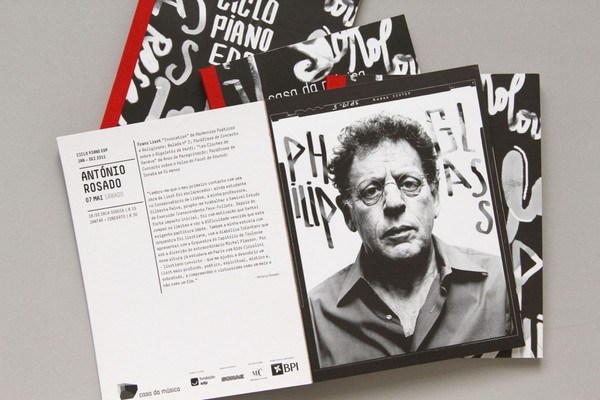
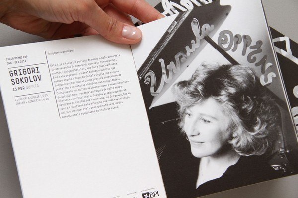 This printed brochure and poster design for a music performance uses handwriting as a design aesthetic.
The title for the brochure is handwritten and the front cover design is created from the names of different composers, each written in a different style of script. The same handwritten element is added to photographs of each composer, to help give each one a unique visual identity.
Wearhouse
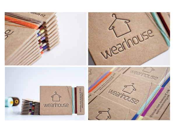
![]() To tie into the brand’s logo, the typography in this business card design utilizes contour lines to make it appear as if bending a wire hanger into different shapes created each letter.
To tie into the brand’s logo, the typography in this business card design utilizes contour lines to make it appear as if bending a wire hanger into different shapes created each letter.
The letters are also embossed onto the card, which gives them a textural element. Recipients can run their finger over each letter, tracing the contours. This builds a stronger connection to the card and, by extension, the brand.
Colossal Media Group
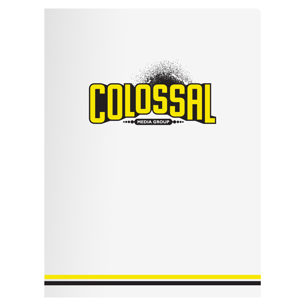 This media group’s presentation folder design features typography that ties directly back to the brand’s identity. The large, bold lettering in the word colossal absolutely dwarves the other font used in this design, making it look larger by comparison. The way the letters grow in size from the middle and out to the ends of the word helps create the illusion that the letters are popping off the page towards the audience.
Rainbow, Whistler
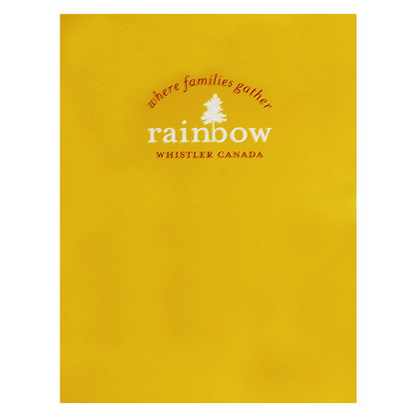 The font in this real estate presentation folder helps to present the brand as not only a luxurious living area, but a family-friendly one as well. The script font in the brand’s slogan helps to reinforce the themes of family and home, while the simplicity of the accompanying font instills a sense of sophistication. The tree design in the logo is incorporated directly with the font so that it looks as if it’s growing out of the letter b, symbolically suggesting that the location is a good place for families to grow.
Art with Impact
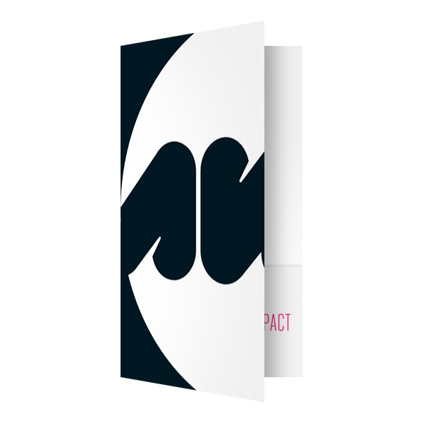
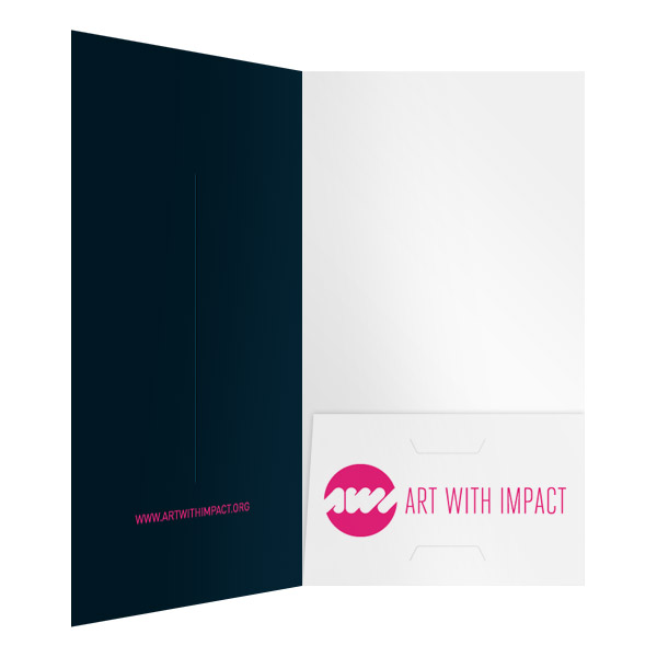
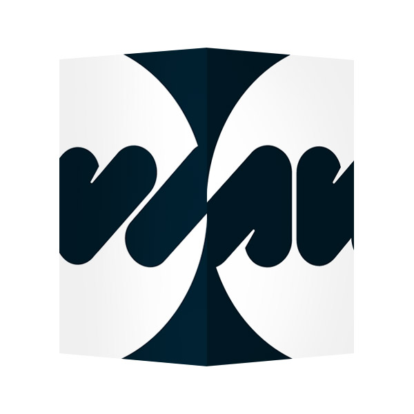 The presentation folder in this beautiful design by Art with Impact uses abstract typography to evoke feelings of modernity. The organization’s initials are spelled out in the logo, which is then cut in half and spread out between the front and back covers. This creates a sense of mystery — it is only when you open up the front cover and see the whole logo on the interior pocket that you fully understand the design.
(Tip: you can download our free presentation folder PSD template if you’re interested in creating your own presentation folder designs.)
Stephanie Schlim Business Card
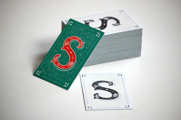
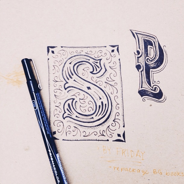 When this graphic designer was faced with the challenge of creating a brand identity for herself, she turned to typography for the answer. This stylized monogram design was created from scratch using hand drawn illustrations converted to vector images. The result is a truly unique design that encompasses the designer’s identity, as well as her sense of artistic style.
Parting Words
Try to imagine these designs with any old boring font, and they immediately lose a bit of their identity and charm. Choosing the right typography for your print design project — or any design project — can often be the fine line between a mediocre design and a spectacular one. When was the last time a font made you stop and stare?
Do you have any examples of amazing typography that you want to share? Type up your typography comments below. I’d love to hear from you.
-
 Trevin serves as the VP of Marketing at WebFX. He has worked on over 450 marketing campaigns and has been building websites for over 25 years. His work has been featured by Search Engine Land, USA Today, Fast Company and Inc.
 -

WebFX is a full-service marketing agency with 1,100+ client reviews and a 4.9-star rating on Clutch! Find out how our expert team and revenue-accelerating tech can drive results for you! Learn more
Make estimating web design costs easy
Website design costs can be tricky to nail down. Get an instant estimate for a custom web design with our free website design cost calculator!
Try Our Free Web Design Cost Calculator
Share this article


Web Design Calculator
Use our free tool to get a free, instant quote in under 60 seconds.
View Web Design Calculator
Make estimating web design costs easy
Website design costs can be tricky to nail down. Get an instant estimate for a custom web design with our free website design cost calculator!
Try Our Free Web Design Cost Calculator
What to read next