- Home
- Blog
- Web Design
- Designing the Perfect Hyperlink — It’s Not as Simple as You Think
Designing the Perfect Hyperlink — It’s Not as Simple as You Think
-
 11 min. read
-
Summarize in ChatGPT
-
 William Craig
 CEO & Co-Founder
- President of WebFX. Bill has over 25 years of experience in the Internet marketing industry specializing in SEO, UX, information architecture, marketing automation and more. William’s background in scientific computing and education from Shippensburg and MIT provided the foundation for RevenueCloudFX and other key research and development projects at WebFX.
 Hyperlinks are the glue that holds the Web together. Without links, the Web would be a very different place, that’s if it would exist at all. Using a simple HTML element — the
 <a> element –you can create a bond with any other web page on the Internet.
Hyperlinks are magical. Hyperlinks are fundamental to the Web. They are always just there.
Maybe that’s why many site owners and web designers don’t pay them the attention they deserve. The design of the HTML <a> element is crucial in the user’s reading experience; we should take enough time to design them well. I’m about to share with you some hyperlink design tips that will lead to a better user experience, enhanced web accessibility, and maybe even bring improvements to your search engine rankings.
Keep in mind that whether you need help with hyperlinks or a bigger digital marketing initiative, WebFX can help.
Hyperlinks Need to Look Like Hyperlinks
All your hyperlinks need to stand out and clearly say to your readers, “Hey I’m a link. You can click on me.” Hyperlinks should appear interactable. As web designers, we like to innovate and experiment with different navigation techniques, but sticking with certain design conventions is important.
One of the things that need to remain conventional is our hyperlinks. According to a study in link readability, the regular Web user sees blue-and-underlined text as links. Blue and underlined is a good standard to stick to, for no other reason than it’s what we Internet users have been acclimatized ourselves to.
Examples of Hyperlink Designs
Below you will see 3 different hyperlink designs.
They are from top newspaper websites.
 |
 |
 |
On the surface, these are all good hyperlink designs. They are some shade of blue. They stand out amongst the surrounding body of text.
But why is The New York Times hyperlink design better than the other two examples? Allow me to explain.
A Simple Way to Test Your Hyperlink Design
Let me show you an easy method of testing if your hyperlinks clearly stand out from its surroundings. If you blur and remove the color from the design, you will see what stands out if someone was quickly skimming or reading the page or if someone has particular problems with their vision such as low-vision or color blindness.
(Read more about color testing tools.) You can do this by: Modifying your CSS property values for <a> and <p> elements to blur them and remove their colors Taking a screenshot and editing it in Photoshop
- Image > Adjustments > Desaturate
- And then Filter > Blur > Gaussian Blur
Let’s look back to our earlier examples, but this time we are going to view them when they are blurred and in black and white. Here is The Guardian’s; you can see that the hyperlink is hard to spot:  BBC uses a bold font weight to create emphasis on their hyperlinks, which is marginally better than The Guardian’s hyperlink design because it at least stands out a bit more.
  With The NY Times, it’s still possible to work out where the link is.

The Problem with Underlining Links
Now here’s where it gets tricky. Here is where hyperlink design gets a bit unsimple. Here is where our convention of underlining links fail.
There is a study that shows that readability decreases when we underline the text in our hyperlinks. The study says that underlined links have “seriously underestimated effects on the usability of Web pages.” The study reports that our current convention of underlining hyperlinks “can significantly reduce the readability of the text.” The researchers go as far as saying, “alternatives should be carefully considered for the design of future Web browsers.” Essentially, the researchers are saying that our current conventions for hyperlinks — underlined text — should be changed systemically. The reason why underlined hyperlinks reduces legibility is that certain characters that go below the base line — characters with descenders extending below the underline such as p,g, j, and q — are getting affected by the text-decoration: underline CSS property value.
Here is the default style of hyperlinks in the Google Chrome web browser (version 28): 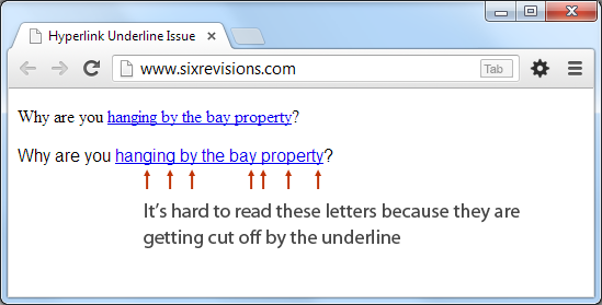
What’s the Solution to This Readability Issue?
We can fix this readability issue ourselves. We don’t have to wait for a change in the way web browsers render underlined text by default. How?
We can use the CSS border-bottom property instead of the CSS text-decoration property to underline our hyperlink elements. Using the border-bottom property can place the underline a few pixels below the affected characters, making the hyperlink easier to read. 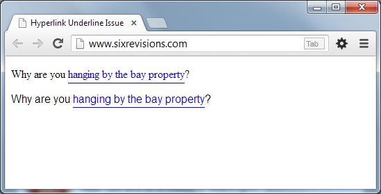 Here is the CSS used for the image above:
a { text-decoration: none; padding-bottom: 3px; border-bottom: 1px solid blue; }Even more powerful than just fixing a readability issue, we can also control the underline’s style independently from the hyperlink text color, thereby decoupling these two components of a hyperlink.
For example, we can reduce the hyperlink underline’s distinctiveness to make the text more legible, or we can make it more distinctive to make the entire hyperlink design really stand out. For the purpose of illustration, I changed the underline color just a little bit, making it a lighter shade of blue: 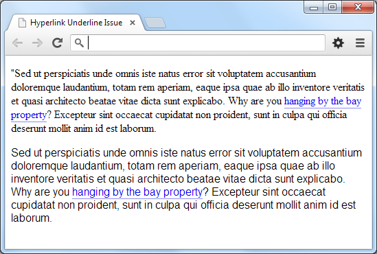 CSS:
CSS:
a { text-decoration: none; padding-bottom: 1px; border-bottom: 1px solid #8d8df3; }Make Hyperlink Text Longer
This next concept I’m going to discuss goes a bit into content strategy territory (which is a big part of web design process). Some of you might dislike this suggestion because it deals with the content creation process, and some of you might not have control over that part of the web development process.
The basis for this next tip I’m going to share is Fitts’s Law. 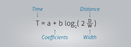 The concept of Fitts’s Law is simple. The law states that the larger something is, the easier it is to see and interact with. That makes sense, especially in the context of touchscreen devices where the size of your elements matter, where the input device (our fingers) is less precise than a mouse pointer.
Using a finger to click on a hyperlink can be a pain; often times you will have to zoom in for small links, adding an additional barrier towards users getting the action they desire (which is to interact with the hyperlink). 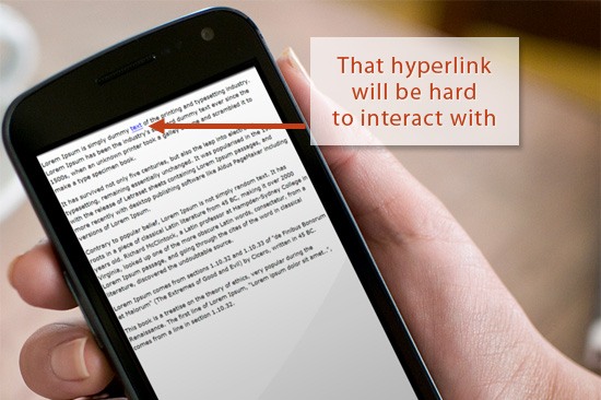 But there is only so much we can do with the style of our links. We can bold them, underline them, change their color.
How about making them bigger by changing their font size? If we change the <a> element’s font-size property, it affects the reading flow, and can affect the consistency of our line-heights. Look at how the continuity of the reading experience is disrupted by increasing the font size of hyperlinks: 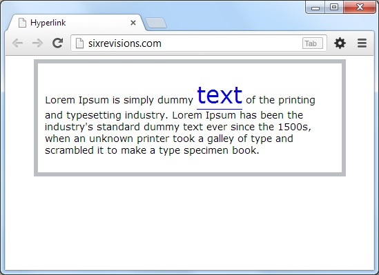 So we can’t expand them vertically.
We will need to expand them horizontally. 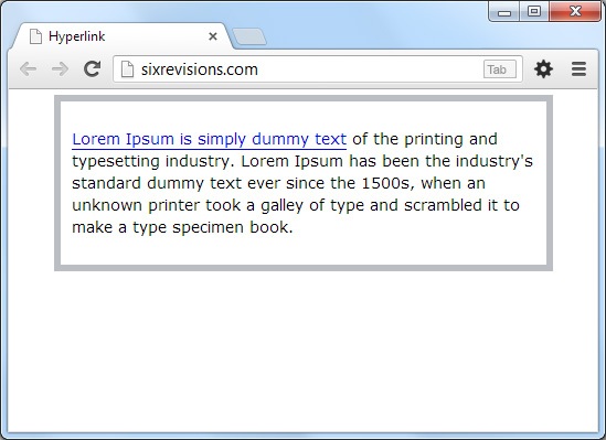
User-friendly SEO Benefits
Having longer anchor text is a user-friendly SEO tactic. That is, hyperlinks with longer link titles is better for users according to Fitts’s Law, but it also has the nice side benefit of being better for search engine rankings.
Anchor text should be descriptive and should tell the user and search engines what the page you are linking to is about, according to Google’s Search Engine Starter Guide. Say you were writing about walls. Compare the two ways a hyperlink is used in these sentences below:
“I would like to talk about advanced wall-building techniques.
Click here to learn how to build a basic wall because what I will talk about is beyond the basics.”
Versus:
“I would like to talk about advanced wall-building techniques. You will need to learn how to build a basic wall because what I will talk about is beyond the basics.”
Not only is the second version better for our user, but it is additionally better for search engines too because there is more context than the anchor text that just says “here”.
Should Hyperlinks be Blue?
According to a study by Google blue links got more clicks than greenish-blue links. The study I referenced earlier about underlined text readability likewise affirms that Web users immediately recognize links when they are blue and underlined.
However, in my opinion, not all hyperlinks absolutely need to be blue. The important thing about hyperlink design is that your links are obviously links. If you can achieve that with a different color other than the conventional blue color, go for it.
Microsoft Development Network (MSDN) supports this concept. The fundamental guideline about designing hyperlinks “is users must be able to recognize links by visual inspection alone—they shouldn’t have to hover over an object or click it to determine if it is a link,” according to their link design pattern guideline. They didn’t say anything about links needing to be blue.
There are some cases where blue-colored links aren’t the best option. For example, if the background color makes it hard to read blue links, then usability and readability triumphs over the standard blue link convention. 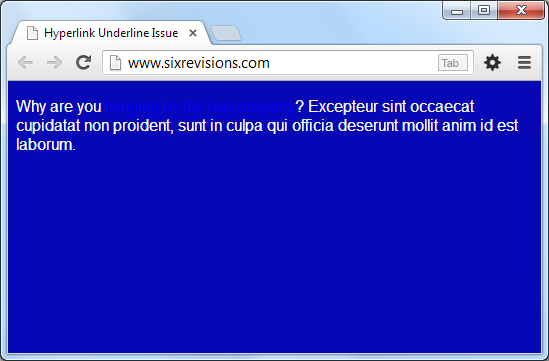 Always do what is best for the user, even if that means breaking conventions.
Summary
Here are the big ideas:
- Designing hyperlinks should be well-thought-out.
- Blurring and removing color from the design is a quick way of demonstrating how well your links stand out.
- Underlined text is a strong and familiar convention. The problem with underlining text, though, is that readability decreases. The solution is to use CSS to remedy the issue.
- Using longer descriptive anchor text can improve usability (Fitts’s Law), with the added benefit of being better for search engines.
- The one thing that is important in the design of hyperlinks is this: hyperlinks should obviously look like hyperlinks.
Related Content
- 5 Usability Mistakes You Shouldn’t Make
- Human Behavior Theories That Can be Applied to Web Design
- Making User Interface Elements Difficult to Use By Intent
-
 President of WebFX. Bill has over 25 years of experience in the Internet marketing industry specializing in SEO, UX, information architecture, marketing automation and more. William’s background in scientific computing and education from Shippensburg and MIT provided the foundation for RevenueCloudFX and other key research and development projects at WebFX.
 -

WebFX is a full-service marketing agency with 1,100+ client reviews and a 4.9-star rating on Clutch! Find out how our expert team and revenue-accelerating tech can drive results for you! Learn more
Make estimating web design costs easy
Website design costs can be tricky to nail down. Get an instant estimate for a custom web design with our free website design cost calculator!
Try Our Free Web Design Cost Calculator


Web Design Calculator
Use our free tool to get a free, instant quote in under 60 seconds.
View Web Design Calculator
Proven Marketing Strategies
Make estimating web design costs easy
Website design costs can be tricky to nail down. Get an instant estimate for a custom web design with our free website design cost calculator!
Try Our Free Web Design Cost Calculator
What to read next


