- Home
- Blog
- Web Design
- 5 Font Pairing Tips to Bring Out Your Inner Designer
5 Font Pairing Tips to Bring Out Your Inner Designer
-
 8 min. read
-
 Sam Wixted
 Content Writer
- Sam has been writing for WebFX since 2016 and focuses on UX, crafting amazing website experiences, and digital marketing In her free time, she likes to spend time on the beach, play with her cats, and go fishing with her husband.
Ah, font pairings — to a designer, the two-word phrase is exciting, but to an average Joe, probably not so much. What’s so important about font pairings anyway? Can’t you just pick two fonts for your website and call it a day?
Well, you could, but it may not be in your best interest. Choosing fonts that go well together help your page to flow nicely, have an aesthetically-pleasing look, and ensure that your website or graphic looks professional and readable. However, simply choosing any two fonts on a whim, or just because you like them each separately, doesn’t mean they work well together — and if they don’t work well together, your design may suffer.
In this blog, we’ll take a look at some of the best font compliments that work together to create a great design for your website, social media graphics, presentations, and more. And don’t forget, if you’re looking for a web designer to help you find the right font pairings for your website, WebFX is here to help. We offer web design services in Pittsburgh, web design help for clients in Minneapolis, and everywhere in between.
The importance of great font pairings
Why is it so important that the fonts in your design look great together?
Simple. When fonts don’t jive, it makes it difficult for viewers to easily read the content, and when they struggle to read the content, or feel overwhelmed due to competing fonts, they may not read it at all. Similar to color scheme, in order to keep users engaged with your design, choosing the correct complimentary fonts is a must.
Furthermore, it’s important to choose a font that allows your heading to stand out so that users know exactly what they’re reading. The heading is flexible in that you can go with a font that’s a little more off-the-wall than a font you would select for your body copy. On the other hand, your body copy should use a font that is easy for users to read, since it will be the bulk of your page.
When all is said and done, the heading, the subtitle, and the body copy should work together to create one cohesive design.
Understanding the different kinds of fonts
Before we talk about what font pairings work well together, let’s quickly talk about the different kinds of type. 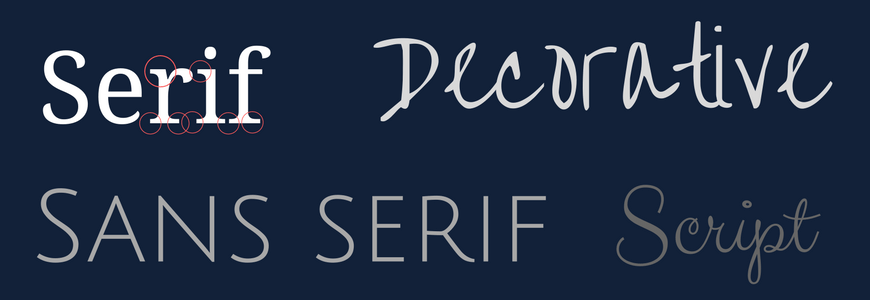
Serif
Serif fonts refer to type that has small feet at the end of each letter stroke. Sometimes the feet are also called embellishments.
Sans Serif
Sans serif translates to “without serif,” which means this type has no feet or embellishments at the end of each stroke.
Script
Script fonts are often thought of as a more fancy kind of font, and each letter links to the next.
Decorative
The most diverse group of fonts, this style is reserved for signage and headlines, but is rarely professional.
Tips for choosing aesthetically pleasing font pairings
Now that we’ve discussed the different kinds of fonts, let’s look at how they work together.
Here are some font tips to keep in mind when choosing fonts that will be close to each other on a page.
1. Think contrasting, not competing
You want the font styles you choose to contrast, but not compete with each other. For example, two decorative styles of type on the same page would compete with each other rather than contrast. Instead, you should choose one decorative or script font in addition to a serif font.
Another common complementary pairing is choosing a sans serif font and a serif font. One of the most important parts of choosing complementary, contrasting font pairs is to ensure that the two fonts aren’t too similar. Be sure to choose two fonts that differ enough that viewers can tell.
To ensure that your fonts really contrast each other, you can experiment with bold and italic options. This can also help to create what designers call a hierarchy. Font hierarchy is when the title is naturally larger than the subheading, and the subheading naturally larger than the body text.
These specs can also involve bold and italics to create a more pronounced hierarchy.
2. Find a big ole font family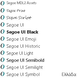
When you find a font family that you like, the hard work of hierarchy and pairing is essentially done for you. A “superfamily” as some designers call it, will include a serif font, a sans serif font, and bold and italic versions of each. This is helpful because you’ll know these fonts already work well together because they are a part of the same family.
All you have to do is choose how you want to arrange them in your design.
3. Don’t use more than 3 fonts in a design
Every font has a personality, and if you have too many competing for attention in a design, you’ll wind up with too many cooks in the kitchen. Limit yourself to two to three fonts — this saves your design from feeling overwhelming to the viewer and avoids creating a sense of chaos.
4. Consider kerning
The space between letters in a typed-out word is called kerning. To create a really awesome design, don’t be afraid to play with the kerning of certain fonts. Obviously, not all fonts will look great with spaces between the letters, but some will.
For example, since script letters are meant to connect to each other, and create a sense of fluidity, fonts in script families wouldn’t work well with kerning. However, an all-caps, sans serif font can look great with kerning. 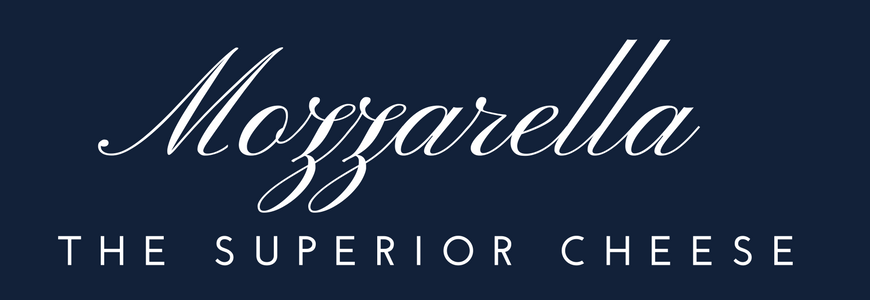 In this example, you can see that the word “mozzarella” is normally spaced in a script font, while “the superior cheese” is in a kerned, sans serif font.
5. Don’t use tired, overused fonts in your design
There’s nothing worse than seeing a design that uses a font that is worn out and overused. It can absolutely detract from your design, and even make you less trustworthy, since many of these fonts are less than professional. When there are so many professional-looking, designer fonts out there, why would you settle for one of these, anyway?
Some overused fonts to stay away from include Comic Sans, Impact, Arial, Bradley Hand, and Papyrus.
Professional font pairings for any design
Now that you know some pro tips about how to use fonts to create an aesthetically pleasing design, let’s take a look at some usable font pairings for any project.
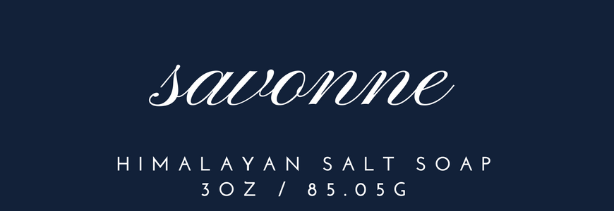
Pinyon Script and Josefin Sans
These two fonts work well together because of the fluidity of the script style font and the rigid simplicity of the sans serif font. The script commands the attention, while the sans serif compliments it nicely. This is also a great example of a kerned subtitle.
Playfair Display and Rosario
The combination of the heavy Playfair Display title font and the thin, simple subtitle font makes for a great paring that’s perfect for a headline/subtitle situation. Neither font detracts from the other, and they work together to get the point across. 
Pirou and Aleo
Here’s an example of a design that has two fonts, but one font is used in two different ways.
The playful Pirou allows “Gatsby” to stand out on the design, while Aleo’s simplicity compliments it nicely. To add a little more interest, this design offers a capitalized title, a capitalized subtitle, and a regular case body copy. With this hierarchy, users can tell what information is the most important, the second most important, and lastly, the details without even reading a word of the content.
For that reason, creating a hierarchy with your fonts is an even better way to accomplish an effective design. 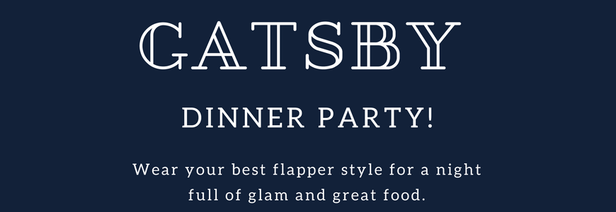
Do you need a web designer to help you choose the perfect font compliments?
If you’re looking for a full-service digital agency to help you get your font pairings right, WebFX can help. Not only do we offer web design, but we offer other affordable services like search engine optimization, pay-per-click advertising, social media marketing, and so much more.
Contact us today or give us a call at 888-601-5359!
-
 Sam has been writing for WebFX since 2016 and focuses on UX, crafting amazing website experiences, and digital marketing In her free time, she likes to spend time on the beach, play with her cats, and go fishing with her husband.
 -

WebFX is a full-service marketing agency with 1,100+ client reviews and a 4.9-star rating on Clutch! Find out how our expert team and revenue-accelerating tech can drive results for you! Learn more
Make estimating web design costs easy
Website design costs can be tricky to nail down. Get an instant estimate for a custom web design with our free website design cost calculator!
Try Our Free Web Design Cost Calculator


Web Design Calculator
Use our free tool to get a free, instant quote in under 60 seconds.
View Web Design Calculator
Proven Marketing Strategies
Make estimating web design costs easy
Website design costs can be tricky to nail down. Get an instant estimate for a custom web design with our free website design cost calculator!
Try Our Free Web Design Cost Calculator
What to read next


