
“Many people find Linux to be an afterthought as far as target audience is concerned, but Linux is exponentially increasing in popularity as an alternative to other operating systems. … Web design should be bulletproof and your choice of type should be no different.” — Jonathan Christopher
Linux Users and Web Design
One area in which few Linux users see any representation is Web typography. In 2003, Linux user and software developer Jeremy Zawodny howled about the dearth of decent fonts for Linux.
At the time, he was right. But that situation has since changed, even though many Web designers still believe fonts designed for (and included with) various Linux flavors are all just icky. That’s not true any longer either.
But the perception remains. As with so many other aspects of Web design, Linux users are expected to tag along behind the Windows and Mac crowd, doing the best they can with the fonts they have. What fonts Linux users (in all their diversity) have depends on a lot of factors, including their particular flavor of operating system, desktop environment, their own interest in expanding their font collections, and so forth.
Most non-designer Linux users tend to have a somewhat motley group of fonts at their disposal. It’s time to let Linux users, in all their variegated versatility, be fairly represented in your font stacks. They might not outdo Windows and Mac users in numbers, but they tend to be more active — and certainly more vocal — than the average Web user.
You can make an outsized impact among the small but highly engaged community of Linux users making use of your designs, and you can do it without disturbing the typographic sensibilities of your Windows and Mac users.
Short Shrift: The Microsoft Core Fonts
“When I was starting out in Web design,” the old codger grumbles around his plug of chewing tobacco, “all we had was those Microsoft core fonts. Eleven dingy little fonts, and we could only use about seven of ’em.
It’s all we had, and we was grateful to have ’em! Seven fonts, designing with ’em every day! In the snow!
Coding uphill! Both ways! Hand me my spitty cup, and quit yer whining!” Times have moved on, Gramps, and we shouldn’t have to be restricted to using Microsoft’s all-too-familiar fonts to view the Internet in all its fractured glory.
When Web designers consider their Linux users’ needs at all, they commonly assume that Linux users have access to the same core fonts that Windows users have, and that a font stack designed for Windows users covers their Linux users, also. This is not the case. A good number of Linux users either had the core fonts package (msttcorefonts) included with their particular setup, or downloaded and installed it themselves.
But many did not. Let’s take a look at the typographical lens we’ve been viewing the web with:
- Sans-serif fonts: Arial Black, Arial, Comic Sans MS, Trebuchet MS, and Verdana
- Serif fonts: Georgia and Times New Roman
- Monospace fonts: Andale Mono and Courier New
- Fantasy fonts: Impact and Webdings
As the old guy says, only about seven of these are routinely used in Web designs. Thus, for your sans-serif text, you have the compelling choice of Arial, Verdana, or — if you’re feeling rowdy — Trebuchet MS. For your serif text, you have the Web-ready Georgia and its old school, print-sourced buddy, Times New Roman.
You have two choices for your monospace text. And you might choose Impact or Arial Black for the occasional header. Is it any wonder so many sites look so much alike?
These “core fonts” are a large reason behind that. No one’s criticizing Microsoft for providing them for our use — we appreciate it. But, especially for Linux users, that can’t be the only set of options.
The “core fonts” provide a very basic font foundation that will serve most users for most sites — more or less. But Linux users expect and deserve more than the short shrift provided by these core fonts — which were never designed for their systems in the first place, and which many hard-core Linux users refuse to use (though according to a 2007 survey, 74% of Ubuntu users have the core fonts package installed, for what that’s worth). Another reason why many Linux users shy away from the Microsoft fonts: Almost by definition, Linux users have to be more computer-savvy and (usually) more Web-savvy than the average grunt who wants his computer up and running ten seconds after slicing through the packing tape.
Many Linux users are aware there are a good number of different (and free!) fonts for their operating systems out there, and they’re savvy enough to download them and install them. As you can imagine, it has to be quite frustrating for them to have the spiffy, Linux-centered fonts and have only a very few Web sites make use of them. We can change that.
The Linux Fonts
Let’s first take a look at some of the more common Linux fonts available to Linux and other users. In most — not all — cases, these fonts work perfectly well on Windows and Mac machines as well. The wonderful pedants at CodeStyle give us a monthly survey of what fonts Linux users have on their machines.
(The surveys exist for Windows and Mac users, too.) The number of survey participants isn’t as large as I would like, but we’ll take what we can get. As of the July 2010 results, the five most common fonts on Linux machines are, I bet, not prominently featured in your designs. Coming in at #1 is Century Schoolbook L, an old-school print serif that is found on almost 98% of Linux machines.
If you’re coding with any of the top five fonts, chances are it’s this one, or a variant thereof. The Century fonts tend to be strong and quite readable, if not completely Web-friendly and a bit fusty in their appearance to some eyes. About half of Windows users have this font, and somewhat less than a third of Mac users have it as well.
Considering its market penetration, it isn’t the first choice for many designers. Second on the list is URW Chancery L. It’s a decorative calligraphic font found on very few Windows or Mac machines, but on almost 98% of Linux computers.
It’s very similar to an Adobe PostScript font called Zapf Chancery, to Apple Chancery, and (less accurately) to the MS Office font Monotype Corsiva. Third up is another font from the URW font foundry, URW Gothic L, owned by almost 98% of Linux users. It’s a very clean serif font similar to the old Futura font.
Very few Windows or Mac users have this font. It’s similar to the Adobe PostScript font called Avantgarde. Fourth is yet another URW production, URW Bookman L.
Very close to the Adobe PostScript font Bookman, it’s a clean serif font. Windows users have Bookman Old Style, a close approximation; some Mac users have either the Adobe or Windows version. The first “Linux” font on this list is fifth-place entrant, Nimbus Mono L, a monospace font with around 97% penetration of Linux machines, very similar in appearance to Andale Mono.
Very few Windows or Mac users have this font. You have to go down the Linux list to #19 to find a font, Lucida Bright, that many Linux users have (under the font name “Lucidabright”) and that other operating systems have as well. That font has roughly the same market penetration on Mac computers (75%); less than half of Windows users own it.
After scrolling past a few more members of the Lucida family, you pore on down the list until you find the “ubiquitous” Arial, at 68%. The common wisdom that “everyone has Arial” doesn’t hold for Linux users. Note: Visibone runs a different survey for a similar purpose, and often gets significantly different numbers.
So what does all of this mean? Well, in short, the Linux folks have a fundamentally different set of fonts than either Mac or Windows users. Common font wisdom as it pertains to the other two operating systems has to be jettisoned entirely for Linux users.
To me, that’s unacceptable.
How Many Fonts Make Up a Plethora?
![]() Wikipedia image featuring the Linux Libertine serif. With all of that in mind, let’s look at a list of some of the major fonts being made available to Linux users — and, as noted above, to Windows and Mac users if they would download and install them. Linux users may not have a plethora of fonts per se, but they do have an ample number of lovely and quite usable fonts.
Wikipedia image featuring the Linux Libertine serif. With all of that in mind, let’s look at a list of some of the major fonts being made available to Linux users — and, as noted above, to Windows and Mac users if they would download and install them. Linux users may not have a plethora of fonts per se, but they do have an ample number of lovely and quite usable fonts.
With very few exceptions, all of them are licensed free for public use, so as long as you don’t sell them, you can use them pretty much as you like — @font-face enthusiasts, font embedders and Cúfon users, rejoice! Some of them are open source, which means if you’re up to the challenge, you might like to try and tweak them to make them even more usable. Remember, different Linux fonts come with different flavors of Linux.
If you’re going to include one Linux font in your font stack, you should include two or three more to make sure you hit all the (main) bases.
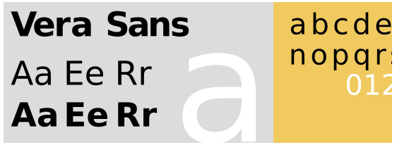
1. Bitstream Vera Fonts
 The Vera family was designed by the font foundry, Bitstream, and released primarily for use with the Gnome desktop environment. It is a TrueType family of fonts released free for public use. Its drawbacks include a relative lack of hinting and a relatively modest glyph base, having only common alphanumerical characters and some diacritics.
It is usually distributed with Oracle’s OpenOffice office suite, though recent versions now feature the nearly identical DejaVu fonts. In recent years, the DejaVu fonts have overtaken the Veras in popularity, largely because of the larger DejaVu glyph base (and because, oddly, the Veras lack italic versions). Development for the Vera fonts is essentially dormant, though it’s worth noting that Arev Fonts has added a significant number of glyphs to the Vera base.
Code maven Cody Boisclair writes that the Vera Sans font reminds him of a cross between Frutiger and Verdana. He’s particularly fond of the Vera Sans Mono font for his coding, while others warn that the Mono font doesn’t always render well in Windows. To my eye, the Vera and DejaVu serif fonts are a good bit larger and heavier than typical serif fonts, particularly the narrower fonts such as Times New Roman, and almost qualify as slab serifs.
2. DejaVu Fonts
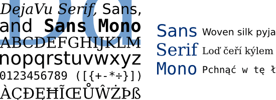 Like their older siblings, the Bitstream Vera fonts, the DejaVu fonts are free for public use. They are almost identical to the Bitstream Veras, but they have the advantage of having a significantly larger glyph base — more Unicode characters, fully covering the Latin, Greek, Cyrillic, and Georgian languages, and partially covering others such as Hebrew and Lao; work continues on covering more languages. The DejaVu fonts are also more completely hinted than the Bitstream Veras.
They come in three varieties: Sans, Serif, and Mono; all three have numerous variants, including bold, oblique, condensed, and so forth, though only the Serif font has italic varieties. The DejaVu Fonts wiki offers an enormous number of PDF examples of the various fonts. Several varieties of GNU/Linux, such as Red Hat Fedora, Ubuntu, OpenSUSE, and Mandriva Linux, come with DejaVu fonts, and OpenOffice now includes DejaVu fonts as well, with Fedora making DejaVu its default fonts.
As noted above with the Vera serifs, I consider the DejaVu serif almost a “slab serif” because of its size and weight in comparison to other, common serifs.
3. GNU Free Fonts
 Also known as “Free UCS Outline Fonts”: The GNU Free Font project contains the usual suspects: FreeSans, FreeSerif, and FreeMono. All three have relatively large glyph bases, so unless you’re writing your pages in Tagalog, the Free fonts can take care of you. The last release of anything done with the Free fonts was in January 2009; I’m not sure what, if anything, is being done to update and tweak them.
The Free fonts are very close in appearance to the Nimbus fonts (more on this later). The primary between them seem to be in licensing, with the Free fonts being, well, free to use for whatever purpose suits you, and in hinting (the Free fonts lack pretty much all hinting, which means you should test them thoroughly to see how they look for you). Many of the font variants come from the URW++ Ghostscript program.
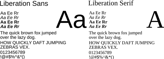
4. Liberation Fonts
 Originally distributed by Red Hat in 2007, there are three flavors:
- Liberation Sans, which emulates Arial, Helvetica, Nimbus Sans L, and to a lesser extent Bitstream Vera Sans/DejaVu Sans
- Liberation Serif, which emulates Times New Roman, Nimbus Roman, and to a lesser extent Bitstream Vera Serif/DejaVu Serif
- Liberation Mono, which emulates Courier New, Nimbus Mono L, and the Bitstream Vera/DejaVu monospace fonts
The Liberation fonts are licensed under the GPL+font exception, which means that you can use them pretty much how you like, in any document on any desktop operating system, without having your document fall under the GPL or other licensing requirements. In 2004, after clashing with Microsoft over the use of their core fonts, Red Hat contracted with Agfa Monotype to provide three alternates for the three core fonts: Albany, Cumberland, and Thorndale. Fun fact: notice that the first initials of these fonts are identical to Arial, Courier New, and Times New Roman.
The fonts were neither open-source nor were they free, and Red Hat didn’t like that situation. The Liberation series fonts, designed by the Ascender font foundry for Red Hat, are the result of the Red Hat initiative. The Liberation fonts are not identical clones of the three Windows core fonts (though they do work nicely in the font stacks with the three Windows fonts), and unlike the core fonts, they are designed to work together in a single design schema.
Ascender vice president Steve Kuhlman says the company spent “hundreds of thousands of dollars” designing the fonts. As of version 1.04, they are fully hinted. OpenSUSE, Debian, and Fedora, among other Linux variants, include the Liberation fonts in their software.
Web designer Leigh Beadon calls the fonts “a perfect tool for Web design,” praises them for their rigid metrics, and notes, “[T]hey are new and different and they expand our options…”
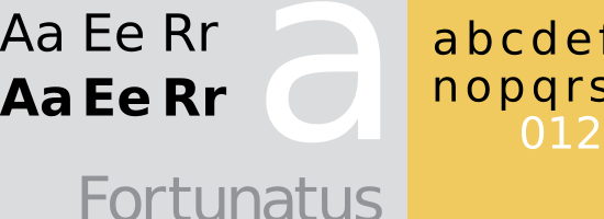
5. Linux Libertine and Biolinum Fonts
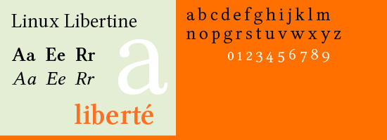 Developed as an open-source collaborative project, the Libertine serif has won some notice after being chosen for the Wikipedia logo (for which the foundry designed the emblematic “crossed W”). Currently, the font family only comes in Libertine Serif, which like most all alternative serifs is designed to emulate Times New Roman. Libertine has a glyph base of over 2000 characters, meaning that it has its own Western, Greek, Cyrillic, IPA, and special characters along with the usual letter/number inclusions.
It comes with italic, bold, bold italic, and small-caps varieties. A sans-serif font called Linux Biolinum is in development, but isn’t touted as suitable for large blocks of text; think Trebuchet MS instead of, say, Verdana — though the font is less decorative. A monospace font called Linux Biolinum Keyboard is also in development.
Although the perception seems to be that the overall font family is called “Libertine,” it appears that the designers intend for “Libertine,” “Biolinum,” and “Biolinum Keyboard” to be the designations for the individual fonts. Libertine is designed as a general-purpose print font, as opposed to Times and Times New Roman; font designer Philipp Poll says both the older fonts have limitations that his Libertine does not have. Poll recommends Libertine primarily for print work, and says other Linux fonts such as Deja Vu Serif work better for screen displays.
Bold and small-caps varieties are available, and, Poll says, a sans-serif version of Libertine is in the works.
6. Luxi Fonts
 The Luxi family of True Type fonts (formerly known as the Lucidux font family) was originally designed for the X Window System. They are similar to the Lucida family of fonts, not surprising since Lucida designers Kris Holmes and Charles Bigelow also gave us the Luxi family. If you’ve ever used Red Hat’s Bluecurve theme, you had the Luxi fonts as your default.
Unlike many fonts used in Linux distros, Luxi fonts are free to use but not to modify. As a result, they were removed from Fedora and Debian distributions (though Fedora users can get it back). They are also available through OpenOffice’s FontOOo wizard.
The fonts come in the usual Sans, Serif, and Mono flavors, each with four types: regular, bold, oblique (the opposite of italic), and bold oblique. Some users find the Luxi fonts questionable because of their lack of hinting.
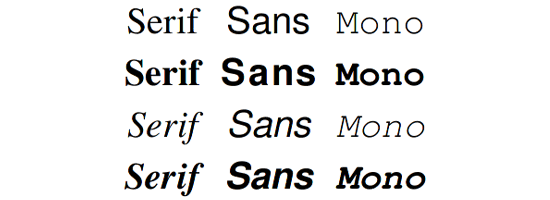
7. Nimbus Fonts
 The Nimbus family of fonts originates with the German font foundry URW++. The family has a huge variety of entrants, but Linux users usually only get the freebies:
- Nimbus Sans L, which emulates Helvetica and Arial
- Nimbus Roman No9 L, which emulates Times and Times New Roman very closely
- Nimbus Mono, which emulates Courier and Courier New fairly closely
Nimbus fonts are available in the OpenOffice software package. URW++ is releasing (commercially, not for free distribution) “Nimbus Global” versions, that have larger glyph bases designed to support languages, such as Arabic, Hebrew, and Korean Hangual, that don’t rely on Latin characters. The Nimbus family of fonts appears in many Linux distros, and was included in some older packaged versions of OpenOffice before being supplanted by the Liberation family.
8. Gentium
 This font is a rather stylized serif font produced by SIL International (formerly the Summer Institute of Language), a US-based nonprofit organization that, among other activities, produces a wide variety of fonts designed to support multiple languages. Gentium’s biggest claim to usefulness, besides its unique decorative appearance, is its large glyph base, supporting Latin, Greek, and Cyrillic alphabets. There are three varieties of Gentium: Regular, Basic and the slightly heavier Book, which only supports Latin glyphs as yet.
All three come in bold, italic, and bold italic varieties, and all are released under the SIL Open Font License. Gentium is still waiting to catch on among Linux (and other) users. Linux maven Bruce Byfield called the font “a mixture of the practical and aesthetically pleasing.”
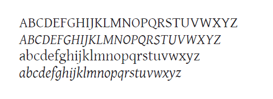
9. Charis
 Another SIL International production, Charis is a stylized serif True Type font designed to approximate the appearance of Bitstream Charter, a font found on most Linux machines but not on many Windows or Mac computers. Mac and Windows users are more familiar with fonts such as the Palatino variants, Book Antiqua, and even the Garamonds. It’s also very similar to the older, apparently obsolete Doulos SIL font, which is even more obscure.
It comes in the usual variants of bold, italic, and bold italic.
Using Linux Fonts in Web Design
Now we come to it. How do you integrate all these nifty, if somewhat unfamiliar, fonts into your CSS font stacks, focused as those stacks are on Windows and Mac users?
First, realize what fonts the Linux crowd doesn’t have that Windows or Mac users will:
- Sans-serif fonts: Charcoal, Helvetica, Geneva, Lucida Grande, Lucida Sans Unicode, MS Sans Serif, and Tahoma
- Serif fonts: Book Antiqua, New York, and Times
- Monospace font: Lucida Console
- Fantasy fonts: Symbol, Wingdings, and Zapf Dingbats
Some of these are no real loss to Web designers or Web users: MS Sans Serif and MS Serif, for example, are old bitmapped fonts that few Web designers use any more; and the fantasy fonts are of little use except in very specialized circumstances. Others, however, are tough losses for Linux users, particularly the more ornate Palatino/Book Antiqua serifs, the ubiquitous Helvetica, and the utilitarian Geneva. Okay, what does the “average” Linux user have that we can use?
Bearing in mind that different Linux systems come with somewhat different font libraries, we can draw some very rough parallels. Remember, these fonts are not identical alternatives by any stretch. The following are suggested Linux fonts along with the percentage of Linux users that have them installed.
If you’re using a font stack based on a narrow sans-serif such as Helvetica/Arial, Tahoma, or Charcoal, you can use:
- Nimbus Sans L (94%)
- Liberation Sans (72%)
- FreeSans (73%)
If you’re designing with a wider sans-serif such as Verdana or Geneva, you can use:
- Deja Vu Sans (91%)
- Bitstream Vera Sans (80%)
If you’re designing for a narrow serif such as Times New Roman, you can use:
- Nimbus Roman No 9 L (94%)
- FreeSerif (74%)
- Liberation Serif (72%)
If you’re designing around a wider serif such as Georgia, you can use:
- Bitstream Charter (91%)
- Century Schoolbook L (98%)
- DejaVu Serif (86%)
- Bitstream Vera Serif (73%)
If you’re designing for a more old-fashioned serif font such as Garamond, Book Antiqua, Palatino Linotype, or Palatino, you might try:
- URW Palladio L (96%)
- Bitstream Charter (91%)
- FreeSerif (74%)
If you’re designing for a monospace font such as Andale Mono, Courier, or Courier New, you can use (note that the Bitstream/DejaVu fonts are significantly larger than their Courier/Courier New and Andale Mono cousins):
- Nimbus Mono L (97%)
- DejaVu Mono (94%)
- Bitstream Sans Mono (81%)
- Free Mono (74%)
- Liberation Mono (73%)
Tip: It’s better to use all of the Linux fonts rather than just picking one from the pile, because of the variances among Linux distributions.
Sample CSS Font Stacks Using Linux Fonts
Playing on my firm belief that life is easier when others do some of the heavy lifting, here are some very basic font stacks using Linux fonts and their (relatively) comparable Mac and Windows counterparts. The general rule of usage here is: Linux fonts first, then the closet Mac equivalent(s), then the Windows equivalent(s), and finally the generic fallback value (i.e.
serif or sans-serif). All you need to do is copy, paste, and adapt to your needs. Please recall that because so many different Linux distros exist, with so many different fonts included with them, to cover our Linux bases fairly completely, we have to use several Linux fonts in our stacks.
Narrow Sans-Serif
font-family: "Liberation Sans", "Nimbus Sans L", "FreeSans", "Helvetica Neue", Helvetica, Arial, sans-serif;
Wide Sans-Serif
font-family: "DejaVu Sans", "Bitstream Vera Sans", Geneva, Verdana, sans-serif;
Narrow Serif
font-family: "Liberation Serif", "Nimbus Roman No 9 L", "FreeSerif", "Hoefler Text", Times, "Times New Roman", serif;
“Antique” Serif
font-family: "Bitstream Charter", "URW Palladio L", Palatino, "Palatino Linotype", "Book Antiqua", serif;
Wide Serif
font-family: "DejaVu Serif", "Bitstream Vera Serif", "Century Schoolbook L", "Lucida Bright", Georgia, serif;
Monospace
font-family: "Liberation Mono", "Nimbus Mono L", "FreeMono", "DejaVu Mono", "Bitstream Vera Mono", "Lucida Console", "Andale Mono", "Courier New", monospace;
Some of the ordering in these stacks is strictly personal preference. For example, I like the Liberation fonts, so I put them first whenever possible. You certainly don’t have to accept my preferences, though I would suggest that you place the DejaVu fonts in front of the Bitstream Veras.
It should go without saying that these fonts are not identical replacements for one another. Your size, width, letter heights, kerning, and other typographical elements will vary. Test your font stacks in as many different systems and machines as possible.
Since virtually all of the Linux fonts are free to use and distribute, there’s no problem in keeping the fonts on a flash drive and installing them on all of your test machines as you go. And of course you are free to add and subtract fonts to suit your fancy.
Wrapping Up
According to survey results from May 2010 as reported by NetMarketShare, the percentage of Linux users among all computer users hovers a smidge over 1%.
A W3Schools analysis drawn from their logs puts the figure higher, at around 4.5%. The NetMarketShare tends towards the mass user profile, while the W3Schools survey is likely slanted towards a more technologically proficient user profile. In contrast, the two survey put the percentage of Mac users between 5% and 7%.
Your mileage will, of course, vary; you should check your site stats to see what the numbers for your site look like. It wasn’t that many years ago that designers routinely questioned the need to design for Mac users. Some even went so far as to question the need for testing their designs in any other browser besides Internet Explorer.
The majority rules after all, right? Well, we know better now. Designers always include the needs of their Mac users in their work, and routinely test in Safari along with the usual Windows-specific and cross-system browsers.
And they provide Mac fonts along with the Windows-specific and “universal” fonts in their font stacks. It’s time to extend the same consideration to Linux users. Savvy Web designers are already beginning to test their designs in Linux browsers such as Konqueror and Epiphany (at least in Browsershots if they don’t have access to a Linux machine) along with the other browsers that are part of their testing regimen.
There is no reason that I can see not to do the same with Linux fonts in your font stacks. Since very few Windows and Mac users have the Linux fonts, the vast majority of your Windows and Mac site visitors will see your design in the same fonts they would have before you made your site’s typography Linux-friendly. To my mind, that qualifies as an example of the overused term “win-win.” Linux users might make up a small part of your user base, but they’re technologically savvy, engaged, and often quite vocal.
You’ll win some well-earned appreciation and support by serving your Linux users’ needs in allowing them to see your site in “their” fonts. Besides, it’s the right thing to do.
Things Left Unsaid
One of the biggest issues not discussed in this article is anti-aliasing.
That’s because many of the more popular distros such as Fedora have anti-aliasing enabled by default (though apparently it is not enabled properly by default in Ubuntu).
Related Content
-
 President of WebFX. Bill has over 25 years of experience in the Internet marketing industry specializing in SEO, UX, information architecture, marketing automation and more. William’s background in scientific computing and education from Shippensburg and MIT provided the foundation for RevenueCloudFX and other key research and development projects at WebFX.
 -

WebFX is a full-service marketing agency with 1,100+ client reviews and a 4.9-star rating on Clutch! Find out how our expert team and revenue-accelerating tech can drive results for you! Learn more
Make estimating web design costs easy
Website design costs can be tricky to nail down. Get an instant estimate for a custom web design with our free website design cost calculator!
Try Our Free Web Design Cost Calculator
Share this article


Web Design Calculator
Use our free tool to get a free, instant quote in under 60 seconds.
View Web Design Calculator
Make estimating web design costs easy
Website design costs can be tricky to nail down. Get an instant estimate for a custom web design with our free website design cost calculator!
Try Our Free Web Design Cost Calculator