- Home
- Blog
- Web Design
- 13 Ways To Improve Conversion Rates on Your Site
13 Ways To Improve Conversion Rates on Your Site
-
 Published: Jul 18, 2023
-
 8 min. read
-
 Trevin Shirey
 VP of Marketing
- Trevin serves as the VP of Marketing at WebFX. He has worked on over 450 marketing campaigns and has been building websites for over 25 years. His work has been featured by Search Engine Land, USA Today, Fast Company and Inc.
Your conversion rate directly affects your bottom line. If your company wants to get the most out of your website, you must optimize it and encourage customers to convert naturally. That’s where conversion rate optimization (CRO) can come in handy.
This page will cover 13 different ways you can improve conversion rates and get more revenue from your customers:
- Use strong call-to-actions (CTAs)
- Show more product/service images
- Remove visual clutter
- Fix navigation
- Highlight social proof
- Test different website versions
- Use retargeting strategies
- Write informative content
- Create short intake forms
- Optimize for mobile
- Outline your value proposition
- Track your customer journey
- Invest in your relationships
Let’s dive into each one below to see how to boost conversions!
Want to learn how to increase conversion rates from the experts? WebFX can help. Contact us online to learn about our conversion rate optimization (CRO) services and how we can earn more revenue for your business!
*This post has been updated by the WebFX team since its original publishing.
Join 200K smart marketers for the hottest marketing news and insights in your inbox. “*” indicates required fieldsDon’t miss our Marketing Manager Insider emails!
Inline Subscription Form


1. Use strong CTAs
Let’s say a user finds your blog post, reads it, and wants to learn more about your business. But you have no clear contact information, and they aren’t sure what the next move is. That’s where a CTA comes in!
A CTA tells your users the next step to take after viewing a page on your site, opening an email, or reading any of your content. CTAs should be short, direct, and easy to follow, so the user knows what you want them to do next.
You can use anchor text for your CTAs or include buttons on your page:

Some popular CTAs include:
- Sign up for our email newsletter
- Purchase our product online
- Request a free quote
- Contact us online
2. Show more product/service images
Having plenty of images on your site is a great way to show people what your business does. If they want to learn about a product, they likely want to see it themselves. They will be less likely to convert if they don’t know what they’re buying.
Make sure you have images that meet the following criteria:
- Clear images
- Pictures from multiple angles
- Blank backgrounds with the product in the foreground
3. Remove visual clutter
While adding images, videos, and graphics is important for good web design, white space is also essential. Too much information can overwhelm people and cause them to bounce, costing you a sale or conversion.
This example from Coke shows how white space can have an impact on colors and visuals:
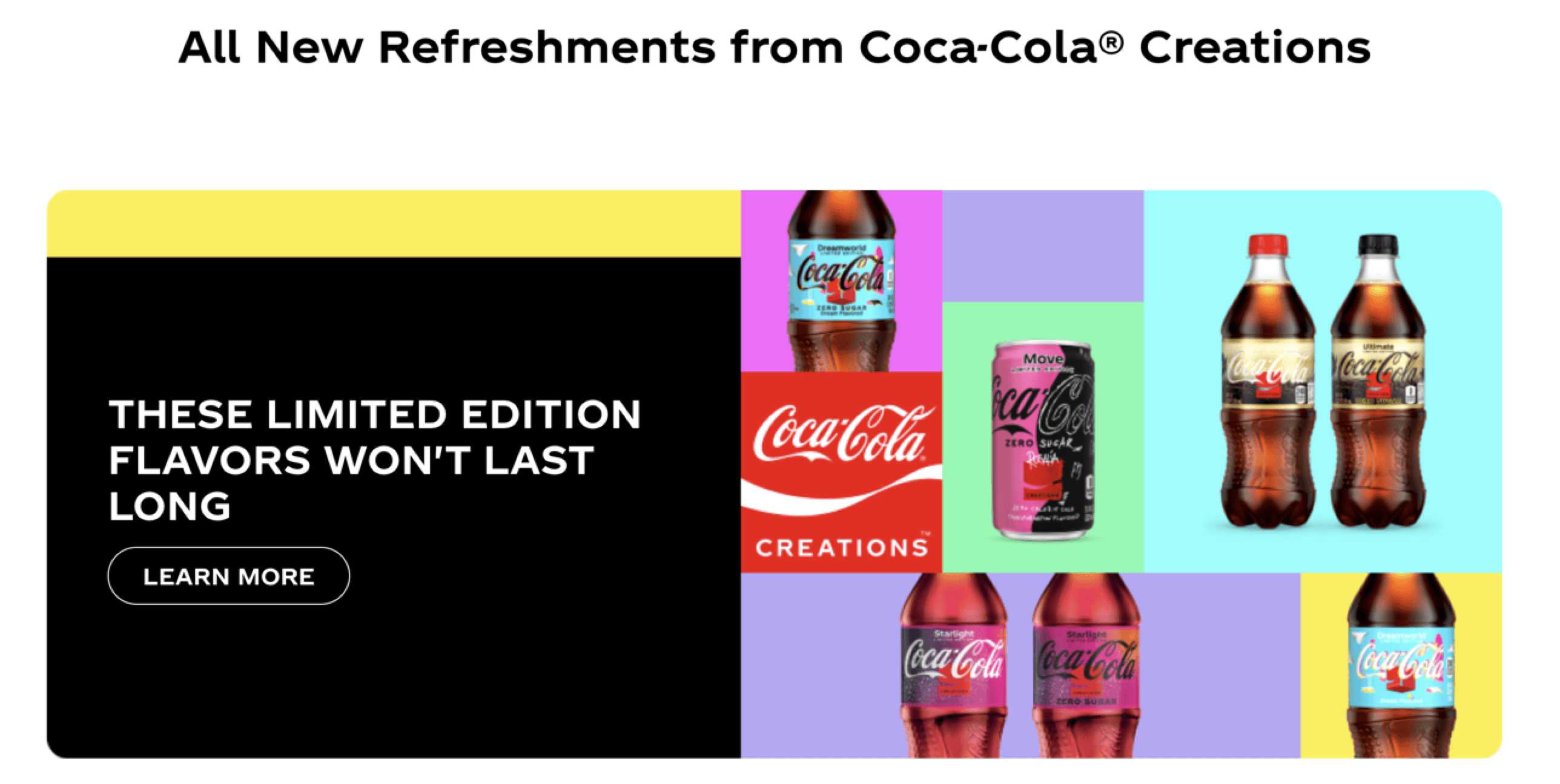
Be sure there is plenty of space around your images and text, and don’t crowd pages with items that don’t perform a task. Be intentional with your design and only add items that serve the user.
4. Optimize your navigation
Making your site easy to navigate will help users find what they need. Most websites stick to a navigation bar at the top of the page, like so:

You can also opt for a sidebar with all the pages/categories on your site. Pay attention to your internal linking, too — sending your users from one page to the next can help move them through the sales funnel. In contrast, it could push them away from your site.
5. Highlight social proof
Why tell your clients you know what you’re doing when you can show them? Testimonials, reviews, and case studies all build your credibility and encourage people to convert. Plus, it never hurts to hear how your customers have enjoyed working with your business.
You can ask your loyal customers to leave a review or submit their opinions in exchange for a discount.
6. Test different website versions
You need to know what users want to see on your site to boost conversions. A/B testing lets you see what versions of your website your customers like to see best.
The A/B method involves creating two page versions and seeing which performs better. You can test it with your audience to ensure you are doing everything possible to convert users.
This video breaks down A/B testing in more detail:
7. Use retargeting strategies
Retargeting is the process of reaching out to users based on their previous experience with your business. This method specifically targets people who visited your website before but have yet to convert.
You can use ads or emails to reach customers who put items in their cart or interact in another way:
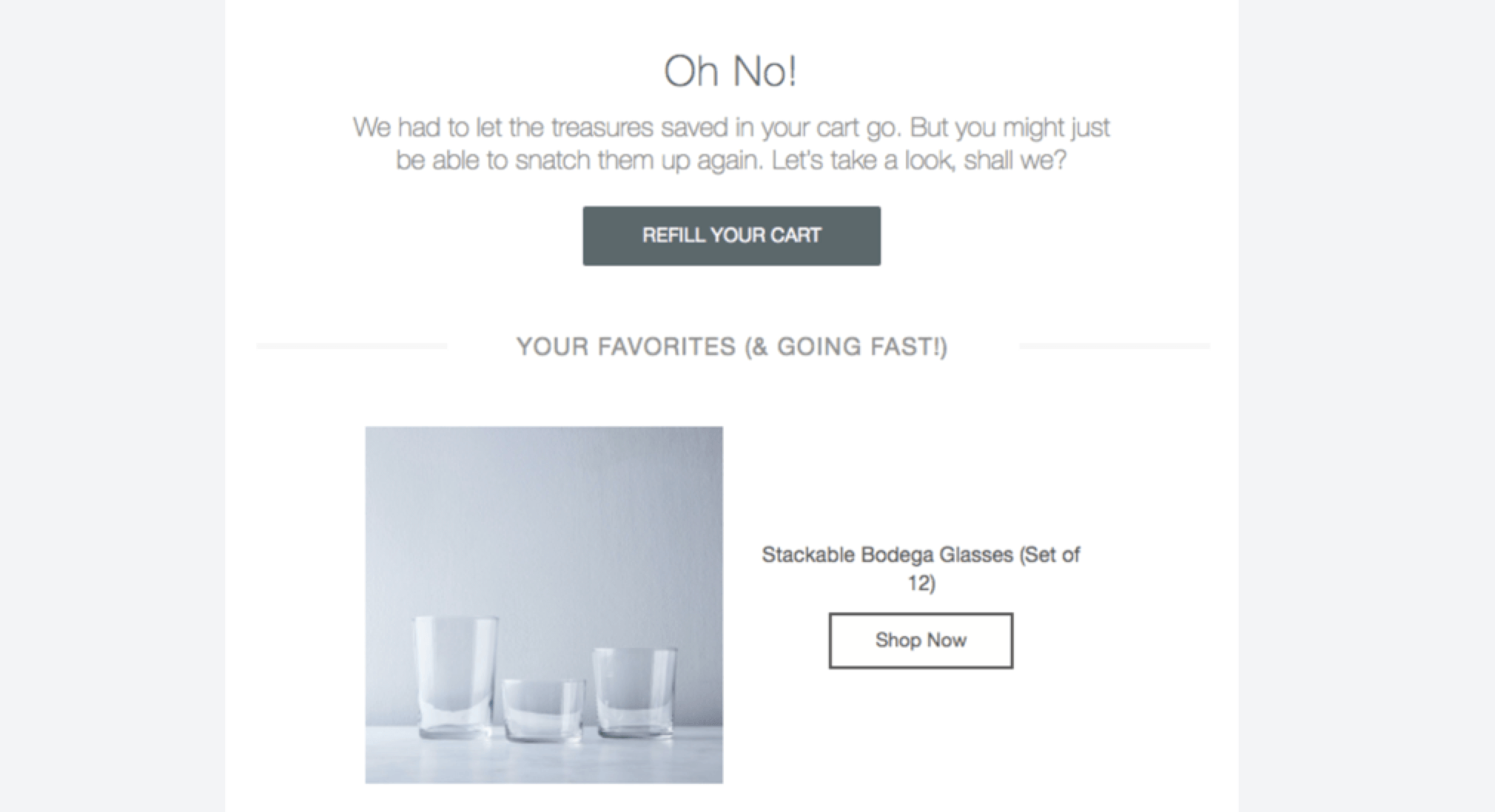
Reaching out to customers reminds them of their almost purchases and keeps your business fresh in their minds as they continue shopping or looking for services.
8. Write informative content
Content can include everything from product descriptions and service highlights to blog and social media posts. If you want to improve user experience and give them a reason to work with you, your content should include strictly informative pieces.
You can write:
- Industry topic pieces
- How-to guides
- Product reviews and recommendations
All these pieces aren’t directly pushing users to convert, but they show that you care about their experience and your position in the market. You become a thought leader, and they will be more excited to work with you.
9. Create short intake forms
If part of converting with your business is signing up for emails, you likely have an intake form. However, you can easily make these forms too long, discouraging people from filling them out.
Your intake forms should be short, sweet, and easy to use. Limit the information you ask for to what’s necessary for your business, like an email or a name:
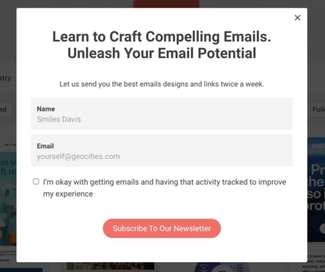
This style of intake form will encourage people to stop and fill it out without interrupting their search.
10. Optimize for mobile
More than 40% of online transactions happen on a mobile device. If your website isn’t optimized for mobile, you could miss out on sales left and right.
Employing a responsive web design can help you get the most conversions possible. Responsive design adjusts your website to match the device accessing it. So, the user will access the same website, but it will match their tablet, phone, or computer.
11. Outline your value proposition
Your value proposition is a statement that describes the benefits (or value) that you deliver to customers who work with your business. A clear description of what you intend to deliver will help you resonate with customers and humanize your brand.
For example, if you own a manufacturing company, your value proposition could be: “We help our customers bring their designs to life with quality materials and dedicated customer service.” This statement explains what you do while also outlining your benefits.
12. Track your customer journey
Your customer journey explains the path customers take, from when they find your business to when they convert.
Some businesses might get most of their conversions from social media, while others might use organic search. Knowing where your customers come from can help you intercept and encourage them to convert.
Using tools like Google Analytics can help you track your customer journey and see what stages they typically move through before purchasing:
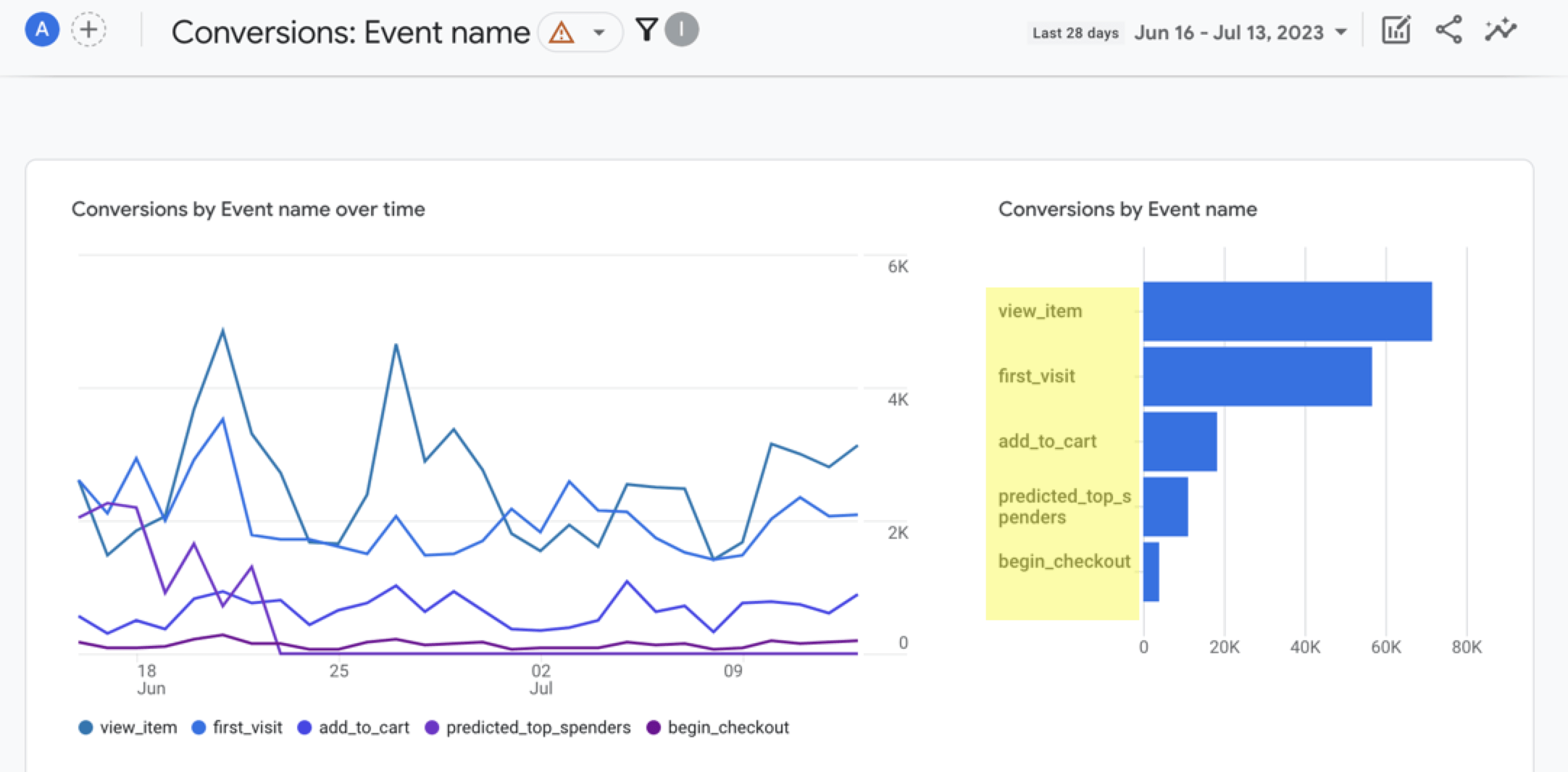
With this tool, you can manually enter the events that you know users take to convert.
13. Invest in your relationships
Above all, building your relationships with existing clients can make it easier to have repeat purchases and new leads. Quality customer service, timely responses, and efficient processes encourage people to work with you and speak positively of your business.
The more you invest in your relationships, the more likely people will turn to you in the future.
We’re masters of our craft.


300+

9,000+

4,000+

200+

100+
Discover how to increase conversion rates with WebFX
Now that you know how to improve the conversion rate on your website, it’s time to make some changes. Still, feel like you need help? Look no further than WebFX!
Our CRO services employ all the strategies above and more to give you the best chance at converting customers. We can help you target your audience and invest in those who require your services most. This strategy ensures you spend your marketing budget on potential customers only.
Contact us online or call 888-601-5359 today to speak with a specialist about boosting conversions!
-
 Trevin serves as the VP of Marketing at WebFX. He has worked on over 450 marketing campaigns and has been building websites for over 25 years. His work has been featured by Search Engine Land, USA Today, Fast Company and Inc.
 -

WebFX is a full-service marketing agency with 1,100+ client reviews and a 4.9-star rating on Clutch! Find out how our expert team and revenue-accelerating tech can drive results for you! Learn more
Make estimating web design costs easy
Website design costs can be tricky to nail down. Get an instant estimate for a custom web design with our free website design cost calculator!
Try Our Free Web Design Cost Calculator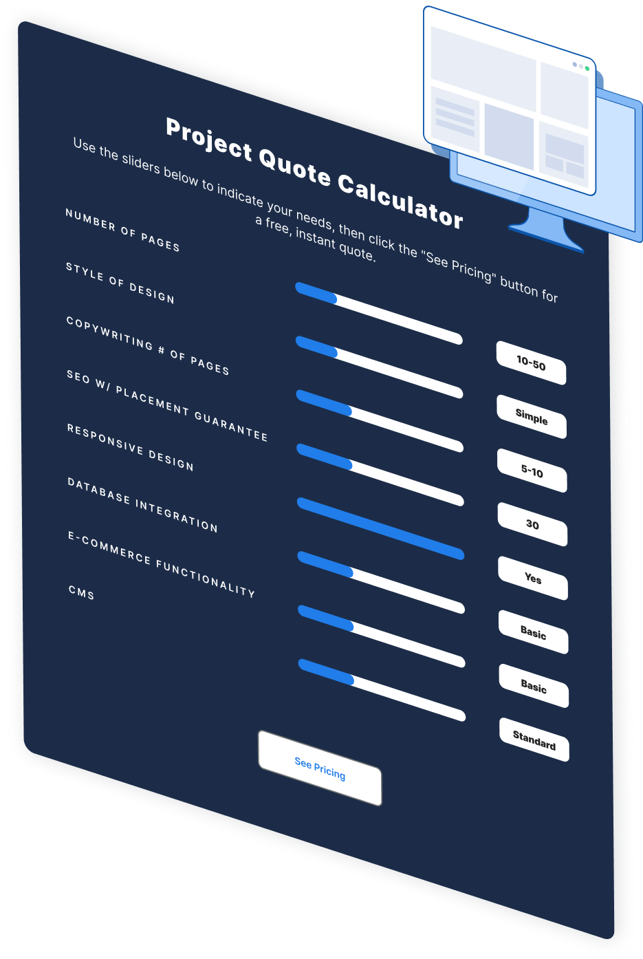
Table of Contents
- 1. Use strong CTAs
- 2. Show more product/service images
- 3. Remove visual clutter
- 4. Optimize your navigation
- 5. Highlight social proof
- 6. Test different website versions
- 7. Use retargeting strategies
- 8. Write informative content
- 9. Create short intake forms
- 10. Optimize for mobile
- 11. Outline your value proposition
- 12. Track your customer journey
- 13. Invest in your relationships
- Discover how to increase conversion rates with WebFX


Web Design Calculator
Use our free tool to get a free, instant quote in under 60 seconds.
View Web Design Calculator
Proven Marketing Strategies
Make estimating web design costs easy
Website design costs can be tricky to nail down. Get an instant estimate for a custom web design with our free website design cost calculator!
Try Our Free Web Design Cost Calculator
What to read next


