

- What are the best examples of websites that convert? The best examples of websites that convert use trust signals, personalized CTAs, and persuasive design. Brands like Mint, Discord, RealSpace, Rookwood, and Skillshare show how clear messaging and user-focused layouts drive higher conversions.
- What is the average website conversion rate across industries? According to Ruler Analytics, the current average conversion rate across industries is just 2.9%, meaning most businesses are missing revenue opportunities by not optimizing their websites for conversions.
- What trust signals help websites convert more visitors? High-converting websites build credibility through customer testimonials, case studies, ratings and reviews, security badges, and recognizable brand logos that reassure prospects others have chosen the business and seen results.
- How does personalization improve website conversions? Effective websites tailor experiences by segment using customized headlines and CTAs based on industry, dynamic landing pages for specific campaigns, and relevant offers that make visitors feel the site speaks directly to them.
- What psychological triggers drive visitor action? High-converting websites use scarcity (“Only 3 left in stock”), urgency (“Offer ends today”), and reciprocity (free trials or resources) to encourage faster decision-making and stronger engagement from potential customers.
Looking to design a website that converts? High-performing sites guide users with clear value propositions and engaging design.
Some of the best examples of websites that convert Mint, Discord, RealSpace, Rookwood, and Skillshare, each using CTAs, trust signals, and user-focused layouts to drive sign-ups, community engagement, or purchases.
Let’s break down the core elements of a revenue-driving website, advanced CRO strategies like personalization and social proof, and these five real-world examples of websites that convert in 2026.
Why website conversions matter
The current average conversion rate across industries is just 2.9%.
Improving your website’s conversion rate (CVR) isn’t just a UX win — it’s a revenue driver. According to Ruler Analytics, the current average conversion rate across industries is just 2.9%. That means many businesses are leaving money on the table by not optimizing their websites for conversions.
Let’s put this into perspective with a quick example:
- Monthly traffic: 10,000 visitors
- Average order value (AOV): $100
- Current conversion rate: 2% → 200 orders → $20,000 revenue
- Improved conversion rate: 3% → 300 orders → $30,000 revenue
That’s an extra $10,000 per month (or $120,000 per year), all from just a 1% lift in your conversion rate. Even small changes like clearer CTAs, adding trust signals, or improving site speed can fuel major revenue growth.
What makes a website convert
High-converting websites balance design, credibility, and strategy to turn visitors into paying customers. Instead of relying only on clean layouts and responsive design (which are table stakes today), the best sites layer in trust signals, personalization, and data-driven tactics that directly impact return on investment (ROI).
Trust indicators and social proof
Visitors are more likely to convert when they feel confident in your business. Build credibility with:
- Customer testimonials and case studies
- Ratings, reviews, and security badges
- Recognizable brand logos or usage stats (e.g., “Trusted by 50,000+ companies”)
These elements reassure prospects that others have chosen you and seen results.
Personalization and targeting
Not all visitors have the same intent. High-converting websites tailor experiences by segment:
- Customized headlines and calls to action (CTAs) based on industry or audience size
- Dynamic landing pages for specific campaigns or user groups
- Relevant offers (“Get a free demo” vs. “Get a free home estimate”)
Personalization helps visitors feel like your site speaks directly to them, making it easier to take the next step.
Psychological triggers that drive action
Conversion isn’t just logic. It’s also emotion. Effective sites use persuasion techniques like:
- Scarcity: “Only 3 left in stock”
- Urgency: “Offer ends today”
- Reciprocity: Free trials, resources, or tools that add value upfront
These nudges encourage faster decision-making and stronger engagement.
Conversion optimization framework
Instead of guessing what works, the top websites follow a structured CRO process:
- Audit your site performance and identify drop-off points
- Optimize trust elements, messaging, and design
- Refine CTAs and conversion paths to reduce friction
- Personalize experiences for key segments
- Test & measure changes continuously to prove ROI
By following this cycle, you’ll create a website that evolves with your audience and consistently drives revenue growth.
5 high-converting website examples
Let’s jump right into our top five examples of websites that convert!
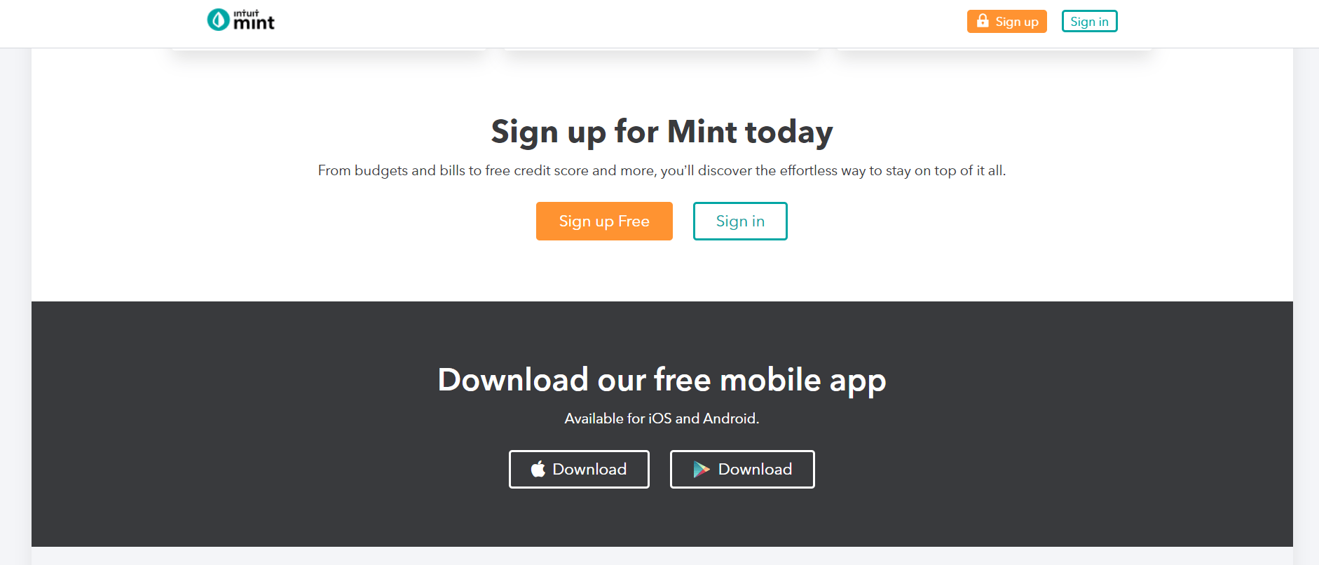
1. Mint
Mint is an all-in-one financial management app that lets you set budgets, manage bills, and check credit scores.
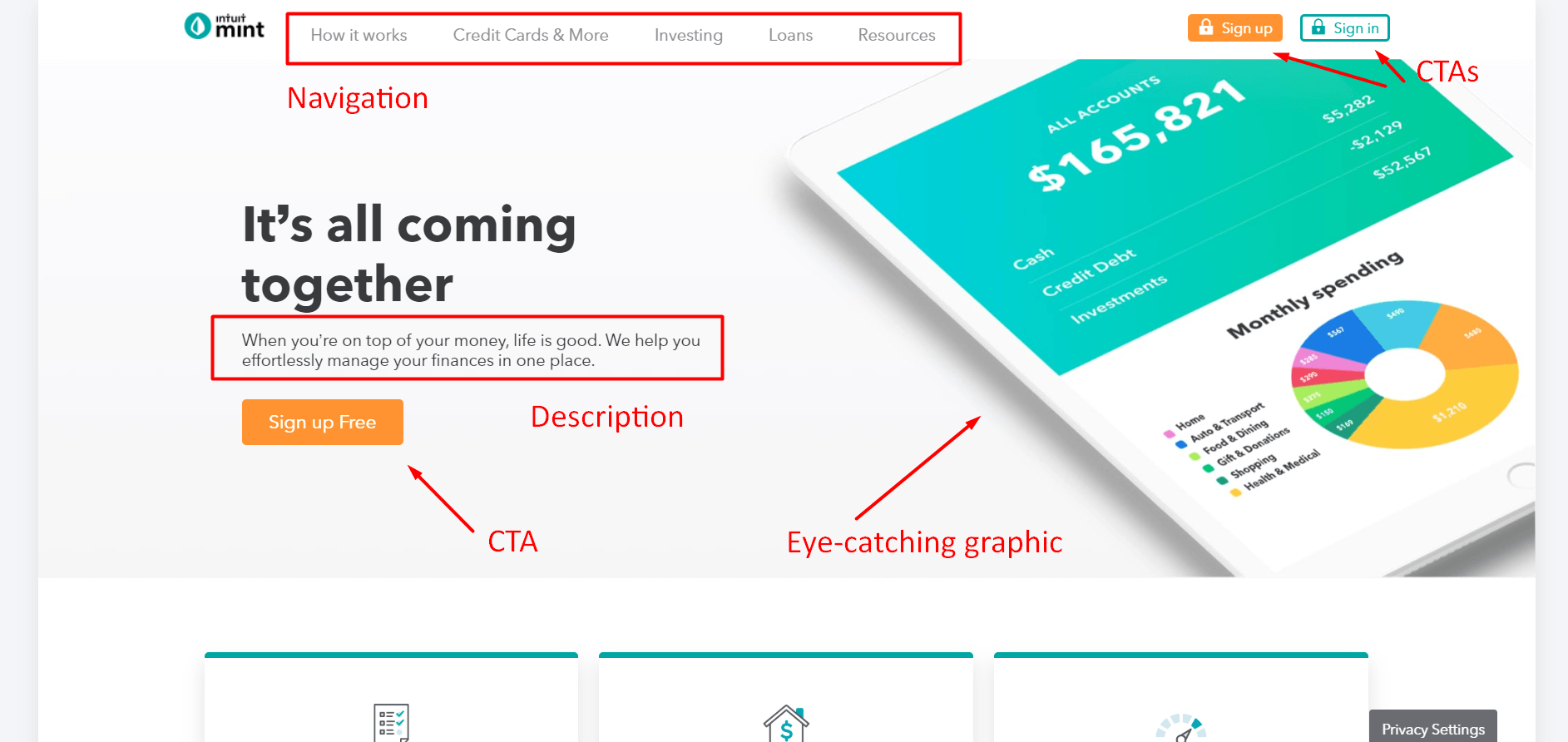
So, why is Mint an example of a high-converting website?
- Attractive web design: Their elegant web design brings simplicity to a topic that brings many people anxiety. With fast loading and mobile responsive pages, it’s easy to get information fast. Additionally, plenty of white space and sleek infographics make this site a pleasure to visit.
- Clear concept and value propositions: Mint lets you know exactly what you’re getting with their app when you first scroll down. They highlight what their app is and what makes it valuable by targeting the top concerns that people have when managing money. The information cards they display showcase how their app solves these concerns and includes call-to-action (CTA) buttons to help visitors learn more and sign up for free.
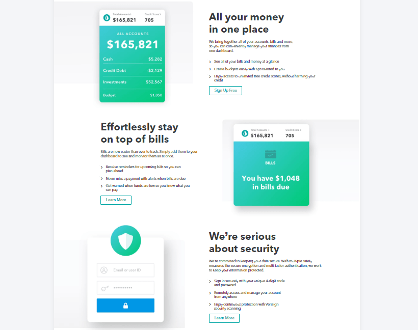
- Noticeable CTAs: Mint places valuable and relevant CTA buttons in visible places throughout their site. They have a few different styles of CTA buttons ranging from a blue outline for their “Sign in” button to a solid eye-catching orange for their “Sign up Free” CTA. These buttons contrast nicely with their overall blue-green color scheme.
2. Discord
Discord is an app that targets the gaming and streaming industry. The app provides a free all-in-one voice and texting platform where people can interact.

So, why is Discover one of the examples of websites that convert?
- Attractive web design: Discord knows their market, and they show it with their fun and quirky web design. Discord’s site has plenty of crisp graphics and engaging animations that charm its audience. With fast page load time, responsiveness, and intuitive navigation, this site checks all the appealing web design boxes.
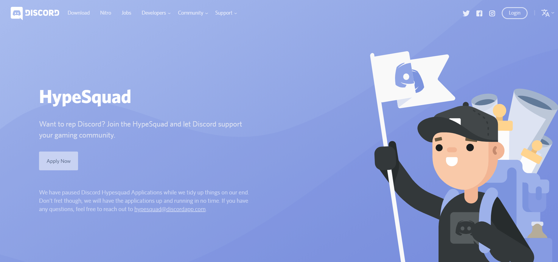
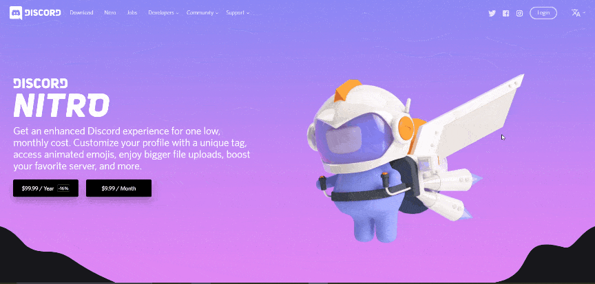
- Clear concept and value propositions: Discord knows what excites their community. On their site, they highlight both their free and premium (called Nitro) products, as well as providing unique opportunities for streaming influencers and game developers.
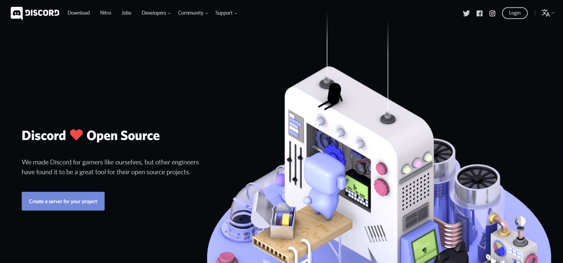
- Noticeable CTAs: Discord’s landing pages have a sleek design and plenty of white space. Their value propositions and CTA buttons stand out. And check out the entertaining animations on these two landing pages!

3. RealSpace
RealSpace makes amazing 3D renders and animations for architectural companies.
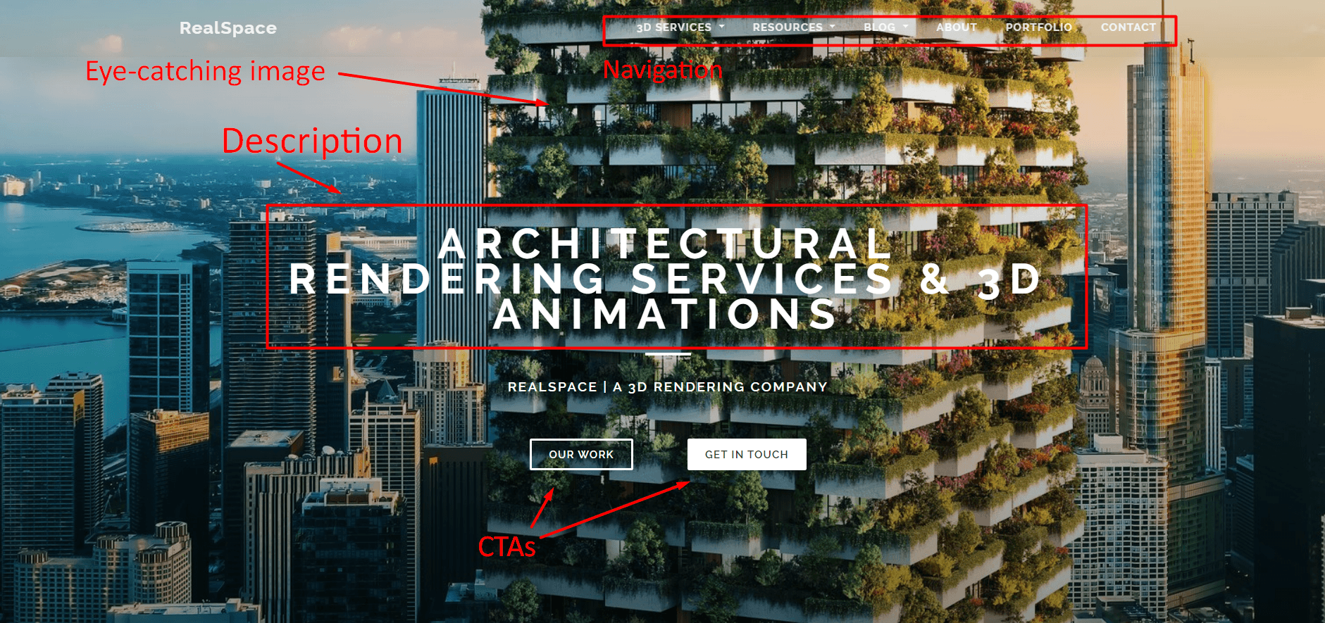
RealSpace fits the bill as an example of websites that convert.
- Attractive web design: With a beautiful portfolio of 3D rendered images (including the one used as the backdrop of their home page), RealSpace makes use of their clean design to attract customers. In addition, they have an awesome blog and plenty of 3D rendering resources for their customers. Their minimalist layout, in addition to these other elements, helps them create an attractive site.
- Clear concept and value propositions: Scroll down a bit on RealSpace’s home page, and you’ll find unique points about their services. With “Learn more” CTAs under each service point, it’s easy to find more information about services if users have an interest in them.
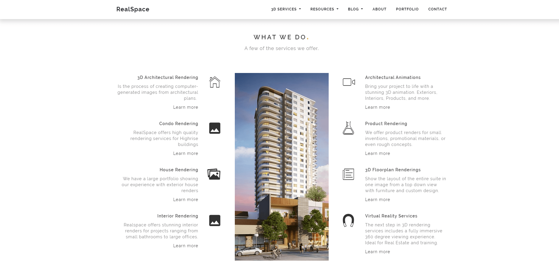
- Noticeable CTAs: With CTA links to their portfolio, services pages, and simple and easy-to-use contact form, RealSpace makes the conversion process quick and easy.
4. Rookwood
Rookwood is a company that makes beautiful pottery and tiles for home use.
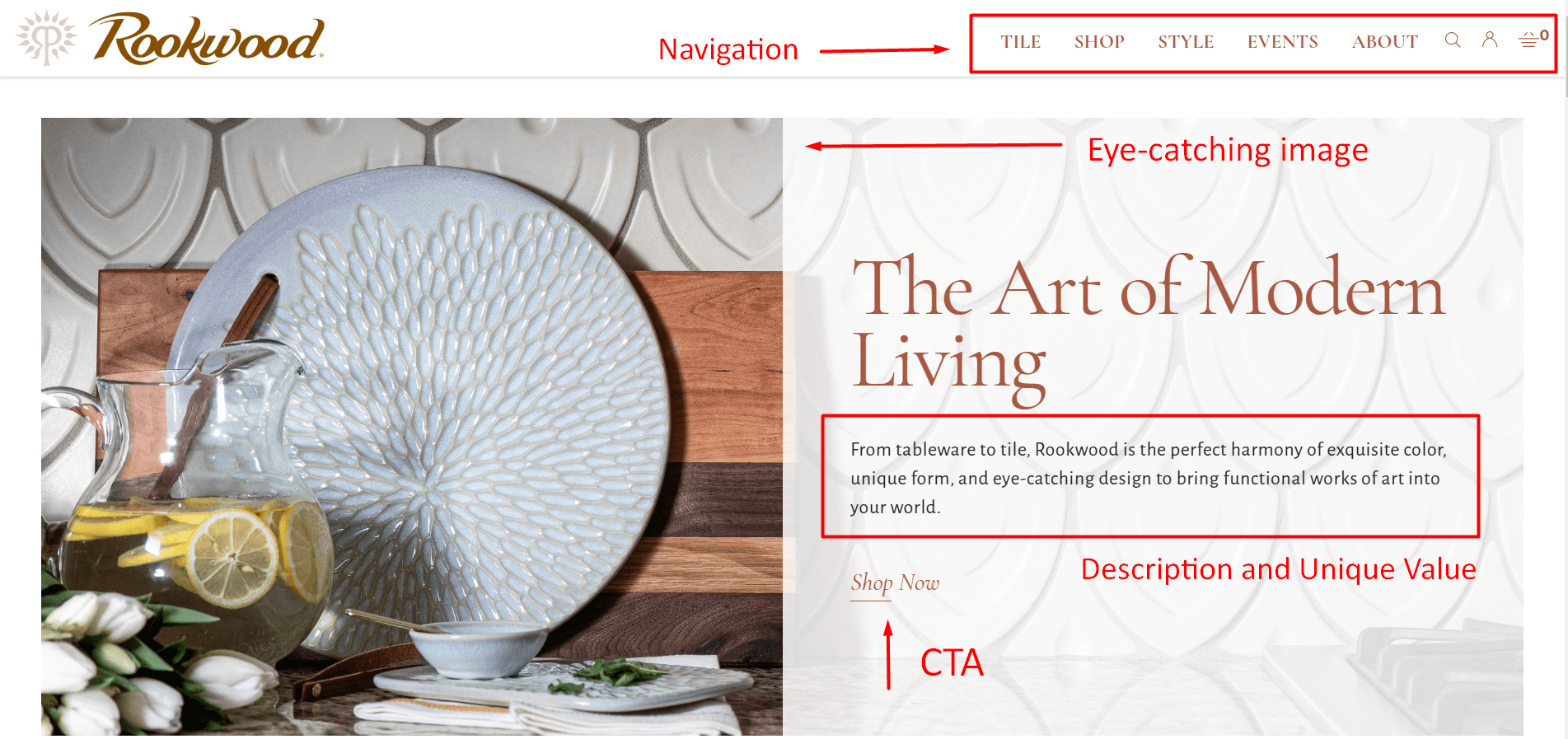
This pottery company is one of the best examples of websites that convert because it hits all the important elements for conversion.
- Attractive web design: Filled with beautiful and eye-catching images of their wares, Rookwood provides a clean and engaging design with their site that includes easy-to-use navigation and white space. Additionally, the muted color scheme brings out the color and appeal of their pottery.
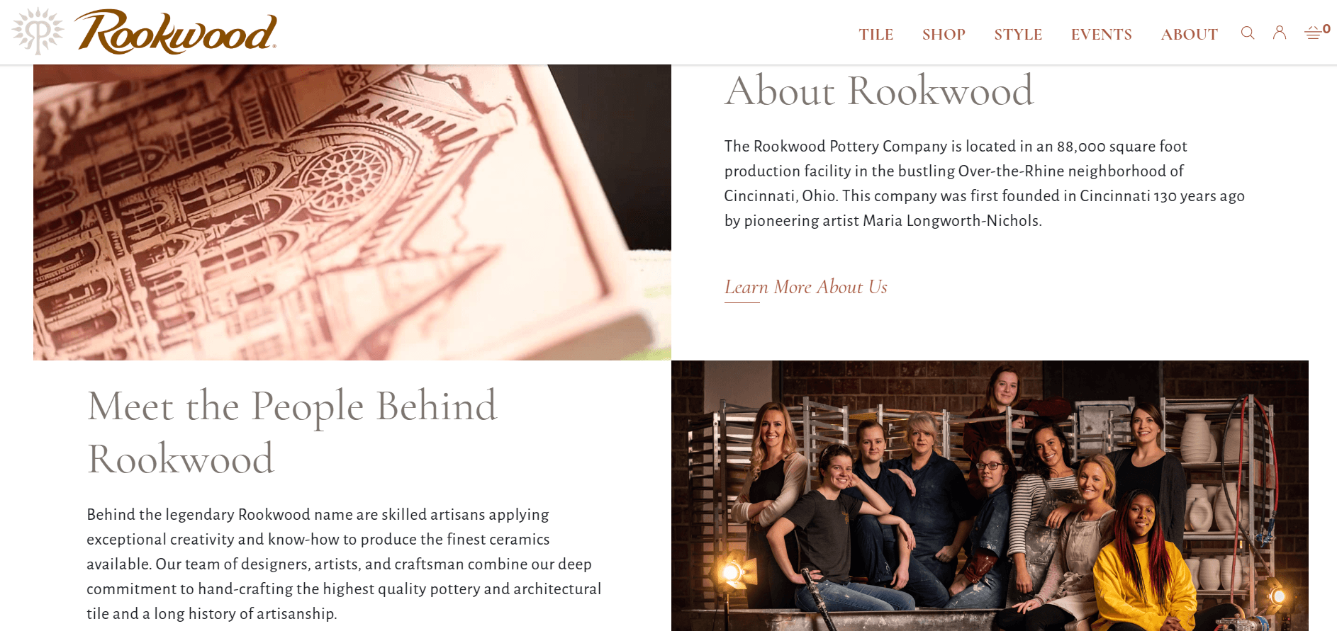
- Clear concept and value propositions: Rookwood shows off their company’s history and what makes them unique in their About page, outlining their intricate pottery crafting process and even providing information on reserving tours.
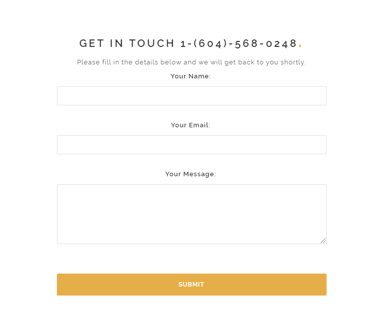
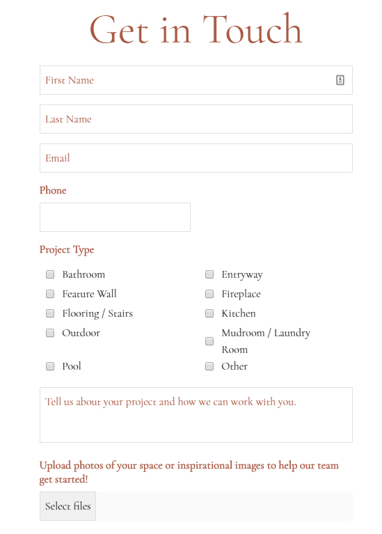
- Noticeable CTAs: Visitors can follow Rookwood’s “Learn More About Us” CTA to their About page, learn more about their artisans with the “Meet the Team” CTA, and explore their products with “Shop Now.” They even provide an easy form for users to fill out for information on services for big projects.
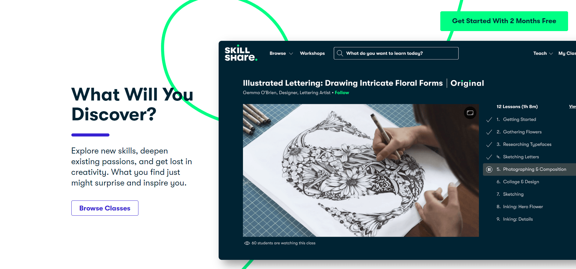
5. Skillshare
Skillshare is an online learning platform with a wide range of classes subscribers can take covering topics such as business, lifestyle, writing, photo/film, and more.
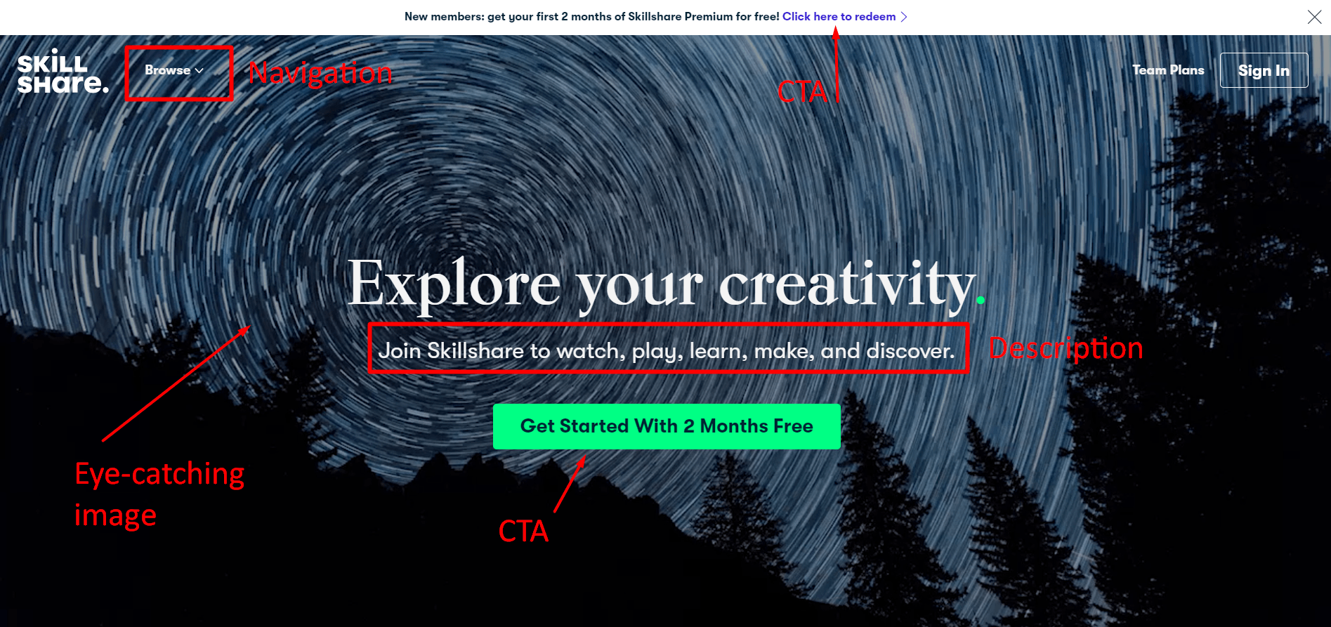
Skillshare is one of the best examples of websites that convert because it hits all the marks.
- Attractive web design: With a fun video header and a playful, decorative line that draws the eye down the page, Skillshare’s web design highlights how enjoyable learning can be.
- Clear concept and value propositions: Wander around their site, and you’ll learn that Skillshare promotes learning and creativity sharing among its subscribers. Visitors can explore classes taught by industry icons and experts, and participate in a thriving online inspiration-based community.
- Noticeable CTAs: With a dark blue and white color scheme, Skillshare’s mint green accent color makes their CTAs pop. And with actionable CTA’s like “Browse Classes” and “Get Started With 2 Months Free,” Skillshare knows how to make customers act.
FAQs about high-converting websites
What is a high-converting website?
A high-converting website is one that turns a significant percentage of its visitors into customers, leads, or subscribers. Instead of just generating traffic, these sites are optimized to guide users toward a clear goal, such as filling out a form, making a purchase, or signing up for a demo.
What makes a website convert?
Websites that convert share a few common traits: They build trust with testimonials and reviews, clearly communicate their value proposition, use persuasive CTAs, and often personalize the experience for different audiences. Adding psychological triggers like urgency (“limited-time offer”) or social proof (“trusted by 10,000+ users”) can also increase conversions.
What are top examples of websites that convert?
Some well-known examples of high-converting websites include:
- Mint: A finance app with a clean, approachable design and clear value proposition that simplifies money management.
- Discord: A communication platform that engages users with quirky visuals, sleek CTAs, and strong community appeal.
- RealSpace: An architectural rendering company that uses stunning visuals and straightforward CTAs to convert niche audiences.
- Rookwood: A pottery and tile brand that blends artisan storytelling with trust signals and easy shopping paths.
- Skillshare: An online learning platform that highlights expert-led classes with engaging design and persuasive CTAs.
These sites succeed because they combine trust-building elements, strong CTAs, and clear value propositions — the building blocks of any website that converts.
How do I build a website that converts?
To create a website that converts, start with a strong conversion optimization framework:
- Audit your current performance and identify drop-off points.
- Improve site speed and navigation for a seamless experience.
- Add trust indicators like reviews, badges, and case studies.
- Personalize CTAs and landing pages for your key audiences.
- Test, measure, and refine continuously with CRO tools.
Why do website conversions matter for ROI?
Improving your conversion rate directly impacts revenue. For example, with 10,000 monthly visitors and a $100 average order value, raising your conversion rate from 2% to 3% increases monthly revenue from $20,000 to $30,000. That’s an extra $120,000 per year without spending more on ads or traffic.
How can I measure my website’s conversion rate?
You can calculate your website conversion rate by dividing the number of conversions (purchases, form fills, sign-ups) by the total number of visitors, then multiplying by 100.
Example: 200 conversions ÷ 10,000 visitors × 100 = 2% conversion rate.
Tools like RevenueCloudFX, Google Analytics, or other CRO platforms can help you track and segment this data more effectively.
Create high-converting websites with WebFX!
Ready to apply inspiration from these five examples of websites that convert? WebFX is here to help with our amazing website conversion design services! As a full-service web design agency, WebFX has an award-winning team of web designers to help you design a website perfect for converting customers.
Check out our awesome web design portfolio to see what we can do for your business. Need a website quickly? Our RainmakerFX software can help you get a high-converting website up and running in 30 days!
Contact us online or call us at 888-601-5359 to speak to one of our web design gurus!
-
 Trevin serves as the VP of Marketing at WebFX. He has worked on over 450 marketing campaigns and has been building websites for over 25 years. His work has been featured by Search Engine Land, USA Today, Fast Company and Inc. Read his review of working with WebFX for the last 15 years.
 -

WebFX is a full-service digital marketing agency delivering revenue-driving strategies across online advertising, SEO and AI search optimization, and digital marketing. Backed by 1,100+ client reviews, a 4.9-star rating on Clutch, and proprietary revenue-tracking technology, our team helps businesses grow visibility and revenue across platforms, from Google to ChatGPT to LinkedIn. Discover how our expert team and revenue-accelerating tech can drive results for you. Learn more
Make estimating web design costs easy
Website design costs can be tricky to nail down. Get an instant estimate for a custom web design with our free website design cost calculator!
Try Our Free Web Design Cost Calculator
Share this article


Web Design Calculator
Use our free tool to get a free, instant quote in under 60 seconds.
View Web Design Calculator
Make estimating web design costs easy
Website design costs can be tricky to nail down. Get an instant estimate for a custom web design with our free website design cost calculator!
Try Our Free Web Design Cost Calculator
What to read next