- Home
- Blog
- Web Design
- 9 Best Website Designs to Inspire Your Site for 2025
9 Best Website Designs to Inspire Your Site for 2025
-
 12 min. read
-
 Macy Storm
 Content Marketing Consultant
- Macy is a content marketing consultant with over five years of experience creating content for dozens of industries including home services, recreation, and education. She’s written about every marketing topic under the sun, from SEO to AI to email marketing. Her work has been featured by Search Engine Journal, HubSpot, Entrepreneur, Clutch, and more. In her free time, Macy enjoys crafting, reading comic books, and walking her dog Daisy.
64% of people want to see a website that holds their attention.
88% of people are less likely to return to a website after having a bad experience.
89% of people shop with a competitor after a poor experience.
So, what does this mean for your website? If you don’t have a functional and aesthetically pleasing website, you lose customers to your competition.
However, it can be challenging to figure out how to design your website. That’s why it’s beneficial to look at a list of the best website designs to help inspire your website!
Keep reading to discover some of the top website designs on the web and learn what you can take from them to build the best website for your business!
And don’t forget, once you have your beautifully designed website, you’ll want to showcase it to everyone. But if you aren’t sure of the best ways to market your new website, subscribe to Revenue Weekly for the latest tips and tricks on marketing your business online!
Best website designs to inspire your 2025 design
If you want to sell more products and gain new customers, you need a website design that delivers.
On this page, we’ll cover five best website design examples that include:
Here are five best website designs for 2025 to inspire your design:
1. Billie
First on our list of top website designs is Billie. Billie sells women’s products for everyday needs, from razors to body lotion to lip balm.
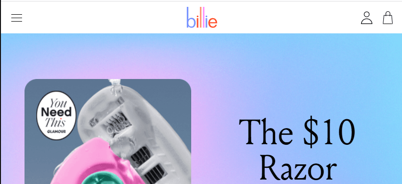
Billie uses pink, purple, and blue colors throughout their design to help it stand out. These color choices match their colorful logo design. Billie uses the same color pallet throughout their business, from their design to product packaging.
Why Billie is one of the best website designs
They use their brand’s color pallet throughout the website. When you design your website, you want to ensure that you’re using your brand’s colors throughout your website. Many people will identify your brand based on your color scheme and logo, making it critical for you to use those colors throughout your website.
With Billie, they use the same pastel color pallet on all aspects of their website, from their logo to their background to their call to action (CTA) buttons.
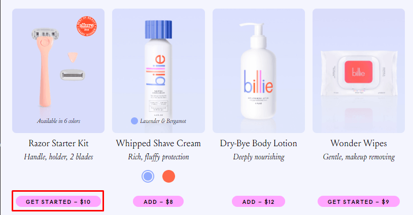
You’ll want to make sure you use your brand’s color throughout your website.
2. Uncommon Goods
One of the best website designs for 2025 is Uncommon Goods. This business offers unique products people can buy, including home goods, unique décor, and more.
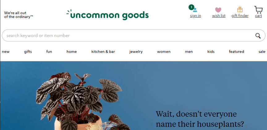
One of the most notable elements of Uncommon Goods’ website is its navigation. When you enter their website, you see organized navigation at the top of the page that details what they offer. Shoppers can easily find the products they need using this navigation.
Why Uncommon Goods is one of the best website designs
They use a clear navigation. When designing your website, make sure you create a simple and easy navigation. You want to use broad headings to organize your information, so people can find what they need with ease.
When you design your navigation, make sure you organize it to make sense to your audience. They’re the ones who browse your website, so it’s essential to make sure you design your website with your audience in mind.
3. Skullcandy
Another site you can look at for website design inspiration is Skullcandy. Skullcandy uses sleek design to promote its headphone products to customers.
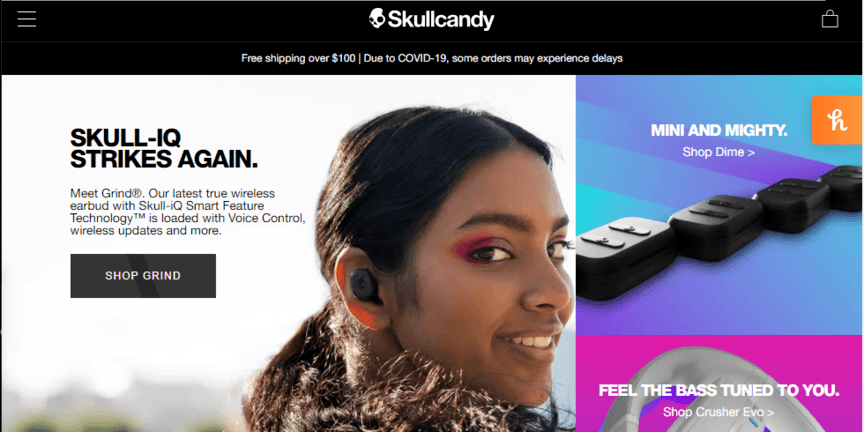
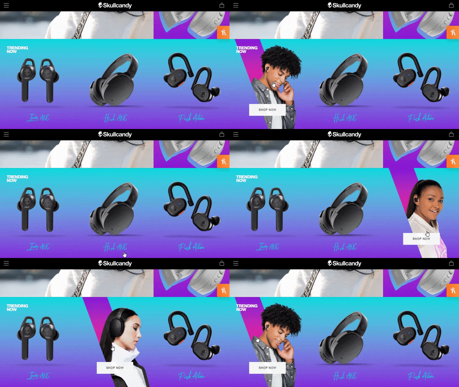
One notable element of Skullcandy is its use of graphics. As you browse through their website, you’ll see engaging graphics that change as you hover over them. It’s a small detail, but it creates an exciting experience for visitors.
Why Skullcandy is one of the best website designs
They create engaging experiences. When you look at the best website design for 2025, you’ll notice that many of the top websites develop engaging experiences for their audiences. As we shared in the earlier stat, 64% of people want to see a website that holds their attention.
By using high-quality and engaging graphics, you can create an experience that holds your audience’s attention and gets them to spend more time browsing your website.
4. Warby Parker
One of the top web designs comes from Warby Parker. This eyeglasses company sells fashionable lenses that allow shoppers to “try before you buy” to find the right frames for your look.
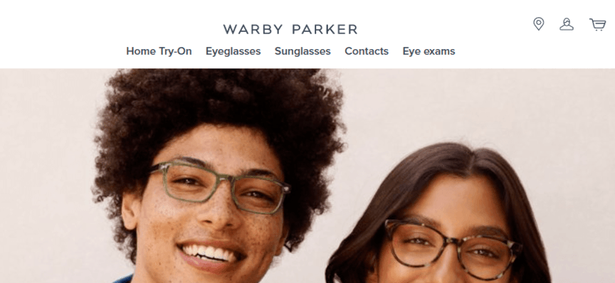
Warby Parker makes excellent use of white space throughout their site. As you scroll through and browse their products, you can easily read and view everything on their website. Nothing is cramped together or challenging to read.
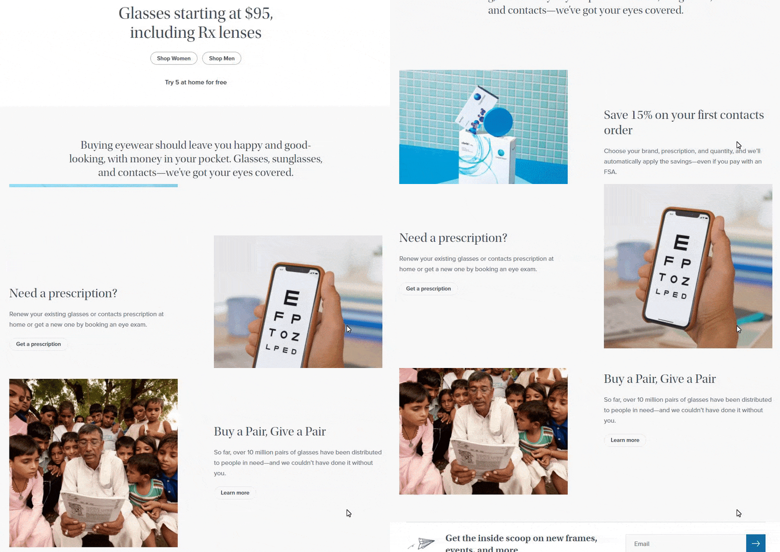
Why Warby Parker is one of the best website designs
They utilize whitespace. When you design your website, you need to use whitespace. If you try to cram photos, videos, and text into every inch of space on your website, you’ll create a challenging experience for your audience — they’ll struggle to browse your website.
Whitespace will help you create a clean website that delivers a positive user experience, which will result in increased engagement for your business.
5. Box Lunch
If you’re an ecommerce store looking for inspiration for your checkout process, turn to Box Lunch. Box Lunch is a pop culture website that offers merchandise related to your favorite movies, TV shows, and more.
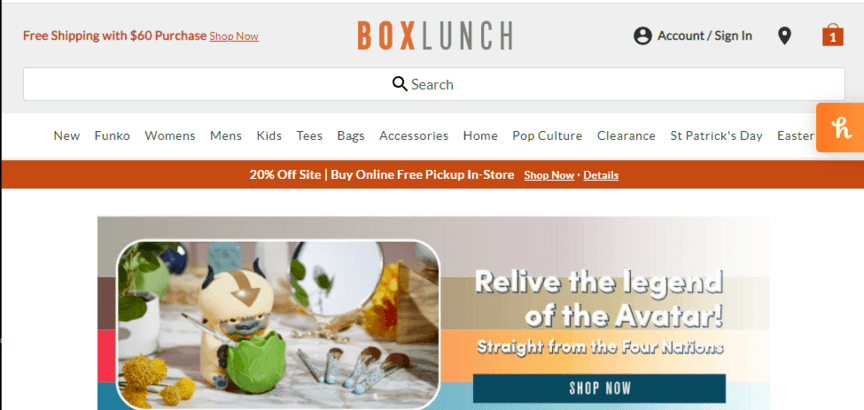
So, what makes Box Lunch one of the best website designs? Well, they utilize a simple and easy checkout process to purchase products.
When you add items to your shopping bag, you can hover over your bag to see what items you added, how much they cost, and the total amount you’re spending. It doesn’t require users to click on their cart to view what they added, making the shopping process easier.
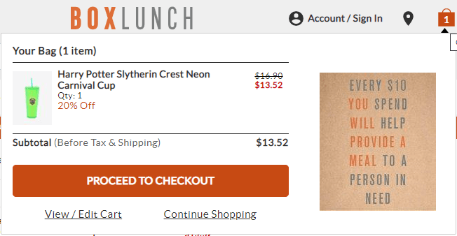
Additionally, when you go to check out, you can see if the item is still in stock as you’re going to check out. You’ll also see details for the estimated shipping rate, which can help you determine if you want to buy the item.
Box Lunch built their checkout process with the user in mind. They give shoppers the information they need upfront to have a smooth checkout process.
Why Box Lunch is one of the best website designs
They offer a functional and straightforward checkout process. When you create your checkout process, you want to make it easy for shoppers to buy your products. That means giving shipping estimates up-front, offering “guest checkout” options, and providing multiple payment options.
When you make the checkout process smooth and easy to do, shoppers are more likely to complete their orders.
6. Yeti
If you’re looking for web design inspiration, check out Yeti. Yeti is a brand that creates items like travel mugs, coolers, and outdoor living supplies. This brand focuses on nature and creating products that people can use while spending time outdoors.
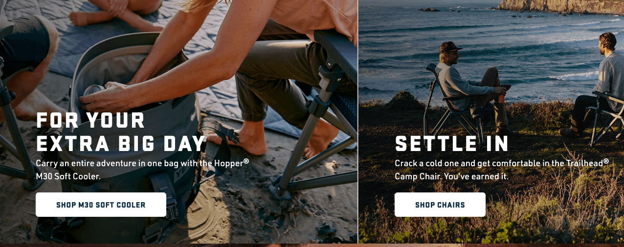
Yeti integrates branded photos throughout their website, which helps people understand their outdoor aesthetic. They consistently integrate these types of photos throughout their website, from their homepage to their product pages.
Why Yeti is one of the best website designs
They create a brand-centered aesthetic. When you build your business’s website, you need to choose an aesthetic to showcase your brand. Your brand’s aesthetic can vary across the board, from outdoor ruggedness to sophisticated luxury.
The important part is that you integrate elements that help highlight that aesthetic throughout your website. You can use photos, videos, and design elements to help you achieve this goal.
7. Dunkin’
The best website design isn’t just about design. While the visual elements play a critical role in attracting users and getting them to engage, the information on your website is just as important. That’s why Dunkin’ is next on our list of the best website design for 2025.
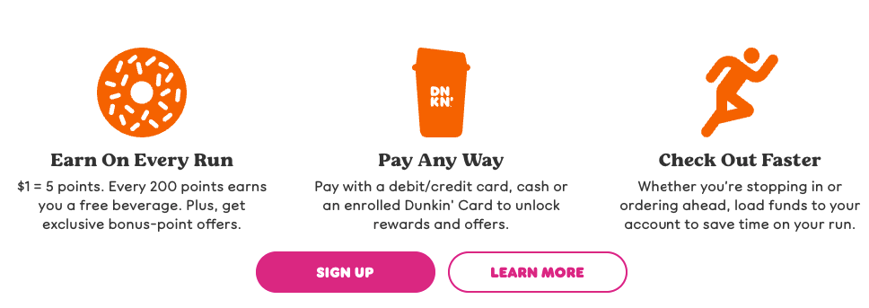
When you visit Dunkin’s website, they have short and informative copy that tells users how their perks program works. They also provide a bulleted list of information on their Dunkin’ app.
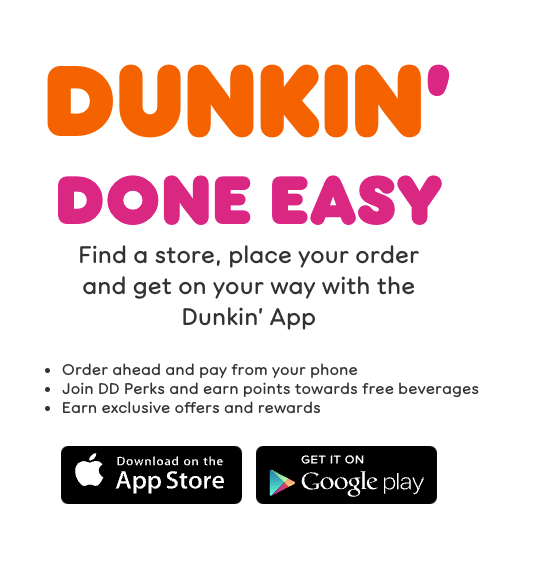
This copy is informative, succinct, and tells users what they need to know.
Why Dunkin’ is one of the best website designs
They create digestible copy. Sharing information on your website is crucial for convincing prospects to buy your products or use your services. The way you present that information is crucial, too, because your audience needs to understand it.
When you craft your website content, write in a way that’s easily digestible for your audience. Keep is short, informative, and helpful.
8. Apple
Next on our list of the best website designs is Apple. Apple is known for its sleek, tech-focused design that draws in visitors.
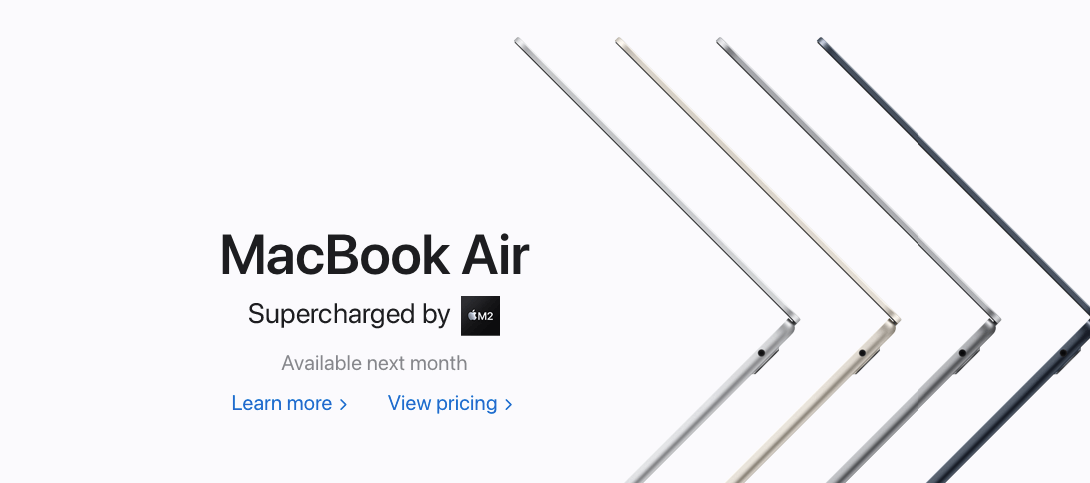
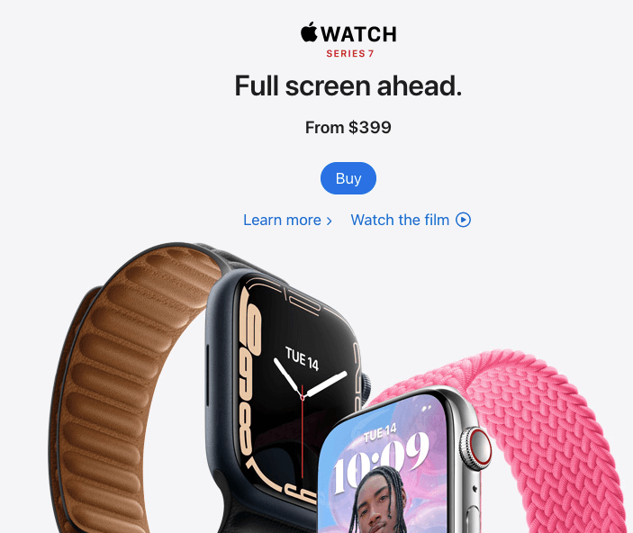
One of the most notable elements of Apple’s design is the consistency. Whether you’re on their homepage, looking at a product page, or learning about the company, you’ll see the same sleek design everywhere.
Why Apple is one of the best website designs
They use a consistent design. A key component of web design is consistency. You want people to feel like they’re on the same website as they browse through different product pages. By integrating a consistent design, you’ll create a cohesive experience for your audience.
9. Coca-Cola
Next on our list of the top website designs is Coca-Cola. Coca-Cola has a classic, branded website that features their prominent red and white color scheme.
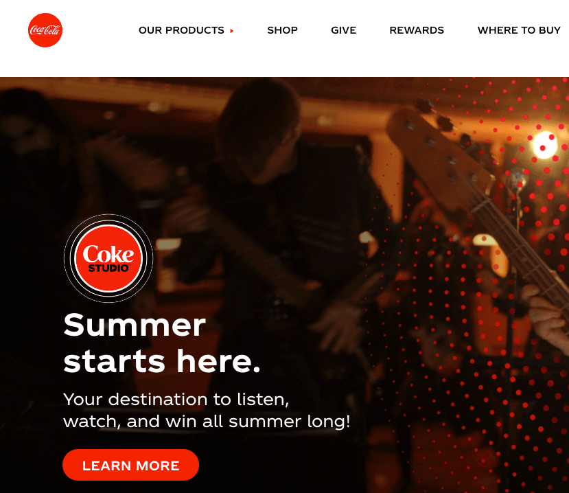
Most notably, Coca-Cola uses their design sceme to make call to action (CTA) buttons that stand out on the page. As your scroll through their pages, you can see numeorus bright red buttons inviting users to take action.
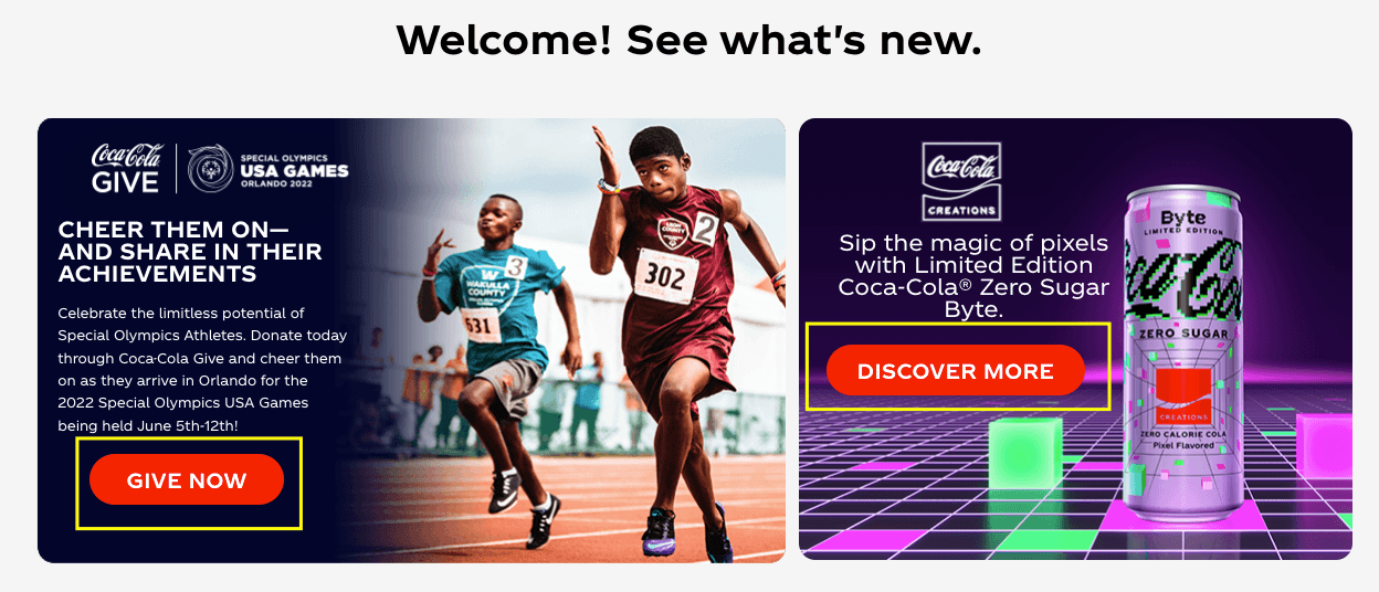
Why Coca-Cola is one of the best website designs
They use CTAs that pop off the page. When you want someone to take action on your website, you must ensure they know how to take those steps. With a prominent CTA button, you tell your audience how to take the next step and move closer towards conversion.
Need help creating the best website design for your website?
Now that you’ve seen the best website designs for 2025, you may feel inspired to start designing your dream website. But if you aren’t sure how to bring your vision to life, the team at WebFX can help. We have over 29 years of experience designing websites for clients.
Our award-winning team of over 500 expert designers knows how to craft websites that help small-to-midsized businesses (SMBs) grow. Just check out our portfolio to see some of the work we’ve done for our clients!
Ready to turn your website into one of the top website designs? Contact us online or call us today at 888-601-5359 to speak with a strategist about our web design services!
-
 Macy is a content marketing consultant with over five years of experience creating content for dozens of industries including home services, recreation, and education. She’s written about every marketing topic under the sun, from SEO to AI to email marketing. Her work has been featured by Search Engine Journal, HubSpot, Entrepreneur, Clutch, and more. In her free time, Macy enjoys crafting, reading comic books, and walking her dog Daisy.
 -

WebFX is a full-service marketing agency with 1,100+ client reviews and a 4.9-star rating on Clutch! Find out how our expert team and revenue-accelerating tech can drive results for you! Learn more
Make estimating web design costs easy
Website design costs can be tricky to nail down. Get an instant estimate for a custom web design with our free website design cost calculator!
Try Our Free Web Design Cost Calculator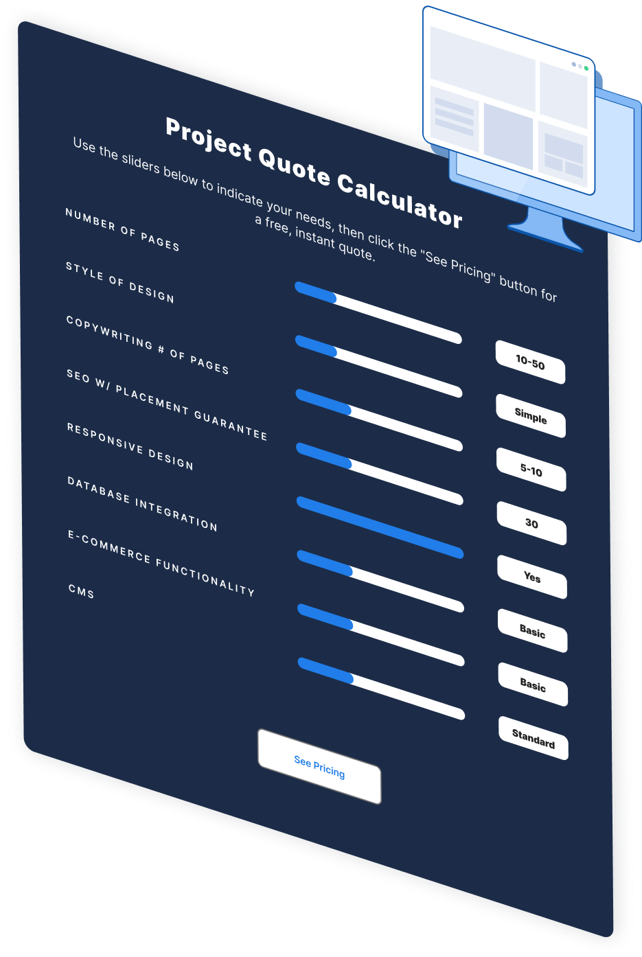

Web Design Calculator
Use our free tool to get a free, instant quote in under 60 seconds.
View Web Design Calculator
Proven Marketing Strategies
Make estimating web design costs easy
Website design costs can be tricky to nail down. Get an instant estimate for a custom web design with our free website design cost calculator!
Try Our Free Web Design Cost Calculator
What to read next
