- Home
- Blog
- Web Design
- Coding a Clean Web 2.0 Style Web Design from Photoshop
Coding a Clean Web 2.0 Style Web Design from Photoshop
-
 26 min. read
-
 William Craig
 CEO & Co-Founder
- President of WebFX. Bill has over 25 years of experience in the Internet marketing industry specializing in SEO, UX, information architecture, marketing automation and more. William’s background in scientific computing and education from Shippensburg and MIT provided the foundation for RevenueCloudFX and other key research and development projects at WebFX.
In this web development tutorial, you’ll learn how to build a web page template from a Photoshop mock-up from a previous tutorial called “How to Create a Clean Web 2.0 Style Web Design in Photoshop” using HTML/CSS and the jQuery library. This is the second part of a two-part series that will teach you how to create the layout in Photoshop, and then how to convert it to a standards-compliant (X)HTML web design.
Final Result
Click on the figure below to see the live demonstration of the web design that you’ll be creating in this tutorial. 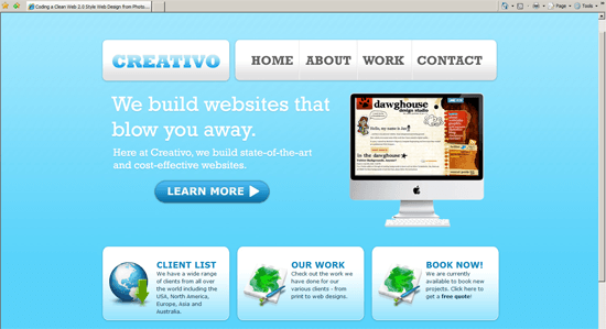
Download
Jan Cavan, who wrote the first part of this tutorial, has provided us with a Photoshop source file that we’ll use to build the site template. The following download contains the Photoshop file and all of the examples that are used in this tutorial.
- clean-web-2.0-source.zip (ZIP, 3.4 MB)
Introduction
In this tutorial, we’ll create a fixed-width web layout using some basic coding techniques. Towards the end, we’ll enhance the design with a bit of jQuery. Though probably not the most efficient way, for instructional purposes, we’re going to work our way from top to bottom – that is – we’re going to start from the header all the way down to the footer.
Preview the examples when they are available to make sure that you are keeping up with the progress. Prepare for a long journey and make sure you have your favorite caffeinated drink handy, because this tutorial will be a very long one! Let’s begin.
Setting up the file structure
1 Create a folder in your local machine for our template files and call it web2.
This will be our working directory. 2 Inside the web2 folder, create the following:
- img folder – will contain all images used in the tutorial.
- index.html – our site template.
- styles.css – our stylesheet.
- javascript.js – this will contain our JavaScript
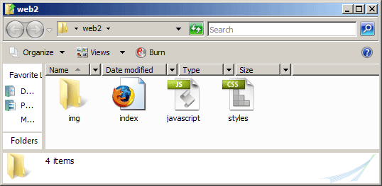 3 Open index.html and styles.css in your favorite text editor (we’ll deal with javascript.js later). Also, open the PSD file in Photoshop; it’s inside the clean-web-2.0-source.zip archive and it’s called web2-mockup-psd.psd. With our file structure set up and all our files opened, we’re ready to slice, dice, and code.
Creating the diagonal background
4 In Photoshop, turn off all the layers of web2-mockup-psd except for the bottom two layers, bg and diagonal lines.
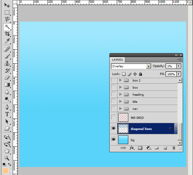 5 Create exactly a 20px wide selection using the Rectangular Marquee Tool (M) starting from the left side of the canvas, with the selection’s height spanning the full height of the document.
 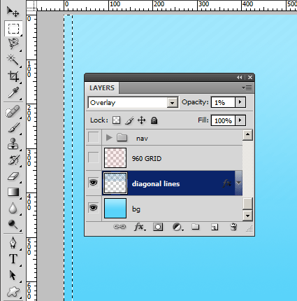 6 Make sure the diagonal lines layer is active, use Edit > Copy Merged (Ctrl + Shift + C) to copy the area inside the 20px wide selection. Create a new document and paste (Ctrl + V) the copied selection into the new document.
Save this inside the img folder under the name bg_body.jpg. 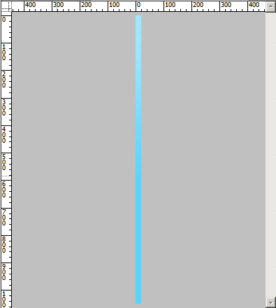
Setting up the HTML and CSS files
7 Head over to index.html. The first thing we want to do is reference style.css and javascript.js in the <head> of our HTML document.
<head> <link href="styles.css" rel="stylesheet" type="text/css" /> <script type="text/javascript" src="javascript.js"></script> </head>
8 Let’s head on over to styles.css and put in some basic style rules.
We’re going to take a shortcut and use the Universal Selector margin/padding CSS reset to zero out all the elements’ margins and paddings. This works a majority of the time, but it’s often better to invest some time learning about more robust CSS Reset techniques. Head on over to my article called “Resetting Your Styles with CSS Reset” to learn more about CSS Reset.
Here is the style rule declaration for resetting the margins and paddings:
/* CSS Reset */ * { margin:0; padding:0; }Implementing the diagonal background
9 We’re going to repeat the 20px background we created (body_bg.jpg) horizontally. We’re going to set it as the <body> background.
body { background:#59d3fa url(img/body_bg.jpg) repeat-x 0 0; }Awesome! Let’s preview how the background looks.
In Example 1 below, you’ll see our diagonal background in action. Example 1: Diagonal lines set as the body element’s background.
Setting up the layout’s container div
10 Let’s move into some HTML. We’ll contain our layout in a 1024px wide container div called #container.
<body> <div id="container"> <!-- content goes here --> </div> </body>
11 We’ll give #container a width of 1024px and center it using the margin property:
#container { width:1024px; margin:0 auto; }Creating the logo
12 Let’s cut up the stuff we’ll need for our header, starting with the logo.
Head over to the Photoshop file. Turn on all the layers. Create a selection around the logo that is exactly 320px and 125px wide using the Rectangular Marquee Tool (M).
Use Photoshop Guides (View > Show > Guides) to make this easier and more precise. The reason you have to be exact is due to the diagonal lines in the background, everything has to align properly. 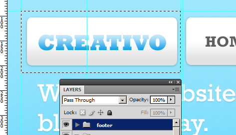 13 Copy Merge (Ctrl + Shift + C) with the highest layer selected, and then paste the logo in a new document.
14 We’re going to make this into a CSS background sprite so that when users hover over it, we can show them a rollover effect. Increase the canvas size, Image > Canvas Size (Ctrl + Alt + C). Double the height of the canvas by entering 250px in the height.
Change the Anchor to the top middle position. 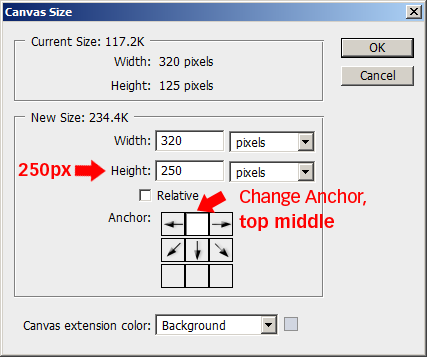 15 Duplicate Layer 1, then move it down to the bottom using the Move Tool (V).
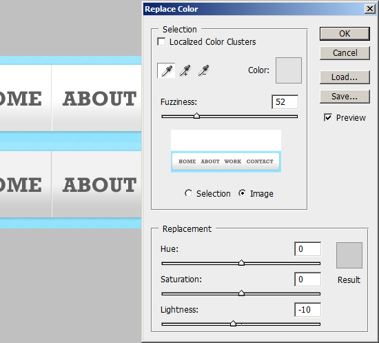
 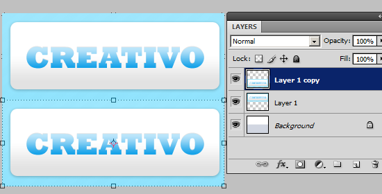 16 With the duplicated layer active (Layer 1 copy), use Image > Adjustments > Replace Color…
. Make sure the Image radio box is selected. Click the Color box to change the selection color, and sample somewhere towards the bottom portion of the logo (#e2e2e2).
Play around with the Hue, Saturation, and Lightness values until you get an effect that you like. In the following figure, you’ll see the settings I used. 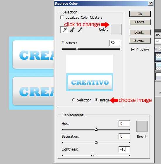 17 Save the file for the web, File > Save for Web (Alt + Shift + Ctrl + S) as logo.jpg in our img folder.
From now on, use the same settings for saving these files. I used the JPEG, Very High, but feel free to change these settings. If you change the default settings, be sure to save it the same way every time to provide consistency in the images.
Creating the navigation menu
18 Just like with the logo, create a selection exactly 640px by 125px.
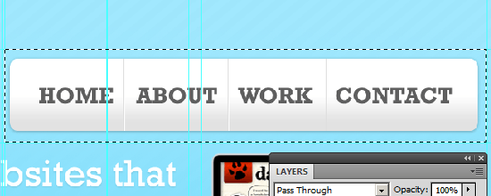 19 Copy the selection (Copy Merged) and then paste it into a new document. 20 Just like in step 14, double the height of the canvas to 250px, Image > Canvas Size (Ctrl + Alt + C), and don’t forget to change the Anchor to top middle. Then again, duplicate Layer 1, and move it down to the bottom using the Move Tool (V).
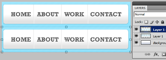 21 Follow step 16 to replace the color for the bottom layer. I used the same setting for the selection color, #e2e2e2.
  22 Save the file as menu.jpg inside the img folder.
Coding the Header’s HTML markup
23 Let’s switch to our HTML/CSS.
First, we’ll start with the markup. Inside the #container div, we use another div to create our header section – we’ll call it #header. You may want to use a more structural naming convention though like #branding, that’s up to you.
If you want to learn more about structural naming conventions, take a breather from our tutorial and read through my article on “Structural Naming Convention in CSS“. For our logo, we’ll use a <h1> heading element. Our navigation will be a standard unordered list item. Each list item’s <a> element needs an ID for the CSS rollover and because they have different widths.
<div id="container"> <div id="header"> <h1><a href="#">Creativo</a></h1> <ul> <li id="home"><a href="#">Home</a></li> <li id="about"><a href="#">About</a></li> <li id="work"><a href="#">Work</a></li> <li id="contact"><a href="#">Contact</a></li> </ul> </div> </div>
Styling the Logo
24 First, let’s style #header.
We need to give it a top margin property so that we have some space at the top of the web page, just like our mockup. Since our content area is 960px, we’ll give #header a width of 960px. This will give us ample room on either side of the layout for scroll bars and so that when the user minimizes the web browser, there’s still a bit of margin on the left and rigth and our content is not right at the edges of the view port (making the content hard to read).
We also have to center it using the auto for the right and left margins. Below, I used the margin property shorthand, and for beginners, the numbers correspond to top (90px), right (auto), bottom (0), and left (auto) margin.
#header { height:125px; width:960px; margin:90px auto 0 auto; }25 Let’s work on the logo’s style first. We transform our <h1> element into a block element.
we float it to the left so that our logo and menu are side-by-side. We use the logo we created earlier (step 17) as the background, and finally indent the text to the left where it can’t be seen to hide our text. This method of replacing text with a background image is called CSS Background Image Replacement.
#header h1 { display:block;float:left; width:320px; height:125px; background:url(img/logo.jpg) no-repeat 0 0; text-indent:-10000px; }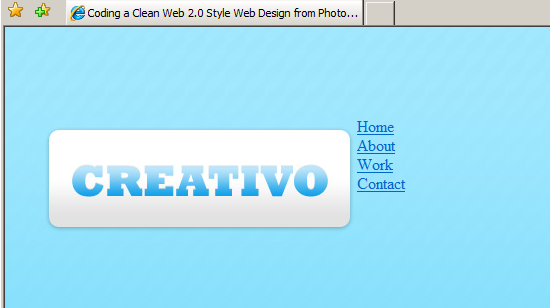 26 To make the logo clickable, we also need the
 <a> element inside the <h1> element to be a block element, and give it the same width and height at <h1>
#header h1 a { display:block; width:100%; height:100%; }27 To enable the rollover effect, we change the background position of a:hover.
#header h1 a:hover { background:url(img/logo.jpg) no-repeat 0 -125px; }Styling the navigation menu
28 Onto the primary navigation.
We also need to convert it to a block element and float it to the right of the logo. Then we set the background to menu.jpg and remove the list item bullets.
#header ul { display:block; float:right; width:640px; height:125px; background:url(img/menu.jpg) no-repeat 0 0; list-style:none; }29 For the list items, we’ll make them into block elements as well, then float them to the right so that they display side by side. Then, just like the logo, we use text-indent to hide the text.
#header ul li { display:block; float:left; height:125px; text-indent:-10000px; }30 We need to set custom widths for each list item so that the clickable area of each menu item will be accurate.
#home { width:160px; } #about { width:137px; } #work { width:129px; } #contact { width:210px; }31 We set the children <a> elements of our list items to display block with a width and height equal to their parents.
#header ul li a { display:block; width:100%; height:100%; }32Finally, for the hover, we adjust the background-position property of the menu.jpg sprite.
#home a:hover { background:url(img/menu.jpg) no-repeat 0 -125px; } #about a:hover { background:url(img/menu.jpg) no-repeat -160px -125px; } #work a:hover { background:url(img/menu.jpg) no-repeat -297px -125px; } #contact a:hover { background:url(img/menu.jpg) no-repeat -426px -125px; }33 Preview your work in a web browser.
Check out Example 2 below to see where we are. Hover over the logo and the menu items, they should change colors. Example 2: The header section completed.
Creating the “Featured Area” background
Let’s call the part of the mockup with the monitor screen, text that says “Web build websites…”, and “Learn More” button — “Featured Area”. 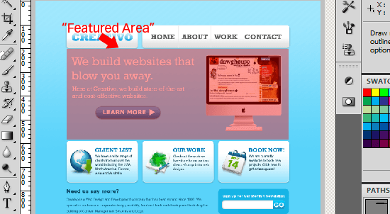 34 In the featuredarea folder in the Layers palette, turn off all the layers except for the sub-title and main-heading layers so that the “Learn More” button and the Apple monitor on the right isn’t showing.
 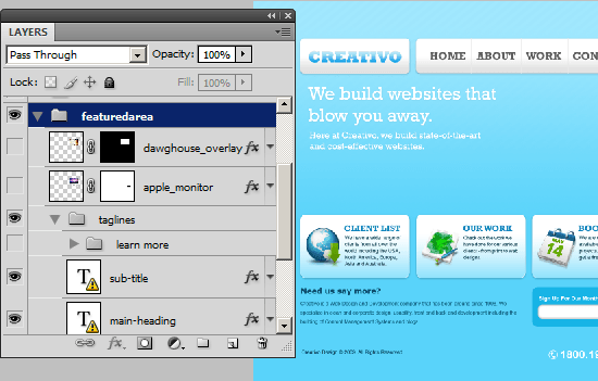 35 Create a selection that is exactly 960px by 360px around the “Featured Area” section.
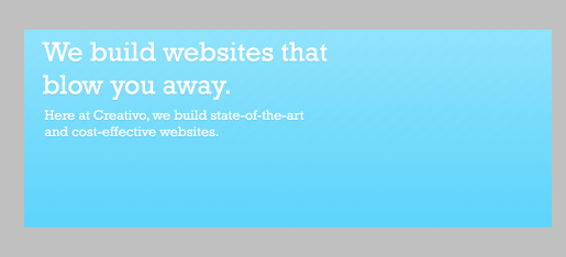
 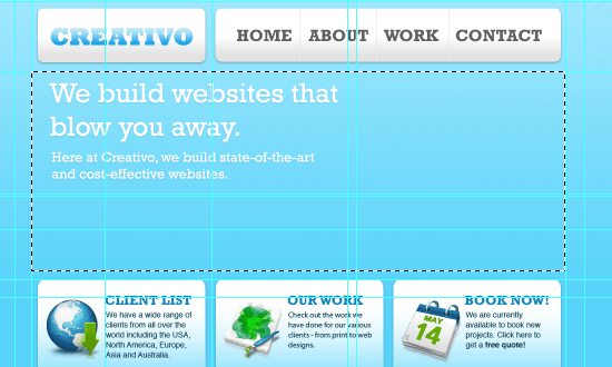 36 Copy this into a new document and then save it as featured_bg.jpg inside the img folder.
Creating the “Featured Area” button
37 Let’s slice out the “Learn More” button. Turn on the learnmore folder in the Layers palette; it’s inside the taglines folder. 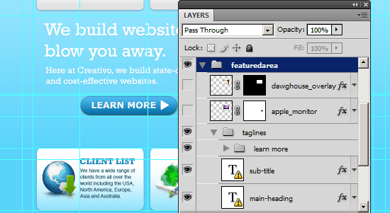 38 Create a selection around the button that’s exactly 280px by 60px.
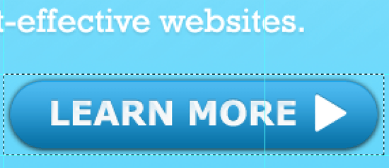 39 Copy the selection to a new document. We’re going to make a rollover CSS sprite for this one as well. Double the height of the canvas, duplicate Layer 1, move the duplicate down to the bottom, just like in steps 14 through 17. For the selection color, I used: #0a72a6. The only Replacement value I changed was the Hue setting, and I set that to +10. Save it as learnmore.jpg inside the, you guessed it, the img folder.
Creating the Monitor image
40 The monitor on the right of the layout will just be an image.
The more industrious individuals reading this tutorial will try to use that monitor as a cool little slideshow where the monitor changes content – we’re not going to cover that here today. Turn on the rest of the featuredarea folder. 41 Create a selection around the monitor, exactly 375px by 370px.
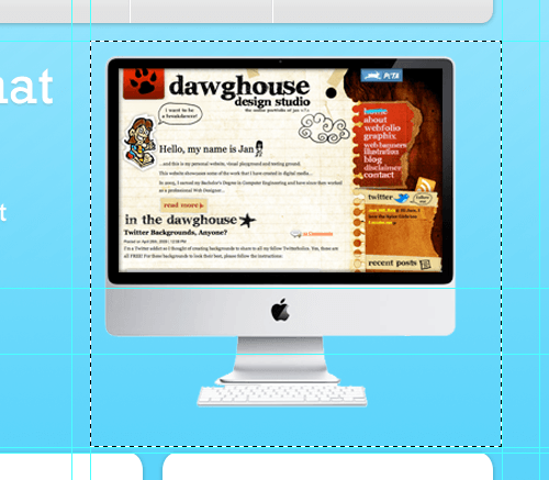 42 Copy it to a new document, then save it as monitor.jpg.
Coding the “Featured Area”
Now, we’re going to work on the “Featured Area” HTML and CSS. So head on over to index.html. 43 For the “Featured Area”, we’re going to use a block-displayed <p> element.
You can certainly use a div for this, but I chose to go with a paragraph. The “Learn More” button is an <a> element, and the monitor screen is just an image inside the paragraph. Here’s the markup:
<p id="featuredText"> We build websites that blow you away[...] <a href="#" id="learnMoreButton">learn more.</a> <img id="monitor" src="img/monitor.jpg" width="375" height="370" alt="scrn" /> </p>
44 Let’s style the paragraph, which acts, effectively, as our container.
We need to set the position property to relative so that (later on) our monitor, who’ll be absolutely-positioned, will position itself relative to the #featuredText paragraph and not the body of the web page. We set featured_bg.jpg as the background and indent the text to the left just like in previous examples.
p#featuredText { display:block; position:relative; float:left; width:100%; height:375px; background:url(img/featured_bg.jpg) no-repeat 0 0; text-indent:-10000px; }45 Next we style the “Learn More” button. We use learnmore.jpg as the background.
We declare a hover style rule so that we can get the CSS rollover effect just like in the logo. We’ll also absolutely-position the monitor on the top right of the #featuredText container.
a#learnMoreButton { display:block; width:280px; height:60px; background:url(img/learnmore.jpg) no-repeat 0 0; margin:200px 0 0 132px; } a:hover#learnMoreButton { background-position:0 -60px; } #monitor { position: absolute; top:0; right:0; }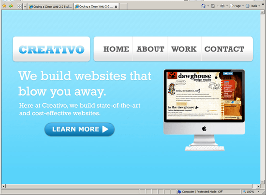 Featured Area is done. Check out the preview of both the header and the Featured Area finished (Example 3).
Example 3: Header and Featured Area completed.
Creating the rounded corner boxes
46 The next step is creating the rounded corner boxes. The mockup uses a non-web-safe for the font, so we’re going to replace it later on with a web-safe font (Verdana). We’ll cut up each box one at a time.
First, turn off the text layers inside the box, box 2, and box 3 folders in the Layers palette in Photoshop. 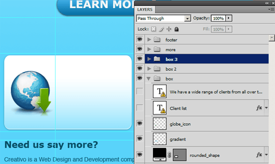 47 Create a selection around the first box that is exactly 320px by 185px. Use Copy Merged, then paste it into another document.
Save it as box1.jpg in the img folder. 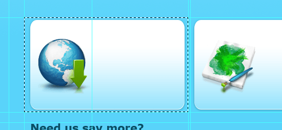 48 Repeat 47 for the second box and the third box. Save them inside the img folder as box2.jpg and box3.jpg, accordingly.
Coding the boxes
49 Head over to index.html.
We will create a containing div for the boxes called #boxContainer. Inside this div, we’ll create three boxes with a class of .box. So that we can set the appropriate CSS background, we double-declare the class property of the boxes with .client, .work, and .book.
Here is the markup:
<div id="boxContainer"> <div class="box client"> <h2>Client list</h2> <p>We have a wide range of clients from [...]<p> </div> <div class="box work"> <h2>Our work</h2> <p>Check out the work we have done for our various [...]</p> </div> <div class="box book"> <h2>Book now!</h2> <p>[...] Click here to get a <strong>free quote</strong>!</p> </div>
Styling the boxes
50 We float the .box divs to the left so that they’re displayed next to each other. We give the <h2> element an uppercase value for its text-transform property so that it is in all caps, just like the mock-up. Then for the .client, .work, and .book style rules, we set the appropriate background for each of the boxes.
.box { width:320px; height:185px; float:left; } .box h2 { font:bold 20px Verdana, Geneva, sans-serif; color:#0f83bc; text-transform:uppercase; margin:35px 0 0 140px; } .box p { font:normal 12px/18px Verdana, Geneva, sans-serif; color:#0c3b4a; margin:0 30px 0 140px; } .client { background:url(img/box1.jpg) no-repeat 0 0; } .work { background:url(img/box2.jpg) no-repeat 0 0; } .book { background:url(img/box3.jpg) no-repeat 0 0; }Preview your work in the browser.
It should look like Example 4. Example 4: Boxes completed
Coding and Styling the left column
51 Below the boxes, there’s a content area that has a heading of “Need we say more?”. We’ll call this “left column”, and put that text inside a div called #leftCol. Here’s the markup:
<div id="leftCol"> <h2>Need us say more?</h2> <p>Creativo is a Web Design and Development[...]</p> </div>
52 We’ll give #leftCol a width the is equal to the width of the two boxes above to give the design a bit of symmetry. We have to give it a left margin to align it with the edge of the first box above, a top margin to give the boxes a bit of room below.
Then we give the text inside the column some styles.
#leftCol { width:640px; float:left; margin:20px 0 0 10px; } #leftCol h2 { font:bold 20px/24px Verdana, Geneva, sans-serif; color:#094e64; } #leftCol p { font:normal 14px/20px Arial, Helvetica, sans-serif; color:#094e64; margin-top:10px; }Here’s a preview of the design with the left column in place (Example 5). Example 5: left column incorporated into the design.
Creating the Newsletter web form
53 In Photoshop, turn off all the layers inside the more folder except for the layers that show the background, the “Go” button, and the input field. 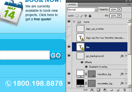 54 Create a selection around the newsletter area using the Rectangular Marquee Tool (M) that is exactly 320px by 110px.
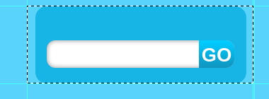 55 Copy the selection (use Copy Merged), paste it onto a new document. Save it as newsletter_bg.jpg. 56 Create a selection around the Go button, copy it, and then paste it into another document.
Save it as go.jpg.
Coding the Newsletter web form
57 For the web form, we use a <form> element, a label for the text, a text input, and a submit button.
<form id="newsletter" action="" method="get"> <label for="emailInput">Sign Up for Our Monthly Newsletter: </label> <input id="emailInput" name="emailInput" type="text" /> <input id="submitButton" name="submitButton" value="Go" type="image" src="img/go.jpg" /> </form>
58 We give the form a relative position so that we can absolutely-position the input and Go button. We hide the border for the text input #emailInput by giving the border property a value of none. We give the form a top margin to align the top portion of the form to the left column, and a bottom margin to give it space from the footer.
#newsletter { position:relative; width:320px; height:110px; float:left; background:url(img/newsletter_bg.jpg) no-repeat 0 0; margin:20px 0 50px 0; } #newsletter label { font:bold 16px Verdana, Geneva, sans-serif; letter-spacing:-1px; margin-top:26px; width:100%; display:block; color:#fff; text-align:center; } #emailInput { position:absolute; top:51px; left:5px; width:200px; margin:0px 0 0 30px; font:bold 20px Verdana, Geneva, sans-serif; color:#999; border:0; background-color:transparent; border:none; } #submitButton { position:absolute; top:43px; right:27px; width:50px; height:40px; margin-top:5px; padding:0; }Check your work against Example 6 below to make sure you’re still in the same page.
Try typing something in the text field. Example 6: Newsletter form complete.
Coding the footer
We’re going to reduce the footer content from the mockup by not including the telephone number image on the right hand side. Our footer will be pure HTML and CSS.
Here’s the markup for the footer:
<div id="footer"> <p>Creativo Design © 2009. All Rights Reserved. </p> </div>
Here is the CSS:
#footer { clear:both; width:940px; border-top:1px dashed #094e64; } #footer p { margin:15px 0; font:bold 12px Arial, Helvetica, sans-serif; color:#094e64; }Example 7: Footer compleste.
Some jQuery Goodness
We’re going to add a JavaScript-based animation effect for the logo’s rollover using the jQuery library. We’ll use the Google AJAX Libraries API web service to do the heavy-lifting and use their infrastructure to serve the jQuery library.
We’re going to give the logo (#header h1 a) a cool fade in and out effect. We’re going to manipulate the DOM to insert a span > a element with a class of logoHover which will have the rollover state as its background. When the user hovers over the logo, we will insert logoHover inside header h1 and then fade it in.
When the user hover out, we fade out logoHover and then remove it from the DOM. You can apply this to other elements in the web design – but I’ll get you started with the logo. 59 To start, include the jQuery Library and javascript.js in the head of the HTML document.
<head> <script type="text/javascript" src="http://ajax.googleapis.com/ajax/libs/jquery/1.3.2/jquery.min.js"></script> <script type="text/javascript" src="javascript.js"></script> </head>
60 Let’s place the following styles in our styles.css:
span.logoHover { display:block; width:100%; height:100%; background:#ccc url(img/logo.jpg) no-repeat 0 -125px; } span.logoHover a { display:block; width:100%; height:100%; }61 Let’s place the following script inside javascript.js.
Read the comments to gain an understanding of what’s going on.
$(document).ready(function(){ // Remove CSS style of hover $('#header h1 a:hover').css('background','none'); // Bind a mouseenter event to #header > h1 > a element $('#header h1 a') .bind('mouseenter',function(){ // Insert a span > a element in DOM that we will fade in // with class name .logoHover $(this) .before('<span class="logoHover"><a href="#">home</a></span>'); // Hide new DOM element immediately, then fade it in $('.logoHover') .hide().fadeIn() // When mouse leaves logoHover, fade out, on complete, remove // from DOM. .bind('mouseleave', function(){ $(this).fadeOut('normal', function(){ $(this).remove() }); }); }); });Finished!
 Congratulations for sticking through this tutorial – you’re a champ! I hope you learned a few tips and tricks on converting a design mockup to an HTML template.
The “Clean Web 2.0 Style Web Design” Series
This article is part two of a two-part series that shows you how to create a design in Photoshop, then how to code it into a valid (X)HTML web design. If you’re interested in more tutorials like this, you should definitely subscribe to the RSS feed.
If your interested in help with this type of design, contact a web design company. For SEO purposes, remember when designing these pages to add good content to build up backlinks. This tips should help you design sites for clients across all industries, from colleges to restaurants!
- Part 1: How to Create a Clean Web 2.0 Style Web Design in Photoshop
- Part 2: Coding a Clean Web 2.0 Style Web Design from Photoshop
Credit
The awesome icons used in the web layout (and which have been mentioned in the first part of this two-part series) are from Wilson Ink on DeviantArt – the icon set is called the Green and Blue Icon Set.
Questions?
Please feel free to ask questions in the comments. I, along with the passionate and experienced readers of Six Revisions, will try to help you as best as we can. Also, please share your thoughts, opinions, and mistakes that you find in the tutorial.
Related content
- Create a Slick and Accessible Slideshow Using jQuery
- How to Create a “Worn Paper” Web Layout Using Photoshop
- How to Create a Slick and Clean Button in Photoshop
- 25 Impressive Character Designs from Behance
- Related categories: Tutorials and Web Development
People who’ve helped improve this tutorial
- Dean Duncan Jones: Suggests to use a
#containerwidth of 1000px to avoid horizontal scrolling for some smaller monitors, instead of 1024px in step 11. - keyser soze: notes that in step 11, there was an error in the height of the menu’s
li, which was correct in the example. - Dave Read: Caught a mistake on step 23 where the
idshould be on the parentliand not in theaelements (it was correct in the example, but not in the tutorial). He also noted that the style rule for the monitor wasn’t shown in the tutorial, which I’ve added on step 45.
-
 President of WebFX. Bill has over 25 years of experience in the Internet marketing industry specializing in SEO, UX, information architecture, marketing automation and more. William’s background in scientific computing and education from Shippensburg and MIT provided the foundation for RevenueCloudFX and other key research and development projects at WebFX.
 -

WebFX is a full-service marketing agency with 1,100+ client reviews and a 4.9-star rating on Clutch! Find out how our expert team and revenue-accelerating tech can drive results for you! Learn more
Make estimating web design costs easy
Website design costs can be tricky to nail down. Get an instant estimate for a custom web design with our free website design cost calculator!
Try Our Free Web Design Cost Calculator


Web Design Calculator
Use our free tool to get a free, instant quote in under 60 seconds.
View Web Design Calculator
Proven Marketing Strategies
Make estimating web design costs easy
Website design costs can be tricky to nail down. Get an instant estimate for a custom web design with our free website design cost calculator!
Try Our Free Web Design Cost Calculator
What to read next
