
 Content is what is considered the “meat” of a website. Content should be usable and displayed in a manner that makes it efficient to read and act on. Now that we have discussed website navigation design patterns, let us now explore popular design patterns for displaying content.
Below, we’ve included a few current design trends in content presentation, all based on enhancing the user experience.
Pricing Tables
Pricing tables are now a staple on the web with the popularity of software as a service (SaaS). Pricing tables make sense when you have more than one pricing option, such as with multi-tiered subscription plans. Tables let visitors compare basic features and prices in a quick-reference format, which makes it easier for them to make a decision and act.
In well-designed pricing tables, each plan has its own sign-up button, streamlining the sign-up process and reducing confusion.
When to Use
Any time you have more than one sign-up or subscription option for the same product (such as with hosting plans or web apps), pricing tables should be used to help potential customers pick the plan that suits their needs.
Examples
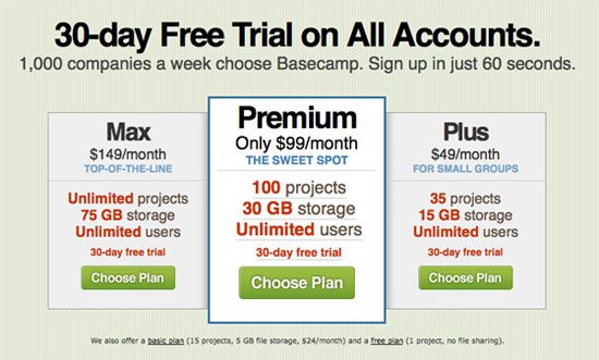
Here are some examples of pricing tables. Basecamp The pricing table in this popular project management tool uses a simple table with only three columns. The plan that provides the best value is given a distinctive design, a popular style often found on pricing tables.
 Wufoo The pricing table in the Wufoo site uses a colorful, fun table to show their service plans and pricing, arranged from most expensive on the left to least expensive (free) on the right.
 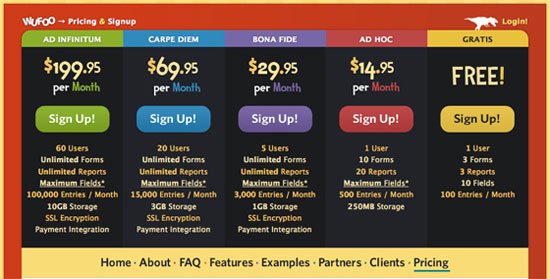 Light CMS Light CMS uses a colorful pricing table, but compared to the Wufoo pricing table (above), it’s a little less vibrant.
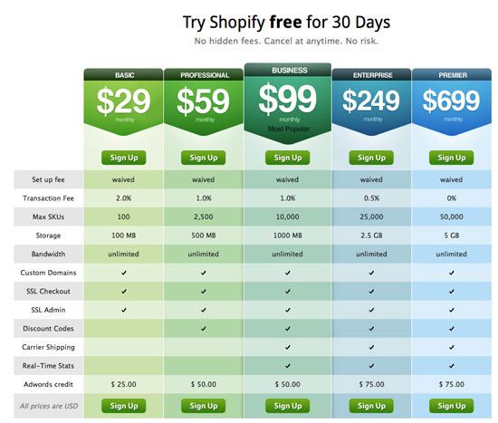
 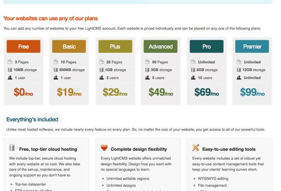 Shopify This hosted e-store solution has an excellent pricing table that shows a great example of using color to differentiate between different pricing plans.
 CannyBill CannyBill has a simple and cleanly-styled pricing table.
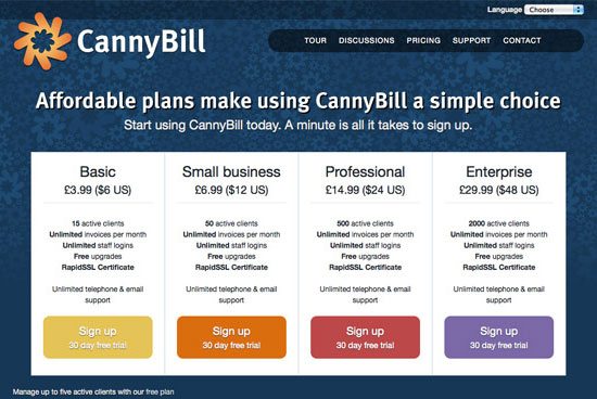
Article Lists with Content Teasers
Article lists are commonly seen on news sites and blogs and can be found most readily on home pages or archive pages where only a part of the content is shown. The way these lists are formatted can make a huge difference in how easy it is for site users to browse for useful content; and as we all know, the easier browsing is, the more likely it is that visitors will stay on your site longer.
Well-formatted lists include not only the title of the article, but also a brief blurb typically taken from the beginning of the post (a content teaser).
When to Use
Any time you have articles that need to be organized into an archive, you’ll want to consider including a content teaser. It makes it easier for your visitors to see if they’re really interested in the article, and can reduce frustration caused by not finding what they’re looking for.
Examples
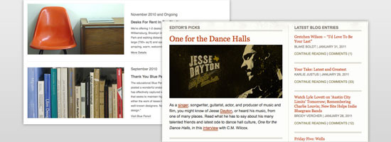
Here are five examples of article lists with content teasers. The 9513 The content teasers on this site show a paragraph or so of content for each of the main articles.
 GoMediaZine GoMediaZine shows roughly a paragraph of content for a teaser, even though they have three different formats for displaying articles on their home page.
  Kind Company Kind Company showcases the beginning of each article as a teaser on their blog.
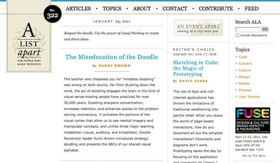
 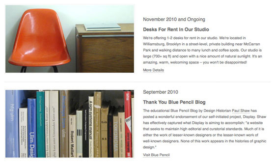 A List Apart The A List Apart front page shows the first paragraph of each article as a teaser.
 Psdtuts+ This popular Photoshop tutorial blog shows a brief blurb on each post.
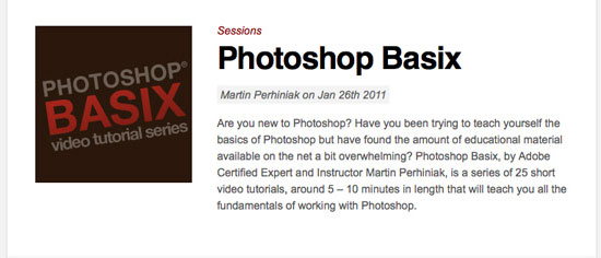
Image Thumbnails
Thumbnails can be used in a couple of different ways. Most commonly, they’re used on product pages or photo gallery pages as a way to provide a convenient view of a set of images.
Image thumbnails can also be used in article lists with content teasers (discussed above) to provide a post with some visual context.
When to Use
Image thumbnails can be used alongside articles or similar content to add visual interest to a page. They can also be used in an image gallery or similar display to show a preview of all the images. In this case, they should be clickable.
When clicked, they should open the corresponding full-size image.
Examples
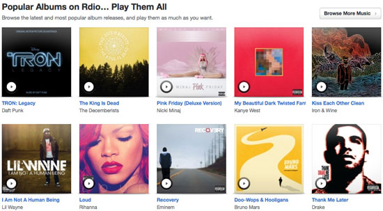
Here are five examples of using image thumbnails on a website. Kester Limb Kester Limb is a great example of thumbnails used as navigation in an online portfolio.  Rdio This site uses image thumbnails to display artwork from popular albums.
 Tobias Bjerrome Ahlin This site uses portrait-oriented thumbnails (which isn’t a very common dimension for thumbnails as they’re usually landscape or square) with some textual content.
 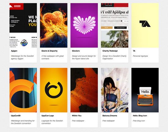 Desey Gallery sites like Desey are perfect for image thumbnail navigation schemes.
 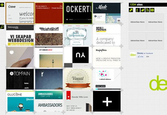 Cosmicsoda Cosmicsoda is an excellent example of how well image thumbnails work on e-commerce websites.
Image Carousels and Slideshows
Image carousels and slideshows are popular content presentation design patterns, and are making more and more appearances in website headers and other prominent web page layout positions. They’re commonly used for displaying images in association with content, often with a headline or caption overlaid on the image. They can also be used to showcase multiple images of a single product, which is sometimes seen on single-product websites.
When to Use
Use a carousel or slideshow in your header or another prominent position on your site when you want to draw attention to a particular group of content, such as featured posts.
Examples
Here are some examples of image carousels and image slideshows used on websites.
Netwise Netwise uses a slideshow to display the main content on their home page. 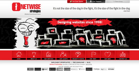 Sudhausba.de This site has a slideshow with navigation as primary visual elements on their home page.
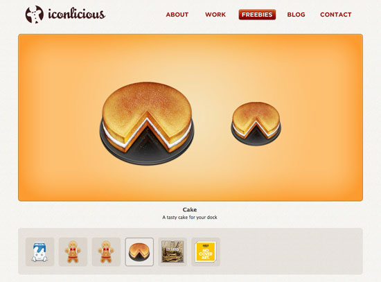
 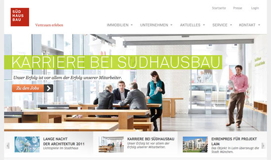 Iconlicious Iconlicious uses a slideshow in their Freebies page to display the free icons they are offering to the public.
 CreamScoop This has one has scrollable windows displayed within the slideshow.
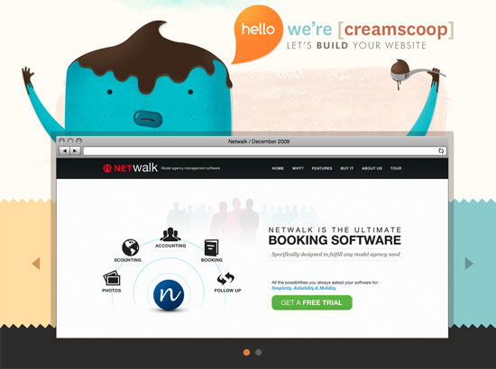
Horizontal Scroll
Horizontal scrolling used to be a big no-no in the web design world, but now there’s a trend in web design that uses horizontal layouts, with client-side scripting (e.g. JavaScript) to facilitate the horizontal scrolling of content instead of displaying horizontal scroll bars in the browser.
Sites that leverage horizontal scrolling for their content are often broken up into screens and are laid out horizontally rather than vertically. Navigation is usually accomplished with JavaScript, allowing visitors to jump from one section to the next without having to scroll.
When to Use
Use a horizontally scrolling content area when you want something a bit different from the normal vertical scroll. It works best for sites that are granular, and those that don’t have any lengthy content blocks.
Sometimes individual screens within the horizontally scrolling area will have vertical scrollbars to accommodate longer content.
Examples
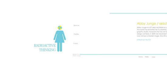
Here are four examples of horizontal scroll. Eolo Perfido Photography This web portfolio featuring beautiful photography uses a stationary header and a horizontally scrolling content area. 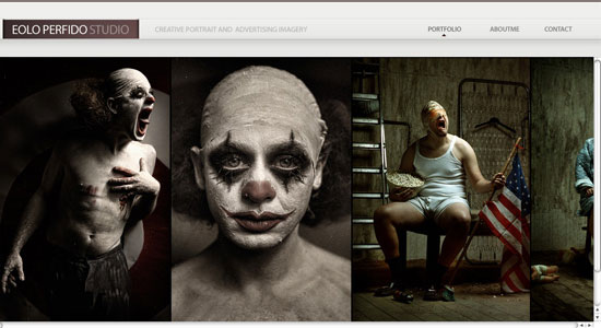 Radioactive Thinking Radioactive Thinking uses a horizontally scrolling web page layout to display the minimal content on their site.
 Stephane Tartelin This website uses a horizontal layout to display the owner’s work.
 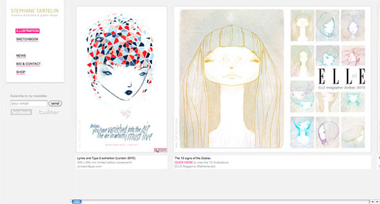 Welovechief.com This site uses a very straightforward horizontal layout.
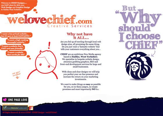
Endless Vertical Scroll
Endless vertical scroll is becoming popular on sites that have constantly-updated content, like Twitter and Facebook.
Usually, endless vertical scrolling continues to load new content as long as you keep scrolling, though sometimes they also require user input (such as clicking a “Load more” button, which you can see more frequently on mobile web designs). Only loading part of a page’s content can reduce page-loading times, and can lower web server resource demands since most users will likely find what they’re looking for within the first couple of content blocks that load.
When to Use
Use endless scrolling whenever you have long lists of content that may not all need to be loaded at once. Examples of this are timeline-based content (such as those found on Facebook’s news feed or Twitter’s update feeds), or for things like search results.
Examples
Here are a couple of examples of endless vertical scroll.
Facebook The news feed on Facebook is probably one of the most commonly seen continuous scrolling interfaces out there.  DZone The social news site, Dzone, uses endless scrolling for displaying search results.
Further Reading
For some inspiration related to the design patterns discussed above, check out the following resources:
- Five Types of Effective Headers in Web Design
- Five Popular Design Portfolio Website Styles
- 40 Excellent Blog Designs
- 70+ Examples of Product Comparison Tables in Web Design
- 25 Stylish Examples of Headers in Web Design
- 16 Free JavaScript Solutions for Displaying Your Images
- 14 jQuery Plugins for Working with Images
- Create a Slick and Accessible Slideshow Using jQuery
Related Content
-
 President of WebFX. Bill has over 25 years of experience in the Internet marketing industry specializing in SEO, UX, information architecture, marketing automation and more. William’s background in scientific computing and education from Shippensburg and MIT provided the foundation for RevenueCloudFX and other key research and development projects at WebFX.
 -

WebFX is a full-service marketing agency with 1,100+ client reviews and a 4.9-star rating on Clutch! Find out how our expert team and revenue-accelerating tech can drive results for you! Learn more
Make estimating web design costs easy
Website design costs can be tricky to nail down. Get an instant estimate for a custom web design with our free website design cost calculator!
Try Our Free Web Design Cost Calculator
Share this article


Web Design Calculator
Use our free tool to get a free, instant quote in under 60 seconds.
View Web Design Calculator
Make estimating web design costs easy
Website design costs can be tricky to nail down. Get an instant estimate for a custom web design with our free website design cost calculator!
Try Our Free Web Design Cost Calculator