- Home
- Blog
- Web Design Contact Form Design: How to Design Forms That Convert
Contact Form Design: How to Design Forms That Convert
-
 Published: Dec 14, 2022
-
 6 min. read
-
 WebFX Team
 Digital Marketing Agency
- The WebFX team is made up of more than 450 subject matter experts in digital marketing, SEO, web design and web development, social media, and more. Together, they’ve helped WebFX’s clients earn more than $3 billion in revenue from the web — and that’s just in the past five years. @webfx
Has anyone ever asked you to fill out a contact card hidden underneath your seat? You might have been interested in signing up for their newsletter or finding out more about volunteering. A website contact form is the digital equivalent that allows users to stay in touch with your business.
In this post, we’re going to talk about contact form design, including why it’s so important and how you can optimize it for your website. Keep reading to learn more, and then subscribe to Revenue Weekly for more digital marketing tips from the experts!
What is a website contact form?
A website contact form is a convenient way for a qualified lead to contact you through your company website, similar to filling out a contact card at an event. Your leads will have different motivations for filling out your website’s contact form.
With the correct design and fields, your contact form will tell you exactly what your lead needs. Knowing what your potential customers are after will help you deliver as quickly and efficiently as possible, fostering their trust in your company and ultimately leading to conversions.
What should be on a contact form?
Contact forms are versatile and you can customize them to meet your needs and offerings. The fields you include will depend on the info you want from the user.
Answer the following three questions to determine the fields that should go on your contact form.
1. What’s the form’s purpose?
At a minimum, a basic contact form will include the following fields:
- Name
- A question or message box
- A “submit” button
However, a bare-bones contact form won’t give users an incentive to reach out. An uncustomized contact form also doesn’t provide companies with enough information to deliver a personalized customer experience.
Instead, you’ll want to include some more detailed fields as well. For example, category checkboxes help your leads choose the services they’re interested in. Drop-down fields serve the same purpose.
Knowing their reason for contacting you will help you prepare the pitch you’ll make when you contact them. It will also make for a better, more streamlined customer experience.
2. Why should they contact you?
Your company won’t be the first or last to offer a free estimate. That’s where a unique selling proposition (USP) comes into play. A USP will set your company apart from the rest. It will also give qualified leads an incentive to choose a free estimate from you instead of the next guy.
If you’re not sure what your USP is, check out your competitor’s websites. What are they offering? It could be anything from free shipping to 24/7 customer support. You’ll see potential customers’ pain points based on other industry-specific USPs.
For example, if hidden fees are a common problem in your industry, you can offer a flat-rate service fee as a USP!
3. What’s essential?
Companies use contact forms for anything from providing free quotes to helping leads sign up for email newsletters or freebies. No matter the purpose of your contact form, you’ll only want to include essential, relevant fields.
Let’s say your lead is contacting you to learn more about your garage door repair services. You’ll need their first name, a phone number or email, and an additional free-form field for their question or service request.
Now, if you were to request their last name, address, and birth date right out the gate when all they want is a comparison quote, they may steer clear of you — because you haven’t established that level of trust yet.
How do you design a contact form?
Fortunately, you don’t need to be an HTML or CSS wiz to create high-converting contact forms. Here are some of our favorite contact form-building plugins.
- Contact Form 7: Contact Form 7 is a popular form-building tool. It allows you to create forms with reCaptcha and customize them with other WordPress plugins to download contacts into CSV files or send customers to PayPal for a convenient payment funnel.
- Conversational Form: Conversational Form allows you to add as many fields to your forms as you see fit. If you’re a CSS connoisseur, you can integrate your coding to style your form how you want. Otherwise, you can customize your forms’ colors, fonts, and overall layout with its included customization options.
- SurveyMonkey: SurveyMonkey forms are excellent for more in-depth customer research. They’re perfect for creating customer surveys and questionnaires with pre-set and customizable survey questions.
3 additional contact form design tips
Check out these other tips for designing high-converting contact forms that your leads will love.
1. Make sure it’s mobile-friendly
A mobile-friendly site is essential in today’s mobile-first digital marketplace. Your lead probably isn’t on a desktop computer if they’ve stumbled on your site through an Instagram or Facebook ad.
To make sure your contact form translates well on a mobile device, follow these tips:
- Make it a single-column form.
- Use drop-down menus with pre-set selections.
- Remove any unnecessary fields and keep it concise.
- Enable autofill.
- Make sure the colors are high-contrast for better visibility.
- Create multi-step forms for lengthier surveys or questionnaires.
2. Include progress bars for reference
If you’ve whittled down your form without sacrificing the essentials but it’s still a bit long, a progress bar will motivate your leads to keep pressing forward.
Let’s say you’ve created a customer satisfaction survey. If the form is a multi-step survey, your lead might become discouraged halfway through and abandon it. However, if they know they’re on the second to last series of questions, they’re more likely to stay motivated to reach the finish line.
3. Use summary or explanation boxes
Have you ever filled out a form and thought, “Why do they need my phone number?” If the information isn’t relevant to the transaction, your lead might feel confused or wary of your intentions.
For example, if you’re interested in a free marketing PDF guide you found online, you’re prepared to provide your name and email address. But if the company asks for your phone number or address, you won’t feel confident about their intentions. In this situation, a summary box is helpful. It’ll explain why you’re requesting the information.
Another example — let’s say you want your customer’s birthday details to surprise them with a birthday coupon. Make your intentions transparent by disclosing why you’re requesting the information with the help of a summary box.
Of course, you should make any non-essential fields optional to fill out. We recommend sticking to the required information. There are other ways to delight customers without requesting unnecessary contact details!
Our long list of services helps you grow every aspect of your business with marketing strategies that are proven to increase bottom-line metrics like revenue and conversions. In the past 5 years, we’ve managed more than 14.9 MILLION transactions across our client base.Time to Level Up Your Sales

Need help designing a form? Contact our design team at WebFX!
Want to design a contact form that converts? Our user experience (UX) and design teams at WebFX are ready to help. We’ll help you create mobile-friendly, effective contact forms that turn leads into customers. We’ve captured over 24 million leads for our clients with our conversion rate optimization and web design services.
We assign a dedicated project manager to each client, ensuring you have a point of contact throughout the process. Contact us online or call us at 888-601-5359 today to speak with one of our strategists!
-
 The WebFX team is made up of more than 450 subject matter experts in digital marketing, SEO, web design and web development, social media, and more. Together, they’ve helped WebFX’s clients earn more than $3 billion in revenue from the web — and that’s just in the past five years.@webfx
 -

WebFX is a full-service marketing agency with 1,100+ client reviews and a 4.9-star rating on Clutch! Find out how our expert team and revenue-accelerating tech can drive results for you! Learn more
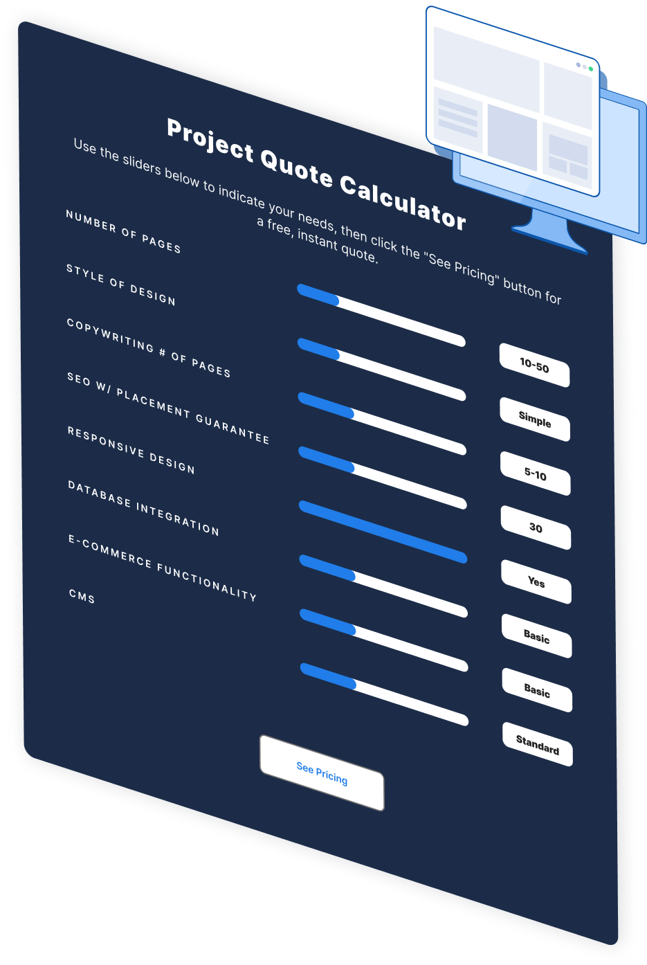
Make estimating web design costs easy
Website design costs can be tricky to nail down. Get an instant estimate for a custom web design with our free website design cost calculator!
Try Our Free Web Design Cost Calculator
Table of Contents
- What is a Website Contact Form?
- What Should Be on a Contact Form?
- 1. What’s the Form’s Purpose?
- 2. Why Should They Contact You?
- 3. What’s Essential?
- How Do You Design a Contact Form?
- 3 Additional Contact Form Design Tips
- 1. Make Sure It’s Mobile-friendly
- 2. Include Progress Bars for Reference
- 3. Use Summary or Explanation Boxes
- Need Help Designing a Form? Contact Our Design Team at WebFX!


Web Design Calculator
Use our free tool to get a free, instant quote in under 60 seconds.
View Web Design CalculatorMake estimating web design costs easy
Website design costs can be tricky to nail down. Get an instant estimate for a custom web design with our free website design cost calculator!
Try Our Free Web Design Cost Calculator


