

I’ve talked about responsive CSS grid systems before, but, at the time, the Flexible Grid System didn’t exist yet. 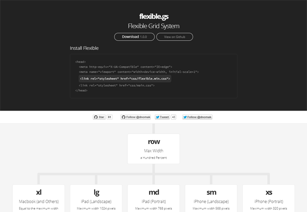 The Flexible Grid System is a 24-column responsive CSS grid system. It has an intuitive syntax and pretty decent browser support — it’ll even work as far back as IE 9. Check out its demo page and resize your browser to see the demo web page layout reconfigure itself as you change the dimensions of your browser’s viewport.
  If you’ve ever used the pioneer of web page layout grid systems, the 960 Grid System by Nathan Smith, at any point in your web design career then you’ll have no problems switching over to the Flexible Grid System, which shares a similar nomenclature and is clearly inspired by the former. The Flexible Grid System is MIT-licensed.
Get the latest version and view the source code of the system over at GitHub.
-
 Trevin serves as the VP of Marketing at WebFX. He has worked on over 450 marketing campaigns and has been building websites for over 25 years. His work has been featured by Search Engine Land, USA Today, Fast Company and Inc.
 -

WebFX is a full-service marketing agency with 1,100+ client reviews and a 4.9-star rating on Clutch! Find out how our expert team and revenue-accelerating tech can drive results for you! Learn more
Make estimating web design costs easy
Website design costs can be tricky to nail down. Get an instant estimate for a custom web design with our free website design cost calculator!
Try Our Free Web Design Cost Calculator
Share this article


Web Design Calculator
Use our free tool to get a free, instant quote in under 60 seconds.
View Web Design Calculator
Make estimating web design costs easy
Website design costs can be tricky to nail down. Get an instant estimate for a custom web design with our free website design cost calculator!
Try Our Free Web Design Cost Calculator
What to read next