
 I am a full-time teacher in the US public schools, so I depend on my school’s rather dated website for many of my job functions. My site looks like the other staffers’, down to the identical font and color choices. I am not the school’s web designer, nor would it do any good if I were.
I have very, very limited control to my pages. In fact, the school employee in charge of our website has very limited control over the site. Like many schools in the U.S., my school’s website is strictly controlled by the district’s IT department, which doesn’t (as a rule) employ web designers or developers.
And even our school’s IT department has its hands tied, because the district signed a long-term contract to use a particular CMS that restricts everyone’s ability to go beyond its strictures. I will give you two phrases that should tell you all you need to know about my school’s site design: “FrontPage” and “HTML 2.0.” Yes, really.
The Suckage
By and large, American public school websites suck. They suck like an Electrolux.
They could suck the chrome off a trailer hitch. Getting the picture yet? Voyaging into the world of public school websites is like taking a trip back in time — and using a smelly school bus to get there.
It’s a world of outdated and massively invalid code. It’s a world whose information is presented in Times New Roman and Comic Sans. It’s decorated with animated clip art.
It favors notebook paper backgrounds and chalkboard graphics (yet I haven’t had a chalkboard in my classroom in a decade). 
 In this world, site accessibility is considered important (Section 508 regulations), but in practice is largely left unaddressed. It’s ruled by Internet Explorer (and all too often, IE6).
Overall, public school websites is a huge section of the World Wide Web that has largely ignored or rejected modern design and coding techniques. It’s an entirely different paradigm than the one that professional designers and developers are used to working in. Should it be this way?
Hell, no. First, let’s take a look at what’s going on with most public school sites, then let’s focus on how the paradigm can be changed.
Ranting and Finger-Pointing is Simplistic and Unfair
It’s easy to just blame and mock the public school systems for having sadly outdated and poorly designed websites. Whether you want to go after individual schools, IT departments, or the districts themselves is your choice.
But the reality is a bit more complicated. Most school personnel have little or no idea how to construct or maintain a website, nor do they have the time to learn. Their time is spent doing, among other things:
- Teaching
- Wrangling students and parents
- Trying to fulfill an ever-expanding and ever more contradictory set of expectations from communities, districts, states, and federal agencies
- Keeping up with a huge amount of paperwork
You can add many, many more duties and tasks to this list. Designers and developers Ted Adler of Union Street Media, Abi Cushman of Brown Bear Creative, and Tim Dailey of Digital Gibberish, who’ve all worked in the acedemic industry, all agree. Their firms are among the few that has had any involvement at all with public schools.
An individual school’s website needs to be structured so that every staff member — from custodian to principal — can access their pages, input the necessary information, and move on to another task without having to battle with code or access issues. Most public schools don’t have a staff member who can devote the time, understanding, and effort necessary to maintain a website on their own, so they have to depend on each staffer to handle their own end of things. Schools also have to choose an approach that can give a reasonable guarantee of privacy and security, in large part because of privacy and safety issues surrounding the children of those schools, and their legal responsibilities in protecting its online information about their students.
And they have to create websites for users with old, obsolete operating systems and the browsers that lurk there — this applies to both school and community computers. As Ted Adler pointed out, school websites have to appeal to such a broad swath of users — parents, students, staff, community members, and people who might be considering relocating to the particular school district — that another priority of a school website is its information architecture and structure. Any school’s home page worth its electrons will let the first-time visitor know instantly where all the different information is, and how to get to it.
The Poor IT Guys
All of this gets thrown into the laps of the schools’ IT departments, which are invariably understaffed, underfunded, and manned by people with little or no knowledge of web development.
Their jobs are to keep the computers running, maintain security, and install new software, among other tasks. Those departments often make the sensible choices to:
- Implement a system wide CMS
- Give each staffer limited access to a small area of the site — usually their own home page or series of pages, and nothing more
- Restrict site access to a very small number of trusted (and monitored) staffers in concert with the department
They’re told to get their schools on the Internet, and get it done by tomorrow, regardless of their lack of knowledge or understanding of the nature of the task. Hence the need for quick and often very dirty solutions.
“School Internet Providers”
Then there are the “school Internet providers.” There is an entire industry of CMS and “site builder” providers tailoring their products for school use. Instead of Drupal, Joomla, and Expression Engine, schools are purchasing products from finalsite, CMS4Schools, SchoolCMS, Chancery SMS, and TeacherWeb, among others.
Most of these are standalone, all-in-one CMS and site-builder products developed, not to ensure aesthetically pleasing, standards-compliant and easily configurable websites, but to create sites that are easy for novices to use, specifically configured for school usage, and relatively secure. CMS4Schools, for example, touts Wisconsin’s Arrowhead Union High School as an exemplar of CMS4Schools’s capabilities. The site is aesthetically satisfactory, more or less, but the site has a table-based layout and boasts 264 validation errors last time I checked.
Obviously CMS4Schools’s primary concern is not to provide modern, standards-compliant and valid websites. Many of these products are attractive for schools because unlike Joomla or Drupal, for example, their systems are “pre-configured” for school use, with sections dedicated to school sites, board and district announcements, school calendars, and the like. Most IT departments have no one with the skills to configure an off-the-shelf CMS for their district’s needs.
Oftentimes, the providers offer “bundled” software to both school districts and town governments, an additional attraction for confused and overworked IT directors.
They All Do It
When Abi Cushman of Brown Bear Creative, a company that has worked on public school websites, was asked why she thought so many schools used a school-oriented CMS and “site builder” providers, she answered simply, “I think because other schools do it.” I think she’s right.
A (Slightly) Better Way
School administrator Robert Kennedy, who has had the experience of bringing computing to schools, advised how websites in schools should be created: “For lots of good reasons, many school websites have been designed by the school’s computer department. I firmly believe that the Public Relations and/or Marketing arm of the school should come up with the design, and that the computer staff implement it. Or have the tagging done professionally if you wish and can afford the cost.”
Lack of Modern Resources
The resources specifically targeted for school websites do not approach those made available for commercial or personal designs.
Many websites on designing sites for schools themselves are web zombies.
Old School Techniques and Information
One of the first resources to come up on a Google search for “school web site design” is a page called Designing School Web Sites to Deliver. The site itself is sadly designed (using Adobe’s now-discontinued GoLive), lacks a doctype, and sports other fundamental no-nos of web design like table-based layouts and inline CSS style attributes. 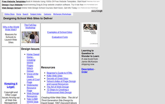 Moreover, the site promotes two books from 1997 along with a number of outdated websites as the places for school personnel to go to learn web design.
While the host site, “From Now On” (FNO for short), promotes itself as a go-to source for information on “educational technology” and has published articles dated as recently as September 2010, the technology being used to present the site is outdated and unsatisfactory. I’m not cracking on the FNO organization per se as much as I’m noting that if this is what comes up as a top result in a Google search, what kind of dearth of resources must exist? Wigglebits is another prime example of another site purporting to teach modern website design.
This site — again, enjoying top ranks on Google — is designed to appeal to kids and teachers alike. 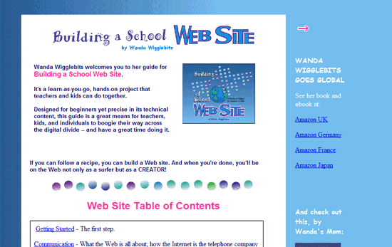 It describes itself as follows:
“Designed for beginners yet precise in its technical content, this guide is a great means for teachers, kids, and individuals to boogie their way across the digital divide — and have a great time doing it.”
At any rate, the site attempts to “talk down” to its users by using terms such as “gunk” and “header thing” to describe markup as if saying, “Hey, kids, you can be a professional web designer and work all day with gunk! Don’t forget to wear your overalls!” It also advises its users to make web graphics in Microsoft Paint and to use deprecated HTML elements such as <center> and <font>, among other recommended stalwarts from the last century’s coding standards.
As far as submitting your site to search engines, Wigglebits advises:
“Yahoo, Google, Alta Vista, Excite, Infoseek, Webcrawler, Hotbot, and Lycos are some of the search engines and catalogs on the Web today.”
And you wonder why teachers and schools have trouble finding proper help for their design and development needs? Kathy Schrock is probably a name that rings no bells with you — but she is to the subject of school and classroom procedures as Eric Meyer is to CSS. Going to Meyer’s site gives you current and reliable information on all things CSS.
Going to Schrock’s site might well give you current and useful information on running a classroom. However, you won’t find that kind of information on her page about school websites. Her site leads you to an “updated” page on evaluating and constructing websites from 2002. The other pages she sends you to are even older. She does provide a set of useful forms for schools to evaluate their sites — here’s the PDF of the secondary school evaluation form — but there’s no place to evaluate the quality and usability of the design itself.
The Overall Dilemma
All in all, schools have been conditioned since the advent of school-based websites to consider themselves as fundamentally different in needs and approach from commercial or personal websites. They look for different solutions than your local church, small business, or self-employed entrepreneur might.
They are given information that is outdated, poorly presented, and sometimes just plain wrong, and lulled into using it because “this information is developed specifically for the needs of schools like yours.” They are served by different providers than the design and app firms who service commercial and personal clients, and are often given inferior products. This is part of the paradigm shift that schools operate under. The general perception seems to be: “School websites just can’t be as good as other sites.” I absolutely disagree with this position.
School Site Reviews
Let’s take a look at some of the sites out there and then look at ways this paradigm can be changed for the better.
Before You Read Any Further…
At some point, someone from one of the schools featured below will read this article and see the write-up on their school’s website.
They might be angry to see their site criticized, perhaps even embarrassed and hurt. To those school personnel and community members, let me say this: You have nothing to be ashamed of. You do invaluable work preparing America’s children for their futures.
You are overworked, overstressed, underpaid, and underappreciated. You and your children deserve better tools with which to build your school’s websites, and you’re not given them. Your school, and its students, deserve to have modern, elegant, beautiful, accessible, and standards-compliant websites that serve as gateways for your students, staff, and community to explore the offerings your school provides its kids and its community on a daily basis.
You create the best resources for your community and students that you can — given the extraordinary restrictions under which you work. Each year you’re told to achieve a near-impossible task with nowhere near the resources you need, like being told to build the Taj Mahal with popsicle sticks and glue. And when you achieve it, you’re told to do a better job the next year with half the resources (“now build it without the glue!”).
School websites are just one part of this model. Whatever onus of “web sites that suck” that may apply to any school’s website is not to be laid at your door.
About the Following Sites
The sites below are somewhat arbitrarily divided into three categories: “good,” “mediocre,” and “poor”. Even the best of the sites below do not meet the standards of a high-grade commercial website, nor those of a top-end personal site. Professional designers may be tempted to rename the three categories as “mediocre,” “poor,” and “godawful”. It’s easy to do that, but it’s worth remembering that with school websites, the paradigm is much different from what a professional may be used to working with. It’s also worth noting that these are not intended to be full-blown site reviews, but “reviews at a glance.” I’ve also checked the sites’ accessibility using WebAIM’s WAVE tool, which provides assessments of a site’s compliance with WCAG 1.0 and Section 508 guidelines. These kinds of “instant accessibility checks” are simplistic and superficial, but they will at least give us some idea of how accessible these sites are.
Let’s dive in.
Good Sites
We have five sites that fit in this category. Apex High, Apex NC 
- Generated from a free template.
- Pros: Stylish use of strong color. Spiffy jQuery-driven navigation menu. Clean design.
Coded with XHTML 1.0 Strict doctype. Has a Twitter widget. Good use of progressive CSS3 elements.
- Cons: Some pages hosted on school district site or other servers. Use of text images limits accessibility and searchability. Serious validation errors.
- WAVE accessibility assessment: Five errors, mostly related to empty
h2and links.
Arrowhead Union High School, Hartland, WI 
- Generated using CMS4Schools, featured in CMS4Schools’ online portfolio.
- Pros: Clean, well-done layout. Search box located in upper right. Event calendar.
Large yet easily navigable link scheme. Attractive JS-driven “slideshow” of selected photographs on home page.
- Cons: Very “template-y.” Spartan subsidiary pages. Inexplicable use of internal styling for links. Invalid and deprecated code.
Enormous amount of validation errors and warnings.
- WAVE accessibility assessment: Two errors, related to missing
altattributes for images (not neccesarily a bad thing if it’s within context) and missing form labels.
Central Learning Center, Henderson, KY 
- Created with DotNetNuke.
- Pros: Strong color scheme. Easy-to-use dropdown nav menu and sidebar menu. Attractive JS-driven slideshow on home page.
News alert box on home page.
- Cons: “Template-y” in appearance. Odd placement of minimize and print buttons on home page. Staff pages are PDFs.
CMS-generated site features lots of extraneous code. Numerous validation errors and warnings.
- WAVE accessibility assessment: 18 errors, all related to missing
altattributes for images.
Kofa High School, Yuma, AZ 
- Generated from School Webmasters, featured in School Webmasters’ online portfolio.
- Pros: Strong red-based design aesthetic. Good drop-down navigation menu. Google Translate function on home page.
- Cons: Somewhat confusing sidebar navigation, with subsidiary menu choices appearing only on hover. Use of graphics as headings rendering them invisible to search engines. Subsidiary template-driven pages hosted on Quia or other providers.
Internal CSS. Table-based layout. Use of deprecated code.
Numerous minor validation errors.
- WAVE accessibility assessment: No accessibility errors.
Mangum Elementary, Bahama, NC 
- Created with Joomla, based on a Joomla template.
- Pros: Strong use of color. Simple, easily navigable structure. Logical placement of information on home page.
No major validation errors.
- Cons: “Template-y” appearance. Little content on some subsidiary pages. Use of tables in layout and presentation.
- WAVE accessibility assessment: Four errors, all related to missing
altattributes for images.
Mediocre Sites
We have two sites that fit in this category. Corliss High School, Chicago, IL 
- Designed by Sapient, a private design firm (all Chicago Public School, or CPS, sites have the identical design).
- Pros: Identical design scheme across schools encourages user familiarity.
- Cons: Busy design scheme, with little negative space and lots of unrelated information packed into one page. Much information on school’s home page pertains to school district and not to individual school. Table-based layout.
Many validation errors.
- WAVE accessibility assessment: 28 errors, all related to missing
altattributes for images.
Juan Seguin High School, Arlington, TX 
- Generated from a Dreamweaver template.
- Pros: Decent header design, with school logo and photo of school. Clean and simple layout.
- Cons: Poor choice of “hover” colors in all links. Header typography difficult to read behind background color. Left-sidebar navigation design rather old-fashioned.
Unnecessary use of iframes. Inexplicable use of internal styling for links. Invalid and deprecated code.
- WAVE accessibility assessment: 19 errors, all related to missing
altattributes for images and empty links.
Poor Sites
We have 11 sites that fit in this category. Cedar Ridge Elementary, Columbia, MO 
- Generated via WordPress.
- Pros: Use of RSS and Atom feeds, though how to obtain feeds not immediately apparent.
- Cons: Eye-watering colors in header; colors clash with logo colors. Poorly implemented navigation design. Mixed and unmatched use of colors, fonts, and borders in various pages.
Poor layout — information and graphics seem strewn about the home page almost at random. Very cluttered code. Unable to validate because of nonstandard code in main page.
- WAVE accessibility assessment: Three errors, all related to empty links.
Crow Creek Middle School, Stephan, SD 
- Generated by FrontPage 4.0.
- Pros: Nice school photo on home page.
- Cons: Very outdated layout and navigation scheme. “Starry” background image very dated. Red links difficult to read against black background.
Subsidiary pages almost unstyled, and what stylings are in place are pre-millennial. No doctype, rendering validation problematic. FrontPage generates lots of unnecessary code and inline stylings.
Dated file names (i.e. home page: Default.htm).
- WAVE accessibility assessment: Three errors, all related to missing
altattributes for images.
Fisher Grade School, Fisher, IL 
- Pros: Nice logo. Contact information in header.
- Cons: Extraordinarily outdated appearance, with tiled background, content scattered almost randomly around the page, and animated cartoon graphics moving across the screen. Important navigational links placed at bottom of page. No doctype, rendering validation problematic.
No CSS; page table- and inline-style driven. Subsidiary pages hosted by Webpage4Teachers, using very outdated templates.
- WAVE accessibility assessment: 15 errors, all related to missing
altattributes for images.
Hillcrest Middle, Simpsonville, SC 
- Created by either FrontPage or MS Office.
- Pros: Attractive header featuring school mascot. Multiple options in dropdown nav menu.
- Cons: Busy layout, color scheme interferes with scanning for information. No doctype, rendering validation problematic. Table-based layout.
Inline styling. Staff pages have different appearance, appear to be generated by different product.
- WAVE accessibility assessment: 13 errors, related to missing
altattributes, and empty headers and form labels.
Kennedy High School, Waterbury, CT 
- Generated via SchoolCMS
- Pros: Simple, easy-to-use layout. Navigation scheme clear, with simple flyout menu. News block above fold.
- Cons: Very “template-y.” Dated decorative animated graphic on home page. Use of “Impact” font in home page quote renders quote difficult to read. No simple way to see code because CMS blocks access through right-click menu.Table-based layout.
Spacer elements. Critical validation errors.
- WAVE accessibility assessment: Seven errors, related to missing
altattributes for images and links.
Lexington High School, Lexington, OH 
- Generated with MS Office.
- Pros: Nice logo.
- Cons: Poor design, color scheme, and layout; very dated appearance. No
titleattributes. Typical mares’ nest of Office-generated “code soup.” Enormous number of validation errors. - WAVE accessibility assessment: Four errors, all for missing
altattributes for images.
Loogootee Elementary West, Loogootee, IN 
- Generated by FrontPage 5.0.
- Pros: Relaxing design aesthetic. Colorful design scheme, using freely available Web graphics credited on home page. Simple to use.
- Cons: Outdated design, with left-side background graphic. Unusual design scheme for an elementary school. Site plays MIDI music file upon loading, with no obvious way to stop music from playing.
Subsidiary pages festooned with broken image links. FrontPage has used confusing and repetitive inline styling. Table-based layouts.
Many validation errors.
- WAVE accessibility assessment: 17 errors, related to missing
altattributes for images and links.
Page Middle School, Franklin, TN 
- Created by MS Office.
- Pros: Simple nav scheme. Attractive color scheme. Subsidiary pages match home page in format and style.
Sufficient negative space.
- Cons: Mismatched items on home page. Doctype in MS Office XML format, rendering validation problematic. Pages are tangles of “code soup” generated by Office.
Table-based layout. Inline styling.
- WAVE accessibility assessment: 11 errors, related to missing
altattributes for images and image maps, and a<marquee>element.
Reagan High School, Houston TX 
- Generated via FrontPage 6.0.
- Pros: Simple, strong navigation scheme, repeated as text farther down page.
- Cons: Rather old-fashioned Flash-driven “splash” page before home page presents, though a “skip intro” link is provided. Very old-fashioned design, with “clip art” like graphics combined with small Flash element showing various views of school. Different pages have dramatically different stylings.
No doctype, rendering validation problematic. FrontPage generates lots of unnecessary code and inline stylings.
- WAVE accessibility assessment: Five errors, all related to missing alt attributes for images.
Tongue River Middle School, Ranchester, WY 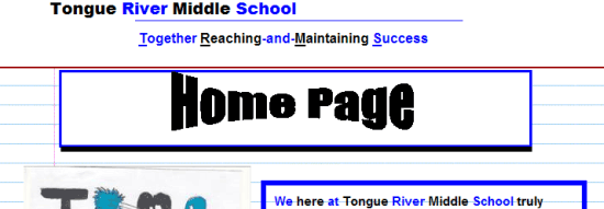
- Generated by MS Office.
- Pros: Laudable use of student artwork on home page, link to Spanish translation of site.
- Cons: Very stodgy, old-fashioned, unappealing and somewhat dysfunctional layout. Navigation scheme clumsy and broken. Confusing use of blue highlights on words that are not links.
Horrific “code soup” generated by MS Office. Table-driven layout. Spacer elements.
No doctype, rendering validation problematic. Subsidiary pages are hosted on Google Sites, and use very plain templates.
- WAVE accessibility assessment: Eight errors, all related to missing
altattributes for images.
White Pine Middle School, Saginaw, MI 
- Created with Schoolcenter, now ThinqEd, which at the time the site was designed, appeared to use FrontPage technology.
- Pros: Well-done header image.
- Cons: Incomplete items on FrontPage. Color scheme renders links, text difficult to discern. Rather uncontrolled use of color.
Flash-driven navigation. Typical FrontPage “code soup.” Table-driven layout. Confusing amalgamation of internal and inline CSS.
Formidable URL. Large number of validation errors and warnings.
- WAVE accessibility assessment: Three errors, all related to missing
altattributes for images.
Summary of the Sites
The number of school websites I’ve designated as “poor” far outweighs the numbers in the “good” and “mediocre” categories combined. Most have problematic color schemes (usually because the schools implemented their school colors as the basic scheme regardless of how the colors appear on screen). The site structures veer from pages packed with too much information to sparse, barely developed sites with little content.
The sites tend to handle navigation about as well as they handle anything, but too often, links are hard to discern because of odd color schemes or display methods. Every site reviewed has validation errors, and all but one has accessibility errors (though it must be noted that these were auto-validated, and there are downsides to auto-validation). Most have table-based layouts, and many use internal or inline CSS.
Interestingly, all but one was designed through a commercially available CMS or site builder program. Only three were designed with a CMS prevalent in commercial and personal sites. While many sites use “school-based” CMS or site builder programs, many use Microsoft’s outdated FrontPage construction system, probably because FrontPage was integrated into Microsoft Office.
Some schools use Microsoft Office itself (specifically, MS Word) to generate documents that were then saved as web pages. Not surprisingly, all of the Microsoft-generated pages appear in the “poor” category. Only one site is professionally designed, Chicago’s Corliss High, and that is actually a district page, not an individual school site.
One of the best, Apex High’s site, was generated from a freely available template. Relatively few feature modern social networking, i.e. Facebook or Twitter links, or RSS/Atom feeds.
Conclusion: A Challenge to Schools and Designers Alike
There are four things that public school websites need above all others:
- Data security
- Ease of use (including content input) by non-professionals, and of maintenance by IT staffers with limited skill sets
- Compatibility with older browsers and operating systems
- Low startup costs
Name a CMS worth its salt that doesn’t provide these things. Tell me a decent professional designer/developer, or a design and development firm, can’t handle these requirements. But, in part for the reasons delineated above, schools seem to have operated for years under the idea that their needs are so different from the rest of the Internet population.
That they have to use completely different CMS software, filtering systems, and other tools, often inferior and unnecessarily restrictive in their makeup, to provide for the “different needs” of the school system. As such, American public schools have generated thousands of websites that fail to implement modern HTML and CSS coding standards, do a poor job of presenting information to their stakeholders, exhibit poor design and construction methods, and ultimately do a disservice to their students, their communities, and themselves. I believe that some of this has been fostered by companies who have marketed their CMS and “site builder” products directly to schools, promoting their products as being designed specifically for schools and their “unique” needs.
The mandates for schools to develop web presences came quite abruptly for many systems, and they scrambled to find something that would help them get their sites developed and running quickly, cheaply, and effectively. That’s when I believe they became open to the variety of firms hawking “school-safe” webwares. And, schools are like any other set of organizations: when one or two schools begin using a particular product, other schools gravitate towards using those products as well, or look for competing products that provide much of the same benefits.
I doubt it took long for schools across the country to begin implementing these “site builder” and CMS programs in their systems. This, in essence, sums up the paradigm of American public school websites. In general, public schools operate in almost an entirely different universe than for-hire Web designers and developers; the two almost never meet.
Public school systems rarely consider approaching design/development firms to handle their web needs, and design/development firms rarely consider public school systems as clients.
How Can the Paradigm Change?
It starts with changing the mindsets of educators and school boards — not an easy task or one that will be quickly accomplished. It’s going to have to be led, I believe, by the American Web design/developer community, and designers and developers from other nations who want to pitch in or perhaps get involved in their home nations’ school sites. The question is a basic and fundamental one: How can we help the public schools get proper websites?
I can’t think of a more deserving community, and one more worthy of help, than schoolchildren. What can you, or your design and development firm, or you in conjunction with your colleagues, do to convince school systems to move towards implementing powerful commercial or open-source CMS programs proven to support modern, standards-compliant websites? How can you help schools design and implement beautiful, standards-driven websites that their employees can use without intensive training?
How can you help schools afford these solutions? Can you convince schools to reallocate some of their communications budget from print media to online media? How can you help your local public schools gain a beautiful, elegant, modern website that will make the kids and the community proud of their Internet presence?
Thanks to the three designers/developers who graciously agreed to be interviewed for this article: Ted Adler of Union Street Media, Abi Cushman of Brown Bear Creative, and Tim Dailey of Digital Gibberish.
Related Content
- Craftsmanship in Designing Websites
- Designing Websites Under Information Technology Restrictions
- How to Teach Web Design Using Optimal Learning and Gestalt
-
 President of WebFX. Bill has over 25 years of experience in the Internet marketing industry specializing in SEO, UX, information architecture, marketing automation and more. William’s background in scientific computing and education from Shippensburg and MIT provided the foundation for MarketingCloudFX and other key research and development projects at WebFX.
 -

WebFX is a full-service marketing agency with 1,100+ client reviews and a 4.9-star rating on Clutch! Find out how our expert team and revenue-accelerating tech can drive results for you! Learn more
Make estimating web design costs easy
Website design costs can be tricky to nail down. Get an instant estimate for a custom web design with our free website design cost calculator!
Try Our Free Web Design Cost Calculator
Share this article


Web Design Calculator
Use our free tool to get a free, instant quote in under 60 seconds.
View Web Design CalculatorMake estimating web design costs easy
Website design costs can be tricky to nail down. Get an instant estimate for a custom web design with our free website design cost calculator!
Try Our Free Web Design Cost Calculator


