

Table of Contents
- Summary of best web design tools in 2026
- Website builders for fast, flexible website creation
- 1. Webflow: Best for advanced visual web design
- 2. Wix
- 3. Squarespace: Best for visually polished websites
- CMS platforms for scalable websites and long-term growth
- 4. WordPress: Best tool for affordable and scalable websites
- 5. Shopify
- UI and design tools for wireframing, prototyping, and collaboration
- 6. Figma: Best for collaborative interface design
- 7. Sketch: Best for professional UI design workflows
- 8. Canva: Best for quick web graphics and visual assets
- Developer tools for interactive and technical website functionality
- 9. Google Web Designer
- Graphic design tools for web visuals and brand assets
- 10. Adobe Illustrator
- Emerging AI web design tools shaping modern workflows
- 11. Relume
- 12. Framer AI
- How to choose the right web design tool in 2026
- 1. Your experience level
- 2. The type of website you want to build
- 3. Your design workflow
- 4. Flexibility and scalability
- 5. AI and automation capabilities
- Great web design tools start with the right tools and partner
- Do I need to learn how to code to design a website?
- What should I look for in web design tools?
The 12 best web design tools in 2026 include:
Designing a modern website takes more than creativity. You need the right tools to plan layouts, build pages, manage content, create visuals, and support your workflow.
The best web design tools in 2026 help you move from idea to launch faster. Some platforms simplify website creation with drag-and-drop builders, while others give you deeper control over design systems, development workflows, ecommerce, and AI-assisted production.
In this guide, you’ll compare 12 of the best web design tools in 2026, including website builders, CMS platforms, UI design tools, developer tools, graphic design tools, and emerging AI website design tools.
Summary of best web design tools in 2026
12 web design tools in 2026 at a glance
Tool
Starting Price
Best For
1.
Webflow
$14/month
Advanced visual web design
2.
Wix
Free / $16+
Beginners building their first website
3.
Squarespace
$16/month
Visually polished websites
4.
WordPress
Free software
Affordable and scalable websites
5.
Shopify
$24/month
Building ecommerce websites
6.
Figma
Free / $3+
Collaborative interface design
7.
Sketch
$10/month
Professional UI design workflows
8.
Canva
Free / $12.99+
Quick web graphics and visual assets
9.
Google Web Designer
Free
Interactive HTML5 web elements
10.
Adobe Illustrator
$20.99/month
Designing scalable web visuals and vector graphics
11.
Relume
Free / $18+
AI-generated website layouts and pages quickly
12.
Framer AI
$10/month
AI-powered website generation
Website builders for fast, flexible website creation
If you want a fast way to build and publish a site while maintaining control over layout and design, you need a website builder. These platforms make it easy to design and launch a site without writing code.
1. Webflow: Best for advanced visual web design
Webflow is a no-code visual website builder that allows you to drag design elements into the editor and build the site you envision. With Webflow, you can design responsive websites visually while still maintaining control over the underlying HTML, CSS, and JavaScript.
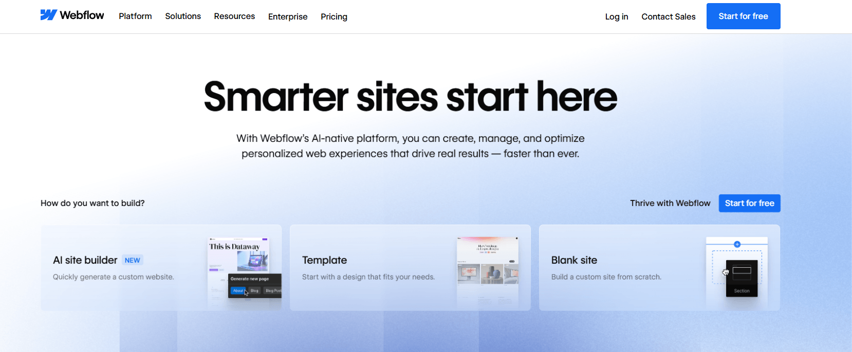
Why we picked Webflow
- Best for: When you want full design flexibility without coding your entire website
- Pricing: Free starter plan with paid packages starting from $14 per month
- Allows you to use an AI site builder, use free one of 7000+ templates, or build a custom website
- Built-in CMS so you can manage dynamic website content
- Integrated hosting and publishing
- Advanced animations and interactions
| Pros | Cons |
| Gives you strong design control | Can feel complex if you’re new to web design |
| Built-in CMS and hosting | Higher pricing tiers for advanced projects |
| Powerful animation capabilities | Smaller plugin ecosystem than WordPress |
2. Wix: Best for beginners building their first website
Wix is a completely code-free web design solution that uses artificial intelligence (AI) to create sites for you. You can choose from 2000+ free templates, build your website, and publish it with a custom domain.
You can then customize and make this site your own. Use Wix to quickly whip up prototypes or benefit from its search engine optimization (SEO) tools and analytics.
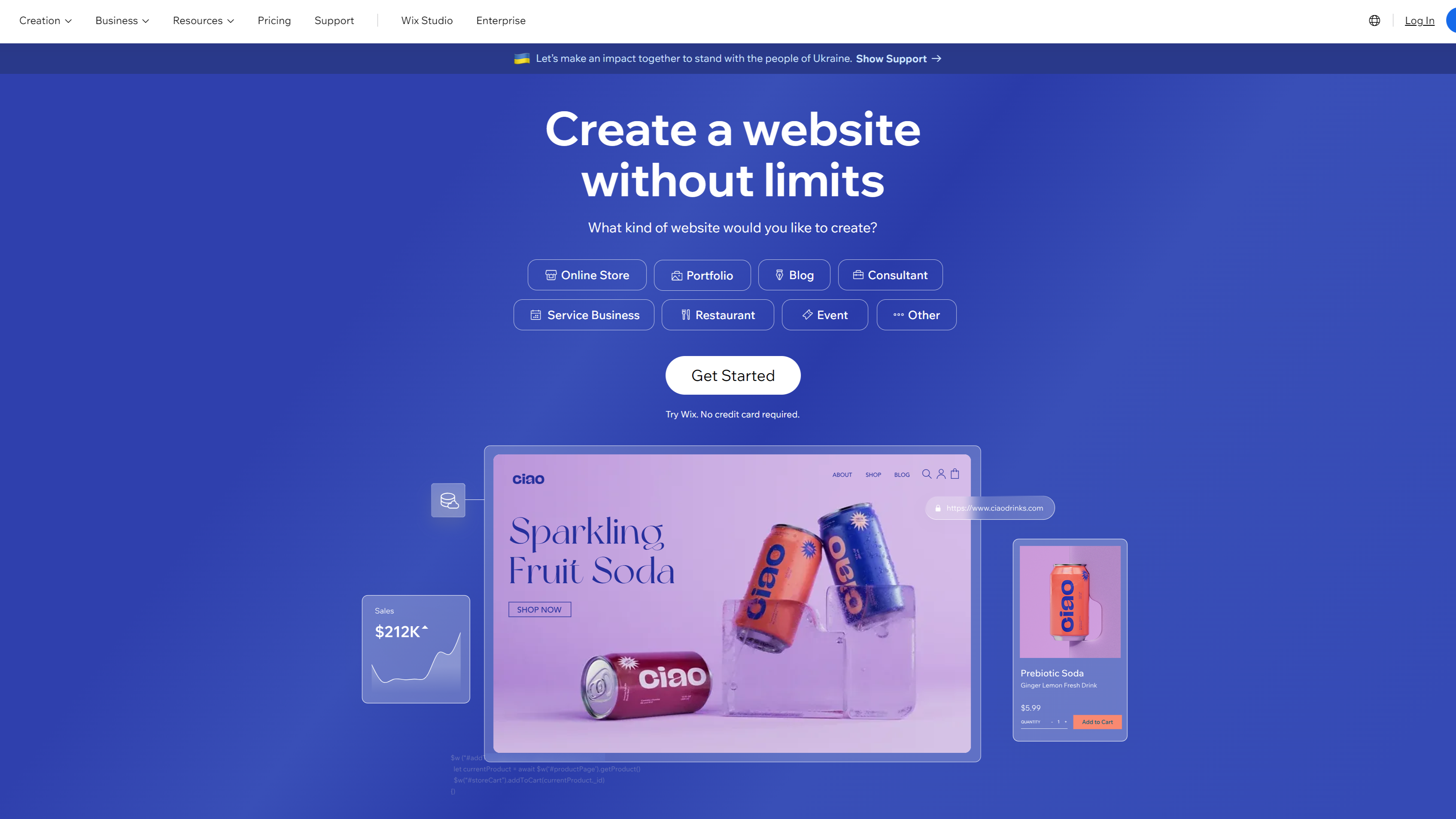
Why we picked Wix:
- Best for: When you want an easy way to build your first website or small business site
- Pricing: Free plan available; paid plans typically start around $17 per month
- Innovate AI tools that help you customize your website faster
- Access a wide range of AI-powered design and content tools
- Customize template elements, including layouts, animation, fonts, and colors
- Access to numerous SEO tools
| Pros | Cons |
| Extremely easy to use | Limited customization capabilities |
| Large template library | Templates are harder to switch later |
| Free plan available | Can feel restrictive for advanced users |
3. Squarespace: Best for visually polished websites
Squarespace is an innovative website builder that’s available in over 200 countries and has been used by more than 14 million entrepreneurs. It helps you build a professional-looking website using elegant templates and built-in tools for content, marketing, and e-commerce.
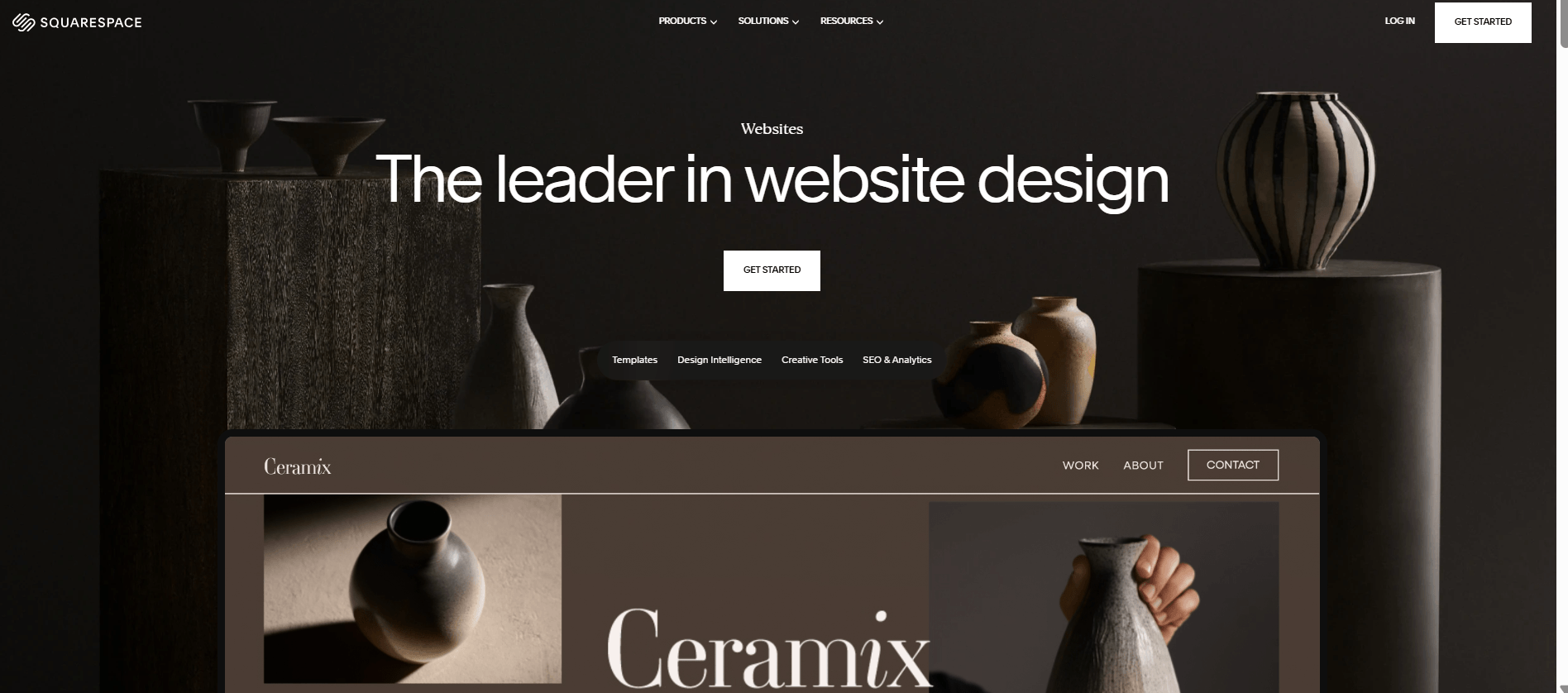
Why we picked Squarespace:
- Best for: When you want a polished website for a portfolio, service business, or online brand
- Pricing: Plans typically start around $19 per month
- It supports search and generative engine optimization (SEO & GEO)
- Allows you to build with AI without any experience
- Use Blueprint AI Builder to personalize or optimize your website in minutes
- Mobile-responsive designs that adjust automatically to different screen sizes
| Pros | Cons |
| High-quality templates and designs | Less customizable than Webflow, Wix, and WordPress |
| All-in-one website platform | Less SEO flexibility than WordPress or Webflow |
| Strong ecommerce features | Limited design flexibility for advanced users |
Best CMS platforms for scalable web design
Website builders help you launch a site quickly, but content management systems (CMS) give you more control as your website grows.
A CMS allows you to manage large volumes of content, customize functionality with plugins or integrations, and scale your website over time. These platforms remain essential when you need flexibility, advanced features, or long-term website growth.
4. WordPress: Best tool for affordable and scalable websites
Around 43% of all websites on the Internet are powered by WordPress, a popular website-building platform for beginners. Experienced designers love WordPress, too, because it’s one of the easiest, most scalable, and most affordable web design tools.
With WordPress, you can build and manage nearly any type of website while customizing functionality through thousands of themes and plugins.
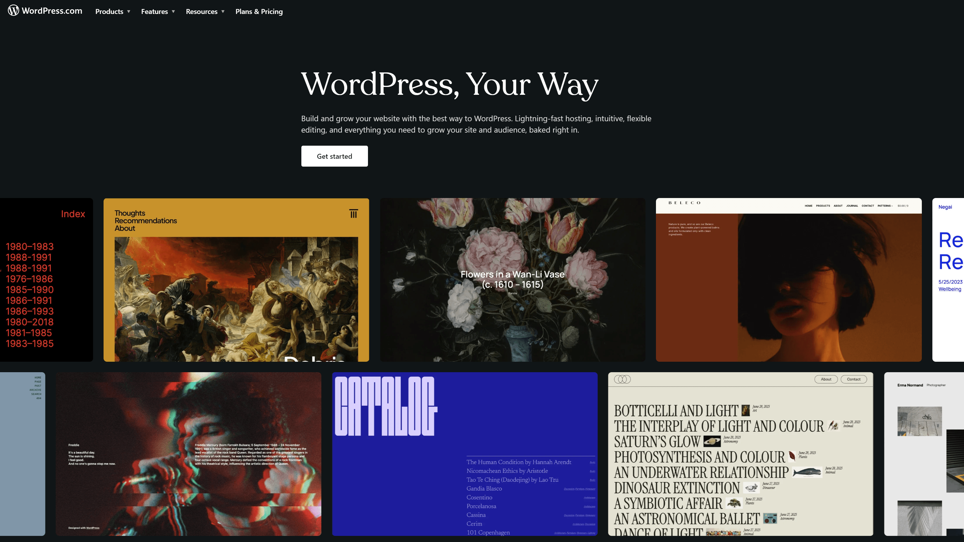
Why we picked WordPress
- Best for: When you want a flexible platform that can grow with your website
- Pricing: WordPress software is free, but you typically pay for hosting, themes, or premium plugins
- Simple to set up and easy to customize
- You don’t require any coding or design experience
- Use the WordPress AI builder to build your custom site in minutes
- Strong SEO capabilities and integrations with marketing tools
| Pros | Cons |
| Highly customizable with a user-friendly interface | Requires hosting setup |
| Huge plugin ecosystem | Maintenance and updates required |
| Excellent for SEO and content marketing | Can require technical knowledge |
5. Shopify: Best web design tool for ecommerce
Shopify is an ecommerce platform that enables businesses to create their online stores. It has built-in design themes that you can customize to suit your brand or use AI to create a website within minutes.
Shopify powers a significant share of online commerce and has helped merchants generate more than $1 trillion in sales.
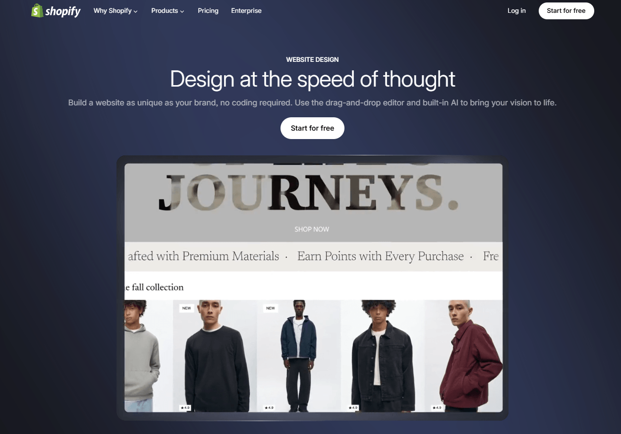
Why we picked Shopify:
- Best for: When you want to launch or scale an ecommerce website
- Pricing: Plans typically start around $32 per month
- Free business name generator and logo maker to help you get started
- Comes with ecommerce tools, like an invoice generator, profit margin calculator, and discount calculator
- Free, reliable hosting and secure payment processing
- Built-in AI-powered functionality for
- App marketplace for adding marketing, shipping, and automation tools
| Pros | Cons |
| Built specifically for ecommerce | Monthly subscription required |
| Easy product and order management | Less flexible for non-ecommerce sites |
| Large ecosystem of apps and integrations | Transaction fees on some plans |
Best UI design tools for wireframing and prototyping
UI and design tools help you create design systems, wireframes, and prototypes that guide how your website will look and function. These platforms allow you to collaborate with designers, developers, and stakeholders while refining the user experience before development begins.
6. Figma: Best for collaborative interface design
Figma is a speedy web-based design and prototyping platform built for collaboration. With Figma, you can design website layouts, create interactive prototypes, and collaborate with your team in real time within a shared design workspace.
roducts.
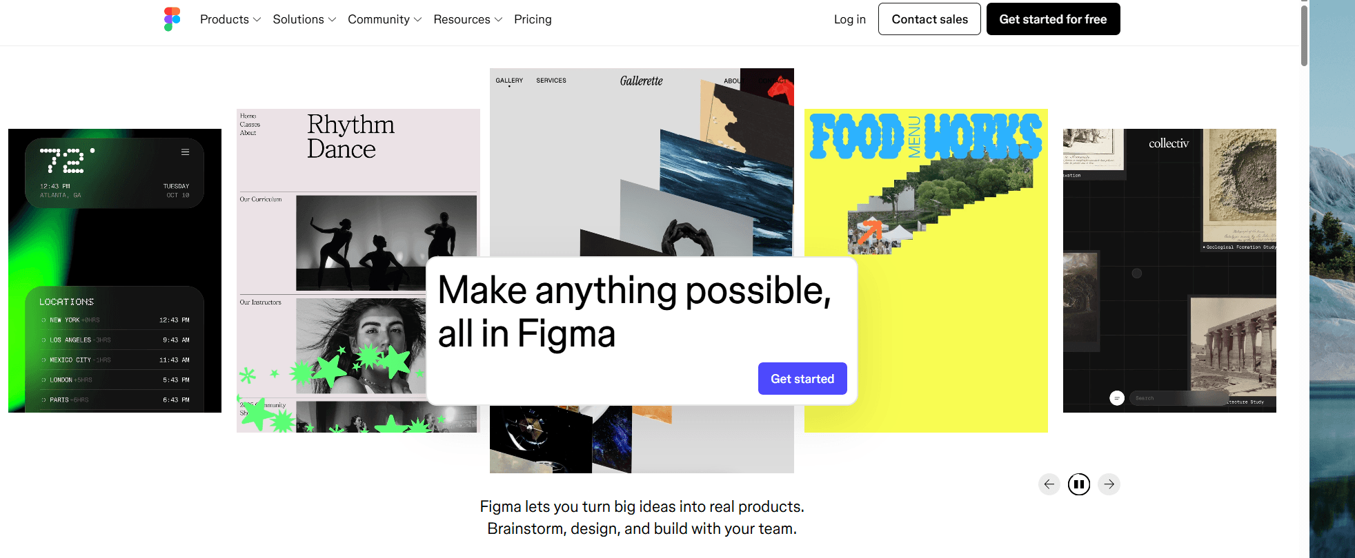
Why we picked Figma
- Best for: When you want precise control over interface design for websites and digital products
- Pricing: Free starter plan available, with paid plans starting around $3 per editor per month
- Allows multiplayer collaboration in real-time for easier alignment
- Supports end-to-end design workflows from brainstorming and illustrating to coding
- Includes AI features that help speed up design workflows and content generation
| Pros | Cons |
| Supports real-time collaboration with your team | Requires a stable internet connection for full functionality |
| Developer hand-off is easy | Advanced features require paid plans |
| Access to thousands of plugins | Doesn’t support high-level deployment |
7. Sketch: Best for professional UI design workflows
Sketch is a complete design application for macOS users that has everything you need to create prototypes and share them with your team.
It helps you design website interfaces and digital products using vector-based design tools built specifically for UI and UX design.
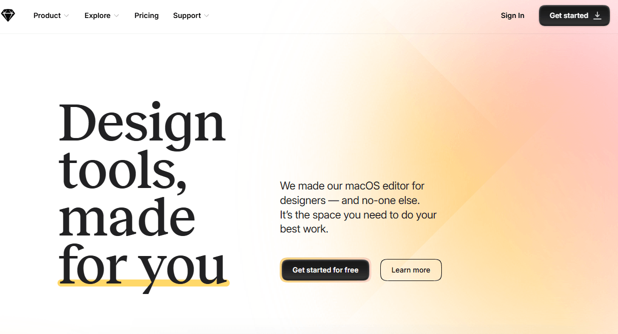
Why we picked Sketch:
- Best for: When you want precise control over interface design for websites and digital products
- Pricing: Plans typically start around $12 per editor per month
- Enjoy reusable templates, customizable tools, and offline and local file support
- Simple controls and an intuitive interface designed to help you work faster
- Vector-based interface design tools
- Plug-in ecosystem that extends design capabilities
- Prototyping tools for testing user flows
| Pros | Cons |
| Strong UI design capabilities | Mac-only application |
| Robust plugin ecosystem | No free version available |
| Clean and easy-to-use interface | Limited prototyping and web functionality |
8. Canva: Best for quick web graphics and visual assets
Canva is an excellent option for anyone looking to quickly create graphics and multiple-page websites, regardless of their experience.
This free, beginner-friendly web design tool offers an extensive library of professional-quality templates and photos to give you a head start. You can complete and publish your website in minutes without any coding or advanced design experience.
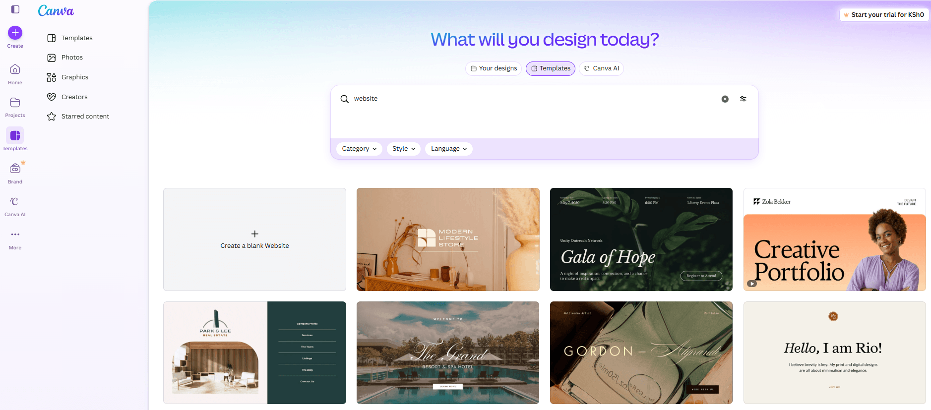
Why we picked Canva:
- Best for: When you want to create website visuals without advanced design experience
- Pricing: Free plan available; Canva Pro typically starts around $12.99 per month
- Drag-and-drop editor for creating graphics and visual content
- Collaboration tools for teams
- AI-powered website design capabilities
- Stock images, icons, and fonts built into the platform
| Pros | Cons |
| Very easy to use | Limited advanced design control |
| Large template library | Not designed for full UI layouts |
| Free plan available | Weak SEO and performance capabilities |
Best developer tools for interactive web design
Once your website design is finalized, development tools help you turn layouts and prototypes into working web pages. You need these tools to write and manage code, build interactive elements, and customize how your website functions across devices and platforms.
9. Google Web Designer: Best for Interactive HTML5 web elements
Google Web Designer is a web design tool that helps you create interactive HTML5 designs and animations that you can embed into websites or digital advertising campaigns.
Not sure how to get started designing? This tool has a template gallery of layouts you can use as a starting point for your design.
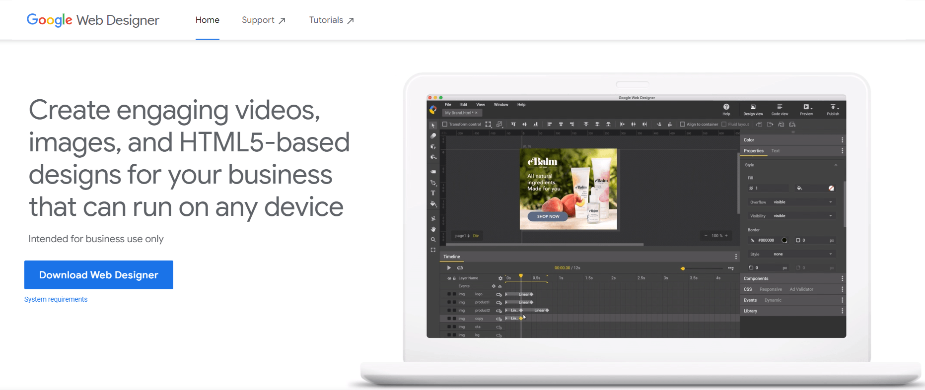
Why we picked Google Web Designer
- Best for: When you want to design interactive web elements or HTML5 animations
- Pricing: Free
- Visual interface for building interactive HTML5 content
- Animation timeline for creating motion and transitions
- Creates websites that can run on any device and workflows
- Integration with Google advertising platforms
- Drag and drop website building
| Pros | Cons |
| Free to use | Limited use cases outside interactive elements |
| Strong animation capabilities | Smaller ecosystem than other tools |
| Visual interface for HTML5 design | Learning curve for beginners |
Best graphic design tools for web visuals
Websites rely on strong visual elements such as icons, illustrations, banners, and brand graphics. Graphic design tools help you create these assets while maintaining quality and consistency across your site.
If you want scalable visuals that support your brand identity and user experience, these tools are essential in a modern web design workflow.
10. Adobe Illustrator: Best for designing scalable web visuals and vector graphics
Adobe Illustrator is ideal for creating highly detailed vector graphics for your website.
Create any logo, infographic, banner, or font you can dream up. If you’re new to Illustrator, there are plenty of websites to help you learn.
Adobe Illustrator allows you to create scalable vector graphics such as icons, illustrations, and logos that you can use across your website.
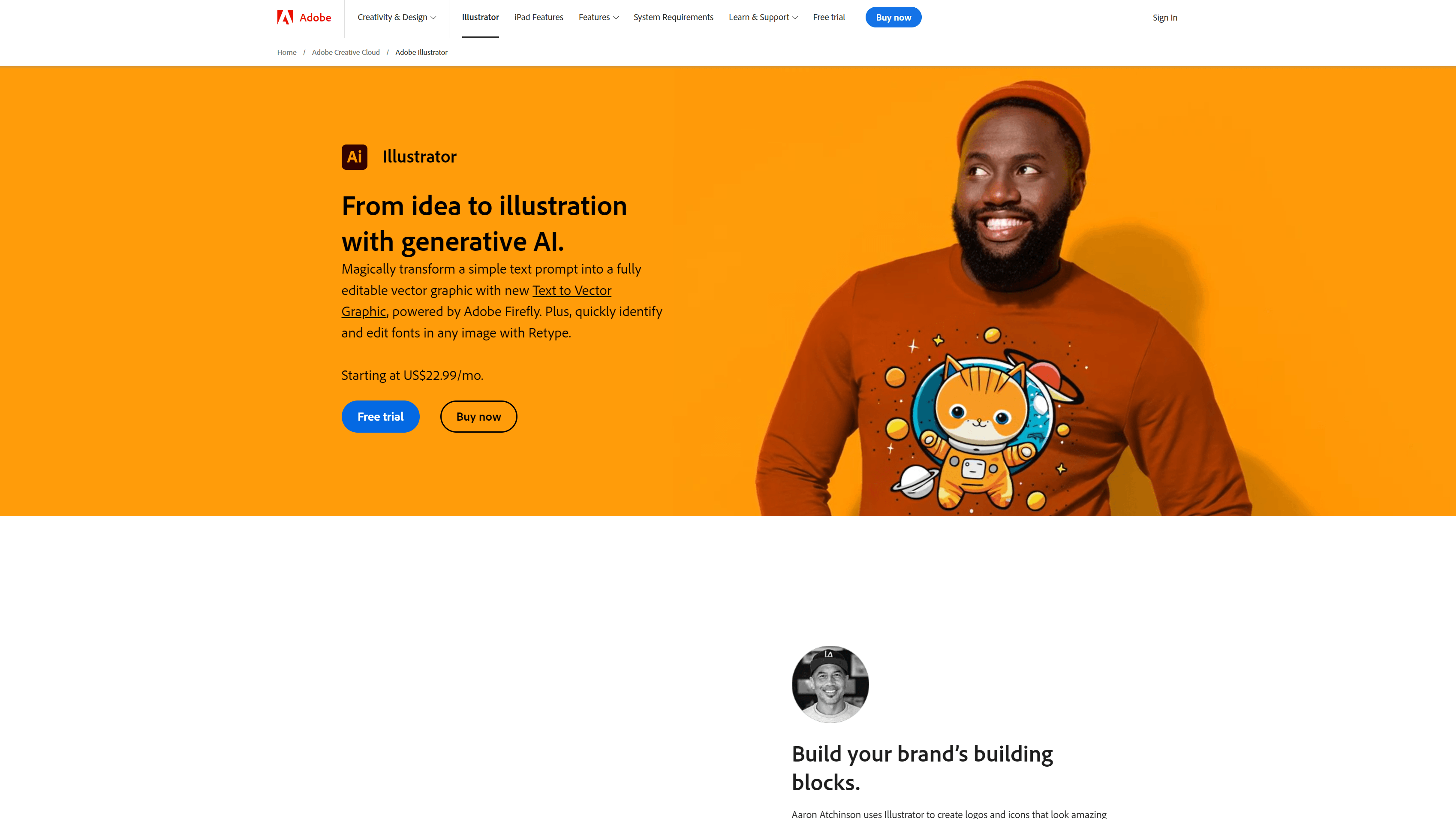
Why we picked Adobe Illustrator:
- Best for: Icons, vectors, and brand visuals in web design projects.
- Pricing: Plans typically start around $20.99 per month through Adobe Creative Cloud
- Integration with other Adobe Creative Cloud tools
- Export options optimized for web graphics
- Creates detailed vector graphics and supports various file formats
| Pros | Cons |
| Industry-standard vector design tool | Subscription required |
| High precision and design control | Steeper learning curve |
| Integrates with other Adobe tools | Overkill for simple graphics |
Best AI web design tools in 2026
Web design continues to evolve as new tools introduce automation, artificial intelligence, and immersive design capabilities. Emerging AI web design tools help you create modern websites faster while experimenting with new visual experiences such as AI-generated layouts or interactive 3D elements.
11. Relume: Best for AI-generated website layouts and pages fast
With Relume, you can generate a complete website structure, wireframes, and reusable components from a single text prompt, helping you move from idea to design much faster. This AI-powered site design tool is trusted by more than 1 million designers and developers who’ve built 500K+websites.
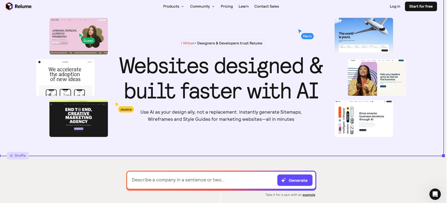
Why we picked Relume
- Best for: When you want to quickly generate website sitemaps, wireframes, and style guides
- Pricing: Free plan available; premium plans from $18 per month, per person
- AI-powered sitemap and wireframe generator that builds website structures from a single prompt
- Tools that help you build scalable design systems with reusable elements
- Integration with Figma and Webflow for a smoother design-to-development workflow
| Pros | Cons |
| Speeds up sitemap and wireframe creation | Works best if you already use Figma or Webflow |
| Strong integration with Figma and Webflow | Limited features on the free version |
| Helps standardize design systems and reusable components | Still requires refinement after AI generation |
12. Framer AI: Best for AI-powered website generation
Framer AI is an AI-powered website generator that creates website layouts from simple prompts. It allows you to automate layout generation, content creation, and design optimization, speeding up website creation.
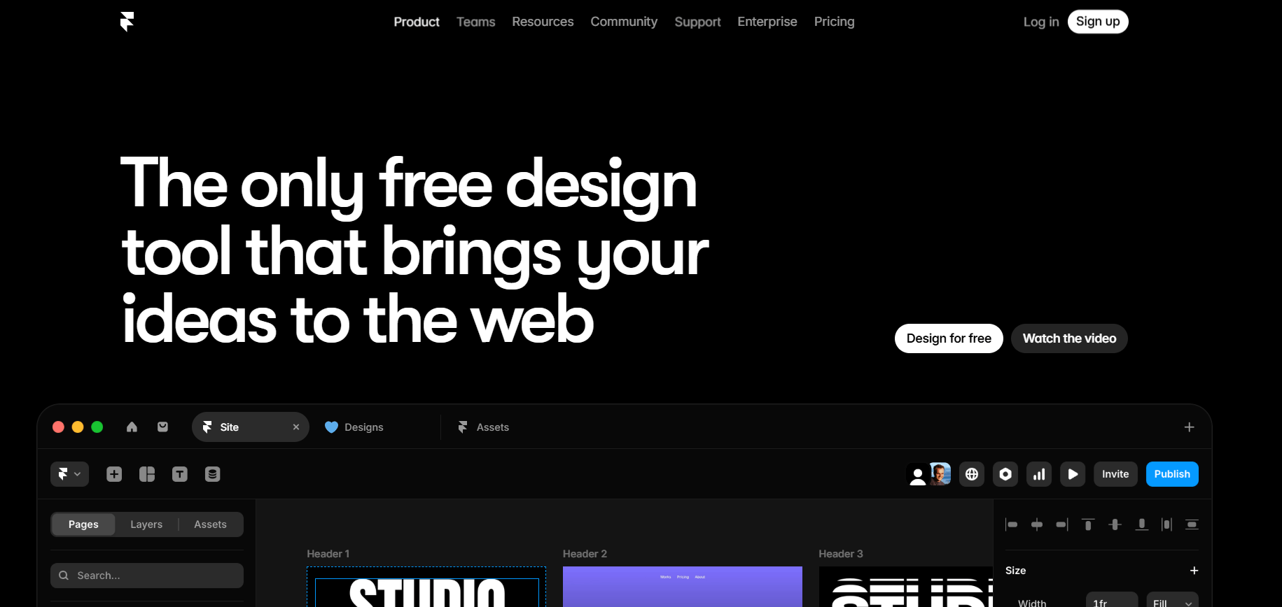
Why we picked Framer AI
- Best for: When you want to build a website quickly using AI-assisted design tools
- Pricing: Plans typically start around $10 per month, depending on features
- Explore advanced, custom components with Framer AI
- The AI can translate your website into various languages without any plugins
- Visual editing tools for refining AI-generated icons, social assets, and visuals
- Generate and refine multiple pages quickly within Framer’s workflow
| Pros | Cons |
| AI speeds up website creation | AI-generated layouts may require editing |
| Beginner-friendly workflow | Access to advanced features may be costly |
| Built-in hosting and publishing capabilities | Requires design knowledge |
How to choose the best web design tool for your workflow
The best web design tool for you depends on your goals, experience level, and the type of website you want to build. Some tools prioritize ease of use, while others give you deeper control over design, development, and scalability.
Use the following factors to identify the tools that best match your workflow.
1. Your experience level
Your technical experience plays a major role in choosing the right platform.
If you’re new to web design, beginner-friendly website builders like Wix or Squarespace make it easy to create a site using templates and drag-and-drop editing tools.
If you’re comfortable with design systems or development workflows, platforms like Webflow, Framer, or WordPress offer greater flexibility and customization.
2. The type of website you want to build
Choosing a tool designed for your specific project helps you avoid unnecessary complexity later.
For example:
- Small business or portfolio sites: Wix, Squarespace
- Highly customized websites: Webflow, WordPress
- Ecommerce websites: Shopify
- Interactive or modern design-heavy websites: Framer
3. Your design workflow
If you collaborate with designers or developers, you may need tools that support collaborative design workflows.
Platforms like Figma or Sketch allow you to create wireframes, prototypes, and reusable components while gathering feedback from your team in real time.
4. Flexibility and scalability
If you expect your website to grow over time, choosing a flexible platform can save you from rebuilding your site later.
CMSs like WordPress allow you to expand functionality with plug-ins, integrations, and custom development as your needs evolve. Similarly, Webflow provides advanced design control for teams that want more flexibility than traditional website builders.
5. AI and automation capabilities
In 2026, AI-powered web design tools can significantly speed up the early stages of website design.
Platforms like Relume generate sitemaps and wireframes from prompts, helping you plan your website structure quickly. Tools like Framer AI can generate full website layouts and content, allowing you to prototype and launch pages faster.
Web design tools are software platforms that help you create, design, and manage websites. These tools support different parts of the web design process, including layout creation, interface design, coding, content management, and visual asset development. The right web design tool depends on your experience level and the type of website you want to build. If you’re new to web design, the best web design tool depends on how much control you want. Wix and Squarespace are strong choices if you want an easy way to build a website with templates and drag-and-drop editing. Canva also works well for simple visual content and lightweight web pages. Some of the best web design tools in 2026 include: These tools support different stages of website creation, from designing layouts and building pages to managing content and creating visual assets. The best option for you depends on whether you want a website builder, a design platform, a content management system, or an AI-powered design tool. Several web design tools offer free plans that allow you to build and experiment with websites before upgrading to paid features. Popular free web design tools that provide basic website creation, design, and collaboration features include: Many modern web design tools allow you to build websites without coding. Website builders like Wix, Squarespace, and Framer use drag-and-drop editors that let you design pages visually. AI-powered tools can even generate layouts and website structures automatically.FAQ about the best web design tools in 2026
What are web design tools?
Which web design tool is right for you?
What is the best web design tool for beginners?
What are the best web design tools in 2026?
What is the best free web design tool?
Do you need coding skills to use web design tools?
Great web design tools start with the right tools and partner
The best web design tools in 2026 help you design faster, collaborate more effectively, and launch better-performing websites. Whether you choose a website builder, CMS, design platform, or AI-powered tool, the right technology helps you turn ideas into high-performing digital experiences.
If you want expert support turning those tools into a website that drives traffic, leads, and revenue, WebFX can help. Our team combines custom web design with data-driven marketing strategies to create websites that look great and deliver measurable results.
We’ve won 120+ web design awards and built 1,050+ over the last 30+ years, proving our expertise in web design. Explore our professional web design services to see how we can help you build a website that attracts visitors and converts them into customers.
-
 President of WebFX. Bill has over 25 years of experience in the Internet marketing industry specializing in SEO, UX, information architecture, marketing automation and more. William’s background in scientific computing and education from Shippensburg and MIT provided the foundation for RevenueCloudFX and other key research and development projects at WebFX.@https://x.com/webfxbill/
 -

WebFX is a full-service digital marketing agency delivering revenue-driving strategies across online advertising, SEO and AI search optimization, and digital marketing. Backed by 1,100+ client reviews, a 4.9-star rating on Clutch, and proprietary revenue-tracking technology, our team helps businesses grow visibility and revenue across platforms, from Google to ChatGPT to LinkedIn. Discover how our expert team and revenue-accelerating tech can drive results for you. Learn more
Make estimating web design costs easy
Website design costs can be tricky to nail down. Get an instant estimate for a custom web design with our free website design cost calculator!
Try Our Free Web Design Cost Calculator
Table of Contents
- Summary of best web design tools in 2026
- Website builders for fast, flexible website creation
- 1. Webflow: Best for advanced visual web design
- 2. Wix
- 3. Squarespace: Best for visually polished websites
- CMS platforms for scalable websites and long-term growth
- 4. WordPress: Best tool for affordable and scalable websites
- 5. Shopify
- UI and design tools for wireframing, prototyping, and collaboration
- 6. Figma: Best for collaborative interface design
- 7. Sketch: Best for professional UI design workflows
- 8. Canva: Best for quick web graphics and visual assets
- Developer tools for interactive and technical website functionality
- 9. Google Web Designer
- Graphic design tools for web visuals and brand assets
- 10. Adobe Illustrator
- Emerging AI web design tools shaping modern workflows
- 11. Relume
- 12. Framer AI
- How to choose the right web design tool in 2026
- 1. Your experience level
- 2. The type of website you want to build
- 3. Your design workflow
- 4. Flexibility and scalability
- 5. AI and automation capabilities
- Great web design tools start with the right tools and partner
- Do I need to learn how to code to design a website?
- What should I look for in web design tools?
Share this article


Web Design Calculator
Use our free tool to get a free, instant quote in under 60 seconds.
View Web Design Calculator
Make estimating web design costs easy
Website design costs can be tricky to nail down. Get an instant estimate for a custom web design with our free website design cost calculator!
Try Our Free Web Design Cost Calculator
What to read next


FAQ about the best web design tools in 2026
What are web design tools?
Web design tools are software platforms that help you create, design, and manage websites. These tools support different parts of the web design process, including layout creation, interface design, coding, content management, and visual asset development.
Which web design tool is right for you?
The right web design tool depends on your experience level and the type of website you want to build.
- If you want a simple, beginner-friendly platform, tools like Wix or Squarespace allow you to create websites using templates and drag-and-drop editors.
- If you want more design flexibility or advanced customization, platforms like Webflow or WordPress give you greater control over layout, functionality, and integrations.
- Design teams may also use tools like Figma or Sketch to create prototypes and collaborate on user interface designs before development begins.
What is the best web design tool for beginners?
If you’re new to web design, the best web design tool depends on how much control you want. Wix and Squarespace are strong choices if you want an easy way to build a website with templates and drag-and-drop editing. Canva also works well for simple visual content and lightweight web pages.
What are the best web design tools in 2026?
Some of the best web design tools in 2026 include:
- Webflow
- Wix
- Squarespace
- WordPress
- Shopify
- Figma
- Canva
- Framer
These tools support different stages of website creation, from designing layouts and building pages to managing content and creating visual assets. The best option for you depends on whether you want a website builder, a design platform, a content management system, or an AI-powered design tool.
What is the best free web design tool?
Several web design tools offer free plans that allow you to build and experiment with websites before upgrading to paid features.
Popular free web design tools that provide basic website creation, design, and collaboration features include:
- Wix
- Canva
- Figma
- WordPress
Do you need coding skills to use web design tools?
Many modern web design tools allow you to build websites without coding.
Website builders like Wix, Squarespace, and Framer use drag-and-drop editors that let you design pages visually. AI-powered tools can even generate layouts and website structures automatically.