- Home
- Blog
- Web Design An Exploration of Website Redesigns: Tips and Examples
An Exploration of Website Redesigns: Tips and Examples
-
 13 min. read
-
 William Craig
 CEO & Co-Founder
- President of WebFX. Bill has over 25 years of experience in the Internet marketing industry specializing in SEO, UX, information architecture, marketing automation and more. William’s background in scientific computing and education from Shippensburg and MIT provided the foundation for MarketingCloudFX and other key research and development projects at WebFX.
 Website redesigns — whether for your own website or clients — seem like exciting and interesting projects. It’s challenging to create a new design while retaining the site’s existing brand and content. And for most web designers, these types of challenges are motivating.
However, website redesigns are tricky to plan and execute. There are several constraints involved in redesigning a website that might not normally exist if you were to start with a blank canvas. I would even argue that a redesign is often more difficult than starting from scratch because of these boundaries.
We will delve into the subject of website redesigns by reviewing and discussing redesign efforts of sites such as Yellow Pages, Mozilla and Blinksale.
Why Redesign a Website?
It’s important to note that Design, in one of its most fundamental forms, is the act of solving a problem. Whether it’s to address durability and signal strength issues while still maintaining the beauty of a mobile phone (like with the iPhone 4’s stainless steel band) or coming up with a solid navigation design that improves findability of site content, the act of designing should be purposeful.
When the motivation to redesign an existing site is driven merely by aesthetics, I believe that the incentive of the redesign initiative is insufficient. There are many costs involved in a website redesign, both to its users and to its owner. For example, creating a new site navigation scheme or the reconfiguration of the web page layout requires existing users to get used to the new web design.
It requires a lot of time, planning and decision-making to ensure that the present content integrates well with the new design. It might also require updating existing content to fit the new design. The outcome of the redesign project should justify these costs.
Here are a few reasons why you would want to redesign a website:
- The site is not user-friendly
- The redesign can increase site profits
- When objective information, such as those gathered by data analysis, clearly indicates something is wrong with the design
- The redesign can improve the site’s speed and performance
- The site is built using outdated web design practices that burden the user experience (table-based layouts, animated GIF backgrounds, outmoded interactions that can be improved using Ajax techniques)
- It lacks features that, when adopted, can profoundly enhance the user experience
- It has information architecture flaws (poor findability, navigation, categorization, etc.)
- It doesn’t fit with the existing company brand
Component Redesign
Does the site need a complete design overhaul or can existing issues be solved through the redesign or realignment of certain components? With the opportunity for us to iterate rapidly and seamlessly on a production site, a partial redesign might be enough. For example, when a checkout web form of an e-commerce site makes the user’s experience cumbersome, we can use our resources more efficiently by focusing on that troublesome component instead of spreading our efforts thin by trying to tackle everything.
Redesign Mindset: Focus on Solving Issues
It’s a fact that the most important element of a website’s success is its content and purpose. Whether it’s to provide a venue for people to connect with each other (like Craigslist) or to disseminate information (like Wikipedia), success is measured — and attained — based on utility, not aesthetics. The redesign must be in line with the intended purpose of the site.
The design must support the site’s objectives. Deficiencies in the site’s content and utility will never be resolved by making the site look more beautiful.
Real-World Examples of Website Redesigns
To explore the topic further, let us examine some website redesign efforts.
Yellow Pages
According to the site’s About page, one of Yellow Pages’ goals is “to be a utility for the people: the one-stop site that, in fewer clicks, helps everyone live more.” Therefore, it makes sense that the outcome of their redesign effort should be to enhance findability; to lower the clicks required to reach the desired information. Does the redesign achieve this goal? Let’s take a look.
Old Design 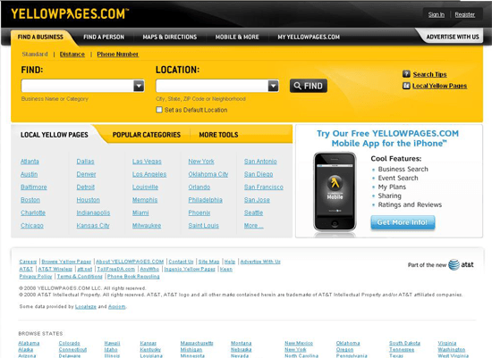 New Design
 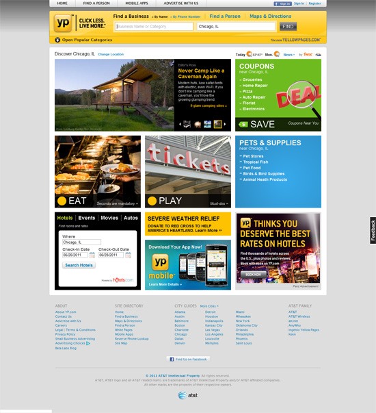 The redesign of the website has a similar appearance to the original design. It retains much of the original colors (most notably the company colors of yellow and black). In the new design, localization is used to populate the front page with more relevant content based on where you live.
This helps reduce the amount of work users need to perform in order to select the locality they’re most likely interested in. Other than that, the redesign is predominantly aesthetic, and old features that were potentially useful were taken out. For example, the “More Tools” tab was moved to a less convenient-to-access spot.
The “search tips” link, which could help new and existing users improve their search queries, was removed. Rich images used in the front page — although they make the page more attractive — can slow down front-end performance and if they don’t enhance the user experience and support the site’s goal, then their inclusion is superficial.
Blinksale
Blinksale, being a web app, would want a site layout that optimizes conversion rates so that new visitors can quickly see how the tool works and quickly discover the path to signing up.
In this respect, Blinksale’s new design has several advantages over old one. Old Design 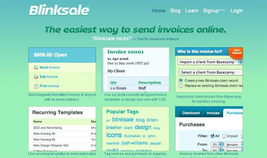 New Design
 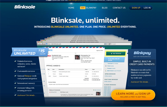 The new design makes it easy to spot the primary call to action on the page, using the art of distinction to highlight its location and direct the eye gaze of the user. It’s also easier to learn about the app’s selling points — how much it costs and unique features that sets it apart from its competitors — because of the succinct bulleted list and price information on the left.
In the old design, the eye flow is slightly flawed, if we were to assume that most of their visitors are left-to-right readers. The logical sequence of a visitor wanting to sign up is to first understand what the web app can do and how much it costs before making the decision to sign up. 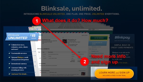 The layout of the old design reverses this ideal eye flow.
Six Apart
Six Apart has changed the page layout structure and the colors used in the design. Old Design 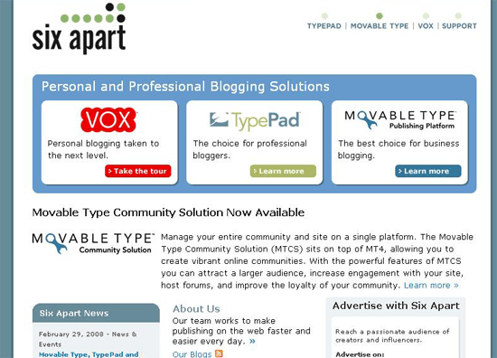 New Design
 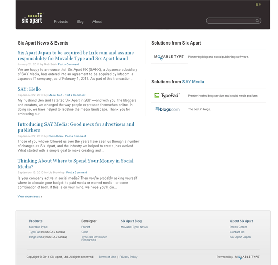 The look and feel of the new design is more subtle and elegant than before. The search box in the header of new design is a well-positioned new feature.
Plaxo
In this example, we can see both positive and (potentially) negative results of a website redesign effort. Old Design 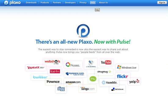 New Design
 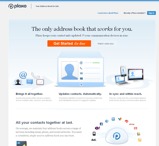 In the old design, Plaxo had a prominent horizontal navigation bar and a home page that was shorter. The navigation menu in the old design was omitted, which means existing users who relied on this feature now have to relearn how to navigate the site.
The new design exceeds the previous page length, which requires many users to scroll down more to access the desired information. However, the new design has a clear call to action optimized towards new site visitors. It has a clean layout that highlights important site features.
It has better content that answers many of the questions a potential new user might have about the app.
ThinkGeek
The latest version of ThinkGeek is a good redesign example. Old Design 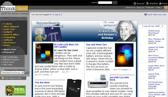 New Design
 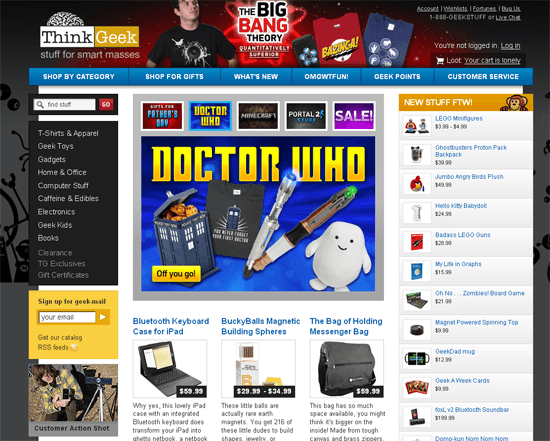 The components that were effective in the old design were retained and then slightly improved.
For example, the left-positioned vertical navigation menu was kept in its place, and just received a typographic redesign to make it easier to read and visually more appealing. The search box was relocated to reduce the needed eye and mouse movements of people searching for a particular product on the site. It’s now appropriately grouped with the vertical navigation menu because these components complement each other.
Moreover, new features like the horizontal navigation bar and a shopping cart status information have been added. The design not only makes the site more beautiful, but it also fixes the page layout and incorporates useful features.
Joyent
When I first saw the old design of Joyent, I didn’t realize what the company provided until I read their site’s content.
The old site’s design theme — though unique and visually appealing — didn’t seem to clearly support and indicate what the company did. Old Design  New Design
 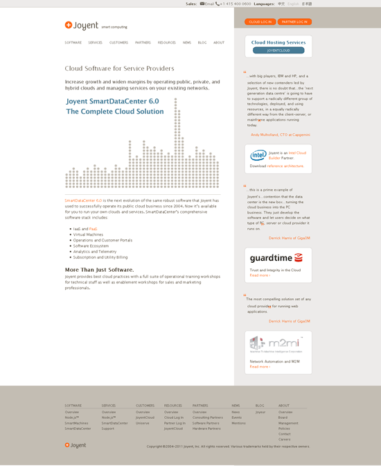 The refreshed design is brilliant. It keeps the useful site navigation of old design.
The new design is cleaner in aesthetics and probably more appealing to their typical audience of IT managers, CTOs, server administrators and the like. The new design adds useful components such as the company’s contact information (prominently located in the site header), a call-to-action button at the side bar and navigation to internal pages in the footer that’s useful to existing and potential users.
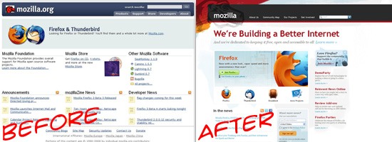
Mozilla
Mozilla sites always seem to have notable designs.
A Mozilla redesign often incorporates innovative design techniques and additions of helpful features. Old Design 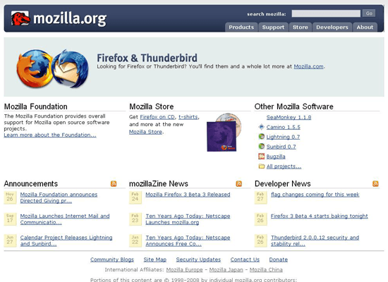 New Design
  Practical features remain unchanged, and some new ones are added; namely, an email newsletter sign-up form and a slideshow highlighting featured content. The new web page layout looks less cluttered, mainly due to the reduction of hyperlinks and the use of whitespace between design elements.
REI
REI is an excellent example of redesigning a site to include useful new technologies and techniques. Old Design 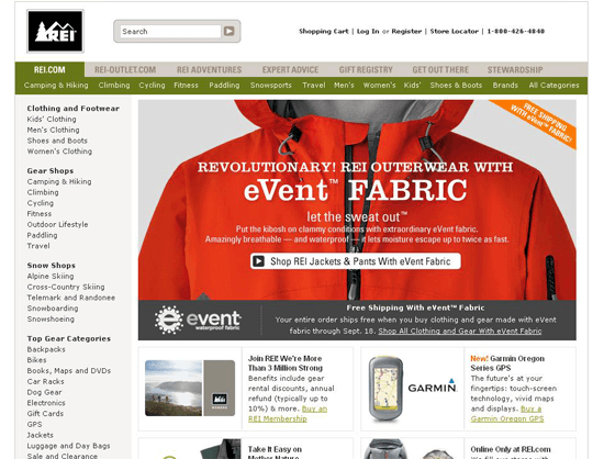 New Design
 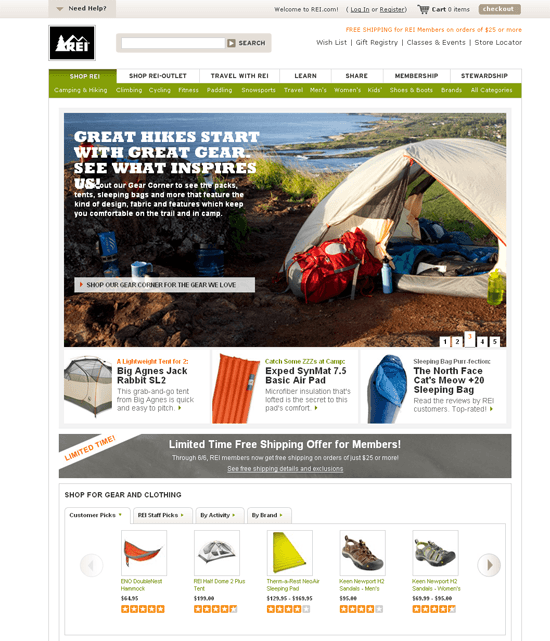 The main navigation scheme and information architecture is kept relatively unchanged. As an e-commerce site, upsetting loyal customers by changing things they might have grown accustomed to means that things such as navigation should be approached with caution in a site redesign.
Using an image slider and a multi-level horizontal navigation bar are the two main changes of the new web design.
Dave Wilkinson
Here we have an example of a redesign of a web developer’s portfolio site. Web developers and web designers are known for rapidly redesigning their own websites, often to reflect the most current design trends.
Old Design 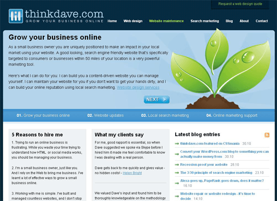 New Design
 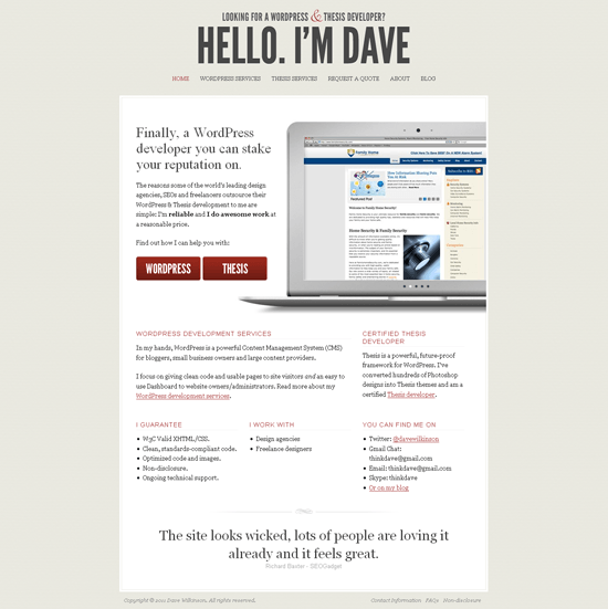 The difference between the old design and new design is remarkably vast. Almost everything has changed. The logo and tagline, the colors, the design style, the layout, the personality of the site’s copy, the information density — they have all been improved.
Etrade
The Etrade redesign effort is more like a realignment rather than a full-blown redesign. Old Design 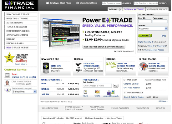 New Design
  Most of the layout’s components didn’t change, and if they did, the modifications were minor. However, what has happened is that some design elements have been relocated.
Whilst the left-hand vertical navigation menu was eliminated, the links were relocated to its proper place, the primary horizontal navigation bar, reducing possible confusion as to which menu a link might be located and freeing up some space.
Conclusion
The idea of redesigning a website is an alluring one. Before we commit ourselves to this endeavor, we must first take care to plan and think about some important considerations.
Mainly, we should determine if a redesign is something we really need to do. A website redesign doesn’t just mean changing the site’s appearance, it’s to add missing features, address design flaws, reorganize the information architecture, remove unnecessary components to de-clutter the user interface and to enhance functionality.
Resources and Further Reading
- Long Live the Redesign
- Good Designers Redesign, Great Designers Realign
- 7 Website Redesign Tips
Related Content
- Creating a Timeless User Experience
- Are Current Web Design Trends Pushing Us Back to 1999?
- Reductionism in Web Design
-
 President of WebFX. Bill has over 25 years of experience in the Internet marketing industry specializing in SEO, UX, information architecture, marketing automation and more. William’s background in scientific computing and education from Shippensburg and MIT provided the foundation for MarketingCloudFX and other key research and development projects at WebFX.
 -

WebFX is a full-service marketing agency with 1,100+ client reviews and a 4.9-star rating on Clutch! Find out how our expert team and revenue-accelerating tech can drive results for you! Learn more
Make estimating web design costs easy
Website design costs can be tricky to nail down. Get an instant estimate for a custom web design with our free website design cost calculator!
Try Our Free Web Design Cost Calculator

Web Design Calculator
Use our free tool to get a free, instant quote in under 60 seconds.
View Web Design CalculatorMake estimating web design costs easy
Website design costs can be tricky to nail down. Get an instant estimate for a custom web design with our free website design cost calculator!
Try Our Free Web Design Cost Calculator