22 Franchise Website Design Examples You’ll Want to Copy
Get inspiration for creating (or updating) your business’s website with this compilation of franchise website design examples from industries like food, real estate, home services, and more.
-
 insights from 100,000+ hours of franchise marketing experience

Table of Contents
- 22 franchise website design examples that crush it in 2026
- 1. Subway
- 2. Chick-Fil-A
- 3. McDonald’s
- 4. RE/MAX
- 5. Wendy’s
- 6. The UPS Store
- 7. Burger King
- 8. Ace Hardware
- 9. Jersey Mike’s
- 10. Signarama
- 11. Comfort Keepers
- 12. Domino’s
- 13. Century 21
- 14. Pizza Hut
- 15. Great Clips
- 16. Cinnabon
- 17. Dunkin’
- 18. BatteriesPlus
- 19. Papa John’s
- 20. Plato’s Closet
- 21. Molly Maid
- 22. KFC
- Inspired by these franchise web designs?
- We Drive Results for Franchise Companies
Having a clean, modern, and functional website design helps you earn new customers for your franchise. But when you’re trying to figure out where to start with your web design, it can feel overwhelming to figure out where to start.
That’s why we’ve compiled this list of 22 franchise website design examples to help you get inspired! Keep reading to get ideas for your website’s design!
Need help building your dream website? Our team of over 750 web design experts know how to craft websites that drive revenue. Contact us online or call us today at 888-601-5359 to speak with a strategist about our web design services!
22 franchise website design examples that crush it in 2026
Ready to get inspired by some franchise website designs? Keep reading to see 22 examples of franchise web design:
- Subway
- Chick-Fil-A
- McDonald’s
- RE/MAX
- Wendy’s
- The UPS Store
- Burger King
- Ace Hardware
- Jersey Mike’s
- Signarama
- Comfort Keepers
- Domino’s
- Century 21
- Pizza Hut
- Great Clips
- Cinnabon
- Dunkin’
- BatteriesPlus
- Papa John’s
- Plato’s Closet
- Molly Maid
- KFC
Keep reading to learn more about each one!
1. Subway
Area of focus: High-quality imagery
First on this list of franchise website design examples, let’s look at Subway. Their bright yellow and green design catch your attention as soon as you enter their website.
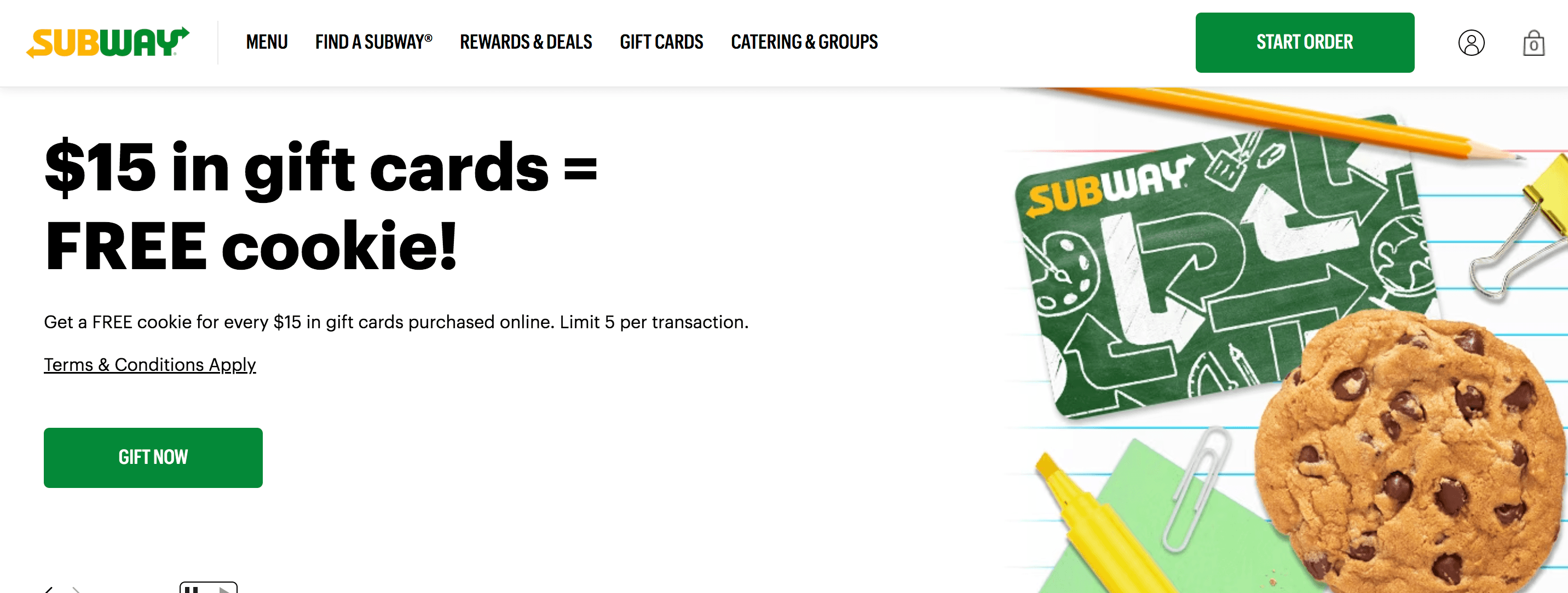
One aspect of Subway’s website that stands out is their high-quality imagery. Their website is filled with photos of their sandwiches. These photos are high-quality and show all the details of their delicious creations.
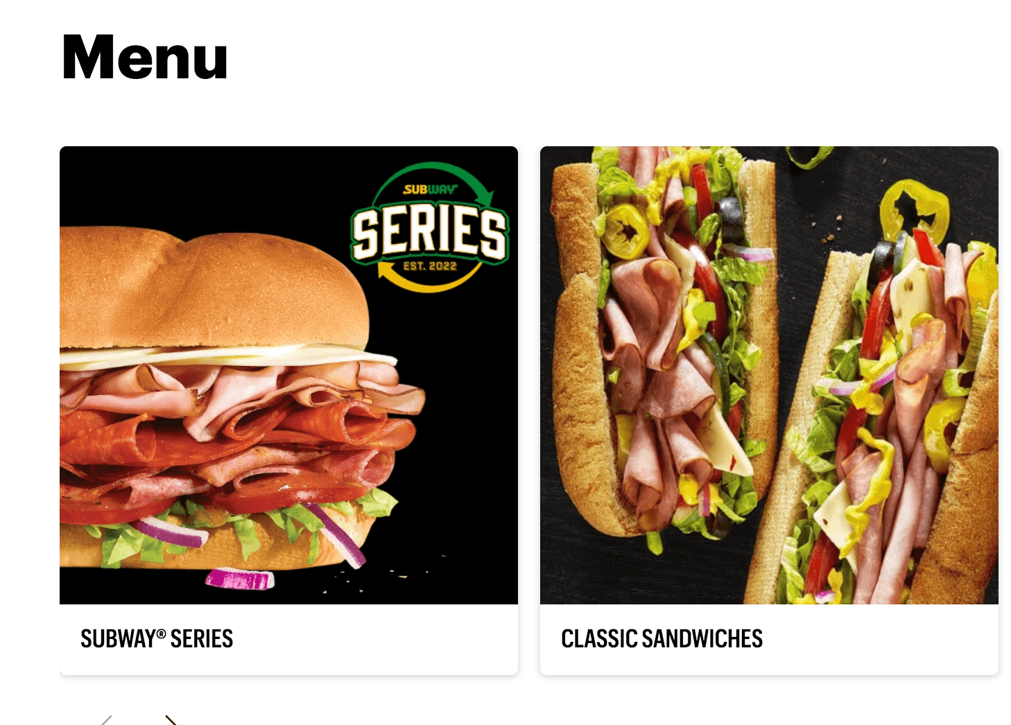
Takeaway: When you design your website, make sure you integrate high-quality images into your website. If you have low-quality or grainy images, you’ll deter people from your website and lose trust.
2. Chick-Fil-A
Area of focus: Color scheme
Next on this list of franchise web designs, check out Chick-Fil-A. This franchise has a simple design that makes it easy to focus on the information on their website.
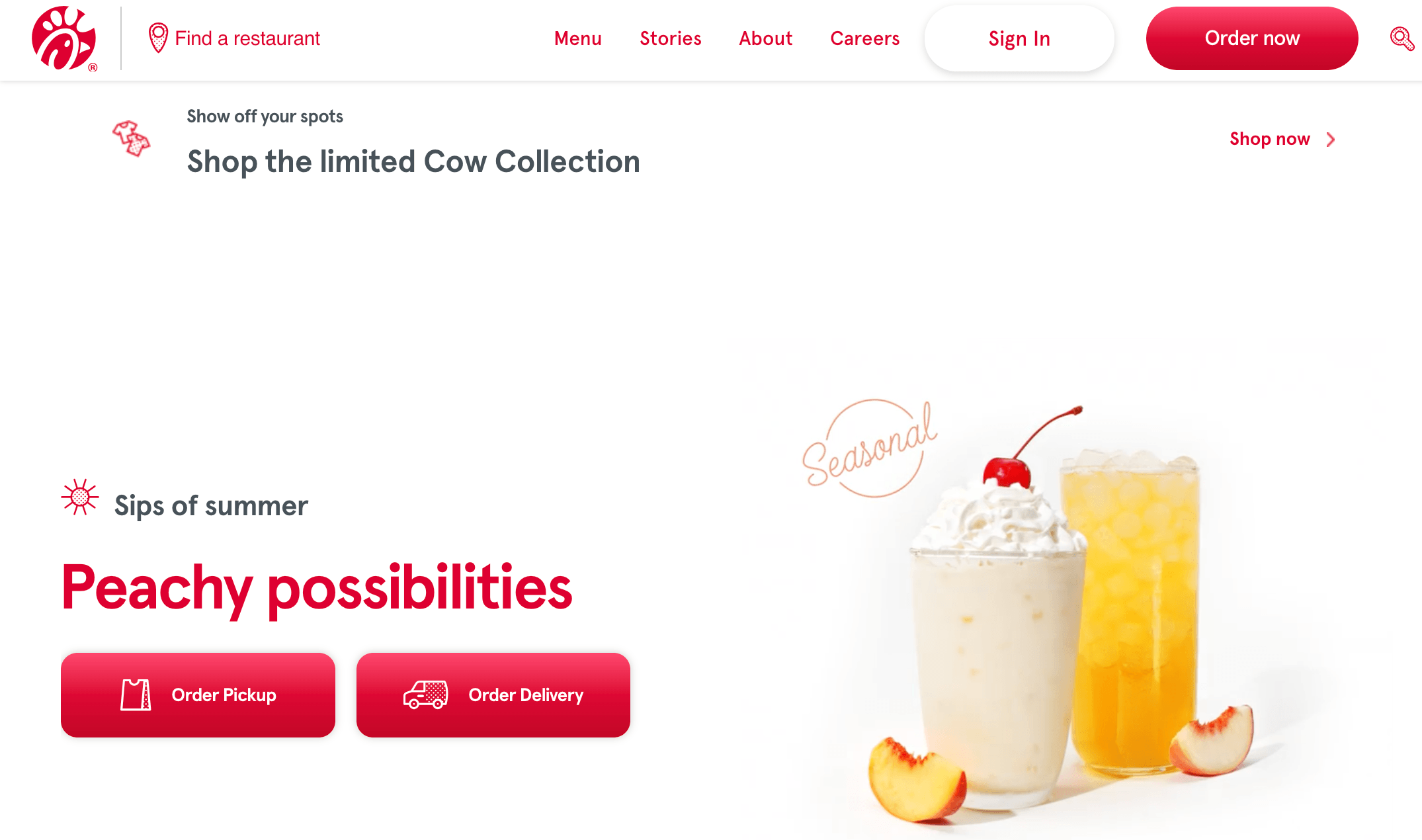
Chick-fil-a does a great job integrating their brand’s color scheme throughout their website. You can see the prominent red and white as you scroll down their page.
Takeaway: When you design your franchise website, make sure you have a set color scheme that you integrate throughout your website. Creating a style guide will help ensure you use your colors consistently around your website.
3. McDonald’s
Area of focus: Call to action (CTA) buttons
Another one of the best franchise web designs comes from McDonald’s. This franchise website integrates their iconic yellow and red colors into their website’s design.
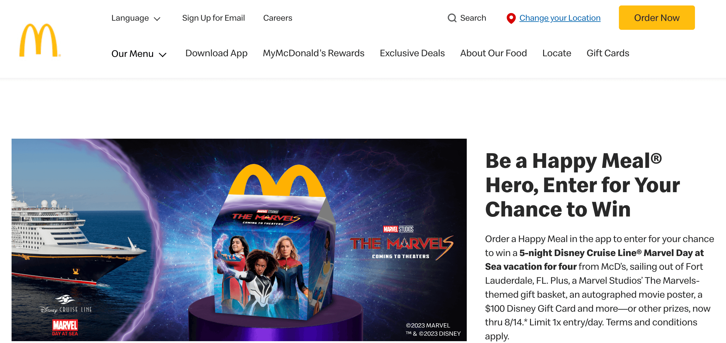
One thing McDonald’s does exceptionally well is create call to action (CTA) buttons that stand out on the page. As you keep scrolling down their website, you see the bright yellow CTA buttons on the page.
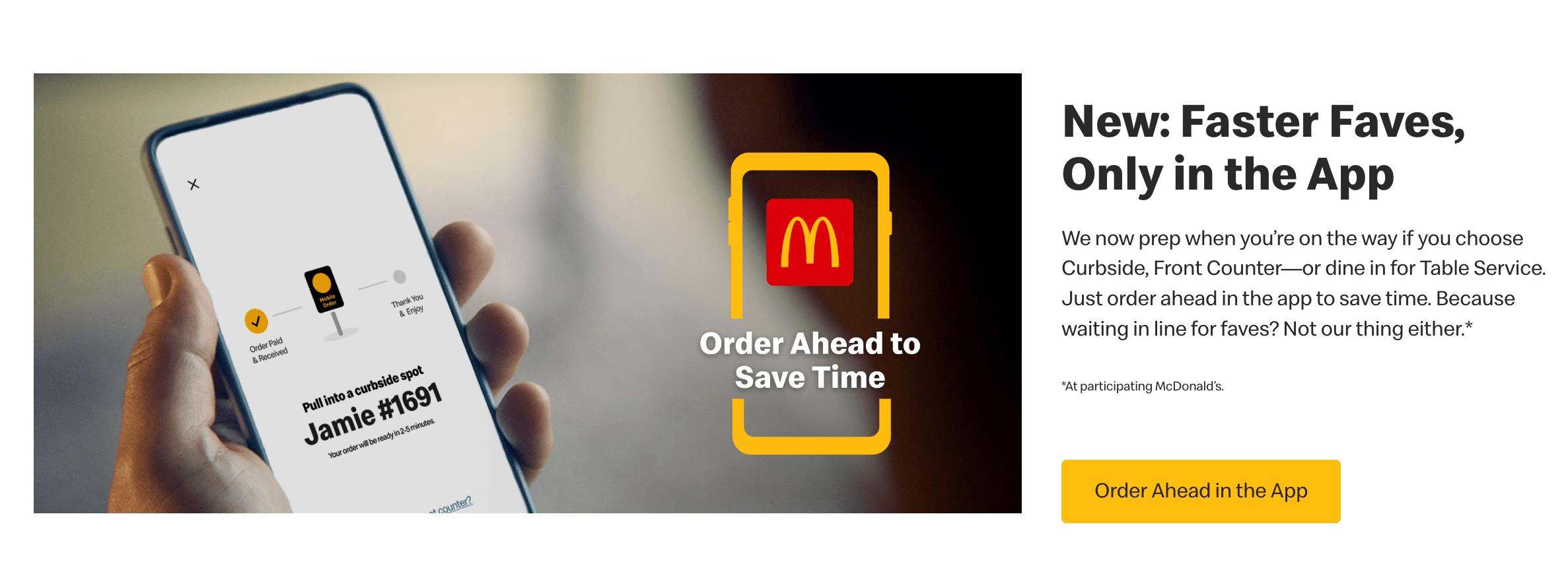
Takeaway: When designing your franchise website, integrate bold CTAs that stand out on your page. Use actionable text that tells your audience what happens when they click the button.
4. RE/MAX
Area of focus: User experience
If you want to see one of the best franchise website designs, check out RE/MAX. This real estate franchise has a prominent red and blue color scheme they integrate throughout their website.
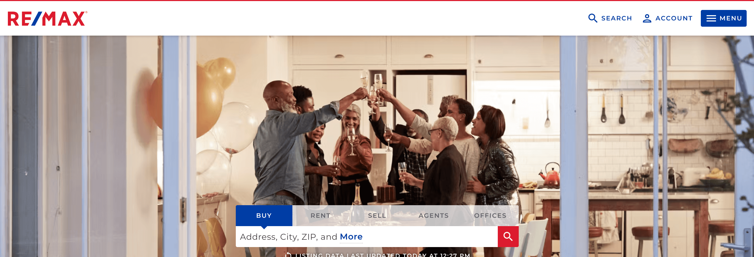
One of the most notable aspects of RE/MAX is their attention to the user experience. When someone visits their website, they can easily look for houses for sale, rent, and more. It makes it easy for visitors to do what they need on RE/MAX’s website.
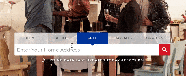
Takeaway: When you design your website, put the user first. Think about what would make their experience better and integrate features that help people navigate your website easily.
5. Wendy’s
Area of focus: Font style
If you want to see more web design examples for franchises, check out Wendy’s. Wendy’s does a great job integrating their brand’s unique color into their website along with high-quality images of their food.
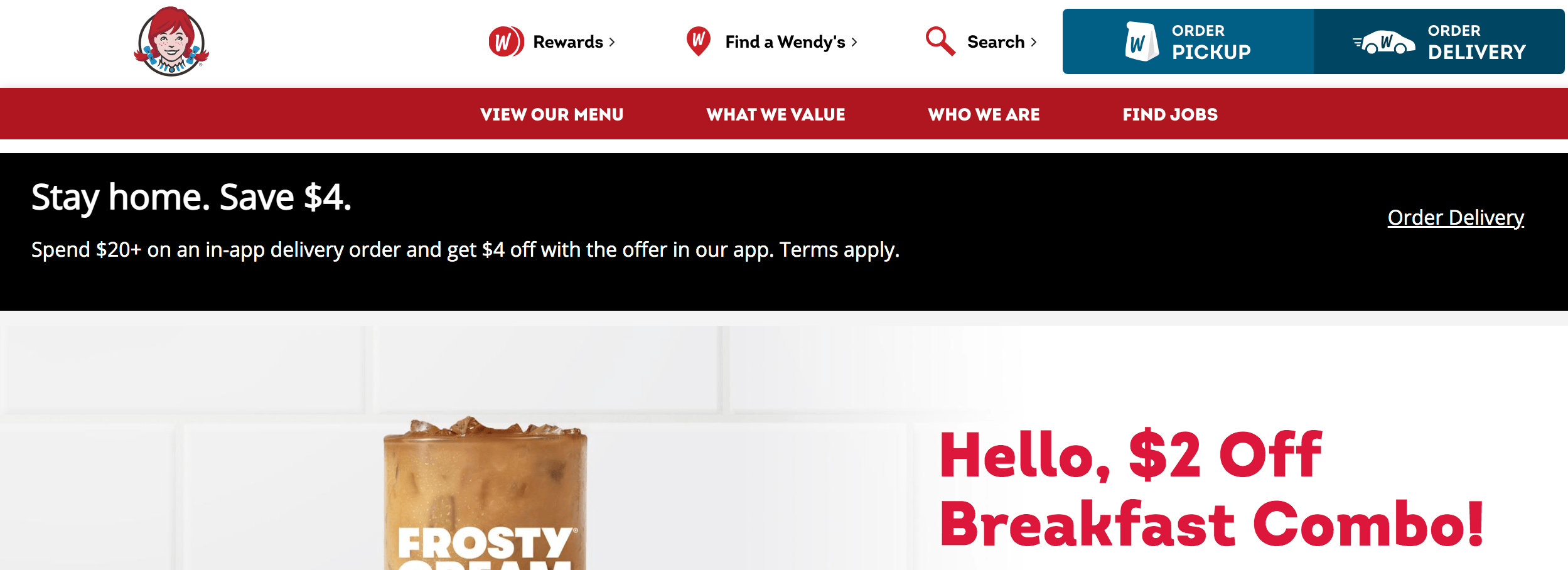
For Wendy’s, let’s focus on their font style. Wendy’s uses web-safe fonts to make it easy for people to read information on their website.
Takeaway: When you select fonts for your website, choose web-safe fonts. Web-safe fonts ensure that anyone who visits your website can easily read information without struggle.
6. The UPS Store
Area of focus: Navigation
Next on this list of web design examples for franchises is The UPS Store. This shipping franchise has a simple blue and white design to welcome website visitors.
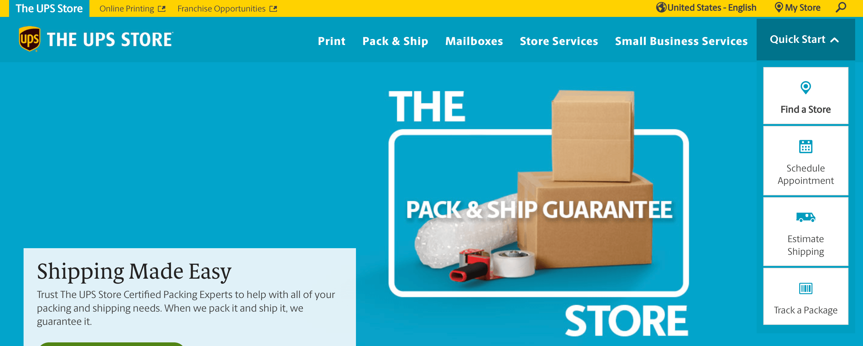
One of the top features of The UPS Store’s website is their navigation. They use broad headings that have multiple pages organized under each. It makes it easy for website visitors to find what they need.
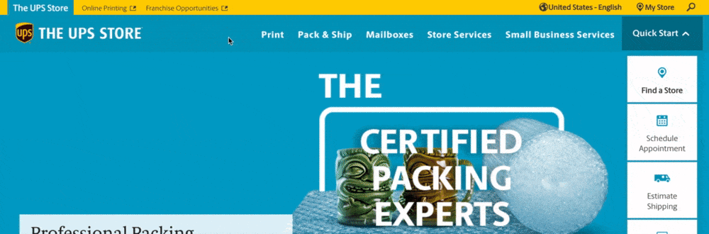
Takeaway: When you create your franchise web design, make sure you create an organized navigation. Use broad headings and subheadings to help organize pages and make them easy to find.
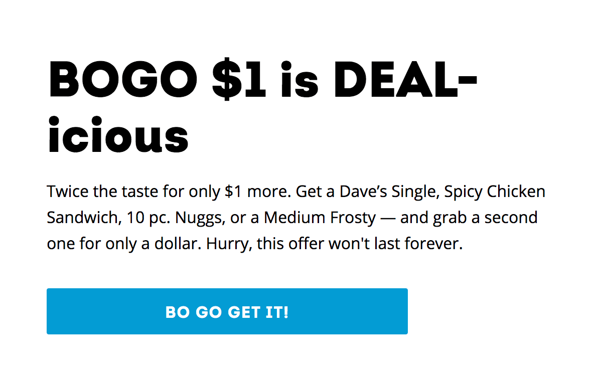
7. Burger King
Area of focus: Modern design
To continue on this list of franchise website design examples, let’s look at Burger King. This fast-food franchise uses high-quality images to draw people in and see what they offer.
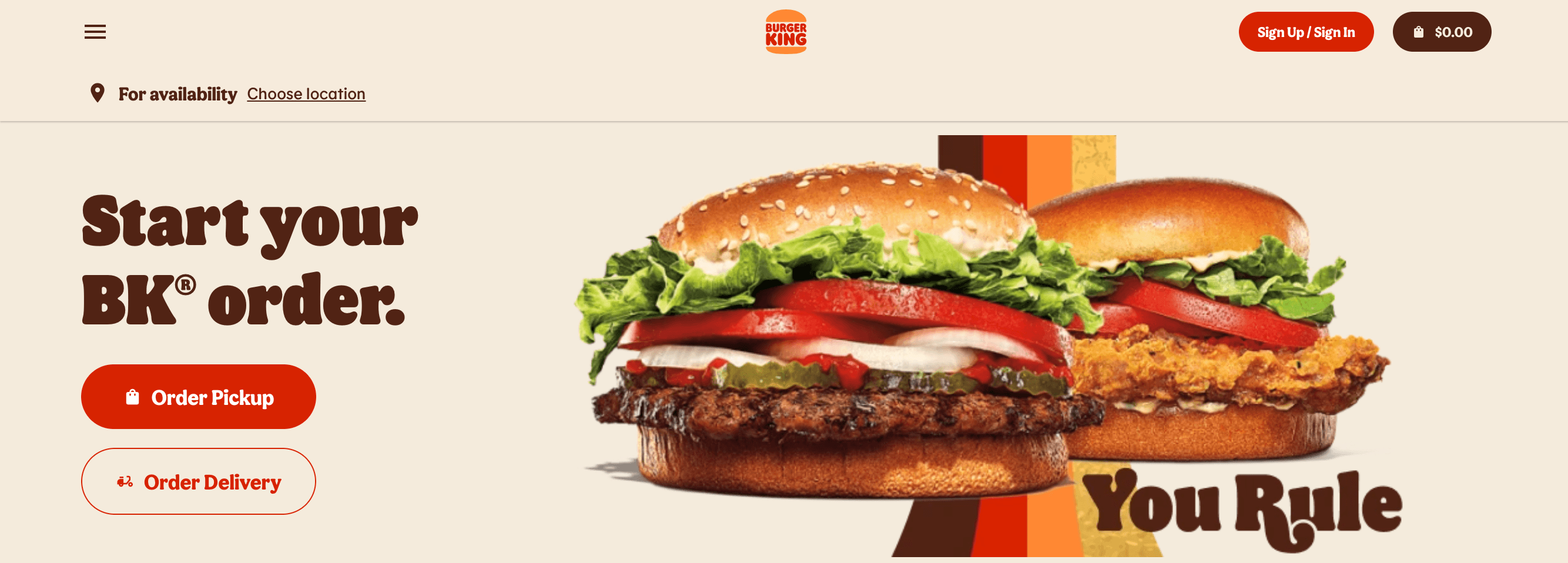
The most notable aspect of Burger King’s website is their modern design. They have a custom style that creates a unique and memorable experience on their website.
Takeaway: When you create your website, you want to make your design unique. Having a unique design helps you stand out from your competition, so think about what you can add to your website to make it different from other franchises.
8. Ace Hardware
Area of focus: Logo
One of the best franchise web designs comes from Ace Hardware. They have a simple red and white color scheme that invites users as they enter the website.
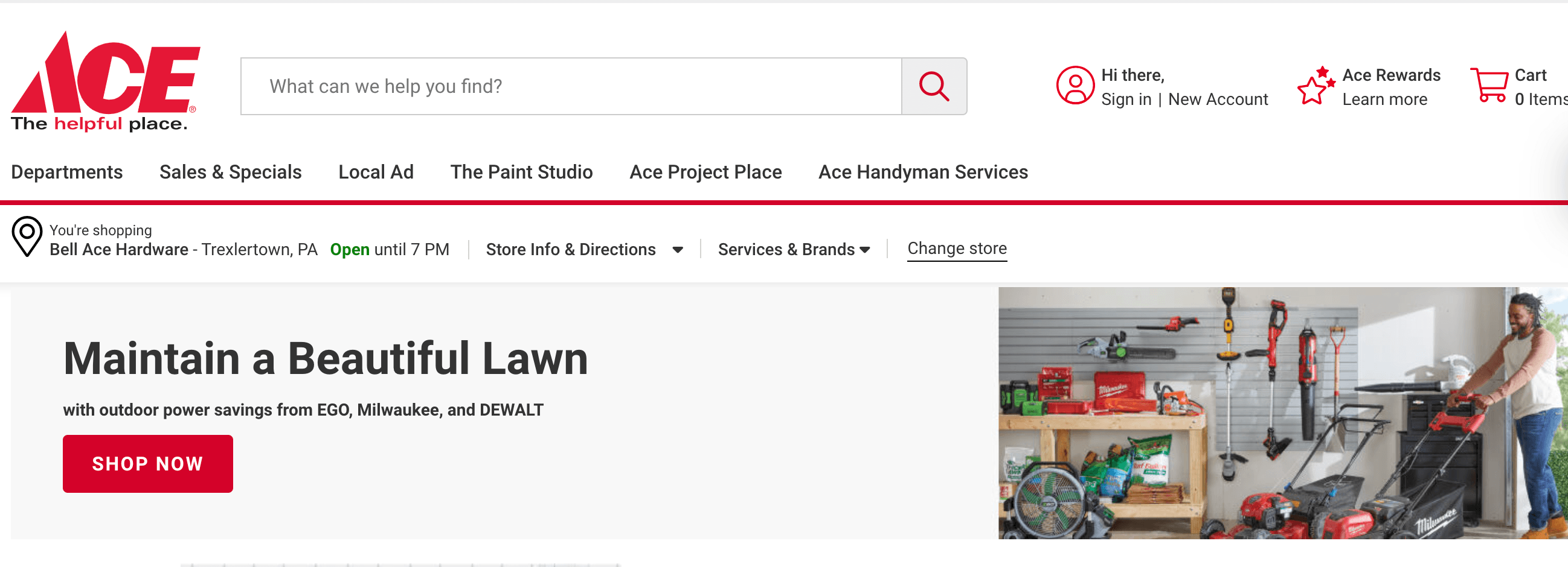
One area where Ace Hardware succeeds is their logo. It’s prominent and appears at the top of the page, so people don’t miss it when they enter their website.
![]()
Takeaway: When you design your website, make sure you have a unique logo prominently placed at the top of your website. Integrating your logo into your navigation ensures that people see it on every page and build brand familiarity.
9. Jersey Mike’s
Area of focus: Important pages
When looking for inspiration from website design examples for franchises, check out Jersey Mike’s. Their prominent logo and high-quality imagery catch your attention when you visit their website.
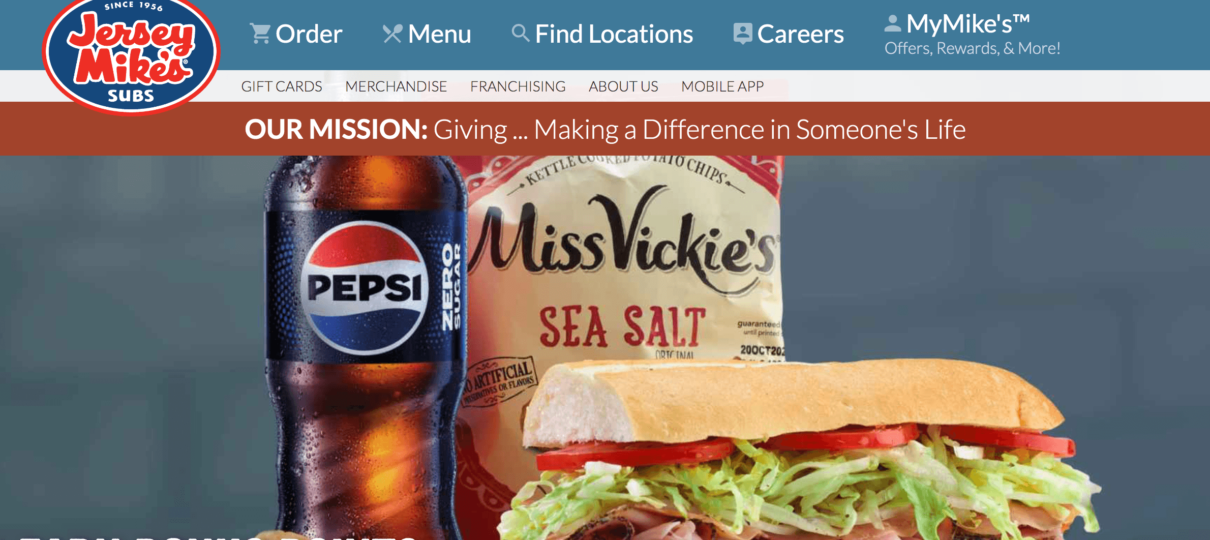
Jersey Mike’s does a great job including important pages on their website to ensure they deliver the best experience. They have pages for the menu, buying gift cards, and how to open your own Jersey Mike’s franchise.
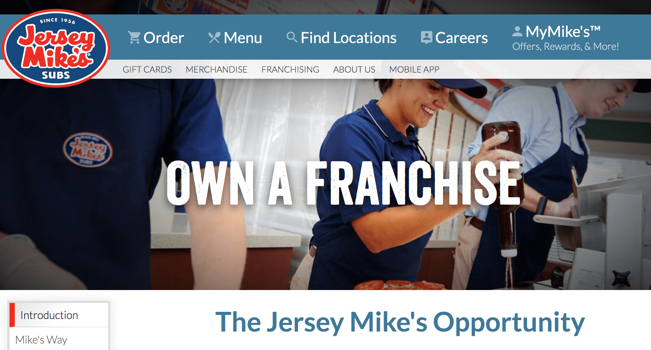
Takeaway: When you design your website, include the most important pages on your website. Think about what pages and information you need to share with your website visitors.
10. Signarama
Area of focus: Offerings
To continue on this list, let’s look at Signarama. This franchise has numerous great features in their design, from an organized navigation to prominent CTA buttons.
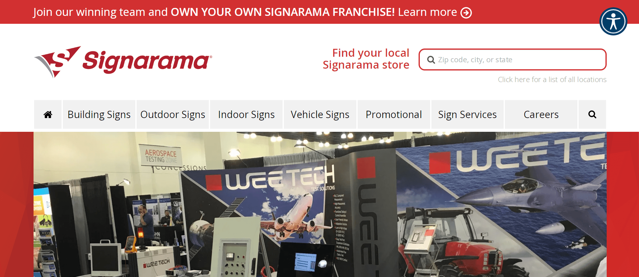
On Signarama’s website, they do a great job laying out their offerings. They share pictures and clickable links to what they create signs for, so people can click on what they need and learn more.
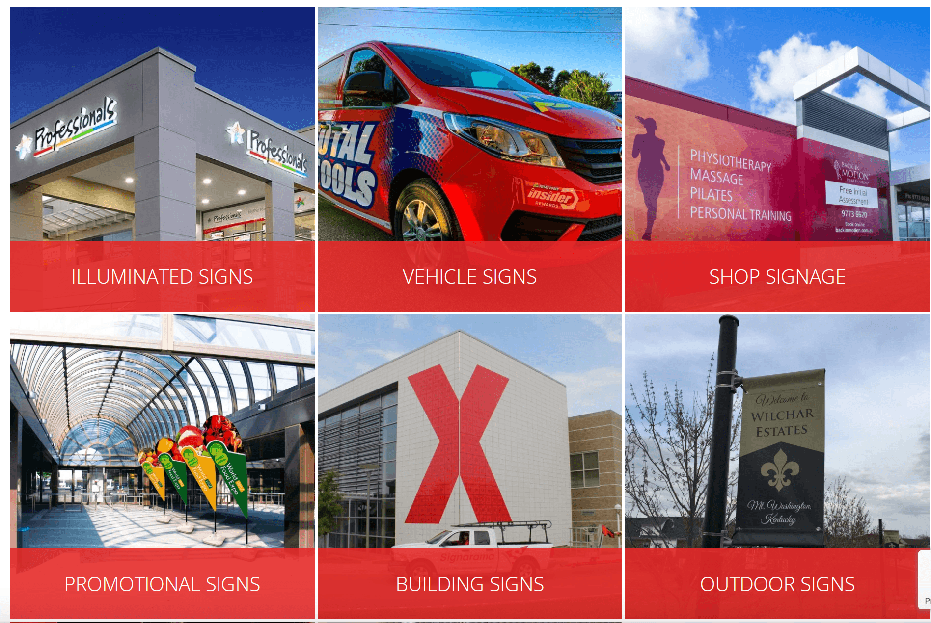
Takeaway: When you create your website’s design, find a creative and appealing way to present what you offer. You can use high-quality photos, videos, and more to present your offerings.
11. Comfort Keepers
Area of focus: Responsive design
If you want to see more franchise web designs, check out Comfort Keepers. They have a simple blue and white design and pages filled with information about their services.
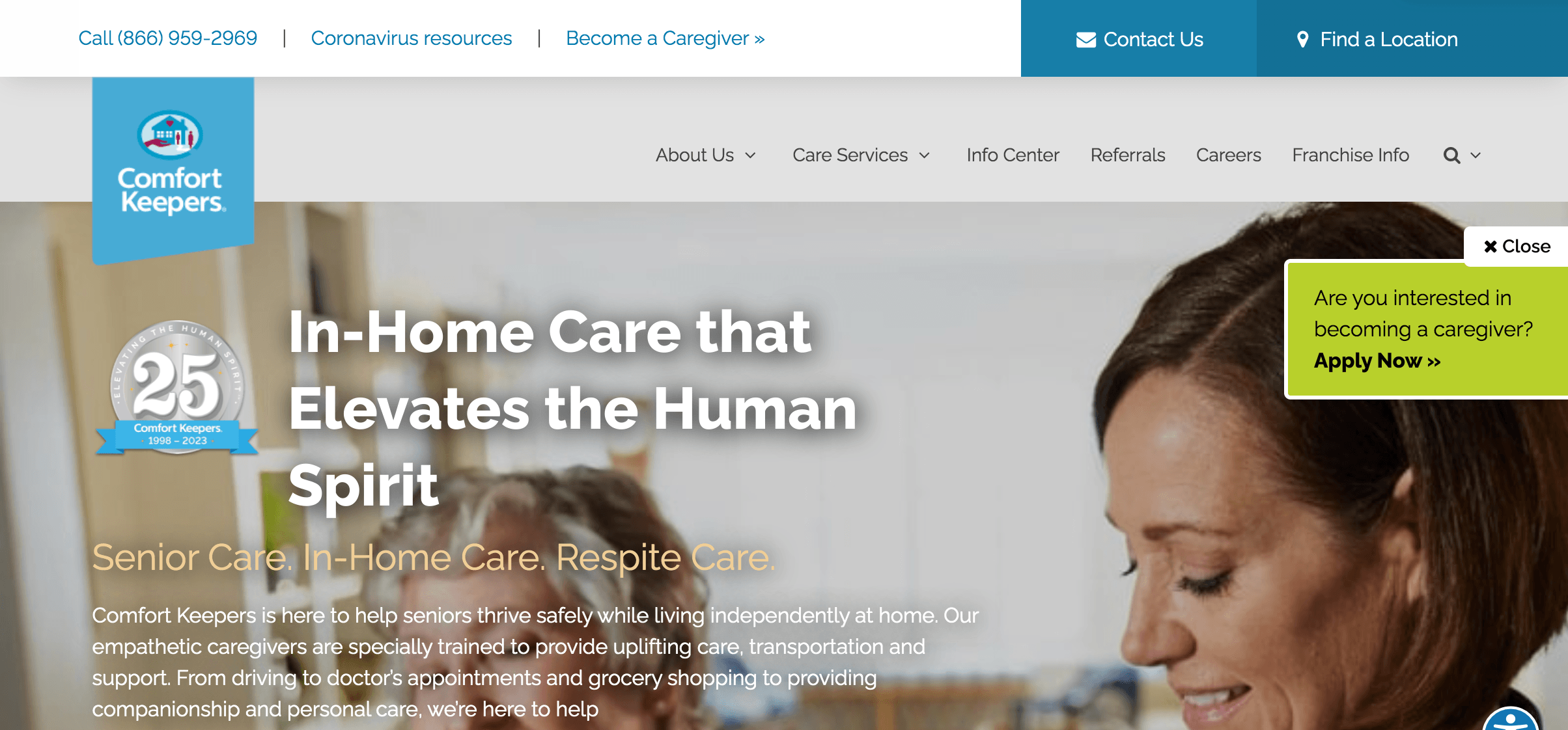
One aspect that Comfort Keepers does well is integrating responsive design. Their website adapts to whatever device users use. It ensures that everyone has a positive experience and can easily navigate their website.

Takeaway: Integrate responsive design into your website to ensure every website visitor has a positive experience. Use mobile-friendly elements like hamburger menus and thumb-friendly buttons.
12. Domino’s
Area of focus: Page speed
Another website to look at for inspiration is Domino’s. This pizza franchise has high-quality images and a recognizable logo integrated into their website’s design.
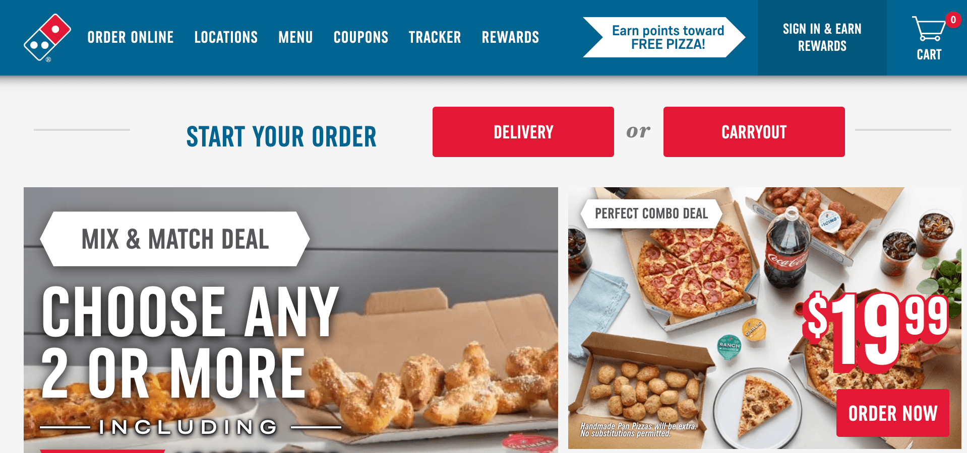
One notable aspect of their website is the page speed. When you visit Domino’s website, the page loads quickly, so you can start placing your order or browsing their menu.
Takeaway: When you design your website, ensure it loads quickly to keep prospects engaged. You can use a tool like Google PageSpeed Insights to see your website’s current load time and find areas of improvement.
13. Century 21
Area of focus: Chatbox
To continue on this list of franchise website designs, let’s look at Century 21. This real estate franchise has a simple tan and gray color scheme that creates a welcoming experience when you enter their website.
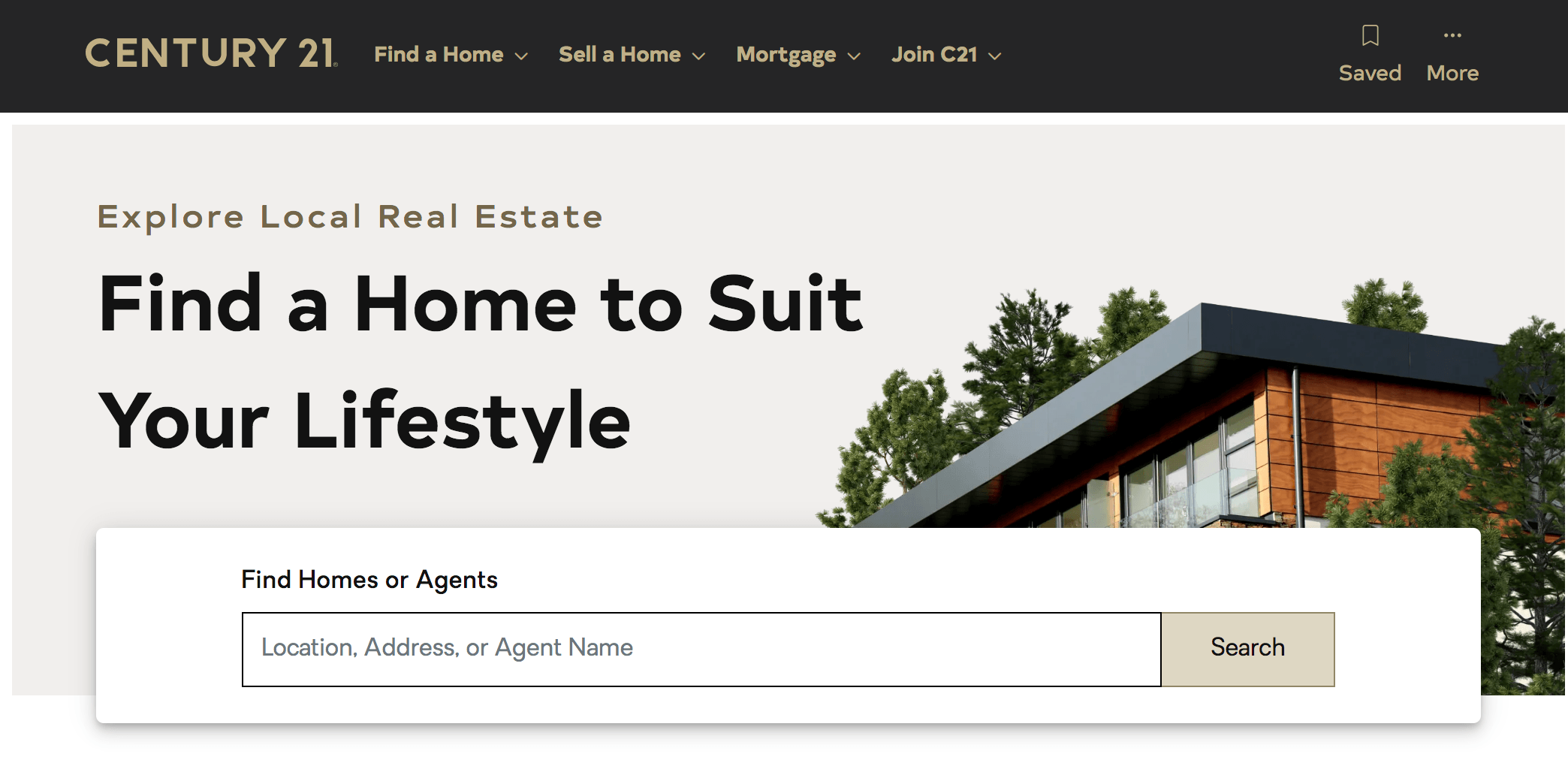
One of the best features of Century 21’s design is their integration of a chat function. If someone has a question, they can easily open the chatbox and get the answers they need.
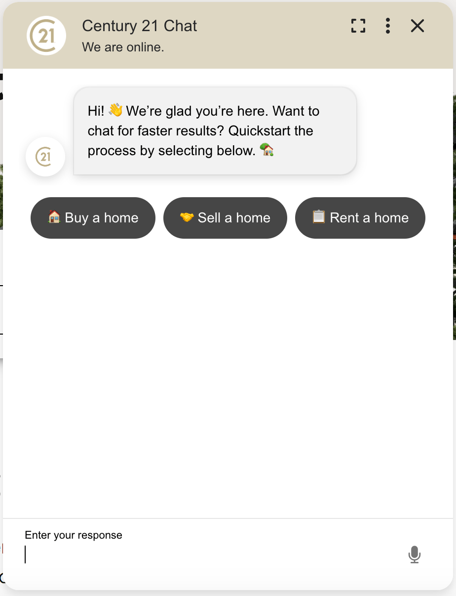
Takeaway: Consider integrating a chatbox into your website. You can integrate a chatbot into your chatbox to answer questions fast rather than relying solely on live representatives.
14. Pizza Hut
Area of focus: White space
One of the best franchise website designs comes from Pizza Hut. They use bold imagery and text to create a visually appealing appearance for their website.
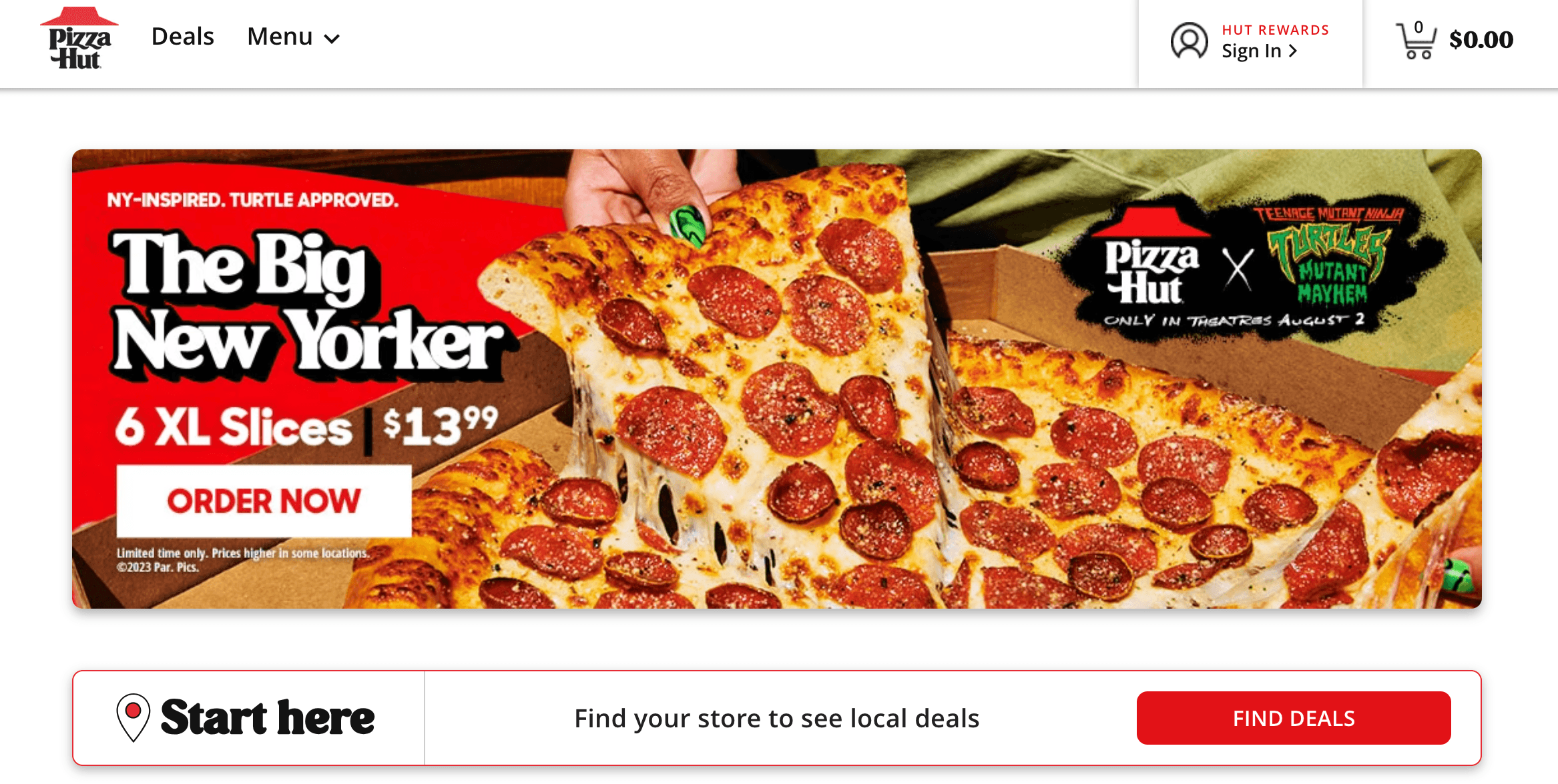
Pizza Hut does an excellent job using white space in their design. They don’t fill every corner of their website with pictures and text. They use whitespace to help ensure their website doesn’t overwhelm visitors and allows them to focus on what’s important.
Takeaway: Integrate white space into your design to help keep your website clutter-free. You don’t need to fill every inch of your website with information. Use white space strategically to draw attention to the information that matters most on your website.
15. Great Clips
Area of focus: Timeliness
When you do franchise web design, you must keep your website updated, so it provides people with the latest information. Great Clips, with their modern website design, does a great job of keeping their website current.
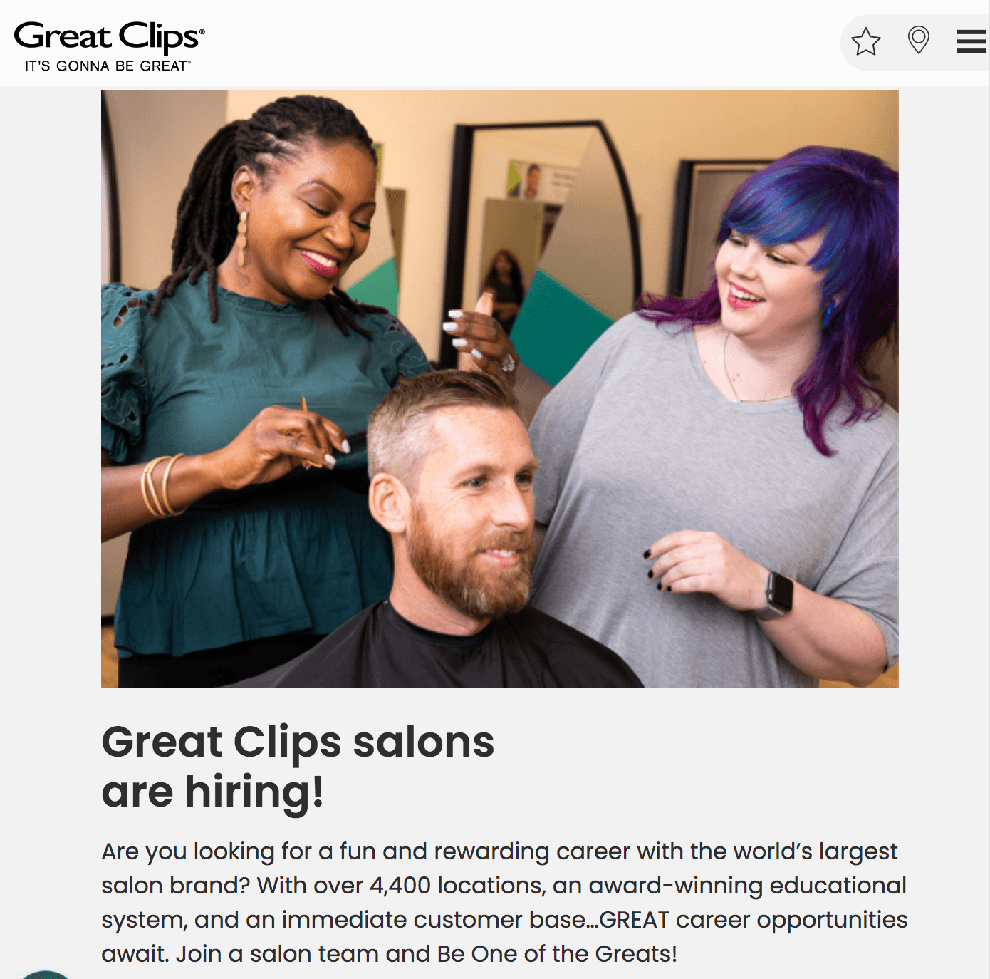
Great Clips does an awesome job of making their website current by changing the information to fit the time of year. They tailored their website to promote their haircuts for back-to-school using an eye-catching graphic.
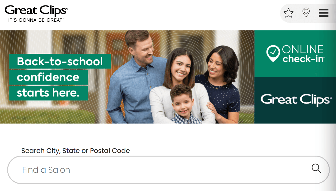
Takeaway: Tailoring your website to the current seasons can help you drive more revenue and engagement. It can be as simple as adding a banner or graphic to the top of your website like Great Clips did!
16. Cinnabon
Area of focus: Readability
Want to get inspired by more franchise website designs? Check out Cinnabon. Cinnabon uses bright photography and a blue and teal design to create an engaging website for visitors.
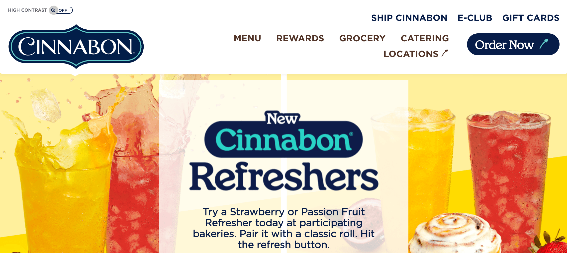
Cinnabon does a great job of making their website easily readable. They use short paragraphs of text to make it easy to skim. Additionally, they have a toggle button at the top that enables users to make some of the text bigger, like the CTA buttons.
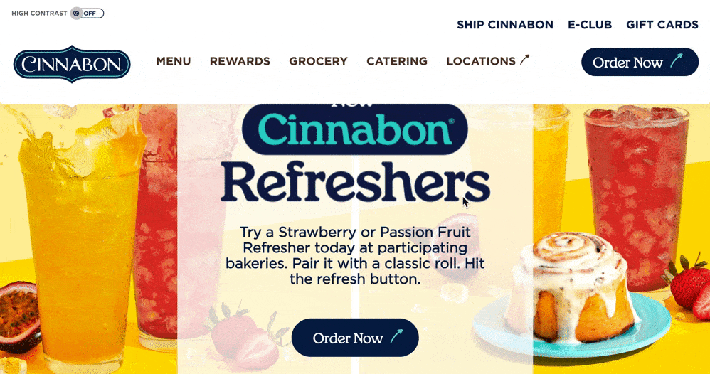
Takeaway: When you add text to your website, make sure you use small paragraphs of 2–3 lines to make it easy to skim. You’ll also want to break up text with images to give users’ eyes a break.
17. Dunkin’
Area of focus: Graphics
Next on this list of web design examples for franchises, let’s look at Dunkin’. Dunkin’ integrates their iconic pink and orange color scheme throughout their website to help build their brand identity.
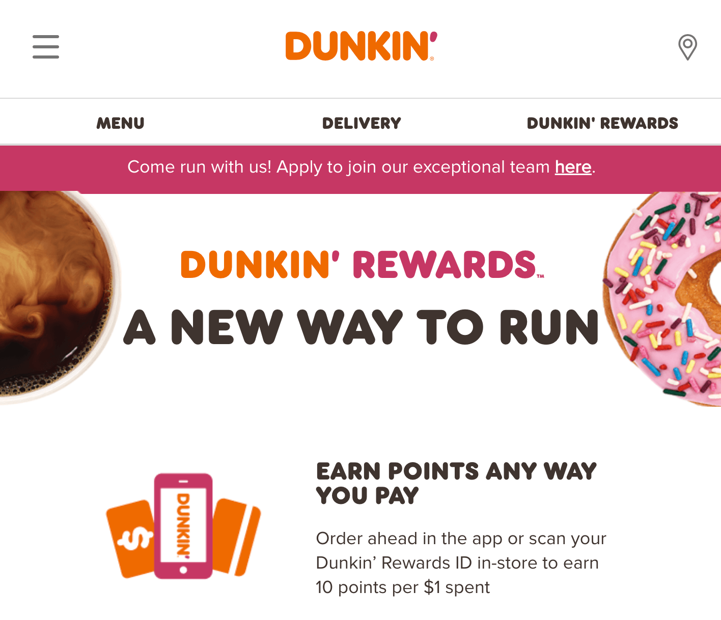
Dunkin’ does an excellent job of using graphics with their authentic photos. They integrate them throughout their website to enhance the text on their page.
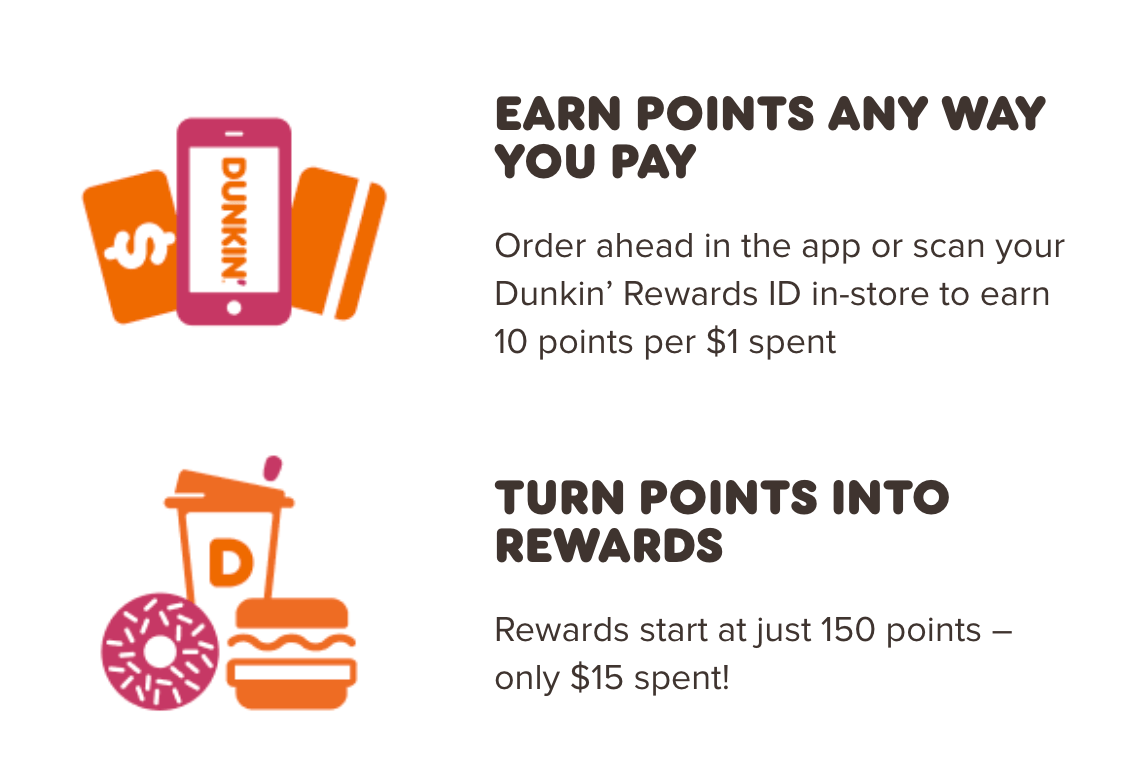
Takeaway: Consider using a balance of graphics and authentic imagery to help make your website visually appealing. You’ll want to ensure your graphics fit your brand’s color scheme and enhances your text.
18. BatteriesPlus
Area of focus: Email signup integration
To continue on this list of franchise web designs, let’s look at BatteriesPlus. This franchise has a bright orange and black design that catches your attention when you enter their website.
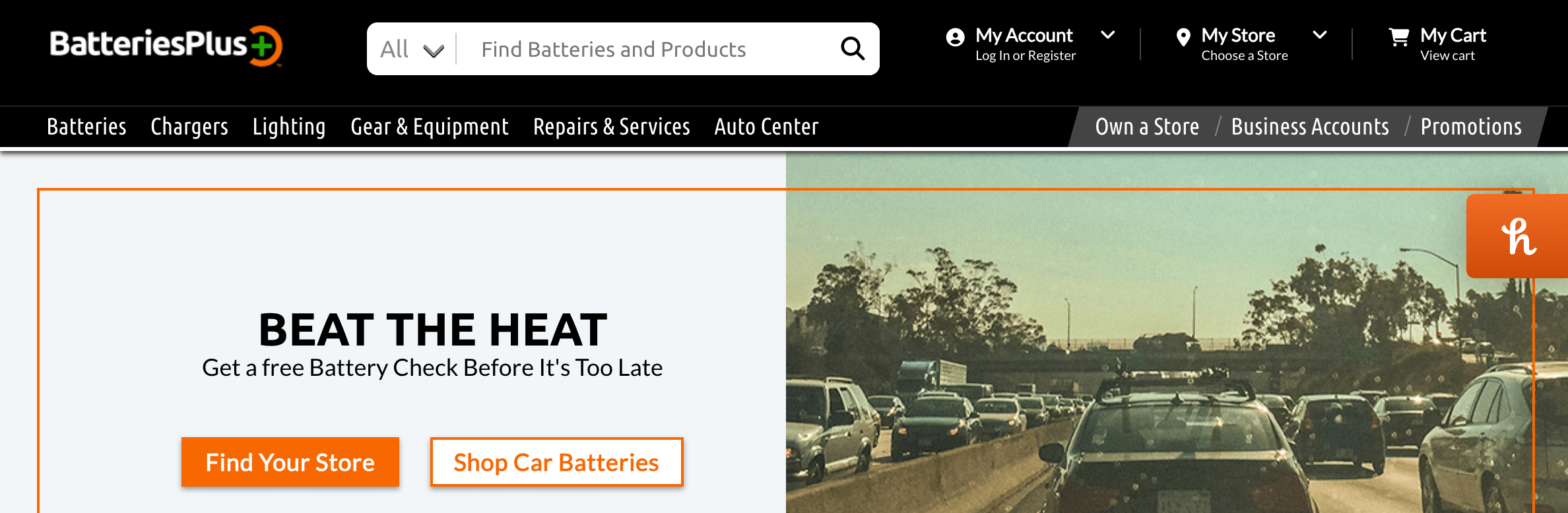
One notable aspect of BatteriesPlus’s website is the creation of a pop-up email signup. They offer prospective customers a discount for joining their email list and staying connected. It’s a great way to capture leads for their business.

Takeaway: Integrate features into your design that helps people connect with your business. It doesn’t have to be a pop-up –– you can have an email signup bar at the bottom of your page, integrate social media buttons, or something similar. Creating ways to connect on your website is crucial for capturing qualified leads.
19. Papa John’s
Area of focus: Checkout process
Another of the best website design examples for franchises is Papa John’s. They use a simple design filled with high-quality images of their pizzas to make people want to order.
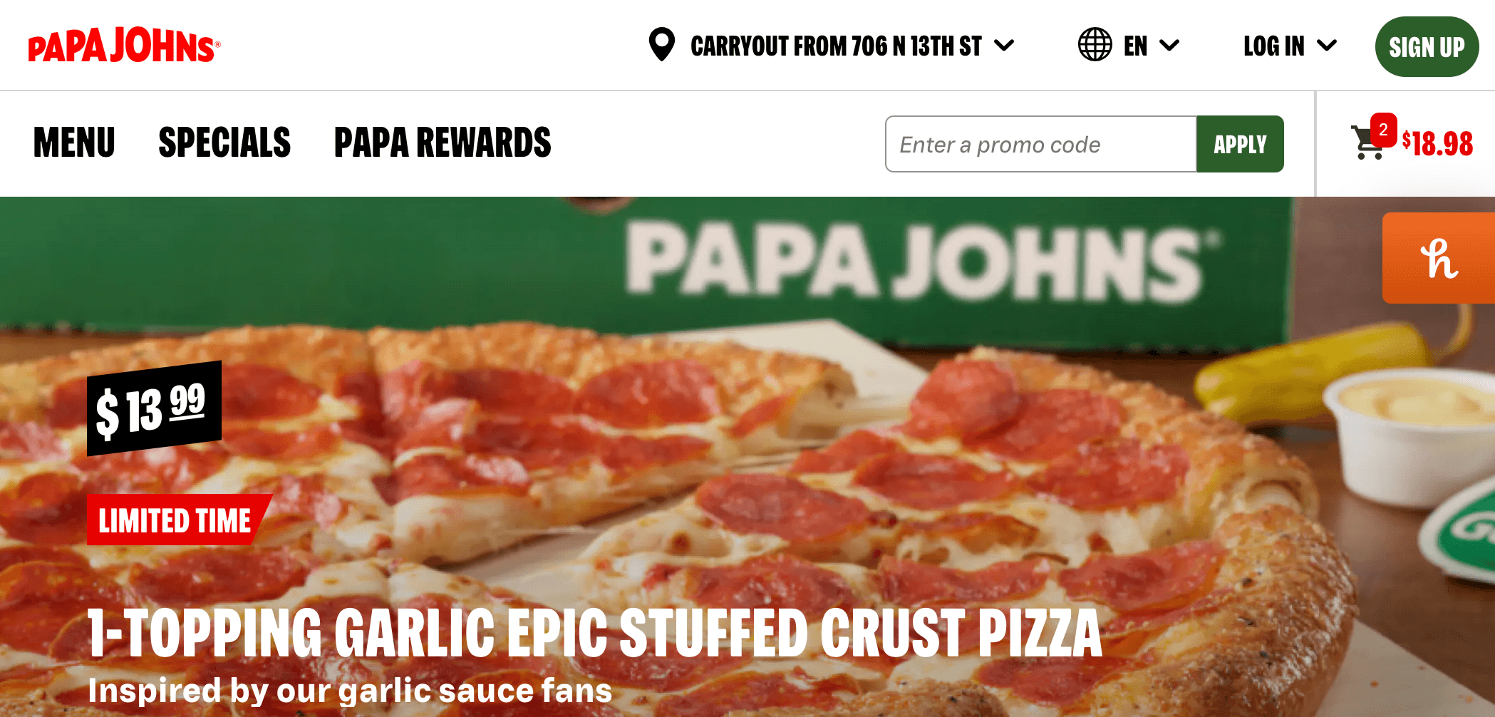
One notable aspect of Papa John’s website is their checkout process. They make it easy for people to add food to their cart and checkout.
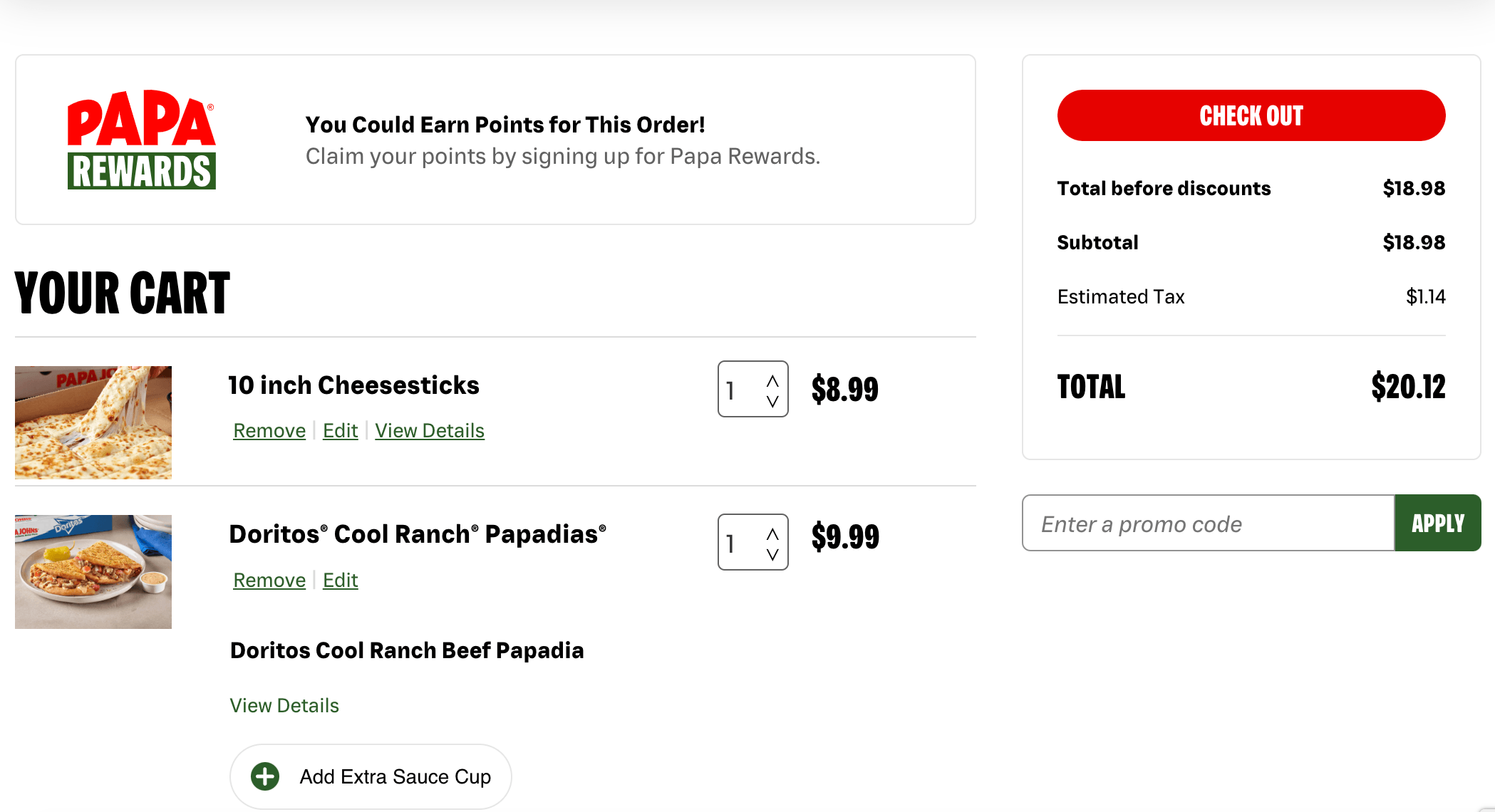
Takeaway: If people can buy your products online, make sure you create a painless checkout process. Make it easy for people to add products to their cart, input their information, and pay.
20. Plato’s Closet
Area of focus: CTA buttons
If you want to see more franchise website design examples, check out Plato’s Closet. This fashion franchise has a gray and teal website that grabs your attention when you visit.
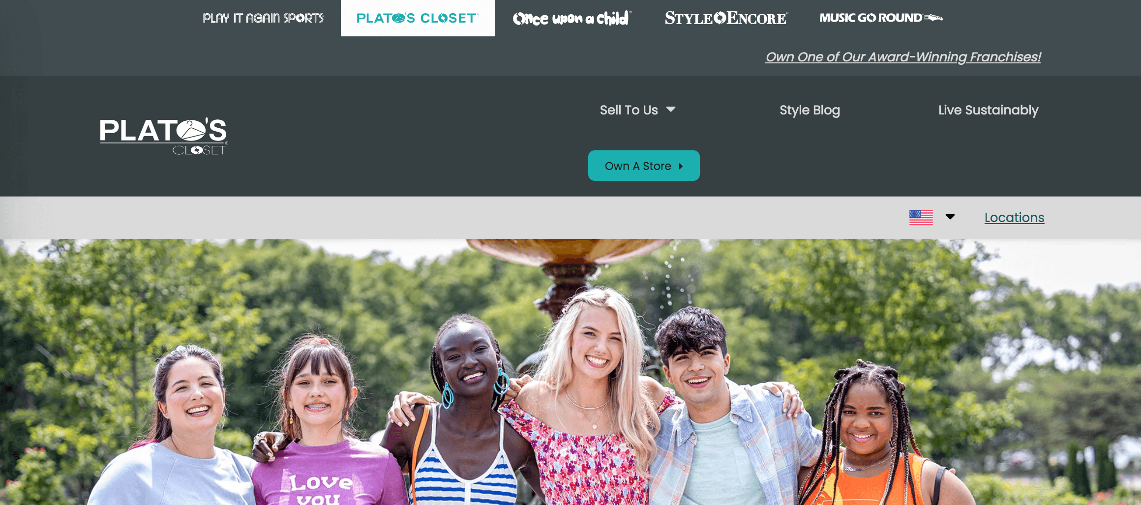
Plato’s Closet does an excellent job differentiating CTAs when they’re near each other on the page. They use two different colors to draw attention to the CTAs and help them stand out from one another.

Takeaway: If you use more than one CTA in the same place, make them stand out from one another so they don’t get muddled. It can be a great way to help draw attention to your CTA buttons while directing prospects to the actions you want them to take.
21. Molly Maid
Area of focus: Reviews
Another of the best web design examples for franchises comes from Molly Maid. Molly Maid has a standout professional design with its pink accents and high-resolution images.
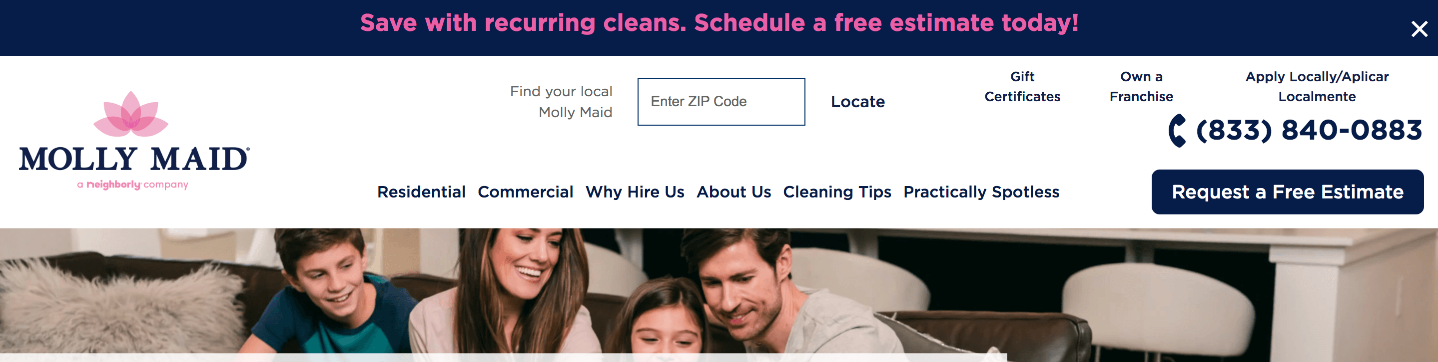
Molly Maid does a great job of integrating reviews into their website. They share what people like about their service to help build confidence with prospective clients.
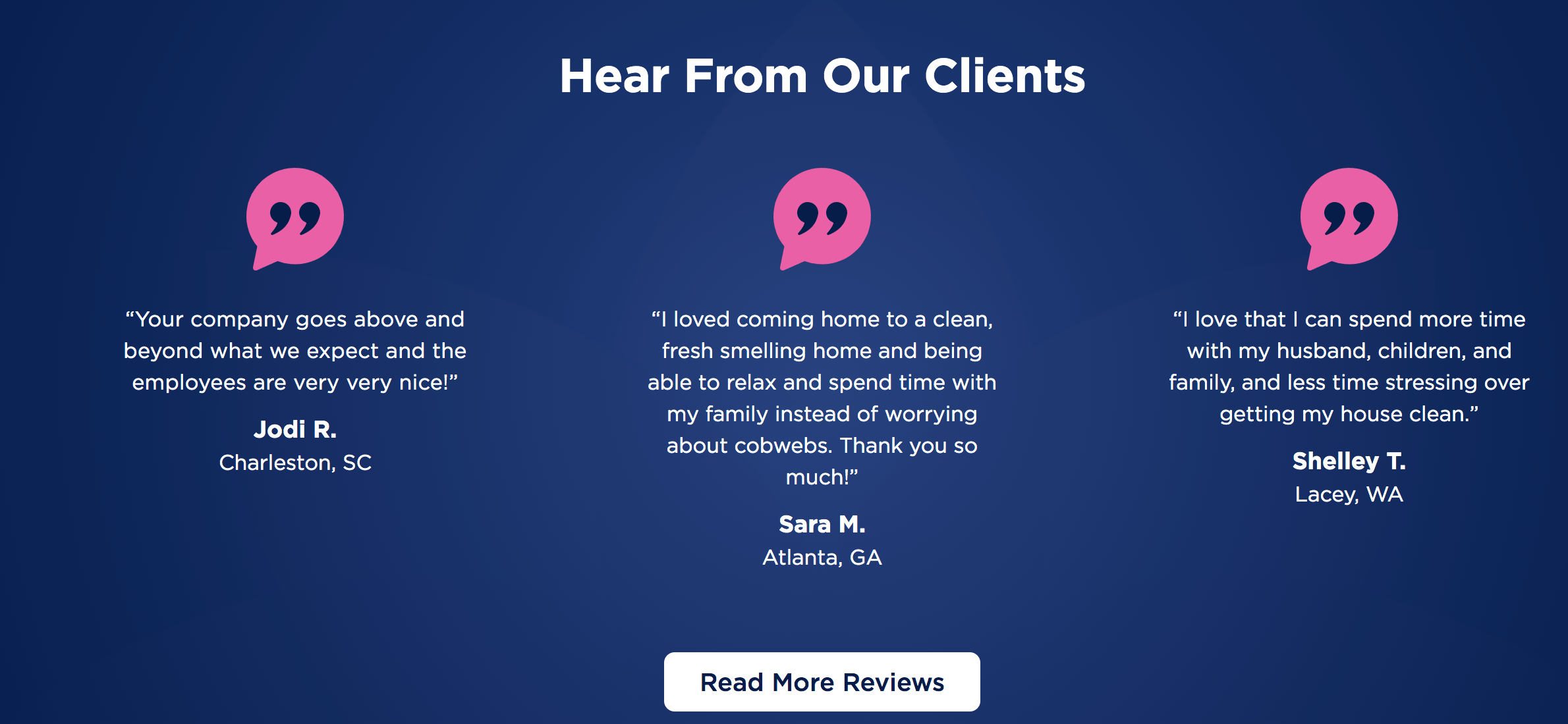
Takeaway: Adding reviews to your website helps build trust and credibility. Integrate them into your website to help show prospective customers what people like about your franchise.
22. KFC
Area of focus: Icons
If you want more inspiration from franchise web designs, check out KFC. This website integrates their iconic white and red color scheme to create a branded experience on their website.
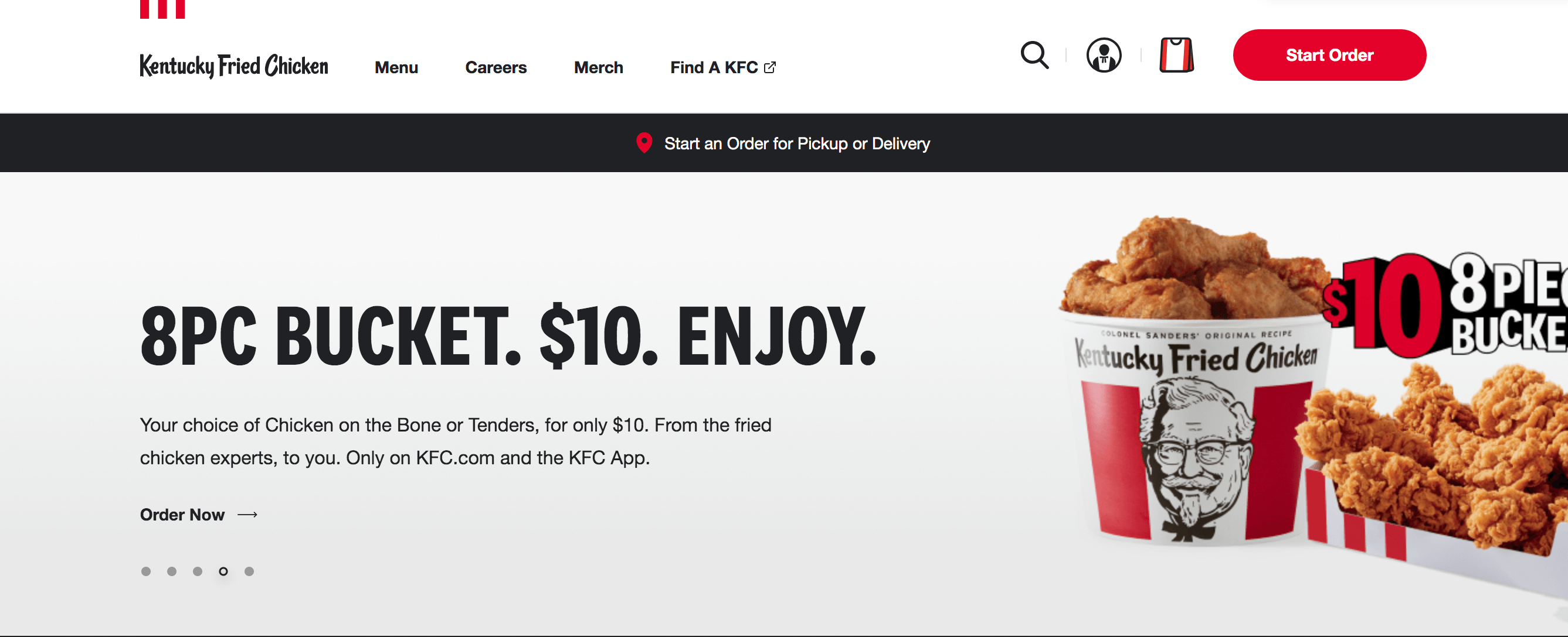
One aspect that KFC does well is integrating icons into their design. KFC uses an icon of a person dressed like the Colonel and a KFC-themed bag as their “checkout cart.” These icons help add to their branding.
![]()
Takeaway: Use icons when appropriate. Integrating brand-focused icons can help build brand recognition and create a unique experience for website visitors.
Inspired by these franchise web designs?
Now that we’ve covered this list of franchise web design examples, you have an idea of what you need to create a revenue-driving website. If you find yourself feeling overwhelmed with how much you want to add to your website, WebFX can help.
We have over 30 years of experience designing websites for our clients. Our team knows how to craft websites that drive business growth –– we’ve driven over $10 billion in revenue and over 24 million leads for our clients.
Want to see what we can do for you? Check out our design portfolio!
Ready to build your revenue-driving website? Contact us online or call us today at 888-601-5359 to speak with a strategist about our web design services!
We Drive Results for Franchise Companies
- 750+ digital experts spanning 10+ different departments
- Data-driven decision making that’s generated $3B in revenue for clients


Table of Contents
- 22 franchise website design examples that crush it in 2026
- 1. Subway
- 2. Chick-Fil-A
- 3. McDonald’s
- 4. RE/MAX
- 5. Wendy’s
- 6. The UPS Store
- 7. Burger King
- 8. Ace Hardware
- 9. Jersey Mike’s
- 10. Signarama
- 11. Comfort Keepers
- 12. Domino’s
- 13. Century 21
- 14. Pizza Hut
- 15. Great Clips
- 16. Cinnabon
- 17. Dunkin’
- 18. BatteriesPlus
- 19. Papa John’s
- 20. Plato’s Closet
- 21. Molly Maid
- 22. KFC
- Inspired by these franchise web designs?
- We Drive Results for Franchise Companies
Solving key challenges for franchises
We aren’t driving enough traffic to our website
Skyrocket your online visibility with industry-leading digital marketing services that boost your rankings in relevant search results and drive qualified traffic to your website.

We’re struggling to attract new prospects
At WebFX, our team of strategists will help you craft revenue-driving lead generation and marketing strategies that attract high-value leads and prospects to your company.

We’re struggling to stay ahead of our competitors
Staying one step ahead of your competitors is critical for continuously attracting new customers and steady sales for your business. Our marketing services put a shining spotlight on your company to outshine the competition every time.

Our marketing efforts aren’t providing a high return
Our data-driven marketing efforts leverage data from your audience, website, strategies, and more to ensure your marketing dollars go toward the campaigns that will provide the highest ROI.

Expand your franchise marketing reach
- 11 Effective Web Design Tips for Franchises
- 5 Benefits of Email Marketing for Franchises
- Digital Marketing for Co-Ops: How to Grow Your Co-Op Online
- Franchise Marketing Agency
- Franchise Social Media: The Guide to Franchise Social Media Marketing
- Local SEO for Franchises: 7 Essential Franchise SEO Strategies
- SEO for Franchises
- franchise statistics
- lead generation for franchises